
Don't wanna be here? Send us removal request.
Statistics
We looked inside some of the posts by nolanwangpost-blog and here's what we found interesting.
Average Info
Notes Per Post
1
Likes Per Post
1
Reblog Per Post
0
Reply Per Post
0
Time Between Posts
18 days
Number of Posts By Type
Text
4
Last Seen Tumblr Blogs


Fun Fact
Tumblr was named as a finalist in Lead411’s New York City Hot 125 in Aug 2010.
Text
190409 Workflow comparison
wMost of the design process or workflow are related with each other.
At the start of the design process, strategy and planning are pretty important, which lead the way of the whole result. This part is more like what kind of product I’m going to design, or what will this design be. For example it’s a shopping site or online newspaper website? It’s like I’m going to build a house or museum or hospital. Different kind of design has it’s own unique feature that makes it that way.
Then is the user research part. I think this part will be replaced or in another way in the future. It’s a great and clear data based way to find evidence to support your thoughts, but it’s too subjective and the data collected may have some personal tendency. There are also some excellent sample success due to user research like Apple’s earpods, the XBOX controller, they did user research by collecting huge amount of data and get the right sollution of that. However it not always happened. I think user research is one way to find design basis. In architecture, the design can be based on environment, culture and function.

For the contect, information architecture part, that’s clear and full of logic. By listing the functions and elements that the design need to have and then orginaze them in a properate way. It’s great that all the designer work together and have a full acknowledge about the project. There’s not actrual part to compare with in architecture. I think this part might related to the design list, like strucuture, ventilation, drain. circuit and even interior decoration. Different people with their major have their own thoughts, so it usually become a mass working together. Now designer have BIM and can work a little better than before.

Then turns to the prototype part. It’s like orginaze components and do the sketching with wireframss. Wireframes seems same as buble diagram that used in traditional function based architecture design, to make a basic knowledge about the function space and circulation about the porject.

Finally it’s time to visual design. Visual design decide how the webpage looks like, it’s welcome or not. The selection of color and fonts are the same as material that used in both interior and exterior facade. They all depend how the product looks like and also the first view to others.
In conclusion, the workflow of webpage design is more like traditional architecture design, from find desgin base to elements collection, then do function orginazation and finally turn to decoration.
0 notes
Text
190212 Fundamentals of Composition
Nintendo is a great video game company that I love the most. This time I’m going to talk a little bit about the design of Labo’s page (https://labo.nintendo.com/). Labe is a kind of toy kit make of cardboard, which is the revolution product in kids toy area. It was rated as time best inventions of 2018.

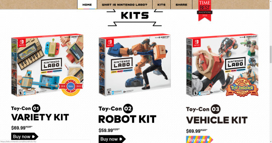
Once you enter the home page, the logo of Labo shows at the center of the whole page, with the kind of font that is thick and recognizable. This kind of font has non-curvature angle at the corner, which is similar with the floding cardboard. For the other parts, they are using the fonts both simple and clear. The font size is also designed into many layers. The most attractive part is both large and bold, and others are just as normal to do the statement work.

For the color selection, the designer choose black and white as its main color, combine with the color come from cardboard. This kind of cardboard color also add a little texture in it, to make it looks more real as the material of Labo. Below the logo is Labo’s three main elements: make, play and discover. They are using three primary colors, which is most recognizable for kids, and also become the main interaction elements of the whole webpage. This kind of color with high saturation is easy to get attention from kids. They are also using black and white color to make a frame around the useful information, to make a difference from other elements.

For the layout, they are trying to seperate each part clearly, also relate to the context. I think the page is layout by center alignment, to put everything in the middle and make sure your eyes do not need to move away. The master gird of each part is not the same due to different needs, but they are equal in the same part. But the mobile verson works pretty well, with all layout keep the same.


For the identity and extended systems, it’s also shown in the webpage. As we know, Labo is a kind of product running based on Nintendo Switch. The main color of labo software in yellow, once you are running in a red-blue nintendo siwtch, it will show as the “make/ play/ discover” elements. For this part it has a toy-con garage mode with the background gird shown above. “What is nintendo labe” part’s black background is filled with the line drawing of the toys in variety kit. The webpage is connect tightly with the product.

In conclusion, nintendo designer using many kinds of elements that is related to the product material and kid’s needs.
0 notes
Text
190205 Empathy and Experience
The reading this week is about the empathy and experience in HCI. Also in the meanwhile, the new game designed by Respawn entertainment called Apex Legends published. For PC version it’s running on the Origin platform, which I would like to talk a little bit about the design of Origin user interface design.
Origin is an online gaming, digital distribution and digital rights management platform developed by Electronic Arts that allows users to purchase games for PC and mobile platforms.

After I log in, the sidebar shows the product they recommend the most, it’s a kind of service more like a membership that let player have access to all the game Origin have, instead of pay for them separately. Because the designer is also player, they know and can fully understand themselves as a user to design the user interface. The ability of empathy is not a hard problem for them to regard themselves as user.

The home page start with the game that I recent played, which is the fast access to the game. It allows you to find the game at one without any other influence. The play button is in orange color that is similar with Origin’s logo, which enhance the memory of the whole platform. In this way, user is influenced automatically by it’s impress and develop the strong and unique feeling of the product. You want play then go to Origin, that’s what they want. A good player may be not a good game designer, but a good game designer must be a good player.

Then it shows the page of deal and new. That’s the most attractive things to a player. Deal means you can get the game within lower price, new means you can enjoy something brand new. After the user enjoyed their game, they will notice these attractive things.

Next is the news part. It’s more for players who are concentrate more on the game itself, but also have interest in other part, like how the game designed or some event will be hold in game. It’s an entrance for them to get information.

The last part is the what’s more part. It shows some game that user might be interested in, to show them if the player have interested. I think for this part it’s more like advertisement for the other games.
Using narrative as a way to do the design work. For the Origin user interface designer, they use empathy to imagine the player’s needs, and create this kind of generated main page. Users come to play game first, then they might try something new or low price, they may also want to know the information about the game they already have, and last to explore something relate. I would suggest to change the news part with the new and deal part, which can relate more with the game that user already have. Also I would add Origin Access information in the new game part, which show how favorable the Access membership is.
0 notes
Text
190122 The Planes of UX Design
After reading the elements of user experience written by Jesse James Garrett, I started to know more about the design process of the user experience design. It’s more like deconstruction the design into details, and explain clearly about which part is used for what.
I prefer to use Con Edison website and it’s phone service as my sample to do the design analysis, which I prefer it’s website most that I feel satisfied when do the purchase of monthly electronic fee, even prefer to enroll it’s monthly payment plan! This time I can do the analysis of the website to figure out why it’s such a great experience for guests.
From the strategy plane, it’s set up to do service for customers, more like the product objectives part. At the same time it also do the security job for the public if there’s something emergency happened like gas leak or power off. So in the first page of the Con Edison, it shows clearly with its main strategies. Also in the phone call, before turn into personal service, it asked whether need emergency service to keep people’s safety.

Then I think for the scope plane, there are many points based on functional specifications. For example, they need to figure out the context part for user to recognize what they want and continue their operation. This time the designer separate the context blank into many parts, like account and billing, services and outages, save energy and money, and its energy future part. In this way user can easily find the part they need.

For the structure plane, I’m not sure if I’m in the right way, I think it’s more in the information architecture way, also build with great interaction design. The first point is always that you can return to the home page by clicking its logo, so people won’t fill mislead when they can not find what they want and could not return to the front page. Also with your mouse hanging on the block of the pages, that part will turn darker to let you know which part you are going to. For the context part, it will show the next level of the main part. I feel no pressure to find where I want to go.

When turn to the skeleton and surface plane, the whole webpage is clear and recognizable for people to figure out what they want. Informations are designed by its level and the font is super clear and easy to read. The page’s color is mainly using blue and white, which fit its logo’s color best. People can choose their aim efficiently, finish their work and leave away.
By reviewing this, I would like to explore more about the Con Edison webpage instead of just finish my monthly electric payment and leave. There might be some thing I do not totally notice, but I think it’s a great experience for user who visit this page.
1 note
·
View note