
🎀 some unserious, not-so-objective ramblings or reviews on all things stationery (previously for reviewing light-coloured fountain pen inks) 🎀• avatar by im_here ; background by @katkat.to on IG •
Don't wanna be here? Send us removal request.
Statistics
We looked inside some of the posts by nopearlsinpools and here's what we found interesting.
Average Info
Notes Per Post
43
Likes Per Post
31
Reblog Per Post
10
Reply Per Post
2
Time Between Posts
3 months
Number of Posts By Type
Text
7
Last Seen Tumblr Blogs


Fun Fact
Tumblr.com rank in the US is 25.
Text
Mini Ink Review: Teranishi Fujiyama Irodori Rin Purple
I bought this ink back in March and until now, I haven't seen a review post for it. So, I guess the task belongs to me... (lol)
Teranishi is more known for their Guitar Taisho Roman ink line, which I don't really vibe with for shallow reasons, but this Fujiyama Irodori line, which is inspired by Mt. Fuji's various "colours," is pretty cute. I got Rin (凛) Purple and Zen (禅) Black.
Packaging:

^ I don't make it a habit to include the packaging in my mini ink reviews but I had to include it for this one because it was a main factor in making my purchase HAHA. Rin (凛), which means 'cold, frigid, bracing; dignified,' seems very fitting for this look of Mt. Fuji.
Photos:


^With flash

^Scanned version
Zoomed in:


^There was a slight smear with a fine nib even at the 20-second mark, which means I wouldn't classify this ink as a fast-drying one. It is also not water-resistant, but at least the lines aren't completely erased by water. You can see the hints of pink and blue.


^Shading shows up with a stub nib
Feels: It didn't feel particularly lubricated or wet. Does it give off Purple Mountains' Majesty crayon vibes? Kinda.
Closest dupe I have on hand: Diamine 2019 Inkvent Purple Bow (NOTE: Purple Bow is cooler/bluer than Rin Purple which looks pretty warm next to it.)

^My hibiscus swatches were done on Kokuyo Campus paper, which isn't the best for showing ink characteristics, but I'll take what I can get.
So, is this mountain colour callin' ya or is it a pass?
.
.
.
#fountain pens#fountain pen#stationery#ink#mt. fuji#mountains#fountain pen inks#fountain pen ink#ink review
19 notes
·
View notes
Text
Mini Ink Review: PLUS x Sailor Dark Purple
Today's ink is PLUS x Sailor Dark Purple, which came with the Starry Sky fountain pen and notebook. The set is a collab between PLUS and Sailor.
Stating the obvious: In a finer nib, the ink comes out as more black than purple. If you want it to look more purple than black, you'd have to use a thicker nib.
Feels: It wrote well in both my fine and my 1.0mm Hocoro nibs.

^ Ink review sheet under natural light (and my hand casting a shadow on the left side lol)

^ Scanned version - I promise I will look for a better scanner which will not wash out the colours but in the meantime, this'll have to do!
Zoomed in:


^ No, it is not water resistant, but at least the water doesn't completely erase the lines! Also, the smear test came in clutch since there was no smear with a fine nib at the 20-second mark.

Other thoughts: I think they captured the colour of the night sky pretty well and I see why they chose this shade as the ink that comes with the Starry Sky pen.
Closest dupe I have on hand: Taccia Ukiyo-e Aomurasaki
.
.
.
10 notes
·
View notes
Text
an attempt was made to hold a photoshoot for my glass pen ✨

「The ★king★ being carried by his loyal subjects」
˚✧₊⁎⁺˳✧༚ʕ•̫͡•ʕ•̫͡•ʔ•̫͡•ʔ•̫͡•ʕ•̫͡•ʔ•̫͡•ʕ•̫͡•ʕ•̫͡•ʔ•̫͡•ʔ•̫͡•ʕ•̫͡•ʔ•̫͡•ʔ✧₊⁎⁺˳✧
🖋️: King's Sceptre Glass Dip Pen (キングステッキガラスペン) by Guridrops


.
.
(You can check out Guridrops here ⬇️ not sponsored by them fyi)
That is all for this photoshoot 🤣
'Til next time! 🍬🍬🍬
.
.
.
1 note
·
View note
Text
the sailor shikiori sansui nadeshiko fountain pen is NOT pink.
DISCLAIMER: No hate to the purple pens and purple pen lovers out there. We like what we like. 💜🩷
.
In September 2023, Sailor released a new Shikiori collection of fountain pens called Sansui (山水).
Based on the promo pics, one of the pens called Nadeshiko looked like a cool-toned, lavender-leaning-bubblegum pink pen. Paired with a white section, the pen was love at first sight (online) for me.
Let this be your reminder that if there's a chance for you to see the pen in person, do it. Don't be like me who admired it online for months and bought it without ever having seen it in person despite having the chance to do so.
Because this whole time I was admiring it, I thought it was for it being a rather different shade of pink.
It's not pink.
It definitely leans more towards purple. 😭

It feels like the exact same shade as the bougainvillea in our garden, which is a saving grace for the colourway since I could ascribe a little sentimental value to it, but on its own I can't help but feel disappointed that it's not pink.
For colour comparison, here is the pen next to an Estebrook Estie in Punch and a Platinum 3776 Century in Nice Lilas respectively. You could see how the Nadeshiko looks significantly more purple than the latter two which are already quite purple-y themselves (though Nice Lilas is still unmistakably pink).

The pen is far from ugly, but it's not pink.
.
.
.
#fountain pen#fountain pens#sailorpen#platinum pens#platinum#esterbrook#shikiori#stationery#rant post
8 notes
·
View notes
Text
TAG Kyoto Kyo-no-oto Ginkaisyoku
Intro: Hello! This blog aims to test light inks in fountain pens with fine nibs to see if such inks are fine nib-friendly enough. I love light inks but I prefer writing with fountain pens with fine nibs. That doesn't usually make a good combo, but that's why I think it's good to test them together.
Disclaimer: This post is not sponsored.
Today's ink is TAG's Kyo-no-oto Ginkaisyoku (in Japanese, 「銀灰色」 meaning "silver grey"), the first shimmer ink I'm reviewing. I don't actually use shimmer inks but if I see an ink colour I like enough and it happens to have shimmer, I'll give it a try.
Ginkaisyoku is a lovely grey with bluish undertones and silver shimmer.


^ Attempts to show you the shimmer LOL. Just take my word for it that it's more visible in person when you tilt the paper!


🍓 I gave this a 4/5 fine nib-friendliness rating because I tried it a bit on Rhodia paper (no pictures! I use my Rhodia Ice Notepad for scratch paper purposes and to blot stuff) and the ink felt dry, especially with the Kakuno (EF) nib. I wouldn't use this ink on Rhodia paper.
🍓 I really like the subtle shimmer and the Preppy (F) showed it best. I haven't tried inking the pen to see if the shimmer will clog the feed long-term, so use it with caution. When I do try it in the far future, I'll update this post.
(The text of the writing samples came from The Night Sky Month by Month (2011) by Giles Sparrow and Will Gater, p. 28.)
Cheers, Aisha ☆彡
#sailorpen#pilotpen#fountain pens#fountain pen#shimmer ink#platinum#kyo-no-oto#TAG Kyoto#light inks in fine nibs
1 note
·
View note
Text
Sailor Yurameku Kitsune Biyori
Intro: Hello! This blog aims to test light inks in fountain pens with fine nibs to see if such inks are fine nib-friendly enough. I love light inks but I prefer writing with fountain pens with fine nibs. That doesn't usually make a good combo, but that's why I think it's good to test them together.
Disclaimer: This post is not sponsored.
Today's ink - Sailor Yurameku Kitsune Biyori - is something I picked because I was looking for a brownish-grey that resembled my cat's coat (she's a Siamese mix). Also, of all the Yurameku inks, this one was what I felt was my "must-try" ink from this line.
The name of the ink is cute: Kitsune Biyori 「狐日和」 (lit. fox-day-harmony) means "changing weather" or "fickle weather" - one moment it's sunny, then suddenly it's raining!
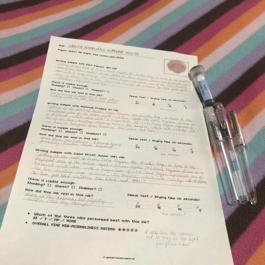
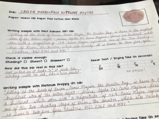
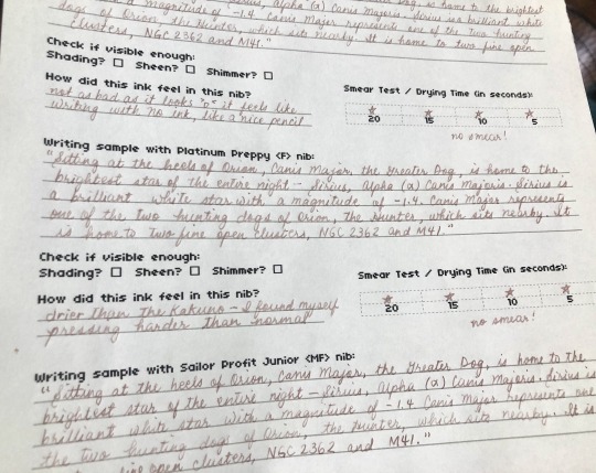
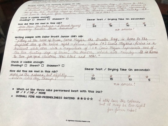


🍓 It is definitely too light, but I still rated it two stars out of five because it wasn't entirely unsalvageable for fine nibs. I personally liked using it with the Profit Jr. (MF) because it wasn't as pencil-like as the Kakuno (EF) and it wasn't as dry as the Preppy (F), and popping in a converter to increase the ink flow as opposed to the dip test I did might make it a decent writer, although I suspect a Sailor medium nib or even a fine stub nib would still be much, much better (i.e., if you don't want to go for a broad nib but you still want the ink to be readable enough).
🍓 If you're gonna use this with the nibs above or other fine nibs, it'd only be suitable for sketching and hatching.
(The text of the writing samples came from The Night Sky Month by Month (2011) by Giles Sparrow and Will Gater, p. 21.)
Cheers, Aisha ☆彡
#fountain pens#fountain pen#sailorpen#stationery#pilotpen#platinum#ink#handwriting#light inks in fine nibs
2 notes
·
View notes
Text
Official Blog Launch and First Post
Hello! Thanks for checking this out.
This blog is a mini passion project that I thought of when I got into fountain pens earlier this year. I wanted to provide a simple resource that reflected the way I used fountain pens and, at the same time, offered something slightly different from the other fountain pen-related reviews I usually come across.
The objective of this blog, as quoted in the "About" section is:
"...to test light inks in fountain pens with fine nibs to see if there’s a light ink out there which could potentially avoid [the stereotype of light inks not being readable enough in fine nibs], and thus give a more exciting option to the fine nib users."
So, yeah, I've designed a template to test light inks in a few fine nibs, particularly a Pilot Kakuno (EF), a Platinum Preppy (F), and a Sailor Profit Junior (MF)! 😁
As part of this commemorative first post, I'll be reviewing Sailor Ink Studio #131~~~
I chose this ink because I was looking for my go-to cool-toned bubblegum pink. Initially, I wanted Van Dieman's Tassie Seasons (Spring) Pink Fairy Orchid, but I couldn't find any available sample or bottle locally. I stumbled upon Sailor Ink Studio #131 by chance and bought the last bottle in stock online 🥴


🍓 I was hoping the scanner would be the easiest way to upload a picture, but it killed the colour. 😕 I guess this means I'll have to take individual photos from now on. 😅
🍓 If you're looking for a crisp line, go for the Kakuno (EF). If you want something more muted, go for the Profit Jr. (MF). If you want enough shading, go for the Preppy (F). Either way, I was happy with this ink in all nibs!
🍓 The text of the writing samples came from The Night Sky Month by Month (2011) by Giles Sparrow and Will Gater, p. 20.
🍓 Disclaimer: This post is not sponsored.
Cheers, Aisha ☆彡
2 notes
·
View notes