
Don't wanna be here? Send us removal request.
Statistics
We looked inside some of the posts by noreen22 and here's what we found interesting.
Average Info
Notes Per Post
0
Likes Per Post
0
Reblog Per Post
0
Reply Per Post
0
Time Between Posts
2 days
Number of Posts By Type
Text
16
Video
1
Last Seen Tumblr Blogs


Fun Fact
If you dial 1-866-584-6757, you can leave an audio post for your followers.
Text
Final Presentation
The presentation focus on how the stamp kit solve the three common issues English speakers face when learning Chinese. The minimal layout design convey the tone of the projects, and make the photos stand out to tell the story.


0 notes
Text
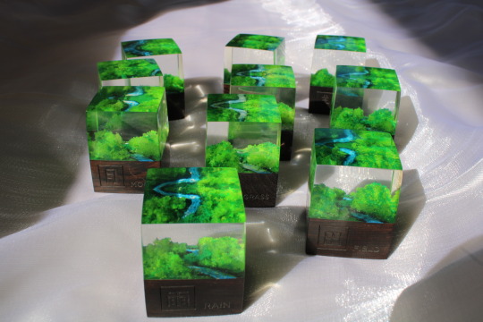
Photography post production
I chose four photos to be used in presentation PDF.
The open packaging that shows two tiers of stamps
The top and side of the packaging
Acrylic stroke and frame stamps’
Character radical stamps
I wanted to use the following two photos in the same page, but their lighting and tone are quite different. The first photo is a little pink and too dark, while the second one is yellow tone. So I retouch them to make them more consistent.
Before

After: bright, blue, energizing

Before

After, The dark blue rectangle is a bit dark and black, so I add more blue into it.

Before: too dark and black

I edit it to more transparent and shinning looking.

Before
After: Make the engraved text more clear, and the texture on wood more obvious.

0 notes
Text
Photo shoot
Before Covid restriction, I was planning to photograph the stamp kit in uni’s lighting room, which will enable me to have full control over the lighting and background setting, creating professional product photography. However, lockdown has make it impractical. So i began to work on how to photograph at home.
I’ve tried photo shoot in many places in my house to find a good lighting place with white background, but I could not find suitable place. So I found this drawer with good sun light. Placing a white bed sheet beneath it with shimmery fabric on top.

cat!

First photoshoot
The lighting is not very good, and it cost me many times to figure out how to use the camera to make lighting better, and how to present kit in a way that show the product clearly but also appealing.
I focus on photograph the packaging


Stamps


Second photoshoot
I think the lighting in acrylic stamps photography are not as expected, so the second photoshoot focus on stamps.


0 notes
Text
Grid notebook cover design
Idea:
Clean and simple
Includes the design inside the pages- Grid & Character outline, So when looking at the cover people can have a glimpse inside the book.
Development
At first, I was struggle whether to use blue or keep it white. As I feel the blue one is more exciting and interesting. But the white one is more consistent with the pages inside the notebook, and it’s clean.


I placed them all together with the packaging and flashcards, and I found the white one work well. As the blue one is too similar with the packaging, resulting in isolate the flashcard, make it looks inconsistent. With white notebook, it make the three collaterals look comprehensive and comfortable. Also I think being consistent with the white pages inside is very critical. Therefore I decided to use the white one.


--------Final design---------


0 notes
Text
Testing
I have asked my sister to try stamping on the grid with outline, and grid without outline to see which is easier to use. She said the open grid is much easier for stamping. As when she stamps on grid with outline, she felt the space is quite small and limited, which make her felt worried that she may stamp accidentally outside the box or not in the right space. But with the open grid, she said it’s easier for her to practice stamping, as she will not be worried about if she stamp it wrong, and it also allow more freedom.
Therefore i change the grid notebook into open grid

0 notes
Text
Testing
Initially, I was planning to laser cut rubber for radical stamp, and glue it on the the resin stamp i ordered in China. However, lockdown make this impractical. Therefore, i only can experience the stroke and frame stamp.
The four strokes stamping is very clear

It is easy to extend the stroke, as it can see through the blue ink from top

I experienced stamping characters, it is very fun and not difficult, I think people will like it.


Experience using different ink colors.

Frame stamps.

0 notes
Text
Packaging production
The packaging is made in China. After they sent me the photos, I found there is something that is not same as my expectation. Therefore, I asked them to sent a video, and found there there are actually many parts that were made wrong.


The improved packaging
The green and dark blue are connected


There are no extra white space on the front.

The packaging took 2 weeks for me to come to the final digital design.
Another two weeks for packaging company to make it, and two weeks to deliver to New Zealand.
0 notes
Text
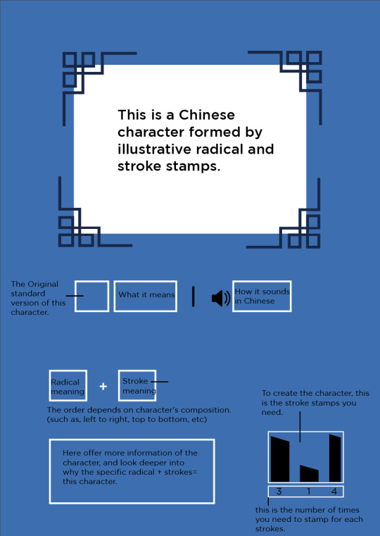
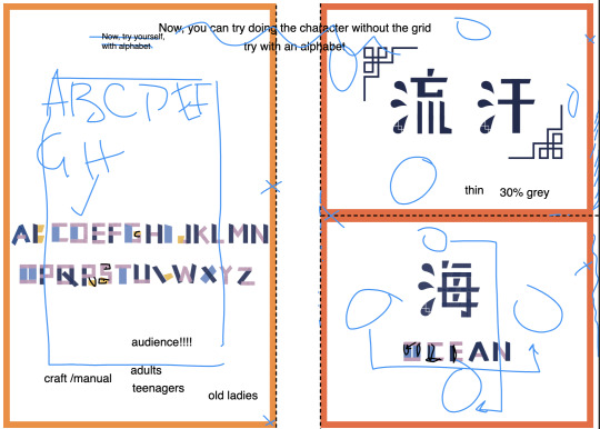
Instruction Card Development
Tatiana’s feedback said that she felt overwhelmed when looking at the flashcard, because there are too many information that don’t know how to read. So she suggested me to design an instruction card.
Flashcard

First attempt
In the initial stage, I have tried using different colours and layout to see which work better to make the message clear. But no matter how I adjust the layout and design, i felt like it is still something that looks wrong but I can’t really tell what’s the problem.
1. green box

2. white outline, black text, layout
3. dark blue box, white text, layout.

4. white box, black text, layout

The following image is Tatiana’s feedback, which help me realized the problems:
too many text
can remove the unnecessary design elements (such as left page frame), as it is distracting
The right page is the left page character +another character to form a two-words characters- the message is unclear, need to work out how to make user understand this

Second attempt
WHAT I IMPROVED-----
Left page- the result is clean and easy to understand
remove unnecessary text only remain the most important message.
Remove unnecessary design elements
make the stroke stamps icons into white that is different from other dark blue boxes
Right page
use different colors to distinguish word 1 and two
Use dash line arrows to point the character to the word, indicating the word is composed by it
Use different colors in stroke stamps to distinguish this text from others.
I’m pretty satisfied with the left page, and I also think the message a lot clear and clean. But I still feel that the right side page need some clarifications.
Left page- teach character

teach words

Final design
I believe the final instruction is very clean and clear, that after this instruction card, people will know exactly how to read flashcards.

The major change I did is to give the three character alphabet number- ABC, and replacing the box to two box that represents the two character form a word, which is much clear.
The top is A+B, which bottom instead of A+C, it is C+ A, indicating the order can chage sometimes depends on different words.

Digital mockup

0 notes
Text
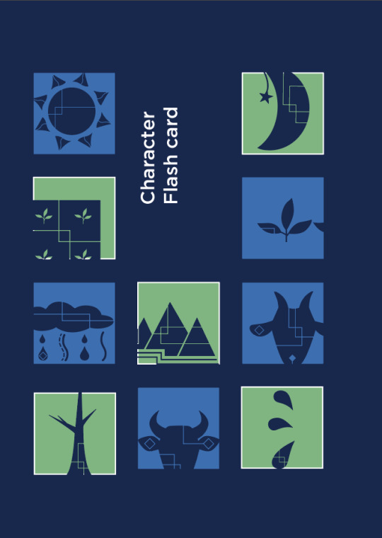
Flashcard packaging design
Idea:
Playful
Includes character radical symbols
Includes square- the shape of the stamps
-----Development-----


0 notes
Text
Exegesis research
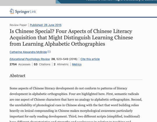
https://link.springer.com/article/10.1007/s10648-015-9318-2

A study was carried out to determine whether knowledge of the internal radical structure of a Chinese character helps a naive learner to memorize that character. Four groups of Australian subjects who knew nothing about Chinese were asked to learn24 character/meaning pairs. It was found that memory for the character-meaning pairings was best for the Radicals Early group, suggesting that it is important to highlight the radicals when a character is first presented to the learner.
Shen, H. H., & Ke, C. (2007). Radical awareness and word acquisition among nonnative learners of Chinese. The Modern Language Journal, 91(1), 97-111.

Xu, Y., Chang, L. Y., & Perfetti, C. A. (2014). The effect of radical‐based grouping in character learning in Chinese as a foreign language. The Modern Language Journal, 98(3), 773-793.
Exegesis name exploration
Key term: Chinese character, easy, fun, nature, beginner, learn, break down

0 notes
Text
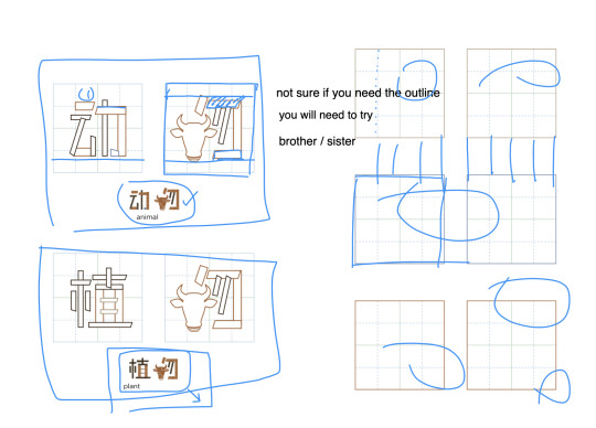
Grid pad Feedback
Feedback:
Left hand page [guiding]
- might overwhelmed the user, so only have one words in a page, move the other to the next page, make the completed character bigger (user will easier to follow), can align character outline to the grid if possible
Right hand page [practicing]
- ask sister to test if it works, The outline grid box can limit the user, so can remove the outline, make the grid go through the whole page. In this way, user can stamp as many time as they like, and not afraid that they only have limited area of stamping.
Suggestion:

page Suggestion:
First page- cover back cover
intro page
guiding *8
entire grid page* 5
perforation page*7

perforation page
The perforation needs to be thinner, grey colour, so it will not look like part of the design.
My thinking:
“Grid go over the whole page” is an interesting idea that i never thought before, This is an important and helpful feedback for me. As in Taiwan, when we learn writing character, we usually have this kind of a square grid box that help use write properly and correctly. So initially, I think a grid outline( a square) will be helpful for stamping, that can locate the character inside the square with grids. But Tatiana said it could overwhelmed people and limit them. That’s a good point as stamping is different from learning writing. As this is a fun and creative process, I don’t want to make user feel like they have to be very careful to follow the grid and all the small details. As no matter how they stamp, people can all tell what characters they create and that’s what matter. I want to avoid to create the feeling of they need to make it very similar, or correct. So I want to create that freedom people can enjoy and try without fear.
The practice grid I use when through education in Taiwan.

Improved version---------
Character outline guidance on left page, with dark blue words indicating how the stamping character will look like.
The right page is an open grid for user to explore freely.

Open Grid pages
After 20 pages of guidance, there are 10 pages grid, people can stamp any characters they like with freedom.

Empty perforated pages
After grid pages are empty pages with perforation. As character stamps are quite pretty, so that people can stamp characters on it and tear it off keep it somewhere, can be on their desk to help memorize.
They are designed with colors base on the ten character radicals.


0 notes
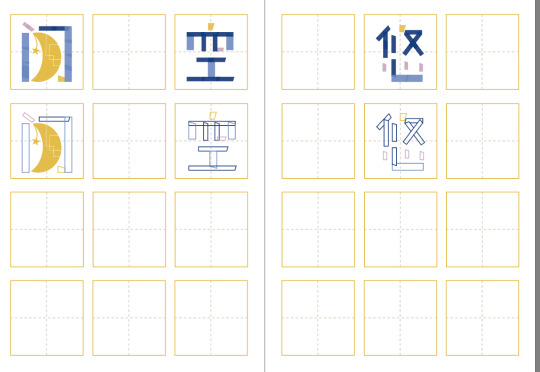
Text
Grid note pad development
Previous layout and problem:
not easy for the user to stamp character, because
too intense, too limited, need more space, need fewer and larger grid outline
What I did to improve- more space, larger grid, more lines in the grid for easier aligning character.
To make it looks more simple and clear, I separate guiding and practice area.
Left page- two words guiding (outline character), the complete character and meaning
Right page- three practice grid box.
How to use
The guiding outline character is the exact size of the stamps. So firstly, user can stamp on the outline to get a better understanding of how to stamp, after that they will practice the characters on the right hand side page. ( There are two words with three practice box, but that’s not a problem, as the two words both includes one same character. So there is basically only three characters, each can be practice two times.) Total three times practice for one character, which I think is pretty enough.
* Left page- guiding
Right page- practice

Spreads


Empty pages includes perforations - It will be slightly thicker paper, that can tear off and stick it on the table to review character. give it to a friend etc.
- one page with two separate perforations- each perforation is the size that can fit a words (two- three characters)
- the other is entire page ( more freedom- user can stamp as many characters as they like)
I add color outline, as if the blank piece of white paper can be boring not look good. So I add the color of the radicals.
Some process and development

I tried to create different feeling on different radical so I add colour on right hand page to see if it looks more interesting, but as it is a notebook, i felt like it’s a bit distracting when stamping.

I want the grid to be light color serving as a baseline guide for stamping. I experienced with different color, dash, dot, thickness of lines. Finally choose blue and green ( same as packaging), but make it lighter.


Experienced with the layout.


0 notes
Text
character research
http://www.chinatoday.com.cn/ctenglish/2018/tourism/201905/t20190506_800166872.html
0 notes
Text
Feedback from Tatiana

Problem:
Need some clear clarification and instruction to let people understand easily, or they might overwhelmed by too many complex information.
Need to let people understand the basic elements in an easy way. Ex, how to use the stamp, how to read the flash card.
[ Three things I need to work on to improve ]
Instruction on how to read the card
instruction step1- step3 ( it is too much text. replace by infographic with drawing )
Grid notepad- larger grid with more space, more grid line (easier align), 20page guide, 20 page grid, 20 page lighter grid can be teared.
Notes from feedback session
----- Instruction Flashcards
include one instruction card at the front before other cards. So people can clearly understand how to read and use the card.
As seen from my sketch, The instruction card will remove all elements (like character, explanation text etc), replace by simple boxes, and indicate with text on top.


----- Grid notepad
Make grid bigger or with more space around - too many grid make user confusing and overwhelming.
Have more lines in the grid- easier to align character
total 50 pages, 30 with outline character guiding, and 20 with empty grid pages (can include perforated that can be tear)


0 notes
Text
Week 11 group exercize
What is the greatest skiil you will take from uni with you?
Communication skill, and the ability to self learning and research instead of expect someone to teach me.
What is the most difficult part of your journey?
Communicating, and collaborating | Learning adobe software, and the journey of finding my strength and my interest in design.
balancing Covid and lockdown
What was something unforgettable
Online classes, and friendship
What are your plans for the next year?
Maybe Postgraduate? master? working? still planning
When NZ opens again, where is the place you would like to go or what you would like to do?
Have a break, went back to Taiwan see family and dog in Taiwan. and eat a lot of Taiwanese good food.
0 notes
