
Don't wanna be here? Send us removal request.
Statistics
We looked inside some of the posts by ntperryysu-blog and here's what we found interesting.
Average Info
Notes Per Post
1
Likes Per Post
0
Reblog Per Post
1
Reply Per Post
0
Time Between Posts
4 days
Number of Posts By Type
Text
17
Last Seen Tumblr Blogs


Fun Fact
There are dozens of funny blogs to kill time on Tumblr.
Text
Sanna Annuka (4.9)
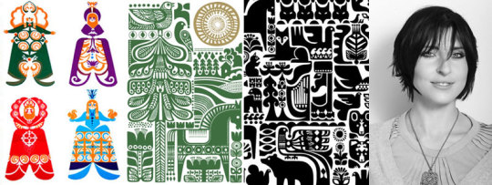
Sanna Annuka is a half Finnish and English illustrator and product designer in the UK. She spent her childhood summers in the Lapp wilderness of Finland, surrounded by nature and folklore, the predominant influences in her work. in 2005, London, Sanna began selling silkscreens of her work in her sister-in-laws boutique shop, and through a single lucky sale, kickstarted her career by doing work for a major record label.
Sanna is different from most people on this list in that she is primarily an illustrator, working more from imagination and more free flowing creativity than the comparatively rigid traditional graphic designers. She makes her name and living through her personal website where she sells prints and ornamentation, and is often working with major brands creating anything from textiles to christmas ornaments.
0 notes
Text
Adrian Frutiger (4.4)
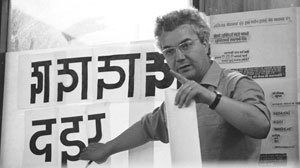
Adrian Frutiger, 1928 - 2015, was a Swiss typeface designer most well known for his sans-serif Univers, Frutiger and Aviner typefaces. At a very early age, Adrian experimented with form and type in creative ways. He was an apprentice compositor for a printer for four years, and afterwards attended the Kunstgewerbeschule in Zurich where he studied Roman monument inscriptions and calligraphy.
In response to the success of the Futura typeface, Adrian put forth the Univers font in a neo-grotesque style which eschews the regimented geometric style of futura. At the commission of the Charles de Gaule airport in France, Adrian reworked an earlier typeface he had created called Concorde, and created the Frutiger typeface, which was used for all signage and wayfinding at the airport. the typeface was made with create technical consideration, improving legibility.
0 notes
Text
April Greiman (2.5)
April Greiman, born 1948 to an progressive New York family, April is considered a pioneer in computer based graphics in graphic design. Though failing admittance to the Rhode Island School of Design, she was accepted into the Kansas City Art School where she majored in graphic design, and went on to learn at the Basel School of Design where she became a student of Armin Hoffman before returning to New York to work.
She eventually moved to Los Angeles where she headed the design department at CalArts, and in 1984, changed the departments name to Visual Communications, as she felt Graphic Design was too limiting a term. This is the same year the Macintosh computer was released, and April began to learn digital applications and how it could affect design, and forever changed its course. “In the tradition of graphic design in the twentieth century, you had to be either a great typographer, a great designer/illustrator, or a great poster designer. Now we are confronted with motion graphics, the World Wide Web, and interactive applications. The world has changed and the field is changing to meet it.”
0 notes
Text
Milton Glaser (1.29)
“I have always thought that in order to stay interested in what you are doing, to some extent you have to operate in the realm of what you do not know”.
Milton Glaser, born in 1929, is one of the most celebrated and recognized American graphic designers still alive and working today. Recipient of the National Medal of the Arts under Barrack Obama, AIGA medal recipient, arguably everyone in America would recognize at least one of his iconic designs, whether it be the I Love NY symbol, DC comics logo, or Brooklyn Brewery logo.
In 1954, Milton founded the famous Pushpin studios which produced the famous rainbow haired Bob Dylan poster (a poster I grew up with framed in my household by my father), in 1954 he founded New York Magazine, and in 1974 founded Milton Glaser Inc., which he operates to this day.
0 notes
Text
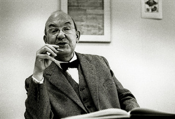
Alexey Brodovitch (1.17)
Alexey was born in 1898 in what is now Belarus. At a young age, he ran away numerous times in order to fight in WWI, but was sent back home again and again, given his father was an influential medical officer. He eventually joined a regiment fighting against the Bolsheviks before suffering defeat, and being exiled from Russia. Alexey first made his way to Paris where he wanted to become a painter, and even found himself amongst artists such as Chagall.
When Alexey came to America, he was already a well established graphic designer. He was brought in to an Industrial Arts school and charged with bringing European graphic design sensibilities to America. Of course, Alexey is most well known for his art direction for HArper’s Magazine, supposedly forming the art director position as it exists today. He took great interest in photography, preferring “raw” dynamic scenes over the stiff portraiture common at the time in America. To this day, Alexey’s influence in magazine layout and publication is still evident.
0 notes
Text
Hjalti Karlsonn & Jan Wilker
Hjalti and Jan are (respectively) an Icelander and German who founded the Karlsonnwilker studio together in the year 2000 in New York City after having worked with each other for Stefan Sagmeister. Their first major works were for recording labels designing CD covers. in 2003 they published a book about their first 24 months in business entitled “Tell Me Why”. Their claim to fame came with the on-air branding of MTV in 2005.
Karlsonnwilker projects are almost always employing new media forms and take unconventional approaches. 3D graphics, visual, audio, and non-traditional print methods are employed to deliver uniquely satisfying results, as was the case for the Audio Visual Machine for Creative Time, which say Karlsonnwilkers recording audio, visuals, and weather throughout New York City in the back of a moving van for one whole week, and extrapolating the information into designed pieces.
0 notes
Text
Aaron Draplin
Aaron has a distinctly familiar mid-western blue-collar flair to his work and personality, which he exudes like fumes from a can of one-shot automobile paint. He puts great love and care into every aspect of his “brand”, having even personally shipped orders for prints and merchandise while on the road touring for his new book. He was born in Michigan, but at the age of 19 set out for Oregon and got his first job making graphics for a snowboarding company.
After a few years on his own, he returned to the mid-west to finish an Art degree at the Minneapolis School of Art and Design. In 2000 he was offered a job as Art Director at Snowboarder magazine in LA. In 2002 he became Senior designer for the Cinco Design Offices of Portland, Oregon.
His work typically consists of bold, crisp vector shapes, patterns, and symbols. You may most recognize his work with the Field Notes memo books, and a myriad of snowboarding companies and magazines.
0 notes
Text
Michael Beirut

Michael Beirut is a Graphic Designer from Parma, Ohio (near Cleveland). At a young age, Michael learned how to draw, but his first designed piece was in high school for a play. He did not know anything about typography but mimicked album and poster art he had seen. He eventually stumbled upon a graphic design book, thereby learning of the profession, and applied for and was accepted by the College of Design, Architecture, and Art in Cincinnati, Ohio.
Michael went on to work for Massimo and Lella Vignelli at Vignelli Associates. He credits his early success at Vignelli Assoc. to the fact that he would work double shifts, intitally doing mechanical assistance type work, and earning the opportunity to create actual designed work for the firm. In his AIGA lecture, he tells the audience, “Hijack your mentor”, elaborating that you don’t need permission to learn from someone; simply attach yourself to them. He has over 100 accolades and was the former president of the AIGA chapter in New York City. Michael went on to work for Pentagram in New York City, where he works to this day, dealing with many high-profile clients.
0 notes
Text
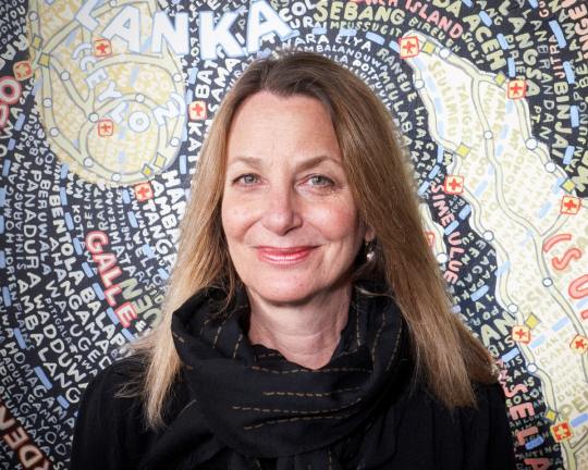
Jessica Helfand
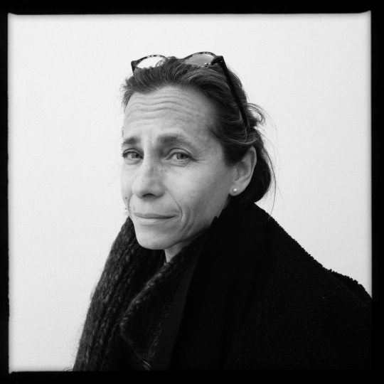
Jessica Helfand is a graphic designer, writer, educator and cofounder of the Design Observer magazine. Born in 1960, Philadelphia, PA, She received her BA in design at Yale, but her first job involved her reading scripts for NYC producers. She eventually wrote scripts for soap operas before a moment of clarity lead her back to Yale to receive her MA, and get back into the design studio. She is co-partner of Winterhouse Studios, and cofounder of Design Observer Magazine.
In 1997, Jessica and William Drental founded Winterhouse Studio, far from the bustling center of the city. In an interview, William remarked, “as long as we have internet, we can work!”. Winterhouse is incredibly selective with the work they take on, and very rarely compromise on their work.
0 notes
Text
James Victore
James Victore is a renown graphic designer, art director, and author from upstate New York who swears a lot. At the age of 19, James made his way to New York City to make a name for himself. After multiple attempts at college, he came under the tutelage of a book jacket designer, and eventually founded his own firm, James Victore Inc. The spirit of rebellion runs strong through all his work.
In a lecture, James states that in his tiny three person studio, he “tries to make work that matters”. OFten dealing with heavy social themes, placing fears, resonancies, and heart into his work, the world will then react it to. Famously, he was commissioned to create posters for Columbus Day in 1992, and delivered an image of a Native American with a skull drawn over the face.
0 notes
Text
Jessica Walsh

The youngest so far, Jessica Walsh is a Graphic Designer living and working in New York City as a partner with Stephan Sagmeister at Sagmeister & Walsh. From an early age, Jessica began coding websites which invariably led her to graphic design. She attended the notable Rhode Island School of Design (RISD) and went on to work for Pentagram, purportedly passing a job offer at Apple. Jessica then went on to direct for Print magazine before working with Stephan Sagmeister.
In interviews, Jessica cannot over-state the importance of play, and break from digital workflows. She feels the best work comes from play, the best solutions make themselves known. She will often incorporate hand made elements and surreal photographs to execute her concepts. Jessica also teaches design and typography at the School of Visual Arts in New York.
1 note
·
View note
Text
Massimo Vignelli
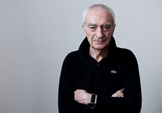
“A sophisticated mind will know how to design things which are complex, but not complicated. An ignorant mind will design things which are complicated but with no complexity”
Born in Milan, Massimo came from an architectural design background to New York City to help found a wing of the Unimark Company. This company would work with some of the largest brands in the world. Massimo soon left the company to found his own firm, Vignelli Associates with his wife Lella.
Massimo is most well know for his modernist “diagrams” of the New York City subway system; he called these graphics diagrams instead of maps because they lacked topographical features. The diagram is used in this form (with some updates) to this day.
In interviews, Massimo repeats his maxim, that “ugliness comes from ignorance”.
0 notes
Text
Rudy Vanderlans
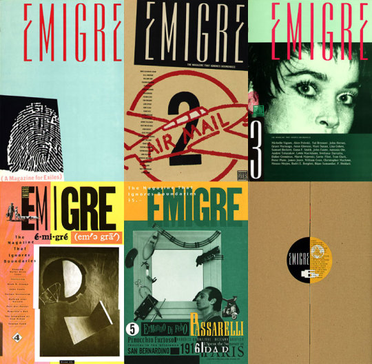
“Since people’s preferences vary so much it’s impossible to try and please everybody. If you would try that you’d end up somewhere in the middle and you would please everybody only minimally, or not at all. So we try to follow our own instincts, and go with what excites us.“
Rudy is a Dutch graphic designer, most known for founding type foundry and design magazine Emigre, with his wife - also a graphic designer - Zuzana Licko. Rudy studied at the Royal Academy of Art in The Hague (Netherlands), before moving to California and studying photography at Berkely.
Emigre magazine was published from 1984 until it’s final issue date in 2006. Rudy was an early adopter of the Macintosh, and in interviews, has admitted that this probably helped to make his publication stand out above the rest. Rudy and Zuzana have received numerous awards for their contribution to type. Besides Rudy’s continued work with the type foundry, he has also published several photography books.
0 notes
Text
Jan Tschichold
Jan Tschichold was a great standardizer of graphic design. In the 1920′s, he helped bring about guidelines which would come to influence nearly every movement since. Imprisoned in Germany for being a “cultural Bolshevik (he sometimes went by “Ivan”, in the spirit of communist revolution), He and his family eventually fled to Switzerland placing Jan, a trained calligrapher and signwriter, in just the right place at just the right time.
After the war, Jan came to reflect on his early work or rigorous standards and uniformity, coming to equate it with Nazi Germany’s strict militaristic society. In the 70′s Jan would create a brand identity for the Penguin Publishers books and influenced brand identity to this day. Jan’s most well know accomplishment is probably his Sabon typeface, meant to appear uniform whether employed by traditional means, linotype or monotype.
0 notes
Text
Erik Spiekermann
Eirk Spikerman is a typographic master known for his German rail system font design, work for Volkswagen, and city of Amsterdam branding. As of late, he and his firm have focused on app design and way-finding.
Erik was born in Germany in 1947, and studied art history at Berlin’s Free College. He moved to London and got his start in graphic design by doing freelance work. Upon return to berlin, he founded a series of firm’s and typographic foundries. Always an influential figure in the field, he attends numerous meetings and gives many lectures throughout the year.
0 notes
Text
Paul Rand
Paul Rand was considered the first major American graphic designer to adopt the Swiss style. His most easily recognizable work is with logo design, designing logos for IBM, Westinghouse, ABC, UPS (discont.), AIGA, and many more. Paul’s designs take on a child-like simplicity. In his book, he justifies the use of simple shapes with the idea of universal symbolism.
In early life, Paul painted signs for grocery stores and his public school in New York City. He learned design by taking night courses at the Pratt institute, but was largely self-taught. His first job as a designer was making stock imagery for various other firms, but before long, he had amassed a considerable portfolio, and garnered international recognition for his various works. Of his great synergy, artistry, and business acumen, Louis Danzinger states of Paul, “We went from being commercial artists to being graphic designers largely on his merits.”
0 notes
Text
Paula Scher
Expressive type, instantaneous brand recognition, environmental integration, are all terms associated with graphic designer Paula Scher. Paula Scher is a world renown graphic designer based in New York City, and is currently a principal designer at the firm Pentagram. She is married to famous designer/ illustrator Seymour Chwast.
Paula is most well-known for her heavily typographic and expressive branding and identity for The Public Theater in New York City. In Abstract: The Art of Design, she reminisces on her rebranding of CitiBank and bemoans the committee process which so often plaques such projects. Her Maps paintings summarize her whole person: within boundaries, within limitations, to a set rule and measurement, she finds expression between the line.
0 notes