
Don't wanna be here? Send us removal request.
Statistics
We looked inside some of the posts by oli-print and here's what we found interesting.
Average Info
Notes Per Post
5
Likes Per Post
5
Reblog Per Post
0
Reply Per Post
0
Time Between Posts
5 minutes
Number of Posts By Type
Text
17
Last Seen Tumblr Blogs


Fun Fact
If you dial 1-866-584-6757, you can leave an audio post for your followers.
Text
RATIONALE
BRIEF EXPLANATION
‘Qui Vive’, French for ‘On Alert’, is a slogan worn on badges by lesbians in the '50s so they could identify one another without outing themselves. My prior knowledge of LGBTQ+ history and Andy Campbell's book 'Queer X Design' have informed my work. I have used a multitude of Queer symbols in my illustrations in hope that when someone recognises one of them, they'll be able to draw from that and understand more as they look closely. Some are more obvious than others, and most – if not all – will be much more familiar to my target audience, Queer designers. My work keeps with the historical theme of Queer symbolism being a juxtaposition of subtle enough that straight people barely notice it, or just think "that's odd", but to Queer people, it's glaringly obvious, because we know where to look.
FURTHER EXPLANATION
Every aspect of my illustrations is thought-out; deliberate. Nothing is added out of ‘randomness’.
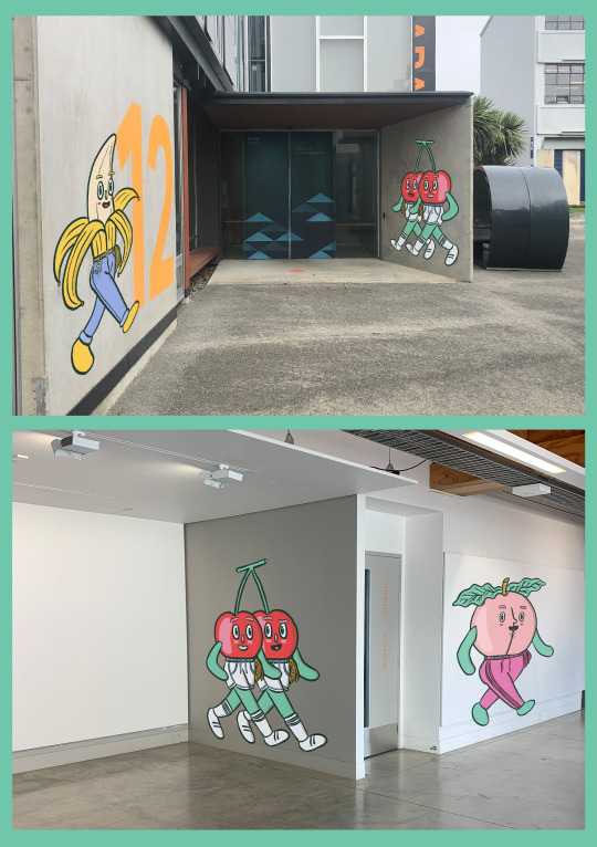
Fruit Characters – Posters
The fruit characters in my poster series are chosen because they have s3xual connotations; cherries = balls, banana = dick, peach = bum (I have to use informal terms otherwise the site will censor this post).
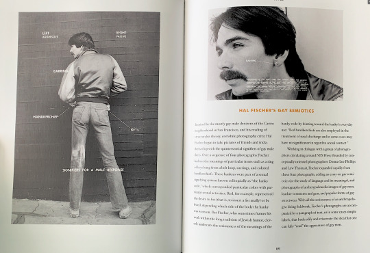
Cherries – The cherries are dressed in ‘Street Fashion Jock’ attire, according to Hal Fischer’s Gay Semiotics. They each have a gold handkerchief, which means “two looking for a third”.
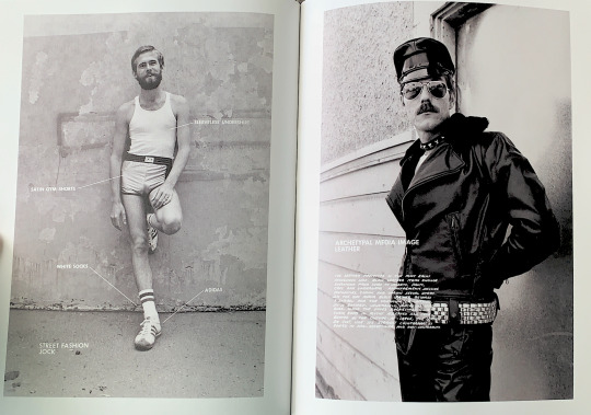
Banana – has a mustard handkerchief, which means he is 8″ or longer down there. His keys are swinging from his belt, a symbol of the leather scene.
Peach – has a fuchsia handkerchief, which means “spank me”. He also has a ‘peach fuzz’ beard. The graffitiing peach is wearing a jockstrap.
Lavender & Violet
Lavender and Violet are posed using a lesbian pulp fiction book cover as reference, to reclaim the appropriation of lesbian relationships using symbols of empowerment. Both flowers are associated with the LGBTQ+ community. They are wearing lesbian feminist t-shirts. Lavender is holding ‘fags’ and Violet is holding a double sided battle axe, a symbol of lesbian empowerment.
Fruit Characters – Speakers
The fruit characters used to represent my speakers are fruits grown in the places that they are from. Some small aspects of their appearance are based on the speaker’s appearance, and they are posed in interaction with the speaker’s work.
Tom & Anita
The cream pie and orange juice are based on Anita Bryant and Tom Higgins. Bryant is represented by orange juice because she was a brand ambassador for Florida orange juice, which was boycotted by the LGBTQ+ community during her anti-gay activist period. The text on the juice carton reads “Straight Juice* 100%”, “*Fruitless”, and “0 Star Woke Rating”.
Higgins is represented by a pie because he threw one at Bryant. He wears his keys on his belt loop and a lime green handkerchief, which means “I’ll smear you with food”. He also wears buttons with a variety of Queer symbols of self-identification.
0 notes


Text
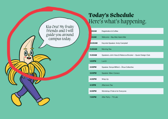
EXPERIENCE TOUCHPOINT CHARACTER GUIDES
The fruit characters are placed around campus, 'walking' towards Te Ara Hihiko. This is mentioned in the brochure so attendees know from the get-go.
0 notes
Text
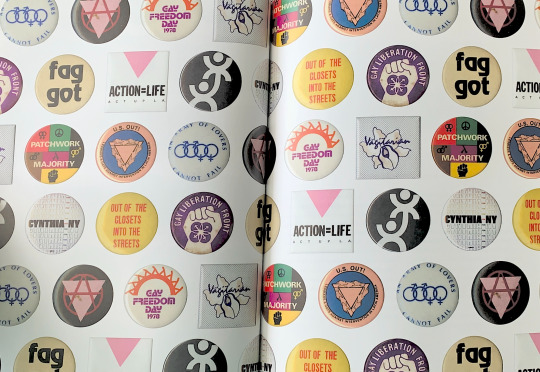
EXPERIENCE TOUCHPOINT BUTTONS
Buttons displaying all LGBTQ+ symbols from my illustrations will be available for attendees to take and use to self-identify if they wish, as buttons have been used historically.


0 notes
Text
INTERIM POSTERS
I presented these posters for the first interim. I really liked both styles so was happy with Tim’s feedback that I should combine aspects of both, it felt like a win-win! In my final works, I combine the illustration and typographic style from the first lot with the bright colours and fruit iconography of the second lot.
The Queer symbolism was for the most part understood by my Queer peers but not by others, which had me torn, because that was my intended effect but the lecturers can’t mark something they can’t understand. So I decided to add a glossary of symbolism as part of my touchpoints.


0 notes
Text
QUEER SYMBOLISM GLOSSARY
Fruits – “Fruity” is slang for gay, derived from the expression “nutty as a fruitcake”, the first recorded use of which is in 1935. It is historically derogatory, but has since been reclaimed.
The Hanky Code – In the 70s and 80s, gay men used different coloured handkerchiefs as a kind of secret code to inform others of their sexual interests. For example, a mustard handkerchief in the left pocket means “my dick is 8 inches or longer”, fuchsia in the right pocket means “spank me”, gold in the left means two looking for a third, and lime green in the left means “I’ll smear you with food”.
Keys – People involved in the leather scene used to (and sometimes still do) wear their keys clipped to their belt loops based on their sexual preferences: on the right side to indicate that the wearer is a bottom, and left if they’re a top.
Peach – In Luca Guadagnino’s 2017 film ‘Call Me By Your Name’, Timothee Chalamet and Armie Hammer do something unspeakable to a peach. We’re not going to go into detail here. If you’re gay, we’re sure you’ve already seen it. Also, peaches look like bums.
Banana – Bananas are shaped like dicks. Need we say more?
Cherries – Cherries either make people, gay or straight, think of kissing or balls, or both.
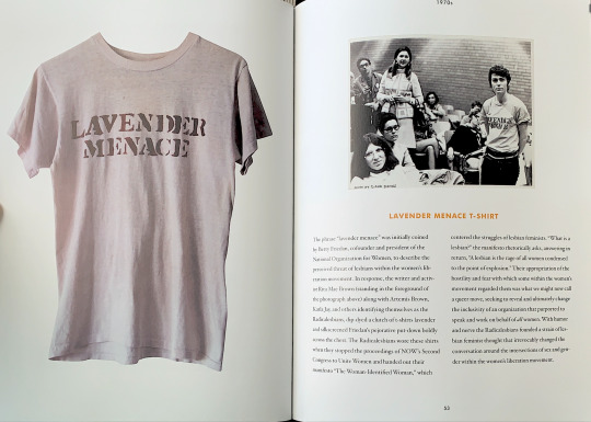
Lavender – In the 1930s, saying that someone possessed a “dash” or a “streak” of lavender was code for saying they were a bit fruity. In 1969, the president of the National Organisation for Women expressed concern that lesbians were a threat to the feminist cause, calling them a “Lavender Menace”. The colour, and the phrase “lavender menace”, were then reclaimed as a symbol of empowerment.
Violets – Violets have been associated with lesbian love since the 6th century, thanks to the work of the Greek poet Saphho, from the isle of Lesbos. Much of her poetry centered around the relationships and love between women, whom she often described as wearing garlands of violets.
Fags – ‘Fag’ is British slang for cigarette. It is also a derogatory slur used against Queer people, especially gay men.
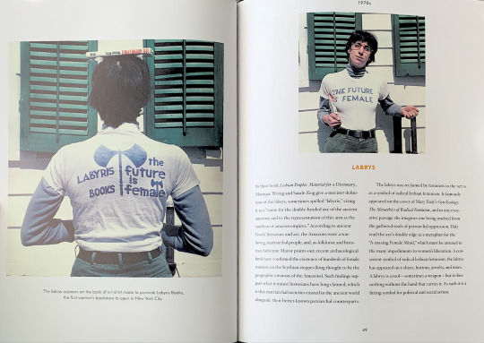
‘The Future Is Female’ – The original ‘The Future Is Female’ t-shirt was a piece of merchandise from Labyris Books, NYC’s first women’s bookstore. The garment and logo have since become an enduring symbol, worn by celebrities and civilians alike. It has also sparked numerous debates about the binary nature of gender and about the necessity for more inclusive discourses in mainstream feminism.
Battle Axe – The double sided battle axe, or ‘labyris’ is a symbol from Greek and Roman mythology that is associated with warrior goddesses. In the 1970s, it was adopted by the lesbian community as a symbol of strength and self-sufficiency.
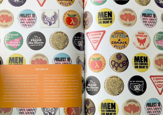
Buttons – The first mass-produced political buttons date to the end of the 19th century. Buttons are popular to collect, because when worn in a collection they can be used to effectively “read” a person’s political and sexual interests.
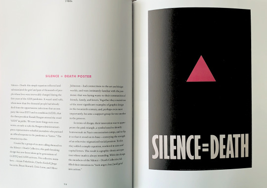
The Pink Triangle – In World War II, homosexual male prisoners in concentration camps were forced to wear pink triangles on their prison uniforms as a symbol of shame and exile. Reclamation of The Pink Triangle began with the Silence = Death poster, which was designed as a call-out to Ronald Reagan for his silence during the AIDS epidemic. It is one of the most significant examples of graphic design in the 20th century.
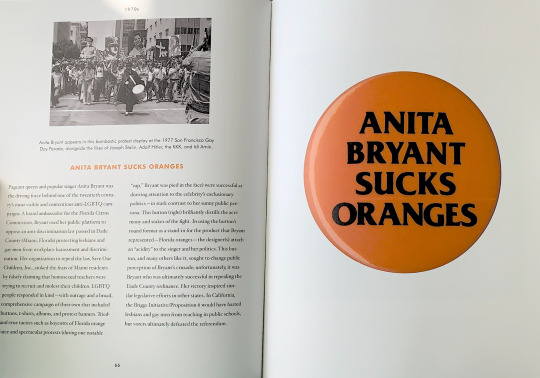
Cream Pie – During a 1977 press conference, while reporters questioned Anita Bryant – a singer, Florida orange juice brand ambassador, and anti-gay rights activist – about her national crusade against homosexuals, gay rights activist Tom Higgins threw a pie in Bryant's face, prompting her to pray for Higgins' salvation.
2 notes
·
View notes

Text
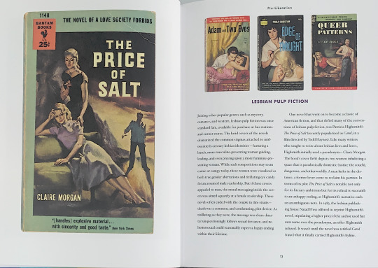
QUEER SYMBOLISM RESEARCH
Scans from ‘Queer X Design’ by Andy Campbell
Lesbian Pulp Fiction
I used the cover art of The Price of Salt as a pose reference for my Lavender & Violet illustrations, to reclaim the appropriation of lesbian relationships using symbols of empowerment.
Lesbian Feminist T-shirts
Anita Bryant
History: Anita Bryant Hit In Face With Pie
Silence = Death
Reclamation of The Pink Triangle
Buttons
Hal Fischer’s Gay Semiotics
0 notes


Text
ARTIST MODEL ELLIOT ULM


https://www.instagram.com/elliotisacoolguy/
3 notes
·
View notes
Text
ARTIST MODEL ADAM BOSLEY


https://adamtheillustrator.com/aboutme
0 notes


Text
ALTERNATE SPEAKER KAAN HIINI
“I left school in sixth form to start studying at AUT, exploring fine arts, spatial design and graphic design, before moving into a Bachelor of Art & Design. After graduation I worked for the Auckland Council and then took off to the UK for a couple years where I worked in hospitality and as a labourer. When I returned I felt a bit disconnected from design, and so I threw myself back into the design community by volunteering with Design Assembly, and CreativeMornings Auckland alongside Jade Tang Taylor, which we organised together for 6 years. That really demonstrated for me the power of community, and helped to make the industry feel accessible and close-knit. The connections and interactions, voices and personal experiences were incredibly encouraging. At the same time Curative was founded and has really shaped how I work, how I think and how I want to exist in the world. It’s a nurturing environment that has continued to challenge me technically, strategically, and emotionally. The work is varied and the audiences, perspectives and communities we work with are diverse, which has been extremely valuable in developing my views and skills.”
Kaan Hiini – Interview with Design Assembly
0 notes