
Don't wanna be here? Send us removal request.
Statistics
We looked inside some of the posts by olivermviscomincont and here's what we found interesting.
Average Info
Notes Per Post
2
Likes Per Post
1
Reblog Per Post
1
Reply Per Post
0
Time Between Posts
19 hours
Number of Posts By Type
Text
7
Photo
9
Video
1
Last Seen Tumblr Blogs


Fun Fact
Tumblr Inc. is funded by 13 investors.
Text
Final
Overall I am very happy with the outcomes of the unit I believe that I have developed a strong range of skills that I can apply towards future projects and my personal work. I think that this was a good end for the first year by setting us up for the second year by introducing us to process books and having us design that before.
Despite having problems at the beginning of the unit I have come out on top and produced a strong set of work.
0 notes
Photo


Process Book - Complete
Here are some pages from my process book which has been perfect bound.
The process book has come out great and I am very happy with it.
For our first attempt at a process book I believe that I have done very well - there are somethings that need to be changed to improve it but other than that I think that I have created a strong design.
0 notes
Text
Perfect Bind
After thinking about the coptic bind and actually trying it myself I realised that doing a perfect bind is a really great substitute for that, I can think about doing a coptic bind another time.
Perfect Binds look great and give off a really clean finish for the book and I am happy I went for this option.
0 notes
Photo

Process Book Cover
I discovered that when I printed off my book design the cover that I had ‘designed’ would actually be the first page instead, as that page was already design to be the cover of my book introducing it as the unit ‘Visual Communication In Context By Oliver Monger’ I thought that for the cover I would do an abstract letterpress print in a magenta using the letter ‘O’ for Oliver. This worked due to the change of bind for the process book. I am happy with the outcome of this simple pattern works well when placed onto the book as the cover.
0 notes
Photo


Letter Press Outcomes
here are the letter press outcomes that I will be using within my process book to introduce the different projects and unit, doing this breaks the consistency of the focused and gridded layout.
I could've done this using big type and inconsistent typefaces however I wouldn't of had the texture and feel that I get from the actual letterpress.
I am happy with how these came out and it looks great when placed within my process book.
0 notes
Photo


Final Design Pages
These are the other breaks in consistency within my process book where I used the full double page spread to display the final designs of the project.
0 notes
Photo


Title pages
Here are the title pages that introduce the unit, project and ending within my process books. I have used letter press to add interest into the layout and to brake the consistent layout that I have for the rest of the process book.
0 notes
Text
Type Within Process Book
For the type I have kept it very consistent to match the same aesthetic this only breaks within the introduction of the projects which was done with letter press.
Typeface Used:
Title: Muli Bold - Type Size: 19pt
Body Type: Muli Regular - Type Size: 9pt Leading: 12pt
0 notes
Photo
Photos of Bound Book
These are the pictures of the book design that I created for the Judge a Book by its Cover project were it has been perfect bound and photographed within the Photo Booth studio at campus.
I am very happy with the outcome of this. I believe it to be the strongest of my outcomes so far, I believe it works really well. Other than some tweaks that I would make to the type I am extremely happy with it.
2 notes
·
View notes
Text
Bibliography
Reference list
foods (n.d.). Unbun · Typewolf. [online] Typewolf. Available at: https://www.typewolf.com/site-of-the-day/unbun-foods [Accessed 26 Apr. 2022].
https://www.facebook.com/pentagramdesign (2019). The Public Theater — Story — Pentagram. [online] Pentagram. Available at: https://www.pentagram.com/work/the-public-theater/story [Accessed 3 May 2022].
Josh (2019). How technology can improve the lives of older people | Lifeline24. [online] Lifeline24. Available at: https://www.lifeline24.co.uk/technology-for-older-people/ [Accessed 29 May 2022].
Lippert, A. (2019). Paula Scher: The Public Theater Collection. [online] Poster House. Available at: https://posterhouse.org/blog/paula-scher-living-legend/ [Accessed 3 May 2022].
Myfonts. (2021). fy{T}i - Type Trends. [online] Available at: https://www.myfonts.com/content/type-trends [Accessed 26 Apr. 2022].
Pentagram (2019). Paula Scher — Pentagram. [online] Pentagram. Available at: https://www.pentagram.com/about/paula-scher [Accessed 3 May 2022].
Redbrick. (n.d.). Redbrick. [online] Available at: https://redbrick.coffee/ [Accessed 26 Apr. 2022].
Studio Nikolai Dobreff. (n.d.). Studio Nikolai Dobreff. [online] Available at: https://nikolaidobreff.de/ [Accessed 26 Apr. 2022].
Study Hall Creative. (n.d.). Curious Creatives. [online] Available at: https://studyhall.design [Accessed 26 Apr. 2022].
The Museum of Modern Art. (n.d.). Paula Scher. The Diva is Dismissed. 1994 | MoMA. [online] Available at: https://www.moma.org/collection/works/8837 [Accessed 8 May 2022].
Typewolf. (n.d.). Nikolai Dobreff · Typewolf. [online] Available at: https://www.typewolf.com/site-of-the-day/nikolai-dobreff-2021 [Accessed 26 Apr. 2022].
Typewolf. (n.d.). Redbrick · Typewolf. [online] Available at: https://www.typewolf.com/site-of-the-day/redbrick-coffee [Accessed 26 Apr. 2022].
Typewolf. (n.d.). Study Hall · Typewolf. [online] Available at: https://www.typewolf.com/site-of-the-day/study-hall [Accessed 26 Apr. 2022].
Unbun Foods. (n.d.). Unbun Foods. [online] Available at: https://unbunfoods.com [Accessed 26 Apr. 2022].
Wikipedia Contributors (2019). Paula Scher. [online] Wikipedia. Available at: https://en.wikipedia.org/wiki/Paula_Scher [Accessed 3 May 2022].
Wikipedia. (2020). Pentagram (design firm). [online] Available at: https://en.wikipedia.org/wiki/Pentagram_(design_firm) [Accessed 3 May 2022].
anartistworld (2015). Chip Kidd. [online] Graphic Design History. Available at: https://apgraphicdesignhistory.wordpress.com/2015/01/27/chip-kidd/ [Accessed 31 May 2022].
Design / Art Practice. (n.d.). Word & Image: Chip Kidd. [online] Available at: http://www.designartpractice.com/blog/15 [Accessed 31 May 2022].
gregneville1 (2020). 1984 since 1954: Orwell covers evolve. [online] PENGUIN SERIES DESIGN. Available at: https://penguinseriesdesign.com/2020/01/17/1984-since-1954/ [Accessed 31 May 2022].
karoelisa22 (2019). The Learners: A Chip Kidd Novel. [online] Karo.Design. Available at: https://karo.design.blog/2019/01/27/the-learners-a-chip-kidd-novel/ [Accessed 31 May 2022].
Long, M. (2020). David Pearson: ‘We can be braver with book design in the UK’. [online] Design Week. Available at: https://www.designweek.co.uk/issues/28-september-4-october/david-pearson-profile/.
Neilly, A. (2015). A visit from David Pearson—type as image. [online] Shillington Design Blog. Available at: https://www.shillingtoneducation.com/blog/david-pearson-type-image-industrytalks/ [Accessed 31 May 2022].
Wikipedia Contributors (2019a). Chip Kidd. [online] Wikipedia. Available at: https://en.wikipedia.org/wiki/Chip_Kidd [Accessed 31 May 2022].
Wikipedia Contributors (2019b). Nineteen Eighty-Four. [online] Wikipedia. Available at: https://en.wikipedia.org/wiki/Nineteen_Eighty-Four [Accessed 31 May 2022].
Videos
HMCT (2020). Paula Scher: ‘25 Years at The Public’. [online] www.youtube.com. Available at: https://www.youtube.com/watch?v=PSQog21kmDM&t=9s [Accessed 3 May 2022].
Create With Jenn (2016). DIY Coptic Stitch Notebook. [online] www.youtube.com. Available at: https://www.youtube.com/watch?v=iciWeCjGrQs [Accessed 31 May 2022].
Sea Lemon (2011). How to Make a Sketchbook | DIY Coptic Stitch Bookbinding Tutorial | Sea Lemon. YouTube. Available at: https://www.youtube.com/watch?v=S2FRKbQI2kY [Accessed 31 May 2022].
Sea Lemon (2012). DIY Coptic Stitch Bookbinding Tutorial | Sea Lemon. YouTube. Available at: https://www.youtube.com/watch?v=ue52htX3j0k [Accessed 31 May 2022].
0 notes
Text
Final Evaluation
The Visual Communication in Context Unit allowed me to explore new skills throughout the three projects that had been set for us over the term. These projects Food Types, Judge A Book By It’s Cover and There’s An App For That utilised a very different final outcome thus we used very different skills throughout. The development of these skills can be seen through how my work progresses and develops when receiving feedback. The first project Food Types had us designing a double page spread for a cookbook with the heavy use of grids to guide the design process. The second Judge A Book By It’s Cover was to design a book cover for a made up novel, The Faraway, we were given the synopsis and some design elements that had to be included within the cover design – we also had to decide what genre we wanted the design to be within I chose to do horror. The last project There’s An App For That was a group project were we would create a concept for an app using a brief given to us from another group, this was mainly done through the use of Adobe XD which was very interesting, I enjoyed learning the application. The last thing that the unit had for us is process books, we had been informed about this within the first two projects however this is the first time we have to do it.
Food Types the first project was pretty interesting at the beginning, but I felt as if it dragged on too much, I became quite uninterested within the project pretty quickly which is why I believe my final outcome for it is not the best it could be. I am sure that there is lots of improvements to make. I also found myself designing a very normal looking cookbook page design. I feel like I could’ve been a lot more creative with the design and layout of the double page spread. Overall, I am not that impressed with the outcome from this project however the skills that I gained to utilise grids and rows to its fullest potential will be very helpful within future projects.
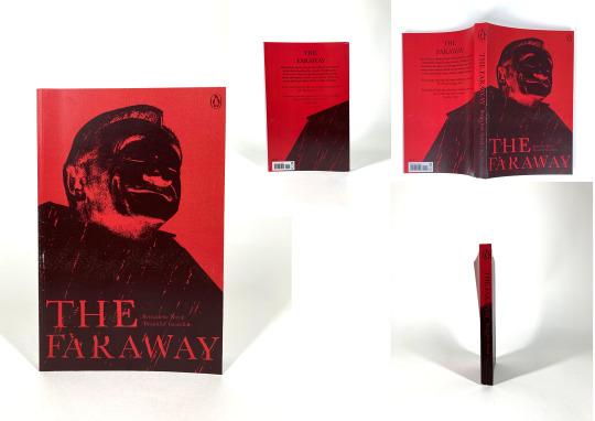
Judge A Book By It’s Cover is the project that I enjoyed the most within the unit, I believe that the outcome from this is my strongest and the development of my design is incredibly interesting with massive improvements after the critique. The start of this project however was pretty slow for me due to personal issues that I had – I felt worn out and really unmotivated which made me miss the majority of the experiment workshop that we had at the beginning of the project to give us a range of different design elements that could build up the cover. This made it so the experimenting that I did was from my room without access to the mediums that were at the workshop. I feel like this made the process feel a lot more personal and I can feel a lot prouder with the final outcome. The genre that I designed for was horror as I felt like that would work the best with the ideas that I had in my head. I believe that I have successfully created a strong final outcome.
There’s An App For That was the group project and was where collaboration was most prominent. Within this project we were put into groups unlike previous group project where we were allowed to choose our own – I believe that this is the superior way to do it as we get a mix of groups that will possibly work together better. I was placed into a group with Hopper and George which was great, we were able to work together really well and get the concept done within a relatively short time which allowed us to design it and make it look nice. All this was done for the presentation where we would present the concept to the group who gave us the brief and would receive feedback. Using this feedback, we improved the app for the hand in.
The process book is something that I have been working on throughout the unit as it has to include the three projects that we have done. Doing this through the unit rather than at the end has allowed me to be a lot more on top of it having all my content in relatively early within the project and only needing to start thinking about the design and how the type flows or how it looks when printed to make sure that I am happy with the outcome. However, I do understand that this is the first time I am creating a process book so I understand that things will absolutely go wrong with it.
In conclusion the final unit of the first year has developed a series of skills in preparation for the second year where we need to step it up and will be expected to create a process book for each of the projects. Although I had some issues at the start of the unit, I believe that it has gone well otherwise and I have created, along with my group, a strong collection of final outcomes that I am proud of. Being able to overcome my issues has made me a better person feeling more motivated than ever.
0 notes
Photo


Test Bind
After some thought and a speak with my tutor I thought it would be a good idea to test the bind that I wanted to go with the Coptic Bind. After attempting this and it coming out looking bad I've come to the conclusion that this is possibly not the best bind for me to do, despite really liking the look of it.
I think that doing a perfect bind and making the whole process simpler for me will actually be better and since this is the first time I have to create a process book. I can try something a lot more experimental the next time.
0 notes


Text
Collaboration Evaluation
Within the Visual Communication in Context unit, we have had a range of experiences with collaboration with our peers with the There’s An App For That project being the most head on with it. Unlike previous experience with working in groups and the like I’ve had a very positive experience this unit.
With the group project (There’s An App For That) everything went extremely smoothly, we were clearly able to work together as a group and had the work balanced between us, we were all able to work on every aspect of the concept and design. This carried through after the initial deadline of the project / presentation spending time to develop the concept using the feedback that we received. Within the earlier stages of the project this was easier to do due to the workshops that we had scheduled within class – to allow us to work efficiently a group chat was created to keep contact throughout.
There’s An App For That was the most successful of the components of collaboration within this unit. Due to past experiences working within a group I was not looking forward to this project but that changed when we got set into our groups and we began discussing ideas.
This unit also included two pin-up critiques where we were given the opportunity to display the work that we currently had and was able to receive feedback from our peers. I was able to get feedback that helped with the development process of the design however the better and more constructive feedback that I received from these was from the tutors at the end of the session. I found that when we got up to look at others work people tended to stray from the side that I had placed my work with everyone mainly focusing on the left side of the wall. This made it so the feedback that I received was quite last minute and lacking due to the limited amount of time that the people giving me the feedback had to look at my work. This unfortunately happened both times. Which led the pin-up critiques to be quite unsuccessful. However, I am able to avoid this in the future of the course by maybe looking at where I place my work in order to receive the best feedback.
The first pin-up crit was for my cookbook double page spread where the feedback from peers felt lacking slightly. The second for my book cover design I received better feedback however it was hard to develop my design based only on that and had to use the feedback from my tutor to impact that.
I will continue to explore the successful components of collaboration within other units by avoiding the unsuccessful points of collaboration.
In conclusion the collaboration within this unit had been the most positive experience I have had with it, although I unfortunately had some unsuccessful situations within the unit, I am happy with the time spent collaborating within this unit.
0 notes
Text
Binding Method
After exploring the possible options for the bind I will be doing for my process book I have found that I would like to do a Coptic Binding. I really like the look of the exposed spine of the book I think it adds a lot of character to the overall aesthetic of the process book.
After the first project were I just did a ring bind for my book I want to do something that I haven't done before in order to explore new skills and learn new knowledge.

0 notes
Video
tumblr
Updated Video Walkthrough - Birdbook There’s An App For That
Here is the final rendition of our application Birdbook. Using the feedback that we received after presenting our idea we developed the digital wireframe in order to improve the concept and design of our app.
Looking back at the feedback that we received I found that one part of it which suggested we add usernames on top of the QR codes as they maybe harder to understand for our target audience we had already considered this by adding in a copyable link that can be sent through text or email. This removes the issue of not knowing how to use the QR code.
However we used the feedback that suggested adding in a repeating pattern into the background at a low opacity to add further visual interest into the design. After including this we found that it suited the app really well. I am glad that we took the time to further our app idea.
0 notes
Photo

Average Page Layout
This simple yet consistent page layout is seen through out my book, breaking with full image pages once in a while to add interest. I have kept the design as balanced as I can throughout however due to the content this had to be broken within specific pages. I am happy with the clean layout it definitely allows the content to be easily read.
I have on most pages placed the type on below the third row, this creates a border that gives a set space for the imagery to be placed within.
0 notes