
Don't wanna be here? Send us removal request.
Statistics
We looked inside some of the posts by on-the-syed and here's what we found interesting.
Average Info
Notes Per Post
8
Likes Per Post
8
Reblog Per Post
0
Reply Per Post
0
Time Between Posts
18 days
Number of Posts By Type
Text
4
Last Seen Tumblr Blogs


Fun Fact
In 2020, 27% of US Tumblr users had an annual household income of over $100,000.
Text
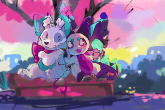
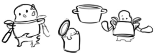
Aku Origins + Doot

lately i've been spending a lot of time thinking about two of my dearest critters, aku and doot! i dug up some old artwork while reflecting on them.
this is a very jumbled write-up, but i have a headache and i'm tired... it will have to do.
i believe i've had aku since i wassss... 11 years old? 11 or 12 i'd say. the oldest drawing i could find of him was in my dA storage from Nov 2012, but i believe i drew this the summer of that year:

and... yeah.... there's a lot to say about these lol. they were definitely not the first drawings of him, and he had an identity crisis for his first few years before i got a handle on things.
a confession! aku was totally a rip-off character at first and i totally lied about it as a kid. i had some complex where everything i made had to be so original (unattainable) and honestly, that mindset had the opposite effect on my art. i think the conversation "all art/artists are inspired by other art/artists" has been done to death by now and i don't have anything more to contribute there. it's true! and by trying to make things dissimilar to anything i consumed (which isn't possible), i just made ugly and incoherent things. different doesn't inherently make an idea appealing or exciting. this especially applies to how i drew sye at around this age, but that's a conversation for another day.
it took an embarrassingly long time for me to accept that, and to realize that no one cares! i have plenty of friends whose characters started as fan characters (particularly pokemon), who have evolved (teehee) so much they've taken on a totally unique identity. i've talked with one of my dearest friends about this, and how one of his main characters was, at first, a fairly direct reinterpretation of a design he saw and clicked with (hi danny!). and while sure, i could see the inspiration and similarities, his character just feels so different and his own thing now. it is interesting! and i think the same thing can be said for aku.

https://www.deviantart.com/jaunty-eyepatch/art/Hopgoblin-Design-167766735
this bad boy is what youthful me saw and went crazy for. he is from the short film Reversal of the Heart. the similarities to current aku are obvious, but way back when it was totally one to one. i love me a simple design! a bright little frog with ears? i'm in dude. i drew aku with the hopgoblin a while ago, cause i owe a lot to the little guy.

it is fun to look at them side by side, because really... they don't look very similar anymore. aku's design changed very soon after i first made him, but i didn't really know where i wanted to go with him. initially, he was a bit of a trickster, which is how he got his name. i find it to be a funny and vaguely charming misnomer these days lol. anyway, there was the image from Nov 2012, and the next dA drawing i could find was from 2013:

if memory serves, this was the first digital drawing i made with my tablet! aww. looks horrible. later in the year i had this:
i had a good number of drawings of him as a more "realistic" frog (lol). i do remember the green eyes, and specifically that i wanted him to have cheek markings, but i was not sure the exact shape or pattern.

poor boy. what is going on here? why is your ear backwards!? this turmoil continued until the fated turning point...

this game is supremely dear to my heart for many reasons but it also helped usher in the era of aku. im amazed i could find pictures of these:


i think it was winter break of 2013 when i first played the game and doodled in an adjacent style. (also, how i learned the difference between water and alcohol-based markers... guess which i had :") )

i drew him as this weird little anthro guy SOOOOOOOOO much. like, constantly. i will spare you the bulk of it, but that's the gist of it. and to be quite honest, part of me misses it a little bit. some of the versions when he was short and squat (i.e. more akin to AC's style) i still find sorta fun and cute. i definitely would not draw him like this again, but i did retain some of that essence for a character ten years later- kipabell!

he of course made his way to my digital drawings too:

interestingly, it seems like the vaguely realistic version of him still existed at this point and i occasionally drew that instead.


this continued until i was 14, and began thinking about a story based on him and another oc. he returned to a blobby form!

weirdly, the vaguely realistic, anthro, and blobby versions all existed at this point (2014). i thought he had a more linear progression, but evidently i liked to toss things up a lot.

things began to stabilize when i was 15 (2015-16).

i animated him quite frequently around this time too. when i was 17 and a senior in high school, i created a companion for him...

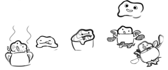
DOOT!
he was initially made for my partner tech, as a sort of stand-in. i drew aku so frequently he was practically my online sona, so of course he needed a partner too! at the time, axolotls were tech's favorite animal, so it was a no-brainer. unfortunately, i don't think his design process was as inspired or interesting. he kind of just... came to be, with very few actual changes over the years.
apparently, "doot" was initially short for "doodle", which i imagine is why he has a scribble-esque mark on his tummy. he was very very stubby, and his palette a lot lighter. i find that shade of blue kind of strains my eyes... but his first palette looks quite similar to olmen's, doesn't it? and that's a coincidence!


these are among the first drawings of him. he was made almost explicitly as a compliment to aku. the most obvious point there would be their color palettes, with orange being the compliment to blue. doot has the bright pink to aku's purple. i also mirrored other characteristics of aku. where he has fangs and bat wings and ears, doot is round and soft with feathery wings (or gills... or ears... whatever). aku has cheek marks, so doot has the blush. i think the spiral might have been to mirror aku's cheek circles, but i'm not certain.

they are made for each other! i made this gif the day before i met tech in person for the first time. you can see here that doot had started to lengthen out, which furthered the contrast.
they were the muse that made me start caring about illustration and design more. i started considering color a bit more deliberately, and began dipping my toes in more complete pieces with backgrounds.


really, they have not changed very much since, just grown with my general art style. i was going to speak a bit more on my thoughts on complimentary designs and where these two stand now, but i have reached the image limit. i will save that for another time. for now, it was interesting to sift through all this old art and try to remember how things were way back when. lately, i have been developing doot more as a character, and i have been pretty happy with how he is now. i would like to give aku the same treatment soon. i think it is safe to say these are the two most important characters to me, both personally and as an artist. i wonder how they will be in another ten years... time will tell!
2 notes
·
View notes
Text
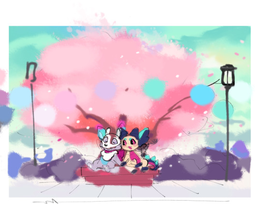
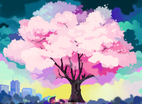
Spring Hues (4/16/25)

this one was painted for my dear partner tech's birthday. i kinda... waited way too long to start... but we clutched and got it done and that's all that matters. i have a few drafts and wips from along the way.
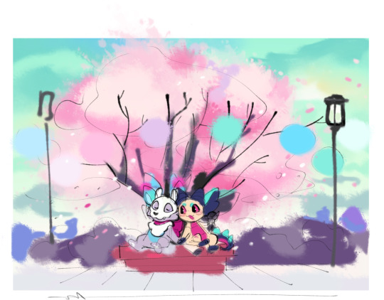
this was the very first scribble! i decided to draw a scene based on our most recent venture to the cherry blossom festival. it's SO pretty and smells sooo nice. it makes me happy to see so many different people from different countries and cultures enjoying nature like that. next year i should tally how many different languages i hear... that'd be cool. anyway:
at this point the only real color ideas i had were the green sky, tree, and the vague purple/blue blobs in the background there. the colors on the characters were added pretty arbitrarily and don't really mesh but that doesn't matter at this point. these days i find color to be the driving force for whether or not i finish a piece: if i don't have any good palette ideas it's reaaallyy hard to get things moving.
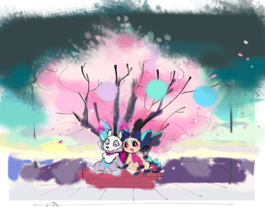
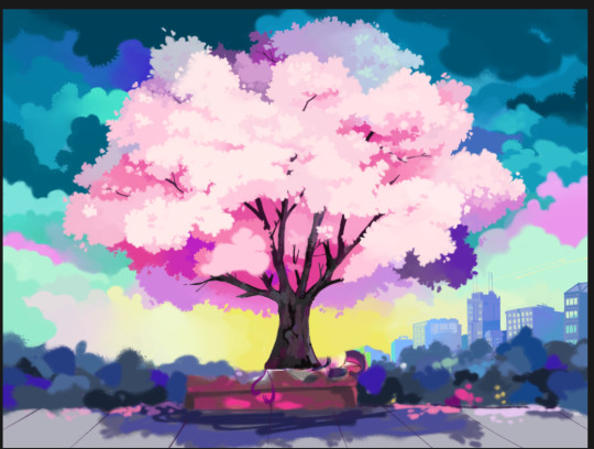
then i had two other thoughts: this year, we went to the festival at dusk and got to see the paper lanterns lit up. plus, the darker blue/green is tech's favorite color (especially when paired with pink) so i wanted to play with that more. i found this layer with the darker sky but it was quickly reworked. it's too yellow and de-saturated here.
alternate tree base color. the warmer pinks and orange tied the sky in better, in both the daylight and dusk drafts.

tying down a more final palette.the blobs on the right were my basis for tech's fav colors so i tried to play off of those. i also wanted to add kind of weird and different for the colors, so having the yellow sunset behind those aforementioned blue/purple blobs sounded fun. cool contrast. i kind of like how rough and primitive the buildings look in this one. i was also excited to do that painterly effect around the street lamp to indicate it's lit, but i just didn't have time to work it in properly. i also felt the characters were a bit too pink at this point.

around this point i also did a more structured sketch of the characters. i didn't really know how to intertwine their hands but i think this pose is cute, almost makes it look like they're mid conversation about something...
toning down the pink shading. i wanted the green/grey/blue shadows pulled from the sky (you can see a similar tone i worked from on the right again).
around this time i merged things and started to paint. this snippet is one of my favorites as far as palettes go; it just feels a lot different from what i might normally choose so it's interesting. i keep imagining the yellow as a goopy paint and i wanna eat it
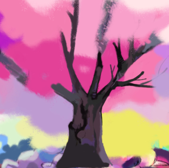
RIP snuffer and sye: tree time! i think my lazy scribble rendering suits bark alright
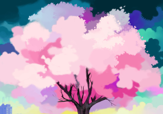
(this is a flipped screen shot) rendering the sky and tree. i like slapping a few random accent colors into cloud scenes like this, but as i worked on the tree it just.. didn't look right. too busy, i guess? something about the tree colors were starting to not vibe with me too. i tried using a premade brush on the blossoms to save some time but it took more effort than it was worth and just didn't work with the rest of the painting style. go go gadget: 3 hours of boring blobby shape painting. i was worried about the tree looking too flat as well but once i added the branches poking out it felt better
more of the same. the sky continued to gnaw on me.
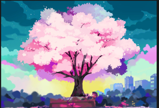
i recorded most of the rendering after the color tie-down (included below), and while rewatching i noticed that the simple early sky looked WAY better. so i painted a similar deal here. i also added stars poking through to say "hey this is at dusk btw it's almost night time". it was a nice way to pull in some of the pinks and greens from further down in the painting. it was also a good excuse to use pure white somewhere in the piece (the sparkly big stars). a little personal challenge i like to do is include pure black/white in drawings whenever i can, out of spite for the years spent not doing that. lukewarm art advice on the internet were engraved in younger me's brain and it led to the UGLIEST colors of all time for years. so doing that, plus throwing on whatever bright, weird colors i feel like, is kind of fun to explore now. i used pure black on the tree bark, for those keeping score at home
played around with color correcting the blossoms. the orange here does work better with the sky colors but it felt a little too orange. this process was very annoying because most everything was on one layer, and i already had to painstakingly paint around the tree to fix the sky.
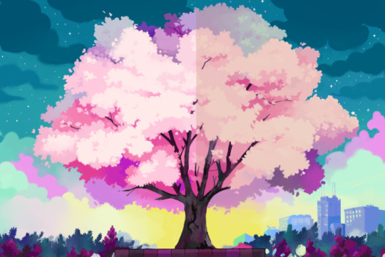
more troubleshooting. this did prove to me that the original colors (left) needed to be toned down a bit. you can also see some of the foliage being rendered too: this is probably the part of the piece i'm most disappointed with. i wanted to properly draw more realistic plants and had even gathered a bunch of refs, but i just didn't have the time. the abstract shape-y plants are fine, but not what i really wanted going into this one.
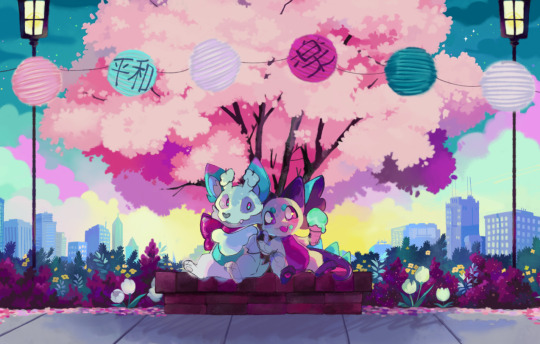
beginning to render the characters. i HATED painting the bricks in this one. i just didn't have any great ideas for the colors and considered just lining it but could get it working. i tried giving it a slightly gritter texture. good enough. i also wanted to do more for the sidewalk but again, no time.
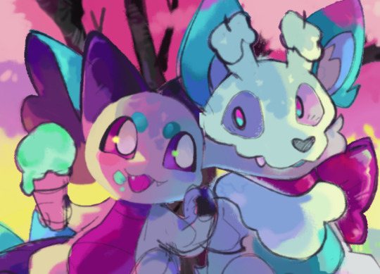
i ended up using the second draft colors for these guys much more than i expected. no time! i was doing this part an hour before bedtime the day before his bday! ahhhhhhhh!!!!! i had to finish it while clocked in and working the day of!

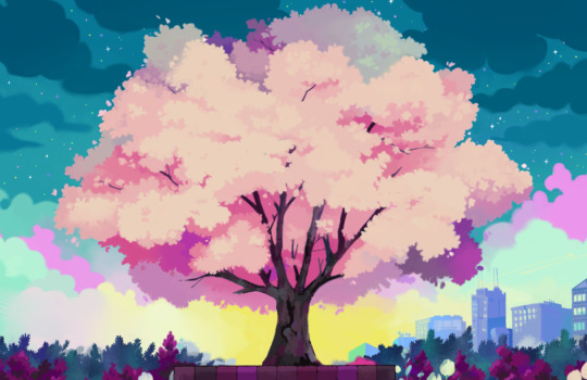
aaaand the final. i REALLY had to skimp on some details which i'm still bummed about. i just need to plan and time things better next time, but i did still have a few things i liked on it so it's okay. plus he liked it and that's what's important!
aaand here is a recording of the painting process. my favorite parts of the piece are colors (specifically the yellow sunset with the cityscape). my biggest let-downs are the lack of detailed plants and the rushed rendering on the characters. i really wanted to slap more color and detail on them but alas... i did learn some things so i'll take it :)
2 notes
·
View notes
Text
THE SOUPENING (11/27/24)

time for a boy most beautiful and delicious, soup!!! he was lots of fun to design and had a (mostly) natural progression. here is all the concept art i could scrounge up!
at first, all i knew was i wanted to make a character named soup, because it would be funny. i didn't have a whole lot of ideas as far as actual design goes, so it was kind of backwards from my usual process. the first soups were weird:
i did some weird experimental guys, starting with this... bird? thing? i dunno. i liked the idea of a wobbly and large character that emerges from a pot, and envisioning how it would move (the character being highly animated and fluid, sloshing around and overshooting the comparatively basic and rigid pot). if i had a visual example it would be awesome, but alas i do not, nor do i have the skill to create it. maybe a project some time?
that version didn't have a lot of sticking power. so the next ones were these things:
more blobs. i was starting to think about how i could build the pot up as a body. the legs and arms came together pretty quickly. i also considered putting him in a can, but that was less interesting (though i did decide that soup can transfer containers, so the can idea isn't totally out the window). alphabet soup is one of my favorite soups, and what i used to refer to my ocs' universe as. i thought it could be fun if the character communicated simple words with the letter noodles, so i held onto that idea for later. i don't really know why they're blobs, they kind of give me adventure time vibes? who knows!
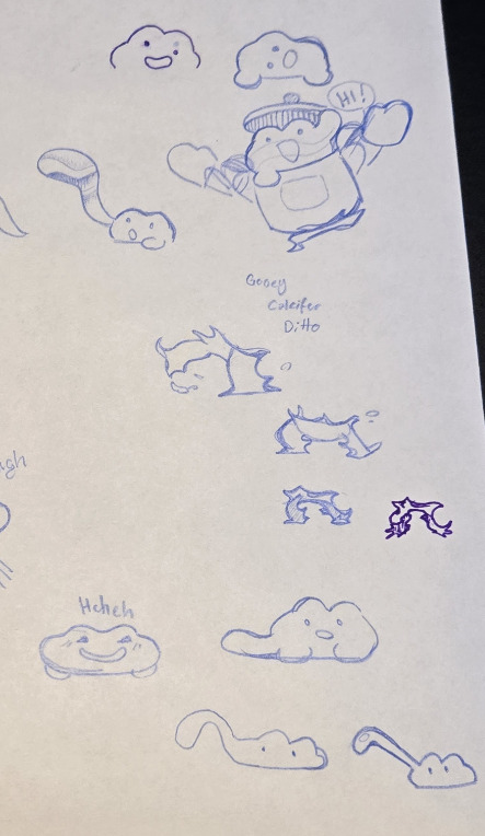
the next iterations became very froggy:
frogs are my most favorite animals so i'll never turn down an excuse to use one for a new oc! i still wasn't really sure what to do with him shape wise. the left most one looks closest to his final version, but i did play around with some softer shapes too. for his face, i wanted him to look super silly and cute. these guys were his main influence:
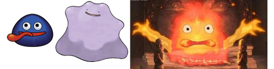
gooey (kirby), ditto (pokemon), and calcifer (howl's moving castle!)
his face is basically ditto's, but he can emote more. gooey is there in spirit and is definitely most akin to soup personality wise. i briefly considered giving soup little eyes like calcifer's (top right), but it didn't look good. i DID end up borrowing the way calcifer's fiery arms look, and rendered soup's legs in a similar style.
a special boy begins to form... i think it was around here that i had the idea of tying in the boiling frogs apologue, which i feel was a lovely coincidence. it felt perfect- it gave a reason for soup to be a frog, and for his body to be a pot and his legs fire, PLUS a backstory. beautiful... a really lucky happenstance for me lol. when thinking about how he's controlling the body, possessing it felt most accurate. he can kind of control it and use it as his own body, or as just a vehicle (like with his soupy arms hanging out above). that made me think of gundam, so then the mech idea solidified. i gave him a little lid helmet and played with the shapes to make him look... clunky but sort of strong? he is such a weird amalgamation of things. frog, soup, ghost, mech. i love him
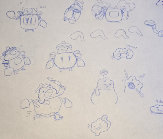
i did most of his next phase at work. i wasn't sure what shape his pot belly should be, so there's a handful of 'em here. those weird crooked bubble 7s in the upper right were attempts at how his soupy limbs might look when extended from himself. it's hard to describe the final look or idea, but ultimately i think the shape of his arms has to be deliberate, concise, and confident. even for apprehensive poses (i think the tests were in the context of soup tentatively poking something). i had the idea of giving him oven mitt hands for his mech because it aided the heavy, robot-esque look. plus, the bare ladles just felt... barren!
more of the same. i bothered to write down his inspirations, and a couple tries at how his fire legs might work. you can see the deliberate/concise/confident arm shape in the bottom right. it looks better, and if i pushed the expression on his face and body then i think the apprehensive feel would show. but whatever! i also decided his face can slosh around and rotate too, for added silliness.

couple more digital doodles.

more beta soups! and a bonus gigan. i did and continue to do a lot of shape studies/explorations wherein i draw the same thing over and over but with different angles, etc. i would change the fins on gigan's back, but that's for some other time :) i might post some of those pages some time.
somewhere in there i decided to steal cook kirby's pot for his body:
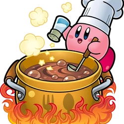
because it is impossible for me to make something without immense kirby influence. that's something i would have been a lot more uppity about when i was younger, but i love openly paying homage to things i love now. no shame!!!
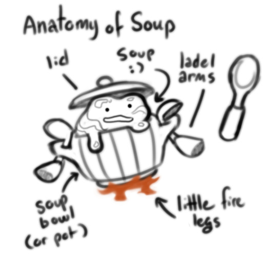
he was basically done at this point, and just needed color. the gold pot was already decided, and a generic brown soup really did just fit the best. i still wanted to use the alphabet soup idea though, so i gave him the ability to eat ingredients to change recipes. formatting a reference sheet was tough, so i ended up divvying it up in two.
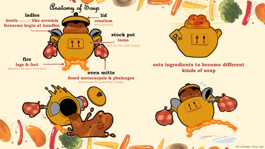
the anatomy of soup image might be my favorite, he looks sooo dumb. i labelled him in a lowkey pretentious way because it was funny, and also because i studied anatomy and physiology in university. you probably can't tell that from my drawings... but it's my favorite subject.
aaand his final render and reference! i thought making it look like a recipe sheet would be cute. i couldn't find any nice templates to borrow online so i made one up. i found a stir fry brush on the CSP asset shop to make it look more authentic. it was sooo fun to use! here is a link to it: https://assets.clip-studio.com/en-us/detail?id=2011852 i'm trying to get better at letting myself use resources to make my life easier, and because it just gives better results. work smarter not harder and whatever.
it took me a while to figure out how to render him there, particularly with the highlights since he's made of so many shiny materials. it is by no means perfect or accurate, but it gets the job done. i liked the heavy paint brush texture on the pot. i thought about making a custom design for the mitts, but a simple classic one ended up fitting best.
and that's it! i think he took a few weeks from initial concept to final design, maybe a month. i'm really fond of him. i think he's a really fun and weird idea, his backstory is equally goofy, AND he's a frog. i would love to make... some sort of physical item of him, but i'm not sure what. maybe a 3d printed model one day..? in the meantime, he is going into my character design portfolio. i would really love to make something like him for some sort of artistic project one day. time will tell!
2 notes
·
View notes
Text
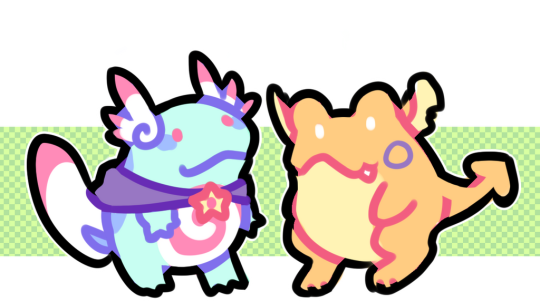
Pika Ki-Yay (2/27/25)
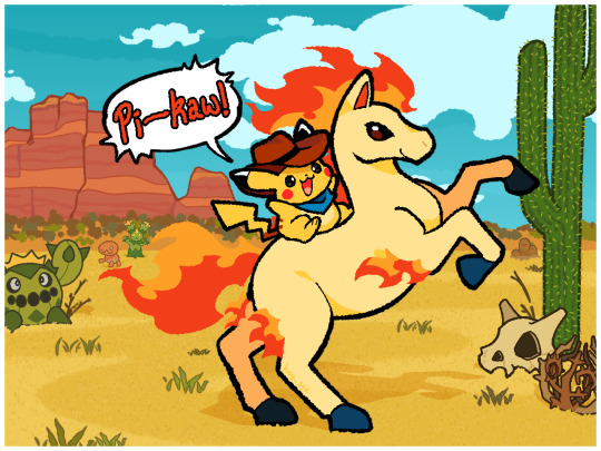
i'll start with this since it's the most recent thing i worked on. it's a redraw of a picture from 2022:
i will try my best to organize my notes. i have a surprising number of thoughts, whooooopsss
2022- things i like
the overall idea: fun and silly!
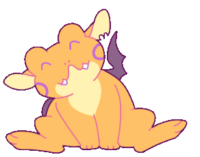
pikachu: i love fat pikachu and i think he is charmingly tubby here. plus i gave him the lighter tummy which is cute. good thinking me
and that's... kind of it
things i don't like
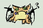
mystery horse pokemon: this one drives me insane. was i drawing a rapidash or a ponyta? it looks like the latter, but i stuck a horn on it? we're already off to a bad start. the second thing that drives me nuts is i forgot to turn on the layer that has the legs' flames when i first posted it. it's already a simple design and yet i forgot such a crucial detail. the tip of the tail flame is sloppy. overall, the shapes and posing are weak. i do remember referencing pictures of real horses rearing, and some did show only one back leg grounded. for the sake of illustration, though, having both planted would be the better route. it gives you a better sense of the driving force of the pose. the proportions aren't great either.
pikachu's hat: what's it doing
the drop shadow: could i have tried at least a little bit here
the background: i can tell this drawing was inspired by kanako eo, one of my favorite pokemon card artists (they actually did a ponyta card! i'm not sure i knew that at the time though). i love the way they use colors and shapes, and especially how simple yet effective the backgrounds are. i think a large reason they are so effective, though, is because of how small the overall illustration is- smaller space means it takes fewer elements to make the environment feel lived in. even for a desert, mine is just so, so boring. the cactus pokemon aren't enough to make it interesting. i don't like how the colors don't feel unified. adding the darker areas of sand and some speckles was a valiant effort. solid C- at best
dithering texturing: fun idea, not executed well. not huge on the blue dithering on the background pokemon but i do understand what i was going for.
in fairness, this was a quick drawing during one of the worst periods of my life. i don't blame me for wanting to make something fast and silly and happy. looking back it just is OK at best
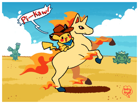
popping this one down here again while i type so it's easier to compare while reading/writing.
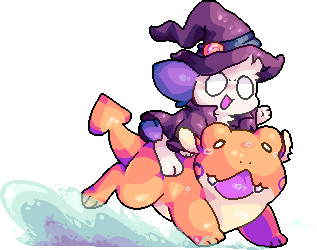
2025- things i like
the colors: overall there's a WAY better harmony with the colors. the slightly green tint to the sky helped sell a warmer environment. i like the big cactus to balance out the green from the BG elements on the left. i think i color picked ponyta's colors from the original. i could have tweaked them, but i don't think it's too distracting. i like how the red/orange plateau looks against the sky
ponyta: i deliberated for a while but decided to go with ponyta in the end. i don't like how beefy rapidash is, or its face. ponyta made more sense! but i did miss the horn... i won't act like the anatomy is great cause i don't draw horses. but it's serviceable. i made a point to give more intentional shapes (particularly on the bridge of the nose into the jawline, the shoulders, and the hooves).
the background: it actually looks more like a place where things exist and live. i like that it's still pretty simple, too. for the sand, i copied the idea from my first image (some lighter/darker spots to break it up). i like it isn't very obvious there are two tones, but it definitely adds some depth. and there's more pokemon!
things i don't like
composition: i had actually planned to make this look more like a poster but scrapped the idea for time's sake. i don't like how smushed together elements are- there are 3 props shoved to the right. i'm not sure how i would redo it. maybe another regular cactus back where the trapinch/maractus are would make it more natural. i didn't want to put anything that would break ponyta and pikachu's silhouette but i think it might have been fine in the end.
clouds: i wanted to have the clouds at a more extreme/slanted perspective but couldn't find a good reference image, and i'm still new at using perspective grids properly. they're just kind of boring
the contrast between the background and yellow part of the flame in this specific area: speaking of composition this might've been a good spot to stick another cactus. break things up a little better!
overall i like it a lot more! it's cohesive, and interesting enough to look at (which is something i've been becoming increasingly concerned with in my art). i think the thick black lines on the central two pokemon work well to make them pop. i particularly like how these colors look:
i used 3 shades of green for the distant scrubs. i didn't want it to be too distracting. there is very little contrast between the greyish tone and the brown one, but i like how it looks. i've been learning how effective grey is in the context of other colors, i would like to get better at utilizing it! the grey adds a slightly cooler tone that makes the background richer. i am very prone to recycling colors too much, and i'm trying to get better at introducing unique colors and keeping them in their area. similarly, i like minimize the number of line breaks/ use longer and flow-y-er lines. i do that too much. i did it on the neck-> ear on ponyta, and im not sure if i prefer it used there...
all in all, my main take-aways from this drawing are: the effectiveness of grey and low contrast colors. not what i expected, but cool! that's all
2 notes
·
View notes