
22 | they | oc drawer, draws my own ocs a lot and theyre mostly robogirls, as well as their world!
Don't wanna be here? Send us removal request.
Statistics
We looked inside some of the posts by orchid1024 and here's what we found interesting.
Average Info
Notes Per Post
256K
Likes Per Post
171K
Reblog Per Post
84K
Reply Per Post
618
Time Between Posts
2 days
Number of Posts By Type
Text
16
Photo
1
Last Seen Tumblr Blogs


Fun Fact
Tumblr Inc. is using 66 technologies for its website.


Text

you dont need to be an expert to know that this isnt how this fucking works. Disney does not go up to a judge and say "id like to expand copyright law please!"
The outcomes of lawsuits set legal precedent, which is then applied to future cases. Like this is such a basic fact of the legal system in the US! And this post is whining about "misinformation" like are you fucking kidding me.
348 notes
·
View notes
Text

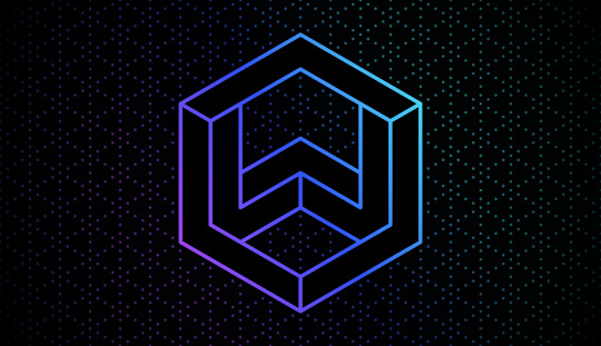
Skysometric Design Retrospective, Part 2
Taking Shape
how does anyone decide on a personal logo? serious question, i have no idea. my old look as WillWare was a hexagon because i like hexagons, and it had a W because the name was alliterative. anything that has a deeper meaning than that is frankly beyond my creative scope.
so i'm Sky now, and i need an S in a hexagon, to continue the precedent set by my old self. well, duh, that sounds like a hole in one! i probably got the shape right on my first try, didn't i?
...of course not! do you know how many freaking ways there are to draw an S on an isometric grid??


now guess how many different ways i've drawn the letter W.
most of these initial attempts were to solve a simple logistics question: how do i inscribe the letter S without leaving any gaps in the hexagon shape? i'm sure i could've used some math to figure it out, but i much preferred treating it like a puzzle and fitting the pieces together.
on the left you can see this quite literally, "weaving" individual rectangles together to create the S shape. but even after a couple of attempts, i couldn't figure out how to close the gaps on the outside of the hexagon. the bottom shape is a fun experiment with taking this weaving concept to its extreme, at which point the S shape is no longer visible. (but it's more obvious if you remove the ↙↗ minor diagonal in the middle!)
on the right i decided to step back and try other methods, like a simple block outline – which i ultimately discarded because it looks a little too much like the Superman logo, or maybe the "cool S" everyone could draw back in school. but the two at the top are worth going into more detail!
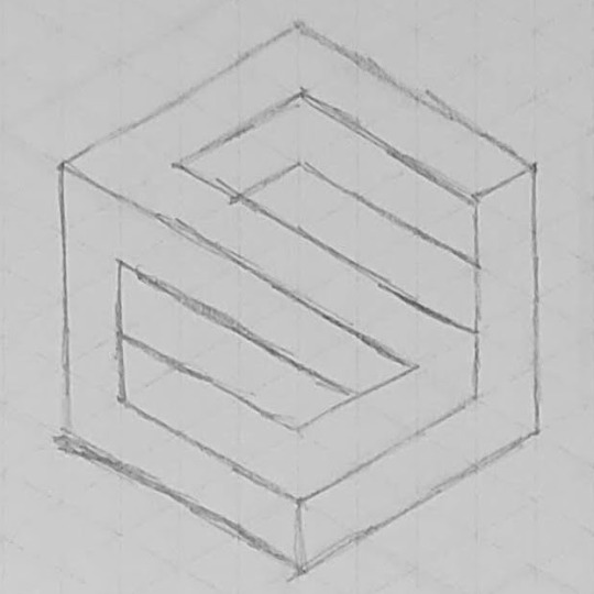

wha? Gamecube logo? nah, i have no idea what you're talking about.
the first was an attempt to make an S in the style of the "New WillWare" logo, using isometric blocks. but it really did not pan out, and any other variations i could think of were too simplistic. this was the turning point that made me realize, yeah, there's no going back to my old look. it won't fit me anymore.
huh? Dropbox logo? nah, you're just seeing things.
even though i couldn't fit this one in a "regular" hexagon (where all six sides are the same length), i still really like the idea – a tight knit shape that shows its direction with a color ramp! the S is visible by following the colors from cyan to purple, a much more subtle look than the other in-your-face attempts.
all this experimentation was fun, but my heart was set on something closer to the "weaving" attempts i started with, fitting block shapes together into a larger hexagon. i could practically see the outline in my head! why won't the shapes fit together??
so i drew the outline, and the shapes naturally followed:

the moment of clarity.
i drew out the new shape several times to help me choose which order to layer the crossbar – should it go over or under the top and bottom? i chose to put it under the top and over the bottom so that the shapes "flow" downward, just like writing an S with a pencil.
and that just leaves one question regarding the shape: how does it look digitally?

"really fast mockup of... an idea" – November 17th, 2020 via Twitter, just twelve days after coming out.
it looks great! so now i have a stable base to work with and build a logo out of.
you may notice it's in different colors than the finished product – in fact, this uses my old color palette, just to make it quick to test the shape with. but now i have a difficult problem... i need colors, and those are historically my biggest struggle with graphic design.
to be continued...
10 notes
·
View notes
Text

Skysometric Design Retrospective, Part 1
Where It All Started
somehow, after a decade on the internet, i've become one of those people who has a whole Personal Brand™. at first i leaned into it on purpose, partly because i wanted to make videos as my shtick (until i didn't), and partly because i didn't really know how else to express myself on the internet early on. these days, however, keeping up a personal brand is less about Who I Am and more that i just enjoy graphic design. making this stuff is fun!
so over the past few years since coming out and rebranding as Skysometric, i've put a lot of work into a new logo, website design, icons, video thumbnails, and even more besides. i'm pretty proud of how it all turned out! and now that most of the heavy lifting is done, i'd like to write about how it went and some things i've learned along the way. there's a lot to talk about, so strap in for a pretty long series!
but, to start, i can't talk about Skysometric without a quick history lesson about WillWare, the old me – the one who got the ball rolling on graphic design in the first place.
———
maybe this is obvious to the trained eye (or maybe not!), but i'm an entirely self-taught graphic designer. i've never taken any classes, studied design styles, learned the fundamentals, or even so much as had a single course teaching me how Photoshop works. (not that i use Adobe anymore, but you get my point!)
instead, everything i know, i learned by doing. i learned how image editing software works by making tiles and backgrounds for Mari0 levels. my fundamentals are deeply rooted in drawing mazes as a kid, so i quickly discovered how to set up grids in every image editor i got my hands on. i picked up other design techniques by attempting to imitate their logos or styles for personal projects over the years.
on the one hand, this means that i've developed a style and workflow that is wholly and uniquely my own! on the other hand, anytime i get stuck, i don't always have the tools to get un-stuck... or even the words to google it.
so instead of googling it, i used the tools i had to make all of this:


rest in peace, WillWare (the brand). clockwise from top left: logo, social media banner, video end slate, stream archive thumbnail.
what started as just a fancy logo to replace my old Sonic profile picture, snowballed into an entire branding suite across web and video! i learned a lot about graphic design as i gradually expanded these designs into my other creative pursuits. you can see so much of that self-taught style i described above in these few examples – geometric grids and graph paper, simple shapes and layers like my Mari0 work... and imitation of Google's Material Design guidelines, like drop shadows and color choices.
in fact, i leaned so hard on Material Design that, after some time, it no longer felt like my own style. anytime i wanted to branch out, i felt constrained by somebody else's design standards! so i challenged myself to find my own design style from scratch, which I called "New WillWare":
this neon light grid is still pretty dang inspired, but it's not "me" anymore.
it took a couple years of slow iteration to arrive at this neon-looking "light grid," and while it rocks, it also painted me into a corner. i had no idea how to make anything more than pretty promotional pictures in this style – i couldn't figure out how to make it work with video, webpages, or even just text, no matter how much i tried to go back to the drawing board. and my lack of formal experience made it that much more difficult to solve these problems!
so after a while, i felt pretty stuck. my old design didn't feel like my own, my new design was a dead end, and i felt like i was too invested in both to start completely from scratch again. i was simultaneously too burnt out to continue, and too scared to throw everything out and start fresh!
and then i transitioned, and started calling myself Sky.
in case you missed the *cough* subtle indicators, both of my old designs are centered around the letter W (being part of my old username and all). "Sky" does not have a W. so, uh, none of this fits anymore! even though i love this old work, and still consider it part of my history, it no longer accurately represents me or my identity. ready or not, it's time to design something new!
on one side, i felt pressure to get away from my old look, the product of a younger designer whose efforts were still the standard for my online presence. on the other side, i felt pressure to rise from the ashes of my redesign, make something of all the failures, successes, and lessons that i learned.
and thus, shedding my old brand identity and donning my new gender identity, i hit the sketchbook running.
to be continued...
14 notes
·
View notes

Text
susie's story (esp in ch4) is so deftly realised. so often you see the "character who thinks little of themself is encouraged to pursue their True Value" storyline unfold in a way that has the character redirected away from "unfitting" desires, like a physically weak character who wants to be physically strong learning to value their personality instead or whatever but susie. susie who is - mechanically, in her stats in the game - best suited to hitting things with an axe, who "doesn't look like she should be playing the piano", is encouraged to pursue a skill she doesn't have because an educator took the time to get to know her and realise what she has genuine passion for. and she's not automatically great at it! she has objectively bad spelling and grammar in her letter to alvin, it's not like she unlocked some secret hidden talent - storytelling and communicating and creative expression in general is something she cares a lot about and genuinely enjoys, but it's something she has to work for. there's a reason why the gerson fight is so long and gruelling. but through this hard work and better understanding of herself we see susie learn how to reject imposed frameworks that occlude her actual personality - she literally shatters the tapestry that tells her the one and only way her story can end, and in doing so prevents Kris from ever having the chance to think of her in that position, whatever it is. it's her story, and she's learning how to tell it.
AND all of this is done without for even a second implying she needs to be even the tiniest bit more feminine than her rough and rude masculine self. hell, from the way she and gerson mirror each other in their loud and abrasive laughs, her unapologetic butchness is presented as a trait that aligns her closer with him and from there with her truest self
3K notes
·
View notes


Text
You really, really don't need to be cheerleading Disney and Universal here. It honestly doesn't matter how much you dislike AI art — if the court rules in favor of the corporations, the implicit expansion of copyright law will do a million times more harm to the arts than fucking Midjourney ever could.
Like. There is no definition of copyright that does not permit AI training, but does permit fanworks. The latter is much more clearly derivative than the former. You do fanart? Fanfic? Disney's pointing a gun squarely at your head and you're cheering because it might hit the AI artists behind you too.
And beyond that, do you know what happens to AI generation if Disney/Universal win this? They aren't opposed to the technology in principle! They'll be able to use their exclusive rights to a vast corpus of art to make their own AI, for their own purposes. Who does this help? Companies who want to reduce employment costs and disenfranchise the working artist. Who does this hurt? Well, it hurts independent AI users. Congrats, your anxiety over commission prices is gone now, not that it was well-founded to begin with. It also hurts anyone who wants to make use of fair use doctrine forever, so I hope none of what you were selling was fanart of copyrighted characters.
I've never made a secret of being rather more open to generative AI as a technology than most people in these online spheres. But for fuck's sake, you really don't need to like AI to realize that this lawsuit's success would be a terrible thing to happen to art! If you've found yourself on the same side as Disney, that should be a clue that you might wanna review your thinking!
5K notes
·
View notes
Text


you two are so goddamn weird you deserve the world
43K notes
·
View notes


Text
woke up, mxster freethem... woke up and... smell the pronouns
59K notes
·
View notes
Text
I get a little defensive when I see comments disparaging Elden Ring Nightreign being "the cheap trendchasing Fromsoft B-team game" since it's got a first time director and is obviously done with reused assets, but like, you don't get senior devs without junior devs.
In this ridiculously risk-averse industry where no project gets signed unless you convince a board of investors who have never touched a game in their lives that your idea will generate 1 Soulsbillion dollars, the fact that a Fromsoft dev that's never directed a game before can pitch a concept to Miyazaki and Miyazaki goes "Let's make it happen, oh but you're the director now, since it's your idea" is pretty amazing.
Most of the assets are already made, the world of Elden Ring is already made, they're not exactly putting the responsibility of the next big Fromsoft title in untested hands here. They're letting their junior developers cut their teeth on a spinoff project! We should be getting WAY more of these actually, they're an investment for the future
3K notes
·
View notes
Text
A couple of years ago we were all terribly concerned about the fact that a lot of American high schools are assigning such crushing homework loads that some kids literally don't have enough time to eat or sleep (and all this in spite of the fact that there's no good evidence that assigning homework actually improves academic outcomes at the pre-university level), but now we're hearing stories about those same schools struggling to stop kids from using ChatGPT to write their essays and suddenly It's The Children Who Are Wrong. Like, do you think maybe there's a certain level of cause and effect in play here?
20K notes
·
View notes
Text
The problem with a lot of attempts to create federated social media platforms is that they talk about building decentralised communities, then turn around and adopt models of social media which are, at a structural and intentional level, hostile to both decentralisation and community-building.
They're caught in this horrible trap where they have to make it work like X/Twitter to leverage people's existing familiarity, but the X/Twitter model by design fosters "communities" consisting of large audiences of passive content consumers whose participation is oriented around following a tiny core of mega-popular content producers, which is fundamentally opposed literally all of their stated goals. It's great for monetisation, of course, but if advertiser-driven monetisation isn't part of our game plan, what the fuck are we even doing here?
You know why it's so hard to find a satisfactory alternative to something like Tumblr? A big part of it is because Tumblr is one of the only major social media platforms that isn't structurally hostile to people just talking to one another.
3K notes
·
View notes