
Don't wanna be here? Send us removal request.
Statistics
We looked inside some of the posts by osalmonarts245-02 and here's what we found interesting.
Average Info
Notes Per Post
3
Likes Per Post
1
Reblog Per Post
0
Reply Per Post
2
Time Between Posts
25 days
Number of Posts By Type
Text
17
Last Seen Tumblr Blogs


Fun Fact
The average Tumblr user visits about 67 pages every month.
Text
Blog 12 Typographic Design Class Reflection
I thoroughly enjoyed this class. I really appreciate that we started with hand skill work and projects to help me have an understanding for what goes into design work outside of using the computer. The 9 square project was a good introduction I thought because it included thorough instructions and rules we had to strictly follow for the project. The amount of detail that had to go into it was appropriate I thought and I'm glad the class started with that project as the foundation. I think it set the standard for other projects and how they should come out. I really enjoyed the type project since it was so different than the 9 square and I thought it was a good break from what we had just done. It was fun piecing together all the different parts of the magazines. I didn't expect to like the kerning project but it was kind of therapeutic doing that worksheet and spending time re-drawing the letters. The final project was certainly the most stressful and I think I struggled with making decisive decisions when it came to the logo, and I also felt that I spent too much time focusing on parts of the logo that I didn't have to worry about early on. In the end, I did enjoy the logo I came up with. I think I could have certainly fleshed it out more and pushed it that extra step to look even better but since I left all of that work for Thanksgiving break, I wasn't in the right creative headspace to do so. All in all, while I did enjoy the class looking back on it, I'm actually switching directions and focusing more on photography classes going forward. Not that I'm not open to other design classes before I graduate, but this class certainly opened my eyes to what work I should expect and what kind of projects I'd be doing. When the time came to get excited about certain parts of the class that design students should be pumped about, I didn't find myself thinking like that and once I fleshed it out a bit more, I realized the kind of work required for design and typography isn't my favorite so now I want to explore a different type of path. I think the final project made me appreciate the whole class overall more, because I realized where everything was coming into play and why everything we did prior was so important and how it could help. I really did enjoy the class and I'm excited now for a nice long break to relax before starting classes again in the spring.
1 note
·
View note
Text
Blog 11 Typographic Design
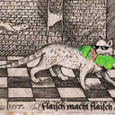
After getting feedback and showing the first draft of my logos to the class and seeing what others have, I have a lot of new ideas. For the wolf logo I started with, I want to incorporate more than one wolf after hearing the comment about the fact that wolves travel in pacts. I also think for me going simple is better because I get a clearer understanding of what I'm trying to get across to audiences. One problem I'm facing is trying to figure out what I want to do with my type because after customizing it for the first discussion, I keep hitting a stopping point as to how to continue and what else to do with it. It doesn't help that the words are very long and so I'm trying to figure out how I can manipulate the letters to make them seem related to wolves on the aesthetic that Connecticut gives off. My other idea/problem is that there are also two other people going the route of a wolf logo and I know everyone's logo will be different but now I want to go another direction and I think I might explore my other logo idea which had to do with a turtle. I really want to try and make the logo as original as possible and I find it hard when two other people are working with the same animal and the same type of ideas for sketches and things of that nature. I worked a little bit on making a logo incorporating the pact idea so I'll add that picture.

0 notes
Text
Blog 10 Typographic Design One
I kind of forgot about the blog this week and I'm also posting this later than 9 but I figured I could talk about the logo sketched I put up on basecamp. The first sketch of the wolf I really enjoy but after seeing some other people going in that direction kind of creating the same look based on the Mohegan's connection with the animal, I'm trying to expand my ideas and think of how I could develop the second or fourth logo I had. The second logo in the wolf's footprint with a river flowing through it connecting the Mohegan's name "the wolf people" and the meaning of Connecticut, "long tidal river". The fourth logo I sketched out to bring to life the idea of the grandfather turtle which holds an important place in the Mohegan tribes symbol and history. When I was sketching these logos out, I had to remember the tips we were given about making logos and how your first sketches should be drawn out in pencil and pen and not on the computer. I remembered that in time because I was getting too in my head to make something really great on the computer instead of getting back down to the basics and just drawing whatever came to mind first. That's one of the reasons I love the beginning levels of creating something artistic, getting down to the basics and just being with the creative mind that sits inside your head. I've learned over time and from a couple books that the best way to sometimes come up with ideas is to just sit in quietness and let all the things you're thinking about flow through your head. It's kind of like meditation in a way where you let everything flow like a waterfall to help you come up with ideas.
0 notes
Text
Blog 9 Typographic Design One
The team I chose for this project are the Connecticut Sun. When I began my research, I started with looking at what has changed about the team in recent years including their logo and where they were located. The team had a different logo for about 17 years before changing to the current logo and originally, the team was based out of Orlando and called the Orlando Magic. I eventually expanded my research and found that the team is owned by the Mohegan Native American Tribe based in Connecticut. I really started basing my research around this tribe, their history in the state of Connecticut, and how they could have an impact on their basketball's team image. Currently, the team name, the Sun, is used to represent the idea that every sports team and fan base need light and energy flowing through everyone involved to really bring the atmosphere to life. I don't think the use of the Sun in their logo and name makes any meaningful connection with nature, the Mohegan tribe, or the state in general. Once I did some research into the tribe, I started coming up with a couple new team names. These are "The River Wolves, "The Turtles", or just "The Wolves". I came with "The River Wolves" as a mix of the name Connecticut, which means "beside the long tidal river", and wolves, which is in reference to the Mohegan people, whose name stands for "The Wolf People". I decided on "The Turtles" because in the Mohegan Tribal Symbol, there are four domes that point to each of their cardinal directions and they represent the back of the Grandfather Turtle. In the Native American culture, the 'grandfather turtle' is the representation of truth in the seven grandfather teachings. The turtle was present at the time that Earth was created and on it's back, carries the lessons and teachings of life. I thought diving into the history and story behind the Tribe that owns the basketball team would be good because the Mohegans are the first Native American tribe to ever own a pro sports team and that is a very important part of the story of the team.

0 notes
Text
Blog 8 Typographic Design One
Reading through the textbook for this week's reading, I'm finding it very interesting to see what is done when editing hard copy. All of the notes on the side such as putting a dash through an upper case letter to make it lower-case and even the note they make about not using post-it notes because they could fall off are things I didn't realize had to be done for almost every published piece of work I have ever read. Not that I never thought about it actually, but more thinking of the scale and length of time it really must take to write and get a book on the shelves or even making a dinner menu with no mistakes like that. I love the advice they give at the end and one of my favorite ones is "it's easier to talk than to listen." I just like that so much because I find it applicable, like the other points they made, to every thing else in life, not just in the design world. It's nice seeing advice and reminders in places like a design textbook where you wouldn't think you'd find any advice like that. I'm adding a picture of my 6 pages from the letter project because I really enjoy how mine are turning out compared to where I started when we submitted the first three pages. I was intrigued when we were presenting because I thought my thought process was different from every one else when it came to things like color choice and just not making the design of the pages for the 2 letters the same. Each letter gave a different feel so I wanted to make that apparent. Each letter's name and color choice was made based on something going on in my day to day, whether it be the color of the music album I keep listening to all day or a character from a movie, show, book, or any other piece of work that has been on my mind recently. Those are the things I was thinking about when designing the pages because they gave me good starting ideas and then I really tried to build off of everything from there and I think it came out nicely. I took out the borders on the first three pages and I do think it gives the look of the six total pages a better feel and doesn't feel as restricting, which is good especially after hearing feedback for everyone's project and what could be changed and fleshed out more.

0 notes
Text
Blog 7 Typographic Design
For this weeks reading, the content is what we talked about in class recently regarding the anatomy of type and the size of letters. Even when we talked in class, and now doing the reading. I always find the little parts of each letter and the fact that they have a name amazing. I really like the descender on the y for some reason because it's very peculiar to me. I found it interesting when they talked about Humanist letter forms because we are learning about naturalism in sculpture made by Greeks and how their sculptures differed from that of Egyptians and I think the humanist letter forms immediately made me think of those topics. I always have a head time wrapping my head around the fact that it wasn't until the introduction of certain technologies that we were able to do certain things. I have been alive for really all of the major technological developments that have made our world kind of what it is today, but to think that many of my teachers and my parents were around for the rise of the desktop computer, which would have made type more accessible, sometimes my mind is blown by that. Getting into the mood board for Fernando, I went into it looking up every single thing that I wrote in my notes from our classroom discussion. I wanted to make the mood board well rounded. I know I could have heavily leaned into the gothic and dark aesthetic, or the skater aesthetic, or the weird creatures in video games aesthetic but I really didn't want to do that. Knowing myself, if I was the one people were making the mood board for, and had asked me all the questions we asked Fernando, I would love to and want to see some variety of everything we talked about. So that's why I structured my mood boards into different sections almost because I think having a little bit of everything he talked about is what's going to interest him and give the most options for continuing with the branding. I was happy when I saw my mood board was different from everyone else's that was shown before that. Not that I think it's a bad idea to lean heavily into one thing the client talks about and loves but there's a reason they answered so many questions and talk about so many things. It's not just so we as the designers can go and ignore everything that was said and only stick to the more popular option. I'm adding my second mood board because I resonate more with that one and I think I made it more aesthetically pleasing and diverse in the content that's on it. Funny enough, the second one is the one I spent maybe 20 minutes on.

0 notes
Text
Blog 6 Typographic Design One
I don't know how I got off track but the reading I talked about last week in my blog was technically the reading for this week and I didn't realize that at all. I don't want to mix up the weeks and keep going a reading ahead. I do have a lot of thoughts about this project and designing the letters that I want to talk about. When I was drawing out the sketches for this project, I couldn't help but think that everything I was drawing was a bit bland and I wasn't combining enough and that other people would have more creative sketches based on their previous work I've seen and the examples that were shown in class. I shouldn't have thought like that because one thing I read recently that I think can apply to all aspects of life and especially the creative side of each and every one of us is that "no one can beat you at being you." So whatever you think looks good and whatever works for you when designing something, make it your own because no one will be able to compete with that. Your ideas are an extension of you and no one can be better and being you than yourself. One thing I've enjoyed about this class more than the Design Technology and Concepts class I took last fall is that this year we've had the opportunity to work our way up to using Adobe Illustrator and develop a base of handwork, creativity, and crafting skill. That wasn't the case last fall. I felt like we were just thrown into Illustrator and that was that. I did enjoy using it but at a certain point, I got kind of worn out from using it and felt like it was just go, go, go with creating and fixing things in the software. I love how my art classes this semester have been going hand in hand with each other and what I'm learning from them. My drawing 230 class, I focus a lot on detail and blending things together to make a smooth, seamless look. In my 3D design class, there's a focus for me on taking time while also being careful when working with your tools. And I think those can all tie back into this class because there needs to be close attention to detail, cautiousness when using your tools, for your own safety and the composition of the project, and these all come together to make whatever you're working on look smooth and seamless and very presentable for whoever you're showing it to. I'm adding a picture of all my sketches because even though I narrowed it down to two choices, seeing all of the ideas that go through the brain is sometimes the most interesting part.

0 notes
Text
Blog 5 Typographic Design One
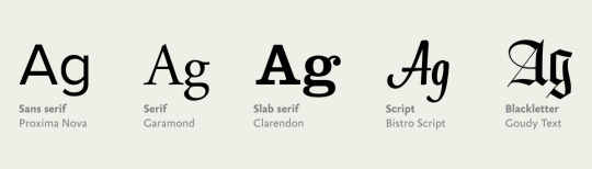
This weeks reading is about kerning, tracking, line spacing, and alignment. One thing I find interesting when they provide examples, and we talked about it in class, is justified and ragged left/ragged right. I've never taken the time to notice in any journal, or articles written that everything is justified until that point was made in class today. The examples in the textbook look so funny when the entire paragraph is spaced out with rivers flowing between letters and lines and the other paragraph is perfectly spaced out yet ragged right with a weird wedge shaped being created. I like that they refer to these as type crimes too. All of the textbook's examples of type crimes I find super interesting and helpful to have an idea of what not to do. I see that you should never stack lowercase letters vertically because it is awkward and the spacing appears uneven. The new project with creating a new letter sounds very fun to me, but I've realized when I learn about new projects, seeing student examples is a double-edges sword. I get a clear example of what I should be working toward and seeing what a completed project looks like. It also overwhelms me because thinking about getting to the final project and final look just stresses me out to a point that is not good for me, and I really need to work on that. Something I've also realized very quickly and just from this morning is to always make sure your work is in a dry place when coming to class in any kind of bad weather. My bag was kind of wet this morning from the rain and I made sure my project was fine, which it was, but other things were wet. I got very lucky and want to make sure going forward now to always make sure my work is in a safe space. I am adding a picture of the different typeface classifications from a picture I found on the internet. I never new there were classifications for types until class on Tuesday and I found it very interesting because I've always thought text and different fonts can be larger than life and hard to comprehend how it all works sometimes. I found it helpful that there are classifications for all the text we see.
0 notes
Text
Blog 4 Typographic Design One
This weeks reading has to do with text, and there was a line at the end of the first page that I read over and over. It says "Although books may define the purpose of typography as enhancing the readability of the written word, one of design's most humane functions is, in actuality, to help readers avoid reading." Its funny to me because as I read the book we have for this class, I love the pages that give examples and don't have a page long paragraph to read, and when the text does come up, I'm not hesitant to read it because the people who made the book basically gave us a break before starting to read. "Typography manipulates the silent dimensions of the alphabet, employing habits and techniques—such as spacing and punctuation—that are seen but not heard." I think that statement perfectly sums up what text does to a reader whether they are reading for pleasure, for a school assignment, a speech in front of a group, or any setting in which they have to read. What they are reading they can translate to written word so easily because how you say everything is already written down in that way. This week we had our grid project due and while it was a little stressful piecing together the magazine cuts, it was a nice change of pace from the 9-square project. Creating the grids and using magazines I really enjoyed because it felt so artistic in a more special way than the 9-square project. I'm excited for assignment 3 (because I get to use my new light table that I ordered for the first time) instead of taping my paper up against the window in my apartment. While it seems like a labor intensive project, I like that it's smaller materials if that makes sense. Instead of a big board and a thousand other sheets we have to cut, everything we need is in the packet we got, and that's a nice refresher for the next week. I'm adding a picture of the three grids from this week. I think my favorite is actually the experimental which is surprising because it's the one I didn't plan on making but it just eneded up that way.

0 notes
Text
Blog 3 Typographic Design One
It was so nice having all the pieces come together for the first project as I put down all the squares down onto the black paper. Putting pieces down was stressful in the sense of being so precise with your hand movements and spacing and if you messed it up, really the whole thing would seem off. The most simple part of the project actually took me several hours to complete. Seeing everyone else's project too was really cool. When I saw everyone's 8th and 9th square, I couldn't help but think wow, they put more effort into those squares than I did. I don't know why I did that because I know I handed in very good work. It just so happens that Christian Bale as Batman isn't associated with the most extravagant colors or designs. I also enjoyed Thursdays class a lot even though it was a lecture. When I learn all of the small, yet significant rules about type, I think to myself "wow I never knew that, that's really interesting." The second project sounds interesting and even though it will be simpler than the first, it actually stresses me out a little more because of the tight deadline. When I have a tight deadline for any project, no matter the difficulty level of the project, I always worry more because there's less room for error and I can't go back and fix or change or redo many things. With the 9-square project, if I messed up a cut or needed to change anything, I had plenty of time to do that and it didn't worry me. With the second project, the task is easier but I do something wrong with it by Tuesday, I only a little bit of time to fix it before it's due on Thursday. I didn't know if we have a reading this week because it didn't say it on the calendar but I started reading next week's and already I'm confused because it talks about the golden section. It says the golden section means: side a is to side b as side b is to the sum of both sides. I haven't fully wrapped my head around that to understand it yet. I really appreciate how many pictures and references the book provides so you can see what they are talking about in the paragraphs. And I could not stop thinking about now what kind of grid the textbook we are using is laid out in. I assume it's column for some pages, modular for others, and manuscript for some. The picture I added is a photo of the keyboard shortcuts I looked up for adobe illustrator. Even though I've used illustrator plenty and have been trying to memorize all the shortcuts, it still baffles my mind how many shortcuts there are for really everything on a computer, and especially how they all differ for all the adobe programs.

0 notes
Text
Blog 2 Typographic Design One
I'm going to start by talking about the reading for this blog. I absolutely love when I read "A frame or pedestal elevates the work, removing it from the realm of the ordinary." I think that is so interesting because when I was working on the portfolio I submitted in the spring, making it in InDesign would have been impossible without creating a frame and borders for the work to sit within. A frame gives the work and type a presentability that couldn't be achieved without it. I really like that the book has small red quotes at the bottom of most pages. I resonate with short phrases that hold such powerful meaning and one page reads "Typography is mostly an act of dividing a limited surface." It's so simple and so true because if you just put text onto a page with no awareness of the space, it's going to look like a big blob. I find it shocking the Web's inventor, Tim Berners-Lee, never thought his invention would be such a design oriented part of society and our world. Work this week for class was very much xacto oriented for me. I learned that all my measurements were off slightly on Tuesday and I knew I could easily fix the three squares by cutting new ones. I was a little more upset with the already cut faces in the high contrast, low contrast, and texture ones because those took so long that I just don't want to recut them and would rather just get whatever points off I'll get for having the measurements off a little. Making the 9th square last night was so rewarding and refreshing because I didn't have to look at Christian Bale's face was drawing or cutting. I have gone to Staples so much to make copies, and last night I made a very good square with color for the 8th square, until I realized that I cut the wrong mark and made one side 3 inches instead of 4. That was very frustrating because I realized I'd have to go make more copies again. One thing I'm learning from this project is to always have enough of what you need in case you make mistakes and have to re-do anything. As much as I love my major and art in general, I haven't been able to identify what I enjoy the most. By that I mean, I have things that take me away from every form of art and every class I've been in. My concentration, graphic design can get to me sometimes because I don't love being in front of a computer for that long, my classes that include painting drive me a little crazy because paint is one of my least favorite mediums. And in other classes, I sometimes worry too much about the requirement for having all this equipment that I'll need for each project. I don't know, all these things are constantly on my mind so it's nice being able to type it out.

1 note
·
View note
Text
Blog 1 Typographic Design One
The first week of classes and work for me has been a mixture of emotions. When we started this project, I started thinking "Ah, this'll be fun and simple". I was wrong. It is fun, but in no way, shape, or form is it simple. At all. The first three squares were fun to make as I taped a piece of tracing paper and the original on the window of my apartment and started drawing. Finding the details in the line drawing and the negative drawing became less fun as my hand and shoulder started cramping for holding up my pen for so long. And the fourth square, frightening me to the core that I have to make a square like that 2 more times. Just like it seems unfathomable to run a marathon after struggling to run 8 or 9 miles, making 2 more squares similar to the fourth blows my mind. That being said, I'm very happy with how the fourth square came out. A few minor tweaks I'll have to make but overall I think it looks very good. From afar, it looks even better and cleaner. The amount of trips I'll have made to staples and Michael's by the end of this project will be astounding. I think already I have spent a total of 2 or 3 hours standing over the copy machine in staples, trying to figure the sizing I need for the copies and looking up on my phone how to use a proportion wheel (even though I don't have one with me standing at the copier). I was able to find an online proportion wheel website, where I put in the dimensions and searched for the right size I need to make the copies so they would be a 4x4 square. I will add a picture of all 4 squares and where I have gotten to with the project. With the reading, already within the first two pages, I have never known some of the information I've read. I didn't know many of the typefaces we use today are named for printers from the 15th and 16th century. It's also interesting that certain people argued letters should reflect the perfect human body, especially considering all the different typefaces we have in the world today. I love how long typefaces have been around, from early calligraphy to the advent of computers and to now when businesses each create their own fonts to authentically distinguish themselves from everyone else.

0 notes
Text
Arts 102 Reflection
Thinking back on this course, there's just so many valuable lessons to be learned. Whether it's learning more and more about adobe, learning how to go through a creative process to come up with new ideas, or how to give and receive feedback from your peers. This was my favorite class I had this semester. Not only was it the class where I enjoyed the work I was doing the most, it was also the class that felt most personal. I was able to put so much of myself and my life into my projects as well as being able to learn and hear about my classmate's lives and their personalities. Having a class like that in college is special I think, especially with how many students at school are in such huge lecture classes where they don't even know the name of the person sitting next to them. I loved the progression of the projects. I think the pace of the work I was putting out was in line with what was being asked to be completed. I never felt like there was too big of a jump between the projects and what was being asked of me to make. The blog posts were a nice way to keep me on track with what was going on in each project. They reminded of what point I was at and where I needed to be by the next class or the next week. Having a class utilizing adobe with a teacher who cares about his students and what kind of work they want to make is amazing. I had a class like that in senior year of high school and it was my absolute favorite. Overall, I think this course did an amazing job at helping me develop skills working with adobe that will serve me well in future classes. This class has also helped me immensely when it comes to creating original ideas and working through every idea you have, whether you like it or not. You may not even like your finished product, but as long as you keep building on the ideas and designs you've already made, that is what's important.
1 note
·
View note
Text
Blog Post 6
It's interesting how it felt like all the projects came together in the end before the final. Project 6 looked at a different side of design and I have to say, it was more satisfying than I thought it would be. Considering how much creativity went into every project this semester, it was so cool seeing how it all came together for me while I was breaking down every aspect of the item (a watch) I chose for the syntax and semantics project, how I thought about each watch's denotations and connotations, and how each watch differed from each other in a specific way. It was also relaxing that the deadline for the project was shorter than all the others. Considering how much work went into every other project, some weeks there was just looming work hanging over my head while I would be trying to accomplish things for other classes. With project 6, it was nice to have just a week turn around to submit it. With the final project here, it'll be fun to see the catalog of work I've made all come together.
0 notes
Text
Blog Post 5
Project 4 has been a fascinating process. Going through a creative process for creating logo ideas is very draining. It takes a lot mentally to consider different ways shapes work together as well as how they can be shrunk with the effect of still drawing the eye. I find this project to be the best practice for my work and what I want to do with my major. I hope to make either logo designs or t-shirt designs for a fitness company. Going through the process of creating multiple sketches in the concept matrix and then expanding on those made me think outside the box about how different shapes and objects can work together to create a compelling piece of art. Putting that work into Illustrator, I'm instantly drawn to adding color, but I can see why we create a black-and-white logo of work instead. Understanding how a black-and-white logo works well with other companies if you were at, for example, an event that has many different sponsors is effective for all logos working together to create a collage. I'm also a big fan of simple artwork and logos have to be simple and effective so that the public can recognize them and utilize them. With that being said, I've learned that logos are a different kind of simple. You have to think about the characteristics of what you're creating the logo for, because that will drive what you emphasize in the logo.


0 notes
Text
Blog 4 Arts 102
The ending of Project 3 was a stressful one. I learned that no matter what you think of your project or how much you think you like it or not, always save your work to your computer. I lost it but had it recovered, and it was just such a stressful process. The ending result of the project was very good I thought. I love hearing everyone else's feedback because I start easily realizing little things I can tweak in my work that I never would've seen on my own. The 4th project is right up my alley: choosing two of my favorite movie characters and making a logo for them. A couple of days into the project and I love how it's not what I thought it would be like. Having to think about color, size, readability, simplicity (for my own liking), and small aspects that go into making a logo is so interesting and rather complicated. It's a completely different entity than just making a piece of art like you normally would. Thinking about it's relationship to where it will be (e.g. shirt, poster, charity event poster with other logos, etc.) is making me reconsider how easy I think it is to just come up with a design on a whim. Having a piece that will be recognizable and easy to replicate as a single color, on different items, and overall just memorable to is very thought-provoking. I kind of love it.
0 notes
