
otherworidlysoul-blog
artisan
15 ; an art who makes art
80 posts
Don't wanna be here? Send us removal request.
Last Seen Blogs

odettenicolettes
𝒐𝒅𝒆𝒕𝒕𝒆 𝒏𝒊𝒄𝒐𝒍𝒆𝒕𝒕𝒆

bizarrepatrivrch-blog
Blog by

bizarreharlequin
Bizarre Harlequin


superjeango
SUPER JEANGO
Photo

it’s really late but this is for inktober. i never complete that. surprise.
3 notes
·
View notes


Photo

drew the lovely Gabriella Brooks 🌹 (watch me improve)
#gabriella brooks#gabby brooks#art#drawing#model#female model#fashion#the 1975#matty healy#matthew healy#matthew timothy healy#gabby brooks daily#coloring
12 notes
·
View notes
Note
hi idk if you will see this but i really wanna be a better artist but i couldnt do the shadowing for digital art. do you have any techniques?
Hellooo! Thank you for your question~ ^u^
I guess for me when it comes to shading, I always make sure I have lots of references to draw from if I’m ever unsure. When I shade, I guess I think about the light itself first. I think about the colour of it, where it’s coming from, the intensity or diffusion, and things like that.

I’m sure you’ve probably seen this guy absolutely everywhere - using the colour wheel you can pick out complementary colours (the ones opposite each other) to help with realistic light and shade. If your light is, for example, yellow-toned, the shadows in the image are going to have a purplish tone to them. Or if I draw something with a golden/red/orange toned light, the shadows will look cool and have slightly greenish undertones.

This is just a commission I did yesterday but I think it’s an okay example of this - the light has warm purple and red tones, but the shadows on the underside of the arms have cool green/yellow tones.
When it comes to light and shade, your light (if it’s sunlight) will usually have a warm tone, and the shadow will be cool. So shading is less about difference in values (how light or dark something is) and more about the temperature (the tone) of the colours.
What might help is making a big-ass folder of lighting references to keep for when you need them, and maybe use the colour-picker tool and swatch all the ways the colours and tones change depending on the light.

Or, in this image here, I think the paler portions of the face have a higher colour saturation and are warmer in tone (yellowy/orange/pink) and the shadows are slightly olive green.
Also if I’m struggling with getting the impression of light, or I want to add something extra to a piece, I nearly always pop an overlay layer on top and add a bright colour. I blur it, lower the intensity a bit, and just go over where light would fall. I used an orange one up above, and I just dig the effect it has.
There’s also this guy on youtube who does some really fantastic videos on shading - I think he nails it. He always has really awesome hue variation in his shading of the human body, and also has some really informative anatomy videos too, if that’s your bag.
I hope this helped! Thank you so much for asking
36 notes
·
View notes
Photo
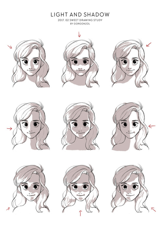
20170226
Drawing Study of February - Light and Shadow
118K notes
·
View notes


Photo

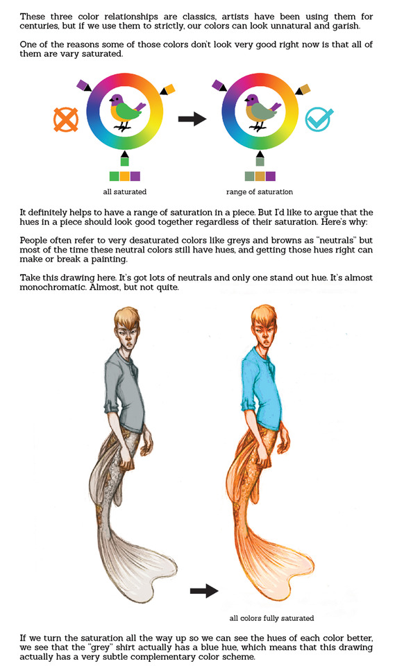


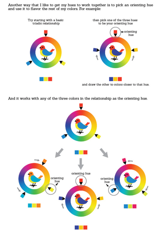


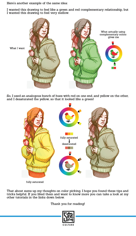
Color Tutorial Part 4: Color Picking and Palettes
Part 1 : Value - link
Part 2 : Hue and Saturation - link
Part 3 : Saturation & Color Mixing - link
Part 5: Digital Coloring Method - coming Feb. 22nd
Other Tutorials - link
Twitter | DeviantArt
75K notes
·
View notes

Photo

Me // The 1975
Oh I was thinking about killing myself, don't you mind
I love you, don't you mind don't you mind
[photo is not mine; the edit is]
#the 1975#the 1975 lyrics#the 1975 me lyrics#the 1975 me#me lyrics#me#matty healy#matthew healy#adam hann#ross macdonald#george daniel#art#lyric art#song lyrics#aesthetic#purple#violet#purple aesthetic#violet aesthetic#band lyrics#gif#8 bit#8 bit art
26 notes
·
View notes


Photo

Head.Cars.Bending // The 1975
Drink, fuck, spew
Telephone you
If you're alone in your room, what's that boy doing?
[photo is not mine; the edit is]
#head cars bending#the 1975#matty healy#matthew healy#matthew timothy healy#adam hann#ross macdonald#george daniel#the 1975 edit#purple#violet#purple aesthetic#aesthetic#8 bit#8 bit art#violet aesthetic#gif#art#song lyrics#lyrics#lyric art#the 1975 lyrics
209 notes
·
View notes


