
Statistics
We looked inside some of the posts by outofthemundane and here's what we found interesting.
Average Info
Notes Per Post
0
Likes Per Post
0
Reblog Per Post
0
Reply Per Post
0
Time Between Posts
5 days
Number of Posts By Type
Text
10
Photo
7
Last Seen Tumblr Blogs


Fun Fact
The average Tumblr user visits about 67 pages every month.
Text
Here is the adobe link to my magazine
https://indd.adobe.com/view/ef1e7c3d-6043-4720-8a4b-90b3ac7391de
p.s let me know if there are any issues with the link.
Also Happy Holidays!
0 notes

Photo


Here is my work in progress. In my layouts I used some grid deconstruction (pg 138 textbook) to create illusions in my work. These specific angles create shapes that appear 3-D even on a 2-D surface.
0 notes
Text
https://indd.adobe.com/view/4f57beaf-72bf-425d-802c-a54f75b06c33
Here is my work in progress from last week. I presented it on zoom in class using screen share. If there is any problems with the link please let me know.
0 notes
Text
2 Proposal Ideas for Magazine
Option A: LGBTQ+ Fairy tales
1. The content of this magazine with be a series of short stories about LGBTQ+ individuals. There will be images that will be created and modified that will be spread out throughout the work. These images will show images of for example two kings together, or a different archetypes than the more common heteronormative fairy tales most of us have grown up with. My inspiration is related to my Portfolio project 1 where i will be creating a story about LGBTQ+ family dynamics.
2. The format of my magazine will be print based, as i prefer to read on paper in comparison to reading on a screen. This format will be effective because of the details of the work, the work will be converted to CMYK which is important for print. There will be a minimum of 300ppi resolution. The magazine will be 8 x 10.5 inches. There will be matte lamination and it will be printed double side. There will be a 14PT satin cover, the type of paper will be 100lb/200m Satin paper. The book will have allemade binding and the binding will be on the longer side. The approximate cost before taxes for two copies will be $116.10.
3. I was intrigued by the Intuitive, Relational and Conceptual layout strategy in the textbook “Making and Breaking the Grid” (Second Edition Updated and expanded: A Graphic Design Layout Workshop by Timothy Samara). What i appreciated about this layout format was that the writing was very clear and legible, and that is it a strategy that depend on chance for their outcome. What timothy Samara implies by this is that this layout is more instinctually and has a bit more room for the artist’s choice of the visual arrangements for their magazine. (pg 150)
Option B: Fitness Do’s and Dont’s
1. My magazine would be about the Do’s and Don’t of Fitness. My inspiration would be one of my all time favourite shows “Supersize vs Super-skinny”. This show is from the UK, therefore i watch the episodes on Youtube. When you watch something from outside of the usual “Canadian” television, it offers a different perspective on what is appropriate in their culture. In the show we follow british physician Dr Christian Jessen who makes opposite sides of the weight spectrum exchange diets. The aspect of the show i want to incorporate into my magazine, is the way that sizes are completely thrown out of proportion. There would be articles about training and dieting and images of food in portions that are astounding.
2. The format of this magazine would be online. I would use the web with the square dimensions of 8.5 by 8.5 inches. The techniques i will be using will be the colour effects on photoshop, I will either use Adobe illustrator to draw my foods, or draw then manually and use image trace. This method will be effective because the juxtaposition of the food in contrast to the background will make the work stand out. The unusual layout is what will either attract the viewer or confuse the viewer. In either situation, the viewer will feel something about the work, which is where i would consider it successful. The moment an emotion is felt about your work whether it be good or bad, that is when you know you have fulfilled your work as an artist.
3. For the layout for the fitness magazine, i was interest in possibly using Pictorialization and Metaphorical Allusion. This layout strategy was compelling to me because ultimately the layout becomes a type of illustration that is relevant to the text. The layout would amplify meaning to the text by guiding the viewer with a visual representation of the narrative. For example if i talk about the effects of over eating, it would make sense to have excess food, or a huge mouth. This technique basically uses imagery as a way to enhance the meaning of the text.(pg160)
0 notes
Photo

Design project.
The form of my Floral Hybrid Chameleon is unique because of its composition being uniquely made from metallic wires. By using the adobe illustrator software i modified an image i had of the finished product, using image trace. I then added some tips that were missing. To obtain the black background on an originally white surface was difficult.Ultimately to get this result I put the outline black and inverted the colours. I then added a white neon one effects on the outline of the animal. To make the content more symmetrical i made sure that each white line was the same length and that the letters were all the same size and typewriter font. I redesigned the original sizes when making the diagram to make them proportional to each other. They are not drawn to scale and given descriptions which shows a much closer perspective to the viewer. I also added colour to the diagram, this way it could connect more to the finished product. By merging an animal and flower this redefines the meaning of the entities. What i am implying by this , is that a flower is now intertwine with and animal meaning it now possesses stronger qualities instead of being just a delicate plant. In regards to the animal, which in this case would be the Chameleon, it takes an existing quality (the ability to blend in with surroundings) and elevates on another level with its new flower properties.
The form of my work went for a 3-D dimensional sculpture, which i then transformed into a 2-D diagrammatical work. In sculpture, it is often difficult to spread your work online as the perspective may differ in the form of a photograph. The effects are more grand in an in person demonstration, however with the content that i produced, i believe i was able to convey my work adequately.
0 notes


Text
Future photographs will be taken outside to show the work in a much more natural light and background


#design
0 notes
Text
Process


After much contemplation, I used wires to create a hybrid flower/chameleon. I used the x and y axis to calculate the location of the wires. I used this method because once the wires were in place it moved the paper the sketches were on, therefore after realizing this I created graphs In order to make sure i would stay on the right path. My Chamelon flower hybrid can be viewed as a type of superhero. In the diagram it includes descriptions of some of their unique qualities
0 notes
Text
Redesign project


Materials used:
Krylon "short cuts" spray paint (blue, black, green) cost $5.99 per can at Micheals (i spray painted white roses black)
Green sand ( $1.50 at dollarama)
paper flowers ( $2 per pack, $8 total spent)
-----------------------------------------------
items/materials with no cost:
Super 77 Spray Adhesive
Newspaper
oil paint ART STUDIO by Battat
frozen dirt (smashed onto canvas for brown colour and textures)
leaf
rotting rose and rocks
0 notes
Text
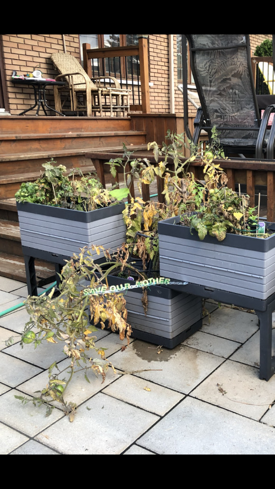
Design project Redesigning Nature


The process + inspiration photo
#design
0 notes
Text
Redesigning Nature

For my project I wanted to incorporate trees as a body. The roots and branches would be lungs and the heart (What keeps the tree alive would be the wooden structure keeping it all together). For the realization of my final project i was thinking of making a papier mâché sculpture or painting. The second aspect of the work would be the layer beneath the soil of the tree. This would add more depth of field (even for a 2D work) because it would show the connotative meaning. The second element would be the soil itself. As a second option I wanted to test the consistency of dirt. My plan would be to take a montage of photographs and incorporate soil in a new fresh perspective.
0 notes
Photo

For my design font project, i created a font called Ecostem. In my rough work prior i had made an alphabet inspired from various aspects of our ecosystem. I had looked at each letter as an individual piece and did not see the bigger picture. I was satisfied with my work because i had worked hard, i valued my design, and i thought it was something original. After hearing some feedback, i begun to analyze my work, looked at some font projects and decided to change my approach completely.
My initial ideas were inspired by Claude Le Blanc’s work Printemps. The green boat truly stands out in this beautiful painting. The nature of how I wanted to incorporate “electric wires” was from thinking about a fishing dock, with immense storage containers. These storage containers are used for transportation and businesses rely on their productivity. Most of these businesses are not run in the most eco-friendly manner, which is why I wanted to write the message “Save Our Mother” as a means of a rebuttal.
There was a particular “electric nature” look i wanted to create, which lead me to the usuage of green thin metallic wires. The green wires would represent both nature (the appearance of wire being plant-like) and electricity,(to take charge of making a change for our environment. I also used wooden letters and a piece of iron\metal. The metal was bendable which i found interesting since i could moves the letters at different angles. I chose to keep my colour scheme simple because i tend to over do it, and i wanted to try a new perspective and create a simplified but more dignified look.
0 notes
Photo

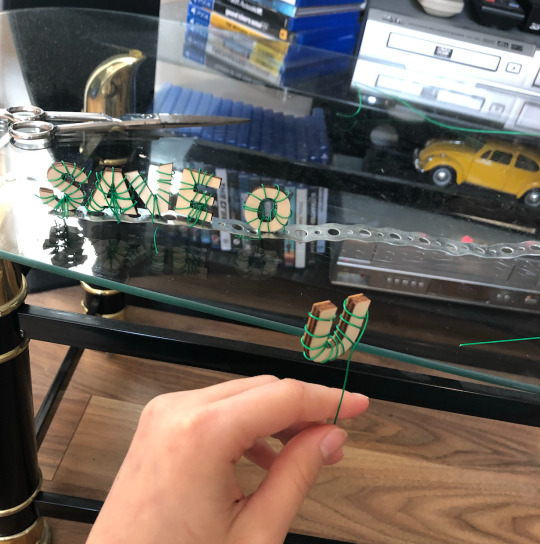


The process
Font Ecostem ( play on the word ecosystem )
(more details in next blog)
#mother nature #saveourplanet
#environment #design #font
0 notes
Photo

Rough draft of Alphabet font design. Inspired by nature and a colour theme from adobe (with a few exceptions)
#design
#alphabet
0 notes
Photo


My inspiration for my fonts was Claude Le Blanc’s work Printemps. This acrylique 24 x 36 artwork inspired me with the contrast in blue lighting with the background paysage. The artwork is priced at $2400 and the artist currently works at the gallery it was exhibited in. The gallery i saw this painting in is called Gallery MX in Montreal near Palais des Congrès.
#design
#canoe
#blue
0 notes