
Don't wanna be here? Send us removal request.
Statistics
We looked inside some of the posts by owenparrrk and here's what we found interesting.
Average Info
Notes Per Post
1
Likes Per Post
1
Reblog Per Post
0
Reply Per Post
0
Time Between Posts
2 days
Number of Posts By Type
Text
17
Last Seen Tumblr Blogs


Fun Fact
25% of US internet users with an annual income of $80-100K use Tumblr.
Text
Final Final Final

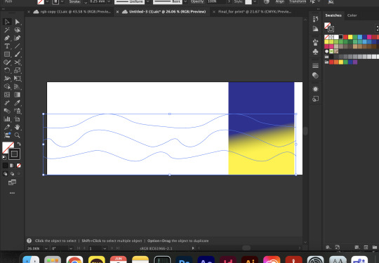
2.8 Rationale This design visualised the unique movement of the site of connection - Lower Albert Street bus stop. The unique movement includes the rapid and slow motion practised by passengers waiting for their buses and the people running to catch their ride. The dominant colour, navy, hints at the site as a bus stop, and the yellow highlighting suggests human energy within the site. The human energy may be interpreted as the noise from chatting or the number of people. Since Neue Haas Grotesk typeface was used to convey the neutralism of the site, the bold weights are used for the names and to deliver the static aspects of the site. On the other hand, the lightweight variations are used for numbers and to deliver the dynamic aspects. The key visual elements in this design, the wavy abstract lines, are employed to emphasise its continuous movement, making it possible to metaphorically represent the fluidity of pedestrians.
0 notes
Text

The final feedback from both of my lecturers helped me confirm my final design. They helped me address the strength of my work, making sure that I can finalise my design and take it to the animation.
0 notes
Text
Final design - final animation After investing a big amount of time sorting out the wavy lines, I was able to create looping lines with the numbers flowing in and out. The movement conveys the continuous flow of people at the bus stop. Ease-in and ease-out effects are applied to the rotation as well, making the movement of numbers smooth.
1 note
·
View note
Text
I successfully created a 4-second video of my lines looping. The speed of the lines sliding through is the desired speed - not too slow/fast. The next step will be texts looping as well as they are rotating and moving.
0 notes
Text
Lines development


To make it loop, the lines needed to be in a specific shape and angle in a seamless position. This procedure took a significant amount of time. Also, working with lots of wavy lines and aligning them for a long time gave me illusions every 30 seconds, which made me sick. What I've learnt from here is that I should work with fewer lines when I'm sorting the perfect position, then expand the lines later when this process is done. The other thing I've learnt is that I should be prepared to spend most of my day when I need to make something loop. Also the lines wouldn't blend as I wanted them to be which made my work much harder to do
0 notes
Text


Lines development
To make it look like moving and looping, I had to make it really long and duplicate it to join two paths together. This will help me convey the endless business of the bus stop and emphasise the dynamic theme.
0 notes
Text
Poster development

I tried to maximise the interaction between the lines and the numbers without making the line part too complicated, as it needs to be further developed in After Effects.
I replaced the texts because I thought using the bus stop name was more interesting, and the potential of the word "stop" to be a metaphor for "static" is powerful.
I deliberately used a heavy height on the number 3 as it is the first number of the bus stop number, because I had to build a hierarchy to make people read the numbers from the number 3. To reinforce it, placing it on the upper left was important as well.
I'm planning to make the numbers flow like what I did in the last After Effects experiment. To achieve this movement, I will need to make the numbers rotate as they change their position. I'm also willing to make it loop.
0 notes
Text
Week 9 feedback reflection


What's working - Text content - Colour (personal choice) - Typeface - Fluidity
What can be employed - wavy lines interacting with texts - Hierarchy
0 notes
Text
2.6 Motion graphic
The animated poster created for the BBC Reith campaign by the design studio Spin aimed to encourage the BBC staff to utilise the newly created typeface. This motion design introduces its range of languages, weights, and styles in a rapid transition of characters from the animation that looks like the English word “Global”, emphasising its ability. The clever choice of the word “Global” in a circle frame that will remind you of a globe effectively delivers its theme of internationality. At the start and the end, it slides in and out, creating a visual hierarchy and anchoring the attention on the type. The remarkable use of motion taught me that it is indeed functional.
0 notes
Text
Peer posters review

Interesting composition and placement. Strong use of typography with a bold colour scheme. The placement of horizontally and vertically aligned text contents forms a unique triangular shape.

Smooth composition with nice use of shape and gradient. The negative space allows the text to attract attention. Hierarchy allows viewers to read through the contents from the top to bottom, and it's effective.

Refreshing range of colour. Controlled use of texts. Interesting shape and the representation behind it. It gives a very calming emotion with the typeface. The placement of texts is bold with their alignment.
0 notes
Text
instagram
This animation visualises the typography of the word "metamorphosis". At the end, it says "변신," which is the Korean name of the novel, The Metamorphosis by Franz Kafka. The book delivers a disturbing fiction story about the protagonist, Gregor, who turned into a huge insect on a random morning. The animation conveys its theme of depression and isolation as it showcases a single character at a time. The black spray paint-looking texture makes it look grunge. The transition of characters is done by adding layers on each character, and the characters appear. Overall, it is quite literal and easy to understand without knowing the book, as it is focused on the keyword of "metamorphosis" and took it to motion graphic.
0 notes
Text

Maybe the final design - placement of texts can be fixed
Colours are fixed as I was working on CMYK & 300ppi doc to focus on the printed results. However, I found that my poster doesn't look the same as the digital work. So I made a separate document to work on RGB & 72ppi to create posters designated for digital upload purposes.
The weakness of my design was that the connection between the design and the site of connection was weak. This was reflected in the feedback from formative and my own reflection. To improve this aspect, my solution was to directly mention the site name. The other weakness was that the wiggly typeface was weak. Since it is not allowed to distort, warp, or blur the text, I struggled to convey the message of fluidity. My solution was to use different weights within a word, scale them small, and tilt them to apply dynamic placement.
0 notes
Text


Focused on the site of the connection by including words like "Stop #31986" and "Lower Albert Street". Lines and the typefaces are continued.
0 notes
Text
Still needs more development in terms of composition and placement. Movement of the wavy lines and the texts is to be carried on.
0 notes
Text
Poster exploration.


Focused on the keywords Fluidity and Static. Colours are chosen - yellow, navy, white.
0 notes
Text
instagram
Rapid positioning of the background element. Horizontally sliding texts. Easy in and out techniques make the movement smooth. The way it is zoomed into a painting and moves around, and it goes back to the first point where the visual is started, loops the video well. Unique use of hierarchy and composition.
Museum of Contemporary Art Australia
0 notes
Text
2.5 Critical Annotation

The visual strategies in this design are descriptive. David Moloney’s project targets struggling young designers, offering them positive assurance through motion posters featuring quotes from successful designers. Each verbs are visualised with a character beside it doing what each lines say to enhance communication. “Look closely” fades in and out, “Listen carefully” stays still, and “Learn continuously” loops. Overall timing of the movement is very smooth and flowing, comforting the viewers. Though not technically advanced, these motions interact effectively and reinforce the key words.The direct connection between word and movement is something I can adopt to refine my own work for the final.
David Moloney: MakingIt21, Ben Brookbanks from Multiadaptor (Copyright © Makingit21, 2021)
0 notes