
paarreeddessss
15 posts
Don't wanna be here? Send us removal request.
Statistics
We looked inside some of the posts by paarreeddessss and here's what we found interesting.
Average Info
Notes Per Post
1
Likes Per Post
1
Reblog Per Post
0
Reply Per Post
0
Time Between Posts
5 days
Number of Posts By Type
Photo
5
Text
10
Last Seen Tumblr Blogs


Fun Fact
If you dial 1-866-584-6757, you can leave an audio post for your followers.
Photo

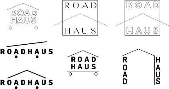
Because I’ve placed a lot of emphasis on simplifying the collateral, I’ve finally chosen my selected wordmark and applied it onto these business cards. I couldn’t decide which colour scheme worked best considering that the deep green and ashy blue compliments the brand identity so well, therefore I decided to work with both by having the two options for the front side of the card and keeping the back side, which contains the company director’s contact details, the same colours.
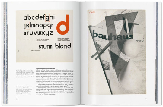
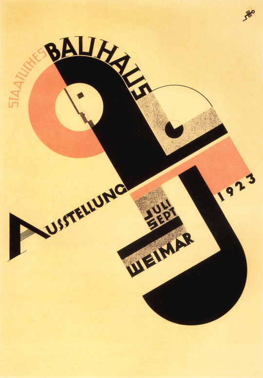
What I really admire about this design for a wordmark is the inclusion of the roof and wheels on the company name, and while I kept the interestingly on-going theme of German names/design principles obvious, the silhouette of the roof and wheels commemorates the Bauhaus (literally translates to “building house”) movement as a way to respond to the ‘timelessness’ of the brief’s requirements. Because the Bauhaus movement is such a grounded, well-respected era of design history, I thought that by adding in the design principle of “form follows function”, where geometric shapes meet their intended function for the purpose of an object (in this case, it would be the wordmark itself), I could then present the company’s purpose in a very direct manner.
0 notes
Photo


I’ve produced a couple of non-interactive, website prototypes on Figma to see how flexible the wordmark would be. Because my chosen collaterals would be to present the finished work through either a website prototype, invoice or business card, I thought that by starting with a website, the biggest idea could kick off the following smaller concepts. I played around with small details such as colour choices and how the blue and green works well with the monochromatic photo choice of a tiny house (this was sourced from Unsplash).
While desiging, it’s important to keep note of company origins and their context. The Kāpiti Coast is located in the lower North Island of Aotearoa, situated 50 km above Wellington. The area is known for its coastal beaches and tight knit community. I think keeping the collateral simple in its delivery perfectly matches the laid-back, tranquil lifestyles that are found in the area.
0 notes

Text
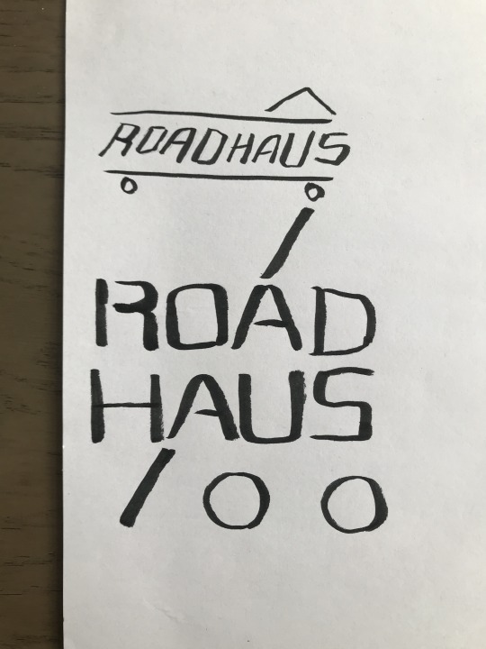
The ROADHAUS brief specified that the logotype should stand the test of time, considering that the owner Tobias Hausmann would like to pass down the business to his son, and perhaps for future generations within the family. Timelessness is quite difficult to predict when it comes to designing, since I’ve noticed constant changes throughout design trends all the time, which can be exhausting to keep track of. I’ve been thinking about including a spot colour as well, since I want to reflect the company’s ethics, nature and location (based in the Kapiti coast). Perhaps a natural colour would work best with the chosen wordmark, and sticking with colours associated with nature such as blues and greens. When I think of construction companies, I think of jarring, ‘hyper-masculine’, and saturated colour schemes. Because the tiny house industry is quite adjacent to other construction company conventions, its alternative edge could suit a more subtle, softer look that aligns sustainability values.
0 notes
Text
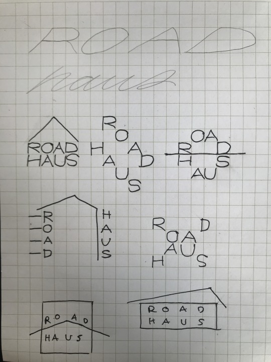
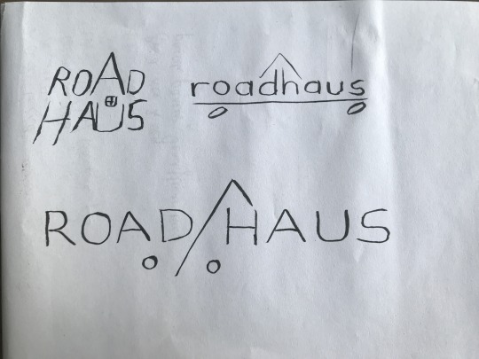
Drafting the wordmark

The first set of concepts adapted from paper to digital.
0 notes
Text
Sketches with a grid
The following sketches were conceptualised using grid paper since I wanted to see if I could make a wordmark that was symmetrical and adheres to simple, not overtly complicated design principles. I wanted to stick with angular typography styles that somewhat resemble or derive inspiration from the Bauhaus movement or Wolfgang Weingart. I also considered the methods that Experimental Jetset applied within their design processes while designing the Whitney Museum’s graphic identity, and how the ‘W’ is a responsive and flexible form of typography.
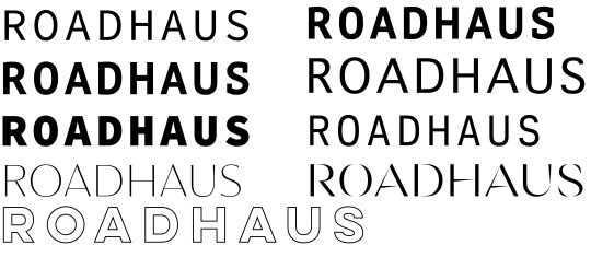
Now that I’ve got a grasp on a couple of ideas to work from, I think I’ve come to the point of deciding which typeface I could use to coincide with the wordmark concepts/arrangements. I’ve already decided that my chosen form of collateral to present my wordmark would be either in a form of a brochure, invoice template or business card. The reason being is that a tiny house on wheels construction company would need to use formal ephmera in order to function as a business, and the wordmark would be used quite frequently on these materials.
Below would be a couple of chosen typefaces that look best with the wordmark and ROADHAUS’s idenity - simple and robust.
0 notes
Text
ROADHAUS concepts
NAME OF CLIENT: ROADHAUS (fictional client)
TYPE OF ORGANIZATION:
ROADHAUS is a construction company that specialises in building tiny houses on wheels (THOW).
THOWs, unlike traditional houses, are built on trailers, partly for mobility and partly in an attempt to circumvent the high cost of building and resource consents, as some authorities treat them as caravans.
The company was founded by Tobias Hausmann in 2014 who, having 20 years of cumulative experience in cabinetmaking and residential-building construction, decided to switch to building THOWs in 2015 prompted by the growing problem of housing affordability across New Zealand. The company is a team of three: Tobias and two apprentices.
The building workshop is located in the Kapati Coast District and his custom-built THOWs, as shell-builds or full-builds, can be delivered anywhere in New Zealand.
BIG PICTURE:
What is happening in the particular market the brand is trying to enter?
The tiny house movement encompasses a variety of followers with differing values. Some followers believe in financial prudence (acquiring little or no debt), and some reject consumerism-driven lifestyles (small living spaces encourage material minimalism), some are eco-conscious choosing to live off-grid lifestyles. Some subscribe to all these values.
Additionally, for some, THOWs are thought of as 'stepping stones' into ownership of traditional houses, but increasingly, want-to-be homeowners are now seeing THOWs as 'forever-homes'. Because of this, tiny homes that were once humble in specifications are increasingly expected to accommodate for the modern amenities that rival traditional houses.
Demand for THOWs has been increasing steadily over the past 2 years due to the spreading of the housing crisis in urban centers into other regions across NZ. With the expectations of easing credit from low interest rates, property prices are expected to increase or stay level, and thus, demand for THOWs is expected to grow even further.
From increased demand, there has been a proliferation of tiny house builders across New Zealand and ROADHAUS requires a logotype that will stand out from other tiny house building companies.
UNIQUE PROPOSITION:
ROADHAUS is proud to be B corp-certified. It prioritizes the use of timber materials that have been sourced sustainability, and also provides the option for constructing with reclaimed NZ native timber upon customers' request. Additionally, the company balances social purpose and profit whereby all apprentices are paid a living wage. Tobias has actively seeked to employ apprentices from difficult or disadvantaged backgrounds. These are important company objectives as Tobias himself was once struggling and even homeless during the 1990s.
Despite the shifting demands of his tiny house builds to have increasingly high-spec fitouts, he reserves a quarter of his building projects for customers in the medium to low income quartile so that they are able to achieve a solution to long-term housing. The company believes that allowing people that have been pushed out of the housing market to live in secure, warm (double-glazed, properly insulated) and healthy homes for the fraction of the price of a traditional house is an important way of helping to alleviate the current housing crisis.
Craftsmanship is evident throughout all ROADHAUS projects. Under Tobias' supervision and expertise as a master builder, all builds are completed by him and his team on-time and within budget.
AUDIENCE:
As mentioned previously, customers/followers of the tiny house movement have been those that are environmentally-conscious and those that like to live simply with values that align neatly with values promoting minimalist and zero-waste lifestyles. But as the housing crisis worsens, the appeal of tiny houses is broadening into mainstream audiences. The brand identity will need to take into account this broadening of the customer base.
OBJECTIVE:
First and foremost, the logotype should transmit a feeling of sturdy assurance that THOWs are a good alternative housing solution for those that have considered this option but are still sitting on the fence.
Through its visual brand identity, the logotype should be able to encompass the range of subcultures that the tiny house movement encompasses and the broadening audience that the movement is continuing to capture.
The design should be able to stand the test of time; the brand should be able to age well (he is intending to pass on the business down to his son who is also a builder) so Tobias has expressed that trendy aesthetics should be avoided.
Additionally, the logotype will need to be applicable to a variety of collaterals such as the company website, social media platform, business card, work clothes and vehicle livery. Scalability of the logotype is therefore essential.
TONE:
The tone should be bold and dependable, while generating interest and curiosity. The given impressions should strike a balance between that of a bespoke company and one that is accessible.
TIME AND BUDGET:
Time: 30 hours in total
Budget: non-applicable
RISKS AND CHALLENGES:
The challenge lies in the logotype's design to balance the competing tones, objectives and its audiences to which it will target.
The design must recognize the company's roots in being borne out of a tiny house movement that valued a way for simple and environmentally-conscious living, while now taking on a larger brand identity of a broadening mainstream audience of middle-class households, retirees & downsizers.
Additionally, it is important for the design to promote the ethical values that drive the company forward such as environmental sustainability, its belief for lower-income households to have access to healthy, long-term housing.
TAKE AWAY:
In one word: 'Fun!'
-------------------------------------------------------------------------------------------
I’m very excited about the creative brief that I was assigned to. I love different forms of architecture as well as the sustainable approach that has become more popular when it comes to building materials, and tiny houses seem to fit that category. To start off my wordmark project, I’ve developed a couple of tiny sketches as a response to the brief. Because the brief requests a timeless, not-so-trendy vibe to the design, I decided to play with the concept of adapting subtle imagery of a house on wheels and a sans serif inspired typeface. Also judging by the company’s name and the owner, I’m assuming there’s some German-inspired design principles that could represent this too. I thought of incorporating Bauhaus elements to the look of the wordmark.
0 notes
Text
Experimentation on the grid
During the process prior to making my zine and poster, I tried having another go at working with the grid. The challenging part of this exercise was estimating the amount of squares needed to make the typeface I wanted for F. But then, slowly as I continued filling in more boxes, expectations didn’t matter after all. I think allowing the direction of where to fill in the next box to be based on intuition seemd to me a much more satisfactory process, because the shapes ended up looking a bit disproportionate. That’s ok though.

0 notes
Photo

Here we have a draft of what my poster might look like. I love yellow appears dynamic and in-motion, what a fun way to introduce a spot colour.
0 notes
Photo

The first mock up for the front cover of my zine, still in the midst of experimenting with altering typefaces, drawing up more grid paper stuff, and playing around with chalk. More to come! This was a fun first try though.
0 notes
Text
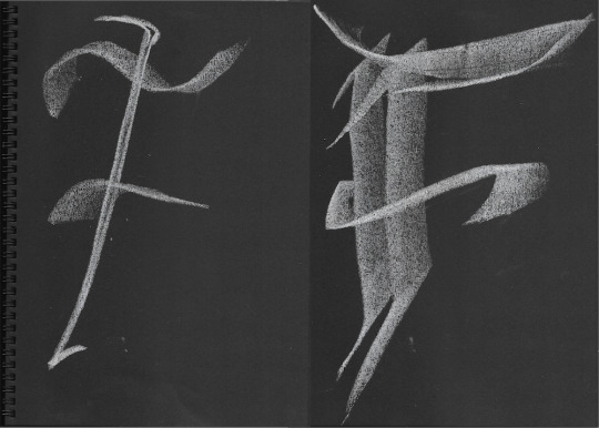
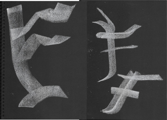
Chalk, Blackletter, and others
For this exercise the class played around with using chalk and black paper as a way to experiment with textures, size and gradients. I stuck with using the Blackfetter font because it allowed me to use all sides of the chalk, varying in thickness and pressure. I’m happy with some and not so much with others, probably because it’s quite difficult making chalk look good without it looking too elementary. I think my experimental ones weren’t as successful as my imitations of the Blackletter type.


0 notes
Text
Ode to Edward Fella
While I’m currently on a research tangent, I instantly thought of Edward Fella, who is an American graphic designer, artist and educator. His typefaces are often handdrawn, breaking every rule when it comes to typography and design. I thought about how I could possibly adapt this method into my own work, since I’ve always loved the playfulness and the unpredictability of anything drawn by hand. What I really love about this project is our capability to do so.
“Ed's work marks a sea change in graphic design,”. “He introduced ambivalence and ambiguity, the multiple meanings of design as text and subtext, and that graphic designers are really artists.” - Lorraine Wild


0 notes
Text
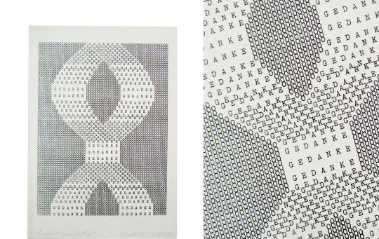
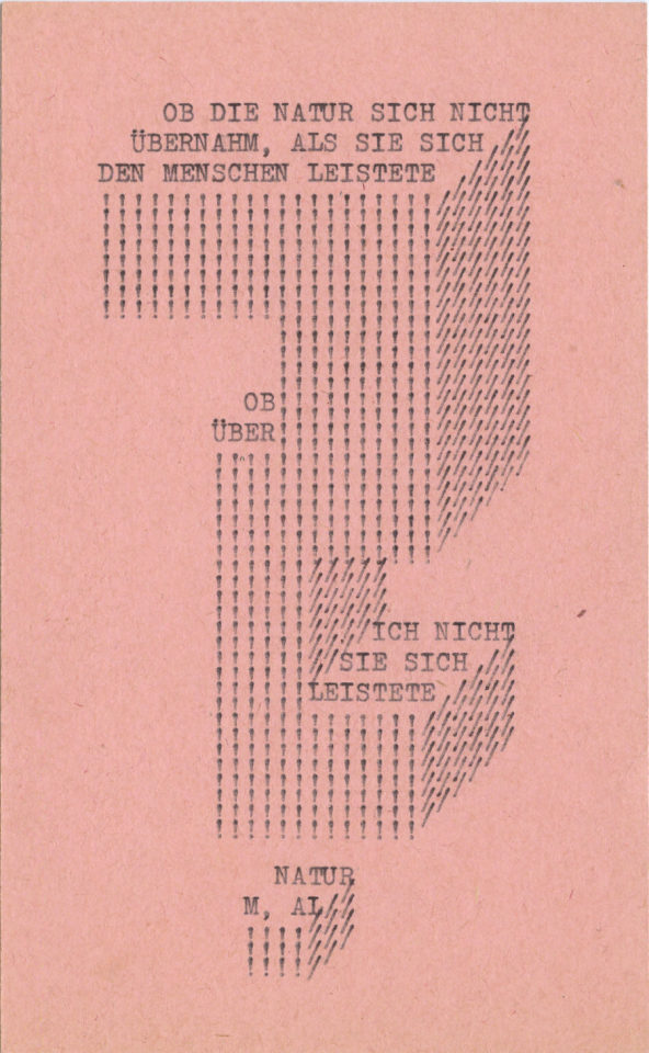
Appreciating Ruth Wolf-Rehfeldt
I’m personally quite a big fan of typography that’s simple upon first look, but as you observe the formations and arrangements of the characters, it actually appears to be a lot more complicated in appearance. I’m particularly drawn to Ruth Wolf-Rehfeldt’s work, a German artist whose work is commonly associated with the Mail Art movement. Trained as a typist (a stereotypical profession assigned to women during that time), she produced geometric, typwriter art that were poetic and clever. Now that I’m reaching towards the stages of developing my zine, and exploring the possibilities of how I would lay out my text, I thought of Wolf-Rehfeldt’s work as preliminary inspiration.


0 notes
Text
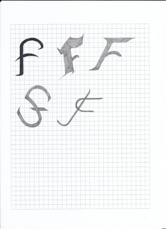
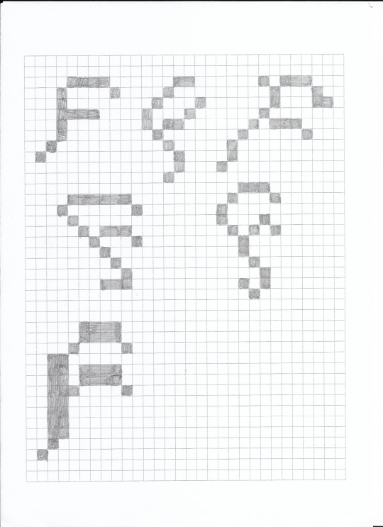
F on the graph
For this workshop, the class developed our abilities for creating typefaces even further by stepping back to the classic 8x8 grid. The exercise consisted of making compositional references to the classic arcade-style font, which was developed as a means to create a typeface that suited the limited memory storage space in computers.


The materials for this exercise was graph paper and pencil. We were meant to draw the letterform within the 8x8 square; I however, being part stubborn and part inattentive to instructions, drew beyond the 8x8 and expanded further out. I ended up creating some pretty interesting formats of the letter F, by applying some form of cursive elements as a challenge to the 90 degree square format.

0 notes
Text
The black square exercise
I’ve always had an affinity for typography and the clever compostions that have largely shaped the way I interpret the delivery of a text, albeit the consideration of the actual context of the text seems to come as secondary to me. Admittedly, I’ve never dabbled in it as much as my other creative pursuits (a background in fine arts, particularly in painting, as well as my former hobby of website layout design during my teen years). Who knew that to construe black squares to interpret a letter in its most abstracted form striked a rather strong irritation at myself for not being able to parrallel my design abilities alongside those who I hold high prestiges for innovating experimental typography and contemporary typefaces. Below features my first attempt; week one is creeping up with a slow but satisfactory output on my behalf.


1 note
·
View note