
This is a side blog for my bookbinding posts. All of that gets posted first to my main blog, @snek-panini, and reblogged here so I can find it more easily. I'm Amberfly on Ao3.
Don't wanna be here? Send us removal request.
Statistics
We looked inside some of the posts by papersnakepress and here's what we found interesting.
Average Info
Notes Per Post
9K
Likes Per Post
6K
Reblog Per Post
3K
Reply Per Post
32
Time Between Posts
12 days
Number of Posts By Type
Note
1
Text
16
Last Seen Tumblr Blogs


Fun Fact
The Tumblr app for Google Glass was released on May 16, 2013.
Note
Heyy,
I discovered, your blog a while ago and have been loving your work!! I wanted to ask how you engrave your titles into the covers since I've been wanting to get into bookbinding!
Have a great day!
Hey there! Thanks so much, I'm so glad people like them!
Most of my titles these days are done with a cutting machine and heat transfer vinyl. I've got a cricut that I bought specifically for doing book covers, though they're not the only brand out there. Sometimes libraries have cutting machines you can use, which might be helpful when you're first starting out.
I used to hand-write the titles but wasn't a fan of that look in the long run. I have also done paper labels (like these pamphlets), which are just printed normally, cut to size and glued on. Occasionally I will also use rubber stamps and embossing powder, like the rose on this cover. That method is actually my favorite but it's got the strictest limits on how and when you can use it, and it's not good for text, so I don't get to do it as often as I'd like.
Hope that helps! Welcome to the hobby!
2 notes
·
View notes
Text
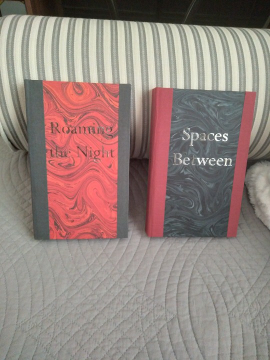
March and April are always quiet bookbinding months for me, because I'm recovering from Binderary and this year I'm also in the market for a new printer. But I did take the time to make these very handsome fellows, and they're a new kind of project for me in a couple of ways. They're anthologies! With themes! Spaces Between is a collection of Good Omens ghost stories, and Roaming the Night is similar but with vampire and werewolf stories. They're both multi-author works and the stories within aren't affiliated beyond the fact that they're my favorites and mostly too short for case binds, but I think they came together really cohesively and I love them to bits.
More pics under the cut, including links to the stories at the end.
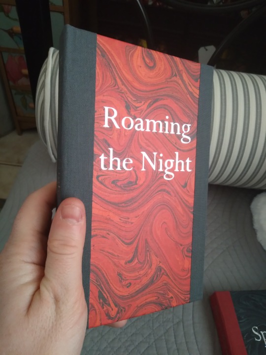
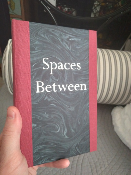
First, some individual photos. These are legal quartos, very nice to hold. That's marbled paper on the cover, though it is the lineco brand and I'm not sure if it's actually marbled or just printed. The text is silver foil htv. The spines and fore edges are book cloth. I had originally planned to do a more traditional 3/4 bind, with corner caps, but my marbled paper was a little too skinny to do the fore edge turn-in, and I've wanted to do a bind like this for a bit so this was an excellent opportunity. And it won't be the last time; I really like how they look and feel.
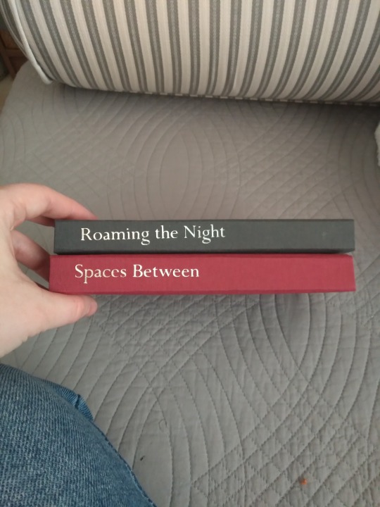
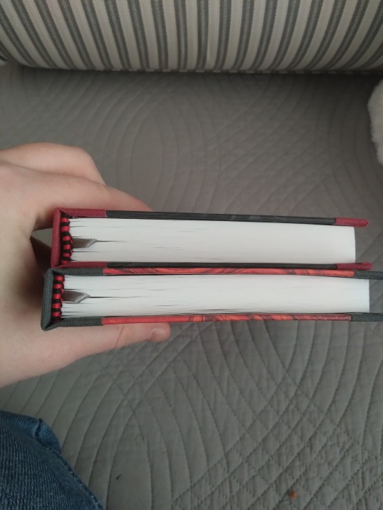
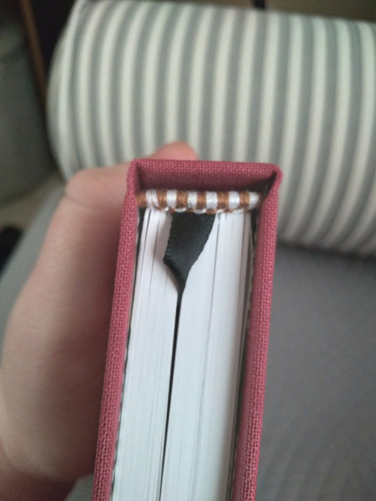
Spine view and top view. More silver foil, matching handmade endbands in red and black, and the same gray ribbon for the bookmark. I love making books in this pattern, where they're not a matched set but enough details are the same to make them feel like they go together.
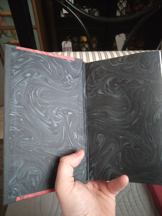
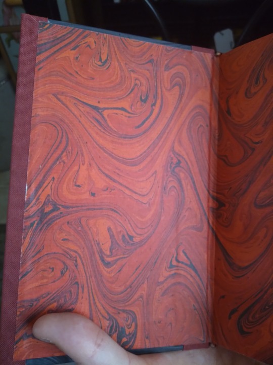
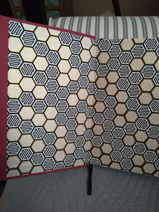
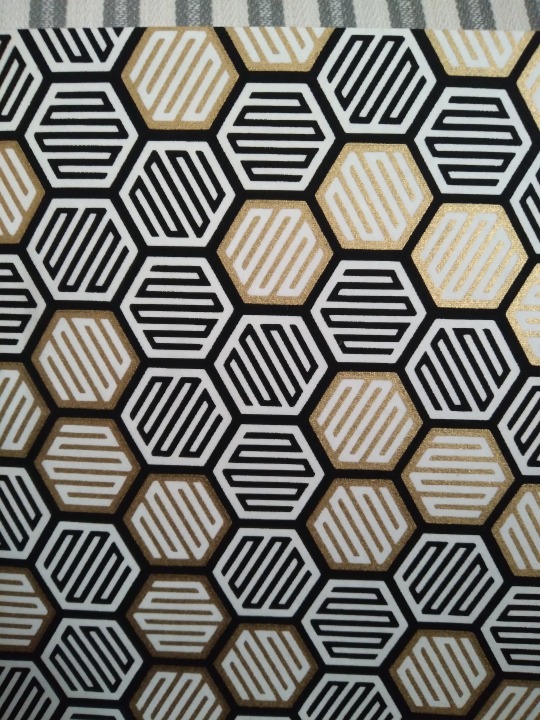
Case in point, Roaming has the red cover with the gray paper for its endpapers, and Spaces has the gray cover with the red one for its endpapers. They're inverses of each other and I could not be more delighted with them.
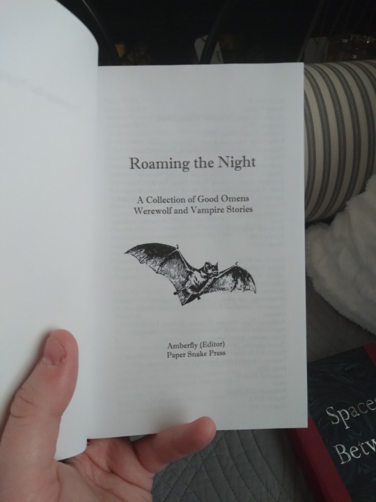
Interiors for Roaming the Night. Vampires on the title page and werewolves in the table of contents. I couldn't decide between them so I incorporated them both. I'm trying to jazz up my ToC designs and this one turned out very well. Don't strain your eyes trying to read the titles; I've got links at the end to all but one of them.
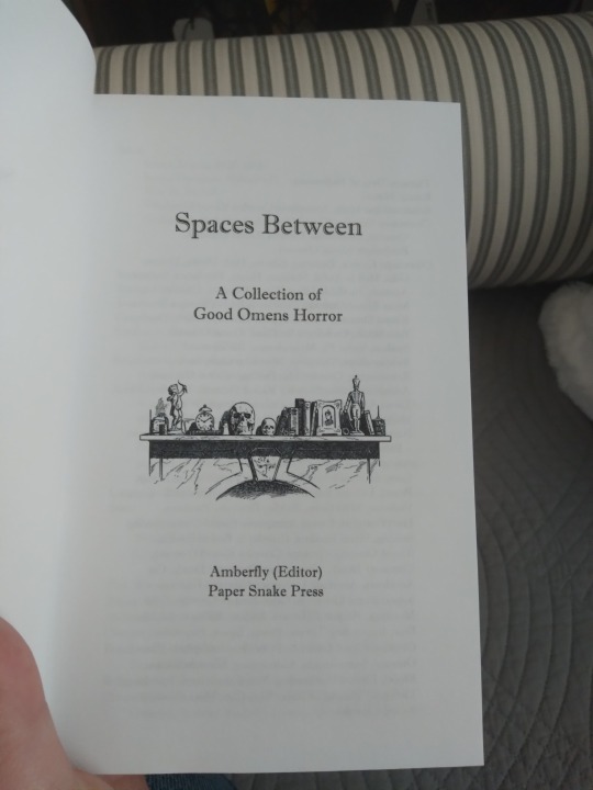
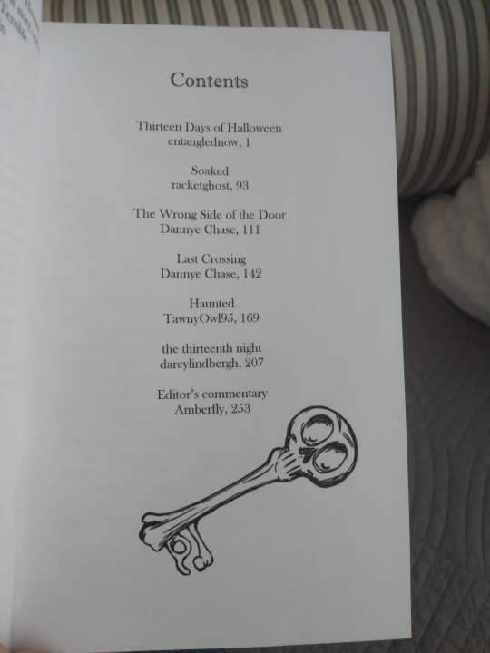
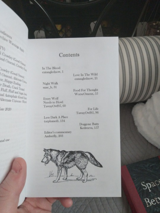
Title page and Toc for Spaces Between. I wasn't originally going to have an image on the ToC for this one, but after I added one for Roaming I thought Spaces should have one too. And at least four of the stories in it involve a haunted building or structure, so a spooky key was definitely the way to go.
The titles for both books are my own invention; they are not named for any one story in the collections. I struggled with that a bit (I hate naming things, it's the hardest part of any creative project). I've done the whole "(Longest Story Title) and Other Stories" before and it's a fine approach, but given that there are multiple authors and they're not in sequence with each other it just didn't feel appropriate to elevate one writer's story over the others that way. I like what I settled on though, even if it was hard.
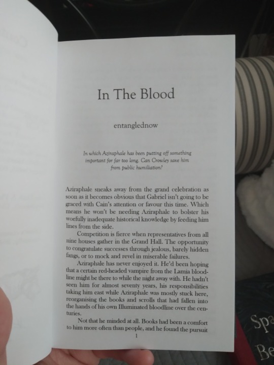
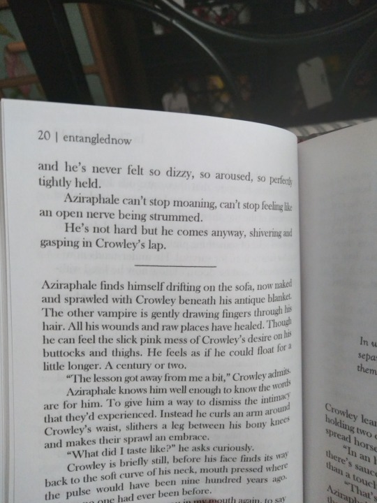
Typeset photos! They're pretty straightforward. I don't like to get too fancy on quarto typesets; I don't usually feel like there's enough space on the page. I've only just realized that the photos are both entanglednow stories, oops.
Another set of interiors that only fellow typesetters are going to think is neat. I finally figured out how to make Word put different headers in each section, so every story has its own title and author at the top of the page. I think this'll only be useful in anthologies, but I am very proud of myself and I think it looks very professional.
That's it for photos! Beyond this point are links to the stories, my reasons for loving them, and tags for the authors.
The stories included in Spaces Between are:
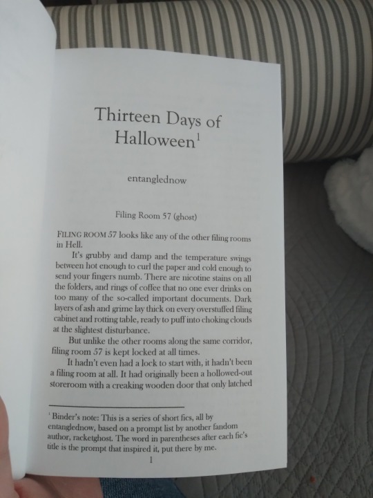
13 Days of Halloween (series by @entanglednow)--I always love entangled’s way with worldbuilding. Their stories always feel complete and lived-in and that’s a wonderful thing in fandom. Even though not every story in this series is an exact fit for the collection, I just couldn’t bring myself to leave any of them out. Filing Room 57 and A Friend in Need in particular have stuck with me for years.
Soaked (@racketghost)--a bit of a loose interpretation of the theme. There’s no ghost in it, nothing inexplicable and horrifying. The fear is entirely explicable and very sexy, in ways that the other stories here are not. But it absolutely nails the atmosphere. Spooky. Unnerving. It just so happens that it’s also playful. It’s a very interesting balance.
The Wrong Side of the Door (@holycatsandrabbits)--singularly unnerving. I love how the beginning so closely catches the feeling of sensational reality TV ghost hunters and then pulls the perfect shift and makes the horror real. I also love that in spite of our two leads professing how much they hate each other, they’d still run into a burning/haunted/otherwise terrible and dangerous building if the other was trapped inside. That’s devotion.
Last Crossing (also by holycatsandrabbits)--Atmosphere is everything to me in horror and Dannye always nails it. This is such an inventive premise, and it’s like I can see outlines of a bigger story; I want there to be more. Something about maritime disasters in particular resonates really hard for me and God the imagery in this one is so incredibly unnerving. I want to sink my teeth into it.
Haunted (@tawnyontumblr)--the one I went back and forth about including for the longest time. The ghosts in it are not real, are a manifestation of very old regrets, as opposed to the literal real ghosts in the others. But it’s a powerful story about accepting help when you need it, and about all the ways in which things can be haunted. And above all it feels like a horror movie, and even more importantly it’s my anthology and I wanted this in it. I am eating it up. Delicious.
the thirteenth night (@forineffablereasons)--I love how they’ve incorporated so many horror tropes into one story, and that the supernatural terrors retain their sense of menace even when the ones facing them are so strongly magical on their own. It’s still a believable threat even though they aren’t in an AU where everyone’s human. Brilliantly done, I love it.
The stories in Roaming the Night are:
In the Blood (entanglednow)--excellent character work, as always. There are no vampires in the Good Omens canon, but damned if this isn’t what they’d be like if there were. It’s also extremely sexy and has top-notch pining in spite of its relatively short length. I’ve always loved entangled's approach to unconventional sex practices and this is no exception. It was one of the first stories I thought of when I first conceptualized this anthology.
Love in the Wild (entanglednow)--love the trust on display between the characters. Again, they’ve got an unconventional relationship and they’ve had to adapt to that, and that willingness to make it work is the crux around which the whole story turns. The love is always there.
Night Walk (@snae-b)--I want this to be novel-length so badly. It’s got fantastic worldbuilding and I feel like I’m just getting glimpses of it from the other side of a curtain. Snae’s fic always has really unique settings, though usually their stories are much longer and often more overtly horror-focused. And I love how this one in particular preserves the forbidden relationship dynamic that’s so compelling in the Good Omens fandom. Delicious.
Food For Thought--tragically I can't link this one as it was a WorseOmens story and they removed all their fics at the end of last year. I had an offline backup saved or I wouldn't have been able to include it at all. You'll never see this, friend, and I know you must have had your reasons, but I know I'm not the only one who misses you and wishes you well.
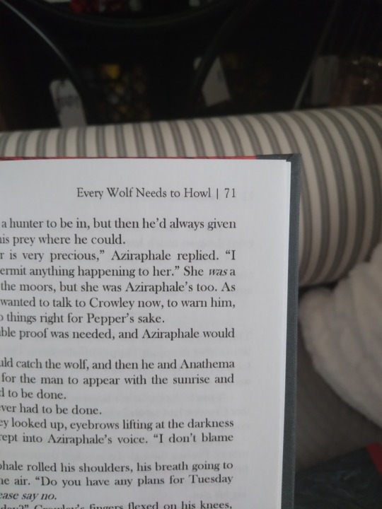
Every Wolf Needs to Howl (tawnyowl)--another story that I knew from first conception had to be in this volume. The overwhelming majority of werewolf fics in this fandom are Werewolf Aziraphale, or Both Werewolves, or Oops All Porn. (Not that that’s a complaint. I just want some plot and character in my smut, and that’s where this fic delivers. And Werewolf Crowley is hot too.) It’s another star on the worldbuilding front; I’d read more chapters of this about the characters’ backgrounds and what it’s like living on the moors.
For Life (tawnyowl)--like a quarter of the GO werewolf fics of the right length for this book are Tawny’s. Thanks friend, please keep up the good work. Helping each other heal from trauma is always a compelling narrative, and again I would read more of this to find out about the world and watch the relationship develop. It’s got an interesting approach of shedding the “monster” identity by embracing it, using it to redefine the self. Both of our leads have done this and they’re using that experience to empathize with each other. And it’s hot. The communication and acceptance is hot and also the sex is hot. Both can be true at once.
Less Dark A Place (orphaned)--including this fic was almost an accident. I was looking for something to bump up the page count and accidentally found a gem. God it’s so compelling, it’s a tragedy that the author orphaned it, whoever they were. I’d love to read more about how their relationship changes and how they both handle the challenges that you know without a doubt they will face. This would have made an incredible novel-length work. Leaving them on the precipice is compelling in its own way though—they’re teetering on the edge of something new and scary and uncertain, which is a lot like how an intense new romance feels even in real life.
Doggone Batty (@kedreeva)--the reason I decided to do both werewolves and vampires in the same anthology. I love the asexual and aromantic approach to relationships. I’m asexual myself so I appreciate seeing those relationships done this well; they don’t need to do those things in order to want to be close. The relationship doesn’t even have room for that, it’s too full of other things for me to think about what it doesn't have. I love the hilarious misunderstandings in this fic, the bit where Aziraphale learns how to do a thing just because it’s fun (barking at a closed door like an idiot), the twist is ludicrous (compliment), and I want to give them both hugs and couch cuddles.
Phew! That's a lot of text. Hopefully tumblr doesn't get huffy with me for including too many links and tags.
127 notes
·
View notes
Text


Today I'm sharing my final book of Binderary, the fantastically good, unfinished The Art of Letting Go by Nekhen. I've loved this fic for years, my friends. It's a Good Omens human AU with a lot of very kinky dom/sub things that are actually baked into the worldbuilding (but not as omegaverse. No shade, but this is different). I never thought I'd read a bdsm fic for the worldbuilding but here we are. Mind the tags and author's notes if you do decide to go for it; it gets intense in places. If you're concerned about in being incomplete, know that it does leave some obvious threads hanging but we end in a very soft place.
Not to be totally self-indulgent but oh my god I am so in love with this bind. I keep looking at it and being surprised that it's mine, that I made it. I think it might be the prettiest thing I've done to date. That's black faux leather (ubonga black, from Hollander's) on the cover, and the inset is platinum silk moire with pewter foil htv for the lettering. It's a crisscross binding, also known as a Secret Belgian, and it's my first time doing this style but it definitely won't be my last. This project was a bit of a challenge to myself; I took it from unformatted text document to finished book entirely within the month of February, to see if I could. And I did!
Have a look under the cut for more images and process talk. I went all out on the details with this one.


Close up of the front cover, where it has mitered corners that don't photograph too well because the leather's so shiny. The silk moire I used was a pair of scraps from when I bound Persuasion last Binderary. The border is deeper than I normally go for because the silk pieces were too small and already cut, so I had to have a bigger overlap. I'm a big fan of the finished product though. Absolutely no regrets.
The image on the back was a free image I found at the Noun Project, called "bound eclipse" (sic). I thought it looked a lot like wedding rings, and while there's no wedding in this fic there is an exchange of vows and an intense level of commitment, so it felt appropriate.


The recommended length for a crisscross binding is about 120-150 pages. As you see in these photos, this one does not fall within that range. It's 340, plus front matter, so maybe about 355-ish all told. It's chonky. Crisscrosses are glueless binds and I know gluing and backing would have helped with the swell in this one, but it's bdsm and unfinished. It had to be a crissscross. The spine piece in this style is held in place only be thread tension and that's the most bdsm thing ever. It's book shibari. I didn't trim the pages since there's not much point to it in a glueless bind (they shift too much) and I thought it would bother me but it doesn't. It's too pretty.


Let's open him up, shall we?The doublure is a cream colored lokta printed with metallic gold and silver ferns. Part of the trust-building process between our two leads involves refurbishing a dilapidated conservatory and bringing in new plants, so I thought some flourishing greenery would be appropriate, and it matches the color scheme very well. I also lined my spine with it, though this isn't very visible in the final product. I had a strip of bare board on the inside of the spine and was worried it would show. All you can see is that little peek at the very bottom, but better safe than sorry. Naked board would have made me very sad. The text block is sewn with regular linen thread, but the visible stitching on the cover is platinum embroidery floss. Fiddly to work with, slippery, but worth it for how well it matches the color scheme. It's also a little bit shiny, like the silk. Perfection.


All the interior ornaments are from the Noun Project. On the title page we have a collar (plot relevant. There's quite a bit of discussion and implication in the fic about collars). The scene breaks are all delineated with a little chain, which I thought was appropriate both due to some literal chains in the first chapter and because of the more metaphorical breaking of chains that goes on as our leads grow closer. The widget behind the chapter number is my favorite though. It's from the same set as the back image, but I made it a paler gray and layered it under the chapter numbers so they look like they're tied up. I was worried it would be too busy but it's perfect.
I chose the crisscross style for this fic for a couple of reasons. One is the thematic one about shibari that I mentioned above, and the other has to do with real-world considerations. I always bind unfinished fics as coptics, because they're glueless and have no spine piece, so in theory it would be relatively easy to come back someday and add more pages if the author ever updates again. However, I found out a couple of months ago that Nekhen had passed away unexpectedly in 2022. We didn't know each other, I just read their fics and was sad when there weren't any updates for a long time. I wanted to give some kind of acknowledgement of the fact that this one isn't finished and never will be, and having it be glueless but still have a covered spine felt like the right balance. We would always like more but we have to acknowledge that there's a period at the end of the sentence, you know? I wrote a binder's note about it at the end of the book (clearly marked, so you know it's from me and not the author) where I quoted the note from the Canterbury Tales that I talked about a few weeks ago: "Of this tale Chaucer made no more."
I just. I really love this book. I've loved the fic for years and now I can love it on paper. It's so good. It looks so professional. If I found this in a book store it would be out of my budget. I may never top it.
48 notes
·
View notes
Text
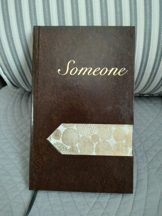
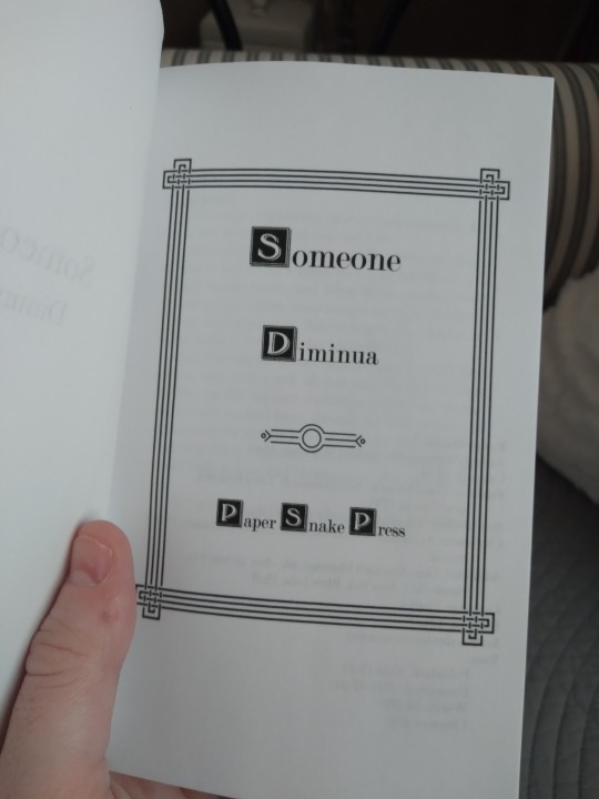
Binderary Book #3 is at last photographed and ready to share. This is Someone, a Good Omens human!au by Diminua, in which our favorite angel and demon are lonely and both turn to a matchmaking service to solve this problem. It sounds like a comedy but it isn't particularly, it starts off very lonely and a bit melancholy before they get a very quiet and beautiful happily-ever-after. As I told the author when I asked to bind it, it lives in my brain and radiates comfort.
I wanted to give it a binding that reflected the sort of classic romance that I feel is present in the story. I used a brown faux leather from Neenah Papers that's much darker and nicer than the faux leather I'd been using previously, though once it's on the book it looks a bit strongly like a bible cover. That's not so bad for a Good Omens fic though.
Have a look under the cut for detail shots; I feel like this one rewards a closer look.
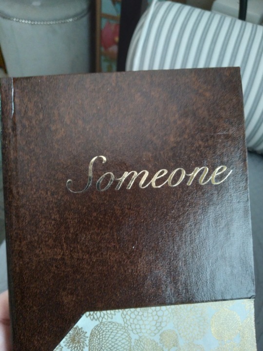
For the title we have gold foil htv. The author's name was supposed to go under it, in slightly smaller text, but it proved too great a challenge for my Cricut with this swirly font and the machine ate it.
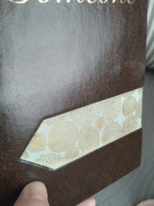
The floral strip is a piece of chiyogami that I got in one of Chibijay's scrap packs. It's cream with gold flowers printed on it, which just screams "wedding" to me. There's a vivid moment in the story where they go to a flower market to pick out what they want for their ceremony, and I thought this was a nice echo of that. I was torn on this bind by wanting to do an accent strip (the way I usually do them, with the end hidden under a different material that covers the spine) and wanting to do a full leather bind since it's been ages. I've done some full cloth recently but the last full leather was a year ago. The compromise I reached was to cut that little point in it and embed it into a cutout to protect it. It went well, though there's a bit where it wraps around the edge and the leather tore so I had to patch it. It's not noticeable unless you're looking for it, so I'm calling it a win. And I love it, it looks like no other book I've made and it's perfect.
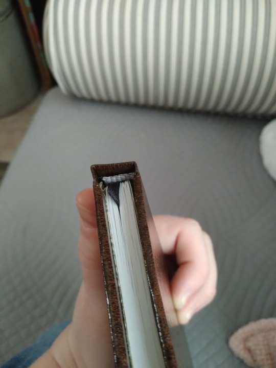
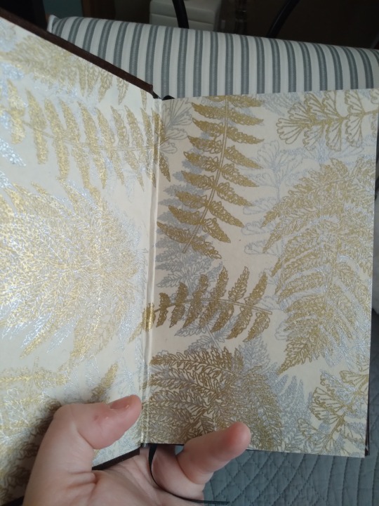
Top view, with premade end band. I would have loved to make custom ones but the book's too skinny. The gray ties in well with the endpapers though. The endpapers are a printed lokta that I got at Blick a while back without knowing what I was going to do with them, They're printed in gold and silver ferns and while they don't match the strip on the front I think they coordinate with it nicely. The first time I cut them I made them too small because the paper wasn't square and they had to be redone. There's a wrinkle from the casing in but we are none of us perfect.
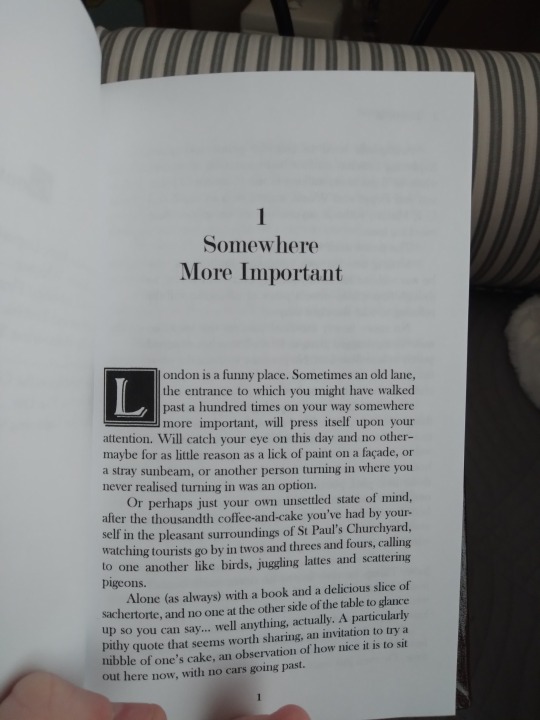
Title page and first page. The frame came from rawpixel, the little art deco widget came from vecteezy and I also used it as a scene break divider throughout the fic. The drop capital is from a dafont custom called Bolton Drop Caps and I love how they all coordinate with each other despite coming from such different sources. Something about legal quartos just begs me for drop caps. They're just the right thing to make the pages pop, and Bolton's a really nice font. Bold, but not frilly. The florals on the cover are very frilly and I like how the interior graphics balance them.
And that's it! This was a start-to-finish Binderary book; I had fully typeset it before the month began, but it hadn't been printed and all the physical work was done during February. I tend to pause between stages so this was practically a speed run for me and I couldn't be happier with it.
21 notes
·
View notes
Text
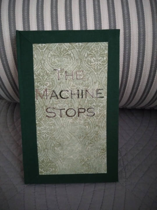
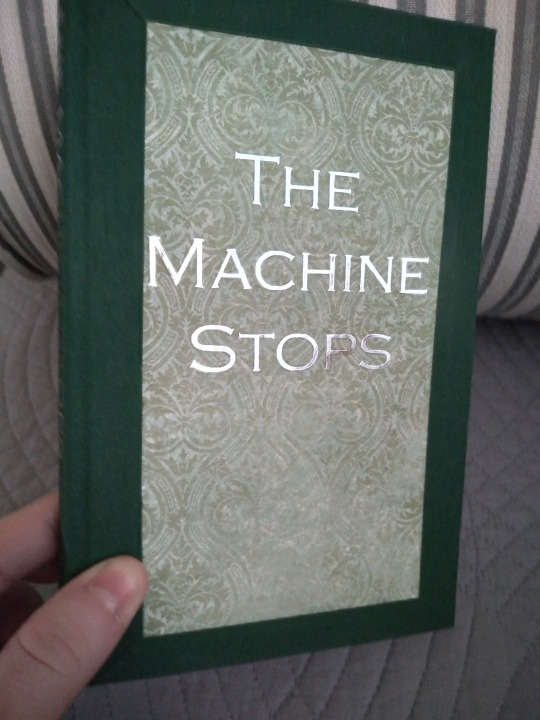
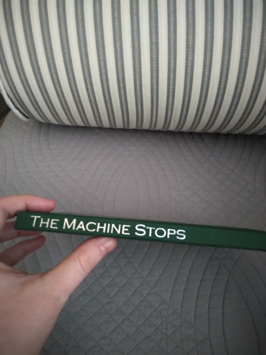
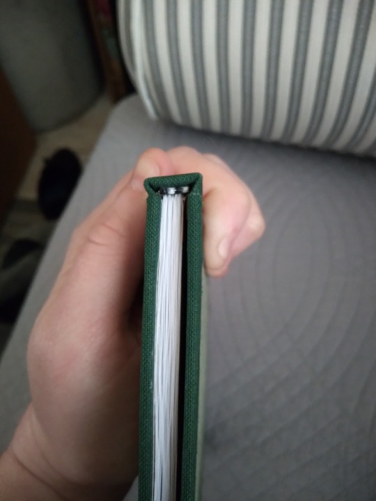
I've got another completed Binderary book to show off today. Back in 2021 I bound my first book, a copy of E.M. Forster's The Machine Stops. I made a post about it last year that you can read right here, if you want. As a first bind, it had a number of issues that I've since learned how to avoid and I've wanted for a while to revisit it and give it a more competent treatment. So one of my Binderary projects was a rebind.
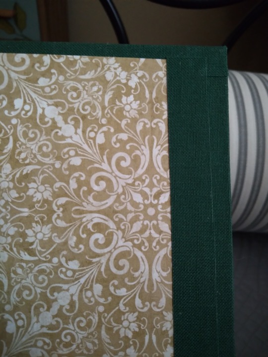
The cover that you see up above is dark green book cloth around the edges with green-and-white printed scrapbook paper in the center, and silver foil htv for the title. Both pieces are scraps from other binds, which is a trick I like to pull with smaller books like this one. It's a legal quarto, far more appropriate for a short piece than the folio size I chose the first time around.
Have a look under the cut for more photos!
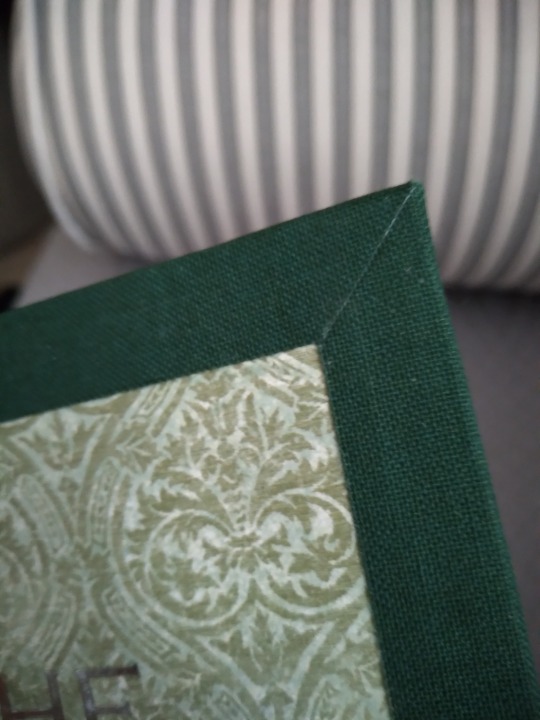
I chose mitered corners for the book cloth because it's an effective work-around for using up scraps because you don't need one continuous piece of material for them. I haven't seen anyone else doing them this way, and though I've done a handful like this all of them have been fic. One of the reasons I do public domain binds is so that I have... I guess decoy books? Sometimes people want to see what I do and I'm not always comfortable either explaining the concept of fanfic to them or answering questions about why there's so much queer sex in it. And I want to show off my mitered corners without that risk, so. Here we are. I like to think that Forster, a gay man, might think it was funny that I was using his story in particular to do this.
Other improvements over my original edition: No more paper spine! Title on the spine! Endbands! Though it's still too skinny for handmade ones, and too skinny for a ribbon. Can't have everything, I guess.
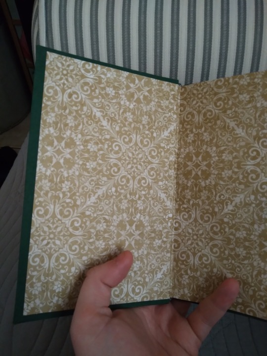
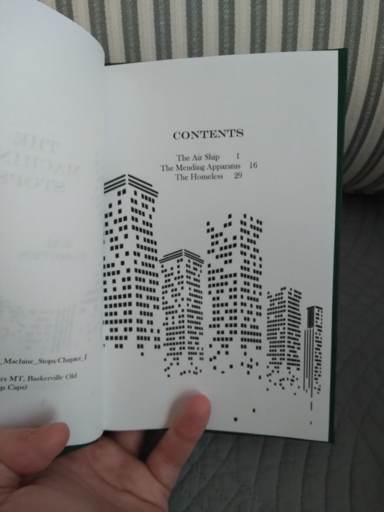
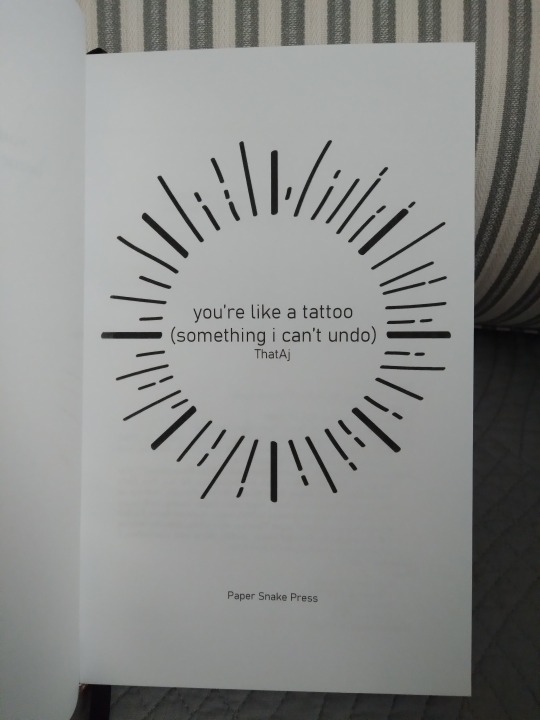
The endpapers are this bold scrapbook paper print. Feels very vintage. I never would have chosen them if I hadn't had the cloth borders; they would've been way too bold if I'd used that printed cover paper on its own. The title page was repurposed from another project. I had actually made it as an alternative option for you're like a tattoo, but the recipient preferred another design. I agree with their choice, and it feels more appropriate for this story about a lonely dying world that for their sexy sweet modern fic. I'm glad I got to use it for something though.
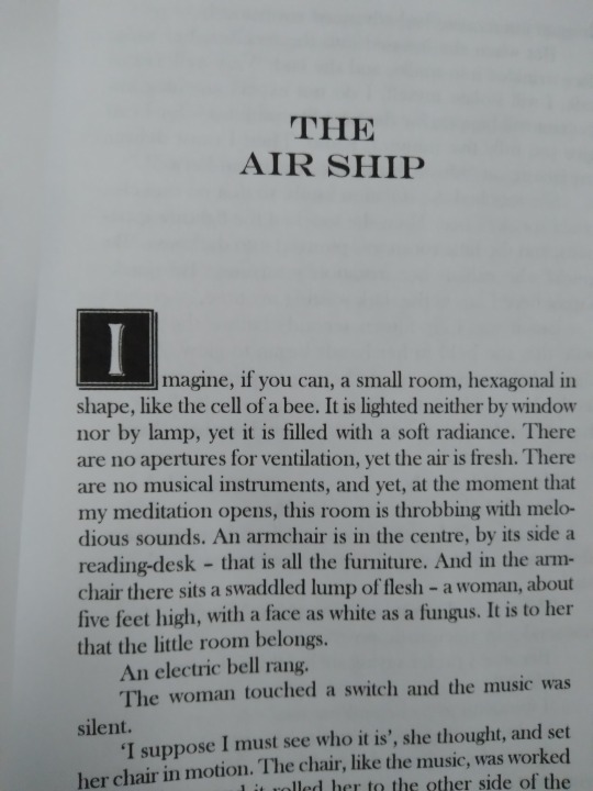
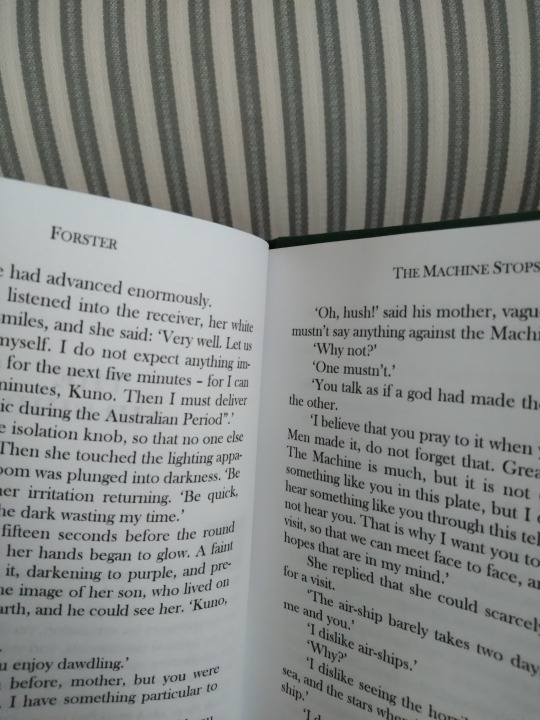
More improvements! Drop capitals! Page headers! No more page numbers on pages where I don't want them! This was a full re-typeset since it's for a different size paper. Hilariously, it's almost the same page count as the other edition, because I also reduced the text size. The original was in 12pt Times New Roman, this one's 10pt Baskerville. But it looks so much better.
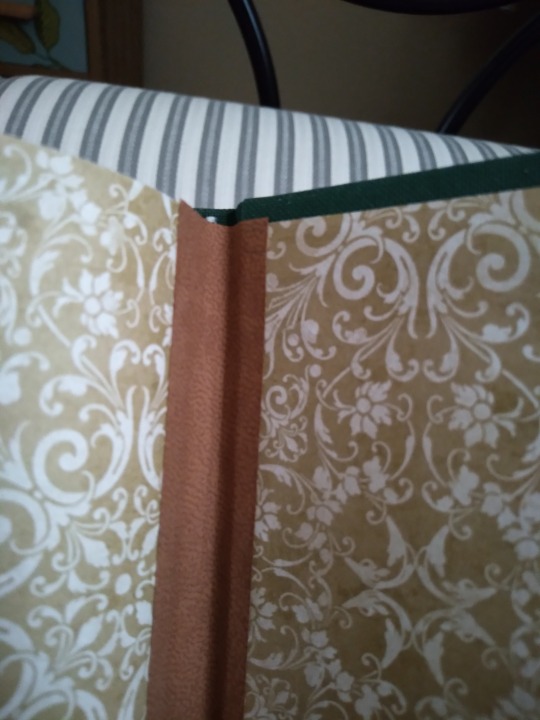
Lest we succumb to hubris, the book gods send us the occasional disaster. It is frustrating but in a funny way that my new and improved, highly-polished bind of the same story had one. And an entirely new-to-me one at that. Somehow when I was casing this in, I got the back endpaper way too far into the hinge, creating an ugly ridge at the crease and a strip of naked board at the for edge. I case with PVA, which dries quickly, and I live in a desert, which exacerbates the problem. There was no peeling up and re-laying; it was not possible without totally destroying the endpaper, and I didn't want to do that. So I used a strip of thin faux leather to cover and reinforce the hinge, and a strip of the same book cloth at the fore edge to cover the bare board. Both were scraps, too small to be of much use in another cover, which is fitting considering how much of the rest of this book is also scraps. It honestly doesn't look half bad, in my opinion. Unconventional, but a lot of things about hobby bookbinding are.
And that's The Machine Stops! It was very nearly exactly four years ago that I bound it the first time. Bindaversary, and well as Binderary? I'm very glad I did it, it was totally worth it to have something I can show off now that my skills have improved.
3 notes
·
View notes
Text
So back in November I offered a custom bookbinding for a charity auction listing, and now that the book's finished and in the hands of the winner I've got their permission to share some photos!
It was a Good Omens-specific auction but @winderlylandchime opted to have one of their own fics bound, from the Queer as Folk fandom. It was somewhat outside my comfort zone as I've never seen the show, but I think between us we managed to put together a very handsome book. And if that's your fandom you can go read their very handsome fic here.
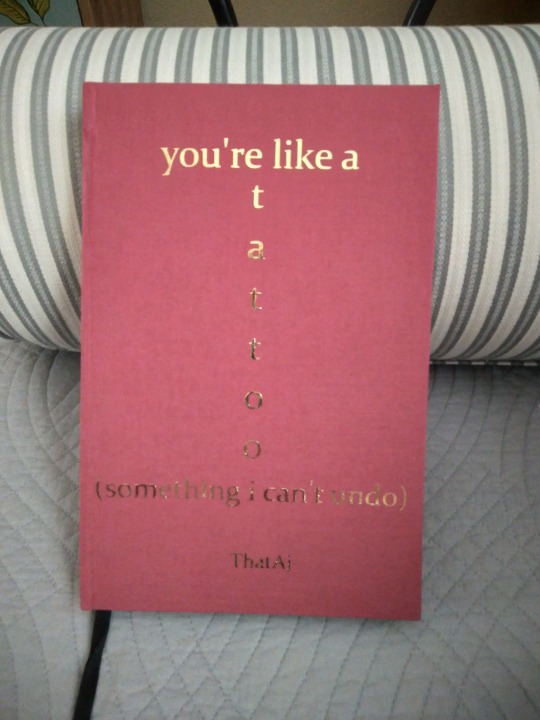
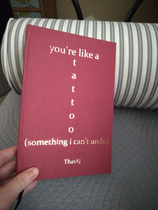
That would be solid red book cloth (full cloth binding) with gold foil htv for the title. I've only done a vertically-oriented title once before and honestly wasn't sure about this until I started messing with it in DesignSpace, and I'm really glad they requested it because it turned out beautiful. The red's a bit richer than it looks in the photos. More pics under the cut!
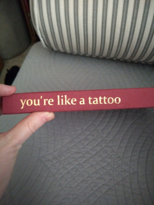
Spine title. It had to be shortened to fit but I always feel like having something there makes things feel more professional, like a "real" (commercially produced) book. The endbands and bookmark fit with the cover in that they are simple and sort of understated. I have fairly ornate taste and I like to do complicated tricks with my books, and it was kind of hilarious that I kept offering those options alongside the simpler ones and it was usually the simple ones that were chosen. It does make things feel more traditionally Book Shaped than some of my other binds though, and there's a lot to be said for that, especially when it comes to binding fanfic.
The exception to that statement about simplicity is probably endpapers, which are this beautiful metallic chiyogami paper. I had actually bought these long before the auction and intended to use them for a forthcoming public domain bind that I was thinking would be sort of bee-themed, but when I got them they were just totally wrong for it. Way too modern and sleek for something set in the English coutryside. They suit this bind perfectly though. Contemporary and sexy and a bit luxurious. And the colors work beautifully with the solid red cover. Endband colors were chosen to match them.
A couple of photos of the interior. That's the same sun image, just edited to be a half-circle. It gives it a kind of cohesion to have the same image throughout, and I feel like contemporary stories without a gimmick tend to benefit from a more straightforward approach like this. And not being in the fandom I didn't want to get too elaborate and distract from the story in a totally unintended way. I love the right-aligned chapter openers too. I have got to do more of those.
And that's that! Hope you enjoyed! I enjoyed collaborating more than I expected to and I'd like to do it again sometime. I missed the deadlines for Fandom Trumps Hate this year, but maybe next year I'll have another opportunity.
40 notes
·
View notes
Text


Since the copy I sent to @madenthusiasms has arrived, it's time to share my bind of their wonderful fic The Ghost of Husbands past. I had really wanted to get this one out by Christmas, since it's a Christmas fic, but life had other plans. But if a Good Omens fic based on Hallmark Christmas Movie tropes (but without the misogyny, heteronormativity, and anti-intellectualism; and with added anti-coporate and anti-megachurch sentiments and positive disability rep) sounds like your cup of tea you should absolutely go read this immediately.
The cover up above is dark green book cloth for the spine and corners, and white faux leather with silver foil htv for the title. It was infuriatingly difficult to find white faux leather in a thickness I could use for bookbinding--all the craft stores had upholstery weight, which is too heavy and thick once it's paper-backed, and only one supplier had this thinner paper-like material. It was Neenah Papers and I'd never ordered from them before and the process was a nightmare and took weeks to sort out. But I got the stuff, and I love the way it looks and feels. It was one of those instances where I knew exactly what I wanted, had a mental image I was pursuing, and nothing else I considered looked half as good. So in the end it was worth it.
More photos under the cut, including Fun With Fonts and the most complicated spine I've ever made.


Spine photos! It's got little ridges! They're called false bands and you make them with thin strips of board, and then if you're like me you put lines around them to highlight them. There's so much htv on here that it had to be done in three stages; lines, text, and snowflakes were all done separately. I was worried there would be issues with sticking, because I haven't always had a good track record with htv and the foil is especially picky, but other than me simply having big dreams there were no issues.


The bookmark is a dead match for the cloth, which was a happy accident. The endbands are double core and I wove them with stripes of alternating thickness so they'd look like candy canes. I was originally planning to have red, white, and green stripes in the endbands but when I hit the halfway point on the first one they started looking like the flag of Mexico and I had to start over. It very much did not fit the vibe. I do love the candy canes though; they absolutely could not have been better.
The endpaper up there is a Christmas-themed scrapbook paper. In isolation they look a bit jungle-y but they're poinsettias. My original choice for these had a different color scheme with blue snowflakes, but I realized that there would never be a better excuse for leaning into the classic Christmas aesthetic, and I have no regrets.


Interiors! The title page graphic is a free-to-use holly wreath from rawpixel. I kind of went nuts with the custom fonts in here. Conventional book design wisdom is to have two or maybe three fonts in a book, to make it feel cohesive throughout. This one has at least eight. The title page has two, one from Dafont called Flakes and a basic Word font called Castellar, because Flakes has snowflakes on every letter and it looked really weird and busy to have all the text like that. The chapter titles are in another Dafont custom called Fireplace that has sparkles and lets you add swishes under it, but the free version hasn't got numbers so those are in Harrington, which I thought was the closest match. The scene break dividers are a dingbat (symbol) font called DH Snowflakes. The body's in Baskerville but there are newspaper articles and roadside church advertisements in it that both have their own fonts, and the cover fonts are different too but I forget what I used there. And you would think this would make it feel choppy but it doesn't, somehow. It works, and it's trope-y and a bit cheesy but that's Christmas movies for you. The earnestness and enthusiasm is what wins the day, not the polish. I think that's appropriate.
And that's it! I had an absolute blast working on this one, it was so much fun to design. Hope you enjoyed!
28 notes
·
View notes
Text
This has taken hours of work comparing different, yet similar fonts and the book cover titles.
All completely hand drawn. I present my own version of the locked tomb font.

For your own use:
It’s currently only letters right now.
I will update as I work through numbers and symbols.
8K notes
·
View notes
Text
So like, many years ago when I was in college I took a course on the Canterbury Tales. Chaucer died before he finished writing that, it's less than half complete, and a lot of the unfinished bits were assembled by scribes after his death. For one of these bits, the Cook's Tale, one of the scribes left a note at the end that reads:
"Of this Cokes tale maked Chaucer na moore"
I'm in the unfortunate circumstance of wanting to bind a fanfic that's been left incomplete because the author has passed away. (Edit: I should be clear that I didn't know them personally, I just read their fic and was sad when they went silent. I only heard about their passing through word of mouth.) And I'm thinking of quoting that note somewhere in the end notes but I'm worried it will sound pretentious. On the other hand I'm a huge nerd and I like to forge connections between high culture and popular culture, and it puts me in conversation with that scribe. Because we're both preserving parts of a work that wasn't finished, couldn't be finished, even though we're separated by several centuries.
Sometimes bookbinding makes me feel like the latest link in an incredibly long chain of people.
29 notes
·
View notes
Text
It's a quiet night at work so I'm doing Binderary planning. For anyone not in the know, this is bookbinding's counter to Inktober or NaNoWriMo, run by the Renegade Bindery discord. It runs in February and I'm pre-gaming.
The first year I did the event I made 4 books, and last year I did 11. Which was insane and I'm not doing that again even though I succeeded. This year's goals mostly involve finishing wips and learning new techniques.
Goals:
Finish my six existing naked text blocks. They need covers and titles, and four of them need to be mailed to the recipients. Two are for me.
Finish typesetting my two existing fic files. I have one I'm actively working on and one I started months ago but got distracted from. I don't have to print these, just finish formatting the documents and do the front matter.
Print and bind the one finished typeset I have. It's ready to go and I have spoken to the author, it's just waiting for the other wips to be cleared out.
Fully typeset, print, and bind one totally new fic. This involves learning a new binding method (secret Belgian/crisscross) and possibly a new endband technique (braided leather). Don't know if those will combine well in reality but in my head it looks good.
Pull the trigger and buy a new printer. I'm tired of the bullshit my hp inkjet keeps pulling, I want to do higher volume and I want to print legal size without pre-cutting it. I'm debating between two models but it's time to commit.
Research the Manga Problem. I want to print out-of-print and digital-only manga but I'm not sure about the logistics (stripping drm, formatting so it reads right to left, margins etc.) Actually printing it requires the laser printer but formatting does not.
I'm not prepared for an intense grind like I did last year. I'm just not, I don't have the energy. And some of this is ongoing right now, I'm not waiting till February for all of it. But this is where I'd like to be at the end of next month.
#reblogging from my main so i can find this later#bookbinding#snek makes books#binderary#binderary2025
24 notes
·
View notes
Text
The On Our Own Side Auction ends tomorrow, November 24, at 7 PM GMT! Bid on these items and more before then!


[Image description: two images with starry backgrounds announcing auction items for the On Our Own Side Fundraiser. The first graphic reads: "Why wait for a miracle? Bid on these treasures and create your own!" It features a commission for one custom jewelry item starting at $5. The second graphic reads: "Get ready to bid like it's the Apocalypse - because these items are worth it!" It features hand-drawn artwork of Aziraphale as an avenging angel starting at $37. Both images have the notes "Discover more on our Auction site!" and "Proceeds will go to the Take Back the Night Foundation." End image description.]
Bid on everything at our auction linked here!
#i have a custom bookbinding commission up for grabs here#alongside all thr other awesome stuff#reblogging from my main#i don't take commissions normally so if you'd like a custom book from me#this is your chance#good omens#snek makes books
13 notes
·
View notes
Text


Last book for a bit. This was a small batch. This is the Project Gutenberg ebook of Northanger Abbey. All my Austens are battered paperback copies that I bought for a dollar and I want to replace them with nicer ones but they tend to be more than I want to spend and this is my solution. That's Japanese book cloth on the cover (I think the celery color) with a sunken inset for the title. It's got scrapbook paper for the floral bit, with gold foil HTV for the lettering. Both the paper and the HTV were scraps left over from other projects and I love how they came together for this one. And I've never done a round inset before and wanted to see if I could. Turns out I can! And it's given me some ideas for future binds.
Have a look at some more photos under the cut!


Photos of the endpaper and endbands. The endpaper is chiyogami and the pattern is called Wrought Iron, which I thought was appropriate for a story about layers and restraint and being blocked from having a full picture, but politely and with flourishes. It's been years since I last read this one but that's the way I remember it. The endbands are handmade double core, and I'm trying a new material for the primary core. I've used stiff jewelry cord before but it tends to not flex correctly when I open the book, so this is a softer leather and way more flexy. It was a little hard to work with as it isn't as smooth, and it's square rather than round so it's got a different look. Overall I like it, though I need to pick up some more colors since you can see the ends. We'll see how well it holds up to reading.


Couple of photos of the interior. All the ornaments are free to use assets from rawpixel. I liked the heavy ornate border on the title page. Made it feel old and ponderous and overbearing, like the Abbey (and its patriarch), and I like how it contrasts with the lighter and more naturalistic tree on the chapter header. Purely by coincidence the grasses around the tree had a perfectly-shaped, correctly oriented square notch for the number already in it. Truly meant to be.
And that's all for this bind! This was a simple one compared to some others. I'm playing more with materials than form at the moment. I do love the feeling of the Japanese book cloth; makes the book very pleasant to hold. Though it doesn't seem to photograph terribly well.
18 notes
·
View notes
Text


At long last, the public domain binds I've been working on for the last two months are complete, and I have the first one to share today! This is Widdershins, a single-author anthology of ghost stories from 1911. I'll admit I haven't actually read most of the stories in it, but the first and longest of them, The Beckoning Fair One, has been a favorite for a long time. I had originally planned to bind only that one, but I'm taking a chance and hoping that the others are just as good. I look forward to finding out.
Have a look under the cut for more photos, and to hear me talk about materials and techniques. I'm gonna get a little rambly in this one.
The cover on this one is Japanese book cloth in yellow gold, from Hollander's. I've never worked with it before this project, but I love it. The color is even more vibrant in person, and it's got a great nubby texture while still being soft and pleasant to handle. And it was fairly easy to work with on the turn-ins, easier than Allure or Library Summit. Will definitely be working with it again.
The title is done in gold foil htv, on brown cardstock, and as you can see here:

...it's inset into the cover. I've done this a couple of times before by making cutouts in thin board and then layering it with the main heavier board. This time I cut partway through the main board and peeled away a few layers. I like this method, it was faster than the other one, but it was also way messier. The advantage would be that it doesn't add any bulk to the boards and doesn't create as much scrap. My paper onlays (inlays?) need some work; as you can see in one of the above photos it's not quite straight or flat. Ah well. All that means is that I need more practice. Have a look at the endbands:


Top and bottom. Handmade, two-color with a single core. I hadn't actually bought the bookmark material when I sewed the endbands, and then when I went to slide them under the tie-downs were in too awkward a spot. So it's wrapped over the top, and I've included a photo of the bottom one so there's a clear photo of them.

Side image. There's nothing special about it except that I'm very happy with how the overhang came out on this one. I tried something new-ish when casing in, and it helped in keeping things lined up. I settled the block into the case and then taped down one side with little rolls of scotch tape between the endpaper and the boards. Flipped it over, glued the opposite one down, then flipped it back, carefully removed the tape, and glued that one down too. It was enough to keep anything from slipping while I was brushing the glue on, and fairly easy to remove the tape if you're careful. Will be doing this again.

Chiyogami endpapers, always a favorite for me. These are gorgeous, they make a great contrast with the other visual elements. And for once I actually got them smooth, with almost no wrinkling near the spine. I did it by smoothing inward instead of outward with the bone folder when pasting it down. Very proud of this job.


Some photos of the typeset. The title frame and the story title frame aren't an exact match but I think they're close enough to coordinate. Both of them are free assets from rawpixel. I like the drop caps in the title and author name but in hindsight I'm not nuts about the ones in my press name. I'd probably leave those out if I did this over again. And I'm experimenting with page headers, having them aligned to the outer margin instead of centered. I think I like it.
And that's that! I'm overall very proud of this one. For once I feel like I've got a handle on the mechanics of everything and it felt like it all went smoothly. It was really a pleasure to work on. Maybe it's because it's a public domain piece; nobody but me is anxious to see the end product. Takes the pressure off.
7 notes
·
View notes
Text
I've got a little bit of a different kind of bookbinding post to share today. Have a look:


I made pamphlets! I've got a bad habit when learning a new craft of looking at easy, highly-recommended beginner projects and saying to myself, "That looks boring, let's do the much harder advanced project that we definitely don't have the skills for." So I actually skipped the part of bookbinding where you learn easy stuff like pamphlets until now, more than 50 books in. But I'm looking at maybe doing some charity commissions for cheap in the near future, and I thought pamphlets would be a good item for that, and it would help if I could show (a) what they look like and what the sizes mean to people who aren't bookbinders, and also (b) that I know how to make them and that they will look nice when I do.
From left to right, that's The Legend of Sleepy Hollow (orange, letter folio), Tam Lin (green, legal quarto) and The Raven (black, letter quarto). They've got cardstock covers and the spines are reinforced and decorated with scraps from other projects. Have a look under the cut for individual photos, interiors, and to hear me talk about materials.


Sleepy Hollow has an orange cover with dark brown over the spine. Usually in a pamphlet the stitching is visible at the spine because it's a single signature, but I wanted to cover it for a couple of reasons. I think it looks more professional, it adds some visual interest, and it protects the stitching from getting snagged on anything. Both pieces are textured cardstock, and the title was printed and pasted onto a bit of scrapbook paper. It's got a line under it because the page I used to print all the titles had a smudge on it, and I miscalculated where it was going to fall on the printed page. So I went over it with a pen and now it looks like it was on purpose. Win-win.


Tam Lin has a smooth cardstock cover and chiyogami on the spine. A while back I bought a pack of assorted strips of chiyogami, about an inch wide, to use as decorative elements, and they're the perfect width for this. The interior images for all three books are free images from rawpixel, and one trick I like to use is to flip the beginning widget over at the end to make an opposing set, like bookends. Reduces the number of images I need to find, and still feels intentional and unified. All three of these are stitched with embroidery floss, so they've got coordinating colors--Sleepy Hollow's is green, Tam Lin's is gold, and the Raven's is red. Customization and theming made easy.


The Raven also has textured cardstock for its cover, but the spine is a scrap of gray book cloth. It also has the only oopsie in its title frame--while I was gluing the back of the red frame piece, it stuck a little to the page I was using as a drop cloth and left a white mark. I tried to cover it with ink but didn't do a very good job. The whole thing's a learning experience. I also played with the margins in this one so I could get the lines to fit better. Poe has a lot of words in each line. I wasn't sure this would work, but in such a small book the narrow margins aren't nearly as jarring as they would be in a full-size one.
Overall this was a really successful experiment. The typesets all together only took about an hour and a half since they didn't need proofreading, and even if they had that's a short job for a story this length. Everything else came together in bits and pieces over a couple of days, less than an hour per book for sure. Spine covers and title frames were all made from scraps so they didn't cost anything or use many materials, and except for the mistake on the Raven cover I think they look really good. And I have so many scraps by now that I could make them look cohesive. In the future I think I'll trim up the fore edges but that's the only thing I'd change. Very pleased, and I think this would make a good charity commission item if there's interest. I'll post more about that when the time comes, if I go ahead with it.
8 notes
·
View notes
Text


This is the final book from the batch I started in April, and look how cute it is! This is London Calling by forthegreatergood, a Good Omens fic set around the end of the cold war. It's definitely a TV!verse fic, not a book fic, but it does a quite good job capturing the feel of the time when the book first came out. It's got pining, and spies, and politics, and actual real grown-up conversations about feelings, and an optimistic ending even if it isn't a happily-ever-after.
The cover up there is a printed lokta paper that I got from...probably Hollander's but it's been a while. It was a total impulse buy and for a long time I kept trying to find stories that would fit it but I kept failing until I settled on this one. The print is metallic, but it phases between gold and silver and copper, so I chose a subdues rose gold metallic htv on the spine, over green book cloth for reinforcement.
More photos under the cut!


I've only just noticed that the photo of the endpaper is blurry, but since it's a simple unadorned green I'm not too fussed about it. I love fancy endpapers but was afraid that whatever I chose would fight with the cover, and I really wanted the cover to be the star here. Machine-made black and white endbands, and a plain black ribbon for the bookmark. In this top view photo you can see one of the most annoying things I've dealt with in all the 50-ish books I've made. One of the center pages in this book wouldn't print correctly no matter what I did. I kept getting one sheet with a single printed half-side (one book page) and one sheet with one fully printed and one half printed side (three book pages), instead of the thing I was supposed to get, which is two fully printed sides (for book pages). I tried every formatting trick I could find and got the same result every time, and I still don't know why. Eventually I just cut off the single page and pasted it in place on the blank part of the three-page sheet, but it didn't turn out too well and the paper is wiggly. I cannot fix this. It is unfixable. So I've just rolled with it and accepted that things that are handmade are going to have quirks. This one's just got a more obvious quirk than most.


Title page and first page of the fic. I wanted to keep it fairly simple and un-ornamented because I don't think opulence suits this fic. So it's not exactly austere, but it shouldn't be ornate either. Some fics are ornate, some just aren't. The feather thing on the title page was originally a scene break divider for another fic I bound, and it was put together with free vectors from I think vecteezy. Like many Good Omens fics, there's a wing grooming scene in this one, so it felt appropriate. The graphic didn't get to shine too well last time I used it because scene break images have to be pretty small, and I think the larger size I was able to use here suits it better.
Overall, in spite of its challenges, I think this book came together really well and I'm proud of it. It's sweet and interesting and I think it suits the fic, and I couldn't really ask for better than that.
73 notes
·
View notes
Text


Books Books Books. The bind I have to share today is The Fabric of Your Hair by @saretton (I have to confess, I left a comment on Ao3 asking for binding permission back in April but I don't think I ever got a response, so I really hope it's ok that I went ahead, and to tag you like this.) This is another really excellent Good Omens human au, with really colorful sensual language. One of our faves is a hair stylist in this one, and the other is a tailor, which is where I got the idea to use dressmaker's forms on the front cover even if there are none in the fic. The cute printed paper came from I think Joanne's, and the sheets had these strange patches of random text and pink roses on them that I had to cut around to get a usable cover, but it was worth it. The spine and corners are brown lineco book cloth with silver metallic htv for the title. Overall it looks a little steampunk for a modern setting but I think it's adorable and I love it.
More photos under the cut!


A couple of images of the front and back endpapers. They're cardstock, and the little images were done with rubber stamps and gold embossing powder. I've only done this on one other book, as it's a challenge to find coordinating stamps that are the right size and shape and also a thematic fit for the story, but I love the idea and think it looks really good. It's like a surprise inside, especially when you turn to the back one and it's different.
I've just realized that I failed to take a photo of the top view on this book like I usually do, so you'll just have to trust me when I say it's got a narrow cream-colored ribbon for a bookmark that coordinates with the rest of the color palette. It's also got machine-made end bands because, while I would have loved to make custom ones, the book is only about 100 pages at legal quarto size, making it a little too skinny for those. The ones I used are an exact match for the brown book cloth though, so they look very nice.


Title page, with scissor image that I got for free from rawpixel, and first chapter header. I kept it pretty simple for the typeset, wanting to let the story speak for itself, and it was actually challenging to find free graphics that would fit the theme without veering even further into steampunk. Cool aesthetic, but absolutely not a fit for this story. I'm satisfied with the end result.


I tried a little something different with the page headers for this one, but it didn't entirely pan out. I printed them in gray so they'd fade a bit into the background, because the title is kind of long and I was worried it would dominate the page on a quarto book like this. It didn't work so well because my printer sucks at printing sharp lines when they're any color but black. So they do in fact fade, but to the point of being illegible on a couple of pages. Left example is a good print, right is a poor one. Oh well, lesson learned, and it doesn't actually interfere with reading so I left it.
And that's it for this one! I really like how the final book came together, more or less exactly as it was in my mind in spite of a fumble or two. I hope you like it too, saretton!
43 notes
·
View notes
Text
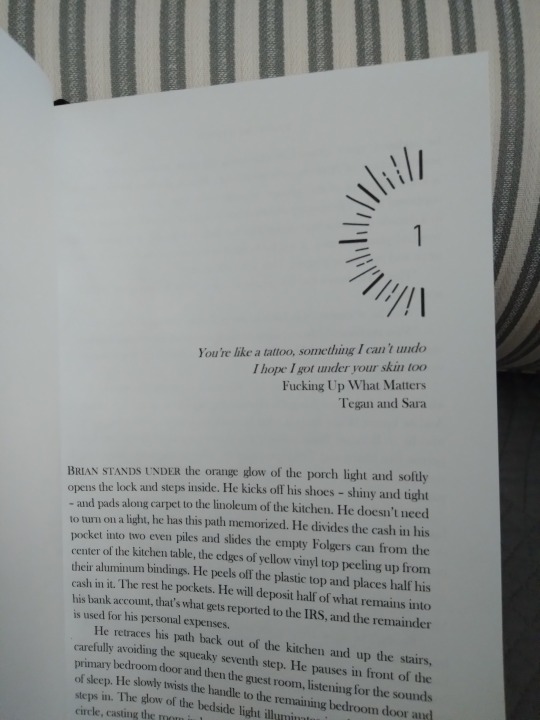
I actually didn't mean to let nearly two weeks go by since my last bookbinding post, but somehow time has just slipped away from me till now. For today we have a pretty simple one, though:
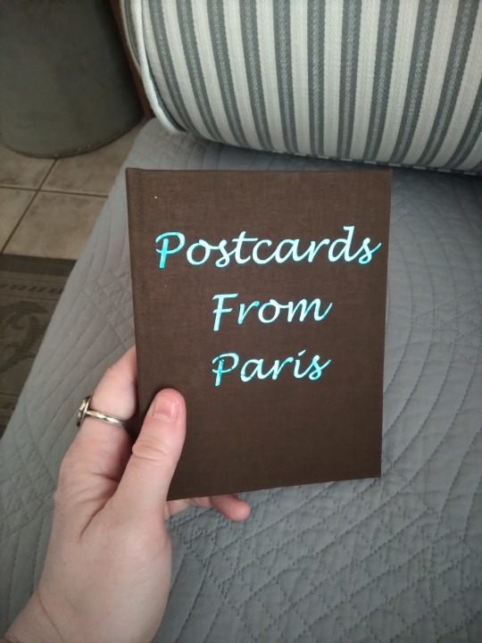
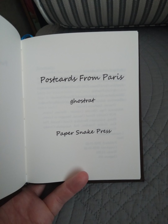
This is Postcards from Paris, by ghostrat, a story that I asked to bind way back at the beginning of May. It's a Good Omens human au, involving letters received by an unintended recipient and a long sequence of getting to know one another via writing. I love epistolary stories and wish they were more common both in and out of fandom, and this one's really soft. Like the whole last chapter makes me feel all rosy and warm. Go read it if you haven't, it's wonderful.
More photos and such under the cut!
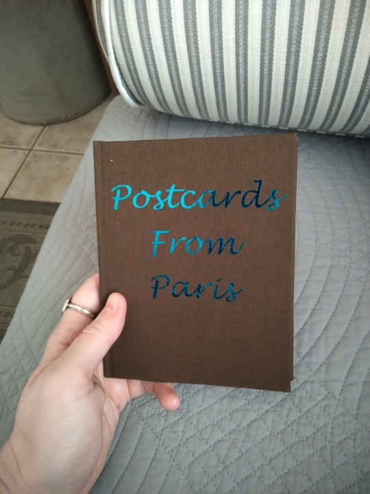
The cover up there is chocolate lineco book cloth with blue metallic htv. Like with many of my small-sized binds, I tried to not buy anything specific to this one and instead make something coherent from what's already on hand, and that philosophy lent itself well here. The story's about getting to know someone with only the verbal impression of them, not even their voice but just the words they choose and their handwriting, and has a lovely feeling of being overwhelmed by their physicality when you finally meet in person, and I think the stripped-down feeling of the bind fits that theme. It's deceptively simple, and you won't realize how deeply you're in love with the story until after you've read it.
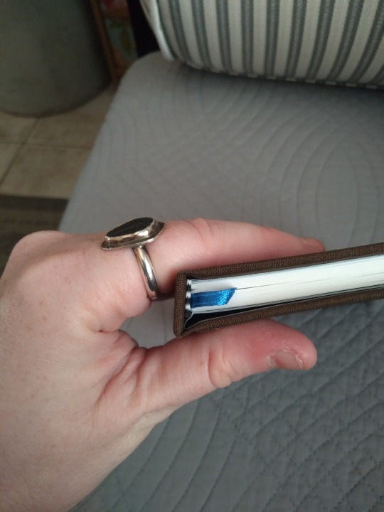
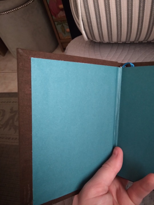
Top view, with blue ribbon bookmark, and slate-blue plain cardstock endpapers. I'm pleasantly surprised by how well all the blues match, considering the htv was bought for another project, the endpapers were bought in a multi-pack for another different project, and the ribbon probably was cut from the shoulder of a fancy shirt. I really would have liked to do custom blue-and-brown end bands, but at barely 80 pages the book's too short for that so it's got premade ones in black and white. The front hinge wouldn't behave when I cased it, so it's got that weird wiggly part and I don't know why. I've used this cardstock for endpapers before and never had that issue, so it's a bit of a mystery.
Interior photos. The stripped-down, simple philosophy persists. About the only theming I did was to choose a handwriting font for the larger text, which seemed appropriate for a story told in postcards.
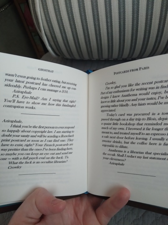
Random interior of typeset. This thing has so many scene breaks, my god. I sincerely thought about picking two handwriting fonts and putting all the postcards in those. They would have been opposing ones so you could tell who was writing without the scene break lines, but it was too difficult to read at this font size and looked kind of messy, so I didn't. I always size down the font a little for quartos, because the full-size one I use for folios looks weird on a half-size page, but this is the only time I've found that decision working against me.
And that's that! As always, I hope I did the story justice with this bind. The designs feel right when I make them, and I hope others agree. I've still got two more books to post from this late spring batch, so those'll be up over the next week or two.
81 notes
·
View notes