
partheniadis-mdd
partheniadis konstantinos
Partheniadis Konstantinos, 23, holds a 5-year diploma in Product and System Design Engineering and is currently studying Masters in Digital Design, Amsterdam. He develops and implements mixed digital and physical product experiences with state-of-the-art technologies and materials.
14 posts
Don't wanna be here? Send us removal request.
Last Seen Blogs
animatedbeards
Animated Beards

yama-bato
COULEURS
animatedbeards
Animated Beards

snow-dxnce
White-Winged Danseuse
animatedbeards
Animated Beards
Photo

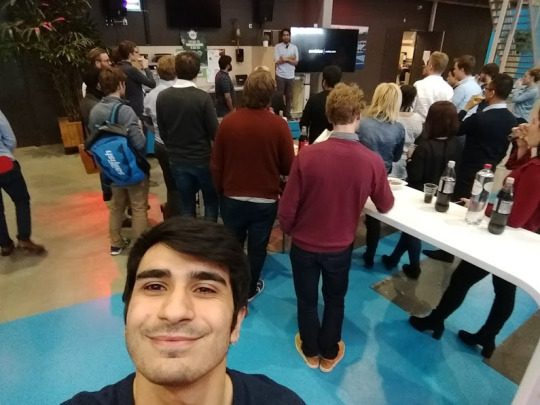
Yes!Delft - Startup Accelerator
self-directed learning; reflection & awareness;
Introduction
I participated at Yes!Delft startup accelerator and product validation program for two weeks after Ingeborg Koning, a startup founder invited me to work with her at her project. She had founded a company named Smart Innovation Development - SID and her product was about a smart heated glove for treating Raynaud's patients. I signed Non-Disclosure Agreement (NDA) which does not allow me to get into ideating or crafting details that would be helpful for my assessment. I reflected on the processes and outcomes during the cooperation and how me, as a digital designer added value to the stakeholder’s ventures.
Meetings
5 April - Client Meeting with SID founder
6 April - Meeting and Workshop at Yes!Delft
20 April - Meeting and Workshop at Yes!Delft
17 May - Meet the makers at Utrecht
The Story
Ingeborg Koning has been working with a professor and a student at the TU Delft, Emerging Materials, Department of Design Engineering to conduct research, develop a prototype and conduct user tests for a smart heated glove for treating the cold hands of people with Raynauds. The student worked on the project as part of her thesis project. From January 2018 she joined a program at Yes!Delft for startups together the student and founded a company called SID - Smart Innovation Development. In the meantime on on 8th March I conducted a user test for people with Raynauds as part of my Personal Project II 'Arnod' in which Ingeborg participated as a Raynaud’s patient herself where we got to know each other. During the workshops at Yes!Delft the student found another job and ceased working at SID. As a result, Ingeborg invited me to attend the workshops in the position of the student who had just left. She explained me that it's an opportunity for her to receive feedback from me as a designer and technology expert about her product, support and advice her with her prototype during the workshops. According to Ingeborg, the user test I did previously demonstrated my ability to come up with ideas, to experiment with complex technologies myself, to empathize with people like her who have Raynauds. I explained that my participation to the workshops can be challenging for me due to the Master's schedule but it can add experience and value to me as an autonomous digital designer. This project has a position in my portfolio as it add value about self directed learning, strategy reflection.
Context
The Yes!Delft program lasted 12 weeks and I participated in the last two before the final pitch. They added me to a shared drive folder and on slack. The two days that I participated there were Peer to Peer reviews with the 10 startup teams. A team from Switzerland with big funds for developing a smart watch for the elders. A team from Italy with a platform to monitor trains condition. A team from Netherlands to operate cranes with Augmented Reality. A team from Netherlands with medical diagnosis platform. A team with an educational platform for AI developers, and a drone company. And, Ingeborg with a smart heated glove for Raynauds patients.
Check the video compilation of things someone can see at Yes!Delft:
https://vimeo.com/274883865
Strategy
I challenged myself to participate in a stakeholder's ventures a successfully reach their expectations with my contribution. The non-disclosure agreement (NDA) I signed upon the beginning of our cooperation explained my role and it was achievable within the scope of the Master's program and from the perspective of my skillset and my personal ambitions. I followed five rules that I set to myself for this project in order to stay within the scope of Master's; (a) Research what you think is valuable for the stakeholder (b) Sketch to help communicate ideas (c) Advise on technology when asked (d) Advise on design when asked (e) Do stuff that keep you relevant to the competences for the MSc Digital Design. I used this project to learn and reflect about myself, what can I do as a digital designer for entrepreneurs, what value does my contribution add. My experience with digital technology (wearable technology, sensors, prototyping electronics, mobile applications) contributed to reach the client expectations. My positive attitude and willingness to participate was appreciated especially while pitching the idea, meeting the makers where I had to lead the conversation about the electronic components in the design. Additionally I helped out with the business model canvas and ideated on finding new marketing techniques, designing a landing page for her product and how would the plan work to run a Kickstarter campaign in September. I provided her with references about relevant cases which she found extremely valuable; she used the video promotion of a competitive product I had discovered to receive feedback from the colleagues at Yes!Delft. The discussion lead to a list of strengths and weaknesses of the competitive product and their video demonstration which she later used to highlight her differentiation point of her startup idea. Given my very positive experience with this startup, I believe digital designers have the power to become valuable members in new businesses. They have the benefit of being an organized creative mind who can support or facilitate conversations with stakeholders from different disciplines. The founder, the holder of the idea oftentimes focused too much on the desired outcome. They need someone to work backwards creatively and construct a series of steps that they can take to reach their vision. Digital designers that have experience from their field can suggest what people should be recruited to reach the client's vision. In the case of SID, the client needs a leading designer, am electronic engineer, a textile expert, a marketeer. There are interconnected roles for all of them, and the designer is most likely the one capable to bridge the communication between them.
Aim
My aim was to experience the startup mentality in person. I was highly motivated by the startup accelerator program at Yes!Delft. I had the opportunity to attend workshops, product pitches, observe ambitious people, try out my professional skills, represent a client's idea and help them support their arguments in terms of technolgy and design.
My Focus
The Non-disclosure Agreement (NDA) upon the beginning of our cooperation referred to my contribution as to "advise and adapt electronical parts of the electronical system made by SID for the smart heated gloves". During the cooperation I focused on providing advice, support and ideas in terms of technolgy for the product design. My relevance with Raynauds phenomenon from my previous thesis project and from my publication and my experience with digital technologies helped me demonstrate active participation to the client's startup activities from workshops at Delft to meeting makers in Utrecht for joint product development.
Tools learnt
Fiver.com for profession voice over your videos for 50€
Hotjar for Online Validation of your target group.
Reflection
At Yes!Delft we participated in a marketing user research workshop which helped founders extract more value from their ideas and products by studying their target group's behavior. Some tactics discussed include how to observe, shadow, interview, think aloud with users. Observe their habits, count times a specific behavior is being repeated. Shadow them, especially with one of your prototypes or competitive products. While doing interviews it is suggested that you use 'silent moments' after making questions. Silence can ease the environment and give time to the user to think. From experts experience at Delft, usually it's the second explanation people give that is valuable unlike what comes first to mind. A moment of silence can help. Probing questions can help the researcher build up their knowledge on a specific topic by using an interviewees experience on it. Before executing interviews, they suggested making sure to check and ask a colleague if the questionnaire has subjective or 'leading' questions. The researcher can use someone else's perspective to make their work more understandable and valuable. Looking back at ISLE startup project, I iterated two times on the text of the concept. This is not related to validating the questions of an interview, but validating the text before submitting it to the competition. I wrote the initial text, gave copies to a PhD student from my previous University who helped me with the linguistics, to my father who is relevant to businesses and suggested changes in the revenue stream table and gave advanced argumentation regarding the question 'why local entrepreneurs can choose ISLE'. The marketing expert from the Yes! Delft said "asking colleagues for feedback is unofficial but its a recipe for certain improvement if you are open to listen".
Meeting makers
The client had found an established and growing startup company that embeds microelectronics to flexible textiles. I am not in position to share the name of the company. This startup was an interesting opportunity to make a joint product development venture in which this startup would facilitate the making process in-house. They showed evidence of experience in the field, with a wearable smart product for the dutch army and one for the firefighters. The benefits of cooperation with another startup would be to bring together two ambitious startups: one that does state of the art embedded wearable electronics and one that wants to build a product to help people with cold hands and especially those with Raynauds disease. The client needed someone to feel safe that would have the ability to make the product and the 'makers' needed a product to add to their portfolio, gain attention and grow faster. The ambition of the client to run a Kickstarter campaign by September should have been a motivation for them to join with her. I had prepared questions for the meeting with the makers. How do they work with customers who want to build and bring a product to the market? What are their terms for joint product development? What are their conditions to cooperate from their point of view? Do they think its feasible to make the product according to the requirements list? Do they have experience with heating technologies and glove design? How many products have they made? How many products of joint product development came to the market? Can they make us a rough estimation of the costs it would take to make a fully working prototype?
Showcase your expertise
I prepared some sketches that i could use to explain the electronic components inside the glove to the clients. The sketches were showing a slight iteration on the client's main idea. I had incorporated different battery distribution to increase comfort and ease of use. I had new ideas for the microcontroller unit and the wiring that would give the system internet of things(IoT) capabilities as client was interested for future iterations. I created a list of 5 main Requirements to make a minimum viable product (MVP). I used recources from the previous research and prototype like materials, thickness, level of elasticity, conductive threads and from my personal expertese like electrical components, wiring and battery design. I had prepared three main questions to ask the makers regarding microcontroller capabilities and limitations, temperature control and expected level of dexterity of the end product. The makers covered my latter question by showcasing in the beginning how their patented technology makes circuits small flexible for textile use. Before the meeting I suggested the client to bring the glove prototypes and competitive products with her. I wanted to try all of them myself so I could make comments during the conversation on what to avoid and what to prefer in the final product. With the prototypes, the makers can take the proposition for cooperation seriously and can empathize better with the client's vision. Where does she want to go? What should they do to surpass the competition? Makers were excited to tinker with the prototypes, check the textiles, the embedded electronics and critique on their safety levels. They have no prior experience with heated components and as they said, the demonstration was helpful for them to reflect and see whether they would like to accept the challenge or not. After the meeting (17/5) they received two copies of the sketches and the requirements list, and we are expecting from them a response on whether they accept to join forces or not. It will be a success for me if Ingeborg manages to expand her startup and has professional technical team to provide her support and develop her product.
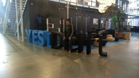

First day at YES!Delft together with the client.
Clarify your position
I chose to be open and clear with my client from the beginning and that was part of the strategy. I did not want the stakeholder to raise expectations. I was studying and my plan was to move out of Netherlands for personal reasons and also because of the acceptance of my ISLE idea in the Aegean Startups competition. Before meeting the makers I wanted to clarify again what my role will be during the meeting and after that. How should I be introduced to the makers? What if the makers were excited and wanted to start working together the next day? What if they were clearly not interested and my client wants disappointed? I explained that I not be available to work on the SID project after the makers meeting. I would need to put all energy on finishing the master studies until 30 June. I would join the client only at the final presentations on 31 May at Yes!Delft where she would pitch her startup idea again in 1.5 minute! I clarified that in the meantime, I would be able to advise her through phone in case she needed support. Clarify your self, your aims, your ambitions and your limitations again and again from the beginning to the end. Meet people and network, do what is expected from you and give your best self when you think it’s appropriate. Because as a founder I met there warned me “be careful of yourself, the world of startups is very demanding and unexpected” and “keep energy for yourself”. The guy was recovering from a burnout for 6 months and he had quit his startup from Yes!Delft incubators which was making money as he said. That was a wise reminder to focus energy on things that you like and make sure you have people around to delegate the workload. The subtle art of delegating work, as David Bailey writes, is to delegate problems not tasks and to coach people instead of instructing them what to do. It’s a matter of small management tricks to have outcomes when the energy is not enough to do everything by yourself. The outcome from this venture of me to join a small startup company during their validation weeks at Yes!Delft is knowledge and a wonderful experience that will help me step with more confidence into the startup world by the time I return to Greece.
0 notes
Photo

Attentionbooth - The opinionated photobooth
framing & strategizing; concept & ideation; creating & crafting; reflection & awareness;
A world of Attention: Take Two.
What if our devices respond depending on the way we treat them? What if the had the rights to judge us based on way they see ourselves? In this 'world’ of the project, the team criticizes the attention people require from others. Their technological devices are the media to help them attract attention with their selfies through popular applications like Facebook or Instagram. When people share their selfies, they will receive feedback (or not) from other people. But what if the device itself already gives them that feedback? What kind of reaction would we expect from people? What would you want to hear? Do we desire honest feedback? Or are the likes that we get on Instagram as much ‘honest’ as we desire?
Relevance to Attentionware
Attentionware was more about control vs autonomy, natural vs digital, digital personality, reflection. With Attentionbooth we aimed higher for achieving cultural relevance, more advanced hardware and software development and user validation that would add research value to the project: studying human behaviour (HCI).
Problem Definition
With the introduction of digital assistants, many questions have risen about the way we treat these digital entities. In many cases, they seem to bring out the worst in us. So what role should these devices play? Should they simply keep functioning as submissive servants, with no apparent values or feelings? Or could they demonstrate (human) morales, and proactively hold up a mirror about the way we treat them, or how we behave as users in general?
In a world where lines between the natural and the artificial are becoming increasingly blurry, we ask ourselves: how do we shape our devices, and how do our devices shape us? What happens when a machine is more honest than the humans around us?
Our Strategy
The strategy was to build a device that will allow us to study how human behavior is shaped during affective interactions with a digital public assistant i.e. a photobooth. Such a prototype device will allow us explore the relationship between humans and today’s trending technology (digital assistants), touching topics like sadism, empathy, ignorance, guilt, abuse, harassment and manipulation. Studying this topic would be a nice opportunity for us to run an experiment in public, observe behaviors and write a paper about the findings around affective computing. What treatment does a digital assistant deserve? Should human computer interaction include empathy? What is the impact of affective interactions on human emotions? How many people have abusive tendencies? What age is the most friendly? What age is the most shy to interact? How many feel regret after affective interaction happens? How many people empathise too much with technology? How many people devote a little of their time to interact with a device?
Below one of the images used in the Moodboard Monica made to communicate the social problem with the team.

Project Plan
Problem definition: What happens if the machine can judge our actions and give ‘honest’ feedback for our looks? Could our relationship with our smart[phone] devices change if AI and affective computing computing has an opinion in social enviornments?
Technology research: Emotional recognition & affective SDKs, Android Studio Tutorials for all the team, Bluetooth Thermal Printing
Product design research: how to design booths? how to attract attention?
Prototype: Android Studio with Face++ and Affectiva SDK, Early prototypes, Build an attractive booth, ask users, iterate on design and code
Validate with users: Place the Attentionbooth at HvA University, track data, observe interaction, interview people for their experience, create critical discussion around the topic of affective computing.
Aim was to publish a paper: We are interested in participating in the “RTD 2019 Conference: Method & Critique – Frictions and Shifts in Research through Design” on 19th-22nd March 2019
1 June 2018 Abstract submission
Concept iteration 1
Case 1: Tech-etiquette
Develop a voice-enabled assistant that gives answers, works or provides a service (i.e. coffee/photography...) only when people are acting kind to them (e.g. Please, Thank you, etc). We need to help users not lose their quality human behaviors and stop treating the digital assistants like servants (slaves). The digital assistant reacts back with vocal, visual or haptic feedback to show irritation (e.g. vibration, changing light or simply acting more grumpy/bitchy depending on the technology personality.)
Case 2: Abuser-interaction
Develop a device that starts demanding attention by people around (like Attentionware) by making common notification alerts (1 device). The device is exposed to public and has multiple buttons. People can use these buttons to lock, dismiss, mute, turn off, like, follow, ignore its alerts or even abuse it. The device can, in return, show emotions of neglect, frustration, discomfort, anger etc based on their personality type (i.e. alexa, siri, cortana, etc).
This case will allow us to study human behavior and explore the relationship between humans and technology, touching topics like sadism, empathy, guilt, abuse and manipulation.We can collect data and map human behavior and how it escalates through the interaction.
We believe both cases have the same difficulty to build, both have research potential on the topic of "human behavior against smart technological artifacts" which looks pretty empty in google scholar. We haven't discussed the time span of these projects yet. Maybe 12 weeks are nice to also have some analytics with users.
Lecturer’s Feedback
Case #1 and Case #2 as two sides of the same coin. Luis was personally seeing great potential in both. They both explore the aspect of how the "personality" of the assistant shapes the interaction with the human. ‘The proposal is already there, it just needs to state that you are aware of the risk of being superficial and specifically state in which ways you might or might not be interested in doing "psychological research" alone.’ he added.
Concept iteration 2
Luis feedback led to quick iteration which would give clearer direction to the project. The aim was to design one artifact inspired by our previous learnings from the Attentionware project. The new artifact will have new form factor, smaller, portable maybe, or placed on a table. We would like to design the artifact so that it provokes interaction (seek of attention) and collects data from the human-computer-interaction and sends them for post-analysis. The results will let us answer what device outputs trigger positive and negative human behaviors. It’s a study on feedback modalities that help trigger the correct human emotional response. For example: If the personality stays calm we expect the human input to stay calm. If the personality asks for too much attention we expect the human to try mute it or leave the device. If the personality gets muted and stays calm we expect the human to leave or un-mute the device. If the personality gets sad and cries (output) we expect the human to un-mute the device. If the personality gets angry and screams (lost control output) we expect the human to get mad and leave or try to impose and enforce him/herself on the device. We believe through simple cases like the above we can study what are the human inputs (give in the form the proper attributes/affordances e.g. button, curves, handle, levers etc.) depending on the mood state of the machine. If its positive when the machine is negative then we believe.
Desktop Research
Selfie
It is the year 1826 and the French Joseph Nicéphore Niépc took the first (known) photograph of his upstairs view. From this moment on humanity would be obsessed with capturing the world around them and, of course, themselves. From cute pictures you send to your grandparents with the new sweater they send you with the holidays to an erotic picture to a crush you met online and hope to meet very soon; a picture says more than a thousand words.
These days we are used to these self portraits, so used to them that Google reported that we uploaded 24 billion selfies in 2017 on Google photos and that is just their service (blog.google). snapchat and other services even offer filters to enhance your appearance. However these filters are hardly new, as most cool things, Japan had it first.
Purikura
Purikura’s (coming from the Japanese Purinto Karabu which means ‘print club’) are photo booths that are widely spread in Japan and South-Korea and offer a service that is comparable to Snapchat’s beauty filters. However the first Purikura emerged in 1995, that is sixteen years before Snapchat even existed. To feel ‘kawaii’, the Japanese word for cute, these booths smoothen your skin, enlarge your eyes, and make your nose thinner. Cute stickers can be added and it is usually used as a social event where you make purikura pictures with friends as a fun memento (some shops even have costumes and wigs to put on before you take a picture with your friends).
Selfie II
Back to the self portraits, or as Instagram introduced the hashtag in 2011, selfies (actually the word ‘selfie’ was first documented in 2002 by a drunk Australian). While we have been taking photographs of ourselves for a very long time, the way we do it now is reasonably new. That is why the why of selfies is not answered yet, it has to do with self-representation and personality factors. As an article on selfie-posting behavior says: ‘‘More research is warranted for our enhanced understanding of this interesting phenomenon.’ (Kim E, et al).
While people that have an extensive selfie collection can be seen as narcissistic, not everyone think that is the case or that it is a bad thing. Pamela Rutledge, Ph.D., is the director of the Media Psychology Research Center and says that selfies are also useful to try new visual identities and that the need for social validation is only natural or ‘hardwired in our brain.’ (bustle.com).
IBM’s Cognitive Booth
Can a machine know people better than they know themselves? To answer this question, we created an interactive installation, the Cognitive Photo Booth, where IBM's AI computing system, Watson, created data-driven portraits of people. Our data is who we are. It's an echo of our behavior. A record of our emotion. In the Cognitive Photo Booth – a key attraction at the AI-inspired Art with Watson portrait exhibition – IBM Watson turned data into the truest portrait ever captured, and showed how technology can reveal the person within.
Thousands of gallery guests queued up to chat with Watson, who then analyzed their answers to his questions, using his Speech to Text and Tone Analyzer APIs. Each guest’s personality profile was then presented as a custom, poster-sized portrait, in the form of a data visualization, printed in minutes.
vimeo
Reflection on findings
In contrast to the above, our project aims to comment showcase all the measurements purely (beauty, upset, smile) and provide a comparison with the previous person that came across the machine.
Concept iteration 3
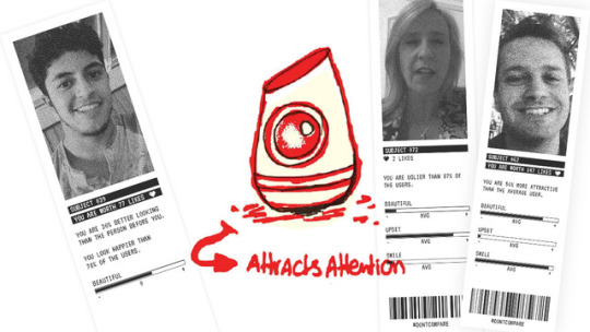
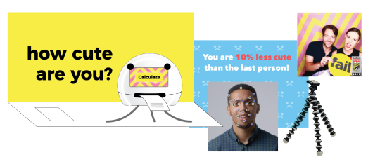
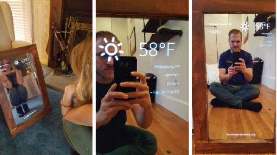
After the two previous iteration the team managed to bring some clarity to the project. The “Attentionbooth” is a critical design that addresses the attention people desire from selfies on online media. The “Attentionbooth” will request attention from passerby’s and ask them to pose for a picture. 3...2...1 -snap! Your picture is taken but what follows is a comparison made by the Attentionbooth with the previous person that had an interaction with it.
You are, for example, 46 percent cuter or You are 35 percent less attractive according to the Attentionbooth, the moment the Attentionbooth tells you this information a second, not-announced, picture is taken. Recording the moment of feedback.
How it works
System detects person passing by
Person starts interacting, triggers device to take picture
Device processes face characteristics, compares to random previous user
Prints unique receipt of formal evaluation*
System takes a second picture while user reads review (and probably reacts accordingly to the results)
System prints captured image and report to the hands of the user
Optional: publishes on instagram under a hastag #dontcompare
Users can retrieve the digital picture through the link shared on the receipt, and put it on public in order the share in on social media and validate whoa re these who share their pictures, those with good ratings or those with bad?
*Evaluation may consist of a report along the lines of:
> you are cuter than 23% of the users
> you look happier than 78% of the users, etc
Additionally, visual social media references (like/heart icons) can be used for context.

The feedback given (evaluation) is based on facial recognition and emotion detection. The photo’s will be displayed on the device and a ‘receipt’ will be printed that reduces our selfies to mere data. How much likes are we worth? Just how cute are you in comparison to the other people that used the machine? In the end, the machine gives us a receipt of the product of social media that we have become.
In the “Attentionbooth” project we want to design, build and test a smart photobooth that tries to catch attention of passersby, take a picture of them and print a physical token or souvenir and gather data to analyze how people treated it during the interaction. To detect presence, the system could utilize parts of the code we previously developed for Attentionware like Ultarsonic sensing and announce audio cues.
Design
The device is a devoted photographer with high context-awareness and a critical attitude towards the people that it meets. It likes to talk to everyone, it detects people’s emotions through its tiny 5.0MP eye. Design of the form was part of my research.
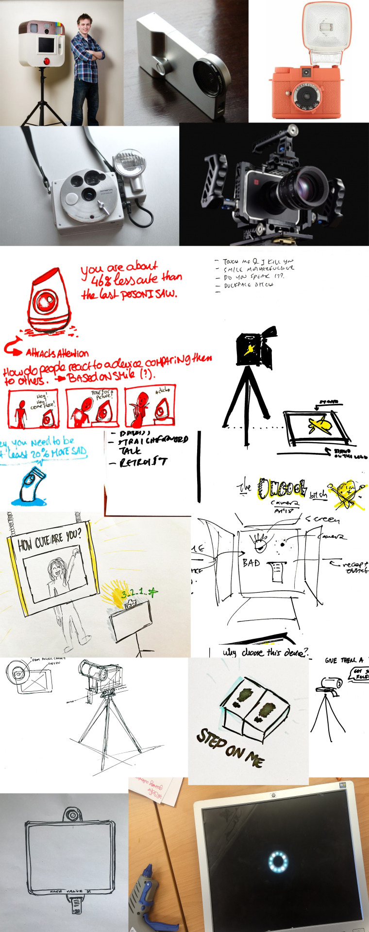
Chantal bringing the ‘Buzzfeed’ style to achieve attention with her blobby photobooth.
Monica bringing the Moodboard with image to complement the concept.


Research Question
“Attentionbooth”, apart from a devoted photographer and objective judge also has a researcher’s mindset. It sees, senses, remembers, collects and analyzes behaviors. It generates new knowledge on every new user interaction.
The device will allow us to study how humans react to the ‘honest’ analysis of their photo taken. I.e. like a photobooth. It will allow us to explore the relationship between emotions, feedback on selfies and how much we want a ‘honest’ evaluation of how well our selfie looks. Instead of having to compare ourselves manually to others, the machine does it for us.
We can collect data and map human behavior and how it escalates through the interaction. After the data collection we can describe the profiles of people that interacted, we can combine data
My Contribution
Affective Technologies
Emotion recognition is used for a variety of reasons. The Chinese Face++ is the first brand to install their “Smile to Pay” in KFC store and the Boston based Affectiva is the global leader in Artificial Emotional Intelligence (Emotion AI) in the West and is now able to detect emotions in recorded speech. Affectiva uses it to help advertisers and content creators to sell their products more effectively. Affectiva also makes a Q-sensor that gauges the emotions of autistic children. Emotient uses artificial intelligence (AI) to predict attitudes and actions based on facial expressions and it is supposed to be a research tool that directly exports results in SPSS or Matlab. Apple bought Emotient in January 2016 to read human emotions. InViso provides real-time emotion recognition for web and mobile applications through a real-time API. Visage Technologies AB offers emotion estimation as a part of their Visage SDK for marketing and scientific research and similar purposes. Eyeris is an emotion recognition company that works with embedded manufacturers including car makers on integrating its face analytics and emotion recognition software.

Rationale for Choice
The first experiments for the concept of Attentionbooth were with Face++ and Affectiva SDK as they were easy to acquire an Android Studio sample. They both provide cognitive services for real world applications. Both systems can be used in our project as Face++ provides one free API key to create a demonstration app, and Affectiva offers a 180-days trial API key. I suggested use Android Studio because emotion recognition requires a good camera and internet connection and doing it by ourselves in a Raspberry Pi would take a lot of effort and none of us were experienced with it. At least I was familiar with Android Studio at which I have programmed all three world projects, Sidewalk, The Foodprint Project and now ANWB Commute. The next plan would be to get a used Android Phone and design around it our ‘Photobooth’ that can attract attention.
Face++ vs Affectiva
Both are very good in tracking face details and emotions. Face++ does something extra: it has an algorithm to assess the beauty of a person by the point of view of a man and a woman. I guess there is going to be a lot of subjectivity as to what is beauty and as Face++ comes from China there is high probability there are different standards of beauty from our western world. Affectiva calculates anger, disgust, fear, joy, sadness and surprise.
See how Affectiva works on Android, and all the measurements it can give:

youtube
Below, Face++ has troubles had consistent issues with making my API key to work. Contacted customer support, they gave me english instructions but still the API key wouldnt work
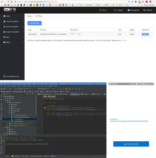
Because of the Face++ issues, i suggested the team we focus on the Affectiva SDK for which we have at least one working example code for Android Studio and its only missing a beauty index algorithm.
Guidance on Android Studio
I uploaded the code on Github so that every team mate could clone it and try experimenting on their Android Phones or on Android Emulators on their computers. I suggested them learn how to 'export a project from github’ directly to Android Studio by looking at a series of screenshots that i had shared with them.

I gave the team a simple app to do each one of them, easy enough for the weekend that can be useful for the Attentionbooth project like a simple UI, camera functions and sounds:
Play an audio file on the click of a button (example from attentionware) (can be done with emulator: https://stackoverflow.com/questions/18459122/play-sound-on-button-click-android)
Have a camera and take a snapshot and save it on the phone’s memory (can’t be done with emulator cuz has no camera, need an android phone or tablet - @chantalramzy maybe you could go for it: https://github.com/florent37/CameraFragment or get yourself another one)
Convert a UI to a PDF and save it on the phone’s memory (for printing 'receipt/image) (can be done with emulator: https://www.codeproject.com/Articles/989236/How-to-Convert-Android-View-to-PDF)
Use the Affectiva demo app, write 'if…else’ cases that create meaning out of the metrics - e.g. `if(anger>50 && ethnicity!=dutch) myTextView.setText(“You are not cute at all with that face yo”);
It was really nice to see Genevieve complete her first tutorial on Android Studio, and then not stopping; she wanted to do more. Then Chantal really trying to install the Affectiva sample but encountering troubles with the software on her computer.
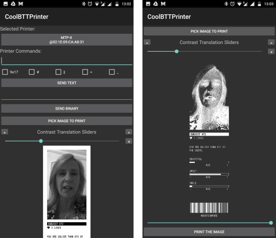
Bluetooth Thermal Printer for Android
I ordered a bluetooth thermal printer which i could control with an Android App. I could potentially integrate the printing app inside the emotional recognition system and then bring Attentionbooth one step closer to reality. Here are some example prints that were designed by Monica!

Reflection
The team regardless its efforts had lost its spirit soon after the beginning of the project. Was it because it was back to back to the previous Attentionware project? Was it because we all had world projects demanding more and more from us? Truth is we all have varying ideas on how this project could end up in terms of technology, design and value added to us. In the meantime other teams were developing planets and interactive systems and we had a weird feeling of being detached from the total class of Interaction Engineering. We stood more critical and asked ourselves whether we are willing to continue this project. We all agreed that we did not want to continue with Attentionbooth and needed something new to get to work on as we have given Attentionware too much attention! We had fun as a team experimenting and ideating, and trying out Affective computing systems that could bring value or make criticism on today’s societal standard of beauty and acceptance which are based on likes.
0 notes
Photo
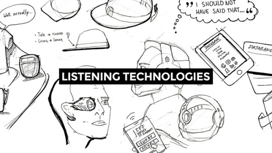

Listening Technologies
concept & ideation; reflection & awareness; framing & strategizing;
Introduction
Technologies that listen to their users are omnipresent in today’s society: smartphones, digital assistants, internet of things products etc. People seem not to realize how exposed they become by accepting these technologies in their lives. In this project we describe the process of exploring three concept designs that can potentially help generate critical commentary on how listening technologies exploit today’s users of technology. The authors imagine a world were privacy concerns in digital products are a thing of the past. Through their designs, they want to encourage makers help create a world of digital products and services that are honest, transparent and work effectively without storing nor exploiting personal information of their users.
What is Listening Technologies?
Listening Technologies, or Ubiquitous Listening as defined by Hui & Leong in 2017[1], primarily refer to technologies that are using user’s voice input in order to perform a task and produce a desirable output [1]. Smart speakers like Google Home and Amazon Alexa are clear examples of listening technologies[1,2]. They are there, in human context, waiting patiently for the correct voice command.
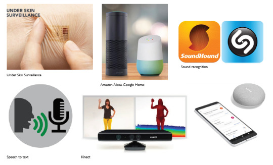
Similarly, smartphones, smartwatches, health trackers, gaming platforms and generally most Internet-of-Things enabled devices use their sensors to gather data from their surroundings to produce value for their users. These systems operate to accumulate data, store, analyse and inform users. Data can be valuable as-is, like voice or video recordings. Although, they can become chaotic and invaluable soon after a bunch of them is stored. Data analysis can help generate meaning out of big data, send users personalized insights, optimize systems’ performance, save energy, control remotely, provide ‘data driven’ functionalities and effortless experiences. For example, Google Maps uses location data to keep a detailed history log of your locations called ‘Timeline’ so that you never forget where you parked your car or where you traveled to last year same day. Although, as Spencer K. Michael recently noticed “Google does not appear to have limits in its hunger for your Private Data“[3].
Authors’ Point of View
In this project, we define Listening Technologies as the spectrum of smart devices and applications that can potentially infringe their user’s privacy. We will be using critical design as a tool to raise awareness about Data Leaks, Trust & Privacy issues and Lifestyle Data (pictured above) around Listening Technologies. We believe the developments in listening technology can also lead to changes in social contexts. The fact that we are getting more aware of being recorded will change our dialogues. It will have a big influence on how we talk to each other.
Our Ethical Vision
The authors imagine a world were privacy concerns in digital products are a thing of the past. Through their designs, they want to encourage makers help create a world of digital products and services that are honest, transparent and work effectively without storing nor exploiting personal information of their users.
Our Process
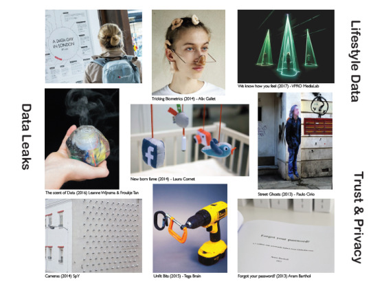
We conducted research on the topic of Listening Technologies, existing technologies and examples of critical designs. These examples were mapped into two semiotic squares[4]. The first was designed to oppose Existing Solutions with Critical Solutions that create effective commentary around Listening Technologies. The aim was to help us understand how to create effective critical designs and avoid providing a direct solution to the problem. The second was designed to oppose Active with Passive participation of the user in the Listening process. Active can be though of as ‘Aware that I am being listened’ and Passive as ‘Unaware that I am being listened’ by a specific technology. The aim of this semiotic square was explore different levels of awareness that Listening Technologies inspire. We wanted our critical designs to be able to raise awareness about the fact that people are being listened and they are oftentimes unaware of it. Overall, the semiotic squares helped us define the meaning and values of existing products and similar critical designs. After the semiotic squares, we started concepting & ideation in two iteration cycles. We went from 13 concepts to 6 and then to 3 final concepts. In the end we reflected back on how these three concepts showcase best the problems we discussed about Listening Technologies and can potentially raise awareness about Data Leaks, Trust & Privacy issues and Lifestyle Data.
Outcomes
See the full 6 page paper with the comments from Gabriel Ferri on it, and his separate formative feedback here.
Iteration 1
During the first iteration the team explored a variety of different directions that could be followed to address the problem of Listening Technologies. During the first iteration we generated a large idea pool from which we narrowed down to 13 rigid concepts: Data wallet, Socio-filter, Erazor, Life on Demand, Chat Cap, Insta Lawyer, Secret Stick, Name Dropper, Bleep Censor, Zzoioi, Diceased FB Friends, Sub-AI, Transcript Shirt.

Iteration 1: Our Process in Iteration 1 and the first 13 concepts.
Iteration 2

Iteration 2: From 13 to 6 concepts, from left to right are Data Roll, U-tattoo, Tunnel Vision, Addiction Simulator, Data Bucks, Life Broadcast.
Iteration 3

Iteration 3: From 6 to 3 final concepts: From left to right: Data Roll, Data Bucks, Life Broadcast are the final critical designs. They showcase how today’s technology infringes our privacy, how we ‘turn our backs to it’, how we are unaware of how much value our internet activity has, and how much can we leave listening technologies rule our everyday lives.
In the Iteration 3 we take a critical standpoint towards our previous 6 concepts. With the help of lecturer’s feedback we selected 3 leading concepts based on the following criteria:
Which three showcase best the problem space of Listening Technologies?
Which can potentially raise awareness about Data Leaks, Trust & Privacy issues and exposed Lifestyle Data?
Which make it easier for ordinary humans to understand the critical idea that the we wanted to communicate?
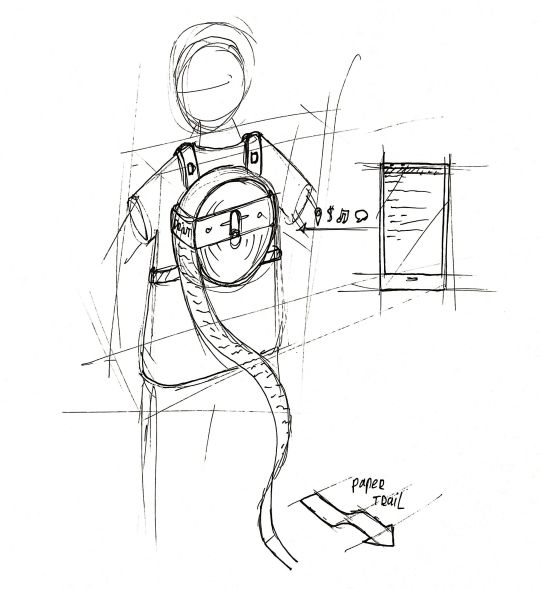
Data roll (image below) evolved into a backpack with a large printing roll. From the first sight, it designates that there are a lot to be printed! The wearer can hear and feel the device speeding up its printing the longer and quicker you surf with your smartwatch: cookies, location data, passwords, likes, comments, are all become instantly physical. Being a backpack works as a metaphor for not being able to see nor touch our data that ‘leak’ behind us and potentially expose our privacy to third parties. In case the users goes offline, the device will stop leaving traces behind. This gives the user actually a call-to-action: be more offline and risk less of your personal life.
Data Bucks makes uses the reference of a wallet (physical product) and a screen (digital) integrated in one object. This way it communicates better that your data have value for some services. So go exchange your private date for a brand new toaster! Fill more online information, gain more data bucks! In a dystopia future, our data is the new currency. This concept comments heavily on how we have sold our privacy and wants to provoke a social ‘nudge’ before data creation becomes human labor where we literally sell our selves. As a drawback, there are some concerns about how to make Data Bucks concept easily understandable by older people.

Life Broadcast showcases that once you use a Listening Technology you start to monetize. Data. Are. Money. They are also attention, and social recognition. Wearing a pair of these glasses can help you be famous and be part of a social movement but there is a pay for that: share every personal moment in your life - otherwise you are unable to see (and thus interact with the real world). This dystopia concept reveals that there might be a point of time in the future where privacy is completely dissoluted by ourselves for the name of showing off our Lifestyle. We want to generate commentary like ‘I don’t wanna live in such a future!’ or ‘There things I want to keep secret!’.

Conclusion
As young digital designers we realize that we can use our practical design knowledge to make criticism on trending technological, cultural and social concerns that are upsetting the world we live in. The next step for us would be to make prototypes and showcase them to public and study to what extent are they critical on the topic. Can they potentially generate discussion around the ever-growing field of Listening Technologies? Are our fellow humans able to rethink the way they are using technology or even protest against it? And finally, back to our ethical vision. We believe through critical products like Data Roll, Data Bucks, Life Broadcast we can inspire designers and developers become more cautious on the way they build new products. We believe young designers, together with users of technology, can raise awareness and lead a future world were privacy concerns in digital products are a thing of the past.
References
[1] Hui, J. & Leong, D. The Era of Ubiquitous Listening: Living in a World of Speech-Activated Devices. (2017).
[2] Engineering, R. D.-N. L. & 2017, undefined. The pros and cons of listening devices. cambridge.org
[3] Your Bibliography: Medium. (2018). Google Sneakily Monetizes Where you Go – Michael K. Spencer – Medium. [online] https://medium.com/@Michael_Spencer/google-monetizes-where-you-go-google-maps-timeline-a3c78b655d7
[4] Dalsimer, A. M. (2016). AJ Greimas and the nature of meaning: linguistics, semiotics and discourse theory. Routledge.
0 notes
Photo

ANWB Commute
framing & strategizing; concept & ideation; creating & crafting; reflection & awareness;
Introduction
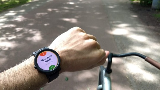
In this project we focused on designing an interface for Royal Dutch Touring Club ANWB with the aim of delivering real time information to drivers with minimum distractions. In the span of 20 weeks the team explored three different directions, conducted 2 survey user research, a lab research, speculated in the future and returned back with insights for the present. The outcomes of each stage where closely discussed with 2 experts in user experience designers and the client Frank de Wit of ANWB. We believe the future of mobility is in all contexts on the road, and ANWB is heading the correct direction wanting to provide drivers a safe way to to stay informed about events on the road while driving. The team explored different form factors, hardware devices and software applications and validated though user reasearch, and design iterations. The presented concept is focused on smartwatch interaction that require absolutely no touch input, making the system safe and easy to reach any time.
Concept Video
vimeo
Client Meetings
16 February: Meeting with Frank & Joey
7 March: Meeting with Frank & Maaike
29 March: Meeting with Joey
13 April: Meeting with Frank & Jordy
26 April: Meeting with Jordy
9 May: Meeting with Maaike & Jordy
24 May: Skype with Frank & Maaike
8 June: Meeting with Frank & Maaike
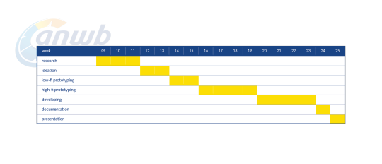
Planning Overview
About ANWB
The Royal Dutch Touring Club ANWB provides assistance and insurance, traffic safety, travel, publishing, advice and information(ANWB, 2015). It is the biggest club in the Netherlands consisting of 4,4 million members (ANWB, 2017). ANWB provides information to dutch drivers through their Onderweg smartphone application: including delays and the reason behind them i.e. traffic jam, accident etc., speed traps, parking spots, parking services, gas stations and more. ANWB, through their omnipresence and their different services, envision “a safe, distinctive, multi-modal travel assistance, for Dutch travelers, to solve unpredictability along the way, using relevant travel advice before departure, on the road and at the destination”.
Project Brief
Create an interface that provides real-time information in a safe way within every context on the road that adds personal and practical meaning to ANWB Customers.
Problem Description
The name Onderweg (on-the-road) predisposes the user with the idea they can use the application while driving. By the time the user hits the road, the application detects the motion of the vehicle by using its sensors and a safety warning appears which blocks any interaction with the application. The promise that ANWB is with the driver ‘on-the-road’ is not kept as no relevant information are announced about the driving conditions ahead. Statistics show that application users take a quick glance about traffic delays on their roads before starting their drive. Meanwhile, unexpected traffic events appear and ANWB is losing its bet to provide this valuable knowledge to their fellow members. ANWB is losing the game of driving assistant applications as Flitsmeister is growingly becoming the ‘best buddy’ for 1.2 million drivers, Google Maps remains the most informative traffic system from all aspects and Waze is the most personalized and meaningful driving companion. ANWB is willing to step up the game of real-time traffic information for drivers. With their 4.4 million proud members in the Netherlands, their omnipresence out on the roads with ANWB Wegenwacht and their partnership with leading traffic data systems TomTom and Simacan there is no doubt that there are high stakes for this company to succeed equally or better than the competition in providing services for their fellow drivers. The safe driving covenant (Covenant, 2017) between ANWB and 39 more companies and the introduction of guidelines (TUDelft, 2016) for designing safer in-car applications are showing the urge for providing traffic information to the drivers without putting them at risk. These changes in the political and technological context give the opportunity to ANWB to step into the digital applications world with a clearer proposal than Onderweg. ANWB internally, function very single minded. The ‘heads’ study the context and the target group superficially as revealed by the client, customer experience manager, and jump to conclusions and solutions directly. The competition is evolving fast and ANWB is slow at engaging with latest digital trends.The client recognizes the friction between the people of the management and the experience designers. The letter are restricted to making visual design proposals and marketing people are basically the enablers of innovation inside the company. Frank’s internal vision is to communicate with the ANWB shareholders what design can do. He is looking forward to create a positive change within the company and boost it with fresh ideas that will help them deliver meaningful experiences to the ANWB members. Researchers identify the urge for utilizing design thinking to deal with the problem of distracted driving. This does not mean ‘design how to make technology unusable for the driver’, but instead, ‘design technology to make it usable within safe boundaries while driving’. Klauer from Virginia Tech Transportation Institute makes an open call for researchers, designers and policymakers to figure out how to allow people to use tech - which they’re going to do no matter what - without killing themselves (Klauer, 2017). “Distracted driving and deaths on the road are an engineering problem and not the user’s problem” she explains. Our team presents an exploration of different concepts and designs, and takes into consideration latest policy, user needs, users’ opinion, technology available, future mobility trends and stakeholder strengths and limitations to deliver a less distracting interface that adds value to the driver’s life. This project concludes by making a remark similar to Klauer’s point that we can research and design interfaces to minimize distractions while driving to a certain extent, although the problem will not be eliminated.
Project Mission
As described by Frank de Wit in the initial project brief “the goal of the project is to provide ANWB members an interface to consume the real-time traffic information relevant to them, while driving safe. Sub-goal is to have a generic design solution that can also be used for other ANWB apps like Fietsen and Waterkaarten.” For us, this meant to focus primarily on car drivers as a target group and at a later stage within our project to generalize our concept and describe possible applications of it for other contexts like biking, boating or even hiking as the client was wishing. The team reframed the project brief to “Create a safe mobility solution that provides personal real-time information for the user's context (cars, bikes, motorcycles, hiking, boats) that adds personal and practical meaning” to reflect the wish of the client to include all possible mobility methods in the brief. The expansion of the brief to cover all Dutch mobility methods would be both a big opportunity for ANWB to differentiate in the market. It would also challenge our team’s strategy to go back to the research phase and study the commonalities and differences between all mobility methods. This change of the brief came 4 weeks after the beginning of the project. Regardless the challenging changes that came late into the game, the team demonstrated their ability to operationally adjust itself, reframe the problem, align their current research activities to uncover knowledge for all contexts on the road and not just for the car. The team aimed to make drivers feel more carefree while they are on the road. The focus of the project was to ‘Create an interface that provides real-time information in a safe way within every context on the road that adds personal and practical meaning to ANWB Customers’.
Research Summary
Convenant: The safe driving covenant (Covenant, 2017) between ANWB and 39 more companies and the introduction of guidelines (TUDelft, 2016) for designing safer in-car applications are showing the urge for providing traffic information to the drivers without putting them at risk.
Human Factor Guidelines: Design safe in-car traffic information services and interfaces that prioritize safety warnings, information that require urgent behavior change and are relevance to the real context. E.g. traffic crash ahead, overspeeding, road conditions and behavior change information with argumentation and persuasive reasoning - in which ANWB is good at as it is the biggest and most reliable source of traffic updates in the Netherlands and cooperates with large traffic observation systems like TomTom and Simacan.
Distractions & Cognitive load: Visual distraction occurs when a driver takes his/her eyes off the road. For e.g. when a driver looks at his/her phone, the distraction caused by the phone in this case would be classified as visual distraction. Manual distraction occurs when a driver takes his/her hands off the steering wheel. For e.g. when a driver eats food while driving, the distraction would be classified as manual distraction. Cognitive distraction occurs when a driver takes his/her mind off the road. For e.g. when a driver is too involved in a conversation, this distraction can be classified as cognitive distraction (Manneliasinjurylaw, 2017). Estimates indicate that drivers using cell phones (cognitively distracted) look but fail to see up to 50 percent of the information in their driving environment.The brain not only juggles tasks, it also juggles focus and attention. When people attempt to perform two cognitively complex tasks such as driving and talking on a phone, the brain shifts its focus(NSC, 2012). When people are visually and manually distracted,the drivers are aware of it and try to limit that distraction. For e.g. when a driver gets a text message and looks at the phone, he/she is aware of it and makes sure to look at the phone only for a second or two. With cognitive distraction, by definition, people aren’t aware that they are distracted and can’t do anything about it. This leads to inattention blindness ---‘looking but not seeing’ (Teater, 2011). Which makes cognitive distraction the most dangerous. M Cooper, J. (2014). Mental Workload of Common Voice-Based Vehicle Interactions across Six Different Vehicle Systems showed that Siri had a higher cognitive load than several other car based interactions. This was based on the The Workload Rating Scale of tasks evaluated by Strayer et al. (2014). Voice User Interfaces require cognitive and, paradoxically, visual attention because they can cause ‘inattention blindness’. Short and error-free interactions cause the minimum possible distraction. A number of drivers were observed to engage in what could be characterized as Orienting Responses (ORs)(Reimer et. al, 2013). These are instances in which drivers spoke directly to the graphical user interface, oriented their bodies towards it, or acted in a way that suggested the voice system was perceived to be “in” the device screen. Design implications of findings: 1. Keep cognitive the lowest because this is the most dangerous kind of distraction. 2. Spread feedback over different modalities to reduce cognitive overload. 3. Assuming there are no errors, short interactions have lower cognitive load than long ones. 4. But number of errors is an important factor. And if short interactions have higher errors, then it is better to have longer but error free interactions. 5. Voice interfaces are not necessarily as safe as considered by car manufacturers and law enforcement agencies. 6. Test voice interfaces against other interfaces to determine if they are safer or not.
Lab Research: We conducted a lab research with 8 participants to understand if visuals or audio are more distracting and efficient in navigation services. Read the paper for details. Read here for Nazli’s formative feedback on the paper who commented “It was a real pleasure to read your paper; many thanks for your work”. Our hypothesis was that visuals are more distracting but more efficient in comparison to audio to navigate to a destination. The navigation system was controlled through the presence or absence of visuals and audio in the system.The navigation system (consisting of visuals and audio) was the independent variable while distraction and efficiency were the dependent variables. The two different stimuli were: (1) visual-only navigation and (2) audio-only navigation. It was a within group study with 8 participants who were millenials and had a driving license. The participants had to drive a car in a driving simulator and had to follow real life traffic rules. We measured distraction and efficiency as a part of the study. Results showed that visual navigation is clearly more visually distracting when driving because participant’s kept taking their eyes off the screen. But in terms of the impact on mental concentration, audio navigation was found to be more cognitively distracting than visual navigation but without a significant difference.Visual navigation was also found to be more efficient than audio navigation because participants with visual navigation missed fewer turns and took lesser, but not significantly lesser, time to complete the route. Design implications of findings: Both visual and audio navigation have their benefits and drawbacks.The design implication would be to make use of both visuals and audio; to spread information over the two modalities (instead of making use of just one) to reduce distractions, improve efficiency and provide a better user experience with the navigation system we create for ANWB.
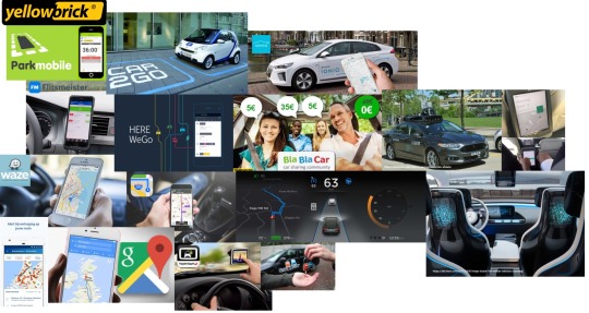
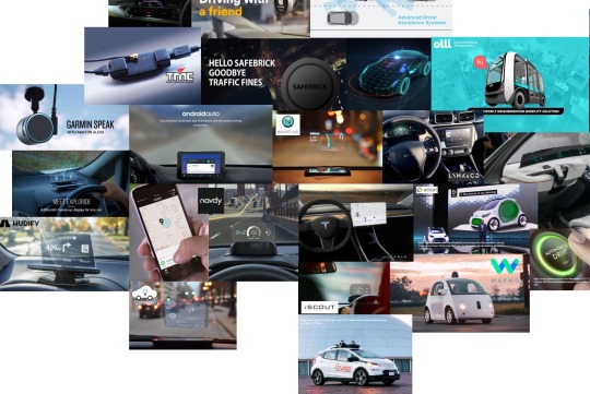
Technology trends timeline: The automotive industry is undergoing through a new age of accessible autonomy driven by social trends and the driverless revolution. Consumer apps are incredibly popular and becoming increasingly more efficient. Current apps that fit within the mobility experience are apps like Google Maps, Waze, Flitsmeister and Apple Maps. Aside from these apps there also a market for car sharing: think about Car2go, Blablacar and Snappcar. Android Auto and Apple Carplay are software systems that are developed to encourage motorists to keep their eyes on the road and their hands on the steering wheel. A product that is out on the market and becomes more popular Heads-Up-Displays (HUD). A separate device is aimed to reduce dangerous distractions by displaying key information directly in the driver’s line of sight. Some systems project information onto the windshield; others project it on a separate screen. Examples of HUDs are Hudify, Chris and Safebrick (Garmin speak, Navdy are dead). The founder of Aito, a company in the field of Haptic Technology, believes that there will be a shift from HUDs to smart materials. He indicates that HUDs are not user friendly and doesn’t make a car smart or modern; these displays are often just interfering and clumsy. Smart materials can make a difference by replacing conventional components with ones providing better quality of performance and higher levels of comfort. Most major automobile firms like Volvo are currently engaged in bringing out the ‘smart’ and ‘social’ and ‘connected’ vehicle which will represent the next stage of innovation(Aero, Volvo). Because of existing technology the automotive industry is making a significant change where the driving experience is changing. Brand identity will focus more on comfort, entertainment, capacity and high-tech experiences than performance. Data will be used to hyper-personalise the riding experience and Artificial Intelligence (AI) will make every interface both simple and smart, as Accenture 2017 reports. Some companies are also testing prototypes of fully autonomous vehicles, including Tesla’s Autopilot driving experience which is the most popular and then Olli, Waymo, GM’s Cruise Automation vehicles and Self-Driving Ubers. Looking at the Netherlands there is a lack of awareness or adoption of existing technologies. A lot of current existing technologies for the car are not very common or available in the Netherlands. For example Google Auto has yet to arrive in the Netherlands.
ANWB App Store reviews: People mostly leave reviews in the app store about the parking functionality as they like it. It is a function with the connected app, they start there parking with the app, connected with Yellowbrick, and stop the parking through the app or by driving away. Because of ANWB Connected it automatically should stop the parking, which in some cases doesn’t really work well that causes high bills.There are some reviews about the traffic jams, there are some reviews about the gas station feature which people overall use most although mainly before leaving home.
ANWB Internal UX Insights: Internal investigation by ANWB UX team in early 2017. Four participants, eye tracker while driving a car, using ‘Onderweg’ app. Participants want to know traffic delay, how big the traffic jam is and what is the cause behind it, and are interested only in traffic jams that are part of their route (personal relevance). Half of the participants miss a navigation functions (Explorers), the other half only uses theapp before and after commuting to work (Commuters).
ANWB ‘Onderweg’ Analytics: Google Analytics of the Onderweg app reveal that more than 16million sessions happened in 2017 and what’s striking 29% of them lasted less than a minute. The users are daily commuters and not explorers, indicating that the information inside the application are most valuable during daily commuting. The short activity times (1minute) and their preference of map views over list views to understand the general traffic congestions indicating they seek for concentrated knowledge at the time of a glance.
Reflection ANWB ‘Onderweg’: The app produces value before and after the commute for the users. It is not being used while commuting and if attempted to be used it can be dangerous because of its complicated UX. Opportunity to provide relevant traffic information to commuters; they require information relevant to their commute and need to make decisions before, while and after being on the road. Onderweg (meaning On-the-road) contradicts with the fact that it’s not being used while being on the road. The stakeholder’s limitation propose that they don’t want to develop another navigation app like Google Maps or Waze because they dominate the app market. Onderweg cans till differentiate and produce value for daily drivers. It can work complementary to one of the apps that people already use as it can run on the background anytime. Background runtime of Onderweg can use motion and location sensors and offer real-time driving information even when the user has not started any application, thus coming a step closer to the ANWB ambition of being there for the driver at all times and contexts.
Survey ANWB members: 36 Respondents, ANWB Members only. 36% are 18-28 years old. Only 27.8% of the total respondents have an ANWB app on their smartphones and 19.4% have ANWB Onderweg. 84% of the respondents use navigation application to support their driving task and preferably they use Google Maps(48%), Waze(12%), Apple Maps(12%), Flitsmeister(8%). 72.2% check their route ahead of their commute, 81% of whom are interested in total time and distance, 73% are interested in traffic jams, 20% check parking spots and costs. For the rest 72.2% of ANWB members that never used the Onderweg app before, they believe it is about Navigation, Help on the road, Safe driving, Route information, Traffic jams, Assistance by ANWB customer service, Route planner. Just 38.8% of the respondents use a parking applications, where 35.5% of them only use parking functionalities of Onderweg (Yellowbrick). The rest prefer Parkmobile.
Survey Commuters: 42 Respondents, 59.5% aged between 18-28, 10% aged 29-38, and the rest 30% 39+ years old. Most of them commute daily by Car (33.3%) or by Public Transport (33.3%), 11.9% by bike. 14.3% Commutes with a combination of these, which indicates that there is an opportunity for ANWB to demonstrate how to help people combine their commuting methods in an efficient and logical way. In addition to this, 19% commute with different mobility method many times and this depends on weather factors (50% of them), the urgency of commuting i.e. how much time in their disposal to arrive their destination, or on the availability of their commuting methods i.e. family might have taken the car already. 61% take a look at digital applications before commuting mainly for weather conditions, when the next one comes, total travel time and ETA(NS, 9292, Google maps, Buienalarm). 75% do not require any addition information than these before starting their commute. The rest 15% is interested in detailed delays they they are going to encounter (i.e. bridges, constructions), what detours they can take, and alerts for traffic jams. Interestingly only 69% of them do not want any information while commuting daily. The rest 31% require information like Real-time delays ahead, ETA times, Timetables for OV, Weather changes, Hop-off and Hop-on times exactly from public transport to another one and re-confirmation of the previous information (any change in plans of their commute). ANWB could cover the needs of these 31% of daily commuters with a simple, non-intrusive interface that keeps them focused on their commute. This can be backed-up by the fact that 95.2% do not use turn by turn navigation while commuting, meaning that no map is required, which aligns with ANWB stakeholder needs not to create another navigation system. 97.6% of the respondents do not need any information after arriving to their destination. The rest are itnerested about changes in the weather (bikers) and parking tracking & information.
Technology Timeline as researched, Today’s digital services and applications:
Technology Timeline as researched, Today’s artifacts and trending:
Technology Timeline as researched, Future trends:

Lab research set-up: My idea was to use the Wi-Fi camera to simulate the navigation experience from a smartphone while driving. Participants commented positively the ‘hack’ with the camera. Read the paper for details. Read here for Nazli’s formative feedback on the paper who commented “It was a real pleasure to read your paper; many thanks for your work”.

See a quick video edit of our Lab Research experience below:
vimeo
Target Group Analysis
The generation of millennials, 18 to 35 years old, is the largest generation currently alive. Studies show their needs differ a lot from previous generations, they value differently things in life and stand for their own worldviews. Millennials are digital natives as they were born in the age of rapid changes in technology. Today, they depend heavily upon apps and digital services. When they hit the road, navigation systems are very important to them. In fact, millennials say navigation apps are the number one technology they use when en-route(Allstate, 2016). They think about roadside safety surprisingly often. But does ANWB take any actions to stay relevant to new customer needs? ANWB in 2016 made significant changes in content marketing strategy. Lieneke Roos, e-content team ANWB realizes they need to approach a younger crowd and deliver services relevant to their needs (Roos, 2016). She adds, “you do not get people inside with a loud call about your product, but with giving them relevant knowledge”, meaning that you can attract users with a product that produces knowledge and value for them, in a personal and practical level. It satisfies their needs the moment they need it, and they feel excited to be ambassadors of this product.
They use analytics to personalize information for every individual customer (Roos, 2016) and, as Lieneke Roos from the e-content team of ANWB points out, “relevant knowledge and information will result in conversions as well”. According to our client, Frank de Wit the Customer Experience Manager of ANWB, they want to provide more relevant information to the drivers. Their analytics that Jordy Spruit, UX designer at ANWB, shared with us show the most e-content from the apps is accessed by 45-year-old ANWB customers on average. Client aims to drop the average age of users from 45 to 35 at least meaning they need to approach younger generations with new services. They identify that the older generations trust and are connected to the brand and are feeling to urge to use the services they provide, including digital applications. The different needs of the younger generations, Millennials and Generation Z, needs to be understood and reflected into the ANWB customer experience design.
Role as Digital Designers
Our role as Digital Designers and as young drivers, is to advise and signify ANWB and older, bigger corporations the direction they have to follow for the future. ANWB needs to stay relevant in the digital services today and in the future. They have to be aware and understand the current and future target audience of Dutch drivers, design and develop products and services by wisely using the technologies available today.
My Point of View
ANWB needs to update their perception within the company regarding what their young customers need from them and what will they need in the future. From talking with the client, Frank de Wit and working closely with ANWB’s only UI/UX Designer Jordy Spruit, we identify their internal struggle of designing for the users. They deal with assumptions that each employee is carrying along in their work. The ANWB ‘Onderweg’ app took 5 years to develop and cost a lot to the company. Unfortunately google analytics show that 29% of the sessions in the app drop out immediately. In an interview with an old ANWB employee and developer of the ANWB ‘Fietsen’ application, they create minimum viable products that literally add little to no value to the ANWB customer by the time of their introduction. They raise user’s expectations but the actual product disappoints them. For example, the new ‘Fietsen’ app was updated all of a sudden taking away data of users without warning like custom routes they had created which were replaced with suggested routes created by the company and not by the community of members. All of a sudden personal and practical values are vanished from a system that first had to study the user preferences and then update their product. They develop their new products in a very slow pace, taking old features away from the app users without alert and thus create bad reputation for themselves. Trust will not come by words but by their actions and by satisfying products they offer. Our team conducted a quick survey online where we captured the motivations of people in being an ANWB member. Our research revealed 49% of youngsters aged 18-28 (millennials & gen Z) are members mainly for the practicality of road side assistance and 21% for car insurance. Interestingly, 72% do not have any ANWB app installed in their phones which contradicts with their increasing smartphone usage. They joined ANWB only because their parents advised them to do so and there is no other connection to the brand. The new generation of Dutch drivers have trouble finding a personal connection to the ANWB brand and their services whereas older don’t.
Next Step
In this project we find value in attracting younger generation in using ANWB information before, while and after commuting. The product we are going to design should reflect the nice vision of ANWB and communicate it in the language of younger people. Although, because of the upcoming changes in mobility sector due to Mobility as a Service (MaaS), ride hailing (Uber, blabla car) and the emergence of self driving cars, there will be less and less interest in car ownership from the youngsters means that ANWB has to recapture their vision and include the new mobility mentalities in their services to add value to the mobility life of their younger members. ANWB is used to having proud members, volunteers and fan-clubs in which people feel the value of being part of. We believe young drivers should be studied more and come in the foreground of their digital applications. We advise that ANWB designers come forward and lead user-centered research, involve stakeholders inside ANWB in the research process, develop hypothesis together, reveal their biggest assumptions either as observers or as active participants.
User Needs
Drivers want to make decisions before leaving home. The same interviewee uses ANWB web-based File List (ANWB.nl/filelist) ahead of their commute to check traffic congestions. She makes crucial decisions based on what she sees on the list: she takes longer but less busy routes, she postpones client appointments. Visually impaired people that participated in the User Test from Sidewalk project take their time to prepare their route ahead of their commute too, to prevent unexpected events, make decisions, avoid difficult to remember areas, save time, be more safe.
Drivers seek for real-time information that can help them adjust behaviors. An interviewee during our research who commutes to her clients by car every day within different cities of Netherlands uses Flitsmeister which announces speed alerts and events ahead on its own. She calls the application her ‘best friend’ while driving. She finds personal value in this application because it helps her adjust her behavior when needed, it is a unique service, and is omnipresent - being there when she needs it to save her a ticket!
Requirements List
Before Driving
The user would like to see the route
The user want to know how long the route/travel time is and the estimated time of arrival
The user wants to know the traffic jams on their route and how that influences the travel time (delays)
While Driving
The user would like to be updated with the traffic delay time (traffic jams), how big the traffic jam is and what the cause of the traffic jam is
The user would like to see the route
The user would like to be warned for speedlights or speed checks (just like Flitsmeister does)
The user is interested in the fastest route as possible in consideration with traffic delays: optional routes
The user would like to be updated with jams/delays on the route (constructions, accidents, obstacles or open bridges)
The user expects that the map ‘zoom function’ will dynamically change based on the road and speed
The user would like to see the nearest gas station based on location and price when needed
The user would like to have the possibility to add an intermediate stop if necessary instead of changing the whole route
The user wants to easily reach the roadside assistance if necessary (assumption)
After Driving
User would like to be guided to possible parking spots near the end-destination if needed
The user would like to know general information about the parking spot (example: price)
The user would appreciate if the app(s) automatically stop when arriving at end destination
The user would like to start the parking costs from the car and have the flexibility to stop the parking costs at any time
Design Decisions
After generating our biggest insights from our research we saw and created two personas, the commuter and the explorer. They both have very specific needs and preferences when it comes to navigating and using apps for this.

Who is the commuter?
The commuter is commuting to work on a daily basis by car. A commuter doesn’t need a step by step navigation to get to this location because they are familiar with it. They however are interested in for example traffic jams, delays, road constructions, parking availability and gas prices. This information needs to be up-to-date and personalised to their needs. But because they know the route they will probably not use the phone in the car.
Who is the explorer?
The explorer is a someone who uses navigation to discover new places. An explorer does need a step by step navigation to that place. They either use an external navigation system or their phone for this.There is a possibility for a commuter to become an explorer. When an unexpected event happens (car crash, open bridge) and they have to take a route they have never taken before.
Ideation
We used the technique of Crazy 8s (DesignSprintKit by Google) method that is used by Google for their sprints. Each one of us came up with 8 ideas in 8 minutes.
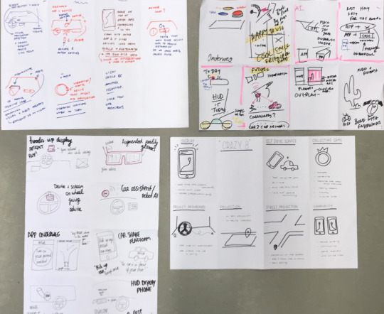
Ideation: My Contribution
I like to produce ideas while being in the context of the intended use of the product. The idea is to think by the eye of different stakeholders: User>Product Shareholder>Technology>Design. Putting myself in the shoes of the user helps me keep a critical stance towards current solutions (i.e. Google Maps, Onderweg) and makes me generate ideas based on my needs on that very moment also taking into account findings from user research (impersonating other people). Second step is to see it from the eye of the product shareholder i.e. ANWB: What does their company vision say? Do the company values reflect these user needs i just revealed? How can the company satisfy those needs? Do these needs add value to the project brief? Next step is to see it from a technological perspective: Is this feasible? Are there data and technologies available for satisfying these needs? Final step, is to see it from a design perspective: Ok, we can have these information at this very moment that the user needs them. Can this piece of information be presented in a way that is not putting the user on a risk (driver)? Can it be presented in an non obtrusive way?
An example of how i applied this process in ideation phase is while i was biking a Saturday morning to a favorite cafe.
Personal Ideation #1
Context: West Amsterdam. Activity: Biking. User: Me. Technology: Smartphone.
Starts biking
Background algorithms understand that the user is biking.
Notification appears confirming that ‘ANWB is on your side, by your ride’ achieving personal and practical meaning.
Notification dynamically changes and suggests what place the user is riding to: ‘White Label Cafe?’ or ‘Hogeschool van Amsterdam?’ trying to predict and validate where the user goes making them feel comfortable that ANWB is by their side.
User can confirm (qualitatively) that they are heading to the ‘White Label Cafe’. If not, no problem. The sensors expect this to be valdiated or not quantitatively.
User pops their phone out and confirms that they go to ‘White Label Cafe’ as they do almost every Saturday afternoon.
App reveals a low fidelity map supporting the users way. Shows Estimated Time of Arrival (ETA) and Delays ahead. User is in explorer mode and thus system shows alternative ways to explore your destination (get to know more from the area) adding to the personal meaning reducing practical meaning.
User stops somewhere in-between their route unexpectedly. System knows where user goes but what happened? is there a traffic light near? Sensors try to understand without interrupting user...
ANWB, wants to help at all times and changes the app UI to provide Parking spots around for bikes (if it's close to destination), or Roadside Assistance, as it’s more possible that teh user might want to stop there for a reason. adding to practical and personal meaning.
User just snaps a picture of the view and then continues biking.
The app updates the UI back to ETAs, delays and the minimal map staying there for the user in case they need it.
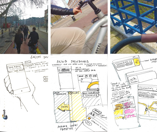
Personal Ideation #2
User leaves from ‘Scandinavian Embassy’ cafe and is heading to home from unconventional ways.
Phone knows that: “I am away from home all day. I went to school already. The time is 18.21. Usually on Tuesdays I return home around 18.00. Usually on working days I return home 89% around 18.00. So, open ANWB App, suggest me to get the bike and go home. Didn't be here usually before so it starts from exploring to home (nav following you without actually giving you instructions)
User says "Ok ANWB" for providing voice input directly to the app.
User says “going home”, letting the system know where they start commuting to (qualitatively validating sensors estimations).
user does not want any voice or tactile feedback. They just want to pop up their phone when they stop aside and know that they are heading well.
User ‘I stop aside the road and check. I got nice so far, also burnt some calories.’
Like Google Fit, I might optionally want the app to lock at my screen and provide me the information I want at a glance. Be there for me. Really.
I stop at a nice cafe and I want to save the location. I take a pic of it. As a good explorers’ app I would like to go back and check what I explored today, where I stopped and what was around. ‘TRACE ME’ in a way that is meaningful for me and I can understand.
Strengths
These ideas of a new assistance application for Commuter and Explorers demonstrates that ANWB could develop their service to actually be there for the user while they are out on the road. Both ideas demonstrate the difference with Google Maps: they are not silently observing the user’s location. It let’s them know they ‘are there for them’ adding to the personal value of being an ANWB member. The practical aspect of this idea is that sensors quantitatively try to geuss what the user might be needing at that very moment from ETA, Delays, to a Parking spot or Detour to their destination, or direct button to Road Assistance. Unlike Google Maps, it provides a minimal map so that drivers orient themselves quickly without a lot of details because they are commuters and most likely will not need a map to make their way to their common destinations.
Concept Iteration 1
ANWB Quick Assist (by Konstantinos Partheniadis):
As of today there are many navigation systems little of which assist for a quick glance on real time information while being on the road. Commuting refers to going to destinations via routes already known to the user where no particular navigation assistance is required. In commuting routes there are unexpected delays as a result of traffic jams, car crashes, open bridges. There are dangers where behavior change is required like speed camera, police cars, speed limitations. All these real time information can be provided on the spot by ANWB through their Quick Assist app. ANWB Quick Assist starts running automatically when the user is moving, it constantly updates a widget with information and in case of emergency send notifications to the driver. In the Quick Assist concept, ANWB is expected to use minimal design elements, clear visuals, large, short and accurate text for minimal distractions. It will speak aloud these information, short and accurately, even when the smartphone screen is off. In case of emergent route change Quick Assist can raise confidence for the driver to take a street they never took before, understand their surrounding and the device will light the way to get back on track to their destination. It differs from Google Maps as (a) it is a lightweight application which will show content in less than three seconds by the time the user clicks it, (b) Dutch maps can be available offline, (c) identifies your vehicle type even if you are on-foot, on a bicycle, a scooter, a motorcycle or a car and sometimes asks you to confirm it, (d) predicts your destination to show and speak relevant information and events ahead (e) takes minimizes visual load effectively (f) provides local traffic information that members of ANWB will trust. ANWB Quick Assist will show limited clickable targets which automatically hide when you are moving to minimize interactions.
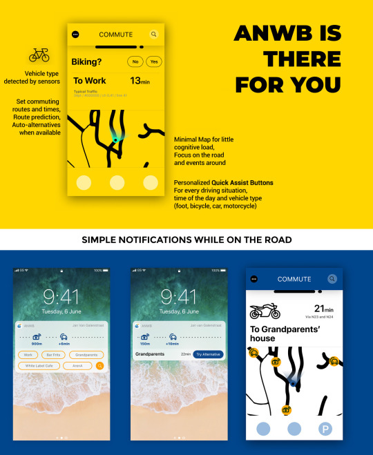
Smartphone Application for before, during and after commuting. Compatible with all contexts on the road ranging from catching the bus, hopping on the train, riding the bicycle on a rush, walking down the street. It’s there for you, with enough battery and endurance to last at any circumstance. ANWB is there to inform you about anything that happens around in the dutch streets and paths, be it constructions, delays on the highway, an open bridge kilometers ahead, parking costs for your car in the specific area you entered. In commuter mode it informs you without annoying you. It’s there, updated in real time for the context that you are currently into. It may ask for confirmation to qualify the context and activity. For example it may ask are you biking now? did you park your car? unexplored area, do you need directions? With its predefined Quick Assist buttons you can instantly ask for directions, parking spots, gas stations, road assistance and more
In our concept we minimize the design elements to complete simple tasks on the road. The main task of daily commuters an ANWB customer wants to achieve is to (a) quickly check locations as an explorer (b) easily turn into commuter when you feel confident finding the place yourself (c) change your vehicle for different routes. ANWB let's you know of information around you (a) alerts of delays: roads blocked, opened bridges, construction so that you plan the quickest, safest route and make quick behavior changes and decisions (b) alerts of dangers: speed limits, speed cameras of police.
Commuter to explorer (by Roselinde Loeffen):
We want to design a service that will focus on this commuter and his/ her wishes and needs. It not give them a step by step navigation as they don’t have a need for this. It will however provide them with a timeline view of their route. Pointing out trouble areas (construction, speed lights and traffic jams). We also want to give the commuter a helping hand when they have no other choice then to become an explorer (think of traffic jams, delays and so on).
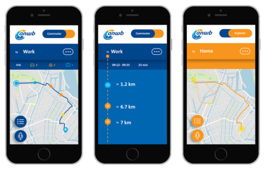
The commuter should also be able to become an explorer voluntarily when they feel adventurous, with just the switch of a button. This might also make sure the app becomes more then just a commuter app, so the amount of users on a Sunday might rise. This will be the unique selling point, setting this app apart from for example google maps. It is focussed on the commuter. We want the user to be able to select and customise the experience of the system in terms of functionality and content prioritisation. For example we want the user to set up or mute notifications, set default commuting method. The concept is based on the core values of the ANWB. Which are trustworthiness (which is also very important when it comes to the design ), openness, involvement. According to our debrief and client needs the concept will hold more values then just these. Confidence, companion and understanding will be implemented as well.
ANWB Controller (by Pinar Kesenci & Edwin D’Mello):
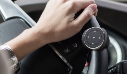
This concept consists of a digital assistant (attachable screen in car + phone) and a physical controller to help commuters reduce distraction and to safely reach their destination on time.The physical buttons (which can be easily attached to a steering wheel or the handlebars of a bike) are used by the driver to get information from the system whenever he/she desires. Thus, instead of the driver talking to a car and having a back and forth of audio commands that can take several seconds (which causes high cognitive demand due to the duration taken to complete a task and the chance of error), the driver just pushes the specific button and gets that information. The four buttons can be customised from the app to whatever the driver wants. But besides the driver being able to ask the system for information, it also provides information before the driver asks for it. For e.g. when a driver is on a regular commute, the system prioritises low distraction so the screen stays off and there is no audio. In this mode, it does not give out any information except when it detects traffic before the driver has reached that point. But if because of unforeseen circumstances a driver takes a new route and becomes an explorer, the system prioritises information over low distraction and provides turn by turn navigation.The system also provides information before the driver is about to go on a commute and after reaching there.
Strengths: This is based on the research as we found that (1) talking to a car causes high distraction and cognitive demand because it takes a lot longer to complete an interaction and there is a higher chance of error (the buttons in our concept don’t require any speech and the is effortless, accurate and provides the information the driver desires)(2) commuters don’t want turn by turn navigation and are annoyed by it(3) they want to know about traffic (both getting a traffic update without being asked and getting an update when they ask for that information).
Your personal AI passenger (by Pinar Kesenci)

ANWB will be your personal AI passenger while commuting. With the reframed focus and new flow the app will be focused on giving valuable data to the user before, during and after the whole journey. During the onboarding the user is asked to add places for their commuting route, like there home and work. The user is asked to prioritise information that is important for them, to make the app more personal. With the ANWB widget users can directly access the most information the user need at that moment in time before they start commuting by right swiping. It’s quick, easy and convenient. Giving the users the right and relevant actions within the widget the users can adjust the data and get more details if they want. Whenever the users starts the commute they only simply have to open the app. Since the app is using sensors and AI the app will recognise when the user starts their commute. The app will switch to a commuter screen, where only the most important information is shown for the user that is personalised. When an unexpected event happens and the the traffic jam becomes to big which causes a lot of delay the user can choose to take a (faster) alternative route through the ANWB app. At that moment the app will provide an alternative route by giving a very simple, less noisy step-by-step navigation to arrive at destination. At the end of the route, depending on the context, the app will provide relevant information or functionalities (i.e. parking functionality).
ANWB Overdrive for 2025 (by Konstantinos Partheniadis):
After research and personal speculation about the future of transportation and ANWB , future looks closer than imagined. In 2025, car ownership will be limited to the elite of the citizens. Mobility as a Service (MaaS) will rule the commuting scene with smart self-driving vehicles playing a vital role in the transportation system of the city. Finland is a pioneer in transportation. Recently their Whim app and MaaS Global receive large Red Dot award for their innovation.
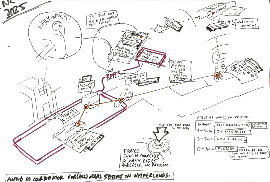
ANWB in synergy with MaaS businesses will generate bigger economic benefits the more people move and use their Overdrive service. With Overdrive, ANWB will quickly become an information and data center of what's happening out in the streets, selling information to other MaaS and cooperating with Government to regulate and predict traffic jams. ANWB Overdrive will make everyday commuting fun, efficient, more predictable. Fun, because it will embrace the spontaneity of the commuters, constrain them less and give them more flexible choices from a large spectrum of available vehicles nearby. Predictable, because sensors, self-driving cars, car sharing, scheduling and knowing people's commuting routines will help predict traffic conditions better than today. Commuters will have the opportunity to explore theirs and other cities of Netherlands behind different vehicles and never care again for maintenance, fees and regulations. ANWB shall rise. Without ANWB Overdrive, ANWB itself will have a hard time keeping up with new mobility services, their services will probably shrink because of the demotion of car ownership, new M-a-a-services will have a hard time converting customers, commuters will struggle with traffic jams and government regulations, Dutch innovation will grow slower, and foreign MaaS systems will be integrated also in the Netherlands (e.g. Finland’s Whim service).In the future, we expect ANWB to have adapted to the ever-changing technological, cultural, social demands in the sector of mobility services in the Netherlands. Citizens will commute by public transportation, similar to what we know today, and the first, in-between and last miles will be conveniently covered by Mobility-as-a-Service (MaaS) systems: shared cars(LyncCo,Forbes,Medium,DriveCanvas), bicycles (VanMoof+,RidersShare), motorcycles, self-driving vehicles(Olli,RAC,TaaS,IONIQ), taxis and ride hailing services(Uber,Drvver) rental and pay-per-mile vehicles(TaaS). Predictability, security and trust will be essential for delivering customer value(Accenture, 2017). ANWB with their new service named ‘ANWB Overdrive’ will play a crucial role for bridging MaaS businesses with commuters and will help keeping the Netherlands in the top three leading innovative countries in the world(InvestInHolland, iAmExpat). For businesses, ANWB Overdrive will provide a convenient mobility service that will integrate smaller MaaS services in a larger one. ‘The whole is bigger than the sum of its parts’, Aristotle once said. ANWB Overdrive will help smaller MaaS businesses gain exposure directly to ANWB’s loyal customers. They will be provided with road assistance for their fleet of vehicles and access to real-time traffic information and other data. The ANWB Overdrive service will make all those services more trustful, profitable, convenient and efficient to use while commuting in the Netherlands.

For commuters, it will help hop-on and hop-off from one MaaS to another with little to no effort, through a pay-by-mile or a monthly subscription model. Every mobility service will be accessible to use through the click of a button and ANWB will be there to guarantee the security, privacy and efficiency of your ride. Drivers will know when it’s the perfect time to hop-off and hop-on to another transportation medium that they wish. For example, imagine knowing that there is a brand new, fast, fully charged electric bike close to the next metro station and that you could use it today as a last mile commuter to arrive to work. ANWB Overdrive will provide a trustworthy sensor package to be installed in all vehicles types for tracking their location, detecting available rides nearby ready for hop-on or reservation, ensuring security, privacy and consistency in the customer experience (CX). Blockchain technology will be used to keep a detail record of previous drivers, routes and vehicle fixes for maximizing trust, privacy and security.
Significant Design Decisions 2:
Client meeting was about choosing either Future or Today concept. Both Jordy and Maaike, as young UX designers, were excited about the future with ‘ANWB Overdrive’ concept. Frank reviewed our work later and suggested we go for Today’s concept ‘Quick Assist’ because it aligns better with the initial brief and satisfies his wishes as client. But in the end he leaves the choice up to us. He commented positively on graphical user interface concepts (1) and (4) of concept ‘Quick Assist’. The team chooses to develop different form factors for the Today’s concept in order to explore different levels of user safety and satisfaction. The team expected that after this iteration it would be clearer to decide which direction to go in the end and which would provide the most meaning for all stakeholder. The complex problem was about to be solved. For this reason significant design decisions were made:
1. Use little to no Voice UI. As shown by literature and as proven by our research, people do not like receiving instruction aloud. Giving voice commands increases cognitive load and easily annoys the user which we want to avoid in the context of driving.
2. Suggest Mobility Method. As user research suggests, most people have more than one mobility method that they use to commute daily. Different context factors are affecting their choices especially for bikers. The system must give all the argumentation on why the user must take this mobility method, why start now from home, why to avoid their usual road, how much are the delays today, what time are they expected to arrive if they leave now etc. All these are very important to the commuter as indicated by our last survey. As indicated also by the speculative concept, it will be important in the future that the users know when and why is the correct time to hop-off a mobility method and hop-on to another in order to reach their destination effectively. ANWB has the data, it only needs to put them in the same screen and visualize it so that it makes sense to the user. Then, more users will take glances when the wake up with minimum to no effort. For more details they will have to possibility to explore more for every bit of information.
3. Focus on Commuters. Doing a competitive analysis and creating the user journey showed us that most navigation apps are already solving the wants and needs of the explorer (Google maps, Waze, Flitsmeister) but not so much the needs of the commuter. For this reason we aim to focus on the needs of the commuter. Since commuters don’t use navigation, they are not using their phone in the car. We see this as an opportunity for the ANWB. Finding a way to communicate the personal and relevant information they need in a safe way. Cater to their needs when it comes to relevant information (traffic jams) and when they have no other option then to become an explorer.
Concept Iteration 2
A personal attempt to bring Overdrive in today: The following UI was designed by me to demonstrate to my team how we could be inspired from the Overdrive MaaS future in order to serve commuters today. This smartwatch application gives ANWB members the ability to receive suggestions for which mobility method to get to reach their destination. The user has the ability to predefine their usual commuting destinations, work, school, gym, family, friend, and the system gets to know the person’s habit. It uses arguments below every suggestion to support why the user should commute or shouldn’t commute with this method now. To do these I used Figma, and smartwatch mockups.


The new commuting driver mode, follows the principles of the above design. The team gave positive feedback on it and we decided to explore this concept also in different form factors: smartphone, smartphone with a remote controller called ‘buttonset’, smartwatch, and a custom hardware device the ‘assistant kit’. The aim was to validate our assumptions regarding what is safer, what is less distracting, what people want, what ANWB can do. User can check at a glance which vehicle is suggested for today’s commute to their usual destinations: for example, ‘Work’ if its Monday to Friday, ‘White Label Cafe’ if its weekend morning, ‘Grandparents’ if its Weekend afternoon time etc. User can always check what’s up with traffic in their region i.e. Amsterdam if they are located there now, by swiping to the left the yellow bar of the destinations. The system will display information and delays related to the mobility method the person selects below i.e. if Amsterdam + Car, the information prioritized will be delays, traffic jams, speed traps and similar to traffic intensity events. The colored dots on the left of each item have a function: If it’s red, it attracts the eye immediately and means that this piece of information will very likely affect your commute. If it’s green it gives the user the feeling of safety and confidence, giving them the ‘green light’ as the specific factor will likely not influence their commute i.e. for biking, a good weather day will give a green light, but a late ETA to work will give a red light as the bike choice will very much likely make them reach late at their workplace. This way the UI helps the user make their glance very efficient and make decisions quickly based on all the factors that we found during our research that interest them for their commute: ETA, delays, total time, traffic intensity, weather conditions.
Smartphone app: The concept is firstly implemented in Smartphone.
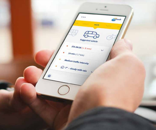
Smartphone app: While Commuting, the today’s way of using smartphone while people commute. In the contrary this concept disables all other notifications from other apps and the interface becomes short and simple and displays only relevant real-time information: delays ahead changing, bridges openning, ETA.

Smartwatch App: Before Commuting, same information as presented in the smartphone app.
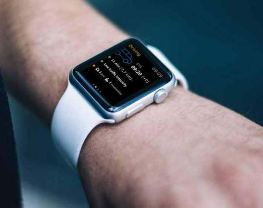
Smartwatch App: While Commuting, tactile and visual alerts that are small short and ‘glancable’ and can be auto-dismissed keeping distractions low. Drawback is that sometimes users will be tempted to touch the watch which requires all hands away from the steering wheel. Watch is expected to contribute very effectively in all-contexts on the road: bike, car, scooter, OV.
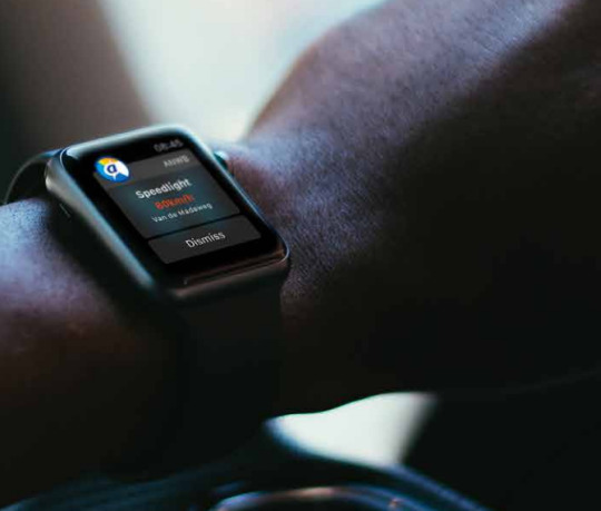
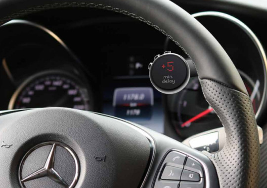
The Smartphone + Buttonset: The buttonset allows for user intervention to the smartphone solution while driving.
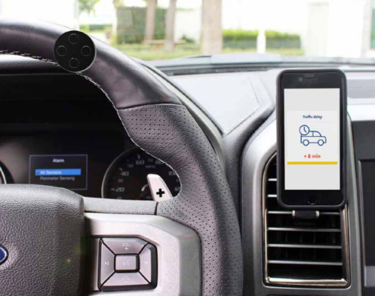
Creating the concepts
Foam forming with sandpaper. Measuring and designing digitally using Sketch (Edwin) and PTC Creo Parametric (Konstantinos). The foam models were 4 in total, one with large diameter screen and buttons, one with smaller diameter only buttons, and smaller variations of them. We invited two esigners from the unviersity to review our early prototypes in terms of perceived safety, distraction and ergonomics. Pinar and Roselinde designed the interfaces and made interactive prototypes for the smartphone (find it here) and the smartwatch (find it here).
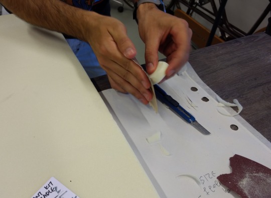
youtube
Watch here the process of making these tangible foam artifacts.
3D printing the models.

The hole was made using Cinema4D to remove material and make room for a smartwatch to fit it (borrowed Apple Watch Series 2). I then used PTC Creo again to measure and scale the model to match the actual size of the Apple Watch (42mm exactly).
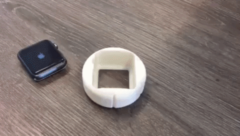
An the iterated model to be thinner with bigger buttons, easier to press and hold:

All the magnetic props, the iterations (from Foam to 3D print to 3D print again) and the steering wheel on which we applied them for optimizations.

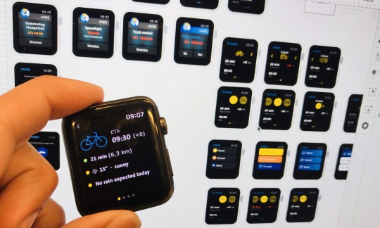
Concept Evaluation & Form Factors Comparison
The first survey revealed that drivers want to know about traffic jams (44%), Route (20%). Speedlights (8%), optional routes (7%), construction (5%), gas stations (3%). What is the optimal way to alert of the traffic Jams? How lo support them make decisions? How to be ‘omnipresent’ as ANWB? How about overspeeding in the specific context? In the evaluation we recruited 9 people at different times and contexts to try out our 4 different prototype form factors of the same concept: the smartphone, the smartphone + buttonset, the smartwatch, the assistant kit.
We gave them simple tasks like ‘select a vehicle for commuting today’, ‘where did you base your choice on’ ‘There’s a speedight trap as you drive, and you receive this notification, how do you behave?’, ‘Which form factor you prefer for everyday use?’ etc. The user then rated on a Likert scale from 1-5 all devices in terms of Safety, Distraction, Confusion, Confidence, Obtrusiveness, Added Values, Ease of use, Practicality, Usability, Learnability, Personal Preference, Likelihood to use. All these terms were chosen to reflect the brief and the attributes that vary between the different form factors. A copy of the table with the results can be found here. In summary, smartwatch is considered to be the most practical solution especially for the users that wanted to be active in multiple contexts on the road. It is also the most likely people would use for this kind of application: real-time traffic information for all contexts on the road. Smartwatch scores the lowest in terms of obtrusiveness meaning that the having something on my wrist to alert me about relevant events and take quick glances while the user is driving is not obstructing my driving activity almost at all. It scores the highest by difference in added value, people would use it more frequently, and they would like to personalize it. Smartwatch scores low on safety especially for the case of driving a scooter because drivers, with the current interface, wouldn’t be able to touch it and interact while pulling the gas. Smartwatch comes second on distractions, after the buttonset. Smartphone with the buttonset comes first in a lot of ratings too including Ease of Use, Lowest Distractions, Highest Safety and Confidence of Use.
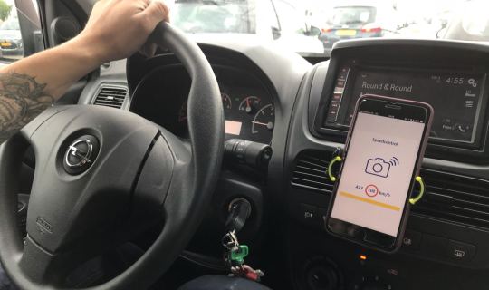
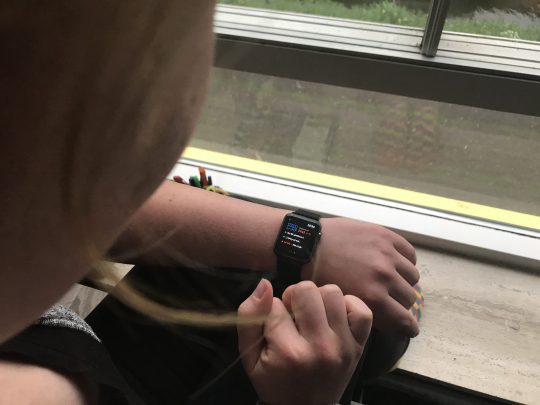
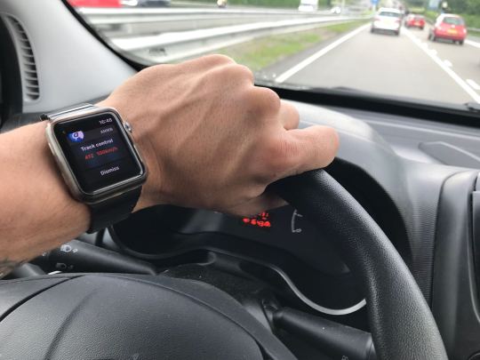
Significant Design Decisions
The user test and the client meeting helped us make decisions and make a plan on finishing the project with another iteration on the Smartwatch concept. The client was excited about our 3D crafted models and our concept validation with 9 users. Client understands our arguments that Voice UI can be distracting and annoying while driving. He sees potential in a Smartwatch UI because it is attached on the user’s wrist and it does not require the ANWB as a company to build custom hardware but instead, software in which they are experts. If a smartwatch application is successful for ANWB at least for early adopters and proud members, they will explore the possibility of getting into hardware and making simpler wrist-based assistants for drivers of all ages. The buttonset was appealing also to the client but it would require hardware development which stakeholder wanted to avoid. We also, as digital designers are not in favor of iterating on the button set because in our point of view would require expert industrial designers and human factor engineers to make it comfortable for the user in all contexts and vehicles on the road. In sort, it would require extra research and the outcomes of a redesign could be questionable since the Masters is about digital applications mostly and industrial design can be supportive to it, but if possible, not a protagonist of the solution. As a result the decisions are:
1. Smartwatch will be the form factor to go. It can provide valuable real-time traffic information for while being on the road without obstructing the driver while maneuvering in contrast to other devices we evaluated. In the Netherlands 20% of iPhone users have a smartwatch (Deloitte, 2017) which is enough to approach early adopters. For this reason we ordered a smartwatch Ticwatch E to think around it and prototype the upcoming experience.
2. The UI should support no touch events while the user is driving. New laws introduce tickets (UK, 2018) to those who touch their touch-enabled devices while driving. “At a court (2018) woman said she was using the watch to check the time and needed to touch the screen to activate and deactivate it.”. There are setting in Android and Apple watch devices that wake the devices on the wrist raise so there are no big worries here.
3. Smartphone for before and after driving. This way other peopel can try ANWB commute to receive relevant information before and after driving. Although the app is not usable while driving similar to what Onderweg does today.
Concept Iteration 3
Back to the drawing board, we mapped the different information that would be required before while and after commuting also depending on different mobility methods (car, scooter, bike, public transport).
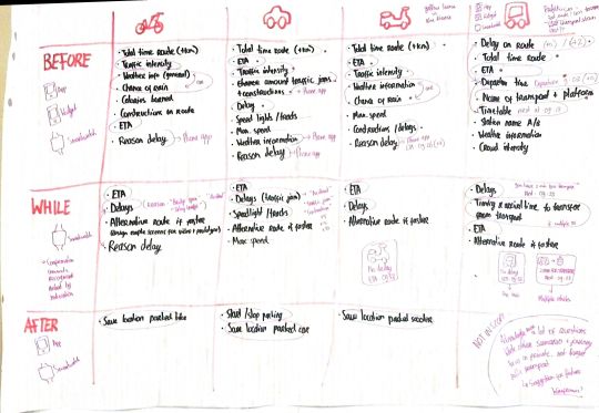
The ANWB commute is the final iteration of the new commuting driver mode for ANWB. It includes the same information as the previous version but it has become much more safe while driving than previously. The user can now provide input to the device by flicking the wrist either inwards or outwards. This will be explained in the strengths of the concepts below. The team equipped with a new smartwatch by Android called Ticwatch E. I took some time to develop a prototype that demonstrates how the watch can work without touching it by just (a) glances and (b) flick gestures.
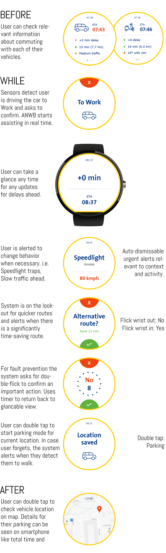
Strengths
The concept iteration 3 called ‘ANWB Commute’ is the result of research, design and reflection on the findings, the stakeholder and user feedback, and our own expertise. ANWB Commute is a strong concept for ANWB to introduce to the market a real-time, omnipresent digital system that will stand for the values of ANWB. Going back to the debrief that reflects the project focus.
Multicontextual: Smartwatch is attached on your wrist and never goes away unless you want to charge it - unfortunately battery life still remains challenging with average life of 24hours(TomsGuide, 2017). Jumping from car, to public transport means that I dont want to think too much, I can just take a ‘glance’ on my watch and see details of whats ‘ahead’. Getting on my bike to school means that the device is there observing my context and alerting me if there is a bridge on my usual route that is opening. This can help em make decision and avoid this part of the commute. The device can help me get out of traffic jammed contexts and suggest alternative routes. With a simple UI it supports me with turn by turn navigation to get to my destination with high confidence and no need to open google maps, type ‘school’, click bike and click go... ANWB is there for me at all contexts.
Safe: The assistant is there, waiting for user to consume the information at a glance. While driving, touch input is intentionally not functioning. In this way, we prevent the driver touching the watch screen and (a) keep both hands on the steering wheel or the handlebars as suggested by Covenant and the Human factor guidelines and (b) avoid any police tickets for using touch devices while driving. As European traffic law says ‘You cant re-programme or touch it while in motion, the same rules apply for any sat nav’ (Flowers, 2017), the ANWB commute enables glances and the two ‘flick’ gestures that allow the user to provide input to the system when needed staying away from the punishable ‘touch’ interaction. Flick is said to be ‘awkward but awesome’ and the team tested it out and works rather good! Following picture is from the official document by Google for Smartwatch Navigation Patterns.
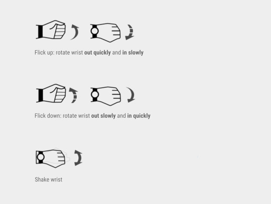
The fact that users required little information while driving worked in favor of the concept as the law is limiting the in-car interactions. The fact that ANWB is capable in developing software and not hardware means that Smartwatch solution is the only way to go for answering the project brief.
Glancable: The screen lights up only when the driver raises their wrist as if they want to check the time; this happens by default on Android and Apple watches and is like taking a ‘glance’, what we like to call ‘glancable mode’. The watch stays silent and doesn’t really give you any information unless you ‘take a glance’. Here it is trying to keep you distraction free by not bothering you again and again because you already know everything.
Opportunity for explorers: Now imagine there is traffic and you take a new unfamiliar route. The information you get remains the same, but the interaction is different. The assistant gives turn by turn navigation constantly telling you where to go because you are unfamiliar with this route. Here it is trying to give you more information and not prioritising low distraction. You have an assistant for your commute which gives you some relevant information safely.
(Video) Below, the 20 hours of ‘extreme programming’ on Android Studio in 1 minute. The smartwatch flick works and will be demonstrated at the final presentation at the university:
youtube
Reflection
My initial Goals: My passion for cars attracted me to the ANWB Brief from the beginning. The team had the capabilities to deal with this complex problem which was initially looking humble and simple. Our previous experience with navigation systems (Sidewalk) would definitely give us some insights in our work. I wanted to build some cool interface for cars, better be physical product. My initial goals were to iterate on a product multiple times. My secondary goal was to work along with real users like co-create workshops. This didn't happen as priorities where given to conducting lab research, writing paper, updating the brief amidst the way. So the project was receiving research insights mainly from literature, trends research, lab research, surveys and client feedback. My third goal was to deliver a meaningful solution that adds value to every stakeholder involved. This is more of a general vision that applies to my works. My inspiration from Stuart Walker continues as applied in WWF-Foodprint Project and my Album2020, I want to continue creating meaning from all aspects of teh Quadruple Bottom Line (QBL framework): personal, practical, social and economical. This is reflected in our design process with the iterations where we were going back and asked ourselves multiple times: is it practical? What about personal meaning? Can non-ANWB members have it? What about other contexts? What happens in the future? Does this give ANWB any business opportunities? Can they actually build it in a possible future? Could this thing sell? What could be the user acceptance if it came to the market?
My Strategy. In the very beginning of the project my goal was to study, organize and propose a complete strategic plan to my team mates. You can see it here on my personal blog. It was a personal learning goal. I never officially wrote down activities to do within a project but for this one it felt really important to do because of the extended timespan of 20 weeks. My strategy used concrete research and design methodologies like agile, waterfalls, co-design session, extreme programming (XP) after a study I did online. The plan separated the project in 7 different stages (i liked to call modules) that were interconnected with each other and would allow us to go back and revise and also close and document previously finished tasks (items).
My initial, waterfall-looking plan:

Turned out to be more cyclical like:

The plan was presented to the team. Strengths of the plan was that it was covering all the expected stuff from us in order to explore and iterate based on user and stakeholder feedback. Team liked the idea of organizing a co-design workshop but they believed it would be challenging to do and might also be optional if we have other choice. My rationale was that in the past I had never participated nor organized a co-design workshop and given the fact ANWB is a big organization, with 4.4 million members we could very likely organize such an event with users members. Weaknesses of the plan was that it was looking like a waterfall method and iterations weren't clearly visible. The client gave feedback on the plan in the first meeting and introduced to us the 'Better together' Lean UX cycle.
The client suggested we do a Lean UX (yellow) cycle for the project:

He firmly believed that we as a team need to take a cycle there and suggested we adapt the current strategy into this plan that he was also more familiar. We saw this as an opportunity to learn from professionals and worked with Lean UX in mind. We had our hypotheses/assumptions: visuals vs audio, physical vs digital. We experimented in lab settings, out in the field. We analyzed our knowledge and introduced it into our research and into our requirements list as insights. The strategy o initially came up with, worked out overall. Several notices (a) no extreme programming took place and that was because experiments were made to run firmly ok on wizard of Oz prototypes. The extended ideation phase did not allow me to start extreme programming sessions with the team in which I was planning to give them tutorials and split tasks for each member to deliver for our experiments. The only programming took place the last two weeks were the ANWB commute smartwatch application was developed as a prototype for (a) demonstrating how the concept works in a video the team is working on and (b) demonstrating how to concept works to the client and to the master's final presentation to let people tinker with it (c) for me to have something to remember and leave back at HVA and to ANWB who can potentially upgrade my basic prototype and try it with users. Client gave feedback on the prototype saying that he is impressed although, 'without offense' he believes the process of the design was more valuable than trying to show how the final interaction works. I finished the prototype quickly after this, with quicker tricks bypassing the difficult parts of programming. In the meantime I enjoyed a couple or more 'extreme programming' 13-hour sessions by myself. The sense of accomplishment after making the thing work dynamically and programmatically is unique. This feeling comes along because you know the idea is now applied and that with the implementation of more advanced APIs Like Google Maps traffic API or TomTom Traffic API I can source the actual delays at my area and on the road I am located on which can turn the ANWB Commute from concept to an actual minimum viable product that can be testable with users in the real context of the road. Although the remaining list of deliverables (iterate the UIs, get client feedback, make a video, document everything) had bigger priority over making a fully working prototype similar to what I did for Sidewalk project which could potentially bring us closer to received user's feedback.
My Card-Sorting Game that we never got to try, was a tool i created myself in order to generate ideas together with users. The game was about the context of driving on the road. The player would have the ability to pick their mobility methods (car, bike, motorcycle, bus, foot) and create with the researcher a story around which they would describe, in a think aloud process, their emotions and actions. The game was never played with users unfortunately. Quickly after I designed this game, we decided to focus on commuters, and the team efforts focused on preparing an extensive survey that would reveal user behavior similarly to my game. I still believe such a game would have been fun and very generative to be played with a team of ANWB members. Or, it could also be very fun to try as an empathy game for the ANWB employees who have a hard time understanding their user’s needs when it comes to digital applications.
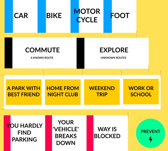
Increasing Complexity. The team demonstrated quick adaptation to changes of the brief and challenges that the client introduced amidst the project. The team started with clear strategy and had to revise the strategy and operationally deal with new challenges. Client was avoiding to steer us in possible direction that they would have in mind. As a result, it happened that we explored a concept that was similar to the Onderweg stakeholder’s vision ‘Mark de Bruijn’ about Mobility as a Service (MaaS). Through our research and design iterations we evisioned ‘Overdrive’, a concept that sees ANWB as the major digital platform that will connect all MaaS systems in one digital application and make them accessible and usable to commuters in the future. They day we presented this concept to the UX designers they showed us a video the marketing team made 2 weeks earlier that envisions ANWB to have a part in the game of MaaS transportation in the future. This says two things. Firstly the team produced results that correspond to leading stakeholder expectations without even taking to him. Secondly, ANWB really has to start making strategies on how to deal with the future of mobility today and prepare the grounds for safe and meaningful connected driving, shared driving and self-driving experiences. Frank, wanted us to discover ourselves and think about future proof concepts and he succeeded in this. No strict boundaries were applied to the project leaving the team in charge of steering the ideas by taking in account research findings, user requirements, trends in mobility, stakeholder capabilities, granted and upcoming regulations and more. The following video demonstrates the way we worked.
youtube
Lessons Learnt: ANWB showcased how big, slow-paced companies that want to catch up with competition need external help. Not only people from outside the company but also young multidisciplinary designers. Young digital designers usually share a common for positive transformation. At least this happened in our team. We were all motivated to help ANWB see the context with a clearer eye, see that they provide their target group with information in the wrong time, they don't ask them for their opinion. Digital Designers can utilize the company's reputation, their knowledge and tools, take in account where they want to be in the future and build solutions that solve something today and are inspired by the future. In the case of ANWB commute, if it wasn't for speculating in the future -which we almost believed we could direct the project into a speculative one- ANWB commute would likely look different. That's because in the future of MaaS mobility services different companies with different combinations of fleets of vehicles, from two wheeled to four wheeled, from private to autonomous, will require a a digital system that will allow access from one vehicle to another meaning from context to context. This multicontextuality inspired me to design the UIs of the ANWB Overdrive, supposing there will be some square, screen-based interface that the user will have access at all times.
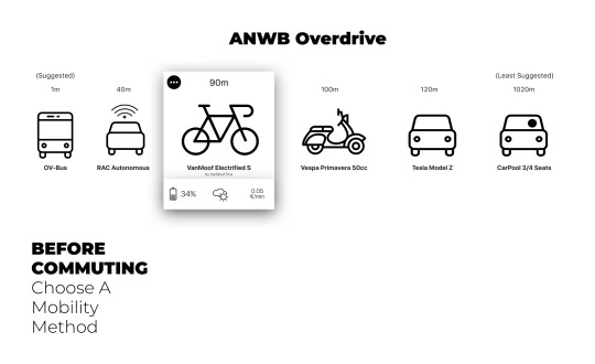
This reflects back to two popular interfaces: smartphones and smartwatches. The small interface allowed me to concentrate information about.multiple contexts and connect different contexts through a swipe gesture as if it is today's smartwatches. My best lesson what that speculating in the future can bring unexpected inspiration for answering today's problems. This tactic most probably ensures that there will be scalability in your concept that most likely you have not even though of before. Essentially the speculation derived out of company's values and size and the trends in technology and mobility. Similarly for other projects, learning who the company is, what it stands for and how the stakeholders see it in the future can allow better framed and sustainable solution for today and the future.
Using the smartphone while driving is like driving with visual impairment
To consume information while driving is contradicting with safety regulations. Similarly to the Visually Impaired People (VIP) project, Sidewalk (Sidewalk, 2017), it was interesting to investigate different input methods and feedback modalities to understand which can minimize the cognitive load for the user to interact with the system and stay connected to their real context which contains risks. Back in 2011, Auto Accident Attorneys of Michigan created a video to demonstrate how distracted driving by smartphone usage is similar to being blind (MichiganAutoLaw, 2011). Raygo used their patented technology for the blind to create a tactile and voice interface to use your phone while driving (Raygo, 2015, Indiegogo, 2015).
There is a relevance between creating digital solutions for people with visual disabilities and for people that are driving. In analogy, VIP that want to commute to their usual destinations, need a system that verifies them that they are heading correctly, that makes them aware of the context, and supports them to make decisions. Drivers, similarly want a system that is there for them, that can understand the urgency and the situation they are in, that can support them make decisions to reach their destination in an efficient way. Drivers and VIPs want to keep their confidence levels high, move in their contexts safely and reach their destination efficiently and on time. For both, it’s important they prepare ahead of their commute. Sighted people have an advantage here and should at a glance know what to expect in their daily commute. What they know might change because of unexpected events ahead, i.e. traffic accidents, bridges, and thus the system must let them know through a feedback modality which can vary based on their context and activity. For example, if the user is still at home, the system can use vibration, audio, visuals to alert them and might expect touch or even text input by them. Unlike when there is an unexpected event while being on the road, the feedback modalities must be restricted primarily to distinctive vibration patterns and secondarily to short, ‘glancable’ and understandable visuals whereas input must be required only for urgent situations and must be conducted through air gestures to maximize safety.
Personal meaning is always important. People usually understate personal value for practical value. For example, my father never enjoys music in his car while commuting to work because he wants to have the local news radio on which announces traffic events for the roads he takes. Based on that, he makes decisions for his commute and takes a different road. Although the new generation of drivers, the millennials, rely on navigation applications on their smartphones whiled riving to receive information such as Estimated Time of Arrival (ETA), faster alternative routes and make it easier to access turn by turn instructions. They also use roadside assistance more than any other generation (Allstate, 2016). The use of their smartphone gives them personal value and studies indicate that it’s not only them who are driving distracted, it’s that they are more comfortable admitting it.
1 note
·
View note
Photo

ISLE - Live like a Greek for a day
self-directed learning; framing & strategizing; concept & ideation; creating & crafting; reflection & awareness;
Introduction
ISLE is a service that aims to transfer the Greek experience to travelers visiting the Greek islands by guiding them to live one or more days as if they were Greeks. Through the ISLE smartphone application, the traveler selects a virtual local Greek persona to live by today and is being navigated to the places that represent the persona’s summer habits: sun, sea, coffee, ouzo, food, cultural events, bringing them closer to local products, experiences and people. Travelers are led to sights but also to affiliated local businesses that wish to be promoted through ISLE. It proposes a simple but dynamic revenue stream model that favors local society and all the stakeholders involved. ISLE was developed by Konstantinos Partheniadis and George Kordatos and is currently in the second and last phase of the Aegean Startups competition 2018. Visit ISLE on isle.homeip.net. The ISLE project was developed from zero during the second semester of MSc in Digital Design. The project has high relevance with the studies for the master degree in terms of framing & strategizing, concept & ideation, creating & crafting and self-directed learning.
Timeline of Events
31 January - Meeting Konstantinos & George, Brainstorming
05 February - Konstantinos, Idea Description
05 February - George, Website Start
10 February - Konstantinos, Website Host at Home Server
13 February - George, Competition and Moodboards
15 February - Konstantinos & PhD Expert Feedback, Idea Description Iteration
22 February - Konstantinos & Business Expert Feedback, Idea Revenues Iteration
24 February - Konstantinos & Traveler Expert Feedback, Idea Description Iteration
25 February - Skype Konstantinos & George, Ideation Session & Website Feedback
25 February - Konstantinos, Sketching
26 February - Konstantinos & George, Low Fidelity UIs
27 February - Konstantinos, UIs Finalize & Logo Design
01 April - Idea Submission at Aegean-Startups.gr
17 May - George, Connection with Aris Entrepreneur willing to help
31 May - Skype, Aegean Startup Seminar for Final Phase
30 July - Business Plan Submission (doing)
The ISLE culture
Visitors of Greece usually admire the ancient story of the Greek, but they will hardly understand their way of life (Stereotyping Greeks, 2017) unless they try it themselves. Understanding a culture requires one to think as the local society does and to interact with it. “If we travel with our eyes and minds open, we place ourselves in a position to observe and appreciate cultural difference” (Sturges, 2005). The aim of ISLE is to communicate to the traveler the passion of Greeks to live in the present time. To let them live carefree of their personal problems for one day. To identify themselves with the local culture. To experience the little things that people from a different ethnicity value highly in their routines. To try. To enjoy. To drop their stereotypes. To reflect on their own outlook about life. How? Through the observation and active participation in a dynamic scenario that guides them through the simple rituals of people of a different culture on an island far away from their homeland.
The Experience
ISLE attempts to deliver a meaningful and genuine experience to the travelers. Firstly, by a mobile application that provides the digital experience, and secondly by interacting with the physical environment, the people and the activities of the island. Through the application the traveler selects how intensely they want to live their day by choosing a virtual Greek persona: Like Aris? 27-year-old, exploratory, romantic, shy, drinking beer without alcohol? Like Helen? 20 years old, hyperactive, dramatic, extrovert, ouzo-lover? Or like Panos, Evangelia and Manolis who are somewhere in between? Then, the application navigates the traveler along those spots that fascinate the chosen persona and advises them about their habits in the real context.
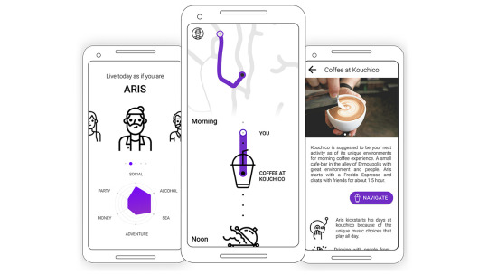
“The real voyage of discovery consists not in seeing new lands but in seeing with new eyes” - Marcel Proust, French novelist.
Personas
ISLE’s personas are virtual figures that will be the result of ethnographic research and will be able to reflect local groups of each island. The personas are 3 to 5 for each island. Each persona will lead the traveler to different "pathways" of experience with unique combinations of activities. Similarly to the personas, some activities are more intense than the others:
Coffee: Traditional Coffee, Modern Coffee, Coffee-Ouzeri.
Food: Gourmet, Restaurant, Souvlaki, Meze, Tavern with live music.
Drinks: Traditional Ouzeri, Beer, Bars, Clubs.
Nature: Fishing, Bicycling, Walking, Chansing the sun.
Beach: Swimming on a secluded beach, beach bar.
Shopping: Local Products, Cellars, Patisseries, Markets.
Entertainment: Summer Cinema, Dance, Fairs, Local Events.
Strengths
Little Competition: Recent statistics show that 75% of today's travelers spend a lot of time using travel apps (marketing insights 2016, 2017) - Google Maps, Foursquare, TripAdvisor, Culture Trip, Cool Cousin. 86% of them are immediately disappointed by poor user experience. For people that are on vacation the problem is that finding a good destinations takes time; search for places around, filter and sort by rating, pricing, distance, see pictures, read reviews, choose destinations, organize them on lists, see them on the map. Competitive applications like the aforementioned forget that the traveler is on vacation and demand their attention. And they do well, because their aim is to provide them with good information to make up a good decision.
On the contrary, ISLE prepares for them an experience that reflects what the locals like to do in their summer. It leads them to the beloved points of every person, but does not push them to be faithful to the plan; the traveler is free to explore anything around and the system completely understands it (no need to make a u-turn anymore).
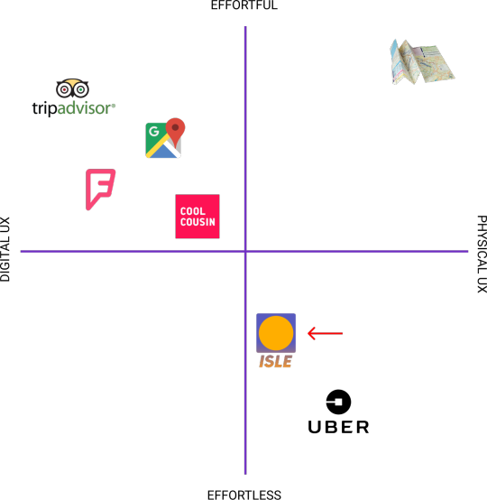
In the Competition Map we can see how ISLE is positioned in relation to the direct competitors - Trip Advisor, Google Maps, Forsquare, Cool Cousin. The Uber service is used as a reference to understand how a simple mobile app enhances real-life experiences directly. The hand map on top-right reminds us the complexity of using a map to coordinate in the physical world. Luckily today's traveler apps have simplified the map experience although, still requiring much effort to find, save, organize and navigate through Points Of Interest. ISLE makes an attempt to simplify the exploration experience by taking users trough a single-day journey from spots that are meaningful for the local personas. This way the traveler can easier and more effectively reflect on the local culture. ISLE provides an effortless traveler experience that is worth trying at least a day during the vacations. The content of the application is simple and the design elements are striped down to the core (see map, timeline, avatar selection). ISLE creators believe minimum User Interface is the way to achieve maximum User Experience.
Profitable and Flexible Business Model: ISLE has revenue only through the affiliated local businesses. It is a form of alternative advertising for local business people. This means a healthy digital experience: free app to download, no in-app ads. Hidden cafes and bars, small shops with local products, etc., can all be displayed if they wish directly to the travelers via ISLE. The entrepreneur agrees to pay a fixed amount for every traveler from ISLE who arrives and stays at their shop whether the traveler purchases something or not. The entrepreneur has the freedom to choose the amount they wants to pay. The larger the choice, the more likely it is to get travelers to their business instead of the competitors. The system creates a small competition within the affiliated businesses but they have nothing to lose with their participation even at the cheapest plan of 1€ per traveler. The business has the ability to win back € 1 charged from the service, as ISLE has prepared the traveler with a good mood to try the experience they offer there. The risk of damage that a local business can have from participating in ISLE is negligible as, if 1 in 10 travelers make at least one purchase of 10€, they have zeroed out the cost of all the 10 travelers. If the company is not satisfied, it may at any time discontinue its cooperation with ISLE.
Independence: ISLE has no control over what the customer purchases. Its role is to direct the customer to the businesses. This method ensures that the entrepreneur will do the best to keep the customer-traveler and hopefully make extra profit that they wouldn’t have the ability to make otherwise. It is up to the entrepreneur to leverage their business, behave properly to the customer and promote their products.
Precautious: ISLE takes care to be aware of what is happening and to create a sense of contact with both the stakeholders - the traveler and the tourist - through the implementation of digital design and digital interactions. For example: "If you were satisfied with the experience at this spot, click YES. If NO, you can make your complaint here."
Team Capabilities: The two group members, Konstantinos Parthenidis and George Kordatos are both product designers. They are in the process of recruiting people to cooperate in the following areas: entrepreneurship and management, software development, legals and marketing.They have contacts with Android and iOS developers and intend to quickly prototype the service after some funds are being granted. The project is separated into stages of Research, Design, Development and Promotion before Launch.
Scalable: ISLE is a startup, a new business move. And like all startups it has to start small. It can potentially take on large dimensions on more islands and cities in Greece and abroad. It has social benefits as it brings the traveler with habits and elements of local culture at a lower level than other applications achieve. Design, aims to show that a travel application does not need to be rich in content to communicate to the explorer the local lifestyle. It promotes entrepreneurial innovation in Greece by inspiring local entrepreneurs to diversify from others and follow modern business models (see Uber Eats) that will bring them additional profits with no effort. ISLE As a start-up, takes its baby steps and aims to be developed for the island of Syros, a small island in the Aegean Sea, in which the owners of the idea have lived as students and know it well. The service is applicable to more islands to which it can potentially bring social and economic benefits.
Reflection
The ISLE service is inspired by Stuart Walker’s and Simon Shuttle’s ideologies about creating products that create value to the life of people. Walker, in his latest book underlines that modern day products eradicate elements that help in reflection and awareness (’Design for Life’, 2017). Shuttle has been talking since 2005 (’Engineering Emotional Values in Product Design’, 2005) about products that produce value to users by stimulating emotion - through experimentation, expectation, mystery, reflection - and logic - through understanding, clarification and recognition (Kelly Goto, 2015).
Societal awareness: ISLE addresses the problem of digital isolation by taking travelers out in the wild, in the unknown. It tries to excite users rather than give them the information asked to consume. It addresses the problem of mainstream traveling by helping travelers detach from tourist groups and explore on their own by their senses. It intrigues the curious ones by letting them step into the shoes of a local person with the Personas. To put it simply, it enables them experience how a local person takes charge of their day. It gives them more contextual and relevant hints about the foreign culture that they can return it back to their country in the form of exciting experiences full of mystery, excitement, weird things, new things, unfamiliar or familiar things. It promotes reflection and engagement with the different culture. Ultimately, we hope that this small service can strikes social change, ideology swift and create a new need: to explore more Personas from different lands across the globe. It could be that ISLE is the beginning of a new way to take a step deeper into cultures we have only heard of before.
Relevance to MSc Digital Design
The idea of ISLE was born soon after the beginning of the second semester during MSc Digital Design. In one week the team cooperated remotely through video calls to frame the problem, the idea, think of the business model and the revenue streams, eliminate assumptions, and write down core elements of the concept. Practically, George would focus on finding image references, making the website work, and I would focus on composing the text that would describe the idea for the challenge and for the website both in Greek and English. I interviewed a tourist expert and enthusiastic traveler herself, who visits the island of Syros every summer. I requested from her to write two short user journeys of typical people of Syros. In this way she helped us shape the concept through her eyes too. I developed sketches of the digital user experience so that they would reflect our main concept of keeping the digital experience to the bare minimum. The aim was to detach the user from the smartphone apps and create a reason for them to arrive somewhere and learn more about the place, its people and the activities that take place there. I designed wireframes with medium-fidelity to communicate also what content will be shown to the traveler and the entrepreneur. Try the simple interaction with ISLE on Figma!

We asked relatives for their point of view, friends for their feedback, business experts for feedback on the revenue streams, designers in our network for feedback on the user journey and the experience. The iterations were quickly done by sharing a copy of the idea document and letting people we asked suggest changes and make comments. We developed the website quickly using Adobe Dreamweaver and a free responsive html template. I hosted the website at my fathers home sever to make use of our own technological resources and prototype the idea quickly. This made ISLE reflect that it is well-thought, and it’s closer to reality than it would be if we just described it through words. The Low Fidelity User interfaces helped the judges and the crowd understand how the system would work in their hands without getting into aesthetic details and commentary. On April 19th, ISLE was announced that it made it to the second and last phase of the Aegean Startup competition. We have since started developing a business plan with mentors and professionals. We are connecting through LinkedIn, reading about startups, asking people for acquaintances to join us in our ISLE journey. We plan to create a high fidelity design soon that will incorporate also microinteractions to add personal and relevant value to the context of the surroundings of the traveler like, type ‘kalimera’ to start, ‘loading sunrise’, show persona’s attributes with animations, use bluetooth beacons or wi-fi hotspots to trigger events in the UI and enhance the environment. My participation at two Yes!Delft Startup weeks for another project is helping with the mentality to take the step and bring your ideas to the crowd. As a lesson from Yes!Delft, we need to make validate the ISLE concept with travelers and entrepreneurs, discuss their needs and opinions on the experience we have designed so far. Digital Design is about leveraging digital tools and design thinking to deliver meaningful products that address the needs of multiple stakeholders. As long as these needs are validated, we can monetize these products and step into the game of start-up entrepreneurship with confidence.
“Ow! That sound cool!” -Edwin D’Mello
“I would love to try this thing the next time I go to Greece!” -Roselinde Loeffen
“I can even imagine this thing happening in Amsterdam! Would be fun to live my day as if I was Mitchel” -Pinar Kesenci
2 notes
·
View notes
Photo


Arnod - A Chatbot for helping Raynaud’s patients
framing & strategizing; concept & ideation; creating & crafting; reflection & awareness; self-directed learning;
Introduction
In this project we designed a minimum viable product (MVP) chatbot that can potentially help patients keep track of their Raynaud’s phenomenon. The chatbot named Arnod, which sounds more humane - an important attribute of chatbots and conversational agents according to Radziwill and Benton, 2017, i.e. see Alexa, Siri. is an iteration on the smartphone application that accompanied my r-node smart ring concept of my bachelor thesis project (Partheniadis & Stavrakis, 2017). With the help of Lean UX strategy, Arnod explores the part of acquiring quantitative and qualitative data from the daily life of Raynaud’s patients to provide a usable, reliable, functional and emotional User Experience. A clickable prototype Arnod chatbot was tested with 19 Raynaud’s patients remotely using a new usability testing tool called Maze.design.
Initial Scope
This project started with the aim of redesigning the User Interface of r-node application which was the result of my bachelor thesis project. Primarily r-node aimed to provide Raynaud’s patients with an interface to (a ) keep track of Raynaud’s attacks and (b ) learn more about their Raynaud’s phenomenon. Secondarily, it aimed to (c ) bring patients together, (d ) bring patients in touch with doctors by sharing their data, (e ) bring researchers closer to patients to help them conduct studies related to Raynaud’s phenomenon.
Reframe of Scope
During the project, particular interest was found behind the idea of Conversational User Interfaces (CUI) for helping patients report Raynaud’s attacks. We identified high potential of CUIs and Chatbots to assist e-health applications (Chung & Park, 2018) in latest papers and applications (Your.MD, Sensely with Mayo Clinic, Buoy Health, Infermedica, Florence). From personal observations, more than 15,000 Raynaud’s patients are actively looking for support and solutions in self-organized Facebook Groups (1,2,3). The CUI could provide Raynaud’s patients with tracking and diary-keeping capabilities regarding their disorder in a familiar environment i.e. Facebook Messenger.
What is Raynaud’s
This personal project started with the aim of evaluating and iterating on the previous UX and UI that had been designed during my thesis project with title “Designing a smart ring and a smartphone application to help monitor, manage and live better with the effects of Raynaud’s Phenomenon”. People who suffer from Raynaud’s Phenomenon (RP) often experience cold fingers, toes and other extremities when they are exposed to cold or stressful situations. See pictures and clinical information here. It appears in 5% (Wigley, 2002) to 10% (Klippel, 1991) of the world’s population depending on geographic location, with women representing 90% of them (Nietern et al., 2015). The typical presentation of a RP cold ‘attack’ involves the fingers turning white (ischemia), then blue (cyanosis), and finally red (rubor). Raynaud’s Phenomenon is either described as Primary or Secondary. Primary RP occurs by itself (as a disease) by unidentifiable reasons and can’t be cured. Secondary RP is considered an expression of another underlying disease which, if identified and managed, it consequently cures RP as well. Both types have common symptoms, but the attacks can differ on symmetry, severity, frequency and duration and can be distinguished with clinical criteria.
Previous version of r-node app
The previous version of r-node features a lot of things like live temperature tracking(UI2,3), Raynaud’s attack prediction(UI2), attacks recording & history log(UI5), community of Raynaud’s patients(see third tab on UI2,3), activity tracking (UI3) similar to what other activity trackers do. This is complicated. This version has explored various different points of views around Raynaud’s. In this Iteration, its a primary goal to conduct validation research on this version by asking Raynaud’s patients, designers, engineers, e-health experts to give their feedback in think-aloud sessions. We are not aiming to evaluate this version strictly but we are seeking new knowledge, insights, challenges. Being in Netherlands gives the opportunity to connect with more patients and experts than I could in Greece.


Project Plan
March 8 - Validation Research: Subject A - Raynaud’s Patient: Meet a Raynaud’s patient from Netherlands, Run 3 Think aloud sessions with tasks, Validate current r-node solution, reveal strengths and weaknesses, potentially connect me with more RP patients.
March 9 - Validation Research: Subject B - Digital Designer with background in Arts: Aim was to see another designer empathize with the people who suffer from RP, see alternative point of view in terms of UX and visual language.
March 10 - Validation Research, Focus Group:Subject C,D,E,F - Digital Designers different disciplines: Aim to be generative and help
March 19 - Feedback from Irene Kamp: “Interesting to do a Lean UX iteration, Focus on what are the Insights generated for the patients and what is the System’s learning curve”.
March 21 - Validation Research, Expert Review: Pieter Kubbens, Neurosurgeon and e-Health Expert: Aim to connect with a network of e-health experts in Netherlands to (a) receive feedback on my project (b) potentially develop an application together.
March 25 - Validation Research, Reade Reumatologie Clinic: Aim to come in contact with health professionals to receive feedback from Raynaud’s specialists for r-node.
April 1 - Ideation: Visualize and Ideate on different point of views as derived from the validation research.
April 10 - Prototype: Filter out ideas and develop a prototype and prepare it for quick user testing using Maze.design.
April 15 - Evaluation: Publish for evaluation before may comes in. Post
April 30 - Evaluation: Gather results & analyze
Reflection & Portfolio Post
youtube
Desktop Findings
Top findings from the project include: Messaging is the number one way people are connecting today. The most important advancement in Conversational UI (CUI) has been Natural Language Processing (NLP) allowing the understanding of the actual human intent when they ask something from their device. More than 15,000 Raynaud’s patients are connected in Facebook groups to share their experiences and help each other regarding Raynaud’s. These Raynaud’s patients with an age range of 30-60 are actively seeking for a solution to keep track of they Raynaud’s attacks (thesis finding). Chatbots in smartphones make qualitative and quantitative assesment of one’s medical condition possible through a single user interface. According to Google Trends, chatbot is a trending search term and Facebook reveals chatbot-based conversations have increased 5.9 times since January 2017. Chatbots are being used more by people in their 40′s rather those in their 20′s. BI Intelligence reveals A Chatbot like Arnod (chatbot/digital assistant), can work together with the r-node smart ring (thesis outcome), to attain quantitative data real-time. Arnod can collect qualitative data in a strategic and natural way through its conversational user interface (CUI). Raynaud’s patients are familiar with Facebook and Messenger interfaces, since they gather in Facebook Groups to report and discuss about their Raynaud’s attacks, and we assume that they are likely to feel more comfortable using the Arnod conversational interface rather than a typical interface with text-fileds, sliders and drop-down menus. Trends in chatbot design in late 2017 provide users with buttons or drop-downs within the chat interface and allow text input only when needed, in order to minimize faulty inputs.
Validation Research Results
The low fidelity smartphone application confused most Subjects. The Raynaud’s tab should keep the amount of information shown to a minimal level. The subjects think the color-sensitive background space is very wisely used to visualize the risk of having a Raynaud’s attack real-time. Subject B noticed that the word ‘attack’ is not a good way to express the appearence of the symptoms as it automatically generates bad feelings (i.e. heart attack) and it might be important to work more on the branding and language used on the product application. Three subjects pinpoint the potential of the product to evolve as a research tool which can benefit the Raynaud’s patients in the long-term. They believe it has a lot of potential in helping study how human activities affect their Raynaud’s Phenomenon. Subject A, with RP, believes it could help identify patterns between people with common habits and common health problems and Raynaud’s symptoms and make it easier to share treatment methods they use. She believes an application like r-node can be a very powerful tool to reveal experiential solutions that people use to deal with their painful and embarassing symptoms. It has big potential to function as a place to track, learn and spread the knowledge about Raynaud’s.
Reflection
Strategy: The strategy worked out nicely. The Sketch below represents one Lean UX cycle from ‘Better Together’ agile framework. During the process multiple stakeholders(patient, e-health expert) and experts(designers, engineer) were interviewed, a chatbot-making tool was tested, and a remote evaluation was conducted with Maze.design and Google Forms with 19 participants who suffered from Raynaud’s Phenomenon.
Only one Raynaud’s patient was interested in participating in the test. I have been in close contact with a German male, two dutch ladies and a dutch representative of a Lupus association of Netherlands. Raynaud’s usually appears secondary symptom to Lupus patients. Although only one lady could finally come over. I prepared extensive tasks like holding cold drinks, warm drinks, typing on keyboard as a normal activity to observe how temperature normalizes. We went outside at a different context where the patient presented a short raynauds attack.
Validation Research: The project started with preparing the Validation Research of r-node. The research aim was to review the current product by patients and experts. The participant was 1 Raynaud’s patient, 1 E-health expert and Neurosurgeon Doctor from NFU, 5 Master Designers students and 1 Technology Expert. Contact was also made with Amsterdam Rheumatology and Immunology Center in order to arrange an expert review with a Rheumatologist who is more relevant to Raynaud’s Phenomenon. Unfortunately doctors weren’t interested in sharing their expertise, but they advised me to approach VU Medical Center, outpatient Rheumatology where they have a larger target audience of Raynaud’s patients. Due to lack of time VU was not contacted. For the validation sessions I prepared a sheet of 38 requirements on which the r-node would be evaluated. To conduct the test the following were used: a poster to explain the concept, working prototypes, cold and warm objects to interact, cameras. Data were collected as notes in a notepad or directly on the requirement’s list through a think-aloud process. The patient and one designer were left by themselves at the end to fill a typical System Usability Scale (SUS) form. The focus group consisted of multidisciplinary Designers. Subject C, 24 has a bachelor in Industrial Design, she considers herself quite social (3/5) when she feels comfortable with the people around her, has usually cold fingers but does not present Raynaud’s phenomenon. Her finger temperature during the test was 20 celsius degrees, and the room was 20. Subject D, 26, she has a bachelor degree in Media and a second one in Graphic Design. She considers herself likes to wear large rings and does not have an oversensitivty to cold. Subject E, 23, she has a bachelor in Design is very social person. Subject F, 25, he is a Product Designer and is a very social person.
Strengths
The user's and experts showed interest for the following things:
Sharing: Designers believe that the system should support the idea of community and sharing data. They suggest that the interface should support functions similar to what raynauds Facebook groups use like sharing images, discussing around them.
Eliminate Costs: Designers believe the patients will not willing to pay for the high cost (100-200€) of acquiring the r-node ring. They positively comment the opportunity to release a minimum viable product in the form of a smartphone application for helping patients keep track of Raynaud’s attacks.
Usership of the r-node ring: Designers propose a temporary ownership of the ring for the patients, since they are likely to get educated on how to treat themselves and then keep on living without the ring but with just the app. If the ring would have a starting price of 300€ she would be willing to wait and pay 100€ for a used ring if they are built to last.
Ideation
During ideation, the aim was to create quick sketches of how r-node would look like from the point of view of each evaluation participant. In total, 12 graphical user interfaces were sketched. The first two would visualize the commonalities between the point of view of the Technology Expert and the Neurosurgeon interviewed. Both have a strong technology background with internet of things, wearables and programming and are well aware of the GDPR laws. Their opinions strongly overlap about the requirement of proving the system with qualitative and quantitative data in order to better assess one’s state of Raynaud’s Phenomenon. Tech expert suggests chat-bots can help collect qualitative data from the user and, thus, help validate the sensor’s quantitative measurements. E-health expert underlines the importance of using questions as notifications in intervals which by his experience, helps collect useful qualitative data with little user effort. From my previous experience with computer vision and taking into account the trends of AI and machine learning, the system can translate qualitative data into meaning i.e. pictures into text for recognizing fingers and their color, or text into snippets to analyze and ask related follow up questions.
Quantitative & Qualitative Assessment
The concept behind r-node knowledge base is to assess one’s Raynaud’s Phenomenon by evaluating quantitative data with qualitative data. To put it simply, there are two point of views that can be combined in order to keep track of Raynaud’s events pragmatically and meaningfully: what the smartphone thinks I am experiencing right now? (sensors, numbers, predictions are quantitative data) and What am I actually experiencing right now? (human outlook is qualitative data).
Little evidence has been found regarding this process of evaluating mdeical conditions. Very recently, in March 2018, a paper points out that “Wearable devices for healthcare provide medical feedback to users based solely on specific biometric data” and thus “inaccurate information can be provided”. Subject H (Luis-Rodil) underlines the “paradox of automation” in which we confess technology becoming automated but the human factor becomes more important than ever to validate the system. The importance of qualitative assessment by humans is crucial especially for health applications in everyday life where no specialized medical devices are used to track the symptoms but regular smartphones. Quantitative data are collected by the smartphone sensors (location, activity) and the smart ring sensors (temperatures, humidity, heart rate, galvanic skin response). The system forms a hypothesis and creates qualitative questions to validate the hypothesis. The user replies or dismisses the questions which appear in intervals as notifications right after an attack has passed (according to the smart ring measurements) or after the user has entered a warmer environment or when the user starts to interact with their phone - which guarantees that their fingers are in a working condition. Qualitative answers are sent for analysis on machine learning and AI systems to help the system aggregate the information and present it in a human form. For example, the system may ask a simple but significant question to validate the accuracy of its measurements and help the system build a baseline to correlate which temperature equals to cold feelings for that person: “How cold do you feel your fingers in a scale from 1 to 5?”, where user simply types “4” in a numeric-only keyboard. A more difficult question could be “What do you think have caused this RP attack?” where user may start typing an extended report on what happened that moment or simply use voice input to say “no idea pal”. That’s part of data analysis and aggregation. After an extended period of time of use of the system we expect it to know more about which activities and contexts make the user more prone to having a Raynaud’s attack. With the combination of the wearable smart ring and the quantitative+qualitative assessment system, we expect data analytics and insights to appear about your situation in real-time: “Work gets colder 2 degrees after 14:00. Maybe it’s time for a tea!”. ”As part of their freedom of choice (GDPR), users can erase the quantitative and qualitative data at any time selectively or wholly. In the end, we expect the users to have gained knowledge from the contexts and activities that affect them or help them decrease the chances of an RP attack: food choices, exercise, places, etc.
Prototypes
Two prototypes were developed. The first was made in botsociety.io. Custom graphics where made in Figma and inserted in botsociety. Botsociety gave me the ability to quickly visualize the human-computer interaction with a chatbot called ‘Arnod’ - an easier alternative to r-node that also refers to a human name which are oftentimes used for smart assistants i,e, Alexa, Siri, etc.. With the first prototype I brainstormed on the user journey of ‘Reporting a Raynaud’s attack’. The aim of the project was to evaluate the system designed with users. Botsociety could playback the chatbot journey I had just created like a video which would make it easy to explain a concept to the stakeholders. Although, during user testing, we want the user to engage with the system and partake in the demo. Botsociety provides a small button that makes the prototype interactive! Unfortunately this did not function properly and as an addition I would still have troubles testing the scenario with users quickly.
For the second prototype, I chose to design the interfaces on Figma, based on Android Material Design GUI, with botsociety prototype and the best Facebook Chatbot Practices as a reference. The next step was to use InVision to make it interactive. For the chatbot creation it was important to use Timer in InVision; when a user says something, there is a delay before the bot behind the chat replies.

Evaluate
I used Maze.design to embed the ‘Arnod’ InVision prototype and conduct onlien user testing. Try the user test yourself, you might find it useful to try for one of your next projects. A link was created and shared strictly on Raynaud’s Facebook Groups. The Maze test had 19 participants in two days. Only 2 out of them completed the whole test. The rest abandoned earlier as the Maze data analytics show. This signifies three things: (a) firstly, users were unfamiliar such testing interface and needed more guidance and support by a physical person; (b) they expected the system to interact back when they would do a mistaken click and as a result they were easily annoyed and quit early; © they found the chatbot especially unfamiliar.

Overall, the users insisted on specific replies to respond to the Chatbot. The heatmaps that Maze generates are a little bit hard to interpret because you dont know actually the users intention. In detail, many times they wanted to express how they feel by themselves by clicking the text input. People where experimenting with all the answers although the heatmaps reveal that 18.2% of the users were avoiding to say “Hi!” to the Arnod Chatbot. The rest were feeling more comfortable about asking ‘what can you do for me’. The second question of the bot was ‘Do you have any cold attacks to report?’ and the people tapped either on ‘Yes’ or ‘no’ and noone tapped on ‘ ‘who are you?’ answer. The next question was ‘Have a picture of the fingers?’ and what’s interesting here to find is that several taps were recorded on the icon to go ‘Back’ or the ‘settings’ icon on the top bar and most taps were recorded on ‘Wait’ response! This could indicate that the users felt uncomfortable with the question as if they have to share their personal image with an unknown system. The question of the bot could be rephrased to ‘Could you please share a picture of the fingers?’ or ‘Would you like to register the event?’ and then ask for a picture where the intention of the bot is clear. When asked to select a picture some dummy pictures where shown. A lot of people clicked pictures that are not fingers which validates our need to use Google’s Vision API to identify that the picture uploaded is likely to be fingers or skin. Although people might still need to upload pictures of the context of the Raynaud’s attack e.g. car, so an additional question could be by the bot ‘I identified pictures that were not fingers or skin-related, would you like me to add them?’ *bot also shows these pictures*. When the picture of the fingers was uploaded, the question was ‘When did this happen to your fingers?’. A lot of clicks were recorded on ‘+’ as if they wanted to add more pictures which supports our previous suggestion to let them add more. Their second choice was ‘Earlier today’ or ‘Exactly at...’ to enter their own time of preference. People clicked that the event felt ‘So Painful :(’ or ‘Little Pain’ and less people clicked on ‘Embarrassing’. The system asked what triggered the attack and the automatic response was because of standing still and working too long. The automatic reply of the system was an insight and statistics, in this case that 62% get white fingers after sitting still and working for too long. The users firstly clicked ‘I don’t care’ meaning they really wouldnt care knowing about others in that moment. Secondly they would click ‘I can relate’ or ‘Tell me more’ and thirdly they would click on the bot’s insight message itself. So, its important to make insights clickable and link to proof of others’ similar events for more insights. At the end where the event was recorded the people wanted to ‘See more’ about the event and noone wanted to ‘Edit’ it. Maybe they could be one button as see more and edit there if a specific field is being clicked. I suggest trying the inVision clickable experience to see what happens on every screen.
After the users completed the task they were being congratulated, and they could optionally respond to a quick survey on Google Forms to leave their feedback. One user was very excited Maze is a great and a much requested tool by the community of digital designers. Conducting online quick user tests can save time and effort and help address the right target group through social media. It keeps track of time spent by the user interacting on each screen, counts and locates mistaken clicks with heat-maps. Maze requires more development in order to be recognized and trusted as a user testing software. It can give although big number of responses when you can send it to your target group.
Opportunity
Patient education for prevention is inseparable part for managing Raynaud’s successfully. It is considered that patients should take proper precautions for avoiding direct interactions with cold objects and environments. Multilayered clothing, glove liners, electric gloves, pocket heaters are essential for keeping the core body and extremities warm during the cold months. A healthy eating, non-smoking lifestyle with daily exercising or meditation can help improve circulation and relieve stress in the long-term.
Patients are poorly educated about what they can do for their disorder. According to all three RP patients during the validation research, doctors, usually Rheumatologists and Neurologists, do not provide enough resources to help patients learn about their disorder. Doctors give medicine only when the phenomenon becomes severe and they warn about side effects. Patients are used to rely on the doctor’s expertise and thus, they don’t seek for a solution themselves. The reversibility of the Raynaud’s effects make patients believe that it is not a chronic disease and because gives the illusion that it goes away. Patients get used to living with Raynaud’s and forget about how much it bothers them in their everyday activities. They learn to live with cold hands, painful purple fingers. They learn to live with it and when someone asks about it, they feel embarrassed. They can hardly talk about it. They avoid social interactions. R-node recognizes that people tend to suppress their feelings and wants to help them learn more about them. Upon arriving home after a cold day outside, r-node, through the user’s smartphone, may ask: “It was a cold day in Amsterdam today. How did you feel about it?”. The user can quickly start replying to the system or can select one of the predefined answers to the question that best describes their feelings: “So Painful :(”, “Little Pain”, “Embarassing..”, “Under Control”, etc.
Patients gather in Facebook groups with tens of thousands of members with different degrees of severity on Raynaud’s phenomenon. They exchange images, opinions, suggest activities to help reduce RP, share experiences and positive energy along the members. R-node recognizes the value of community, appreciates the simplicity of exchanging image posts, queries and links within Facebook and aims at integrating similar features in the smartphone application.With r-node we believe we can give patients a safe place to keep track of their phenomenon and also explore solutions and seek for help within the thousand other patients.
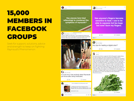
1 note
·
View note
Photo

School Project - WWF “The Foo(d)tprint Project”
concept & ideation; framing & strategizing; creating & crafting; reflection & awareness;
Introduction
We were challenged by WWF to create a ‘toolbox’ that will help companies reduce their environmental footprint. We re-framed the problem and focused on finding a solution to reduce CO2 footprint from corporations by making changes in their food-related habits of their employees.
According to the Paul Zevenboom, client at WWF “Many industries are responsible for the depletion of natural resources in our planet. WWF aims at empowering them and their employees with the right tools and knowledge to minimize their impact and insure they behave in an ethical and sustainable way. Indeed, some industries may pivot from polluters to promoters of a greener economy.”
The Foo(d)tprint Project
The Foo(d)tprint Project we developed is by design a scalable service system that is addressed to small and medium-sized enterprises/corporations (SMEs) that are willing to promote greener internal behavior change. The focus point is to start by changes in food-related habits within corporations that are willing to minimize their CO2 impact on the environment. SMEs comprise of 60 to 70 percent of jobs according to OECD (Organisation for Economic Co-operation and Development). Because of this, a substantial CO2 footprint reduction in SMEs can lead to dramatic improvement of the environment, so it’s important the system to be scalable and adjustable for different small-medium corporations.
Social trends in Corporations
Corporations usually prioritize productivity and efficiency rather than quality of life. Corporations soften forget that the working environment that they offer to their employees is a social context within which personalities are shaped, routines are formed, habits are adopted. Conservative Top-Down approaches in corporations are inflexible when it comes to changing business culture. Employees are used to receiving and executing orders from ‘above’ and their personal goals are of lowest priority while working. When Top-Down business models want to change behavior internally, they must provide clear directions and objectives, so that workers will know how to effectively accomplish the business goals [1,2,3]. Big corporations with high environmental footprint usually rely on corporate responsibility [4] to reshape their image externally, although, internally they damage the environment with their slow-paced bad habits. Many corporations fail to stand for an internal shared vision that can approach employees’ sensitivities and can give them individually and collectively the grounds to develop better, more aware and responsible personalities. This attitude of big corporation negatively affecting their functionality and efficiency as, especially the new generation of workers seek a quality balance between life and work. Bad attitudes by corporations are easily spread thanks to the world of mouth [5] boosted by social media.
Small Business for the Change
Luckily, remarkable changes are noticed in small corporations [6] who focus on providing a cool environment to their employees set and pursue social and environmental change internally and externally. According to Sushil Cheema [7] of entrepreneur.com “61 percent of small businesses are actively trying to go greener, 70 percent anticipate to go greener the next two years”. The styling, the materials, the structure, the events, the technology, the power usage[7], the food choices[8] are more flexible and sensitive putting collectivity and responsibility in the forefront. Small corporations because of their more ‘flat’ structure than Top-down corporations, usually have a young, open and fresh vibe that allows all the members to share common goals. They want to grow big together, be noticed and make a difference to the world. Their small employee size (10-50) enables them to be agile, develop interpersonal communication, affection and relationships. In contrast to larger longer-time established corporations, they usually consist of younger employees on average. The employees can boast about how their working environment helps them evolve a better self.
Food Related Habits in Corporations
Recent articles (see links below) discuss ways to increase employee productivity by changing food related habits within corporations. Creating lunch culture, providing healthy food can boost productivity up to 20%, giving choices, making eating food an experience with creative dishes. Eating together is an easy way to achieve bonding between employees no matter their discipline or their hierarchical level. Especially in corporations, eating food should be a worthwhile break from work.

https://www.entrepreneur.com/article/279546

https://www.thebalance.com/how-to-encourage-healthy-food-choices-at-work-1917961

https://www.fastcompany.com/3066077/these-companies-are-balancing-free-food-and-wellness
The Opportunity
According to Paul Zevenboom, client at WWF “Food is something that is ‘easy’ to change within a company (dining area). How can we help employees to change also their personal daily eating behavior? Think of it in a personal level, starting by changes in their eating habits. Important within that level is a step by step tooling where people will be helped on a daily base where they can influence the company back. Think of a bottom-up approach.”. Small-medium corporations are flexible enough and can easier tolerate cultural changes within their environment. Change refers to employers and employees trying new habits consciously together and ultimately adopting low carbon-emission food habits in a personal and collective level. A refreshed dining area, a passionate local chef, ‘greener’ local ingredients, less packaging, good communication of low-footprint habits. New, more knowledgeable choices and ambassadors of ‘good behaviors’ should be around. Within the corporation, people can have the opportunity to try new eating habits, explore with the help of others new food choices without being forced, learn and take knowledge from work to home and enjoy the benefits of a better health status. Starting behavior change internally can possibly generate momentum and attract more people. A respectful, qualitative, collective and joyful behavioral and cultural shift within the corporation can attract attention from external parties and as a result stimulate positive commentary about their green shift.
Our Solution
The Foo(d)tprint Project engages employees in an easy & effortless way through a collective game to make ‘greener’ food choices in their organization’s canteen, raise awareness and reduce their carbon footprint. The game organizes employees in teams of 5, and they compete against other teams within the organization. We want to create a good-nature banter - a playful and friendly exchange of teasing remarks - like friends that support different football teams and make fun of each other. To promote behavior change and to form new habits to the individuals we run the game in Sprints of 21 days. According to Maxwell Maltz, writer of the Psycho-Cybernetics, “21 days is the minimum amount of time needed to adapt to a new change and start forming a new habit.”[11]. The Foo(d)tprint Project to function initially requires the following: A small-medium corporation (SME), with up to 100 employees, with a canteen, one ore more CEOs that want help and support to reduce their corporation’s footprint and some open-minded employees. The toolbox that we give the CEO includes:
WWF representatives: One or mroe WWF representatives of the project must help directing it. They helps set goals, implement the system and evaluate its outcomes. Part of this team should be a designer that will create info-graphic material, posters and food labels. Together with the CEO they will set project goals. What is the current employee situation? What are their eating habits? What does the canteen serve and what is the baseline CO2 emissions measured by food consumption in the canteen? Where do you see the corporation in the future? How much do you want to reduce your food-related CO2 emissions?
The Calculator Software: An interactive engine that calculates the estimated CO2 emissions of each item sold in the canteen. It takes in account how much land-distance traveled, water, energy and waste is required to produce and deliver it[14]. Unlike other engines [11,12,13] out there it should make it easy to calculate sandwiches, soups etc which include a mix of ingredients of different emissions. The calculator is an additional, plug-in software that has a database of the available food choices at the cashier and their impact to the environment (CO2 per item). When the cashier scans items that an employee buys, it shows in a screen how much CO2 each item and all in total emit to the environment so that they learn and try to make better, greener, choices next time.
The Ambassador software, the conveyor of the idea, the message carrier of the whole project through whom employees will know everything related to reducing their footprint by functioning in teams. The software runs on employees computers and appears in most touchpoints with the system.

Email templates: What should your employees know before they join the Foo(d)tprint project? How to form teams? What are the terms and conditions? How can they win and what is the trophy?
Tailor-made Posters and Styleguide: Raise awareness about the Foo(d)tprint Project in the physical context of the corporation! Posters with facts about food choices available at their canteen, the impact of red meat, the health benefits of beans, the fun they will have by joining a team and a Sprint!

Food Labels: They are replacing current canteen food labels and they include the estimated footprint to the environment (CO2 per item) and are in the style of the Foo(d)tprint Project with the Ambassador style.

The Leaderboard Screen: A large screen placed somewhere on the exit of the canteen which shows the ranking of each team on who has less footprint to the environment by their canteen food choices they make. Employees can see real time how their individual choices affected their teams but it is anonymous, because we don’t want to expose, judge nor point fingers at people that like to eat in a specific (meaty) way. Although, in the team environment discussions are promoted like, “hey guys, what happened today again? Why are we having more and more impact? I suggest today you eat meat and us eat pasta salad with fish. Tomorrow I’d like to eat crockets!”

The Idea Box: A physical box where employees can drop in their ideas, complaints about the system. It is important before the next sprint starts to take in account any employee feedback and re-adapt the system. We want to eliminate any threats and weaknesses on the system and keep it as simple, unobtrusive and fun as possible for everyone. People can also register their ideas/complaints through the ambassador software from their desks.
‘Collective Responsibility’ as core value
The Foo(d)tprint Project is all about working in collectively responsible ways to improve the working environment. From the projects and campaigns that already exist (analyzed later) we found out that it is not about the individual, it’s about creating a community and embracing the collective feeling. It’s also about responsibility - without pointing fingers. On your own it’s very hard to achieve a long-term goal, or a new habit, without sharing it or talking about it to keep yourself motivated over a long time. If you do it in a group and have people around you with the same long-term goal and motivations, you are responsible of taking care of each other and make sure you achieve your long-term goal more or less together with the others. And in our case of reducing environmental footprint, which can easily be underestimated, it can be easier to motivate people if ti’s about collective responsibility.
Scenario
Before lunch: Tomas is sitting at his desk working and it is close to lunch time. Tomas’ friend - Vincent - from another team walks by and asks him if he would like to join for lunch. Tomas agrees and gets up to go for lunch. While walking to the cafeteria, Vincent asks Tomas if he is prepared to be beaten for the third day in a row. Tomas grumbles a little bit and Vincent talks about how his team is be`er than Tomas’ and they are going to win.

At the canteen: Tomas enters the cafeteria. He browses around to see what food he wants. Vincent laughs and asks him to get the beef so that his team can get an advantage. Tomas is a little annoyed. He looks at the labels for prices and the footprint of the food he is buying. He is a little concerned about his team getting a bad score because of him. So he decides to buy chicken instead of the beef to keep a be`er score. He goes to the register and asks for a chicken. He sees his score for his order on the register. He adds an environmentally friendly food like banana. His score increases and the screen shows the footprint of his entire order (chicken + banana).
Eating lunch: He confirms the order with the cashier and pays by card. The system knows who has paid and adds the score to Tomas’ team. Tomas waits for Vincent to complete the order. When both of them are done, they look at the big screen to see their teams’ scores. Turns out, Tomas’s team has ‘cut’ the points gap on Vincent’s team. Tomas jokingly warns Vincent to watch out for his team because they are going to go ahead of his team very very soon. They walk towards the table and see their colleagues sitting there and join them. Emily smiles at them and asks who did be`er today. Tomas tells her that his team just kicked Vincent’s ass. They laugh and sit to eat.
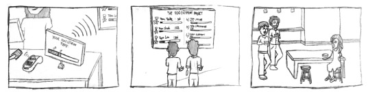
SWOT Analysis
Strengths of the Foo(d)tprint project can be distinguished into Individual benefits and Company benefits. Individual benefits refer to personal, practical and social meaning added to the life of the employees whether they participate to the project or not. Individuals that participate raise awareness in a personal level, they realize the choices that are available and can finally see, measure and try without mental or physical effort. Their tries are beneficial to themselves as they improve their health status, to their team as they raise their chances of winning the trophy set by the CEO - which can be cash, extra vacation days, devices, discounted food or free subscription for green food packages delivered at their doorstep. They must have something to fight for in an easy and effortless way. The system is designed to reflect on the Unilever’s 5 Levers of Behavior Change [13] and it raises awareness in an experiential way (by trial and ‘error’) on food choices; makes it easy to taste new experiences in an effortless way as the system informs you so you process it subliminally (“Wow pork really `dragged the line down`, i should check the alternative food choices the Ambassador gave me and Emma told me about yesterday”); it does not force you to change your routine but just gives you knowledge and waits for you to act (or not); makes it desirable to contribute to the team efforts, to your new personal goal and to the new vision of the corporation to collectively become one of the first greener organizations from bottom to top (from employees to CEOs) in a “we are all in this together” way, does not punish, keeps it all anonymous on the leaderboards; it is rewarding as it gives some practical trophy to fight for as mentioned before but also the individual receives social acceptance and recognition as a “fighter”; it promotes habit adoption through the Sprints which challenge trying new food and minimize the impact to the team and the environment and 21 days might be enough to break the bad eating habits “Now i go to the supermarket and I ‘feel’ the CO2 impact of many products; I feel the micro-environment of the canteen has impacted my life and made me wiser on what food replacements I like. For example i feel better to get white meat instead of red meat as i recall it having more than half the impact to the environment.”.
Opportunities arise before starting the game, during and as it ends. Before starting the game CEOs have the opportunity to measure their baseline CO2 emissions produced by food consumption at the canteen by all the employees. Together with WWF they implement the calculator silently, and for several weeks they gather metrics and data: What is the most preferred thing to eat each day? Do people eat less meat on Mondays? What happens if we take popular meat away for a day and at the same spot we put some exclusive chef meals made of beans? What happens if we introduce smaller plates? The same tests can happen during and after the Foo(d)tprint game ends. The calculator reveals opportunities to observe habits and see if negative reactions arise. During the game people will have the opportunity to meet other employees from other teams. Lunching together in a common place is an easy way to bond and the Foo(d)tprint project aims at adding high Social meaning to the life of the employees (see Quadruple Bottom Line of Sustainability by Stuart Walker[10]). It’s a very interesting opportunity to help people get to know each other within the corporation of 100 employees, from different departments, of different sexes and different ages. The old vegan lady can finally express her opinions more freely and help educate others. Taboo about vegans/vegeterians can be eradicated. During the game there are Economic and Practical opportunities to measure teams’ performance. It’s interesting for the CEO to know how the system they just paid thousands to implement affects their corporations outcomes. Simple questionnaires, discussions or observations can reveal the potential of a collective game to help the corporation function better. Are the employees more bonded than before? Are they smiling and laughing more? Are they having a moment to forget about their responsibilities and enjoy that ‘playful banter’ with other co-workers? Are they feeling more positive about catching the deadline by the end of the week? There are opportunities even by the end of the game. Yes, the game has an end after three sprints (21+21+21= 63 days of sprinting + 7+7 days of reflection and readjustment before each sprint = 77 days in total). After three sprints it stops and the large screen with the leaderboard goes away, but the food labels can stay. There is a large opportunity to introduce the Foo(d)tprint Ambassador app for personal use to make the habit stay. It will be a tool that has a friendly-to-use CO2 food calculator to easily compare food choices on the go. The database will already be large after many corporations will have shared food information and barcodes of products they sell at their corporate environment. The database will keep on becoming larger easier there after since funds will have been collected by WWF corporate and they will be able to calculate CO2 emissions of all the very popular food choices at the supermarkets or at the local market. Local producers can potentially join the Foo(d)tprint project and be benefited and receive small funding or free environmental-friendly packaging of their products by WWF corporate for continuing their good ‘green’ work. I believe there is a large opportunity to raise awareness and give consumers knowledge through an easy tool to make new habits that benefit the environment. WWF can start small with this corporate project, generate ‘momentum’ and trigger a chain reaction. For example an employee is likely to confess that “after three sprints ended in my corporation, I treat my family as if we are a team. I tell stories about what i learnt trying different food and how we worked together with my team in my corporation to tackle the challenge. How subconsciously my preconception about what I like to eat changed and now I have wider choices to make. A lot of discussions were initiated at the table and at the supermarket and we all tried new products. For example now my kids replace cow milk with soy milk every other week as its more beneficial for them and tastes as good with their cereals so its a win-win situation!”

Weaknesses of the Foo(d)tprint project can be attributed to its persuasiveness (not being persuasive enough or being over-persuasive), to its complexity (staying too superficial or being too complex without a reason), to its time consumption (consuming a lot of time by the CEOs managing the system), to its implementation process (cost to implement and friction with stakeholders). Persuasiveness of the Foo(d)tprint project must stay medium-low for the simple reason that it should be unobtrusive and fun to use. The game should remain a game, and by no means should it turn to extreme competence between employees. The nature of the game is Social and collective it can potentially generate feeling of bad exposure to the individual, hiding away their choices, being too critical on themselves, attempting to please everyone - make the team and CEOs proud - which can suppress feelings and personalities. We want to keep individuals as anonymous as possible and we don’t want to force behavior changes without their will. We want to support everyone try new food choices, replace eating habits and discuss about them. We made the system simple and integrated in the employees every-day routines and kept the the new touchpoints to as little as possible. For example the Ambassador software must bare intuitive affordances and easy interactions so that it’s easy for everyone to use regardless of their familiarity with computers. We used Microsoft’s ‘Clippit’, the default assistant in Office 2000/XP/2003 as a reference to make it usable and understandable to everyone. We designed the Ambassador to not embarrass the employee if it pops-up on their computer during a meeting: Only a label is popping up in the colors of the Foo(d)tprint project. details are shown only if the user clicks on it. The Ambassador must be easy to dismiss or mute and it must automatically go away after some time of not interacting with it. The system takes time to implement because it requires that all the food sold at the canteen are calculated. Luckily there are information out there about how much CO2 each food emits to the environment so its easy to make an easy estimation as we did in our prototype according to some examples[15,16]. Stakeholders

Threats. Individuals might try to please everyone and it might generate bad commentary about “he/she is too focused on the trophy”. Discussions will be initiated and they can be positive or negative. There is a high possibility of people trying to embarrass others “Lets see how you mess up our efforts” or even kick people out teams because they don’t want to put more effort, or simply don’t have the money to make greener/less impactful choices. For this reason we the participation is optional We need to clarify that not participating does mean nothing to the CEO and their position is not threatened. That’s why the WWF representatives must be around once in a while to ask employees how they feel, how the CEO believes that the employees feel and try to eliminate bad perceptions of the CEO. For example the CEO might be a 60 year old who has always been a vegan in their life and has strong opinions about what behaviors are good and which are bad and they might be too critical towards the employees that are ignorant or are not trying enough. Setting goals is critical to creating a shared vision with employees and that should be explicitly communicated to them. CEOs might underestimate this initial step and my think that it is WWFs responsibility to communicate this vision. But we believe if WWF appears around with their branding (WWF, pandas, environmentalism) people are going to be demotivated. That’s a very important reason why we provided a different branding for the Ambassador and the whoel Foo(d)tprint project. Did you see Pandas or WWF logos anywhere? NOPE! Its something that comes from the internals of the corporation, from the CEO. And they must eb in position to set the new greener vision: How much do you want to reduce your footprint after each sprint? Where do you see your corporation in 1 year and in 3 years regarding environmental awareness?
Our process
To deal with the challenge we split the process in five main stages: Discovery, Research, Concept, Prototype, Document.
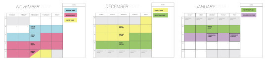
Discovery
Individually we took 1 hour to make an interpretation for ourselves right after we talked to the client. I developed a schema that explained my point of view of the project aim, and clients’ - Paul and Claar - ambitions for the project. “Easy, feasible, comprehensive approaches for reducing employees’ footprint within corporations.”. I like to work with stakeholder’s visions. Paul ideally wanted to approach big corporations and sell a green toolkit; As he said, “dear ING, this is a green-behavior plan that will help your employees embrace the value of sustainability (..) from within the company and expand it to their personal lives”. His focus point: processes, business, selling plan, promote WWF corporate. Claar has a focus point on the food choices employees are given within the organizations they work. She strongly stands for giving “Power to the beans! Food is a big deal now, we have a lot of research. Don’t try to become experts on that field. Focus on what can design do for upgrading the food-related habits in corporations to substantially reduce their footprint !” Both agreed that there is no solution for what we are looking for. My first thoughts were:
Make employees feel they are part of a bigger movement.
How can design (service, product, digital, graphic) promote better habits, attitudes, mindsets?
To check sustainability [9] frameworks from Stuart Walker [10], Professor of Design for Sustainability at the University of Lancaster, as i utilized them in my previous studies.
The core idea was to start small, provide a small motivated company with a service system to reduce effectively their footprint, feedback and reflect on the outcomes, then scale up the service system and adapt it to empower equal or larger corporations, then repeat and, as a result, empower the planet. The feedback loop is essential to measure environmental feedback and emploee’s behavior change, embrace opportunities for redesigning the service system, minimize possible threats and grow wiser as WWF-corporate.The company profile as suggested by the client was mid-sized corporations with up to 100 employees, with an open mind who are interested for help from WWF to reduce their footprint.
Research
Corporate CEO Interview. As proven by an interview with a corporate CEO, they engage their employees in Meatless Monday challenges, they lunch all together at a shared dining place, although there is a food-from-home culture. Many employees source food from a local biological farm and they are proud of this.
MeatlessMonday.com. A campaign where they support in just skipping meat for one day a week. Values are: it’s good for you, good for nation’s health and better for the planet. With high-influencers like Oprah they managed to be active in 44 countries and motivate more individuals and companies to join with Meatless Monday. High influencer people promote baby step, also for meat lovers, to change eating behaviors offering an online place with a big database of recipes and a lot of resources and knowledge.
Tidy street project Brighton. A neighborhood energy-awareness campaign that aims to show how electricity usage on Tidy Street compares to the rest of Brighton. It was about challenging people collectively. A community-feeling was developed and they all wanted to get better results on energy saving every week. Creating a community feeling and working towards a common goal shows increased engagement and high levels of joy and fulfillment.
Apple #closethering competition. Internal corporate campaign where teams were formed and challenged to be physically more active as much as they can. Employees who completed all activity challenges on the Apple Watch each day for a month earned a physical and a digital badge and a matching T-shirt. Employees were very enthusiastic and competitive to win, so they encouraged the rest of the team by moving more to win. It was not about the price or the exercise anymore, it was just about winning. Persuading people by making a game out of something and putting people in teams to make them feel responsible. Creating a competition with teams creates this competitive feeling of winning and creating responsibility for each other to maintain the highest score and stay motivated.
WWF Food Expert Interview: They are having different strategies to reduce footprint: 1. Change the whole system of the Europe agriculture policy 2. Changing the eating habits 3. Creating a better version/other tool like the Footprint test 4. The subject is very delicate, everybody is scared to point fingers and no one likes to tell people what they can and can’t do (key point). “At WWF, we facilitate and promote the good ‘green’ behavior but don’t undermine others. Its fine if they want to bring their own food although most in-corporate canteens don’t make ti easy to make greener choices”, the WWF Food Expert explains. People tend and want to see how they score on something compared to others. They don’t want to score lower than the others, so it will motivate to score better. It is really difficult for people with habits. They have to do it for a long time to make sure the new habit will stay. So there would be a challenge; how can we make sure that they maintain a new habit for a longer period than just a couple days? Biggest threat: Not punishing others. It’s difficult to change habits
Expert Feedback and Reframing:
Reframing school project with the team and with the support of Per Liljenberg Halstrom. Promote one or more collective activities that can turn into individual habits that, indirectly, reduce the total corporate footprint. With the application of our proposed systemic solution, corporations can boast a better working environment, better atmosphere, more collective thinking that can attract more attention from the competitors and fans and consequently attract investors, sponsors and new, better, more conscious employees. The new food-related trends that raises the confidence, the satisfaction levels of current employees. Managers and CEOs need to follow and give the good example, recognize and reward the new, more beautiful way that employees treat each other and support the values that the corporation wants to represent.
CO2 Calculator: Try out our simple custom calculator we made on Google Spreadsheet here. The goal was to prototype our system and use real carbon emission values in our Cashier register prototype. We can understand the carbon emissions from food by observing the stages that it takes for it to be produced and to be delivered to our hands. How much water is required for the item to be produced? How much land does it have to travel? How is it packaged? How long do we drive our car to take them to our home? For the prototype we used readily available grams of CO2 emissions per kilo for some sample foods (g/kg) which then were converted to CO2 grams per gram of food (g/g) and then multiplied by how each portion at the local (for example HvA) canteen weighted e.g. they sell roast beef slices of 20 grams (1 portion) and each gram of it emits 13.3 grams of CO2 to the environment, which means 20*13.3 = 266 grams of CO2 to the environment (g/portion). Similarly, and to put it in context, an Apple emits 44 grams of CO2, but it is four times bigger portion than the roast beef (80 grams vs 20 grams) meaning that you will consume less food and will have less impact to the environment and to your team. To make it easier to read and to communicate and have score unit for the game, we divided by 10 each g/portion (meaning (g/portion)/10 = (g/10)/portion = decigram/portion). So now the minimum thing you can find at the canteen is White bread which score 2 impact to the environment (Fun fact: Brown bread scores 3!) which is the minimal choice someone can make.

Reflection
1. Behavior Change Study
In this project i explored how to design for behavior change, shared my insights with the team and evaluated constantly the system we designed on its behavior change aspect. I uncovered some previous knowledge, studied theories and put them to practice with our design. Designing for behavior change needs to provide meaning to the individual. For this reason I introduced the team to Unilever’s 5 Levers of Behavior Change[13], to Ken Wilber’s Behavior Analysis based on the Integral Approach [especially check the video 16,17,18], and to the Quadruple Bottom Line(QBL) of Designing for Sustainability by Stuart Walker [10,11]. The project aim was to create collective responsibility and both are very sensitive words: Collectivism requires that you create bonding, reasons to speak, discussions to initiate, arguments to raise, ideas to correlate. Responsibility requires the individual to try understand, reflect, act accordingly. Having also a personal vision and sharing it with others is what makes it powerful; Collective Responsibility. Even those that disagree on adopting greener food habits have, all of a sudden, found a reason to talk with each other and argue with those that are willing to change. In this social interaction we don’t want to lose the individual and for that reason the system must add personal meaning. The employee must be able to reflect on what’s happening, to understand and feel free to make a choice. Personal aspirations like sense of achievement, recognition are underlined by design of the system since it implements social and practical rewarding mechanisms. The individual realizes the practical meaning of participation while they are in the game and after the Sprints have finished. The individual is a little more aware while they make choices at the supermarket, they bring knowledge back home and raise their children with more awareness. Knowledge is a practical tool that can help them achieve their personal and social goals in a meaningful way for them as it’s reflected from their experiences and their (new) beliefs. In short, Stuart Walker’s Quadruple Bottom Line (QBL) for Design for Sustainability fitted the situation perfectly with the Foo(d)tprint project! We achieved to design a system that adds not only Economic value to the people involved (rewards, productivity) but also Personal, Practical and Social meaning to their working and non-working lives. This underlines that my role went beyond a ‘doer’ and ‘maker’ as I utilized, adapted and adopted frameworks to design for the given brief. For example, QBL helped us propose a system that is meaningful for the client’s needs (Paul Zevenboom), for the corporation, for the employee, for the future of WWF Corporate (by describing Opportunities), for us as a team of young designers that want to make desirable and valuable products. During the process I realized there big commonalities between Wilber’s behavior analysis and QBL and as soon as we figured out the Foo(d)tprint Project system to fit at QBL it almost fit Wilber’s model too! That happened because Wilber speaks about attracting the Individual Internally (give me a reason to do it) which reflects also on Walker’s Personal and Practical values. Similarly Wilber talks about using Social values to motivate the individual, using practical values to explain how and why, using practical and economic ways to make it easy and affordable for everyone to behave in a similar way. Unilever was critical and important to persuade the client that we created a system that reflects the brief and makes it easy to adopt greener behaviors. Some tangible outcomes of my analysis were three personas, scenarios, value proposition map, scenario for each one and proposed that in the context of a working environment employees might ‘jump’ from acting as one persona to another.

2. Creative Technologist
My experience in technology brought me in the forefront of understanding and revealing potential use cases of existing technologies in corporations and canteens and to coordinate the prototype development. What technology should be used to minimize intervention in employees routines? How environmental impact is calculated for each food? How do you communicate employees the concept of ‘impact’? How do you visualize it?
After understanding People and their motivations to change behavior I thought that fitness trackers and ‘quantified self’ solutions do not provide strong Personal, Practical nor Social meaning to the people’s lives in order to encourage different, healthier habits. Half of them who try these fitness wearables, including me, are stop using them short after buying them[19, 20]. Although the technological trends showed that the quantified self would take over our lives, it wasn’t until very recently the ‘inventor’of the word and co-founder of WIRED magazine stopped using it. They talk more about a term called Quantified Us and talks about the shared value of working towards a common goal [21]. We admit giving out numbers, animated graphs and loads of context-aware notifications doesn’t provide value to the life of the user. Especially in our case, we wanted to minimally intervene in the routine of the employees with a digital system. Going for smartphone apps, notifications, personal footprint trackers, real-time leaderboards on their smartphones wasn’t an option. It would only promote individualism, increase the touchpoints with the system, give freedom to interact with the system whenever the user wants and would take extra effort and time from their working tasks. We believe the system constrict the ‘green’ efforts to only very few, highly motivated (vegan) employees as the collectivism would be nonexistent.
The outcomes of my role as a creative technologist were concepts, the CO2 calculator, an affinity diagram, an After Effects animation of the Leaderboard, two working Android Prototypes written in Java, a working Wi-Fi employee card reader written in Arduino C.
My concepts range from exploring the main idea to visualizing the ‘impact’ system and how it behaves. In the following series of pictures you will see initial concepts ranging from personal apps that show interaction with technological artifacts used in corporation i.e. employee RFID card, blockchain technology which could help prove the ‘origins’ and the impact to the environment of all the food resources available at a canteen, a new canteen menu with smaller plate study, loyalty points and reward system. I explored different contexts of canteens as some of them serve food in a linear process (there a distinct enter and exit) where its hard to wander around in contrast to non-linear canteens (most cases, i.e. HVA) where the employee can have more freedom in choosing, trying, leaving stuff and explore how people behave.

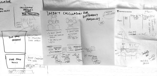
We ideated with the team around how the Ambassador should look like in terms of color, shape and how will it stand for our client’s aim to ’reduce carbon footprint’. We all agreed that using earth colors is a good idea but should not resemble too much of WWF and environmentalism. Thats why we came up with shades of dark blue and orange/yellow.
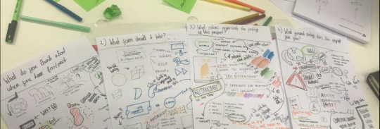
The design is always initiated collectively in our team. The ambassador, the food labels, the cashier’s screen, we all ideated together in a shared space. Reflecting back, the ideation process was super fast, where we all took decisions in one single day. The vision was clear, the structure was clear, the affinity diagram was there, the technologies where there. The only thing that took some more time for iterations and refinement was the leaderboard. The leaderboard was conceived in the next day and each one of us had at least one iteration on it: Me with sketches on ‘flying hams’ and making graphs on the whitewall, Pinar encompassing all our insights in a final sketch, Edwin making it in high-fidelity in Illustrator, Rose aligning the design to the branding colors and bringing the Ambassador in the scene, and me, making it animate on After effects. When one was busy on the leaderboard the rest would work either on finalizing other designs, making the prototype labels, printing, gluing, organizing the demonstration, testing out the android prototype. Reflecting back on this process i like how fast and interestingly the design evolved after each one’s point of view. Although there was time pressure to finish the project and we had no other choice, I would try again this multi-iterative process between us. The high-fidelity design of the rest artifacts was split among the team members. Rose would describe, research and deliver the Ambassador to fit the requirements and add value to the system. She requested feedback from the team before making decisions helping us all stay put, and bring balance to the design. Feedback between us helped making the ambassador neutral-looking, the cuteness was mildly intentional as we wanted to speak in a simple and fun language. Even the ambassador’s cuteness could initiate a conversation in the employees’ environment. Pinar designed the cashier interface, made multiple cases of the same interface so that I can develop it on Android Studio with code. She made it interactive using Sketch and InVision.

Edwin would focus much on collecting and framing the benefits of the system, internal and external benefits, to design high fidelity interfaces. Regarding the impact visualization:We came up with a horizontal line that represented the zero impact. Each item that would be placed on the line would impact the environment. The metaphor used was the weight: the ‘heavier’ the item for the environment the more the line would ‘bend’ downwards. In one day we managed
I used the high fidelity designs to develop a working android prototype. Here its demonstrated the evolution of the looks of the interactive ‘bezier’ curve in the process of coding:
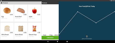
The final working prototype: The foodprint calcualtor can now demonstrate how the cashier will tap in the system the food choices of the employee. On the left side it’s the cashier screen and onyl they can see it. On the right side, it’s the employee screen and its pointed to them so that the cashier can not see it. Both screens are connected to the same application and they update each other live. We noticed by the prototype that less impactful choices can be significantly healthier, cheaper and bigger portions. See how it works:
youtube
The Affinity diagram describes which technologies show up in the system and which are the user touchpoints. Find it also on the pictures in the beginning.

And typical me explaining technologies and working with them. Featherboard Huzzah and Android app exchanging messages through wifi when an rfid card is detected. Feather huzzah supports I2C also (less cables around) but it can not provide enough power in this setup to run the RFID reader chip (See documentation and issues of others[1],[2],[3]). For this case I soldered also the SPI pinout series and connected the devices in SPI mode.
Huzzah Pinout -> PN532 pinout:
14 -> SCK
12 -> MISO
13 -> MOSI
02 -> SS

NOTE: Make sure to set the little toggle switches set to SPI mode [0,1]! GitHub codePN532 Example code “iso14443a_uid”. Below a demonstration of me explaining to the team the principles of Near Field Communication and how it can be integrated in the Foo(d)tprint Project:
youtube
Below the NFC card reader: It’s mission was to demonstrate how employees will pay their food choices at the cashier by tapping their employee card (or credit card). The interaction is fully integrated into their routines keeping the Foo(d)tprint Project’s interventions to any canteen to a minimum:
youtube
youtube
Below, the process of converting a high fidelity sketch into a high fidelity user interface in Android Studio.
youtube
Other references used
Sustainable Diets: What You Need to Know in 12 Charts | World Resources Institute. Available at: http://www.wri.org/blog/2016/04/sustainable-diets-what-you-need-know-12-charts. (Accessed: 2nd January 2018)
Boucher, P. How Blockchain Technology Could Change Our Lives. Eur. Parliam. Res. Serv. 28 (2017). doi:10.2861/926645
Cares, W. Behaviour Change and. Environment (2006).
Wilber, K. Introduction to the Integral Approach (and the AQAL Map). 1–46 (2006).
Hoekstra, A. Y. The water footprint of food. Jonas Förare (Ed.), Water food. Swedish Res. Counc. Environ. 109, 49–60 (2008).
Stehfest, E. et al. Climate benefits of changing diet. Clim. Change 95, 83–102 (2009).
3 notes
·
View notes
Photo


Attentionware
framing & strategizing; concept & ideation; creating & crafting; reflection & awareness;
A world of Attention
Attentionware is a project developed for the Interaction Engineering lecture in the first semester of studying MSc in Digital Design. With a team of six multidisciplinary designers and the guidance of Luis Rodil-Fernandez, Marcus Graf and Ubi de Feo we explored with a critical and fun approach how the social media, mobile applications and digital assistants listen, seek for our attention and exploit us.
Framing the problem
Our technology today is vying for attention in any way possible, sending a barrage of notifications, ads, and sounds our way in order to get us to interact with them and their products, even going as far as competing to outdo each other. Attentionware is an installation is a visual representation bringing out this perverse side of technology by humanising it - giving it an organic form and a human sound, trying to get the passerby to interact with it and changing attitude with the warmth of touch. But beware, the modules are aware of each other and will compete for your attention, becoming jealous when you interact with one other than itself and will try to persuade you further to leave the other and interact with it instead. You could stay with one module or give your attention to another but the cycle for demanding your attention never ends, much like most objects in the internet of things today. The world is filled with different personalities and so is the internet. Our project has four characters that are based off technologies who talk to you. These characters that are all different and have different levels of boldness and score differently on the caring or creepy line. Like notifications on a phone or computer these personalities will try to catch someone’s attention in different ways.
Strategy
The team’s goal of the project was from the beginning to build a modular interactive system that can be showcased and put the class of the Digital Design masters on the map of the large building of Leeuwenburg, Hogeschool van Amsterdam. The team started with ideation, quickly got into technology and fancy applications to showcase the skills of the class. The concept of attention-seeking devices hanging around the physical context of people’s everyday activities is a way to demonstrate our relationship with technology today. The project named ‘Jealous Wall’, ‘Turn Me On’, and finally ‘Attentionware’, as we named the devices after their main ‘superpower’ to seek for attention, gave the team meaning and enthusiasm to work for.

The team of six split in two smaller teams. The goal was to work efficiently, have people responsible for specific processes on the project and stay agile. Pinar Kesenci, Genevieve Korte and Chantal Ramzy formed a team to explore the form, the look and the sound of Attentionwares. Their process included material research, producing low and high-fidelity prototypes, making use of the HvA Makers Lab, testing, integrating with technology and iterating. The technology which comprised the heart of Attentionwares was explored by Jouke Zult, Monica Vogels, and Konstantinos Partheniadis. Their processes included testing hardware and software technologies for detecting human presence, sense of touch, audio playback and amplification, power autonomy and wi-fi interconnective (mesh) networks. The agility in the team was accomplished by weekly team meetings. Members would give feedback on individual and team processes, participate in their activities and try for themselves. For example, Konstantinos would advise Chantal on 3D modeling software, Genevieve would try coding with Monica, Genevieve would cooperate with Jouke in implementing the Attentionware voices in the system, Monica would use her dad’s wood cutting tools to make base for the silicon surface of Attentionware, Konstantinos would make moodboards for the form of Attentionwares, Pinar would help in hardware wire connections with her steady hands. All team members were involved in cost management to stay within budget. Also, they were all involved in soldering the Attentionware modules and visited at least once the HvA Makers Lab.
youtube
Video of the way we worked.
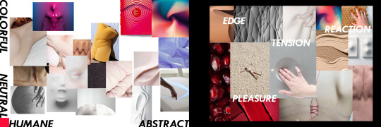
My Moodboards for designing the Attentionware experience. Images sourced from my Pinterest collection.
The result of the design can be refelcted back to the moodboards. The modules feature abstract skin texture that flows organically in three dimensions. It’s natural and outwordly at the same time reminding of cellular structures or underwater creatures.
Result
The result of our strategy worked out effectively and very productively. In numbers the team managed make more than 20 silicon prototypes, 1 3D-printed mould, 5 accurate copies of the silicon blobs, 4 wooden bases, test more than 15 different technologies and shrink down and optimize 9 hardware components for each module. We soldered two fully working, interconnected Attentionware modules, and hung them for 48 hours before the entrance of the Master’s room. The Attentionwares with their looks, their personalities, their voices and their jealousy attributes attracted the attention of most passersby, annoyed 2 lecturers from other studies, and triggered the anger of a student who in front of other witnesses threw a punch. One module dropped dead. Moral of the story? Too much attention-seeking can harm. Sensitive things exposed to public, alone and helpless, with eye-catching looks and attractive surfaces trigger people’s worst selves, just like cat-callers (see at the concept section below, this is related to street harassment commentary we intended to provoke). Witnesses say the Attentionware module was not speaking at the very moment of ‘attack’. After this event, we assume that Attentionwares’ goal was successful. After all they managed to attract people’s attention and bring them one step closer to our master’s area.
youtube
My contribution
Concept
My involvement in Attentionware was in concept and ideation, tech research, hardware and software development and advisory on product design. I first initiated the idea of jealousy between smart-objects when someone is near them. I liked the idea of smart assistants starting to flirt with the people standing around them. Together with the team we effectively built upon this concept and related the idea to current social, cultural and economic trends: strangers catcalling passersby[1]–[3], raising awareness for #stopstreetharassment[1], [4], new laws for confining street harassment [2], [4] which make it punishable with a fine of 190€ in Amsterdam and Rotterdam since 2018, smartphone notifications battling for your attention[5], social media addiction[6], [7] and the evolution and integration of smart home assistants in our lives[8]–[10]. Attentionware was born with key components of generating pick-up lines, making people feel attracted or embarrassed, guilty or filthy, annoyed or enjoyed of the interaction. The interaction would happen willingly or not and, in this way, we wanted to emphasize how our personal devices require attention and provoke people to interact with them.
Technological trends & future fears
The concept of Attentionware apart from doing social commentary it also explores the layer of what Sean Mulholland of IDEO refers to as ‘Affective User Interface (AUI)’[8] which, as part of Affective Computing, is able to change its “shape” depending on users’ emotions and behaviors[11]. For example, Affectiva is creating emotional recognition software to adjust the car’s behavior depending on driver’s anger, stress, and fatigue levels[12]. The AUI layer of interaction enables bots develop their intelligence based on the users that they serve[8]. Good examples are Siri, Cortana, Google Now and other intelligent digital assistants which are designed to expect the user’s attention and they start functioning only when they hear the right “wake word”. They listen all the time, collect data, analyze and personalize information the right time we might need them making the interaction more affective time by time[13]. Attentionware addresses the problem of ‘listening technologies’ and criticizes them by incorporating a different personality type in every module: Bixby, Cortana, Siri and Alexa. Each personality is designed with specific traits, they all listen to what’s happening and their attitude changes depending on the user behavior: how close is the user? Did they touch the device? Did they abandon them for another device? Is someone else around to give them attention? Each module firstly understands their “feelings” through sensors and the state of other devices in their private mesh network. Then they express their feelings to the other modules in binary code, and each one interprets their feelings into an English voice to be understood by humans, i.e. State_1 = “Hey there, Touch me!”, State_3 = “Touch me not them, they are clearly not as important as I am”. Attentionware demonstrates in a simple way how smart networks can develop awareness of their surroundings. Recently, researchers at Facebook witnessed the most “sophisticated negotiation software on the planet” between two AI agents[14]. They discussed in plain English for a while and quickly developed their own language after affecting one another. Shortly after, they were shut down by their developers. This proves AI communication can potentially shift out of control, develop their own shorthands and surpass human understanding[14]. In addition, Attentionware comments on how Artificial Intelligent (AI) systems can potentially shape into something evil in case they are uncontrollably developing their personality based on how users treat them. For example, Microsoft’s Tay Twitter bot quickly turned into a racist, sexist chatbot after being exposed to other people with bad intentions[15]. Concluding, as of today, there is evidence that our digital devices are shaped after us and oftentimes they bring out our worst selves which can have bad implication to the behavior of the device. In the future, intelligent smart assistants can potentially be nurtured accordingly to how people treat them and end up having unique personalities among other assistants. There is a high risk of AI developing out of human control and understanding.
Interaction Engineering
My role in the project was relevant to my previous studies. As a Product and Systems Design Engineer, I was involved with interactive systems and was familiar with Arduino sketching, Bluetooth communication, testing and choosing hardware and software development also in my thesis[16], [17]. My experience with Proof-of-concept development was helpful to the Attentionware team. With Attentionware I practiced and expanded my capacity to test and iterate in the context of a six-member team, fast-paced working conditions, short deadlines and staying within budget. The iterations started early. I started with capacitive touch, then converted the technology to human proximity sensing with the help of Marcus Graf. My idea was to install aluminum foil behind the Attentionware blobs, below the silicon surface, to sense people approaching with the aim of keeping the surface human-like and clean of any technological cues (design requirement). We tested how the signal of human presence was affected when silicon, HDPE plastic, plexiglass, fabric or other materials where on top of the aluminum foil. Silicon at thickness of more than 5mm was completely insulating the signal.

The idea was abandoned and we explored how to detect human presence alternatively: graphite-powder silicon[18], [19] for increased conductivity integrated on the blob design, capacitive sensor (MPR121) connected on the silicon[20], infrared sensor (GP2Y0A21YK0F) detecting proximity up to 70 meters[21] - similar to the ones our phones use to detect if the device is placed near the user’s ear, ultrasonic sensor (HC-SR04) often used to estimate obstacles appearing in proximity of up to 400 meters[22]. We found out quickly the graphite would make our Attentionware blobs visually darker and color would look inconsistent, and the conductivity signal would be also inconsistent as the silicon would perform as an insulator (resistor)[18], [19] that would make it trickier for us to code how each module should perform upon human touch on different spots on the silicon. Infrared sensor was found to perform good [23] even with thin silicon on top of it as light could penetrate it better than the ultrasound of sonar sensor. Later the team found that its signal was inconsistent on every module and so we decided to integrate the bulky but trusty ultrasonic sensor in the design. This was a change of plans as we had to intervene technologically on the visual of the blobs in order to detect the proximity of people and their hands when interacting with the Attentionware modules.

The heart of Attentionwares with its 9 technological compontents.
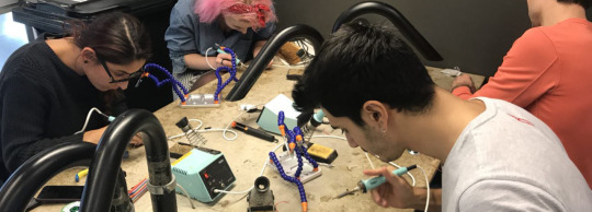
Soldering the modules with the team.
Conclusion & Reflection
There is a high demand of attention from people and it’s reflected also into the devices we design. The Attentioware modules manage to capture the exploitation of the users by their smart devices and vice versa. As a result, one of the modules is ‘shot’ down by a passerby. With our critical, fun and interactive project we intrigued people around the university. Unfortunately they were only able to see the superficial layer of the concept: it’s cool! ...and annoying. An extended version of Attentionware was intended to be developed with the aim of making the modules functioning more efficiently and demonstrate the concept of attention-seeking in social context. People exposed to Attentionwares can potentially realize how their smart devices demand their attention one after the other, endlessly. We want people to feel excited with Attentionware. We also want them to feel annoyed. We want them to close their ears when four Attentionware modules shout aloud and crave for their ‘touch’. The next time they are going to feel indignant by bulk emails, snaps, likes, notifications, we want them to relate to how Attentionware treated them back then. We hope users of technology will realize how their devices affect their lives and will gain control over them. In the end, there are more essential things in life for us humans to pay attention to.
References
[1] “Catcalls of NYC: The project raising awareness of street harassment | The Independent.” [Online]. Available: https://www.independent.co.uk/life-style/catcalls-of-nyc-instagram-street-harassment-women-sexual-men-new-york-us-a8092636.html. [Accessed: 22-Apr-2018].
[2] “Minister on catcalling law: Some men still say ‘It’s French culture’ - CNN.” [Online]. Available: https://edition.cnn.com/2017/10/19/europe/harassment-law-france/index.html. [Accessed: 22-Apr-2018].
[3] “France plans on-the-spot fines for sexual harassment in public | World news | The Guardian.” [Online]. Available: https://www.theguardian.com/world/2018/mar/21/france-plans-on-the-spot-fines-for-sexual-harassment-in-public. [Accessed: 22-Apr-2018].
[4] “Meet the woman who takes selfies with street harassers | The Independent.” [Online]. Available: https://www.independent.co.uk/life-style/woman-selfies-street-harrassers-harrassment-catcalls-men-instagram-noa-jansma-a7983991.html. [Accessed: 22-Apr-2018].
[5] M. Pielot and L. Rello, “Productive, Anxious, Lonely - 24 Hours Without Push Notifications,” 2016.
[6] “7 Things You Realize During a Social Media Break.” [Online]. Available: https://spoonuniversity.com/lifestyle/7-things-you-realize-during-a-social-media-break. [Accessed: 22-Apr-2018].
[7] “Social Media Is Taking Over Our Lives!” [Online]. Available: https://www.theodysseyonline.com/social-media-taking-over-lives. [Accessed: 22-Apr-2018].
[8] “Designing the Siris and Alexas of the World | ideo.com.” [Online]. Available: https://www.ideo.com/blog/designing-the-siris-and-alexas-of-the-world. [Accessed: 22-Apr-2018].
[9] C. Meurisch, M.-D. Ionescu, B. Schmidt, and M. Mühlhäuser, “Reference model of next-generation digital personal assistant,” in Proceedings of the 2017 ACM International Joint Conference on Pervasive and Ubiquitous Computing and Proceedings of the 2017 ACM International Symposium on Wearable Computers on - UbiComp ’17, 2017, pp. 149–152.
[10] “We know they are listening, but what do they hear? – Analytics for Humans – Medium.” [Online]. Available: https://medium.com/analytics-for-humans/hey-listen-how-four-big-tech-companies-are-collecting-and-using-your-data-8ddb6ea857dc. [Accessed: 22-Apr-2018].
[11] R. W. Picard, “Affective Computing.”
[12] “Affectiva Automotive AI.” [Online]. Available: http://go.affectiva.com/auto. [Accessed: 19-Apr-2018].
[13] “How Google Now, Siri & Cortana Predict What You Want - Search Engine Land.” [Online]. Available: https://searchengineland.com/how-google-now-siri-cortana-predict-what-you-want-229799. [Accessed: 22-Apr-2018].
[14] “AI Is Inventing Languages Humans Can’t Understand. Should We Stop It?” [Online]. Available: https://www.fastcodesign.com/90132632/ai-is-inventing-its-own-perfect-languages-should-we-let-it. [Accessed: 22-Apr-2018].
[15] “Here Are the Microsoft Twitter Bot’s Craziest Racist Rants.” [Online]. Available: https://gizmodo.com/here-are-the-microsoft-twitter-bot-s-craziest-racist-ra-1766820160. [Accessed: 22-Apr-2018].
[16] Konstantinos Partheniadis, “r-node: A smart ring for Raynaud’s on Behance.” [Online]. Available: https://www.behance.net/gallery/56331467/r-node-A-smart-ring-for-Raynauds. [Accessed: 22-Apr-2018].
[17] K. Partheniadis, “Digiphysical - Partheniadis Portfolio.” [Online]. Available: https://digiphysical.tumblr.com/.
[18] M. A. Darabi, A. Khosrozadeh, Q. Wang, and M. Xing, “Gum Sensor: A Stretchable, Wearable, and Foldable Sensor Based on Carbon Nanotube/Chewing Gum Membrane,” ACS Appl. Mater. Interfaces, vol. 7, no. 47, pp. 26195–26205, Dec. 2015.
[19] J. Hobson, “CONDUCTIVE SILICONE MAKES FLEXIBLE CIRCUITS,” 2016. [Online]. Available: https://hackaday.com/2016/01/07/conductive-silicone-makes-flexible-circuits/.
[20] “Adafruit Capacitive Touch HAT for Raspberry Pi - Mini Kit [MPR121] ID: 2340 - $14.95 : Adafruit Industries, Unique & fun DIY electronics and kits.” [Online]. Available: https://www.adafruit.com/product/2340. [Accessed: 22-Apr-2018].
[21] “Pololu - Sharp GP2Y0A21YK0F Analog Distance Sensor 10-80cm.” [Online]. Available: https://www.pololu.com/product/136. [Accessed: 22-Apr-2018].
[22] “Ultrasonic Ranging Detector Mod HC-SR04 Distance Sensor – SainSmart.com.” [Online]. Available: https://www.sainsmart.com/products/ultrasonic-ranging-detector-mod-hc-sr04-distance-sensor. [Accessed: 22-Apr-2018].
[23] “Infrared Sensor - team zero.” [Online]. Available: https://mdd-teamzer0.tumblr.com/post/167600531548/design-decision-6-an-alternative-to-sonar. [Accessed: 23-Apr-2018].
2 notes
·
View notes
Photo


Sidewalk - for Visually Impaired People
framing & strategizing; concept & ideation; creating & crafting; reflection & awareness;
Introduction
Sidewalk is a wayfinding application designed to guide Visually Impaired People (VIP) through an urban environment. With the help of smartphone and smartwatch sensors Sidewalk provides an effective way to navigate both indoors and outdoors with less cognitive load. The team designed, built and tested two prototypes with four VIP in a lab setting. The test provided preliminary evidence that magnetometer-based navigation with GPS and Bluetooth beacons can help users stay on their navigation path and be more aware of the dangers in the context that surrounds them. For full documentation see here. Test the prototype yourself here.
youtube
Visual Impairment
Visual impairment affects approximately 285 million people worldwide, of which 39 million are blind and 246 million have moderate to severe visual impairment[1], [2]. Estimations show that every 5 seconds another person goes blind[3]. This large number of people rely on hearing, touch and smell to understand their context.
Project Vision
The client, Joey van der Bie, is a researcher at Digital Life at HvA who envisions a better lifestyle for people with visual impairment. He with his research team called Eye-Beacons, have a recent publication about guiding the VIP in the environment with Bluetooth beacons[4]. Our team of four designers, captured Joey’s wishes and we formed the vision of designing a digital system that would provide the VIP with the confidence that sighted people have while exploring urban environments. With Sidewalk project, we aimed at learning from Joey and creating together a well-thought, technologically-sophisticated smartphone and smartwatch application that would help him and his team build a stronger prototype by September 2018 which was one of their project milestones.
Strategy
Our team, which consisted of four multidisciplinary designers, made a plan to understand the needs of the VIP, studied literature and accessibility guidelines, explored sensory technologies and feedback modalities of smartphones and smartwatches, put competitive applications to test, developed prototypes and conducted a user test. Every week we had a planned meeting at Theo Thijssenhuis (TTH) of HvA with Joey. In the first meetings, usually two from our team would lead the conversation and the rest would take notes. In the following weeks, we would start with a ‘retrospective’ – report on our latest work and findings – and continue with feedback, discussion and milestones for the next meeting. With retrospective, each one of us would be responsible to present their contribution to the project to the client and with this tactic, all of us practiced argumentation.
Team Functions
Our team firmly believed that an application for visually impaired people doesn’t have to be unaesthetic just because users hardly see it[5]. Roselinde Loeffen conducted visual design research by studying typography, colors, contrasts, UI patterns and the meanings behind them and to what extend visual impaired people see and perceive them. She collected more than 15 apps for the VIP and disseminated them to the team to study. She helped translate Google Material [6] and Apple Design [7], [8] accessibility guidelines for the Sidewalk prototypes Pinar and Konstantinos to build the prototypes. Edwin D’Mello conducted thorough review on previous Eye-Beacons team research, studied scientific literature about design accessibility, technology and the target group needs, he developed and revised user journeys that explained in detail the pains of the VIP while preparing and navigating to a destination. He collected design requirements from different resources and his work ensured that our ideas where on track with the latest Wayfindr protocol. Pinar Kesenci worked on decoding client needs, attended a lecture by Royal Dutch Visio, studied literature about the VIP, inclusive design, assistive technologies on smartphone i.e. VoiceOver, Magnifier, etc. worked on current solution by Eye-Beacons, conducted market research, developed and iterated the clickable HTML-based prototype using Axure for preparing a route with Sidewalk. Pinar and Roselinde helped prepare and execute the user testing in Dutch, and return to us, the international teammates, an executive summary of what happened in English. I conducted contextual observations to empathize with the VIP as a starting point. I studied scientific literature and related work on smart navigation for the VIP, feedback modalities, sonification of instructions to reduce cognitive load, magnetometer-based navigation, state-of-the-art in products for smart wayfinding and utilized team findings and individual experience to build early smartwatch prototypes, iterate with team and Joey’s feedback, guarantee the technology to work during the user test and, in the end, edit the final video demonstrating the Sidewalk project. As a team we attended an accessibility design lecture at HvA, put competitive apps to test, gathered research findings, translated into design requirements, concepted, organized and conducted the user test with 4 VIP and documented the findings in a document of 117 pages which was delivered to Joey along with a video we created that would help him and us explain the Sidewalk concept to others.
Everyone was committed to their tasks and the team milestones where instantly translated into individual milestones. Everyone was engaged with the project and because of that, without promising a lot, they all delivered good quality work. The atmosphere within the team was warm, friendly and trustful and we were there to help each other. We were weak when the time came for the user test as we would meet people with different needs than us. Meeting four VIP in person, talking about their everyday efforts in living in the city, put us in their shoes. For me, designing interfaces will never be the same again and I will never take my sight for granted again. I want my eyes to rest from the screen and seek for more solutions to be screen-less, tangible, and add value to the life of people effortlessly. What would be my design skill after all if one day I turned blind?
youtube
A video demonstrating quickly the way we worked for Sidewalk.
Our Solution
Sidewalk is a navigation application especially designed for people that have restricted eyesight. It enables visually impaired people prepare a route on the smartphone and navigate to it with the smartwatch as a guide. Test the prototype yourself here with which you can prepare a route (wizard-of-oz). Below follows a SWOT (Strengths, Weaknesses, Opportunities, Threats) analysis of the Sidewalk project.
Strengths
Sidewalk provides constant reconfirmation that the user is on the correct way to their destination. Sidewalk is divided in two phases: The preparation phase and the navigation phase. Unlike Google Maps, Sidewalk by default is using high contrast colors and shapes in its UIs, even on the map in an aesthetically pleasing way. Sidewalk also, as a name does not refer to blindness or any kind of impairment. The name of it and the app’s aesthetics reduce or eliminate stigma and as a result it makes also sighted people feel comfortable to use it.
During preparation phase, user inserts their destination by typing or by voice. The route is initially calculated as the fastest, but gives the ability to calculate the safest, or the easiest (to remember), or the personalized one which makes the system different than the other ones available on the app store. The fastest route is calculated by including shorter distances, but it can feature many turnings making it hard to memorize. The safest one, as also suggested by Wayfindr[9], is preferred by many VIP who want less car traffic, less bicycle lanes, less roads to cross.
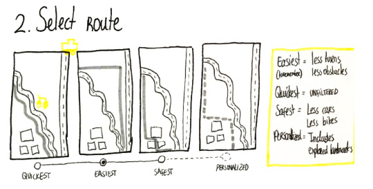
The route is automatically divided it into smaller segments with checkpoints, making it easier to memorize the context and check the progress and reduce uncertainty: “You are passing Charlie’s bakery on your right! Now, you are approaching the zebra crossing.”. OpenStreetMaps (OSM) has detailed street information like where is zebra crossing, tactile pavement, bike lanes, highways and all the details. Sidewalk want to make use of these data by OSM maps and provide alerts relevant to the user’s location and decide on navigation routes.
The power of Bluetooth beacons is integrated into the Sidewalk project. As the user is walking or navigating, they will receive custom alerts from the context i.e. “Construction area, very near” if there is a beacon placed there broadcasting this message. The distance is determined by the user’s smartphone and the strength of the signal of the detected beacon (close=higher signal). Beacons enable also indoors geolocation were GPS cannot reach. In combination with the magnetometers (and step counter) we user’s direction and scan for the next beacon instruction! An example of the navigation process indoors would be, “You are now in the lounge!”. The user would raise their watch horizontally, the system would calculate angle to turn and then it would announce “Turn right to 2 o’clock”. The vibrations would start until the user would point the correct direction. When they’d stop and the user stopped moving, it would say “Checkpoint 2 of 6 completed. Walk 50 meters to the Main Entrance door.”
For the navigation phase, the smartwatch application is designed so that the VIP primarily relies on voice instructions and vibrations for adjusting their heading angle on every decision point, and secondarily on the visuals. Voice instructions are short and informative as VIP like them [9], [10]. The vibrations are instant to inform that the user is heading towards a wrong direction. The user is expected to hold their smartwatch horizontally and rotate their body until they are pointing to the correct direction, when the vibrations stop. If the user needs a moment to think and the vibrations annoy them, they can hold their palm on the smartwatch screen and vibrations will ‘mute’. The user can double tap on the screen to listen again the last instruction which will always be short and concrete to process and understand the information of the message, also as Wayfindr protocol suggests[9].
Sidewalk is optimized to work with popular text-to-speech functions like Apple VoiceOver and Android TalkBack, popular to the visually impaired people[11]. These assistive technologies help them focus on objects on the graphical user interface by swiping right (next) or left (previous) and double tap to click on them.
Weaknesses
Studies have shown magnetometer sensors are not very reliable when large metallic objects (i.e. cars, trains) or big magnetic fields are around (i.e. train stations). During our tests we proved that the user may mistakenly be notified if (a) big metallic parts or magnets are around the smartwatch e.g. chargers, trains, computers etc. or (b) the device is not well calibrated or the application is ‘bugged’. Sidewalk acknowledges this weakness and has plans to work it around in the future when magnetic field interferences appear. To prevent compass mistakes, we suggest (a) the use of gyroscope sensor for validation of angle displacements where it is much more stable and trustful at calculating small angle differences than magnetometer (b) warn user on high metallic interference from environment detected so that they take precautions and rely less on the device (c) use A-GPS signal to help the system calculate user’s direction (d) continue navigation only with GPS similar to what Google Maps do today. Sidewalk knows that the user might need to change direction to avoid unexpected obstacles or because they have a personal reason e.g. feeling uncomfortable or scared. As a result, the system should tolerate their changes in heading.
Opportunities
Economic Opportunities
According to Joey, Dutch Municipality is planning to install more than 5000 Bluetooth beacons all around Amsterdam with the aim of giving the VIP clues about the urban context. For example, they will be able to send them messages to their smart devices that there is a construction area in proximity, or, there are stairs to reach the train platform, and more as the Wayfindr protocol for the VIP describes[12].
Sidewalk is a digital system meaning it has small to zero costs for the individual to acquire and use. In 2015, the average yearly income of blind people was estimated to be $37,600 (National Federation for the Blind, USA)[13] in contrast to $57,230 of sighted people[14]. and studies have shown that some visually impaired people fail to reach the Minimum Income Standard (MIS) by up to £150 (200€) per week[15], [16]! The Sidewalk application works on cheap smartwatches like LG G Watch W100[14] which we used to test it, and costs around 100€ new today [15]. To put it in context, the white cane [12] costs around 20€ [17], it is a robust tool important for avoiding obstacles which works together with the city’s infrastructure like the tactile ground. Guide dogs are raised and trained with a total cost of 50,000€ on average [14] and are used to [15] pave the way on the sidewalk, in the traffic, avoid obstacles, stop at curbs and steps and more. So, an advanced smartwatch application can provide similar or additional features to keep the costs of living low and promote a more independent life.
Sociocultural opportunities
Visually impaired people organize into organizations so that they address their problems together, seek help, support and promote awareness about the experiences of the VIP in everyday life. Royal Dutch Visio, Bartimeus, Rotterdam Oog Ziekenhuis, Oogvereniging are some of the most popular associations for the VIP in the Netherlands. Joey has a close contact with Bartimeus and Royal Dutch Visio, and it is a big opportunity for us to develop prototypes to test with real users.
Sidewalk seeks for a solution that will reduce stigma. Unlike most apps that we tested, Sidewalk is the result of inclusive design process using universal design language, common UI patterns (linear UX, tabbed activity) making is usable by everyone and also the VIP.
Technological Opportunities
The team conducted market research and put popular navigation apps to test on smartphones and smartwatches. Each one of us reviewed at least two applications. The market research suggested that there is an opportunity for a high-quality navigation app especially designed for visual impaired people that they can rely on to prepare a route and guide through it.
Our solution does not mean to replace but to supplement the user’s existing mobility tools, such as white canes or guide dogs. The smartwatch is tight on the user’s wrist so there is no risk of losing it. It can give tactile feedback directly on the user’s wrist and the interaction can happen with simple finger taps or voice input. This is a great benefit for the VIP as they can easily use their white cane or their guide dog at the same time with the smartwatch
Currently Bluetooth beacons are part of large Internet of Things applications in smart cities[4], [13]–[15] all around the world notifying, alerting, collecting data, optimizing traffic, bringing tangible cost savings and even preventing negligence lawsuits for services [16]. The use of beacons, and similar wireless geo-location systems are constantly growing and are finding their role in the future of smart cities[17]. Joey and his Eye-beacons team project are working towards this goal of making the city of Amsterdam smarter more inclusive and livable also for the visually impaired people. My prior experience with beacons in a location-based game [18] helped the team spending little time figuring out the technology.
I did an extensive background research on compasses and magnetometers. The findings suggest that compass, the traditional instrument, is being used by visually impaired people to train orientation and mobility for the VIP children. As in all things, compass directions must be learned and practiced and you can help by learning to use them at home. With practice, we can all instinctively know how the directions are related to our current position in space. For this reason, we believed magnetometer-based navigation has a basis to be integrated into the Sidewalk navigation system. Magoo[18] was used as inspiration and uses magnetometer in its wearable device to assist in the navigation and it’s the only concept similar to ours.
Threats
The threats are related to the weaknesses of the product. We believe inaccuracy of technology can have a bad impact on how the VIP trust digital software and hardware to assist them while navigating. For this reason, we believe its important to remind that Sidewalk is a supplement assistant for navigation and should not be seen as a replacement for guide dogs and white canes. The form factor of the smartwatch helps minimize the effort of receiving instructions for navigating in the busy city.
My Role
Me and the client, Joey, have a shared motivation in utilizing sensor technology for the benefit of people’s lives. My previous experience with smart wearables[19] and smartphone applications [19][20] was put to practice again. I developed two working prototypes for Android devices, tested them indoors and outdoors multiple times by myself, with the team, with fellow colleagues and with the client.
The main concept was that the user would start their navigation, the device would tell the user to turn specific angle in degrees (or o’clock) on every decision point or obstacle that is ahead. The device would slightly vibrate meaning that the user has to stop, raise their arm and place smartwatch horizontally in front of them, then expect the next instruction, change angle, listen to information about the context and start walking again until the next decision point. When the user would go off-track, the magnetometer would also recognize the difference in angle between the user and the navigation path and it would vibrate to re-align the user with the path. Technologically, this is easier to be calculated when the smartwatch is held horizontal in front of the user as they walk.
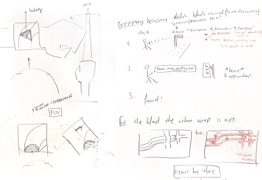
Sketch that demonstrates the initial idea of the magnetometer-based navigation assistance.
The first version of Sidewalk was developed to demonstrate the concept of magnetometer-based navigation. It didn’t make use of GPS but instead it counted steps taken before triggering the next instruction. It was a successful initial demonstration of how the heading of the user could dynamically be fixed by utilizing magnetometer sensor. The client responded with positive feedback and encouraged making a better version of the prototype to test with VIP users. The second and last version of Sidewalk was further developed and had visualization, Bluetooth connection to the user’s smartphone to receive instructions and speak them aloud with voice. It used an arrow that would point at the actual direction of the next checkpoint. It would turn red and vibrate the device instantly when users would point off the path.

Smartwatch v0.1, first android prototype with step counter and magnetometer-based navigation.
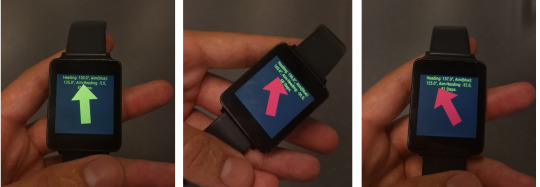
Smartwatch v0.9, the pre-final prototype with vibrations, visualizations and audio instructions. The text on top is only for debugging purposes.
Suggestions for Future Iterations
Our user test revealed interesting things for a future revision. Overall, two out of four users seemed to follow the smartwatch arrow even if they knew where they had to navigate. One user saw the stairs and realized that the device should have alerted earlier to change direction because the environment included danger(s). This gives us insight on how the device should behave in the next iteration (requirements): The arrow must always point towards the next decision point, The device must be aware and alert user of the environment’s dangers (beacons), The user must be alerted in case of inaccuracies (e.g. high magnetic field differences).

Post-evaluation sketches.
The smartwatch compass accuracy failed once (user B). The device was pointing +10 degrees more than it was supposed to making the user upset. The verbal instructions told him to “keep on walking straight in the hallway for 12 meters” helping him continue their trip. The use of cane was found to be helpful to keep the user within the boundaries of the hallway as instructed verbally by the device. This case makes the 3rd requirement mentioned before even more important.
The device is required to be held horizontally to help the compass (and gyro) make correct measurements while being at the DPs or reconfirming user direction. One user (C) did not understand that function and needed further explanation during the prototype testing: The smartwatch device must understand its own orientation and alert user to raise their hand (verbally) when it’s time; Explain how to interact with the smartwatch through an onboarding process during preparation phase (e.g. full simulation mode that takes users through all Decision Points while being at home).
One user mentioned that if they are feeling lost they are looking for hotels or something similar around the area to ask for directions. This is a good suggestion for including in the landmarks and checkpoints of the Sidewalk app: Give the option to include hotels and citizen information agencies.
One user noted that there were no adequate preparation instructions given. The particular user was having a guide dog and, as they explained, it is important to receive preparation instructions so that they let their dog know which direction to steer in the next DP: Include preparation instructions on all segment earlier than 5 meters; Give users the option to change that to their likings through settings; Consider this setting to appear on the on-boarding process in case user selects “I have a guide dog”.
Conclusion
Our user test suggested that despite weaknesses of the Sidewalk prototypes, the acceptance by the test users was largely positive. This indicated that the combination of smartphone, smartwatch and beacons is an effective way of guiding visually impaired people through an indoors setting. The distribution of feedback over three modalities – tactile, audio and screen was also received positively as the users could understand the information. This suggested that using three modalities for feedback reduced cognitive load, thus helping visually impaired people move around without sensory overload.
With iterations and testings, Sidewalk could become one of the solutions that visually impaired people rely on for their everyday commuting. Future aims are to simplify the product, reduce the learning curve, include public transport and improve the audio instructions. Iterations could also improve accessibility on the smartwatch by using better contrast, personalization and more legible and understandable text. Technology iterations could refine the current prototype to a more trustworthy and reliable application. Last but not least, getting the support of city officials involved in Joey’s, Eye-Beacons team and our efforts, we believe that Sidewalk can become a product that visually impaired people like and use.
*Edit 04/05/2018 Added picture of UIs.
References
[1] W. Grussenmeyer and E. Folmer, “Accessible Touchscreen Technology for People with Visual Impairments : A Survey,” ACM Trans. Access. Comput. Arch. Vol. 9 Issue 2, January 2017, vol. 9, no. March, pp. 1–31, 2016.
[2] “Lighthouse International - Prevalence of Vision Impairment.” [Online]. Available: http://li129-107.members.linode.com/research/statistics-on-vision-impairment/prevalence-of-vision-impairment/. [Accessed: 30-Apr-2018].
[3] W. H. Organization, “World Sight Day,” 2010.
[4] J. van der Bie et al., “Guiding the visually impaired through the environment with beacons,” in Proceedings of the 2016 ACM International Joint Conference on Pervasive and Ubiquitous Computing Adjunct - UbiComp ’16, 2016, pp. 385–388.
[5] Robyn Collinge, “How to Design for Color Blindness,” Usabilla, 2017. [Online]. Available: http://blog.usabilla.com/how-to-design-for-color-blindness/. [Accessed: 30-Apr-2018].
[6] “Accessibility - Usability - Material Design.” [Online]. Available: https://material.io/guidelines/usability/accessibility.html#. [Accessed: 29-Apr-2018].
[7] “Vision Accessibility - iPhone - Apple.” [Online]. Available: https://www.apple.com/accessibility/iphone/vision/. [Accessed: 29-Apr-2018].
[8] “Accessibility - App Architecture - iOS Human Interface Guidelines.” [Online]. Available: https://developer.apple.com/ios/human-interface-guidelines/app-architecture/accessibility/. [Accessed: 29-Apr-2018].
[9] “Design principles - Wayfindr - Open Standard.” [Online]. Available: https://www.wayfindr.net/open-standard/designing-for-vision-impaired-people/design-principles. [Accessed: 01-May-2018].
[10] H. Nicolau, T. Guerreiro, and J. Jorge, “Designing Guides for Blind People,” Proc. Int. Conf. Softw. Dev. Enhancing Access. Fight. Info-exclusion (DSAI’09). Lisbon, Port., no. January, 2009.
[11] Á. Csapó, G. Wersényi, H. Nagy, and T. Stockman, “A survey of assistive technologies and applications for blind users on mobile platforms: a review and foundation for research,” J. Multimodal User Interfaces, vol. 9, no. 4, pp. 275–286, Dec. 2015.
[12] “Bluetooth Low Energy beacons - Wayfindr - Open Standard.” [Online]. Available: https://www.wayfindr.net/open-standard/wayfinding-technologies/bluetooth-low-energy-beacons. [Accessed: 01-May-2018].
[13] E. C. Bell and N. M. Mino, “Employment Outcomes for Blind and Visually Impaired Adults,” J. Blind. Innov. Res., vol. 5, no. 2, 2015.
[14] “Middle-class Americans made more money last year than ever before.” [Online]. Available: https://www.businessinsider.nl/us-census-median-income-2017-9/?international=true&r=US. [Accessed: 01-May-2018].
[15] D. Hirsch, “Low income and visual impairment: do benefits and wages meet minimum needs?”
[16] J. Köberlein, K. Beifus, C. Schaffert, and R. P. Finger, “The economic burden of visual impairment and blindness: a systematic review.,” BMJ Open, vol. 3, no. 11, p. e003471, Nov. 2013.
[17] “Compact White Cane for the Blind | Braille Superstore.” [Online]. Available: http://www.braillebookstore.com/Compact-White-Cane.1. [Accessed: 01-May-2018].
[18] “Magoo - Arduino Project Hub.” [Online]. Available: https://create.arduino.cc/projecthub/4189/magoo-e4ff24. [Accessed: 01-May-2018].
Other References
1. Damaceno, R. J. P., Braga, J. C. & Mena-Chalco, J. P. Mobile device accessibility for the visually impaired: problems mapping and recommendations. Univers. Access Inf. Soc. 1–15 (2017). doi:10.1007/s10209-017-0540-1
2. Siebra, C. et al. Toward accessibility with usability. in Proceedings of the 11th International Conference on Ubiquitous Information Management and Communication - IMCOM ’17 1–8 (ACM Press, 2017). doi:10.1145/3022227.3022233
3. Chen, X. ‘Anthony’, Grossman, T., Wigdor, D. J. & Fitzmaurice, G. Duet. in Proceedings of the 32nd annual ACM conference on Human factors in computing systems - CHI ’14 159–168 (ACM Press, 2014). doi:10.1145/2556288.2556955
4. Cherston, J., Hill, E., Goldfarb, S. & Paradiso, J. A. Sonification Platform for Interaction with Real-Time Particle Collision Data from the ATLAS Detector. in Proceedings of the 2016 CHI Conference Extended Abstracts on Human Factors in Computing Systems - CHI EA ’16 1647–1653 (ACM Press, 2016). doi:10.1145/2851581.2892295
5. Azenkot, S. & Lee, N. B. Exploring the use of speech input by blind people on mobile devices. in Proceedings of the 15th International ACM SIGACCESS Conference on Computers and Accessibility - ASSETS ’13 1–8 (ACM Press, 2013). doi:10.1145/2513383.2513440
6. Ducasse, J., Brock, A. M. & Jouffrais, C. Mobility of Visually Impaired People. (2018). doi:10.1007/978-3-319-54446-5
7. Holland, S. & Morse, D. Audio GPS: spatial audio in a minimal attention interface. Pers Ubiquit Comput 6, 253–259 (2002).
8. Sierra, J. S. & Togores, J. S. R. Designing Mobile Apps for Visually Impaired and Blind Users Using touch screen based mobile devices : iPhone / iPad. ACHI 2012 Fifth Int. Conf. Adv. Comput. Interact. 7, 47–52 (2012).
9. Seifi, H. & Lyons, K. Exploring the Design Space of Touch-based Vibrotactile Interactions for Smartwatches. 156–163 (2016). doi:10.1145/2971763.2971783
10. Yatani, K., Banovic, N. & Truong, K. N. SpaceSense: representing geographical information to visually impaired people using spatial tactile feedback. Proc. CHI 2012 415–424 (2012). doi:10.1145/2207676.2207734
11. Mascetti, S., Picinali, L., Gerino, A., Ahmetovic, D. & Bernareggi, C. Sonification of guidance data during road crossing for people with visual impairments or blindness. Int. J. Hum. Comput. Stud. 85, 16–26 (2016).
12. Coughlan, J. M. & Shen, H. Crosswatch: a System for Providing Guidance to Visually Impaired Travelers at Traffic Intersections. J. Assist. Technol. 7, 131–142 (2013).
13. Nam, C. S., Li, Y., Yamaguchi, T. & Smith-Jackson, T. L. Haptic User Interfaces for the Visually Impaired: Implications for Haptically Enhanced Science Learning Systems. Int. J. Hum. Comput. Interact. 28, 784–798 (2012).
14. Choudhury, A. & Medioni, G. Color contrast enhancement for visually impaired people. 2010 IEEE Comput. Soc. Conf. Comput. Vis. Pattern Recognit. - Work. 33–40 (2010). doi:10.1109/CVPRW.2010.5543571
15. Rodrigues, A., Montague, K., Nicolau, H. & Guerreiro, T. Getting Smartphones to Talkback. Proc. 17th Int. ACM SIGACCESS Conf. Comput. Access. - ASSETS ’15 23–32 (2015). doi:10.1145/2700648.2809842
16. Grussenmeyer, W. & Folmer, E. Accessible Touchscreen Technology for People with Visual Impairments : A Survey. ACM Trans. Access. Comput. Arch. Vol. 9 Issue 2, January 2017 9, 1–31 (2016).
17. Csapó, Á., Wersényi, G., Nagy, H. & Stockman, T. A survey of assistive technologies and applications for blind users on mobile platforms: a review and foundation for research. J. Multimodal User Interfaces 9, 275–286 (2015).
18. Rodrigues, A., Montague, K., Nicolau, H. & Guerreiro, T. Getting Smartphones to Talkback : Understanding the Smartphone Adoption Process of Blind Users. doi:10.1145/2700648.2809842
19. Geplande, P. S., Sciences, A. & Visio, R. D. Format Uitgewerkte projectaanvraag InZicht 12 e ronde in Word Algemene gegevens / General Information Samenvatting Projectleden / Project members. (2017).
20. Bardot, S., Serrano, M. & Jouffrais, C. From Tactile to Virtual: Using a Smartwatch to Improve Spatial Map Exploration for Visually Impaired Users. Int. Conf. Human-Computer Interact. with Mob. Devices Serv. (MobileHCI 2016) (2016). doi:10.1145/2935334.2935342
21. Anagnostakis, G. & Antoniou, M. Accessible Museum Collections for the Visually Impaired : Combining Tactile Exploration , Audio Descriptions and Mobile Gestures. Proc. 18th Int. Conf. Human-Computer Interact. with Mob. Devices Serv. Adjun. 1021–1025 (2016). doi:10.1145/2957265.2963118
22. Dhar, A., Nittala, A. & Yadav, K. TactBack: VibroTactile Braille Output Using Smartphone and Smartwatch for Visually Impaired. Proc. 13th Web All Conf. 13:1--13:2 (2016). doi:10.1145/2899475.2899514
2 notes
·
View notes
Photo
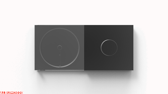


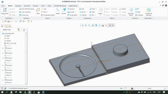


Album2020 Personal Project
& Download Springer style Research Paper made for Nazli Cila’s lecture.
Brief
Designing a long-lasting music playback device for home that can add personal, social and practical meaning to the life of the active music listener.
home music device; digiphysical product design; long-lasting; useful; valuable; sustainable;
Research Question
How can a home music player be redesigned in order to maximize the value (personal, practical, social) that it adds to the life of the active music listener?
I am investigating the research question with the help of Quadruple Bottom Line of sustainable design (QBL) by Stuart Walker. This method helps me question research insight critique my design decisions in order to maximize the resulting meaning that the artifact adds to the life of the future consumer.
As Walker S. mentions in his book, QBL of sustainability is a framework used to help “the emerging artefacts become contributing elements in the development of critique; as such, one of their roles is as arguments manifested in tangible form or demonstrative rhetoric.“
Walker, S. (2014). Designing sustainability: making radical changes in a material world. Routledge.

Reminder: Download Springer style Research Paper made for Nazli Cila’s lecture.
Reframing Process
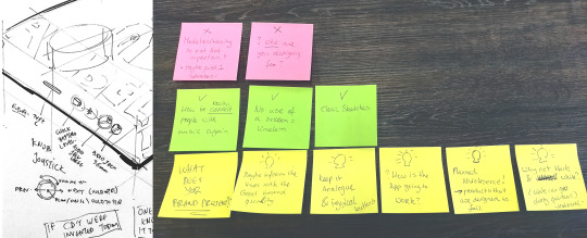
Initial brief was:
Design a modern, portable and connected compact disc (CD) music player to encourage young music lovers continue embracing the essence of the physical music format.
After receiving feedback 1 from Pinar (Irene’s lecture), feedback 2 from colleagues (Irene’s lecture) and feedback 3 from Nazli, among the positives also three main issues were araised:
Unclear research question
Unclear target group
Inefficient/incomprehensible brief for specifying a Field Research plan (Nazli)
Reframing with the new brief:
Research and Design for a long-lasting music playback device for home that can add personal, social and practical meaning to the life of the modern music listener.
Target Group

Active music curators, music addicts & music wanderers who enjoy listening to physical or digital full albums, occasionally or actively collect CDs, value highly their music picks & have taste in minimal design.
Methodology

Brief, 3 feedback sessions, Reframe and new Brief (3 weeks).
Desktop Research (technologies, design, user needs, market research)
Field research (Market research and observation, 4 interviews, 1 survey with 11 respondents)
Preliminary Design (sketch ideation, 2D/3D digital design, render)
Presentation & Feedback session with Irene and 5 colleagues (Nazli not present unfortunately)
Research Analysis, Table with design decisions and Conclusions
Desktop Research

Technologies, Design and Facts - these are the core factors I incorporated in my desktop research.
Research on Technologies helped me learn that there are smart home technologies (Chromecast Audio, Sonos) that enable wireless multi-room music streaming at home with the click of a button on the smartphone or computer. These technologies collaborate with top music streaming software services (Spotify, Google Play Music, Deezer etc.) closing the gap between the products that the consumer buys. They are all now interconnected and seamless interact the one with each other. Key design decision for my design is to incorporate Chromecast Built-in in my product. We want the consumer to stay updated and relevant to the technologies they already use and not make any compromises. In other words, we want to maximize the practical value of in-house music streaming, maximize the social value by eliminating the fear of “missing out” on latest technologies, and maximize the personal value as we establish well the value of ownership and control of the consumer over the product (and they almost never feel that they are being controlled).
Below is a collection of comments from Facebook groups discussing the practical and personal values between physical music formats (CDs, Vinyls) in contrast to music streaming (Spotify, iTunes), smart-home devices and their services in music (Amazon’s Alexa).
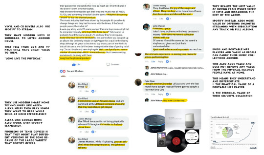
Field Research

Researching, observing and hands-on testing of CD players and music streaming devices. The most dominant devices are mid-sized Bluetooth speakers, with powerful Digital-Analog Converters (DAC) and minimal controls. Read more about my experience at MediaMarkt interacting with the latest Music Players and observing people make choices here.
Interviews

4 interviews. 30 minutes duration. Flexible probes to make the most out of each participant’s opinions.
I collected the answers on paper notes and took 40 minuets after each participant to decode their answers and fill in a google form I had made. You can find the interview structure questions here and the individual replies here.
Online Survey

Additional questions were created in a new survey to support and evaluate the design decisions and make sure they are no assumptions. Previous research insights were used in the new survey. The surveys were shared to four online Facebook groups that have active music listeners: (a) Discogs, (316,132 followers) the largest physical music format community that enables people organize their collections, buy, sell new discs. (b) Your Last 3 Albums You Listened To (106 followers), (c) Soundcloud Music (85,100 followers), (d) The Basement Recordstore (1,217 followers). Discogs came in contact to me through Facebook saying that they are forwarding the survey to their colleagues. They were very kind and let me know that they are available for anything I want regarding the project as their business headquarters are in Amsterdam. Check the Survey here and the overview results here and individual replies here (88 pages). They are primarily mentioned and analysed in Nazli’s research paper, see top of post for download link.
Research Results

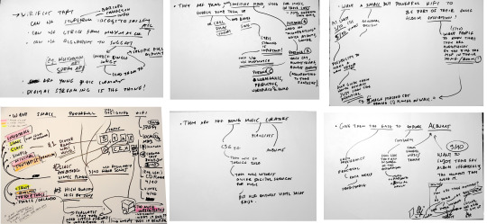
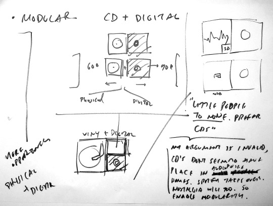
The results were analyzed by using a mix of the techniques of mind-mapping and affinity diagrams (see picture above). Sometimes I like to refer to this technique as creative analytical thinking, especially when it contains preliminary sketches that derive from research insights. All the insight, design decisions and value propositions are written and discussed in the following paragraphs. Overall, the survey verifies and supports previous design decisions and generates new insight and more design decisions for the next version of the product.
Verification of design decisions. The survey verifies that the system can implement elements from Discogs API in the smartphone application. The target group is interested in keeping track of their music collections, watch discs they would like to purchase, receive metadata about the artists, the albums and related stuff on demand.The survey verifies also that the system can implement Musixmatch API (see gif below). This feature will provide users with lyrics of the current playing song. We verify that the target group consists of young music curators: Young listeners with knowledge on music, they support their likings and their opinion has a place in discussions about music. Some of them are ambassadors of their playlists, they like recognition, talking and showcasing their collection of music be it physical or digital.We verify that digital music streaming, i.e. Spotify, Soundcloud, is the number one trend in listening to music. Physical music formats have still place in the homes of the music lovers as they add more personal and social value in their lives.There are music listeners that want music suggestions; the system can again use Spotify’s API to implement its useful algorithms and make music suggestions through the app.

Give them the ease to explore albums. The target group is looking for easy, predictable interfaces, practical design with simple understandable affordances that guarantee them easy access to their music, helps them explore new albums through the interface. The system must give the opportunity to constantly explore music, the freedom within well-defined limits (the UI), must give them the feeling of being in control of the exploration (as they recognize themselves as curators) for more personal meaning, help them be identified as “unique” music curators. They are interested (90%) in listening to the entirety of full albums, they want to enjoy their favorite albums effortlessly the moment that they need to, in the context of their homes.
Give them both tactile and smartphone controls. They want to control the device while doing activities at home. Activities can be location specific or spatial. Location specific activities, e.g. work on desk, cook in kitchen, nap at bed/couch, would require the user to control the music device remotely through an application or through voice control. Spatial activities in home, e.g. cleaning, walk around, dance, play with kids, would give the ability to the user to approach the device and control it directly from its tactile controls.
They want a small but powerful hifi to be an extension of their physical music collection. At least 30% of the respondents collect CDs and 50% collect vinyls. The music device we are designing has the potential to make a new trend: A modular music listening system that comprises of a central music receiver (with knobs and a screen), a plug-and-play CD reader module or/and a plug-and-play Vinyl record module. In a same manner users could attach a cassette reader too (future work). This modular system will help users synthesize their unique wall exhibits out of their music culture (personal, social and practical meaning).
Minimal design. The target group has a preference for minimal design as proven from the question 14. In order of preference, 60% of respondents would like to have Dieter Ram’s wall-hung record player, 45% the Glass exhibitable vinyl player, 27.5% the high quality HiFi system by Sony. In the contrary, only 18.2% chose the Sonos’ powerful portable speaker. So, we assume that they are not interested in portable, rechargeable music boxes but instead, they would value more a static music system to be the centerpiece of their homes. I analyzed the ideas behind the top selected designs by the respondents and interpreted what they mean in order to understand what drives respondent’s design preferences.
Design References
See Pinterest Board with 154 Pins
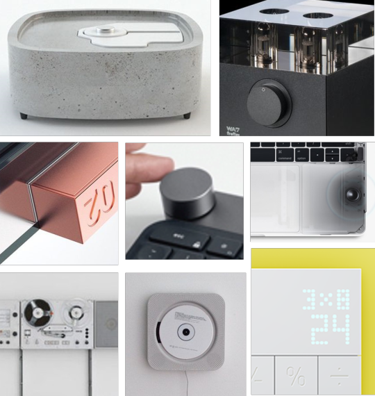
The main objectives of the design are subtleness, simplification, functionality and durability. Design references range from contemporary DIY projects (fig. 1) to Dieter Ram’s wall-hung TG60 tape recorder (fig. 6). These designs use concrete (fig. 1), glass (fig. 2, 3), or metal (fig. 3, 4, 5, 6) as a main material. We value highly the material of the artfiact, the feeling of the texture, the feeling to the touch. We want users to interact willingfully, thoughtlessly. The object must humbly exist within the home’s atmosphere, demand little to no attention, and be there when the user needs it. The outcome of the interaction has to be positive at all times. No bad feelings. No wrong actions. No unexpected feedback from the artifact.
For this reason, I used Dieter Ram’s 10 Principles For Good Design to lead my design.
Preliminary Design
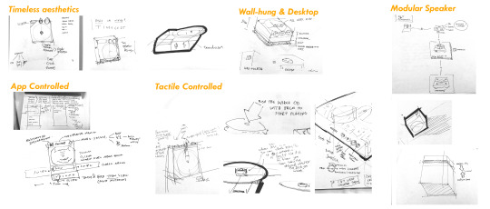
More than 20 different sketches were produced and treated as an idea pool to generate one and only 3D model. Below are the dominating sketches and the final model. Tools: PTC Creo, Keyshot 6.

Logo Design
People want to have an identity, something that can recognize that they partake in the new movement Album2020 want to create. The design was made to represent the two sides and how alike they are. The physical on the left (CD or Vinyl) and digital on the right (Knob Control - electronics are well hidden - heh)

Future Work
I believe there is a lot of value still to be distilled from this project. My plan for future work includes redesign, making a prototype, evaluating with users, analyse and visualize the results.
First step is to develop myself a medium-fidelity 3D printed protoype, embed the electronics, design the remote app, and evaluate the product’s stance in a user’s house (e.g. let them give feedback in the form of a diary or through forms),
Second step is to form a clear business and approach investors or companies for a quick development of this product.
Business Plan

Album2020 is a product that reimagines the connection between the owner of music and the music track itself. I want to seek for short-term investors and a team to develop the design, a high-fidelitty, fully working, pre-production prototype including both physical music player and the digital app.
To make this happen I am going to approach consumer electronics companies around Netherlands, starting from Fresh’n’Rebel, Rotterdam with my design proposal and a business plan. Their successful products are mobile speakers (Rockbox) and headphones (Caps) and Bluetooth earplugs. The ultimate goal is to offer me a job opportunity as a junior digital designer, have access to the product design team and the developers’ team. I have concluded that the modular version of my music player applies best to the Fresh‘n’Rebel’s value proposition of their products.
Fresh 'n Rebel (..) is for those who share a genuine love for fun and freedom (...) and offers stylish products that help you enjoy and share the joys of life with others wherever, whenever.
The business plan will include specific steps to reframe (align the product to F’N’R values and style), redesign, develop, test and evaluate the high-fidelity version of my digiphysical product at a medium-low budget in a time-span of 6 months maximum.
Alternative business plan
Form a team of passionate industrial designer, hardware developer, software developer and I will finally play the role of the digital designer and be the product owner. This shall be a sidejob if no investors are found. A kickstarter/indiegogo campaign would also work.
Crafting
I dissassembled an old DVD/MP3 player that would let me get to know better the digital electronics behind such devices. I have previous experience with electronic devices and my curiosity is what helps me understand if my design is feasible. Ideally i would like to create a prototype to hang it on the wall in the HvA MDD space and let users interact with it, observe them and write an evaluation on the interaction design of the product. Time pressure did not allow me do craft this prototype but another time I might have the opportunity to create a test probe out of it (for Research Through Design purposes!)
youtube
youtube
References
1. KnobFeel. No Title. (2017). Available at: https://www.youtube.com/user/KnobFeel/videos.
2. Don Norman’s jnd.org / Affordance, Conventions and Design (Part 2). Available at: http://www.jnd.org/dn.mss/affordance_conv.html. (Accessed: 12th January 2018)
3. Walker, S. Designing Sustainability: Making radical changes in a material world.
4. • Chart: The LP Is Back! Or Is It? | Statista. Available at: https://www.statista.com/chart/7699/lp-sales-in-the-united-states/. (Accessed: 7th January 2018)
5. Back on record – the reasons behind vinyl’s unlikely comeback. Available at: http://theconversation.com/back-on-record-the-reasons-behind-vinyls-unlikely-comeback-39964. (Accessed: 5th January 2018)
6. Walker, S. Stuart walker design - quadruple bottom line of sustainability. Available at: https://www.stuartwalker.org.uk/designs-2/10-quadruple-bottom-line-of-sustainability. (Accessed: 5th January 2018)
7. Richards, B., Walker, S. & Βlair, L. Reframing progress in the digital age:moving forward sustainably. Int. J. Sustain. Econ. Soc. Cult. Context (2013).
8. stuart walker design - Design for Life: creating meaning in a distracted world. Available at: https://www.stuartwalker.org.uk/. (Accessed: 5th January 2018)
9. Walker, S. Sustainable by design : explorations in theory and practice. (Earthscan, 2006).
10. Lee, J. H. & Price, R. Understanding users of commercial music services through personas: Design Implications. Ismir 2015 476–482 (2015).
11. Fuller, J., Hubener, L., Kim, Y. & Lee, J. H. Elucidating user behavior in music services through persona and gender. 17th Int. Soc. Music Inf. Retr. Conf. 626–632 (2016).
12. Good design | About Vitsœ | Vitsœ. Available at: https://www.vitsoe.com/eu/about/good-design. (Accessed: 5th January 2018)
13. Customer Demographics - Age Ranges, Generational Names and Numbers | Marketing Artfully. Available at: https://marketingartfully.com/2014/10/08/customer-demographics-age-ranges-numbers/. (Accessed: 3rd January 2018)
14. LG Music Flow hands on review | TechRadar. Available at: http://www.techradar.com/reviews/audio-visual/hi-fi-and-audio/audio-systems/lg-music-flow-1279563/review. (Accessed: 2nd January 2018)
15. The timeless beauty of minimal turntable design. Available at: https://thevinylfactory.com/features/timeless-beauty-minimal-turntable-design/. (Accessed: 2nd January 2018)
16. Google Cast: here’s every product that works with Google’s open streaming platform | TechRadar. Available at: http://www.techradar.com/news/television/these-are-all-the-products-that-work-with-google-cast-1291053. (Accessed: 2nd January 2018)
17. Audio Devices | Cast | Google Developers. Available at: https://developers.google.com/cast/docs/audio. (Accessed: 2nd January 2018)
18. Cast SDK | Google Developers. Available at: https://developers.google.com/cast/?hl=en_US. (Accessed: 2nd January 2018)
19. Chromecast built-in. Available at: https://www.google.com/chromecast/built-in/. (Accessed: 2nd January 2018)
20. Discogs Forum - Other sites like discogs. Available at: https://www.discogs.com/forum/thread/735251. (Accessed: 2nd January 2018)
21. Are there any other good sites like discogs? : vinyl. Available at: https://www.reddit.com/r/vinyl/comments/5x6ste/are_there_any_other_good_sites_like_discogs/. (Accessed: 2nd January 2018)
22. The 8 Best CD Players and CD Changers to Buy in 2017. Available at: https://www.lifewire.com/best-cd-players-and-changers-1846562. (Accessed: 21st November 2017)
1 note
·
View note
Photo

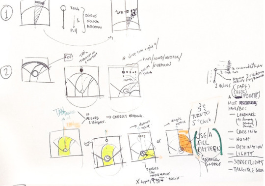
Sketching
All #sketchaday i did can be found on my blog
Reasons to sketch are two: Creative Analytical Thinking (Technical, Explanatory, Wireframing, Mind-mapping) and Ideation (Concept demonstration, Aesthetic Expression, Shape)
0 notes
Photo


PlayCHI 2017
Self-Directed Learning
Role: Conference Volunteer, T-Shirt Designer
My contribution guaranteed me a seat to see Ian Bogost keynote speech at the PlayCHI 2017.
Key takeaway: Limits are what give the game the opportunity to be played and enjoyed.


1 note
·
View note
Photo


Defining the problem
Giraffes experience difficulties trying to drink water from the lakes: stooping down requires that they (a) spread their front legs and (b) lower their head resulting in high levels of discomfort, awkwardness and exposure to predators.
Framing with questions
What artifact can co-exist within the animal kingdom? How can the artifact work support drinking process of the animal effortlessly? How can we design affordances of the artifact so that it is easily understood by the animal? Can the system be digital, physical or both? How would the process of natural selection help giraffes solve the problem of drinking water in the future? Can humans today do something similar through the aids of technology? Would it be a good idea to consider simulating the natural selection as a process to ideate and explore possible evolution scenarios? How does the new artifact solve the drinking problem of giraffes and what advantages/disadvantages does it give to the animal and the other animals in the same environment (stakeholders)?
Design Approach & Methodology
One interesting design approach for animals would be to design scenarios that can stimulate natural selection to happen faster and help the animal evolve beneficial characteristics (e.g. to easier drink water). The short amount of time for this (and other) assignments does not allow me to attempt this approach but it would be interesting to explore in future research projects. For now, we are going to use current or emerging methods of product design to create an easier way of drinking water into their animal’s natural environment (nature or zoo).
Desktop Research: Pumping water
Research on the internet showed that giraffe’s drinking process can take up to 25 seconds during which their large necks (esophagus) is getting filled with up to 5 liters of water (170 ounces)[1]. To hold such an amount of water in their mouths the animal equips powerful muscles on their mouth that act as pumps and valves. As Figure 1 explains, the intake stroke (a) draws water into the mouth, while the discharge stroke (b) pushes it out into the esophagus.

Observation
Artis zoo hospitalizes more than seven giraffes of different ages and heights. I saw giraffes eating leaves from high trees or from a pack of greenery hanging from a high human-made crane. The younger ones would spread their legs a little and eat from the grass on the ground. I didn’t see them struggling until I came up with the label that explains the animal’s details and its drinking problem.
Unfortunately, during the 1 hour and 15 minutes of observing the animal no giraffe was recorded drinking water from the lake. Eating from the ground was a good way to observe the animal’s difficulty in spreading its legs. Older giraffes preferred to eat from medium heights or more (Figure 2). They are at least three times the height of the average male human. In fact, females are 4.5 meters and males 5-6 meters high. Their neck alone is 4 foot long. After a fast google search from my smartphone I found out that giraffes dive their head into a lake in less than 2 seconds. In an analogy to humans, if we tried to do the same, we would faint. Imagining the largest giraffe stooping its head down to the ground level helped me transform their problem into a challenging design brief in my mind.

Vulnerability
The 25 seconds of drinking water is very short time but is long enough to make the animal vulnerable to its predators. Giraffes have only two predators (besides humans): crocodiles and lions[2]. Spreading their legs up to three times wider than they normally are makes it hard to react to an unexpected attack. Lowering the neck also constricts their field of view making them unaware of the dangers of their environment. In this awkward position, they are easy prey for predators. A giraffe has been observed reacting nervously while drinking water after a bird passes by its ear and a small baboon makes an unexpected sound. The giraffe raises its head and sneezes the water all over the place as its water-pumping procedure is being interrupted[3] (See Figure 3). This proves giraffes are always anxious while drinking water as they are aware of their weakness. Usually one giraffe keeps watching around while the other one gets a drink. If a giraffe is attacked, it kicks its attacker with its long legs and sharp hooves[2]. Of course, there is no reason to worry while the animal is in the zoo.
Design
The solution that giraffes are looking for is smartly depicted in the Figure 4. With this as a starting point for our ideation process we will make an attempt to design a mechanism to pump water from the lakes to a higher level.
Design Requirements
Make it easier to drink water (=stoop less)
Make it safer to drink water (=stoop less)
Keep an open field of view to watch for predators
Comprehensive action-reaction mechanism to the animal
Easy familiarization between the animal and the solution
Reduce anxiety
System must be easy to maintain by humans (or ideally animals!)
Scenario
An adult thirsty giraffe called ‘Marion’ detects a large unknown water hole to take a sip of water at a desert. There is no other giraffe nearby to help her keep an eye for predators while she gets busy with drinking water. She decides to take the risk and approaches the water hole. Something looks unfamiliar to Marion. There is a very wide and flat stone in front of the water hole and looks like she will have to step on it to drink water. Luckily the stone is not high at all but exactly at high as the level of the ground. Marion steps with her two feet on the stone to test the unfamiliar stone. She feels like the stone is moving a little towards the ground and immediately jumps back on the sand. This made her more nervous. To her surprise she had triggered a 4-meter-high fountain of water which she had never seen before! The fountain lasted for less than 20 seconds but she didn’t approach it as she was still anxious to try drinking from it. She makes sure the environment is still safe. She approaches the stone and steps on it harder this time. The fountain is triggered again right in front of her with much more power reaching the height of her head! She instantly extends her head and reaches the water from the fountain. Marion is excited but still anxious of this new finding so she still keeps an eye in front and to the sides of her for predators. Everything looks peaceful and Marion fills her stomach with water easier and safer than ever before.
Ideation

The first idea coming into the mind is the fountain from the scenario (figure above). With a few calculations turning a 600kg force (assumedly coming from the giraffe’s frontal weight distribution) into a 5-meter-high fountain requires a sophisticated pressure mechanism to be engineered for the needs of the wildlife environments. Problems emerged after analyzing the idea on the mind and paper. Firstly, water cannot be pumped up the fountain if there is little to no water left in the waterhole. This may lead to damaging the mechanism as it would suck in mud, rocks etc. The 5-meter-high water fountain can be affected by the air thus it may make it difficult to take a constant sip of water. The development of the fountain idea led to a series of sketches that implemented the previous pressure mechanism. The new design would pump water inside pipes upwards to fill a large sink for the giraffes to drink from
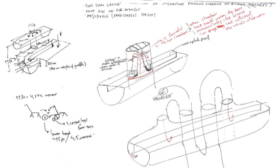
The key take-aways from ideation are: (a) The sink (figure above) stands statically into the water hole and gives plenty of time to the animals to familiarize with. (b) Stands fixed at 3.5 to 4 meters which is enough for most adult male or female giraffes to drink from easily without stooping their heads more than 15 degrees. (c) It can store water inside it for the dry days – thus solving another problem. (d) Enables giraffes keep a big field of view depending on the design. (c) Requires mechanism to be installed below the ground and may be difficult to maintain.
The analytical thinking through sketching below shows the Cylinder-Piston mechanism which could work as a simple lever. Requires moving parts and heavy duty materials
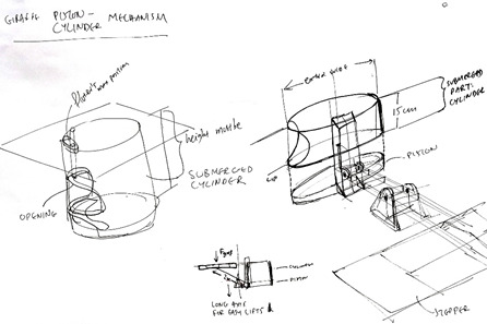
Prototype Development
A 3D model of the mechanism was designed and developed to better understand and communicate the solution to the drinking problem of giraffes. Tools include Cinema 4D for modeling and animating the mechanism and Keyshot 6 for rendering.

The mechanism is animated to show that a small movement of 15cm on the standing pad (stone) of the giraffe pushes 15 cm upwards a piston with extremely large area (approx. 7sq.m) within the cylinder. The large area helps displace 5 liters of water upwards through the pipes. The mechanism must be engineered for optimum torque so that it is easy to (a) lift and (b) press the water within the small diameter pipes. For now, the prototype uses something like a crankshaft with two rods: one rod connected to the standing pad of giraffe and the other connected to the cylinder of the sink (See middle-bottom image from figure above).
Render
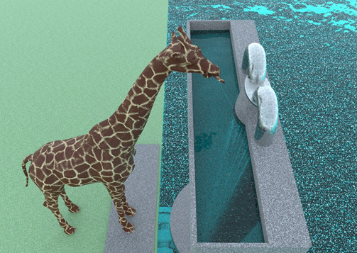

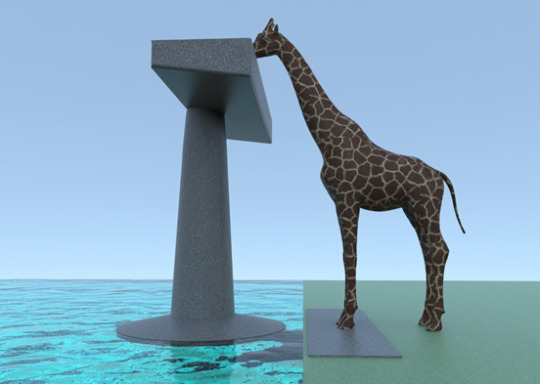

Stimulating natural selection through design?
Question, Critique of my design.
In this project i questioned myself what would happen to the giraffes if they all suddenly stopped drinking from the ground but starting drinking from magical sinks like this. Natural selection is the process in nature by which organisms better adapted to their environment tend to survive and reproduce more than those less adapted to their environment. Natural selection happens faster to rapid-changing environments. The process of natural selection happens to the genes when the animal faces the real need to evolve. If the problem is being ‘solved’ by human intervention there will be minimum evolution or another ability/gene will evolve. This can have good or bad effects on the animal’s abilities e.g. disability to bend over anymore, or weakening of the “strong mouth muscles” which would enable growth to their brains [insert more random-to-us-but-logical-for-the-nature scenarios here as natural selection happens]. Designing an artifact to help giraffes cope up with their drinking issue could also make their genes “lazier” to evolve in the future, just like what happened with humans who have slowed down their natural selection processes due to their large success in protecting themselves with their technological advancements [1]. The designed artifact is critiqued and looks like it would give giraffes advantage into surviving, reproducing and increase their population in their natural environment. The product gives them the advantage of being less vulnerable and agile as the tall animal can still observe their environment for threats which could not do previously, and thus it will be in position to react faster to enemies.
References
https://www.thedodo.com/how-giraffes-drink-1585365005.html
[1] O. Bootle, “Are humans still evolving by Darwin’s natural selection? - BBC News,” BBC, 2011. [Online]. Available:
http://www.bbc.co.uk/news/science-environment-12535647.
[2] “Giraffes Facts.” [Online]. Available:
http://easyscienceforkids.com/all-about-giraffes/.
[3] “Giraffe sprays liquid everywhere as it SNEEZES at South Africa watering hole,” Daily Mail Online. [Online]. Available:
http://www.dailymail.co.uk/news/article-3357602/Huge-giraffe-sprays-liquid-SNEEZES-taking-drink-South-African-watering-hole.html.
0 notes