
Eleanor | she/her Practicing animator and illustrator✨
Don't wanna be here? Send us removal request.
Statistics
We looked inside some of the posts by pastelpear and here's what we found interesting.
Average Info
Notes Per Post
250K
Likes Per Post
179K
Reblog Per Post
70K
Reply Per Post
379
Time Between Posts
1 month
Number of Posts By Type
Text
13
Note
1
Photo
3
Last Seen Tumblr Blogs


Fun Fact
After the announcement of the deal with Yahoo!, there were 170K signatures of unhappy Tumblr users petitioning to prevent the sale in 2013.
Text

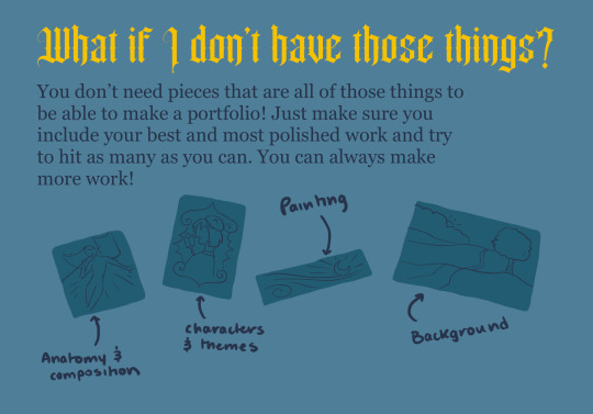
Need help prepping your zine portfolio or could use some pointers? Here’s a brief guide for choosing and organizing your works to make a successful portfolio!
Let’s start with artists.
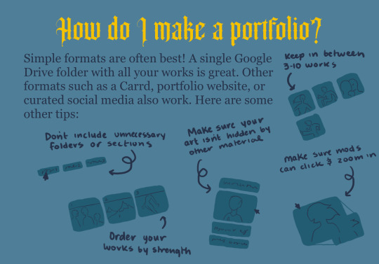
What format should you use? Simple is usually best! Google Drive folders are often preferred because they easily display your work with no extra steps. Carrds, websites, or curated social media work too, so long as there is not extra material or posts hiding your work. Try to have as few clicks before seeing your work as possible, so no need to separate work into folders and certainly don’t require a mod to search your entire page for it—they may not have the time.
Make sure that your work is publicly viewable! Double and triple check that your Drive folder is shared publicly or your websites are not behind a password.

When choosing which pieces to include, always choose your best and most polished work. All works should be complete, in full color, and be fully shaded or rendered. Try to have at least some of your works be approximately something that would be found in a zine, which usually means about A5 sizing. Backgrounds are an essential skill for zines; make sure you show you can draw them well. Of course, sometimes some of these elements are excluded in a piece as a stylistic choice, but all are important skills to show you have.
If possible, try to include the topic of the zine in your portfolio. It does not need to be every single piece. If you only have WIPs or messy work of the topic, then it may not be worth it to include it and that’s alright (though make sure the zine does not require art of the subject when making that decision. Ours does not).
Most zines ask for featured works separate from the portfolio. These are the first things mods look at when evaluating your application. Choose your strongest three (or however many are asked for) pieces as your featured works. Typically, try to include art within the fandom as a featured work if you can. Try to have those vital skills on display in these as well (backgrounds, rendering, etc) so it’s immediately clear you’ve got what it takes.
No need for every piece to hit every point. Try your best for the portfolio together to hit most of them and meanwhile you can work on creating some art specifically to show off anything you’re missing!

There are some things you want to avoid including at risk of weakening your portfolio. A portfolio is only as strong as its weakest piece, so having less pieces is better than having weaker pieces. Only include polished work you’re most proud of. WIPs, sketches, or isolated character work may give the impression that you won’t provide a complete zine piece. Including multiple styles or mediums (especially ones that you wouldn’t be comfortable using for the zine) may confuse a mod as they might not know which you’ll use. If you include multiple styles, make sure that you are skilled and polished enough in all of them to use them for the zine. It’s totally fine to have a smaller portfolio, especially if you’re just starting out—don’t clog it with art that’s not your finest.

Merch portfolios are very similar to page art portfolios, but focus on character-centric work often without backgrounds. Do research on what makes a good merch design, because not all compositions translate well to physical products.
Photographs of merch you’ve made are excellent, but if you don’t have them then you can make mock-ups to help mods understand what you’re envisioning for the final product. Merch portfolios can be a combination of photos, mock-ups, and designs. Print samples may look very similar to a typical page art piece.
If applying as both a page and merch artist, you will likely want to have separate portfolios, as the roles require emphasis on different skills.

Writer portfolios are similar to artist portfolios in that they should contain only your best work. You may also use a Google Drive folder or another hosting website so long as it is highly curated and does not contain many other works to sift through. Typically, zines ask for 3-6 works under 3k words, but double check these numbers with each project you apply to.
If you’re applying to a specific role, such as poetry or article writing, try to have those kinds of samples ready. It may help to make a separate portfolio for those more specific applications.

Here are some other tips! Of course, there’s an infinite amount of ways to make a great portfolio, so if this guide isn’t working for you that’s totally fine. Experiment with different ways if you’d like!

Our applications open soon. Good luck!
Got additional questions? Send an ask here on Tumblr or on our Retrospring! We’re always happy to help or clarify.
Learn more about our Dungeon Meshi zine here!
652 notes
·
View notes
Text
“The only time a lawyer can cry is when it’s all over”

Desde hace 10 años que jugué Ace Attorney me destrozó la historia de Godot, siempre quise dibujarlo pero no tenía la habilidad.
En febrero finalmente lo dibujé junto a Mia.
533 notes
·
View notes
Text

It’s been over a year but here is the piece that I did for the ‘Where I can follow’ Ace Attorney Sibling Zine! This piece was made to go alongside Elliot Sonder’s fic ‘Inked Devotion’ which can be read here: https://archiveofourown.org/works/54944317
This was my first zine experience and I really enjoyed it! Hopefully, I can do some more zines in the future 🤞🏻
#ace attorney#fandom zine#franziska von karma#miles edgeworth#aa franziska#aa miles edgeworth#ace attorney siblings#illustration#digital art#procreate#art#fanart
578 notes
·
View notes
Text

Forgot I needed to post here too 😅
2 notes
·
View notes
Note
How do you choose the colors in your art? Your color palettes always look so cohesive and so pleasing to look at!
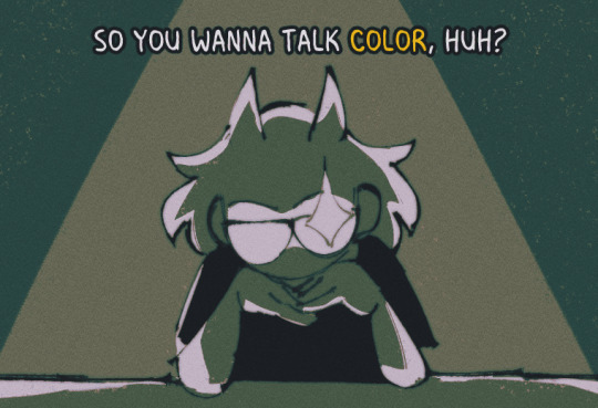
ah, this is gonna be pretty long so i'll talk about it under keep reading :^]
now i am no expert!!! i am just a guy!!!! i'll just be talking about how i do it! ok!
PART 1: COLORS??? HELP.
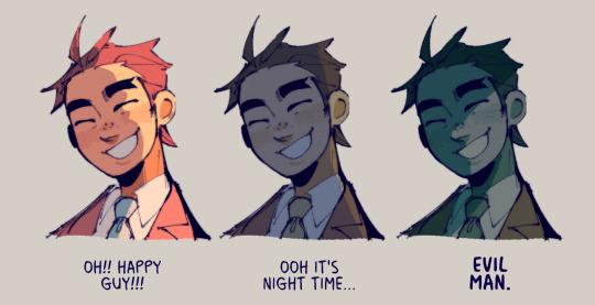
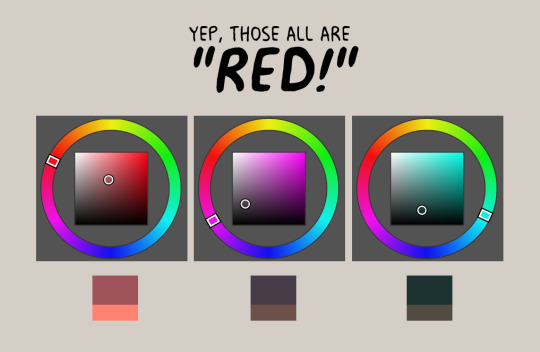
i really like going with warm stuff on my art so it's kind of a given that most colors i use end up wounding up on this side of the color wheel
so, let's say i'm coloring trucy, a character who wears blue, i end up choosing warmer looking blues, sometimes i end up choosing purple or gray if the other colors i chose makes it look like blue, yannow, color theory and stuff. like this for example!

now the first one is noticeably blue, but the second one is like a lavender and third one is like, really not blue! it's like a desaturated rose color or something, however, paired with the right colors...
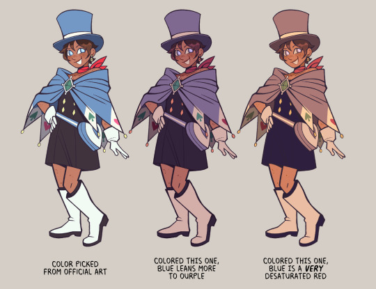
they're all "blue", aren't they?
PART 2: CHOOSE WEIRD COLORS
by weird colors, i mean colors that aren't like what the thing looks like irl. like, a leaf is green right? but, it doesn't have to be when you color it!
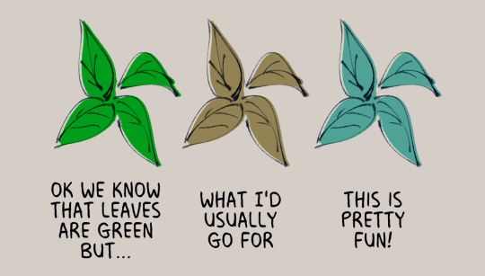
like when i color things gold sometimes, i use a light and desaturated red-orange for it or how like with the color blue, i don't even use blue at all!
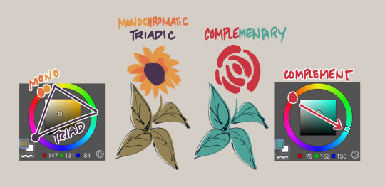
now just because i use warmer tones a lot doesn't mean i don't use the colors from the other side of the color wheel, it depends really, if the color scheme i'm going for is monochromatic or if i really wanted to make something pop
but of course, you can't just color willy-nilly, you gotta take into account
PART 3: CONTEXT AND MOOD
where and when is your drawing set? what's the mood? are we having fun here or are there Horrors?
see how it changes the mood? the things we're supposed to be feeling when we look at the drawing? yeahg. ill use warmer colors when i want the drawing to look happy dreamy etc but ill break out the blues and greens when we're in sinister town pftt
also, just wanted to share again how other colors can change what another color looks like:
PART 4: GRADIENT MAPS AND OVERLAY LAYERS
now as for making colors more cohesive... seriously, just slap that thing on top of your piece and it helps the colors get together even more! like of course i choose my own colors but gradient maps + overlay layers are kind of like adding that one final thing.
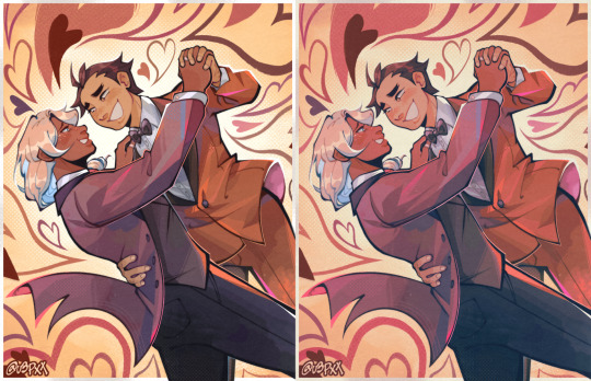
i'll use this one as an example, left one is no gradients maps/overlays and the right one is with them. i just really prefer some good ol' ourple tones in my art so there are a couple of things i add on top to really bring out the warmth in here, like so:

PART 5: ANYTHING ELSE?
uhhh don't be afraid to use tools in your program to correct the colors you don't like ala color balance tone curve contrast brightness etc etc.
hell, you can even color pick from like irl pictures and adjust accordingly to what colors you want.
i also do have like colors that i consistently use when shading things after countless trial and error; like how i'll use purple to shade red, blue to shade with green etc etc
ig that's all, hope this helps!
1K notes
·
View notes

Photo
Fear me, if you dare!
Help support me on PATREON
93K notes
·
View notes

Photo
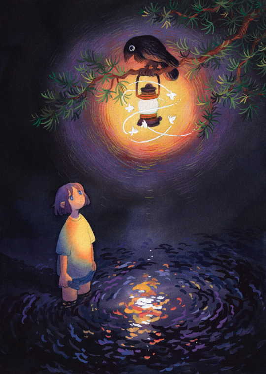
Guidance🕯
A mixed media piece with colored inks, poster color and colored pencils!
20K notes
·
View notes
Text
ace attorney popped the fuck off by doing that thing where certain characters have ‘hidden’ sprites that you only see once in the whole game, usually it’s an emotionally closed off character offering a smile in the final hour of their story to show a sense of peace and closure, but ESPECIALLY they popped the fuck OFF by having franziska von karma break down crying in hers.
‘the angry/mean character is actually deeply emotional and using anger to keep it at bay’ is an incredibly common character archetype but it is so often done in a more shallow manner. like they will just bust out their tragic backstory in the 11th hour and we’re supposed to sympathize because awww they’re sad :( but we already know everything there is to know about franziska pretty much immediately. we know she is a child prodigy, we know she is a genius, we know she is fierce and dedicated and that she loves what she does. and we know she’s lost her father, and we know she’s upset with her brother and wants to see him again. but she does not invite pity, because she does not want it. she lays these details out clearly and concisely when they’re relevant to what is being discussed–they simply are. she remains as she is, and she fights the same way she always has, for what she believes in.
franziska goes through it. we watch her go through it. we watch her lose everything, and then we watch her have to be confronted with the fact that her brother disappeared on her and is utterly remorseless about it aloud. and then we watch her get shot by a violent hitman, and kick and scream and fight while she’s bleeding out because she wants to go to court. she has to be dragged to the hospital by force. never once does she back down an never once does she present anything other than this steely determination and resolve. until the very, VERY end. until POST CREDITS. she doesn’t even crack until AFTER THE CREDITS HAVE ROLLED!
and it is KINDNESS that breaks her! it is softness that makes her cry. i feel like to a lot of people what miles says to her in that scene might seem cruel, but it isn’t about what he says, it’s about what he does.
by franziska’s own admission she has abandonment issues. one of the few single insights we get into her pain is that people tend to discard her and make her feel left behind. miles fled back to his home country and left her all alone in germany to pursue his career, and he wasn’t wrong to do that, but it obviously hurt franziska and she felt neglected and like he didn’t bother to keep up with her. and then when he took his dramatic fucking sabbatical, he refused to loop her into that, too. miles decided without the consent of the people who love him that he was not worth it. he was unbelievably selfish to disappear the way he did, blinded by this idea that he is not loved or worth love. franziska loves him more than anything, and he did that to her on the tail end of her father’s incarceration. she lost both of her favourite people in the span of a few months.
she ran away at the end of JFA and intended to give up on everything. and she ran away from him because if she abandons him first, he cannot abandon her. but nothing miles says in that scene undermines the fact that he chased after her. he could look her in the eyes and tell her she was scum to him but the fact of the matter is he followed her. he loved her enough to not be content just letting her give up and run away. he chased after her. can you imagine what that must’ve meant to her?
he didn’t have to chase her. and he didn’t have to bring her whip back. and when he said ‘if you stop being a prosecutor, this is where we part ways’ i think we all knew he was not being literal. i think we all knew he was full of shit. i think what miles meant by that was to light a fire beneath her. to say that he had no intention of stopping, that he would keep on fighting, and that he wanted her to fight alongside him. they’ve always been rivals and they have always pushed each other to do better and be better, and miles knows that rivalry drives franziska unlike anything else. she doesn’t actually want to stop prosecuting, she’s just emotionally vulnerable and struggling to cope and throwing a bit of a tantrum about it, and so he pokes at an old button he knows will clear her head. franziska is a difficult person, but miles edgeworth knows her more than any person in the world, he knows how to love her and he does. he loves her so much.
she has seen a lot of pain in JFA. she has seen a lot of wicked words thrown her way, a lot of pushback, a lot of antagonism and banter and bickering, but the one thing no one shows her is kindness and love. phoenix tries, when he brings her flowers, but he gets nervous and backs out at the last second. gumshoe tries, but he does it out of earshot where she can’t hear. every nice thing someone says about franziska, they say while she is not there to listen. miles is the only person who looks her in the face and says he loves her.
it is love that allows her the space to fall to pieces. it is love that shatters her veneer and turns her into a sobbing mess. she’s literally just a little girl who was forced to grow up too fast. she’s 18 years old and everything’s so hard. she just needed a fucking hug.
no scene in ace attorney will ever, ever, EVER mean more to me.
3K notes
·
View notes

Text
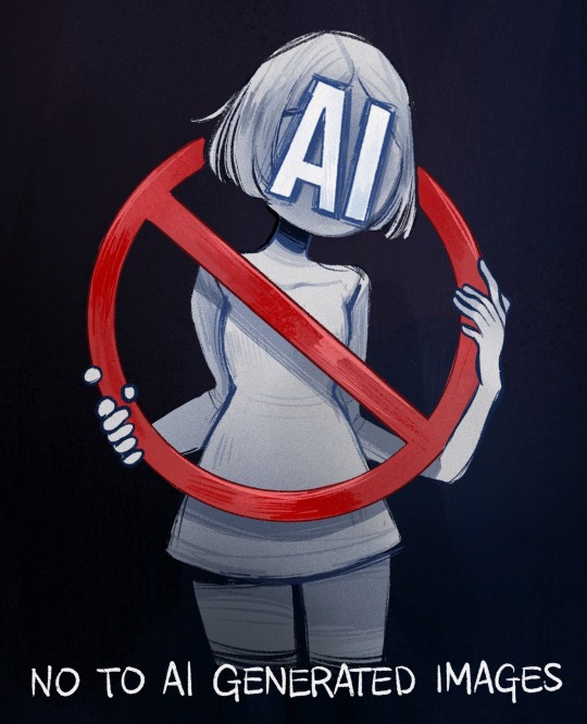
AI chan might be cute, but stealing art isn’t‼️
29K notes
·
View notes
Text
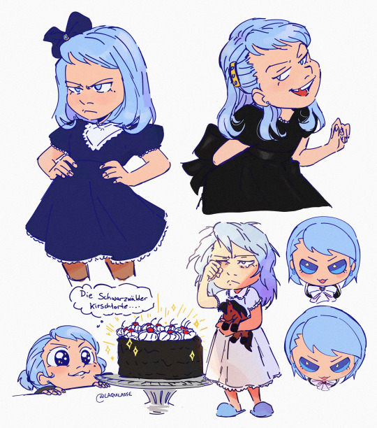

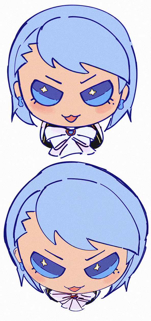

No little German boy is OUT yes little German girl is IN
5K notes
·
View notes
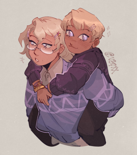
Text
brothers forever
2K notes
·
View notes
Text
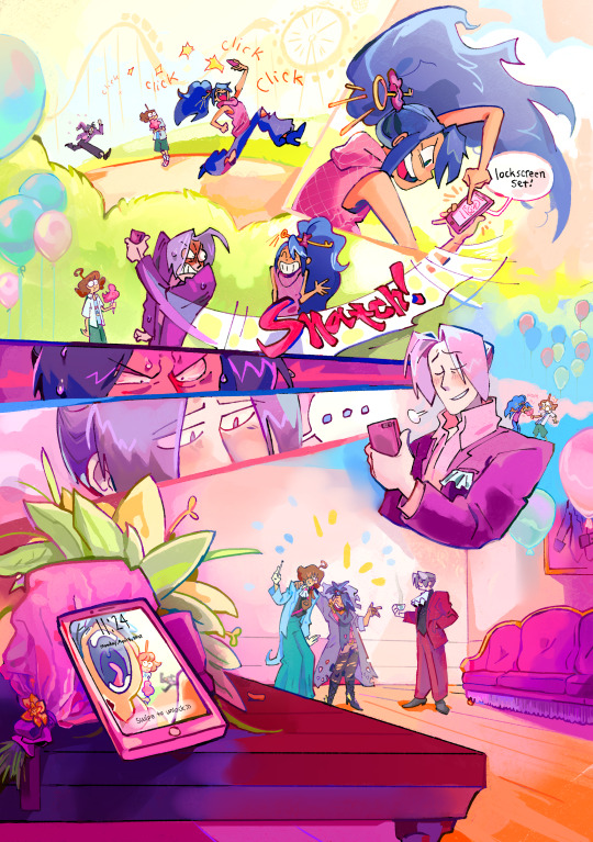
I forgot to post this here but I worked on the dadworth zine!! @dadworthzine they're having leftover sales, pls check it out :D
3K notes
·
View notes