
Statistics
We looked inside some of the posts by pelaanthony-blog and here's what we found interesting.
Average Info
Notes Per Post
9
Likes Per Post
8
Reblog Per Post
1
Reply Per Post
0
Time Between Posts
6 days
Number of Posts By Type
Text
17
Last Seen Tumblr Blogs


Fun Fact
Tumblr has 4 main sources of revenue.
Text
☾Extended Project: The Evaluation ☾
Overall, the project has been stressful and a lot of hard work as not only was I a leader but I was also ‘put down’ by a student throughout the course. However, all the effort I put into creating the exhibition made me feel better as the work I had tirelessly created could be seen by my friends and family. I think I have done well with this project, even through the trials and tribulations I have come under, and have researched, problem solved, planned and made some art work that I didn't think I could do.
Context and Research
Before I started my work, I had to research into different aspects that will then help me progress positively into the making of our game.
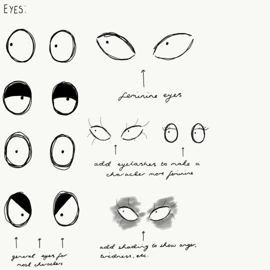
As our group decided very early on that our art style would be Tim Burton inspired, a main aspect of my research was collecting information that would help me draw in that iconic style. Burton’s characters are surprisingly very animated even though they are draw with black, scratchy-thin lines and aren’t always very detailed. He has been able to do this by using big, dark eyes that are the main feature that will show each characters emotion, paired with the thin eyebrows. Lauren and I agreed that this art style would be perfect for us to use as, not only does it depict a creepy tone, it also will be easy to keep continuity between all the artist as the art style isn’t difficult to replicate.
I also did another piece of research into how another artist could manipulate their work so it transforms into the iconic Burton style. This was very important for me to look into as a lot of the artists in both groups struggled to change their art styles to fit with the drawing style we were looking for as a group. Looking into how another artist has been able to change their work would hopefully teach us to be able to do the same and again, keep continuity throughout the project.
I did a lot of other aspects of research for this project, however another important thing I needed to look into was my leaderships skills and how to bring my team closer together, while also working well with other groups. After doing a case study on Disney, I learnt how tightly knit each sector needs to be to be able to work efficiently and cohesively as a group - we could only be succesful at creating our game if we all worked together.
I discovered a lot of precise and detailed information that would help me lead and create work successfully for our game, while also teaching me skills I may need to apply for future job careers. However, I would have liked to researched more in-depth into leadership skills as I didn’t know how to overcome certain issues with people being nasty to one another. I applied what I learnt about leadership to my team, about treating everyone as individuals, however I think it would have also been good if all groups on the course worked closer together to achieve our common goal.
When researching and looking at context for our project, I had to make certain decisions to help lead my group as an Art Director. After a positive response from the rest of my peers, I and the other Art Director decided that creating an art style that was Tim Burton inspired would be the best way forward. I also made the decision, after checking with Lauren, that the rest of the game and surrounding world should be Art Deco inspired to not only fit with the 1920s time period, but also give that gothic glam to the game so it’s not just shades of dull colours.
Next time, I would find out more into leadership styles to help me deal with the more difficult students I had to be involved with as I couldn't control their behaviour, which in turn meant some of the quieter artists in my group were left feeling overrun by the louder students. However, I did learn how to better bring my art team together and work more effectively as a group, I grasped a much better understanding of Harvard referencing, and I was able to learn how to manipulate my drawings to fit a specific art style. All these skills will help me in the future as I will most likely be asked to fit a certain art style in a future games company but I will know how to do that. I have also learnt how to manage people which is great experience for any future managerial roles I have.
Problem Solving
Throughout the project I have had to solve many problems as a leader, however there were a few problems that seemed to cause the most disruption within the art groups. Lauren and I had a continuous battle with some artists who would not try and change their art style to fit the tone and create continuity within the game. Not only did they not want to change their drawing style, they also hadn’t done enough research into the Tim Burton inspired art style which meant they couldn’t then try to draw with that style in mind. We also faced a major problem with the lack of attendence with some students; they would miss vital information about characters so they couldn’t then draw the characters in the way they were written. Because of the attendence issue and the lack of communication in group B, we also had some students doing work that was actually set for group A artists.
I decided to create art guides for facial features of different characters e.g. nose shape for an ‘snooty’ character, to help the other artists who didn’t want to or weren’t able to change their art styles. The art guides also helped students who hadn’t researched into Burton’s work enough but could now get a sense of his style and what character would have a specifc set of facial features. Having regular meetings with Lauren about what each artist was doing in both groups also meant group B didn’t keep doing tasks set for group A.
It would have been more positive if the attendence of students improved and that the art style stayed consistent. From the art survey collated at the exhibtion, one answer stated that, “The art style didn’t stay consistant and changed towards the end of the game.” From this, Lauren and I know that we needed to focus our efforts onto getting the students who did the art and the end of the game to stay within the art style shown throughout the rest of the story.
When it came to problem solving, I made the decision that art guides should be collated together to help anyone struggling with the tasks at hand. Lauren and I also had to make decisions in which artist would be doing what in the progression for the project. However, if we did this project again, I would create the ‘How To’ art guides earlier to make sure the artists had a better understanding of what we would be trying to achieve.
Through my time problem solving, I have learnt to take better charge as a leader by sticking to my decisions and organising my art group better so we are more effective and efficient towards the project. I have also learnt how to create an art guide that would actually help other artists and include extra information and shading and line size. These skills will help me in the future, again with management and being a better leader as I have had to work with other people and trying to get them to change their art style.
Planning and Production
A really positive outcome to my planning skills meant all the art work for the project was drawn before the deadline and to a finished or at least good standard. Students had an understanding of what they needed to do and my group and I were always willing and ready to draw any last minute assets if needed.
Although we kept to the delegated time constraints, my group and I did not follow the schedule I had created for us as a group and then my own personal one. I believe that if we kept more closely to these schedules, the students would have felt more at ease with what they needed to do and more organised.
My main decision-making priority was who needed to do what task and why. With the help of Lauren, we need to make sure that every artists was working on art that they not only were very good at but also enjoyed doing. We messaged our groups and found out what each artist would prefer to work on and then contribute towards the game. Luckily for us, there was a good amount of people on each art aspect of the game: four people on main characters, two people on locations and four people on any extra assets, characters or locations. After making this decision, we were able to progress forward with the project ahead.
If we had to do this project again, I would plan with Lauren what artist was doing what as quickly as we could and then stick to that plan. Art group B wanted to do different things to the plan that had been created so next time, Lauren and I should have been stricter on what students were doing for the project. Because of this, I have learnt to be stronger in any decisions I make and to all be organised and efficient with mine and my team’s time.
To progress with these skills in the future, I now have better time management skills that will help me with my leadership. I also learnt how to better colour chose a schedule so it would actually help myself and my team.
Practical Skills
When it came to practical skills for the project, most of the actual art created looked very professional and fitted with the Burton inspired style. Survey results from the exhibtion showed that the public through the the art style was “creepy” and “gothic” but was also “unique” and the “colours were great”. Out of the 20 people that answered the survey, all 20 people people liked the colour scheme. These responses mean that our artwork was able to comply with the overall vision we were aiming for as a group and as a course. However, like I mentioned before, it would have been better if the artists who were doing the final levels kept with the art style we had all chosen.
Lauren and I had to make decisions of the designs of each character and which artist would be doing what but next time, I would suggest to Lauren that we were firmer with our decision making and didn’t let artists in group B go off on tangents.
When creating the characters for this project, I was able to improve my drawing skills as not only was I designing new things every week, I was also drawing in a completely new style to me, a skill that would help me in future job prospects and help me when defining my own original art style. Even though I am still not very good at doing them, I have learnt to also create image planes that are given to the 3D artists to begin to model. I still need to improve when I have to draw the character side on as I’m still not very good at getting the proportions right but I am getting there. Also, buy drawing on my iPad in Adobe Sketch instead of paper, I have been able to improve my digital art skills so my work now looks a lot more professional looking. These skills I have learnt will help with a future job as I now know how to draw digitally and also how to create image planes that would help with the production line in a company when artwork has to be passed to the 3D artists.
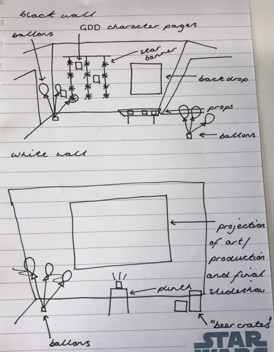
Exhibition
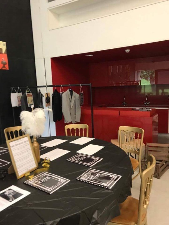
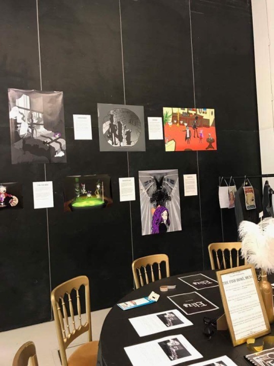
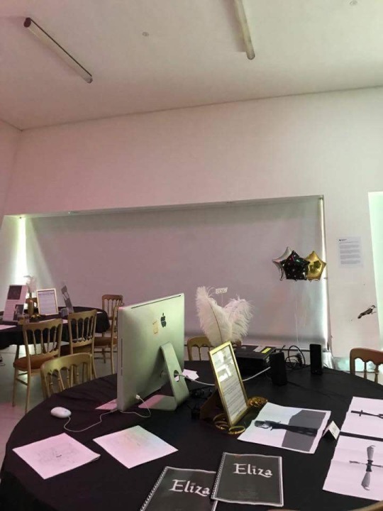
The exhibtion went really well, not only throughout the week but also on the showcase night to our friends and families. The decorations I had made and bought looked very professional and it was clear to the public that it was supposed to represent a 1920s club or ‘speakeasy’. I had decorated the art table so there was colouring sheets for the children to complete and art books for the older members of the public to look through and see the art concepts we had created. I had concerns about the table being too flat or uninteresting so I also hand-made a gramophone to add depth to the table, which contained some of the artists favourite pieces of work. We also faced a space issue as we couldn’t stick work onto all the walls at the exhibtion so I used a clothes rack to hang posters and hang 1920s style clothes to keep the vibe of the room intact.
At the exhibtion, I was able to speak to children and adults about the work we had created and how I was able to lead my team. It was nice to be able to share my work with the public and everyone really liked the art books created to show every piece of concept art the artists had worked on.
Lauren and I also created a survey for the public to answer about the art we had created. 20 people answered our survey between the ages of 16 to 23 and both male and female. This wasn’t our target audience age, however our secondary audience was 13 to 17 year olds so we can still use these survey results to help see if our work was appropriate. Out of the 20 people who answered the survey, only one person stated they did not like the art style as it was “amateurish” and the “art style changed towards the end”. However, the other 19 people said the art was “cute”, “simple” and “dark” - the look we were trying to aim for with the game art. We then asked the question, “Do you like the colour scheme?” to which all 20 participants answered yes, they did like the colour scheme. This was a huge achievement to me as I was the one who wanted to use an Art Deco style colour scheme so instead of the gaming just being greys and blacks, we include colours such as purple and green while still keeping that gothic style.
To improve the exhibtion, I think it would have been better if we gave a clearer understanding to the public about what the exhibtion was about - people were enticed into the room but didn’t really know what we were trying to show. We should have better advertised our space as a game development showcase so people knew what they were looking at. It would have also been nicer to have more work on the tables and not just in paper format but maybe on a slideshow or something more ‘3D’ to show the interactive side to our course.
I was in charge of the overall look and feel of the exhibtion so I had a lot of decisions to make concerning the showcase. I had to make the plans of what would go where in the room, what would be exhibited on our art table, what decorations we would have and where they would go, and an overall plan of how the exhibtion would run.
I learnt a lot from planning this exhibtion such as how to plan an event for the public, which was a huge thing for me to begin with. I’m a perfectionist and get stressed really easily so I had to make sure everything was meticulously planned which actually worked out in my favour in the end as setting up was easy as everything had already been organised. I also learnt how to do budgeting and costings for an event which again scared me at the start because I’m rubbish at maths, but with the help of my mum, I was able to create a professional budget and costing Edexcel spreadsheet that was intended to be shown to Lizzy and Tristan. I also improved my skill at making stuff by hand and actually surprised myself with how well the decorations turned out!
I found planning the event was stressful however it has opened up my eyes to a career choice that I hadn’t thought about and that I’m good at. I will also be able to put this experience on my CV, and having planned an open event to the public at First Site at 18, it would hopefully show future employers how successful I can be.
5 notes
·
View notes
Text
☾Extended Project: The Progress of the Project (May) ☾
1st May 2017
As the exhibition draws closer, I need to redo my original exhibition plans so they are up-to-date and look more clear and professional, ready to show the staff at First Site to make sure they are okay. Evidence Below. If I make the plans clear and finalised, the staff will hopefully see how serious I am taking this task and let us create what I have planned.

Once I got home, I carried on making the decorations for the exhibition. Evidence Below.

Fake Crates of Alcohol

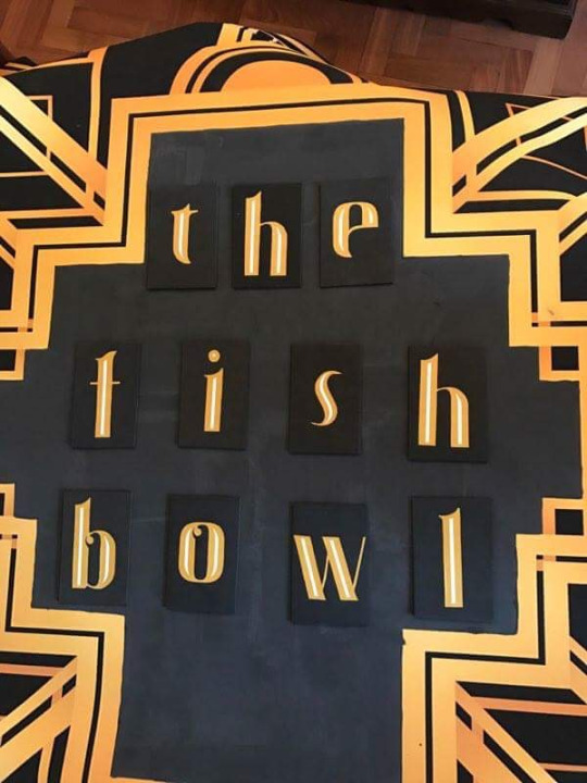
The Fish Bowl Menu

Centre Table Decorations
The Fish Bowl Backdrop
3rd May 2017
Lizzy wasn’t happy with what each team had said they would contribute to their tables so I messaged each group to get a true understanding of what would be present on each of their tables. Evidence Below.
Contacting Leaders about Tables at First Site
8th May 2017
We needed to start ordering the decorations as the exhibition is soon. Lizzy had planned to ask Lauren if she could contribute her award money to the course so we could use that to pay for the decorations, however there was no set time we would receive that money, it could even be put into the account after we leave the course. I was feeling very stressed as I didn’t know what to do as we were running out of time, until my parents so kindly donated all the money to pay for the decorations we needed. Because of this, I could decorate the exhibition how I planned to do and make it a great showing of all our work.
10th May 2017
Today I decided that I would create a yearbook style booklet for my fellow classmates as a keepsake from the two years spent doing this course. The yearbook would contain a picture of each student and a quote that most fits them of their choosing. Every student that wanted to be included has and I have even put in quotes from the tutors who have mentored us through the course. Evidence Below.

Booklet
11th May 2017
Part of the evidence I need to show to receive a distinction in this course is my concept art throughout the project and why I have changed and made decisions on certain aspects of artwork. I was going to do this on another Tumblr blog but I felt that wouldn't really get across the creative decisions I have made unless the drawings are next to each other. The art book will show I progress throughout the project and all the creative decisions I have made and I thought the best way to view this work would be in front of your eyes, instead on a computer screen. Evidence Below. Problem Solving.

Art Book
25th May 2017
With the exhibition beginning on the 31st of May, I needed to carry on making any final decorations. Evidence Below.

Table Centre Pieces
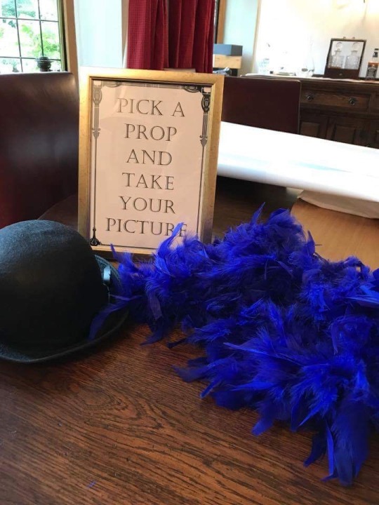
Prop Table Sign and Decorations

Finished Alcohol Crates
Due to my concern on my art table being too flat and boring, I needed to come up with an idea that would entice the public to come and look at our work. I came up with the idea of making a gramophone that when lifted, you could see some of the artists favourite work. This would add some interest to the table and attract the public to look at our art. Evidence Below. Problem Solving.

Gramophone
I used a simple box and covered the lid with some brown paper. I then cut out some foam circles and painted one silver to depict the record on the turntable. Making the ‘cone’ of the gramophone stand up was a huge problem, the weight of it meant it kept bending over the foam tube I had used to stand it up. It was then I found some plastic tubing which I drilled into the box, screwed it to the lid and then glued the cone to it. The strength of the plastic meant the cone would hold up. Problem Solving.
As we weren’t allowed to put anything on the walls at the exhibtion, I had to find other ways to show off work around the space we were allocated. I came up with the idea of using a clothes rack, filling it up with 1920s style clothes and hanging a few pieces of work off it. The public could then flick through the rack looking at the work and also me immersed in the idea behind the exhibtion.
30th May 2017
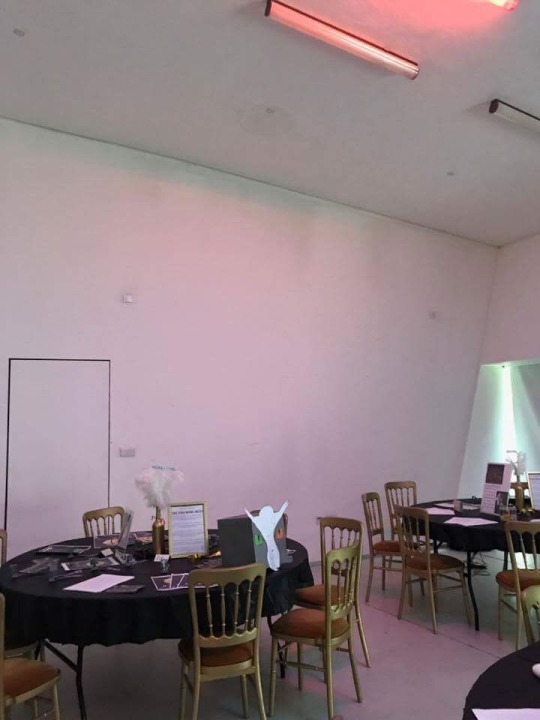
All day was spent setting up the exhibtion for the opening tomorrow morning. Callum and I got to First Site first and had nearly finished setting everything up before the other leaders came to set up their tables. Because my plan had been so detailed before hand, me and Callum were able to set up without having any issues. We decorated the tables, placed out work, blew up balloons, hung up posters, set up the photo booth table, and added any extra details needed. By the end of it, the exhibtion looked really good, you could really get a sense of the 1920s style we were going for.
Writing Table with Clothes Rack

Prop Table
A1 Poster Wall
Game Set Up Before Macs Arrived
Marketing and Audio Tables
Design Table

Art Table

Lights at the Exhibtion
31st May 2017
This morning was the first day of the exhibtion and my turn to run the event with some of the other students on the course. At the start, I felt uncomfortable having to talk to different members of the public but as the morning went on and I added colouring pages to our table, it was easier to get children interested in the art table and so then I could talk to them and their parents about what we had been doing on the course. Problem Solving. The children really liked the art style and the colours which was quite surprising as our target audience was 12 year olds but these children were around five or six. A lot of the children were also interested in doing game design when they were older so I spoke to them about what I did for the project and they liked the idea of drawing the different characters. The adults were even interested in what we were doing as game design was new to them as well so they wanted to know what each group did and how we were able to work as a whole course to produce our game and the work we had created towards it.
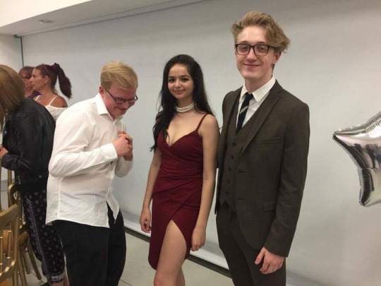
In the evening, we had our special showcase to our friends and families to which they could see our work and we all get dressed up in a 1920s style. Callum and I created a showreel of our production time and interviews with the leaders and each group. After that, Lizzy gave out awards to students who had worked really hard towards the project and I was lucky enough to receive one! It was a really nice ending to the course and it was nice for my family to come and see all the work I had done.

Jamie, Hayden, Jon, Me and Callum at First Site
Jon, Me and Callum at First Site

Jamie, Gillan, Alex, Hayden, Jon, Me and Callum at First Site
0 notes
Text
☾Extended Project: The Secondary Research (Art Deco & Steampunk) ☾
As a class, we had decided that the art style we would be heading towards was Tim Burton inspired, using thin wiry lines and big eyes to draw and create each character. However, we needed an overall look to the game, how the world Eliza resides in looks like. I had heard from the writers that they wanted the game to be set in a past era to add ‘creepiness’ to the game so I looked in to time frames where it would give the most darkness to the game.
I bounced between the 1940s and 50s until I read a newspaper article online about the sinking of the Titanic in the 1920s. This catastrophic event caused a huge dullness in the 20s and with our game being set in the same time, would link to the fact our game is supposed to have fairly dark undertones.

Titanic Newspaper Article
However, the contrast to this, the 1920s was also known as the ‘Roaring 20s’. It was a time of partying, dancing and drinking and people were much more free with their clothing choices and hairstyles. This contrast would fit very well into our game as Eliza’s world is distroted and random; it consists of dull tones but also bright club lights. After this research, I decided that our game would be best set in the 1920s and I let Jamie and Lauren know.

Roaring 20s
I began creating a PowerPoint to show the whole class so they got a real sense of the art behind the story. In that presentation, I included the typical 1920s clothes that would be worn by the men and women. These pictures would help the artists get a feel of the time period and understand what each character would most likely be wearing depending on their age and class.

Clothes PowerPoint Slide
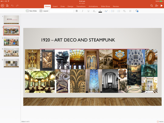
Even though I had a time period set, I still needed to decide how the world Eliza and her friends inhabit looks like. I had always had an interest in the Art Deco style and it was, “...the predominant decorative art style of the 1920s...” (Boundless, 2017) due to the rise in clubs and bars. It is weirdly beautiful with strong gothic undertones as purples and greens stand out against dark coloured architecture. I thought this would be the perfect solution for our game as I was always concerned that because everyone wanted a ‘creepy’ game, they would just be interested in using blacks, whites and greys. However, if our game includes the Art Deco style, we would be able to use a much wider range of colours but still create and eery and gothic feel.

Art Deco Style Gate
Continuing on with my PowerPoint presentation, I added two other slides to help everyone understand the creative direction I was aiming for and help the artists understand how they needed to design a certain character, building or location.
Architecture PowerPoint Slide
It was extremely important to me that all architecture was designed keeping in mind the shapes and styles of Art Deco buildings. The strong and intimidating presence of the buildings is also paired with the beautiful curved walls and glass features, something that would let our players know clearly that this would be a weird world. The colours here are also very important to take into consideration, although darker, all the colours stand out against the metal frames of the building creating that eery and delicate feeling. I also created a PowerPoint slide on the patterns that would be present in the Art Deco style. These patterns could be used for buildings, clothes, furniture, anything really!

Pattern PowerPoint Slide
I loved the Art Deco style but I still felt as if something was missing to truly bring the weirdness back to the art. I then remembered about the fashion movement of Steampunk and how we could incorporate that into our drawings. Steampunk, “...typically features steam-powered machinery rather than advanced technology.” (Postlethwait, 2016). At the time of the 1920s, electricity and modern-powered engineering were dreams for the future, not anything they believed could be achieved then, however having a Steampunk element to our art not only brings an industrial and heavy-metal style, but also the weird contrast between curved, beautiful buildings and harsh metals.

Steampunk Style Machinery
To add to the distorted and dystopian world our game was set in, I thought we could also included characters that could be half ‘human’, half ‘metal’. These characters could incorporate the mixture of human looks with the heaviness of the copper coloured metals, creating an unsettling world littered with close but not fully human like things. To practice this concept and see how could it would look in practice, I designed a mechanical arm that could be replaced on a character instead of their usual arm.

Mechanical Arm
As you can see by my drawing, the arm looks heavy and is clearly industrial as I have included a gauge on the side of the arm. The arm looks brown and dirty but I have included dark blues and a variety of metal colours that have rusted in different ways to add depth to the arm and extra interest to it.
0 notes
Text
☾Extended Project: The Progress of the Project (April) ☾
4th April 2017
Today I spoke with Lizzy about ticket prices for the exhibition. I mentioned to her that the ticket price income could be put towards the decorations budget so we wouldn’t have to worry about fundraising as much. Earlier on in the year, Essex University had invited us to one of their open days and had given the public the chance to pay for a ticket if they wanted to, if not, they could just enter for free. However, as an incentive to pay for a ticket, the University offered goodies for the paying customer. I suggested this idea of following suit and coming up with a similar ticket price option. I believe Lizzy agreed with me as later on she sent me an email of the ticket prices and what a customer would get for their money. Evidence Below. Problem Solving.

Ticket Prices
5th April 2017
Today I went to view First Site with Lizzy, Jon and Taylor as that is where our Eliza exhibition will be held. I was able to see and learn about the space and what we were working with. Because of this, I got the chance to plan each room briefly and organise what we would need or not need any more from my initial decorations list. Evidence Below. After the visit, I contacted the marketing team with a new and reduced budget for decorations and if there were any ideas on how we could raise that money in the time limit. So far there have been no final ideas.
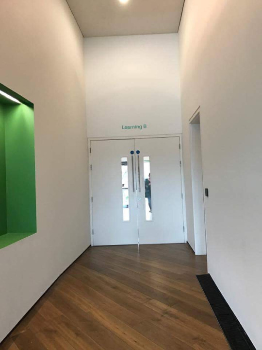
Hallway at First Site
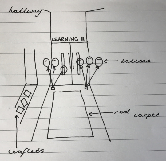
Initial Hallway Plan
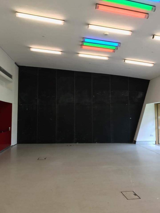
Left Wall at First Site

Right Wall at First Site
Initial Wall Plans

First Site Kitchen

Lights at First Site
24th April 2017
Part of my plans for the exhibition is that every team e.g writing would all have an individual table to be able to showcase their work on. They could include any work that their team was proud of and wanted to show off to the public and their families. Evidence Below.

While making plans for the exhibition tables, I realised that a lot of tables will just have sheets of paper and booklets on them, causing them to look flat and uninteresting. I needed to come up with some ideas to help each table look more interactive and decorated. The design table wanted to included pictures of the 3D assets that had been created in Maya but to solve the above problem, I thought about using augmented reality to make the 2D pictures ‘come to life’. Problem Solving. I started to research into augmented reality which is, “A technology that superimposes a computer-generated image on a user's view of the real world...” (IGI Global, 2017).
After looking into many options of creating augmented reality and with the help of Callum, we were able to create it through an AR app called Augment. Evidence Below. Problem Solving.

ShadowMan AR

Marbles AR

Trickster AR
However, after creating the AR assets, I noticed it wasn’t very accessible or easy to understand how to use so I will need to find a way to make it easier for the public to use at the exhibition.
25th April 2017
After having a whole class discussion, Lizzy told us that she wanted the rest of the Eliza story line that hadn’t been made into the game to still be shown at the exhibition. First, Alex came up with the idea of turning the rest of the unmade story into a graphic novel but the class were concerned with the amount of work that would take in the little time we have. Then Lizzy came up with the idea of creating storyboards for each part of the unmade story but I said they wouldn't be very clear as they would have to be printed quite small to fit in the space at the exhibition room. Taking inspiration from the storyboard idea, I came up with the concept instead of having huge A1 singular drawings that depict each level that hasn’t been made. That way, the class could show people around, using each picture as a narrative tool to explain the rest of the story. Problem Solving. Because Lauren was busy with other work, I wrote out brief explanations, while using the script for guidance, of what each still drawing should consist of and, with the help of Lauren, delegated the drawings to a few of the artists who had finished their other tasks.
After doing that, I focused on the budget for the exhibition. I had already written out a budget before for the decorations we needed to buy but I needed to it with printing and art book costs ready for a budget meeting with Lizzy and Tristan next Tuesday. Evidence Below.
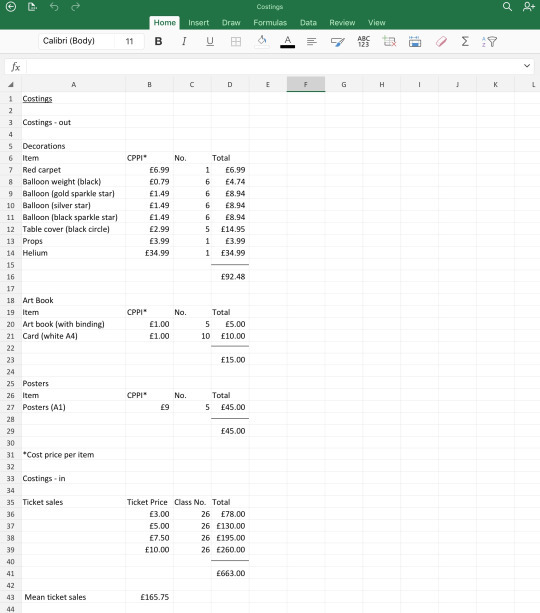
Costing Spreadsheet
The point of creating the costing and budget spreadsheet is to give me an approximate amount of money I would spend to the amount of money we would receive. It helps us organise and not overspend money we don’t have. Doing these spreadsheets have helped me by showing we wouldn’t overspend, in fact, we would create a profit from the amount of ticket sales to the amount spent on decorations and printing. Of course these are just estimates so I must still be vigilante in what I am buying.

Budget Spreadsheet
While doing research into decorations for the exhibition, I found out some important information on what balloons we should use. Latex balloons were cheaper but we would have to buy more and purchase more helium canisters for them to last the exhibition week. Getting foil balloons are more expensive but we will be able to buy less of them and would only need to use canister of helium, overall making the foil balloons cheaper. Problem Solving.
For the last couple of days, I was trying to find ways to make the augmented reality of our 3D assets more accessible to the public as it was quite complicated to use on the app and I couldn't find a way to make it simpler to use for the younger children who may visit our exhibition. I had looked into 3D printing our models and that's when Carlie had mentioned to me that Colchester Institute had a 3D printer. Lizzy is going to make contact with the appropriate people to see how much that would cost us to do and hopefully we can do that instead. Problem Solving.
28th April 2017
As I have been ahead of my work, today I was able to draw my single shot for the orphanage level needed for the exhibition. I first came up with the idea of having Eliza, Marbles and ShadowMan looking out of the orphanage. The characters would be looking sad while they stand on the balcony of a dilapidated, Victorian style building. Evidence Below.

Original A1 Poster
However, after I had drawn this poster, I realised it didn’t quite fit within the drawing style we were aiming for and I also didn’t believe it represented the characters very well. So I decided to redraw the poster as if Eliza was lying in her bed in the orphanage, while ghosts flew round her room. This idea brings the ‘spooky’ element to the game but I made sure the ghosts were appropriate for a younger audience to see. Evidence Below. Problem Solving.

New A1 Poster Design
As you can see, Eliza is the main focus of the picture as she is brightly coloured compared to the greyness of the rest of picture. Marbles lays on the bed with one eye open, protecting her from the ghosts around. However, if you look closely, the ShadowMan is standing in the corning, mischievously waving to Eliza in her bed. This picture is foreshadowing the rest of the story, letting the viewer know that the ShadowMan cannot be trusted.
0 notes
Text
☾Extended Project: The Secondary Research (Technical) ☾
When it comes to a technical side of drawing, as an Art Director, I needed to decide what would be the best way to produce work that would then be sent to the 3D modellers later on in the process. The work being sent needed to be clear and also come with image planes for the 3D modellers to work off of, all new skills for the artists to work on. Straight away, this was a difficult task for all memebers of my art group, including myself, as none of us had ever drawn an image plane before. I personally struggled with having to imagine something from a different angle or 3D perspective. Because I struggled with this, I couldn’t help the other artists so instead I showed them examples on the internet, YouTube tutorials and asked Callum, a 3D artist, to help explain how to create an image plane so that he can use. I created a few image planes throughout this project but I believe I will need more practice as I’m still not getting all the proportions correctly drawn and that would have made it hard for the 3D artists to work off of.

Image Plane for Eliza
From my own personal skill point, I mainly draw digitally as I feel there is less pressure to design the correct thing first try, and I also feel digital drawing is crisper, with the possibility to edit the picture with so many more tools. My biggest decision on my own personal level was choosing what colouring techniques I preferred, whether that was through paint or water colour.

Paint (Left) and Watercolour (Right)
Both look very different; paint being a very solid, thick colour, whereas water colour glides around the page and is fairly translucent. I love that paint can bring that rich colour and really emphasise an area of a drawing. I think that paint can give a drawing a more professional look due to the boldness of the colour. In terms of our project, paint would be a very good option as, even though the game is dark, it includes a lot of bright purples and greens, something paint could portray very well. On the other hand, water colour, even though soft, can create quite an eery tone due to its ‘watered-down’ colour tones. It brings a sense of mystery and shadow that again, would fit well within our game as we need to included that sense of mystery and curiosity.
To combat this issue, I have decided to colour most drawings in paint but any details I want to add some mystery or quirkiness to, I will use watercolour. Overall, I think the mixture of both colour techniques will work quite well as they are bringing both bold and eery connotations to each drawing.
Eliza Has Been Coloured with Paint Except her Hair which is Done in Watercolour
Over the course of this project, I really wanted the chance to be able to improve my digital drawing skill as that is the industry standard in game companies. Moving from pencils and paper to using Adobe Sketch on my iPad has been a turbulent journey, with me feeling frustrated and confused on why I could draw on paper but not digitally. However, I practiced everyday and learnt quickly on how I have to hold the pen slightly differently, for example. Now I much prefer working on my iPad due to the final drawing being of a much high quality.
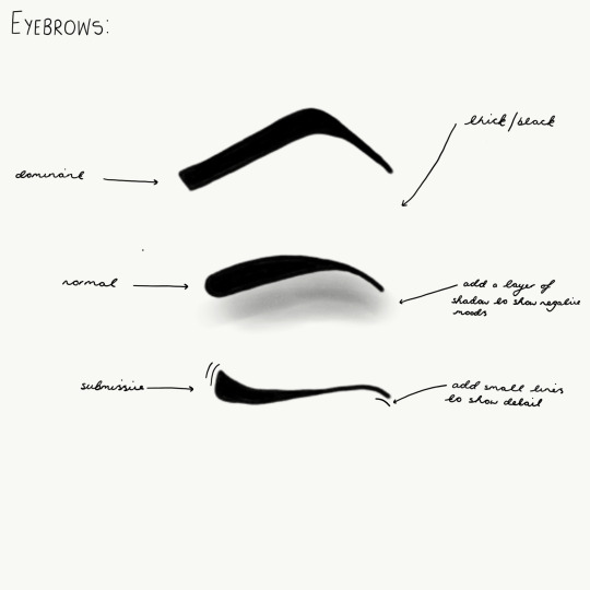
Changing and developing my art style to turn it more ‘Tim Burton-esque’ was quite easy for me as I still haven’t really found my own style so using his designs as inspirations really helped me establish more of a grasp on my own art style. However, a lot of the artists in group B didn’t have such luck with changing their art style. They didn’t really want to adapt their art style for this project as they were comfortable drawing how they knew, but me and Lauren wanted them to step out of the box and try doing something they hadn’t done before. Some artists also hadn’t researched into Tim Burton and his work so didn’t really know the style they were trying to take inspiration from. They hadn’t grasped his consistent art style such as the big round eyes, so again, me and Lauren pushed for them to look into and research him. Finally, we had a extreme problem with attendance, with most of group B not coming in regularly. Due to this, they hadn’t learnt and gotten to know the characters the writers had created for the story, making it a lot harder for them to create a personality through the drawing of the character. To counteract this fairly crucial problem, I created an art guide of the facial features of characters and which characters would have a specific feature. In the corner, I also added information on what pen size or colour to use and how to add detail if needed, such as shading.

Eyebrow ‘How To’ Guide
There were a few practical and technical issues along the way when creating artwork for the game. The first problem we encountered was that not everyone knew how to use Photoshop confidently or how to draw digitally in general. A lot of the artists felt more comfortable drawing in pencil on paper so encouraging them to move their work to Photoshop was quite a difficult task. I was able to show my group a few tips on how to work well in Photoshop but most of the group A artists took their own initiative and found tutorials on how to use the software.
Another problem me and Lauren faced as leaders is trying to help other artists learn how to create image planes for the 3D artists to work off of. Like I mentioned before, this was hard as most of us had never tried to show our 2D work from a 3D perspective so it was definitely a learning curve in the journey of our art skills. The best me and Lauren could do was show the other artists example of 3D image planes and get them to watch tutorials to grasp a true understanding on how to create them.
From a leadership point of view, I learnt a lot about how to run this process in the best possible way. My goal form the beginning was to make every artist feel involved and proud of their work, make them feel like they contributed to the making of the game. In the specialism essay I did for a previous unit, it was interesting to discover the best ways to head my group, making sure I exhibited excellent organisational and time management skills and also bring an excellent blend of people skills and an ability to implement and enforce rules and regulations effectively. I believe I have done well leading group A art group as all artwork produced has been successful and to a really high standard. Everyone in the group gets on and feels counted for, Nathan and Ryan seemed to have become best friends!
Delegating tasks was also a crucial part of the organisational and leadership skills I needed to use to lead my group successfully to the end of this project. Every week I made sure that all my artists knew what they were doing and felt like they could answer me any questions if they were unsure about the task they wer set. I was very open and welcome to suggestions made by artists as I wanted to get second views and opinions on things, but I was also strong enough to make decisions and not let people voice their ideas louder than other memebers of the group.
1 note
·
View note
Text
☾Extended Project: The Secondary Research (Andrew Tarusov) ☾
When it came to the art style of the characters, I also looked at Andrew Tarusov to show how he is capable of manipulating his own art style to that of Tim Burton’s. This is helpful for us to research as then we will be able to learn how to change our own drawings to achieve the art style we are aiming for.
Tarusov doesn’t usually draw in the Tim Burton art style with him stating that, “Most of all I like vintage style Pin-Ups and comics.” (Tarusov, 2016), with neither of these platforms present in the Tim Burton films. So how did he change his style to fit that of the iconic looks from films such as the Corpse Bride or Nightmare Before Christmas? Andrew would have researched Tim Burton’s art style in great detail, practicing how to draw the big round eyes and the withered body shape. Although he has tried to replicate Burton’s style, Tarusov has also managed to keep his own style on each drawing, something that I want the artists in our production to be able to do.
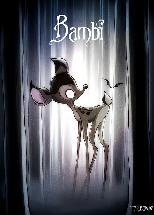
Andrew Tarusov Bambi Poster
The artists need to develop their skills to be able to take Tim Burton’s work and then manipulate to it so it becomes more original and unique to our game. It’s a difficult task but with enough research into his work and practice, it clearly can be done.
Like I mentioned before, this art style that Tarusov has replicated isn’t his usual style and neither his usual muse to take inspiration from. He is very interested in comic books and the ‘pin-up’ style, looking at pop culture and politics in the present age. Some of the artists in our the art groups are more interested in manga art but by showing Andrew is able to change his art style, they might be more willing to give it a go.

‘Animals in Politics’ by Andrew Tarusov
It’s important for the artists to realise first of all, it is possible to change an art style through practice and research, even though it is difficult it is still achievable and will only help them in the future when doing concept art for companies.
To help the artists further with our endeavours to take inspiration from Tim Burton’s work, I created a few ‘How To’ guides on the facial features of different characters. These have apparently been extremely helpful for the artists who were struggling with this task, however I do think we still have a problem with people not wanting to develop their art skills and draw something different. It has been quite a hard task to push everyone out of their comfort zones and try an art style that is new for them. Luckily, Lauren and I didn’t chose a complicated artists as inspiration since Tim Burton’s work is easy to take inspiration from due to the big eyes and thin lines.

Eye ‘How To’ Guide
1 note
·
View note
Text
☾Extended Project: The Pre-Production (One Sheet, Individual Schedule, GDD Pages & Proposal) ☾
I enjoyed completing pre-production for the project as I like to feel organised before embarking on my work so I can then create the best quality work. Fortunately, I had already learnt how to complete pre-production on a past project last year so I felt confident to complete this work.
Below is my proposal and my individual schedule. I do however, find it quite hard to write a proposal as I tend to ramble and go off topic but in this case, there is a limit to the amount of words you are allowed to include. To combat this, I wrote everything I wanted to write on paper and then removed anything that wasn’t relevant before writing it up properly. The indivual schedule was helpful to me as I could keep track of what I needed to be doing and what tasks needed to be completed by a certain deadline. I get stressed and overwhelmed quite easily so having an individual that I can focus in and keep on task makes me feel much more in control and let me know what I need to be doing on specific weeks.
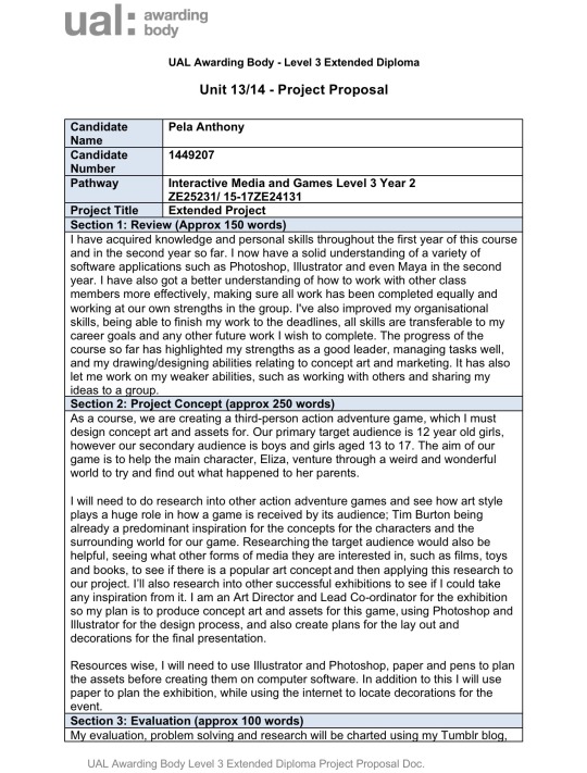

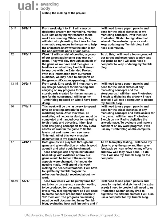
Proposal and Individual Schedule
It’s very important to make sure my proposal was professional and completed well as it is almost like the ‘front cover’ of my project, the first piece of work my tutors and UAL will see. In my proposal, I had to go into as much detail as I could to explain what I have already learnt on the course and how I will progress these skills. I had difficulty including the most important aspects of what I was doing in the 2nd year but I was able to narrow it down in the end.
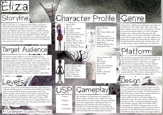
My one sheet was really fun to do as I like to be as creative as possible while still adding the much needed information. I had already made a lot of one sheets for Graphics at GCSE so I was confident in what I was doing. I made sure the writing was precise and clear but added a relevant background picture to make it more interesting. I also made sure sketches of the characters were included so the audience could get to know the face that matched the biography I had created for the four main characters. Even the typography needed to be in keeping with the gothic style of the game to really show the audience what the game Eliza, is about.
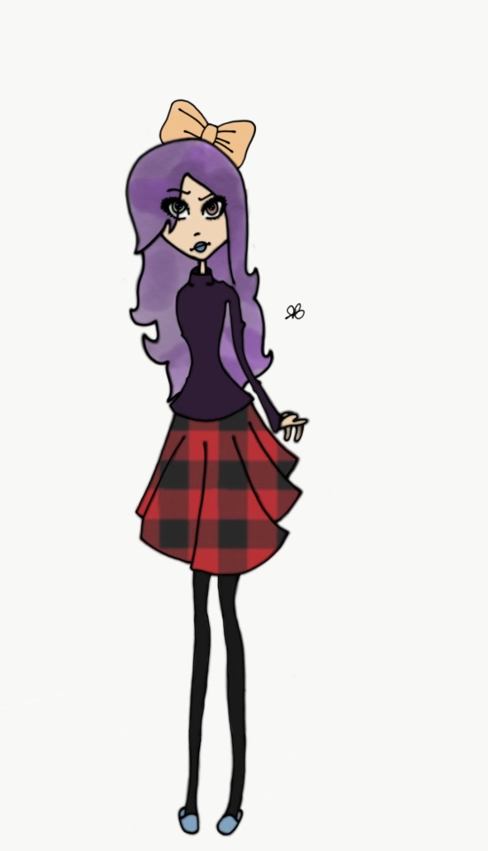
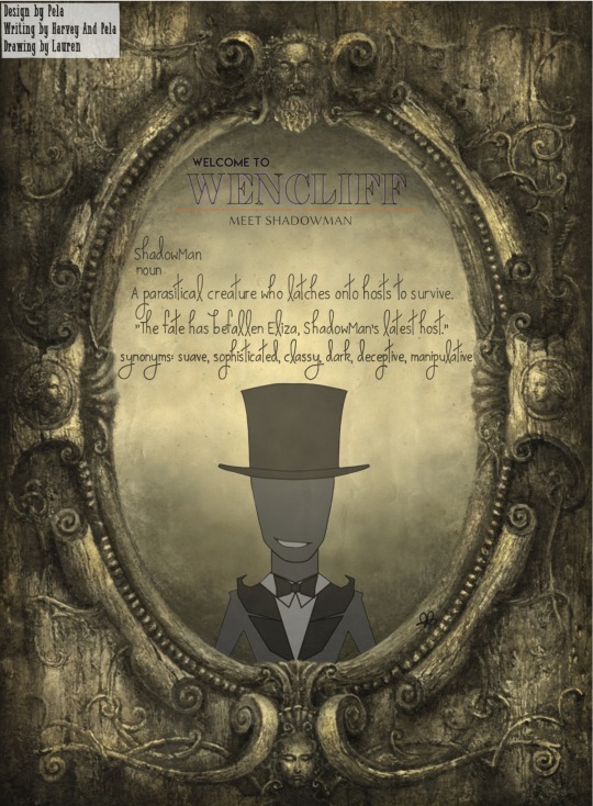
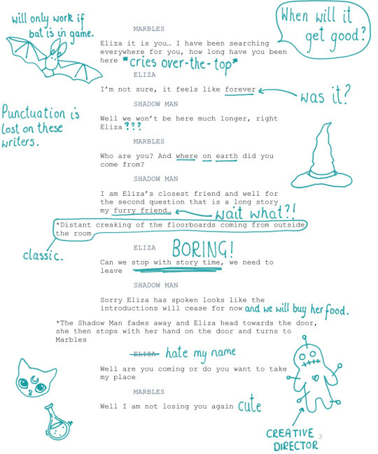
I came up with the idea of doing short character bios to show the reader what each character is like, while still adding humour and some extra information. For example, most of the ShadowMan’s information is unknown or N/A to add more mystery to this character. I have also shown how each character may interact with others, for example, Marbles the cat lists one of his dislikes as the ShadowMan, not only letting the player know there may be differences between them but also adds more mystery to the ShadowMan.
One Sheet
Creating the relevant GDD pages was actually quite a task for me to do as I had to create and gather character art, edit backstories written by the writers so they were shorter, and design interesting pages for all this information to go on. Straight away I had the idea of putting the art work on gothic mirrors so it looks like that characters are looking at themselves. This design not only fits with the dark tones of the game but also adds some interesting depth to the art pages. After deciding my initial idea, I had the job of fitting everything on the page and making it clear for readers to see.

Eliza GDD Page
On each page, I included a couple of lines of text to describe the character. I wanted the reader to be able to infer traits about the characters instead of being bluntly told about them to create an air of mystery. For example, instead of stating that Eliza isn’t the nicest of children... I wrote “There are a lot of kids at the orphanage but for some reason, the only friends Eliza has is...”.
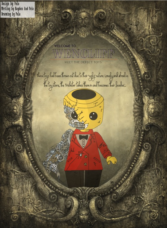
Distorted Lego Man GDD Page

Trickster GDD Page

Frog Bouncer GDD Page

Fish Bandits GDD Page
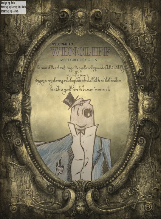
Gregory Gills GDD Page
On this GDD page, I mentioned about where the player would find Gregory Gills as his location on the world map is very important to the game as the player visits back to him for quests.
ShadowMan GDD Page
To begin with, I struggled coming up with an idea to explain the ShadowMan without giving too much away to the player. I decided that, since most things about the ShadowMan is unknown, a dictionary definition will how this character as being unusual and strange as a simple statement about them couldn’t be given. In the dictionary statement, I was able to give hints about what the ShadowMan was like without explain the whole depth to the character.

Marbles GDD Page
0 notes
Text
☾Extended Project: The Case Study (Disney) ☾
To look more in-depth into art style, theories and methods, I did a case study into some of Disney’s work.
I first looked into the feature film Fantasia, which was released in the 1940s. It was one of my favourite films when I was younger due to the explosion of colour, sound and animation. It was astonishing to me as a young child to see these interesting developments of animation just based on sound created by an orchestra. "Visually, this segment provided a field day for the Disney effects department..." Finch in 1973 speaking about a scene in the feature film. Amazingly in this production, sound created visuals and visuals created sound, causing excitement on the senses and a new way of creating. Due to this, hundreds of studies were made for specific segments of Fantasia, with abstract forms used to illustrate musical ideas. (Finch, 1973). Having each team in that production relying on each other so much suggests to me that all parts of the production team had to work very closely together to create this final masterpiece. They all had to rely on each other to form their part of Fantasia’s story; the artist’s couldn’t draw without the music and the story couldn’t be written without the art. This close knit tapestry of teams would be an appropriate way of organising ourselves as a production team since our deadline is short and we all need to focus on different aspects of the game, while still keep consistency.

Fantasia: The Sorcerer’s Apprentice
A key factor of Fantasia, which I think we should apply to our game, is that the artists took inspiration from relevant and cultural work at the time of making the film. For example, the section of Fantasia named, "Dance of the Hours", interpreted by the Disney artists, became a hilarious parody of classical ballet that was popular at the time of making. In our case, we could also use popular references to culture at the moment, to not only make a comment on it and express our opinions, but also create a relationship with our audience as they would also know what the game is talking about. A game which does this well is Borderlands 2, in which the game makes constant references and includes Easter eggs to pop culture, even referencing to other games! In the first ‘Rescue Claptrap’ mission, a Guardian Angel says, “Would you kindly give him a hand?” a reference to the iconic phrase in BioShock. An interesting idea for our game would be to add references and Easter eggs from some of our favourite films/games/TV shows to keep our audience entertained and connected to our game.

Fantasia: Dance of the Hours
When it came to some design inspiration for our game, I looked to the Silly Symphony posters. “In 1929, Disney launched a new series of cartoons which he called Silly Symphonies.” (Finch, 1973). The colour pallets, the eccentric fonts and the amusing characters all gave me inspiration for some in-game posters for our game. It intrigued me that in each of these Silly Symphony posters, a story was told and I thought that would be perfect for our game, to have posters in each level that add extra information to the story for the player to immerse themselves in.

Silly Symphonies Poster
As you can see above, unlike modern posters, these Silly Symphonies posters contain a lot of text and imagery. All the text explains what the poster is about, written in bold text and white font when certain information needs to stand out more. I took this concept into consideration as I wanted to be in-keeping with this old style, meaning I was able to add more information to my in-game posters that I would if they were to be set in the modern age.

Silly Symphonies Poster
I love the bold colours used in this Silly Symphonies poster above; the primary colours give the poster an interesting lease of life compared to the old style typography. When creating my in-game posters, I also wanted to use bold colours, however, because our game has gothic tones, I decided those bold colours should be purples, blues and oranges. Like I mentioned earlier and you can see clearly in the picture above, the poster shows a clear story about what is going on, in this example, the story of the Three Little Pigs.

Gwen the Witch Poster

Toy Box Poster
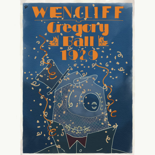
Gregory Ball Poster
I coudldn’t completely take inspiration from those posters as they were made in the 70s and our game is set in the 20s, however, hopefully you can see the aspects I did take inspiration from. Including bold text was a must and I copied the bold colours that were seen in the Silly Symphony posters. I also used the trick of outlining the text in a darker shade of the same colour, taken from the researched posters, to make the words stand out and look more interesting. Surprisingly, a lot of posters in today’s time are fairly minimalist and want the reader to be drawn to small bits of information at a time. Although this is useful from an advertising point of view, the ‘old-school’ posters were all about a lot of colour and a lot of fun. Due to this, on every poster I made, I included a lot of drawings and a lot of different colours to entice the audience and make them want to find out more.
I also took inspiration for these posters from a book called, Comics Sketchbooks: The Unseen World of Today’s Most Creative Talents by Heller from 2012. The images I took from this book as inspiration are a lot more modern than the Silly Symphony posters, however they still have underlining similarities.

Women Crying Poster
This ‘pop art’ piece of work gave me inspiration for my Gwen poster; creating this glamour but pouty character. Albeit not very similar drawings, the bouncy curls and sharp eyebrows appeared prominently in my interpretation of Gwen the witch.
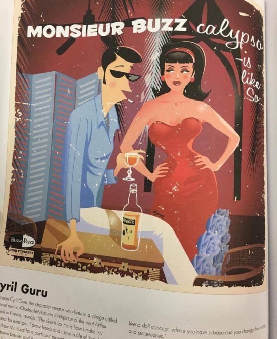
Monsieur Buzz Poster

Selection of Posters
Just like the Silly Symphonies posters, I loved how these posters would also explain a story using characters, text and colours. Even though these posters are drawn in a different art style, I can still take the same inspiration from them.
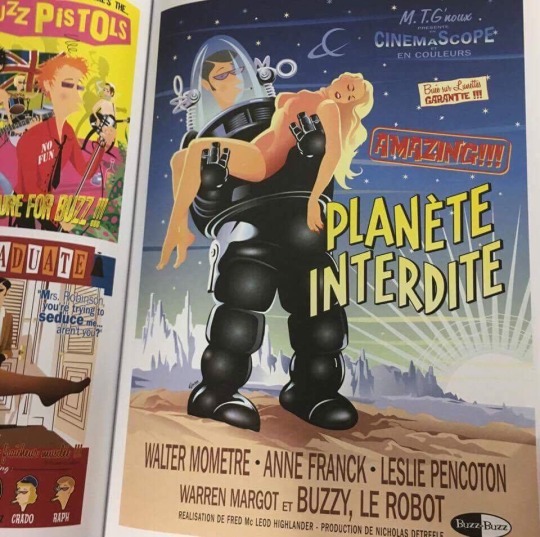
Planete Interdite Poster
Like the Silly Symphony posters, I loved the bold titles and explosion of colour on each individual poster. Even on these posters, a story could be drawn just from the artwork alone, something I wanted to be shown through my in-game posters.
1 note
·
View note
Text
☾Extended Project: The Primary Research (The London Classic Car Show) ☾
I was very fortunate enough to visit a classic car show with my family and Callum. While we were there, I was able to find some primary research with neon lights first attracting me to a ‘50s’ area of the event. Even though our game isn’t set in the 50s but in the 1920s, I thought there was a lot of inspiration the whole group could take from these pictures. The shapes, colours, music and lights could help anyone in their project if they are stuck with any ideas to fit the Art Deco theme.
The pictures I gathered showed off the use of lights in everyday objects. Not only neon signs but even in petrol pumps! The use of these bright lights is very relevant within our Art Deco art style so we should create a lot of asset concepts that use this source.
A lot of primary colours were also used to really advertise products and make objects stand out. I thought as a way to play on this, we could have objects that look weathered but used to have this shiny look to them, that way, the character really understands the state of the game world and knows it’s not what it once was.
I thought it would also be interesting to look at the fonts in the signs and the other items to take inspiration and maybe use them for any assets we have with writing on them. It would be interesting to have a variety of typography present throughout the game to keep the player interested.

Petrol Pumps
These petrol pumps used bold colours and typography to stand out, some inspiration we could take into our artwork.

Coca-Cola Vending Machine
The Coca-Cola machine is bright but also is in-keeping with its vintage routes. The font plays a big role in understanding what era it is from as it isn't as bold as the advertising we use in the modern age. This implies to us artists that font is very important to take into consideration when design signs or posters for in-game.
Empty Canisters
I took a picture of these empty canisters to show the weathering on them. I would hope us artists would be able to replicate this level of 'wear and tear' on some of the assets we create to set the tone of the game.

Neon Lights
It was particularly important for us to include neon lights throughout our game because they add some sinical glamour to the Art Deco/steampunk vibe of the game. Interestingly enough, they were the first thing that attracted me to the area so we could use some neon sign concepts in our marketing campaign to attract the target audience.
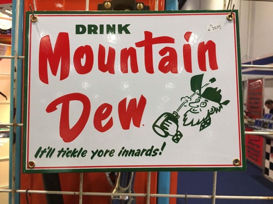
Mountain Dew Sign
Mountain Dew is a modern drink nowadays that our team and our target audience would know about. I took a picture of the old advertising poster of the drink to compare to the company's newer advertising campaigns to show the advancement in how we sell products. I noticed that a lot of the older advertisements contain little sketches or doodles to add some comedy to the poster.
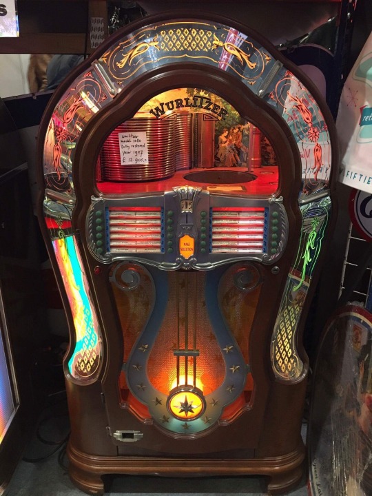
Juke Box
I was able to film a recording of the juke box playing to help the sound group with any inspiration for the game. The music had a swing vibe to it and reminded me of what we all wanted in Gregory Gills’ club. This type of music will hopefully be used in our game when appropriate.

Pictures and Video Sent in Group Chat
I then sent all these pictures and video to the relevant group chats to help them with any inspiration they may have needed to progress forward in the project.
0 notes
Text
☾Extended Project: The Primary Research (EGX Rezzed) ☾
On Thursday, Callum and I went to EGX Rezzed, a gaming festival where you met developers, form links, and learn about the industry. EGX Rezzed focuses on indie games so it was helpful to use this experience for not only research for us, but primary research for our game.
When we first arrived at the event taking place at Tobacco Docks in London, I noticed the amazing architecture. The gothic style framework and details would be perfect extra inspiration for the artists and level designers. Because of this, I took pictures of the buildings to get a sense of my surroundings.

Metal and Wood Framework
This mixture of materials creates an interesting effect; a mixture of industrial and natural frames. I thought this would be a concept we could use within our game, not only to add layers to the art style, but to also help asset designers create structures quickly with this simple framework. The colours of the metal are also interesting too. Usually metal is grey or rusted but here it is shades of green. This fits in with our ‘Art Deco’ theme, adding more colour to mediocre objects and buildings.

Basement at EGX Rezzed
This connection of tunnels in the basement was great inspiration for the sewers in our game. I took a picture to show how they all connected and to show how we could design our sewers. I like the idea of using dimly lit lights in the sewers in the same way they have used them at this event. The stone tiles and brick ceiling was also a new way to ‘reinvent’ our original sewer idea and maybe add some more ‘class’ for when nearing Gregory Gills’ The Fish Bowl club.
Framwork Inside Tobacco Docks
Again, this was another picture to really show off the amount of exposed structure they had within this building. To apply this to our game, we could show places are run down by showing the insides of the building, such as peeling plaster and broken walls. I think doing it this way would be much more immersive for the player, to not just to see a dilapidated building but to actually see its inner workings in lots of detail.
Basement at EGX Rezzed
At the event, they had transformed each room into developer spaces with this metal walls that kept up with the industrial style of the whole place. I thought it may be an idea to use this concept, of having a pre-made building and then adding modern architecture, to Gregory Gills’ Fish Bowl club. It would add comedic value to have a very run down sewer but to see this extravagant club lit up in the middle of it.

Clock
We have a clock tower level in our game so I took this picture as inspiration of what the clock could look like. I think, as it’s the final level, the clock tower should be quite haunting but also strangely beautiful which I think this clock does quite well. The detail may help the artists to come up with concepts and colour ideas.

Cage at Event
I not only took this picture to show how beautiful the industrial style can weirdly be, but also to show the varying colours of metal they have used. We could keep with the Tim Burton art style but range out to different shades and designs to create something like the picture above. None of the colours are bright but the greens are all slightly different shades and every bit of metal has been mounded into a different pattern. I think it’s very important for us to take this amount of care and detail into our concept and assets designs to really help immerse the player into the game.

Developer Session with Ken Levine
This trip helped with primary research towards the game but also towards my own personal research. I was lucky enough to attended a developer session with Ken Levine, a creative director who made my favourite games and also inspired me to get involved in the game industry. He taught me a lot about the industry, being honest about the highs and the lows. This session also helped me get a clearer plan in my head about what I will do after college has finished, making me excited about developing my own game.

The most amazing part of the day was actually being able to met him! I was shaking so much but I was able to ask him more questions about the industry and get a picture with him! Ken Levine told me that I should develop a game if I want to and to not lot enyone or anything hold me back. He then gave some more advice, which included him telling me and Callum to message him whenever we need his help with anything! I was honoured to met someone so inspiring to me and the whole day helped me in the college project and also with my future.
0 notes
Text
☾Extended Project: The Progress of the Project (March) ☾
1st March 2017
I am still confused as to why but Josh left the a group chat on Facebook which means he can longer keep in contact with the rest of the leaders. He told us that if we wanted to talk to him, it would have to go through Jon which isn't good as work flow will now be disjointed and inefficient. The rest of the leaders tried to add him back to the group chat but he wouldn't join. To resolve this, I told Lizzy this was a problem that had occurred, that we had tried to add him back but he wasn't interested. Instead, Lizzy and I came to the conclusion of having regular leader meetings on Thursdays to keep everyone up-to-date without having to go through the Facebook group chat. Problem Solving.
The animators have began animating the characters for the game but needed some varied facial expressions for Eliza. I created different facial expressions for the character that should cover any emotion she would have in our game. Evidence Below.

Eliza Facial Expressions
3rd March 2017
Today we received the full assignment brief for the Extended Project. As a class, we went through the booklet making sure we include everything to get the grade we want. I am hoping to receive a distinction so I highlighted all the distinction grade criteria I need to reach. I started to feel quite stressed about the final presentation we would have to show to the tutors so I decided to start planning what I will show at the end. Problem Solving.
I also decided to redo some of the GDD pages I had created as I didn't think they were professional enough or to a good enough standard. I decided to use the bios the writers had written for each character but then cut them down so only a small amount of information is given about each character in the GDD. I did this so personalities of each character were hinted at, not just out rightly told to the reader, that way, more mystery and humor is added to the game. Evidence Below. Problem Solving.
Recording with Jamie on my Phone
6th March 2017
The Instagram page wasn't getting much attention from the public, let alone the target audience so I looked up popular art tags to help 'spread the word'. Hash tags on Instagram are used to help people find pictures that they would be interested in and help us branch out and advertise to a relevant audience who would be interested in what we are creating. Problem Solving. I let my art team know to start adding the relevant tags to the end of their posts and as a result, we are now receiving more followers and likes. Evidence Below. Problem Solving.

Art Tags for Instagram

Ryan Talking About the Improvement of Using Hash Tags
7th March 2017
Callum, the 3D artist, and I were discussing are concerns with the low poly style. From his point of view, when putting the models in Maya, they became too jagged and distorted. From my point of view, this low poly style couldn't be drawn efficiently by the artists to keep up with the design process. Due to this, Callum and I decided that creating the characters with slightly softer angles and bigger proportions would combat the two problems we were facing. Evidence Below. Problem Solving.
Recording with Callum on my Phone
9th March 2017
This morning, Lizzy let me know that Lauren had been feeling very stressed and overwhelmed with her group due to their negative attitude and lack of attendance as she feels it reflects on her. I felt sorry for her and wanted her to feel more in control so Lizzy and I went through both art groups on what they needed to do for the project. After doing this, I relayed it back to them and made sure everyone was clear with the task and was happy with what they had to do. Evidence Below. Problem Solving.
Jobs for Each Artist that Week
19th March 2017
After starting the making of the levels, Jon let me know that we would need more characters with the Trickster in the toy shop to fill out the level. I cam up with the idea that we could have some distorted and damaged toys that could be controlled by the Trickster. Problem Solving. Jon was happy with this idea so, after talking through it with Lauren, I set the artists who didn’t have any work to do to create some of these characters. To add some humour to the game, I drew a distorted Lego Man, tying in the idea of using pop culture references our target audience would understand. Evidence Below.
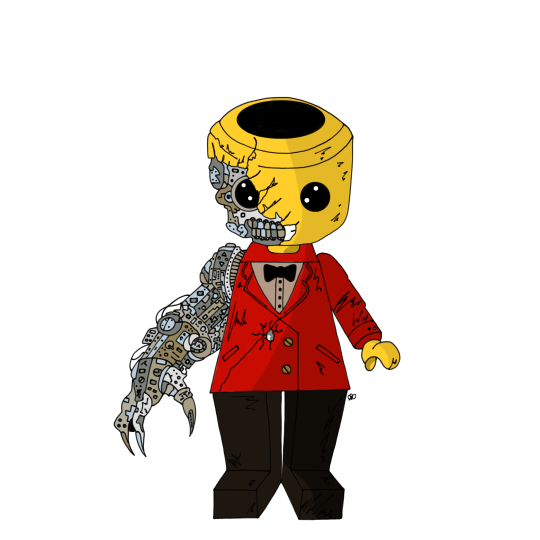
Evil Lego Man Toy
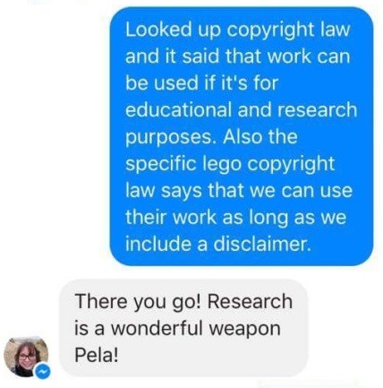
After showing both art groups by Lego Man idea to get any feedback off them, one student voiced their opinion on copyright laws and how I couldn't include this character in the game because of this. Since none of us knew about copyright laws, I decided to look up the specific laws on copyright in general and in regards to Legos own rules. Evidence Below. The general copyright law states that work can be used for educational or research purposes, which is what I am doing for this project. I then looked up the Lego copyright rules and that stated that their work can be used as long as a disclaimer is included. Due to this information, I am able to use the Lego Man drawing I created. Problem Solving.
General Copyright Laws

Lego Copyright Laws
Telling Lizzy About Copyright Laws
23rd March 2017
As the level designers and 3D artists started creating assets and levels, they realised that more assets needed to be created to fill up the empty spaces. To combat this problem, Lauren and I wrote down a list of all the extra assets needed for the orphanage and sewer levels to which everyone had to chose one to either draw or draw and then 3D model in Maya. Problem Solving. I chose to design a bath asset for the orphanage, taking inspiration from a real life example of a Victorian style bath. I wanted to create the look of an old, steel bath to create the darker tones for the game so using this example would help me achieve that. Evidence Below.
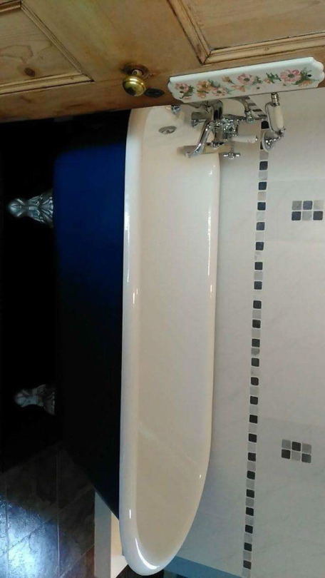
Real Bath Asset Example

Bath Asset Drawing
I also had the time to create the Warden, an old, miserable woman who runs the orphanage. Evidence Below.

Warden Concept Drawings

The Warden
24th March 2017
A few artists have been struggling to draw in the Tim Burton inspired art style that we decided to do at the start of the project. I knew already that some artists didn’t want to change their art style as they found that the one they usually draw in is easier for them, however they needed to explore other drawing styles for future job prospects anyway and me and Lauren wanted them to move out of their comfort zones. The attendance with a few of the artists is also a problem as they didn’t know characters in detail so they couldn’t express the characters personality through its facial features and body. Finally, some of the artists had also not done any research into the Tim Burton art style to begin with so they didn’t know how to take inspiration from it. To help them draw in that style, I created a ‘How To’ guide with pictures to help them with facial features and will move on to body parts and clothes soon. Underneath each facial feature, I detailed what character would have this type of lip, for example. On the side, I also put little notes on how to draw the facial features and how to add detail if needed. Evidence Below.
So far, there have already been a few positive outcomes from this solution. All the artwork in the game will now be in the same or very similar art style, which will keep continuity throughout the game. The art guide I drew also explained what features each character would have so the student who haven’t been in will know what type of character would look a certain way. Problem Solving.
Eyebrow Art Guide
Eye Art Guide

Nose Art Guide
31st March 2017
I was lucky enough to be chosen to be in charge of the visual design and feel of our exhibition showing at First Site. I already have lots of ideas that I can’t wait to plan and put into action. I already know that I want to make most of the decorations, not only because it will save us money, but also because I find it fun to try and create and make different things.
I want to set the exhibition up as if it was Gregory Gills’ Fish Bowl club in the 1920s to really immerse the visitors into our game and get a true understanding of the story. Luckily, I had a friend that had a Great Gatsby themes party so she kindly gave me some of the left over decorations she had from that, but after planning some of the other decorations we would have to buy, I let marketing know that we would need to raise around £80 to pay for those. Lizzy and I came up with the idea of selling tickets at different optional prices that equate to receiving items such as the art book or soundtrack. The money we receive from that would hopefully be able to fund the money to be able to buy the extra decorations needed. Problem Solving.
I’ve already started creating some decorations for the exhibition such as the gold spray painted bottles that I will use as centre pieces on the tables and a the beginning of the backdrop that will be used as a background for the ‘prop’ table. Evidence Below.
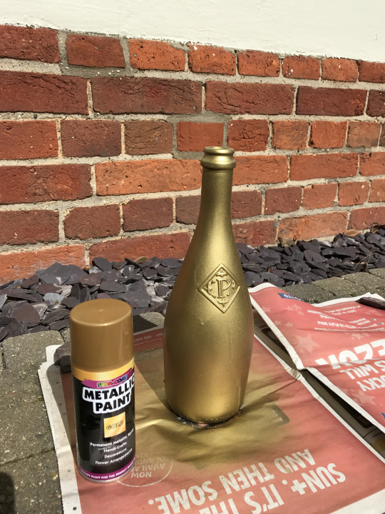
Bottle Spray Painted Gold
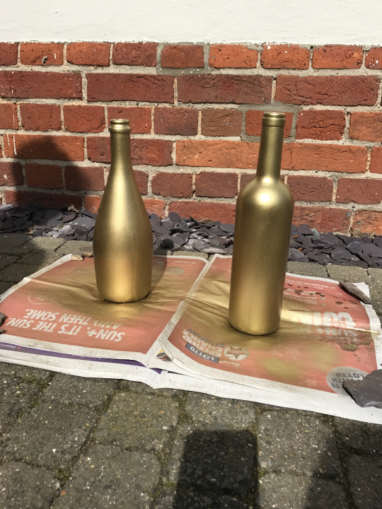
Gold Bottles

Beginning of Backdrop
0 notes
Text
☾Extended Project: The Secondary Research (Marketing) ☾
Although my group doesn’t have to market our game, we have been asked to help the marketing team by creating posters and logos to help advertise it. We will help create art for any posters, leaflets, advertising boards etc. the marketing team ask us for. To create an advertising campaign that actually appeals to our target audience, we must do a lot of research into already existing examples that correlate to our game.
The first example I looked at was the movie poster for the Corpse Bride:

Corpse Bride Poster
I wanted to research into this as Tim Burton’s work has been a huge inspiration throughout our game. The interesting thing about this movie poster is there is a lot on it. Many posters like to go for simple and clear designs to attract their specifc audience but the marketing team for Corpse Bride wanted to showcase the iconic Tim Burton art style on the front of their movie poster. To apply this to our marketing strategy, we could show our art off through our posters, attracting the target audience through an interest in our drawings and art work.
Another marketing scheme I wanted to look into was that of the film Deadpool. Even though this film has no relevance to our game, their marketing team used every platform possible to try and reach their target audience. This level of exposure is what I think we should be trying to achieve to try and get as many people as possible to know and then come play our game.

Deadpool Advertising Campaign
The picture above shows one of the billboards the advertising team for Deadpool came up with. To use emojis is extremely clever as their target audience consists of young adults who use emojis daily for texting and social medias. We could take inspiration from this and use advertising techniques that target soley our demographic, taking into account their interests. To progress this further, we could create our own emojis, something the Deadpool marketing team have also done. Our 12 year old target audience use their phones daily so being able to download set of emojis related to our game and share them between their friends would be a great way to get the word out about Eliza.
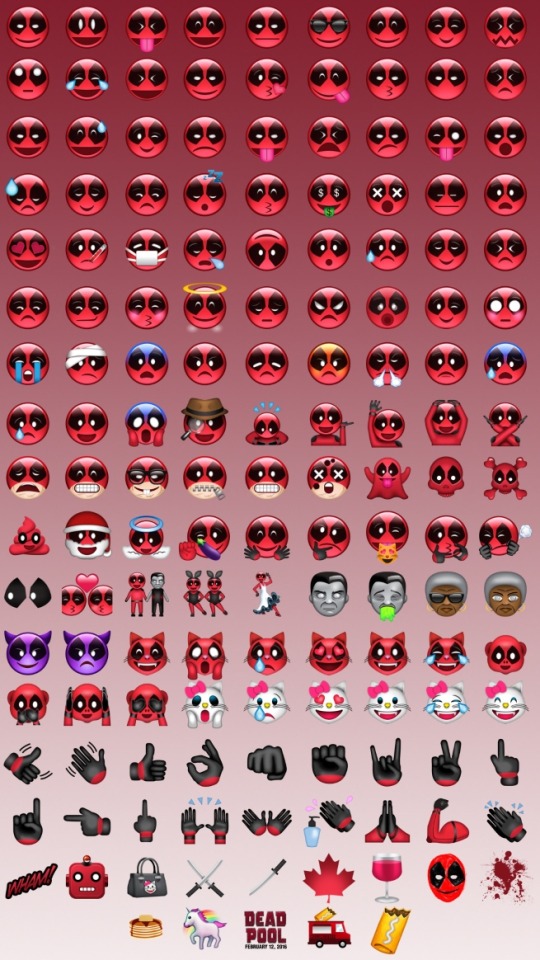
Deadpool Emojis
These emojis, and the ones we could create specifically for our game, could be downloaded free from the App Store for people to use. Doing this would expand our advertising as people will talk about them, word of mouth being a important with our target audience as they base a lot of their interests on what is popular at the time.
Another creative way they marketed Deadpool was through creating a poster that looked like the Deadpool script that had been scribbled all over by the Deadpool character himself. This is a really good idea as it gives the character more personality and tells the target audience more about the character. For example, the Deadpool character has drawn a ‘new logo’ in the top left corner. This tells the audience that the character is unruly, confident and childish, creating more layers to character that the audience may not know much about just through an advert. Something like this would be really good for us to use to help the audience learn more about the characters we have made and let them create a relationship with them before th game is actually released.

Script Poster for Deadpool
I therefore decided to take my research further and also edit part of the script as if I was Eliza after being inspired by the Deadpool marketing campaign.
Script Poster for Eliza
I really liked this idea and enjoyed doing it as it gave more depth to Eliza and enabled the audience to learn more about her character. I think our target audience would find this entertaining and also a creative way to advertise our game. This inclining of humour also lets the target audience know that even though our game is fairly dark and weird, there is also a lot of humour involved.
Through doing this research, I’ve learnt that any art used for marketing needs to be clear, bold and recognisable. The audience won’t be looking at these adverts for a long time so we need them to remember our game. Due to this, the advertising campaign must be obvious from the get go so not to confuse the target audience.
I first created a poster for our game, Eliza:
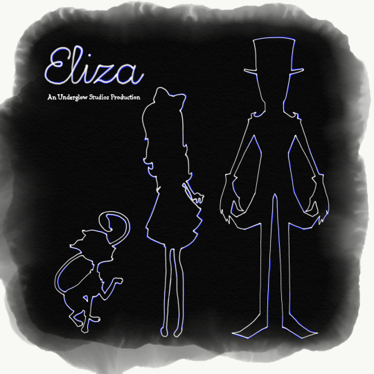
Eliza Poster
I took inspiration from the Art Deco style we chose to create neon outlines of the characters. I kept in mind that I needed it to be clear and simple so I only included the three main characters, the tile of the game and our production group name. Obviously if this poster was distributed out, I would need to include the release date and slightly more information about the game. I believe that our target audience would be enticed by this advert as the colours are dark but interesting, something our ‘non-girly’ 12 year old girl target audience would be attracted to.
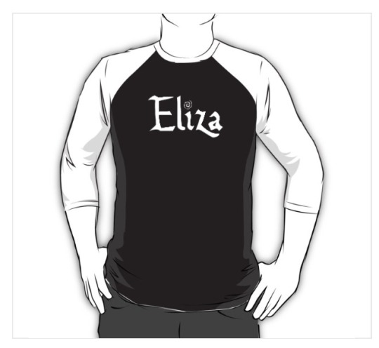
Finally, as an idea for marketing, I created some t-shirt designs as merchandise for our game:
T-Shirt Designs
I designed the t-shirts to all be black with white sleeves to stay in-keeping with the gothic feel of the game. On this t-shirt design, I just put our game logo in the middle so it is bold and clear.

T-Shirt Designs
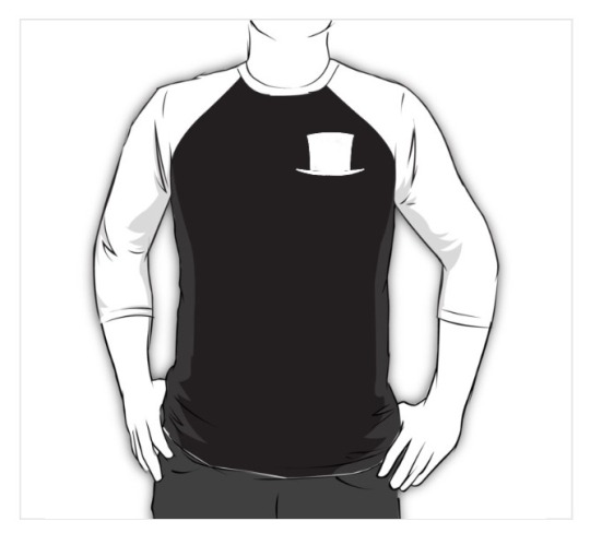
This t-shirt design just consisted of our game 'symbol', which appears frequently throughout our game. I thought this would be a good design to have on our t-shirts as it's another way for the target audience to link back to our game.
T-Shirt Designs
The top hat correlates to the actual antagonist of the game, the ShadowMan. I felt giving the option for target audiences to 'pick a side' and start discussions between players, therefore spreading the word about our game.
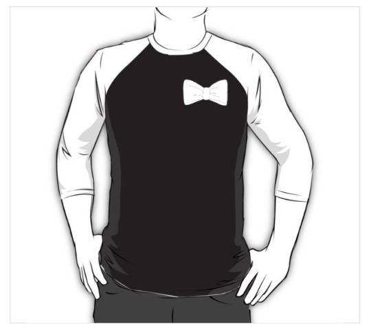
T-Shirt Designs
The bow design came about as the game is still aimed at females so having a design that was slightly more feminine may appeal to some players.
These designs are simple with either our game name on them or a small but significant logo that is relevant to our game. When doing research into my target audience, clothes and finding their own style was very important to them. To sell merchandise for our game would not only bring more appeal to it but also bring in free advertising by word of mouth and people asking other people about the t-shirts.
Throughout the production of the game, I felt like some in-game posters would be interesting to tie the game together. One of my favourite games, Bioshock Infinite, uses posters and signs to tease the player into understanding a deeper story and finding out more information about characters and the world they are in. I made some posters for in-game to tie the story together and make it flow better which I produced in the old 1920′s Art Deco style.

Gregory Gill’s Ball In-Game Poster
I wanted it to be clear to the player that Gregory Gill's club, The Fish Bowl, was the place to be. These posters would be placed around the map to show how a big ball was to be taking place at the club. This indicates to the player that Gregory Gills may also be an important character in the game as his posters are everywhere.
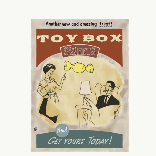
Toy Shop Advertising Sweets In-Game Poster
The collectables in the game are little sweets that enables the player to receive new abilities. I felt like in may have been slightly confusing to the player as to why sweets were the collectables so I created a poster to tie them in. This poster shows the toy shop, The Toy Box, sells the sweets and that they are something very sought after by the townspeople.
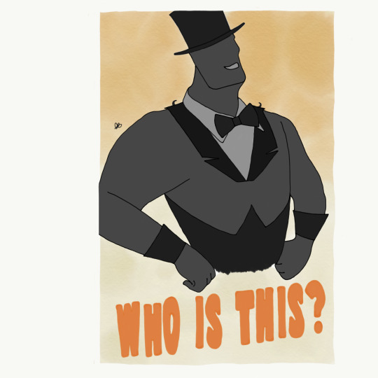
ShadowMan In-Game Poster
Throughout the game, the ShadowMan is a mysterious character who the player never really gets to know that much about. In the end, he becomes the antagonist, having to fight in a boss battle against Eliza. I wanted the player to feel wary of this character to create tension so this poster hints that no one really knows who the ShadowMan is.
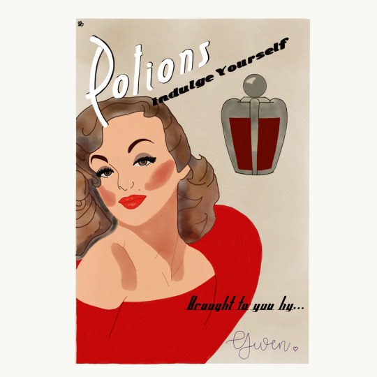
The Witch’s Potion In-Game Poster
At the time of creating this poster, the witch, Gwen, was an old hag who wore extravagant clothing and was obsessed with beauty and trying to keep her youth. To add some humor to the game, I created a poster which showed Gwen looking glamorous, trying to advertise the selling of her positions. However, when the player then finally meets the witch, they will see she looks nothing like how she thinks she looks in the poster.

The Orphanage In-Game Poster
The final in-game poster I created was about the orphanage that Eliza has been living in with Marbles the cat and the ShadowMan. I thought very carefully about this poster to infer what the orphanage was really like without giving too much away. I used bold colours with a sad looking girl on the front as these posters would be around the map, trying to get townspeople to adopt children from the orphanage. However, the poster is ripped and muddy, indicating that it has been pinned up for a while and no one is interested in the children at the orphanage.
0 notes
Text
☾Specialist Essay: The Impact ☾
When researching about my specialism into Art Directing and being a Lead Artist, I discovered a lot about how I want to develop my own art style. Researching this information has given me a better and deeper understanding into the field of work I want to be a part of.
Through my research, I have really progressed my love and skill for drawing in the same style present in the Bioshock game series. The Art Deco and neon colours really appealed to me and throughout my research, I was able to show how much the games had influenced me. I drew a mechanical hand from inspiration from the first Bioshock game and I also replicated an Art Deco pattern to include in my essay. I used to draw a lot with a pencil on paper but many gaming companies use digital software to draw so, due to this, I have started learning and using Photo Sketch, a digital drawing app so I can learn to draw at an industry standard.
It was interesting to research, in detail, about my specialism. I have benefited from finding out how companies use Art Directors and Lead Artists, what they do, and how they lead a team. I can use this information for the final project and in any future work.
1 note
·
View note
Text
☾Specialist Essay: The Sources ☾
When doing research into an in-depth study, it is extremely important to find information that will back up points made in that essay. However, not any sources should be used, only ones that have been stated from a reliable book, website etc. If information is taken from a non reliable source, quotes used in the specialist essay may be incorrect, meaning I have not looked enough into my specialism Art Directing and being a Lead Artist.
All sources I have used in my essay have been from reliable books and websites. The authors and website writers have either been in the business for many years, created their own theory in the industry, or have their own game developing company. Although I found positive and helpful information, I also looked at sources that would not be useful in my study. For example, when looking at a few online journals, I came across the ‘Artists Journal Workshop’. I thought this would be helpful as it may go into some considerable detail about drawing and any skills I may want to harbour. However, the journal was actually referring to fine art and went into detail about the history of that topic. Because of this, I didn't use this source in my specialist essay.
0 notes
Text
☾Extended Project: The Secondary Research (Tim Burton) ☾
Surprisingly enough, when we all first came up with the idea of our game, the art style quickly followed with many people liking the ‘Tim Burton-esque’ art concepts. As an Art Director, I had to look into detail about this art style and if it would be appropriate for our game. It was hard to work this way around as usually we find research and then decide on an art style, however this time we were finding research that would fit with the art style we wanted to go for.
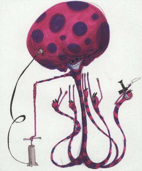
Tim Burton Original Artwork
If we did this again, I would suggest keeping the ‘Tim Burton’ style in mind but actually look more in depth into other art styles before making a decision right at the beginning of the project so we fit more along the lines with what our target audience want.
Tim Burton’s art work has always been able to, “...carry the audience away into the depths of his imagination. A world full of contradictions, both dark and light, frightening and welcoming, cruel and tender.” (The Artifice, 2014). This is what we wanted to create in our game, a world of darkness and gothic-ness that the characters are able to shine out from due to their weird and quirky ways. Burton's work is spooky but doesn't cross the line into scary, a line we need to make sure we do not cross in our game due to the fact the target audience is 12 year old girls. It’s also important for us to create memorable characters so the audience can reference back to our game and our company.

Tim Burton Original Artwork
Semiotics plays a huge part in what makes Burton’s characters appealing as his characters incorporate bold colours such as oranges and greens, contrasting off the clean whites, blacks and greys also present in the characters. Because of this, the audience feel that there is something deeper to the character due to the multitude of colour linking to a multitude of layers. We want to create this feeling with our own colours so, instead of just using blacks, whites and greys, we decided to use dark purples and oranges to create more depth and personality to each character we design.
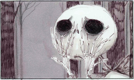
Circular Eyes with Thin Eyebrows Show Emotion
Not only do we want to use Tim Burton’s artwork as inspiration due to the colours he uses, we also love his art style and the way he creates characters using scratchy and thin lines. It was important for me and Lauren to pick an art style that all abilities of artists in our group can use so continuity was present throughout the project - Burton’s work was great for this due to the simple englogated shapes he uses. His concept art is simple, a style that would be greatly appreciated in our work. However, I also wanted characters to have depth and feeling to them, this being difficult to show with thin lines and simple shapes. This is when Tim Burton’s work stepped in again as his use of portraying emotion through huge eyes and thin eyebrows played well into what we were doing. Using this ‘trick’, we can add emotion to each character in a simple way.

Final Concept of Eliza with Inspiration Taken from Tim Burton’s Work
0 notes
Text
☾Extended Project: The Progress of the Project (February) ☾
1st February 2017
My first priority for today was making sure all my work for the Future Proof Assignment was done, ready for marketing next week. After this was done, I was able to focus on carrying on my designs for extra assets towards the game. Evidence Below. I have decided to create some in-game posters to help tie the story together and give some extra information to the player while exploring the game world. I found this task really fun as I love creating marketing material but specifically for games as I have a moral issue with some advertising schemes - I don’t like marketing that makes people feel less without the product. But, with this kind of marketing, it just adds MORE to the game and does take anything away from the player. Problem Solving. After doing my research and my own personal love for the style, I decided to settle on creating Art Deco style posters to help bring that tone into the game.
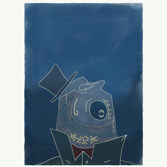
Start of The Fish Bowl Poster
2nd February 2017
Today I carried on with my in-game assets so they wee ready to be used by the marketing team and put on our game website. Evidence Below.
The Fish Bowl Poster

ShadowMan Poster
After deciding an Instagram page would be a great idea to use as advertisement for my art tem and attract the target audience, I made sure to allocate days for the people in art group A to upload so the page was always kept up-to-date.
Later on in the afternoon, Jon presented the whole class with a PowerPoint about the gameplay for Eliza, our game. I thought this would be a positive experience as everyone would get a better understanding of the formation of our game, however I became stressed as everyone kept demanding what they thought our art style should be to pair with this gameplay. After the lesson, I spoke with Lauren and we agreed that it should be us what the game ‘looks’ like to which Lizzy agreed with. Because of this, I created a PowerPoint myself to show the class on Tuesday about what the art style of our game world would be. This PowerPoint was not only to help the rest of the course understand the art style, but for art group A and B understand the style of architecture, clothing and design me and Lauren were looking for. Evidence Below.

Art Deco PowerPoint Showing Architecture

Art Deco PowerPoint Showing Clothing
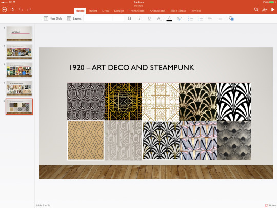
Art Deco PowerPoint Showing Patterns and Designs
3rd February 2017
I carried on with my specialist essay today but I have really been struggling with it as I don’t truly have a great understanding of the task. I tried to create a mind map about the things I was going to write about in my essay, however that still wasn’t correct. I have set up a meeting with Lizzy to go through the essay and hopefully help me get a better understanding. Problem Solving.
7th February 2017
I have carried on creating more in-game posters as I enjoy doing them and I feel like they will help progress the game story. Through research, I have been able to recreate posters in a style that would have been seen in the 1920s. I’ve also been feeling very stressed and overwhelmed recently and creating these posters helps reduce my stress levels. Evidence Below. Problem Solving.

Toy Box Poster

Potions Poster
8th February 2017
Today I was able to go through my Specialist essay with Lizzy. She told me what I had written was good, however, I needed to work on my sentence structure to make more sense and write a higher level piece of work. She then helped me improve the outline of what I already had by letting me know what I needed to include to reach those higher grading criteria. This really helped me and by the end of the lesson, I had been able to complete most of the essay off.
9th February 2017
After finishing the essay off today, I was able to complete some artwork for inspiration to our game. As none of the artists had really gone in-depth with the whole steampunk style, I decided to do some research and try and come up with some sketches of how we could incorporate steampunk into our game. By the end of the lesson, I had drawn a mechanical arm. Evidence Below.

Mechanical Arm
I took great inspiration off my favourite game series, Bioshock, to try and maybe include characters with metal limbs or faces to add a creepy, industrial sense to the game.
21st February 2017
I am planning to finish my pre-production over half-term as I want it to be completed and organised so I can start production. So far, the progress into making our gaming has been extremely slow so hopefully, by completing my pre-production early, I will be able to get a head start into creating art for the game. Problem Solving.
Art group B haven’t created a schedule yet so it’s causing a lot of stress for me and my group as we don’t know what they are doing. To combat this, I have let Lauren see our schedule and let her know what we are doing each week so she is able to work off of what we are doing. Problem Solving.
23rd February 2017
Today, I went to the college library to take out a few art books to see if I could use them for research. I fell in love straight away with a Disney book which explained all about the progression of Disney and its art. I decided to complete a case study on the book as the information I unsurfaced will not only help me with art style towards my posters, but also helped be on how I lead my art team and also how I interact with other teams.
0 notes
Text
☾Extended Project: The Communication & Organisation ☾
In a group project with many people and different stages, it’s extremely important for me as a leader to be organised and to make sure everyone in my group knows what they need to be doing at specific times. I am the Art Director of a team of five, including me, so my first order of work was to assign job roles to the group and delegate tasks. To do this, I first asked my group to produce some of their art work to me so I could see their strengths and weaknesses to know what part of the project would be best suited to them. I also asked them if they could draw some of their favourite characters in the ‘Tim Burton’ art style as that was the initial art style everyone wanted to aim for. I knew it would be a challenge to ask them to change their art style as it is a difficult feat for even professional artists so I let them manipulate their favourite characters from games, films etc as they know those characters well and may have more fun doing that instead of me assigning them a character to change.

Tim Burton’s Original Artwork
We had a slight issue where people didn't feel comfortable moving out of their comfort zone and drawing things they didn't usually draw. However, Lauren and I were adamant, as this was our final project, that people should try things they hadn't done before. For example, people who hadn't drawn digitally before needed to produce some work on Photoshop which meant they had to learn and improve that skill.
Overall, I believe that task went extremely well. I set it over the Christmas Holidays so I didn’t expect much work to be done but the whole of group A was enthusiastic to keep sending me the art work they had done and helping each other with any difficulties they were having.

Group Artwork Delevoped in the Style of Tim Burton
My next job was to delegate tasks for the remainder of the project so each artist knew what they need to contribute by the end of the second year. I knew it was important for me to do this early on so people felt comfortable that they knew what they were doing from the beginning and so they stayed motivated on their aspect of art for the game. Looking into their art work, me and Lauren had to decide who needed to be doing what. We decided that Taylor and Nathan should do locations; Nick, Harry, Aaron and Liane should do extra characters; and Ryan, Lauren, Kelton and me should do the main characters. Lauren and I spent a while deciding who should do what and took our time to really think who would be best for each role and try and push people a bit outside their comfort zones to improve their skills.
Communication is key to this project as I needed everyone in my group to know what they were doing and if they had any problems, they were able to contact me quickly to solve it and vice versa. To combat this, my group talk through a Facebook group chat, as after a discussion, this would be the best tool for us to use as we can all access Facebook easily and would answer quickly.
The group chat is good to communicate through and also remind people when their day is to update our Instagram art page so the audience can keep up-to-date with what we are working on. I delegated specific days for people to work on but we have one person in the group that doesn't post on their day frequently. I have explained to the student how they are letting the rest of the team down if they don't pull their weight in updating the Instagram account but I believe the problem has been resolved as the student is now posting on their allocated day.
Not only do I need to be able to communicate with my group, I also need to be in contact with the other groups and my target audience. I am able to talk to other group leaders by regular meetings each week and a leader’s group chat also on Facebook. However, to try and get our target audience more knowledgeable about our game, I must branch out more to schools and colleges to get them updated on our game, receive feedback from them and maybe get them to come in and test our game throughout the project. I emailed Thurstable School and Great Totham Primary School but neither of them replied. I should have pursued other schools instead of 'giving up’, but by that point, Lizzy had been able to send a survey out to a local primary school. If I did this project again, another idea would to actually try and set up meetings with the schools by going in or calling them.
I decided to collect my primary research from our target audience elsewhere so I created a survey to find out final details and tweaks maybe needed to be done to the original Eliza concept art I had done. From the 19 participants, I was able to get a clear understanding of any small things I needed to change but luckily, my secondary research had been in depth so not much needed to be edited to Eliza.

Survey for Main Character
To help keep my group on track and to help them know what they need to do, I had to create a schedule for them. I also created an individual schedule for me so I could personally feel in control and on top of any deadlines I needed to be aware of.

Team Schedule
I really went into detail about what each artist needed to be doing at separate times so they weren’t confused about their tasks. If they ever felt they didn’t know what to do, they could refer back to this to get them back on track. I colour coded it: red being time for concept art, blue for holidays and half terms, green for the time spent drawing the finished assets, orange for any play testing or for when we aren't producing work, purple for exhibition week, and yellow for the final evaluation. Not only will this information help the whole team, it will also enable other teams to keep track of what we are doing and if they need to plan any meetings to talk about things at different points in the schedule.
At the beginning, the two art groups were going to have the same schedule but very quickly I noticed we were working at different paces and focusing on different parts of the project so it would be inefficient to have the same schedule. I spoke to Lauren and we decided to have two seperate schedules for each art team but for us to keep up-to-date with what each group was doing.
Having a personal schedule for me will be good as a lot of the time I become stressed and overwhelmed when I feel like there is a lot of work that needs to be completed by a deadline. A schedule will help me know what I need to do and to help me feel more in control about work I need to prioritise.

My Personal Schedule
Finally, at the start of any long break or weekend, I would assign each artist a piece of work. I would do this so they would be reminded that work still needed to be produced for the progress of the project to continue. I would also remind them on their specific assigned days to update our art group Instagram.
I think, as a whole, I have been doing well to keep the team motivated, organise them so they know what they are doing, and communicating to them and other teams. I think, however, moving forward, I would be more sterner when team members aren't creating work and aren't pulling their weight in the project. This way, the overall team will feel like they are being treated fairly and likely be more motivated to carry on working. I have learnt very quickly that different people work in different ways, that I have tried to change my ways of motivation or explanation of tasks for the seperate team members. Some of the group only need to be told once to do a task and they understand what I'm saying, whereas others need more of a push to stay on track with the project.
0 notes