
Don't wanna be here? Send us removal request.
Statistics
We looked inside some of the posts by peltiertech and here's what we found interesting.
Average Info
Notes Per Post
0
Likes Per Post
0
Reblog Per Post
0
Reply Per Post
0
Time Between Posts
2 months
Number of Posts By Type
Text
17
Last Seen Tumblr Blogs


Fun Fact
Tumblr has a low social media market share in South America.
Text
Lambda Formulas to Calculate Easter
This article presents Lambda formulas that calculate the date of Easter according to Western and Eastern Orthodox calendars.
In the first months of the Peltier Tech blog, I wrote an article about Calculating Easter, which is a complicated task. I shared a couple of worksheet formulas to calculate the date of Easter, then I posted two VBA UDFs (User Defined Functions) to compute Easter, one for “Western” Easter and the other for Orthodox Easter. Then I talked briefly about the differences between them. Without much…

View On WordPress
0 notes
Text
Unblocking and Enabling Macros
When Windows detects that a file has come from a computer other than the one you're using, it marks the file as coming from the web, and blocks the file. Here's how blocked files behave in Excel, and also steps to unblock macros in the file.
When Windows detects that a file has come from a computer other than the one you’re using, it marks the file as coming from the web, and blocks the file. This includes files emailed to you and files downloaded from the web. Here is how blocked files behave, and the steps you must take to unblock macros. Blocked Files If you open a blocked file, Excel opens it in Protected View. The ribbon is…

View On WordPress
0 notes
Text
ISPRIME Lambda Function
After limited success using AI to write an ISPRIME formula, I built my own ISPRIME Lambda function. My approach is shown step by step.
Prime Numbers (and AI) Using ChatGPT and other AI tools to write Excel formulas has become popular. Bill Jelen aka Mr Excel has a simple test to see whether the particular AI engine is reliable: ask for a formula to determine whether a number is a prime number. Until recently, the response is this formula to test cell A2: =ISPRIME(A2) This makes use of the well-known but nonexistent ISPRIME…

View On WordPress
0 notes
Text
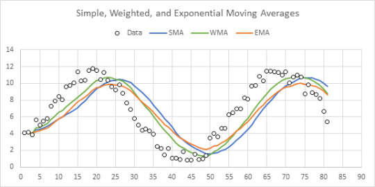
Lambda Moving Average Formulas
In two recent articles, Excel Lambda Moving Average and Improved Excel Lambda Moving Average, I described my efforts to build a Lambda moving average formula that worked the way I wanted it to. I’ve included average calculations for the first few data points before the number of points being averaged is met. I’t’ve also included only counting points within a set number of days, even if there are…
View On WordPress
0 notes
Text
Index of Peltier Tech Blog
Finally an index of Peltier Tech blog posts. It's incomplete, but it should help you find the topics you're looking for.
Main Topics Cornerstone Articles (Important and Popular Posts) Axis Labels Axis Scales Chart Events Combination Charts Conditional Formatting of Charts Custom Chart Types Data Labels Dynamic Arrays, LET, and LAMBDA Dynamic Charts Error Bars Floating Bars Gantt Charts Gaps Histograms Legends Marimekko Charts Pivot Tables and Charts SERIES Formula Slope Charts Statistical…

View On WordPress
0 notes
Text
Improved Excel Lambda Moving Average
I recently wrote about how I wrote an Excel Lambda Moving Average formula. I started with internet searches, which led to formulas which didn’t work or formulas which were too complicated for me to understand. After a brief and amusing foray into ChatGPT, I built myself a workable formula that worked by generating a running sum, subtracting an earlier point’s running sum from the current point’s…

View On WordPress
0 notes
Text
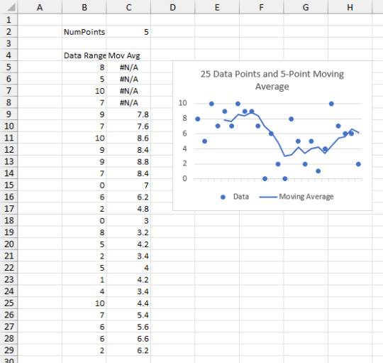
Excel Lambda Moving Average
Moving Averages When averaging time-series data, you often want to smooth out peaks and valleys. A moving average is an easy way to smooth your data. When I track my weight, for example, I use a 7-day moving average. This smooths out peaks associated with weekends when I might go out to eat and enjoy a beer or two. The image below shows 25 random data points and a five-point moving average. The…
View On WordPress
0 notes
Text
LAMBDA Function to Build Three-Tier Year-Quarter-Month Category Axis Labels
LAMBDA Function to Build Three-Tier Year-Quarter-Month Category Axis Labels
A certain data layout can produce a chart axis which divides and subdivides the categories into logical subcategories, such as years, quarters, and months in the following chart. Generally, this data layout must be produced by hand, because it relies on an arrangement of filled and blank cells to help Excel parse the data into subcategories. In this post I’ll show how a LAMBDA formula can build…

View On WordPress
0 notes
Text
Trendlines and Chart Types in Excel
Trendlines and Chart Types in Excel
tldr; Stick to XY Scatter charts if you need trendlines for your data. Line charts may misrepresent the relationships in your data. Trendlines and Chart Types A user had problems with my Trendline Calculator for Multiple Series and sent me his workbook. It turns out, he was using the program on a Line chart, and I recalled that Line charts can have problems when calculating trendlines. Here is…

View On WordPress
0 notes
Text
Unlink Chart Data
There are occasions when you may want to break the link between a chart and its underlying data. Maybe you copied the chart from another workbook, and you no longer have access to that workbook. Maybe you want to avoid the headaches that may arise from pasting a chart into PowerPoint or another program. Maybe you’re just tired of seeing this warning when you open the file: There are several ways…

View On WordPress
0 notes
Text
PBCharts Inflation Analysis
Last week we released the PBCharts (Process Behavior Charts) tool for performing SPC control chart analysis. I’ve been working on PBCharts for well over a year, and we had an extended beta testing period, during which we cleaned up numerous issues. I thought I’d walk through an analysis to show how easily PBCharts does its work. My colleague posted a quick analysis of inflation since the start…

View On WordPress
0 notes
Text
Excel Chart Series Size Limits
Excel Chart Series Size Limits
How many points can I plot in each series of my chart? How large of a VBA array can I plot in my chart? Two good questions, which I’ll investigate here. A colleague emailed me asking about the VBA array size limit for plotting in a chart. He said he thought the limit was 32,000 points, but couldn’t find any official documentation of this, and his trials only worked for half that many points. I…

View On WordPress
0 notes
Text
Combination Chart for Multi-Factor Test Results
Combination Chart for Multi-Factor Test Results
I’m not sure what to call this chart, other than it’s a combination chart (stacked column and XY scatter) and it requires some additional data manipulation. The chart shows test results from a test program that includes different factor levels: Groups (Alpha, Beta, Gamma), Classes (High and Low), and Treatments (A, B, C), with four replications per set of factors. The intent is to show each…

View On WordPress
0 notes
Text
Clustered Column and Line Combination Chart
Clustered Column and Line Combination Chart
Combination charts in Excel are pretty easy, once you figure them out. But sometimes they present challenges. If you make a combination clustered column chart and line chart, it takes special treatment to align the markers over the columns. I will warn you that adding several series of lines to a chart with several series of columns might make your chart cluttered and difficult to read,…

View On WordPress
0 notes
Text
Good Chart Data
The most important chart trick is Get The Data Right. You will save time and make better charts if you use Good Chart Data. Here are characteristics of Good Chart Data.
Tips and Tricks Everybody loves their Excel tips and tricks. I know I’m famous for my extensive collection of Excel charting tricks. But the most important charting trick is Get The Data Right. The secret of successful Excel charting begins and ends with Good Chart Data. I teach it in all of my charting workshops and seminars, so I was surprised that I did not have a blog post dedicated to good…

View On WordPress
0 notes