
pictorialplanet
Pictorial Planet
Darkroom user and analog photographer. The author of The Art of Black and White Developing.
35 posts
Don't wanna be here? Send us removal request.
Last Seen Blogs

whiteytom
Untitled

airaril
bravery and stupidity
whiteytom
Untitled

lilwen666
₊˚ʚ 🌷︰love grows where my Alan goes

supremekins
╰(*´︶`*)╯♡
Photo

Today my new book is published! Like my Pictorial Planet page on FB or Twitter to get the latest, as it happens! https://www.instagram.com/p/CNkF0wMsNwO/?igshid=c0x5h9sbzdsh
0 notes
Photo

My black and white darkroom photographs after tinting with oil paints. #marshalloils #ilfordhp5 #ilfordpapermultigrade #satin #d23developer (at Rafford) https://www.instagram.com/p/CEb-NQsgtNB/?igshid=q6g5onye073w
0 notes
Photo

Black and white darkroom print colourised with oil paints. Taken at Altyre estate, Moray, Scotland. #510pyro #ilfordfp4 #ilfordmultigradefiberpaper #oilpainting https://www.instagram.com/p/B8enDNOpcyn/?igshid=y660m5p22t9v
2 notes
·
View notes
Photo

Beautiful gradation with #fp4plus and #510pyro . Grain is very fine :) https://www.instagram.com/p/B8ZKbBLgq6W/?igshid=18j63ju27a2q1
0 notes
Photo

In the darkroom today. ❤️ https://www.instagram.com/p/B6IfdyZgz7m/?igshid=1kfiugfqvi6g8
0 notes
Photo

A colorised Ilford FB Matt print from the darkroom. https://www.instagram.com/p/B4-vybcgi5o/?igshid=19c6wjlq9vdgt
0 notes
Photo

Tonight I'm making some prints for colorising with oils. Ilford FB Matt works very well for this. https://www.instagram.com/p/B4-s7mBgogf/?igshid=1sdh2r5kev89i
0 notes
Photo

#trix #pmkdeveloper #forres park https://www.instagram.com/p/B4hyLOxgi16/?igshid=tt9yi4w8uuki
0 notes
Photo

Old reliable! I'd never be without it. Semi stand tonight with Acros. Rodinal and Acros were made for each other ❤️ https://www.instagram.com/p/B4VkgcuADE4/?igshid=1b8mbte0kcot9
0 notes
Photo

Slowing down Sitting in Findhorn bay enjoying the moment. My new darkroom is up and running, yay! https://www.instagram.com/p/B4Rsx-jAMth/?igshid=docwcw5wccwo
0 notes
Photo

The new Pictorial Planet darkroom is finally finished! To celebrate I souped an FP4+ in PMK tonight, the first of many in our new space. https://www.instagram.com/p/B4ItCA5gnZK/?igshid=1wz5a8uau2g32
0 notes
Text
6 ways to sharper prints!
Setting up the camera as the predawn light fills the horizon you prepare for the photograph running a well rehearsed list through your mind.
Right film…right exposure…camera on tripod with the added weight of your rucksack dangling between the tripod legs…best lens and best aperture selected…mirror locked up…the sun rises…you squeeze the shutter release cable…
Click
With the film developed in your favourite soup it's time to make the print and after all that effort you want it sharp. So what can you do to get the best from this fine negative in the enlarger?
1. First, let's just think about how big are you want to print the image?
What's that got to do with sharpness? Well, when it comes to sharpness size matters. Bigger is not always better and is certainly not sharper. In fact, the bigger you print the less sharp your final image will seem. However, many photographers feel the urge to print big and end up with unclear images.
"I mean, it's a landscape isn't it, it should be big, right?"
Wrong. In fact, often a smaller print will have far more impact. To start, think about the viewing distance. Will someone view the print in their hand, or on a wall. On the wall might mean bigger, because of the longer viewing distance, but that's not necessarily true. Even on a wall a print might well look better printed small, especially if people will walk up to it to look. Try this, print smaller and frame bigger. This is a trick the masters showed us. Weston, Strand and others often liked to contact print their negatives. This made the final images anywhere from 4x5 inches, 5 x 7 inches up to 10x8 inches (sometimes but rarely more). The smaller size gives the print a certain precious quality, better tonal range and greater sharpness. Strand apparently printed his images in multiple sizes until he decided upon "the one". I don't know if I'll do that for every print but know, smaller is sharper.
2. What lens should I use on my enlarger?
It's a commonly held belief you should enlarge with the same size lens as the "standard" lens for your camera. For instance, 50mm for 35mm negatives, 80mm for 2 1/4 square and so on. This works but is it the best option? Well no, not really.
If you print with the next size of lens up from the "standard" you'll be getting sharper prints (assuming the same quality of lens). This is because you are using the "sweet spot" of the lens. When we use the standard lens, we magnify the negative from edge to edge of the glass. Using a longer lens means you are only really magnifying through the centre (and best) portion of glass. Yes, you must reach higher up the enlarger to focus but if you are printing smaller (as above) it won't be as bad as you think. Try it.
3. Which F-stop should I choose?
Your enlarger lens is not at its best wide open. Just like your camera lens it improves in quality as you stop it down and peaks around three stops down from fully open. This is where you should make your prints. Focus wide open and close down three click. And, the longer exposures will aid in dodging and burning giving you more control in perfecting your image.
4. Focus with a piece of photo paper on the easel.
I have a piece of enlarger paper ready for this. It's a sheet I use for dodging and burning and it sits right beside the enlarger. Make sure you place a piece of your photographic paper on the easel before readying your grain focuser. By lifting the focuser by the thickness of the paper you'll achieve a more accurate focus. Oh, and ensure you have your filter fitted for your VC paper. I use "under the lens" Ilford filters and ensure the filter is in the holder before I grain focus. This helps sharpen the grain at the right wavelength. Before VC paper was popular darkroom users would place a blue filter over their grain focusers to sharpen the right wavelength. VC papers react to various wavelengths of light so choose your filter first and pop it in.
5. Don't let the enlarger move!
This is the gotcha we might all forget about. The slightest and I mean slightest movement of the enlarger head will reduce sharpness of the print. It's just like takin the photo in the first place right? We use a heavy steady tripod to stop camera shake but do we think of steadying the enlarger?
There are ways of making your enlarger rock solid from attaching it to the wall to making sure the enlarger table is big and heavy and solid. You can help by standing absolutely still when making the exposure. Set up the easel, check your filter and timer, wait and let the enlarger steady for a moment and then carefully make the exposure. Setting your enlarger table legs on a rubber mat might also help dampen vibration from the road or the kids running around upstairs if that's a problem.
6. Add some contrast to your developer.
This is unusual but a valid technique and a useful tool to have. We all have our favourite print developer. I often use Dektol or my home brewed AGFA 100 and here's a little trick that might add some perceived sharpness to your prints - add punch! By popping a little extra Sodium Carbonate into the developer we can add a ton of "je ne sais quoi" - "special something". The added Sodium Carbonate makes the blacks richer. Now, we used to do this in the "old days" and it worked to punch up the image. It adds that special something to your perceived sharpness including the micro-sharpness; it's like moving the detail slider up in Lightroom. By always having a 10% solution of Sodium Carbonate on hand we can easily add 30ml to a litre of working print dev. See what you think.
That's it for now. 6 ways to sharper prints. Why not leave your tips on sharper prints below?
Till next time, keep firing those shutters!
John
More at: pictorialplanet.com
0 notes
Text
8 commercial developer replacements
I got to thinking what home-brew alternatives could one use for commercial developers? Here's some ideas. What do you think?
1. Xtol/DDX
This one's easy for me! FX-55, perhaps Geoffrey Crawley's last public formula released in conjunction with Amateur Photographer magazine, it's the perfect replacement for these two commercial Ascorbate developers. It's fine grained, low toxicity, and makes beautiful negatives. Simple to make, this developer will save you money and make cracking negatives to print.
To use, take 100ml of stock part A and dilute to make 1 Ltr of working solution. Then add the dry developing agents to the 1 Ltr of working solution to create the viable developer. It keeps for up to 36 hours but then must be discarded.
For an idea of developing times start tests at 7 minutes@20c. Don't test with important negatives!
Part A Stock
Sodium Carbonate Anhyd. 15.4g (Mr Crawley said 20g of Potassium Carbonate but I find that harder to get)
Sodium Bicarbonate 1.5g
Sodium Sulphite 25g
Sodium MetaBiSulphite 12g
Water to 1Ltr
Part B
Sodium L-ascorbate 1.3g
Phenidone 0.1g
2. HC110/Rodinal/Ilfotec
HC110 and Rodinal are often quoted as having long keeping qualities and can both be used at great dilutions. Rodinal is also renowned for its sharpness and its compensating effects, especially with stand and semi-stand techniques. 510-pyro is the perfect substitute with its long lasting quality. It can be used at 1:100 dilution right up to 1:500 and produces some of the nicest tonal range I've ever seen in a print. The grain is much finer than Rodinal and somewhat finer than HC110 so if it's grain your after you'll have to use a faster film. However, 510 gives the same edge effects that Rodinal is so good at and also those long stand development times that means you can develop films of different iso in the same batch. Highly recommended!
510-pyro
Hot TEA (Triethanolamine) 75ml
Ascorbic acid 5g
Pyrogallol 10g (wear mask and gloves and take care as this must not be inhaled!)
Phenidone 0.25g
TEA to make 100ml
Note: It can take a long time to dissolve the phenidone
To test your film try diluting 1+200 and develop for 12 minutes at 20c. Again, don't test with important negatives!
3. Ilfosol/D-76/Perceptol
D-23 without question. Pretty similar results I'd say and a lot cheaper. Easy to make and just as versatile. I've written about D-23 a lot in other blog posts. you'll get tons of times from the Massive Development Chart.
750ml warm water
7.5g Metol
100g Sodium sulphite
Water to 1 ltr
So, that's a stab at alternatives to commercial products. you'll probably know where your favourite brew fits into this. but I'm curious? What's your idea of alternatives made in the darkroom?
1 note
·
View note
Photo

The bothy The rain came just as I set up my Pentax MX. Shielding the lens I managed to grab this shot before we had to move on. The weather in the Cairngorms can be somewhat unpredictable! Perceptol home brew 13.5mins. PanF+@32iso. https://www.instagram.com/p/B3Y3hvSgFVy/?igshid=1f7tm0mvwnvdb
0 notes
Photo

The hot seat Look how this developer controls the highlights so well. Grain is also well controlled. #ilfordhp5 #ilfordhp5plus400 iso320 #barrythornton2bath 5+5 mins 20c https://www.instagram.com/p/B3WmTCHAglP/?igshid=bigmu31lgwbf
0 notes
Photo
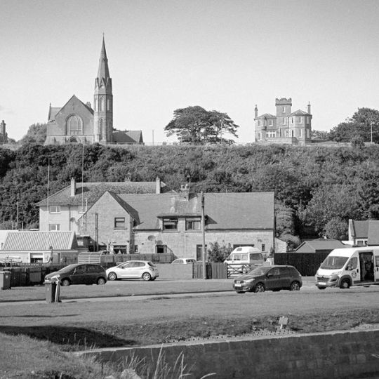
Two towers #perceptol home brew #ilfordpanfplus 13.5mins@20c #pentaxmx #scotland #lossiemouth https://www.instagram.com/p/B3WUSTJAgqF/?igshid=asfxrolahm36
0 notes
Text

One of the few
0 notes