
Don't wanna be here? Send us removal request.
Statistics
We looked inside some of the posts by pixelartproject-1 and here's what we found interesting.
Average Info
Notes Per Post
0
Likes Per Post
0
Reblog Per Post
0
Reply Per Post
0
Time Between Posts
8 hours
Number of Posts By Type
Text
17
Last Seen Tumblr Blogs


Fun Fact
Premium Tumblr themes are available from anywhere between $9 to $49.
Text
Evaluation
What I think went well!
Overall I think the game looks great, It's definitely the style and genre that I was inspired by.
From the feedback I got, 90% of everyone who played tested thought the stylistic choice of the game was consistent. I managed to fix most of the broken glitchy parts of the game and have all the components stay visible throughout. I really liked layering the
What could have gone better?
As I joined the class halfway through the project, I didn't have as much time on the project as everyone else. I feel like I didn't get to do a lot of the things I had planned to do, such as adding the crane or the button mechanics. I wish I had the time to focus on the background and make a contrast between the layers using shadows or having the character stand out from the background.
what would you do differently
If I was doing this project again I would steer more into the character and dialogue side of the game and add quests for the characters. I'd like to focus on some harder game mechanics and find out more ways to be able to code things into the game, as I feel like I didn't get much of an opportunity to focus on coding this project. I would also like to experiment with font staples and curated colour palettes, as my first project had a pretty neutral muted palette. In the next project I'd like to try more story and dialogue in the next project and maybe add a more complex title page from the game with settings so that the mouse sensitivity can be edited.
I really enjoyed this project, I definitely leaned into my strengths with most of the game being art. I'm really excited to try 3D in my next project as I haven't had much experience with 3D modelling and it's an opportunity for me to try something new.
0 notes
Text
Playtesting 2 Feedback


I got a lot more mixed reviews in my second playtest compared to the first time I did it.
I got a lot less negative feedback on the game bugging out so I was glad I knew it was working much smoother now. I had a 50/50 split on whether I should have a darker robot character or a darker background but I've decided a darker background might be better since the character needs to stand out from the garbage in the background which is quite dark.
0 notes
Text
Game Feedback!
After having people playtest my game, I've been received feedback from 6 different people from the class. They left pretty honest reviews of my game so far on my google form that I had set up with questions for them to answer.
Overall the feedback was pretty positive, however most of the people who played my game though that the jump was too big/ spacious and that it was hard to jump from object to object.

I also got a few comments stating that when the robot collided with certain blocks of the tile map the robot got stuck which I had noticed whilst playing the game myself.

Overall I think the form was really helpful in seeing what other people would like to be added to the game and what kind of direction the game should start to head in.
0 notes
Text
Adding the animations into my game
First, I started importing all 4 of my sprite sheets for my character's animations into the contents draw. I applied a 2D texture setting to each sprite sheet and extracted them one by one.
instead of having the grid cut them out automatically, I used the manual grid method to select every box to be 32 x 32.
once separated I created a flipbook out of all the separate sprites, I continued to do this for each and every animation.


I then went into my third-person characters file and made a state machine which I could add my animations too.
A state machine in short, checks what is happening to the character in a true and false format. For example, is the character falling? Yes. These questions check what 'state' the character is in and what animation should play.
0 notes
Text
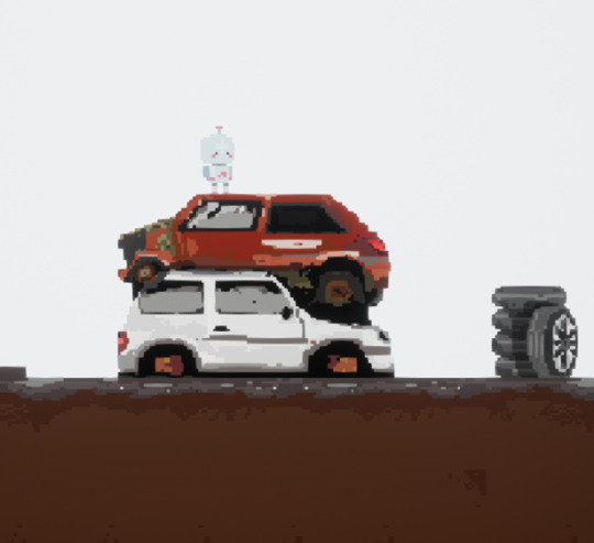
Game Background

I purposely put a gap between the actual floor and the fence so it looked like the fence was further in the background. I also made sure the fence looked further away by making it in proportionately smaller than the cars.
This is what the tile map looked like with the background behind it.

I did this by importing the PNG into the contents draw, then turning the png into a sprite so I could insert it into the world and move it behind the tilemap.
I really like how the end result looks, if i had more time with the project i would like to have experimented with making the objects in the background more shaded and looked at shadows and lighting.
0 notes
Text
More tiles for the tile-map.
I re-did some of my tiles and managed to create another tile set with added ground so that the art looks better.

I think the redesign of the floor made the game look a lot better and gave the ground more texture.
0 notes
Text
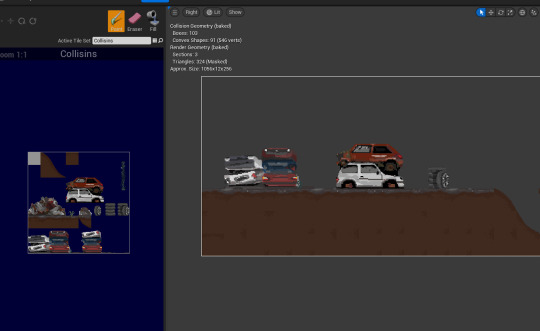
-Creating my Tilemap-

Using reference images a started to work on my tile set, making cars, stacked wheels and all of the ground and trash piles that the character needs to walk on.

After finishing the tile set I imported it to my games content draw and made sure the PNG was paper 2D, I then created a separate tile map and added the tile set to it and began mapping out my level.
0 notes
Text
-Making a sprite sheet-

After I had finished my animations using the timeline feature in adobe photoshop, i made sure that the frames from the animation were made into separate layers, and I transferred those into a new document.
This blank document had to be 32 pixels high and (however many frames I had)x32. I then made sure the sprite was in the correct positions in the boxes so the animation doesn't jitter.


0 notes


Text
HUD Plan

If i had more time on the project i would have liked to add a cog that has the cog disappear in thirds when the robot takes damage.
3 chance's and then you have to replay from the start of the level.
0 notes
Text
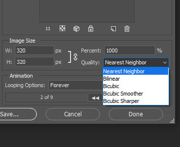
Making the animations into Gifs
We then had to turn our sprite animations into gifs, so for this we went to file, export and Save for web.

Then I made sure that the format was on GIF.
I sized the image up by 10 times and made sure that the quality was turned to nearest neighbour so that the image resolution wasn't fuzzy.


0 notes
Text
First trial play of the game
Today I got to play through my game, It was super buggy as I had only just put in the tile map and put the animations down. The artwork looked great in the game and I was really happy with it. The level wasn't fully formed, as I only had time to put down the ground in the tile map and a few background items in the scene.
The game kept glitching out and disappearing whilst hitting some of the collisions, looking over it I think it was because the collisions weren't perfect and the gaps were causing the tile map to glitch out.
like this for example.

Update:
I tried fixing this by redoing the tile set collisions and making them so they fit perfectly, this fixed most of the problem but some of the collisions were still off, so the game was slightly glitchy still. however, as this was nearing the end of the project I didn't have much time to fix the glitching.
0 notes
Text
I was in a shop today and I saw this robot toy that you could buy

I thought the design was super cute and I liked the idea of having multiple legs on the design.
I didn't end up including the legs or claw hands in the final design but I thought they would be super cool as a 3D design since the legs would give more purpose rather than just for looks.
0 notes
Text
-Trial HUD Test-

In lesson today we were asked to rearrange the HUD to how we would like it and then give an explanation for the steps we took.
Everything squared off with red, means it in only visible once a certain button has been pressed.
I decided to put Level count and Health count in the upper left corner so its fairly out of the way but still clearly visible, the only problems i can see with this design is if their are objects/items behind them which are out of sight, or the curser wont pick up.
I put the magic meter on the left hand side since its vertical and would make the most sense to be put somewhere far left or far right, I decided to put it on the left side with the health and level bar as they all came under a similar category.
I was debating not having an ammo count at all, or maybe having it inside the inventory as I interpreted the game as more of an ark, the forest or terraria style game where you would find/craft loot in the woods to hunt animals/and hostile creatures. But I've put in in the corner as looking at the level, health count ad magic meter. I would say that this game is probably an adventure combat style game and reloading would be a very common mechanic.
As the menu icon in the middle is quite large and overwhelming I've opted to having it trail the character relative to the angle the character is facing, so that the toolbar is behind. I would like the toolbar to only appear when the D pad is pressed so that it stay out of the way until it is needed.
If this game was on PC I would have the map as the 'M' key and have it bring up the map either in the corner small or take over the entire screen.
0 notes
Text
MoSCoW
Must have...
Starting my project I need to make sure that my game must have a functional tile-map that i can use to design the level and add collisions to. I need at least 4 character animations for death, walking, jumping and idle.
If these aren't included in the game then it isn't really much of a game but more of a visual art piece with no movement at all.
Should have...
A consistent art-style and colour palette that matches the theme of the game. A character design that makes sense in the environment its in and enough detail in the background and foreground that its not boring.
Could have...
If possible I would like to have the addition of double jump in my game and interactive switches to help get through the level. If i have time I have plans of adding a crane that can be interactive and is moved so that the character can finish the level. It would be nice to be able to add barbed wire to the background.
Will not have...
My game will not have any cutscenes, other characters or multiple levels. As i've only had a limited time for the project and these things will take a lot of time, I don't think that i will be able to complete them in time.
0 notes
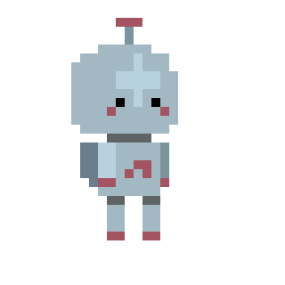
Text
Redrawing my original design in pixel art
I redrew my design using the pencil tool on 1 pixel on a 32 x 32 canvas.
I chose to do the character at a size that would make the character easy to animate, but not so small that I couldn't add the details from the original design.
----------------------------------------------------------------------
After turning my robot design into pixel art I decided to go through some different colour designs, just to check if I liked them more in pixel art.


I did this by using the colour balance option and changed the tones to see how the pixel art would look like in different colours.
I eventually settled on the original design colours as I thought they fitted best.
0 notes
Text
More on Machinarium
I really love this game, I haven't had the opportunity to play it but after finding it through looking at robot designs I think the game is really cool, the mechanics of the game are pretty dated as it came out in 2007.

GIF by drgamesdesignt1
I think the artstyle is really interesting and i like the imperfect look
0 notes