
Don't wanna be here? Send us removal request.
Statistics
We looked inside some of the posts by planet-pens and here's what we found interesting.
Average Info
Notes Per Post
26K
Likes Per Post
10K
Reblog Per Post
16K
Reply Per Post
4
Time Between Posts
6 days
Number of Posts By Type
Photo
7
Text
10
Last Seen Tumblr Blogs


Fun Fact
Tumblr was acquired by Yahoo for $1.1B in 2013.


Photo


A few weeks ago I was told to illustrate 8 images that followed a narrative. The narrative followed the two images you see on each end of the images. Using Donald Trump as a character made it easy for me to emphasise his features. Being given these images made it more apparent that I had to draw about deforestation so I made this funny little cartoon.
0 notes
Photo


Two late entries for the Halloween zines XD spooky
1 note
·
View note
Photo


Printed my own zines for the class a few weeks back. Could do with a tidy up if I’m going to do this again but not bad for a first try.
0 notes

Text
Week 6 - Feedback from the main zine
My “Creatures from the bog of Murk” zine was handed in and received feedback from the whole class.
Pros:
* Front and back cover tied in well and looked professional.
* Most of the illustrations worked well together as a set
* The theme tied in well with the illustrations and followed the supernatural Gothic style.
* The physical booklet looked tidy and all looked even.
Improvements:
* Used a different format (it was not traditional) as it would have made it easier to make the images tidier.
* A few of the drawings didn’t stand up to the same mark as the stronger ones.
* Some didn’t look like they belonged to the same theme and seemed a little bit weaker to the others.
* One of the Zines was glued together poorly and may have looked rushed.
0 notes
Text
Week 5 - in class mini zine
For this week we had to create a small zine to understand how to create them. I made a story about a giant flea escaping a nuclear power plant. This task helped me:
* How to create a narrative through drawings that the viewers can follow as a story.
* How to create a clear image for the viewers to understand.
* Setting up the zine ideas with an understandable front and back cover.
Improvements:
* It would help to use more materials other than pen to communicate the narrative.
*Most of the characters were just stick people in the background and the focus was just on the main giant flea (which was well drawn out compared to the rest of the zine)
0 notes
Text
Week 4-Artist research

For my artist research this week I looked at an artist named soulmori. I was first intrigued by her art style because of the dark and Gothic overtones that has some similarities to my own work. I am very fond of the use of nature, ghouls and lack of colour in her images that I can relate to my own designs.
With techniques; she uses the same unipen fine liners that I use for her creations that make it very important for the artist to concentrate on the use of shadows and shading. For example, if you look at the line work on the pumpkins and tree trunks you can see how the darker lines at the bottom of the plants make the image more three-dimensional.
I also admire the use of pure black shadows around the trees and plants. The absence of light here and in more of her work is something I could use in my own images. As well as the absence of light she also uses patterns on the wood that textures the natural elements.

image source: https://insta-stalker.com/profile/soulmori/
There are a few pieces that she uses very bold colour however in my current work I am only using very dim or no colour at all. In the image above I am particularly fond of the dim red as it signifies the darker side of nature surrounding her. The dim blood red colour of the background ties in with the Gothic skeleton imagery whilst continuing with the dark shading that continues throughout the image.
I like the way the crown or princess connotations contrast with the skeletal figures, however I find the picture quite beautiful and peaceful to look at. It is intriguing that the combination of the Gothic trees, the skeletal figures and blood red background would feel so peaceful.
Another contrast is the simplicity of the designs and the line-work in the trees that create the slightly creepy, hand drawn effect that goes hand in hand with the Gothic themes. This technique runs through many of her images which gives the continued textured effect throughout the work.

image source: https://twitter.com/soulmorii
For my last image I wanted to just analyse the colour used and the different techniques. The simple landscape picture is quite beautiful and the bold colours contrast with the textures of the wood it has been painted on. Although this is not line-work or a drawing the textures present in the other two images are still visible to me, personally, as I can see the rings from the trunk through the image which gives a permanent natural texture. This makes it clear to me that nature is an important aspect for the artist and I also enjoy using it in my own work so it is great to analyse.
The natural, beautiful, Gothic and simplistic use of these unique techniques inspire me to continue with my own style. It has allowed me to understand different mediums of this creative industry and I will hopefully be experimenting with my designs, colour, patterns and textures to further improve my ideas.
1 note
·
View note
Text
Week 3 Idiom
I illustrated an image depicting the phrase; “It costs the eyes in your head”. To illustrate this I used:
* A Gothic style to emphasise the graphic imagery of eyes in your head.
* Bold colour especially emphasis on the red blood so the viewers eyes are directed towards the eyes.
* Dark colours within the image to support the dark style.
* Dim watercolours also contribute to the dark themes throughput the piece.
Improvements:
* I could have used Photoshop to clean up some of the impurities.
* Using a traditional style means that any mistake made is very difficult to rectify so using more technology in the future would be a good idea.
* I only used watercolours so it’s difficult for some of the colours to come through as boldly as possible.
0 notes
Text
Illustrating an idiom week 2
For this weeks lesson we had to get creative and stick together an idiom out of card. I chose the phrase “pop your clogs”. This helped me understand how:
* Bold colour can emphasise an illustration.
* How to use other mediums to create work like using more crafts.
* Use the phrase “pop” and create imagery to reflect the sound of an explosion or a physical pop.
*Making a clear image that is readable for the public as the phrase.
* Using the skeleton hand as an emphases on death physically popping the image of the clog.
*
0 notes
Text
Scavenger hunt
Our objective was to walk around Cardiff and discover our surroundings through imagery and drawing. Rough 3 minute drawings of whatever we could find on our list were then tallied up to see who could win. Through doing this we learned how to:
* Draw quick on the street in public which inspires confidence for these first few weeks.
* Make new connections with the people in the class
* Gain confidence in drawing strangers
* Learning that working outside can benefit your work
* Quick sketches will help you speed up your drawing process over time and improve your skill.
* Throwing us straight into a task and into the outside world encouraged us to start work right away and be more productive.
* Including a competitive aspect encouraged people to be more enthusiastic about the task.
0 notes
Text

Week 1 in USW "It costs the eyes in your head." A French idiom that means it costs a lot. I took it a bit literally though but I'm pretty happy with that.
0 notes

Photo
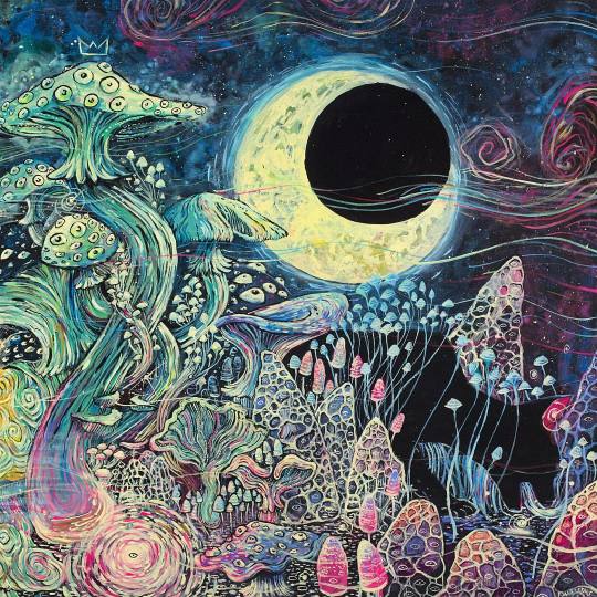
Big King Cap and his Kitty Cats on view at the Los Angeles Brewery Art Walk today 11 - 6 @ 642 Moulton Ave W13 (at Brewery Artwalk)
25K notes
·
View notes
Text

I wish I could think freeley all the time and not just in small intivals.
0 notes
Text

#lotus#neon#lilaclotus#lilac#flower#negative#colour#illudtration#flowerillustration#petal#painting#watercolour
11 notes
·
View notes
Text

An old drawing revamped
2 notes
·
View notes