
Don't wanna be here? Send us removal request.
Statistics
We looked inside some of the posts by polettoltyan99-blog and here's what we found interesting.
Average Info
Notes Per Post
31
Likes Per Post
26
Reblog Per Post
5
Reply Per Post
0
Time Between Posts
4 days
Number of Posts By Type
Photo
12
Video
5


Fun Fact
In February 2021, Tumblr had 518.6 million blog accounts.
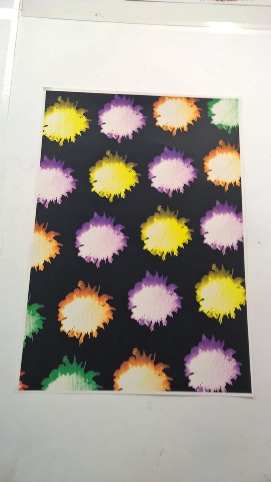
Photo
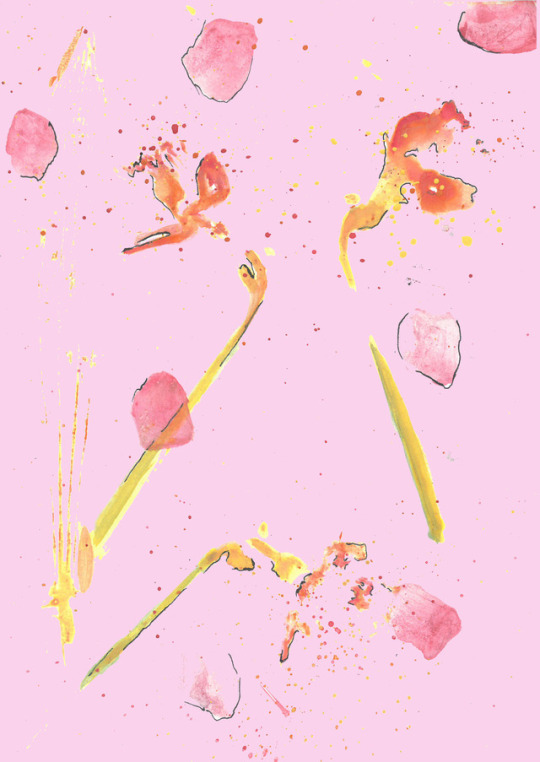
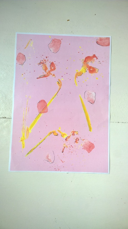
these three patterns what I want to use for my wallpaper designs. I wanted to use one from the first prints I did and also I used two patterns what I did from the flower pounding thechnique.
I choosed these three patterns because I wanted to use something with loads of colours on and use different techniques. I am going to print these patters onto wallpaper. I going to do this to show how it look my patterns on different surfaces.Because the paper is going to be bigger and longerthe pattern is going to be repeated.
10 notes
·
View notes
Photo
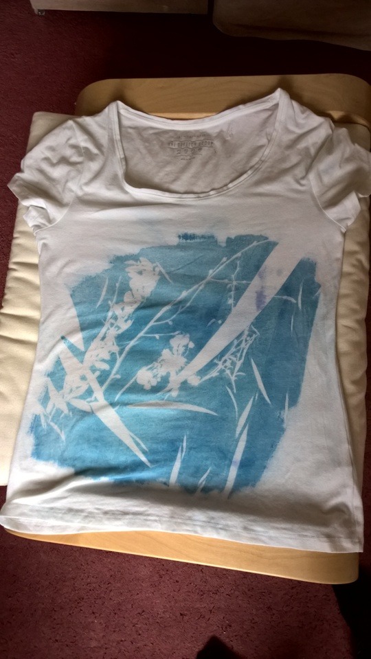
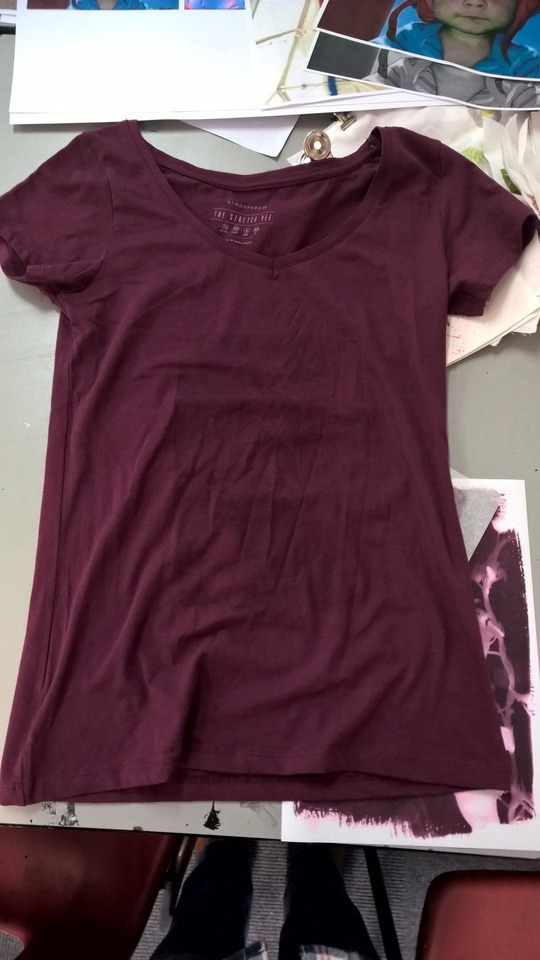
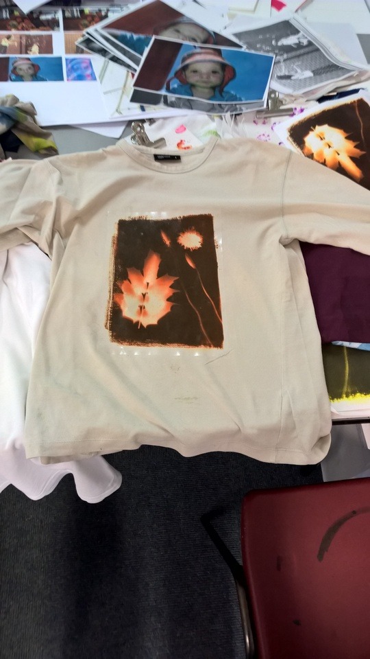
These are part of the final pieces I planned to do for the end of my FMP. Because I was doing surface patters I was thinking of applying onto fabric and other surfaces. For fabric I came up with the idea that I can apply the techniques what I tried on t shirts. I came up with the ideas that I am going to one with cyanotype print and one what I want print the pattern on it.
Because the first one did not work I did another one of the printing technique. I used this special paper that can be put out to very big heat and it would transfer the picture onto the fabric. First I tried to transfer the picture with an iron but it did not create that big heat so I went to the 3D workshop and use a transfer heater to make the picture transfer to the fabric. It only took 29 seconds to tranfer the picture from the paper to the t shirt. It worked out well because the picture what I used for the print came out very sharp and clear.
The first two try what did not worked out the way I wanted it. The cyanotype what I did turned out to be underexposed what made of the blue much ligheter than it should be and the t shirt was very crinkled under the UV box so the crinkles showed up after I washed of the access chemical It showed up white. Also I did not washed out the fabric propally and after it dried out the chemical what it did not got washed out turned some parts of the t shirt faint blue. Also with heat press technique the first trz did not work because the heat wasnát high enought and I did not press the iron on it long enought.
3 notes
·
View notes
Photo
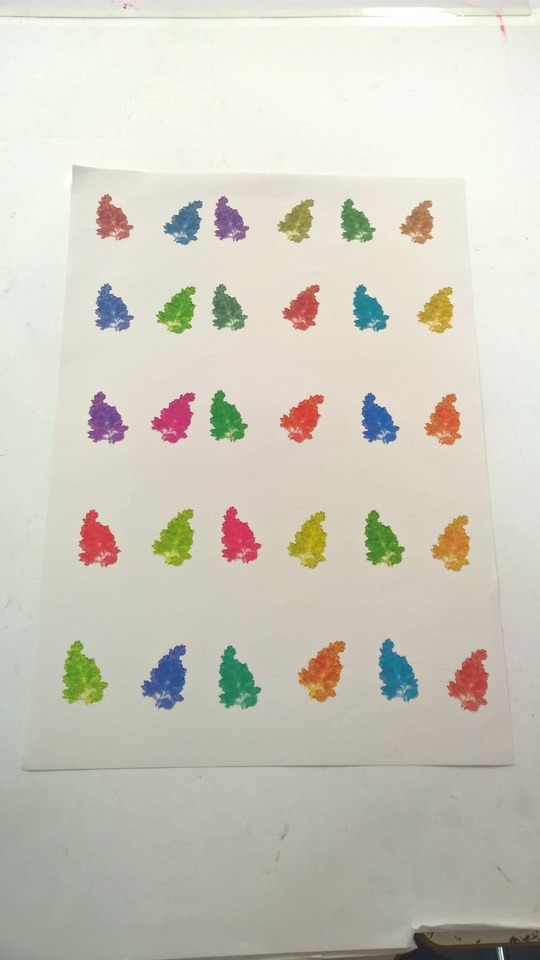
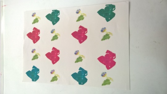
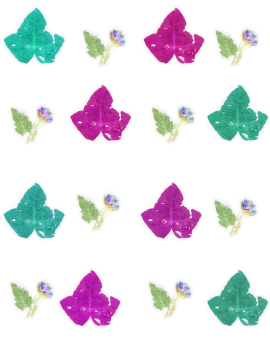
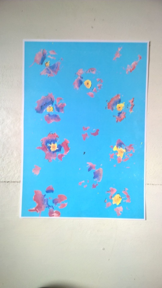
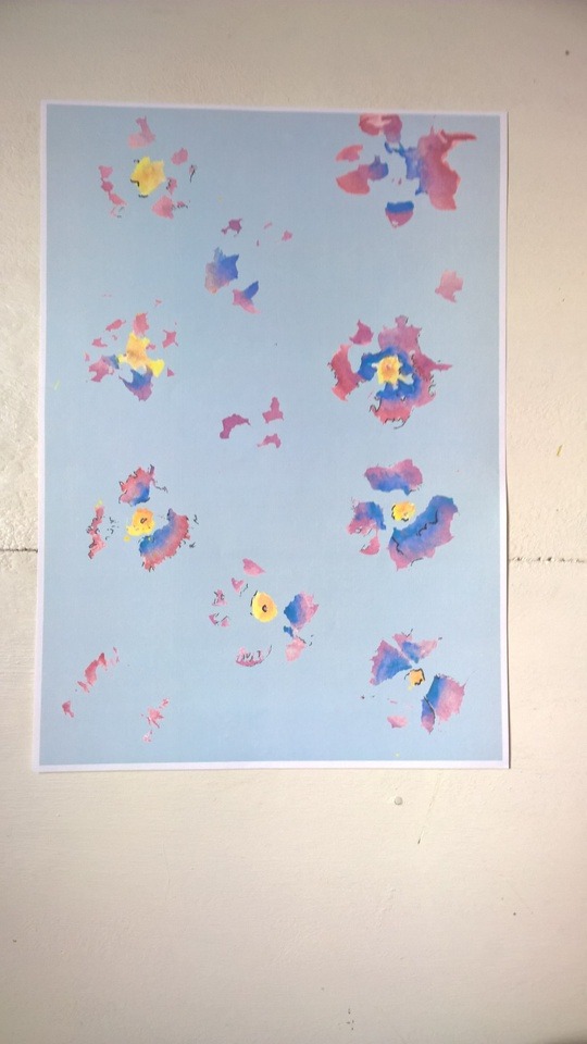
These are the patterns what I made using Photoshop from the flower pounding. Because after time the flower pounding looses its bright colour I thought that on Photoshop I can make the colours more brighter and I could change the colours of the leaves and flowers. I tried come up with different patterns and come up different colour combinations. I tried to use very bright colours because I wanted them to look different than normal flowers and leaves. For one of them I used the cyanotype prints flower to create a pattern out of it.
The patterns worked out very well because they are very different from each other but the colour scheme are similar. Also I used the same flower poundings for most of it example, for the leaves I used the ivy leaves. Also I was worried that the colours going to be too dark when I’m going to print it out but they were the colour what I wanted them to be. For some of them I use a colour as a background because I thought they would look better with coloured background.
It was hard to create the patters the way I wanted them to be because I wanted to create a very symmetrical pattern and it was hard to make them symmetrical. Also it was hard to create an on going pattern because some patterns would not work as pattern because they would not look god. It was hard to came up with new ideas because I did not wanted to repeat the pattern what I done already so it took time to came up with new ideas.
3 notes
·
View notes
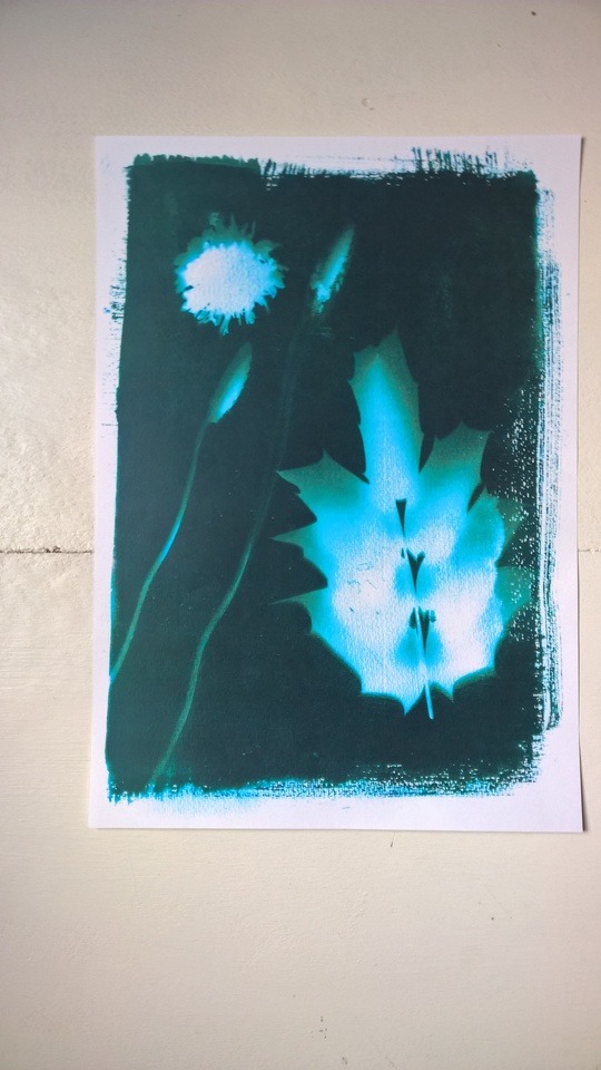
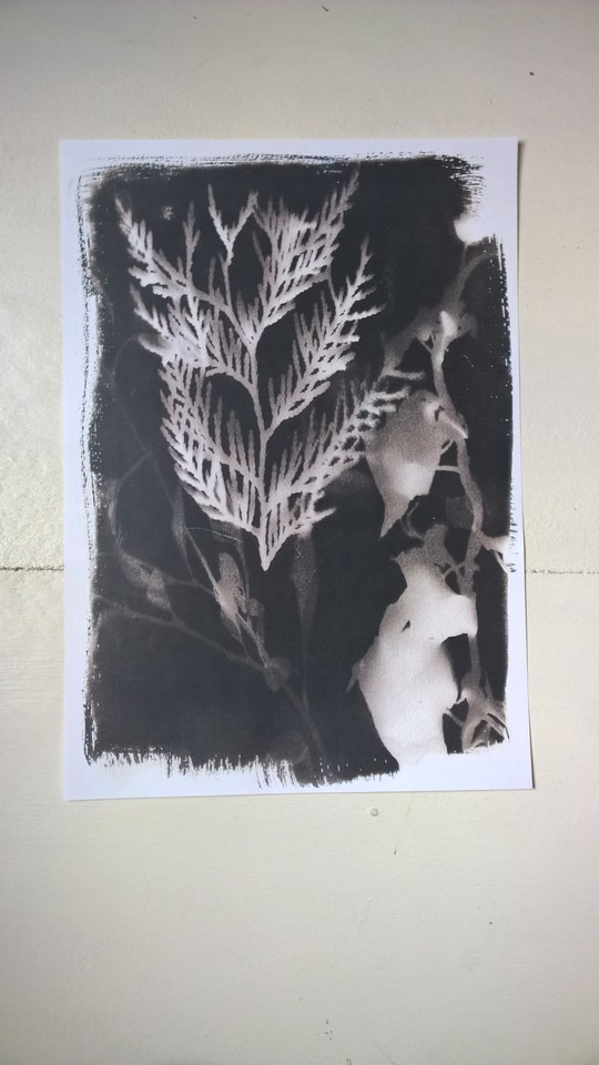
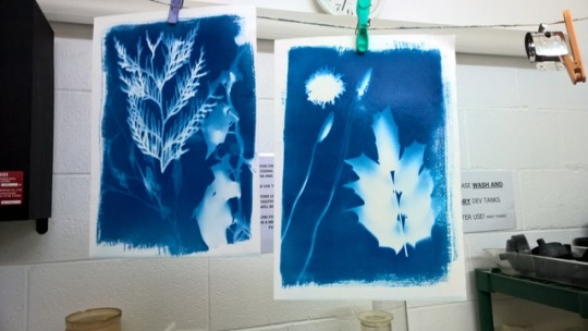
Photo
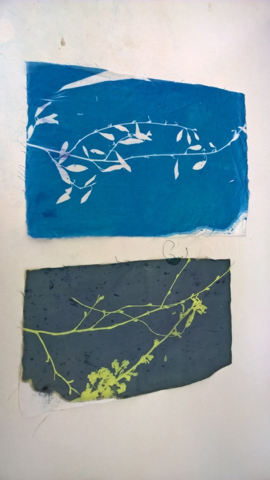
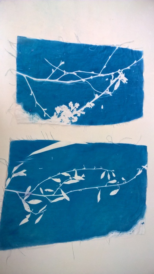
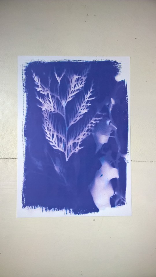
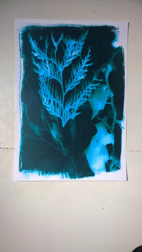
These are cyanotype prints I did on fabric. Because for my final piece I want to do a t shirt with a cyanotype print on it. I know that I could use cyanotype on fabric but I wanted to test how I am going to it on the t shirt and how I am going to lay out the flowers and leaves on the t shirt. Also this time instead of taking it outside and use the suns UV lights I used a UV box because the weather was did not had the right conditions.
These two cyanotype worked out very well because instead of being a small bit blurt the outlines of the leaves and flowers are very clear and crisp what makes it look more professional. Because the UV box sucks out the air from itself the top of the box presses down onto the fabric and that makes the fabric squeeze to the plant and makes the line so clear. Also the cyanotype was applied in the right way it doesn’t have any to dark areas in it and the colour of it is dark enough to show it developed in the right way and it was in the UV box for the right amount of time.
It was hard to keep the fabric straight because the cyanotype pulled the material together a little bit and the fabric is stuck to the flowers and plants. Because they dried out, they were very delicate an breakable so I needed to be very careful with them. But the fabric still crinkled together under the UV box so it left a white line on the print and it did not look good.
0 notes
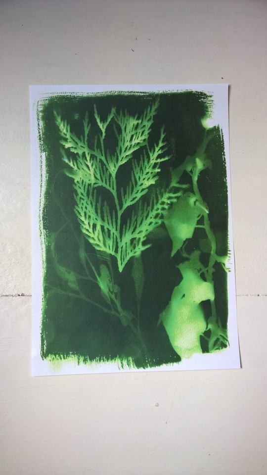
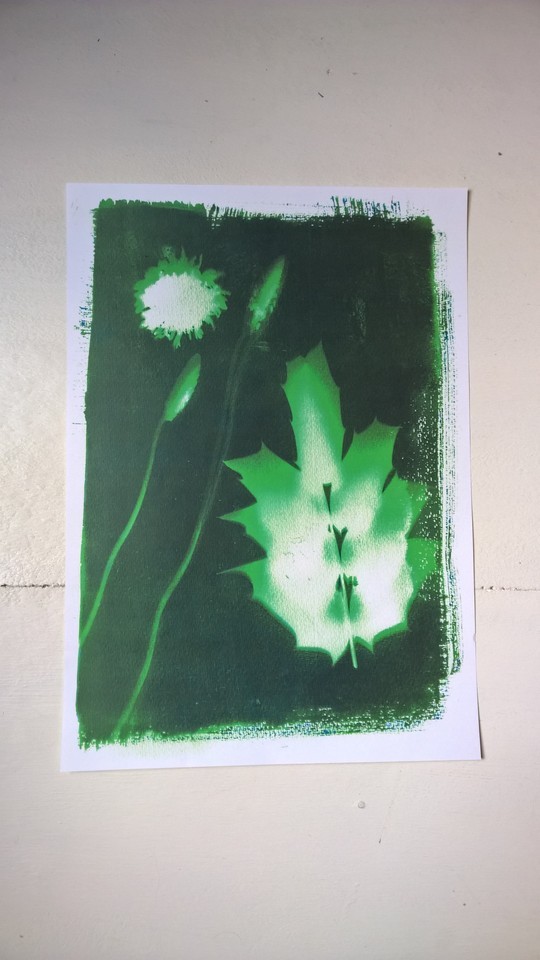
Photo
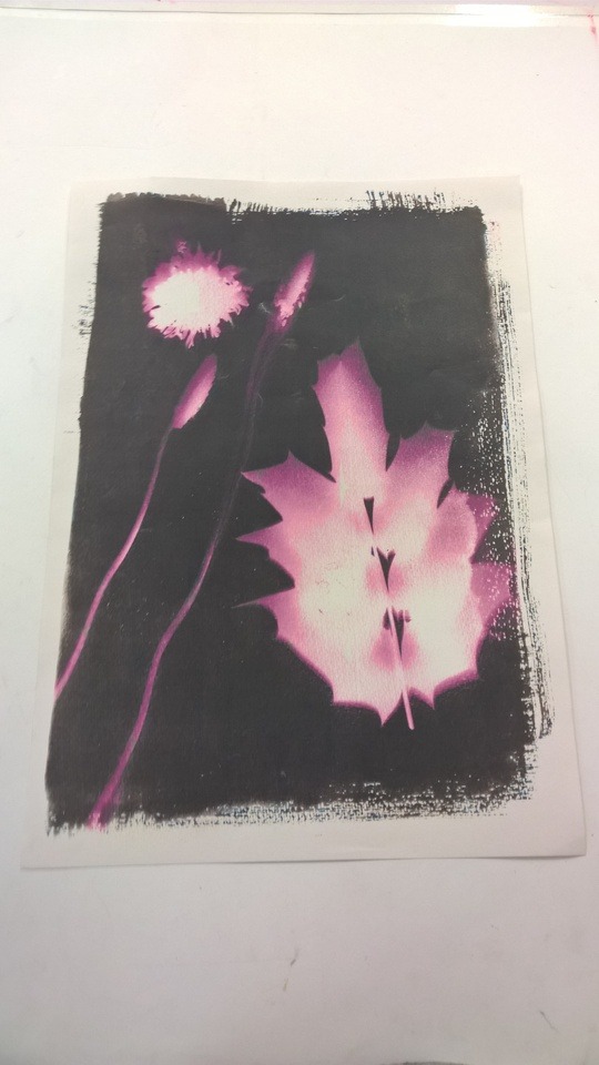

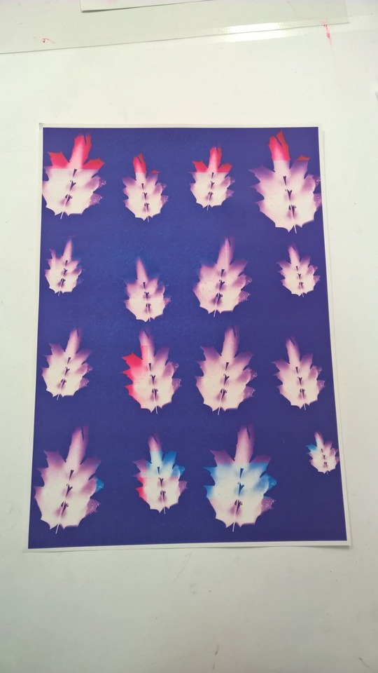
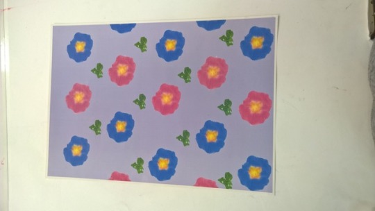
These are the update versions of the cyanotype prints what I photo shopped. I found out that I can add colour to the white part of the print. I wanted to see how the prints look like with the white parts coloured in and with a different coloured background. I mostly used something bright so it have a contrast between the flowers and leaves and the background.
The updated versions of the photo shopped prints worked out very well because the contrast between the flowers and leaves and the background makes it seem like the flowers and leaves are glowing like neon lights. Also it’s something I never did before and this new experience helped me learn new skills.
I only did two because after I had a break I did not know what to change on Photoshop to make paint not the background bot the white part of the print. Because I did not know how I did it I could not made more of these kind of prints.
1 note
·
View note
Photo
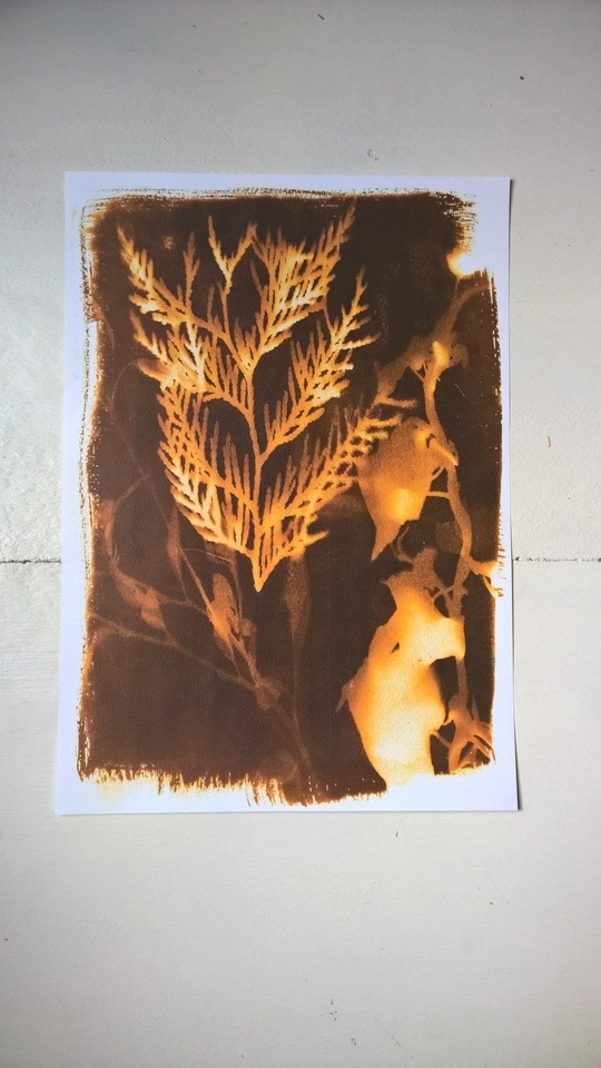
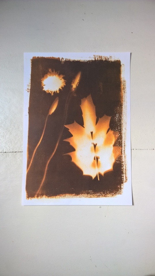

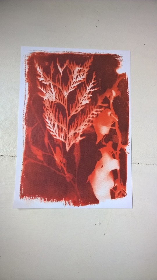
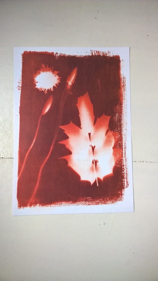
pg.1
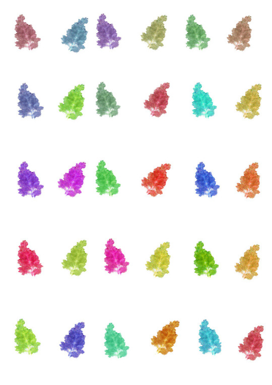
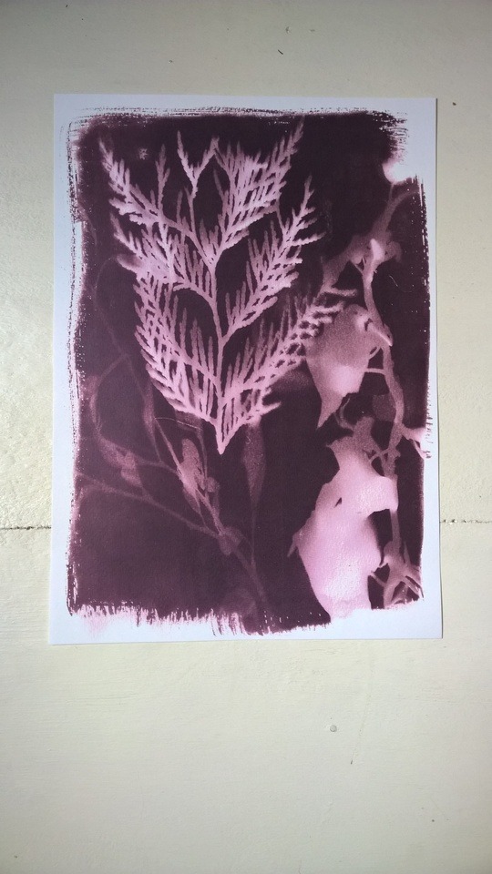
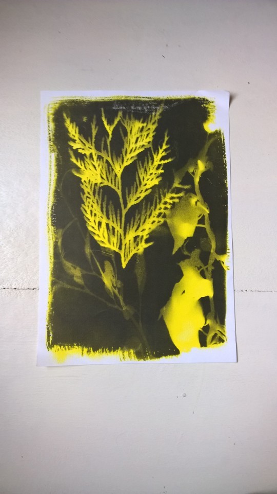
these are two cyanotype prints what I scanned in and change the colour of it on Photoshop. Because I wanted to do different coloured cyanotype prints but it would take to much time and money to just mix out different coloured chemicals so I decided I am going to edit the colour on two prints I already did. I wanted to do several colours because I wanted to find out witch one look the best. I tried out several different colours to have a variation of coloured prints and to see what colours look the best with the prints.
I think the photo shopped print worked out very well because the variety of colours what I used on them and that the colours are so bright on the prints. I was worried that the colours are not going to show up well because the natural blue colour is going to show up behind the colour what I put on it but the colour what I used are completely blocked the blue. It also made the prints look more interesting and more unique.
It took a very long time to colour the whole print in with the colour because for different parts I needed to use different size brushes and I needed to go over with the brush several times because one layer did not hide the blue of the print. Also on Photoshop the print looked much lighter then after I printed it. Sometimes that made the prints distorted a little bit and that ruined the appeal of it.
5 notes
·
View notes
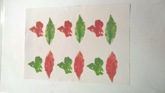
Photo

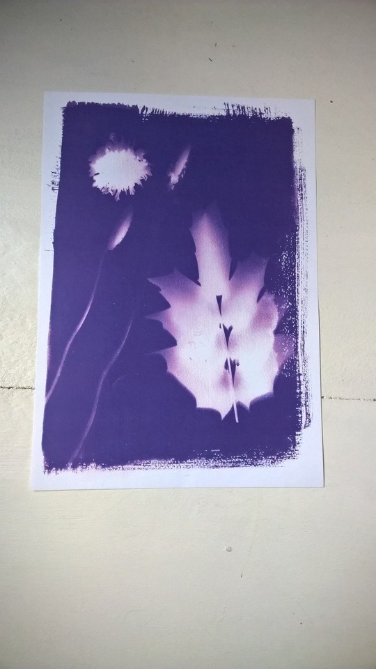
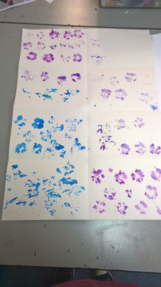
These are the photo shopped prints with watercolour on them. I scanned the ones in with the watercolour added to it then I scanned them in and added colour to it as a background. I choose these prints because I made them better by adding watercolour to it and I liked these the best. I liked them because the paint added a better look to the ink prints and because the colours on the print harmonies with each other.
I think it worked out because the colours what I used for the background are match with the prints I did and the prints stand out from bold background. also i tried to find a colour that matched to the colours what I used for the prints. I choose pale colours so the prints stand out on them more. Also for one print I choose two different colour background. I was not sure witch colour should I use so I decided use both colours so so it has a variation.
I did not use all of the watercolour prints because some of them did not work out. Some of the colours did not work out with the prints because they were to different from each other so it did not look good with each other. Also after I print out something the colour is always darker than on the screen, so I needed to choose something very light so after I printed it not going to be to dark.
2 notes
·
View notes
Photo
I tried cyanotype print on paper. I needed to mix together two powders with water. After I mixed the water and the powder I needed to mix the two chemicals together in the dark room because if it mixed and applied in UV light or any kind of light the chemical is start to react with the light and it not going to work. After I mixed the two chemicals I apply it with a brush with natural hair in it for example horse hair. It is easier to apply it with a natural brush and it works better. I needed to apply the chemical thin because it dries faster. After I applied the chemical onto the watercolour paper it needed to dry until it dried fully and the chemical turns a light lime green colour. I took the sheets outside and lay the flowers and leaves onto the sheets and arranged them. Because it was very sunny that day I waited 30 seconds then The colour of the chemical changed from light green to olive green. I took the prints inside and filled a box with running water and washed the access chemical off and let it dry with the hand dryer.
I think the prints worked out very well because the prints the flowers and leaves stand out out sharply and they are clear to see. It was easy to apply the chemical onto the paper and it dried nicely. Because the sun was bright that day the prints came out strongly and it was done quick.
Because there was nothing to press the leaves and flowers down they left their shadows on the print. The outline of the flowers and leaves are not that sharp.
1 note
·
View note
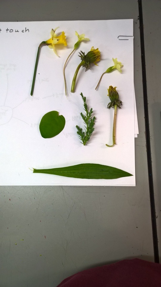
Photo
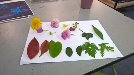
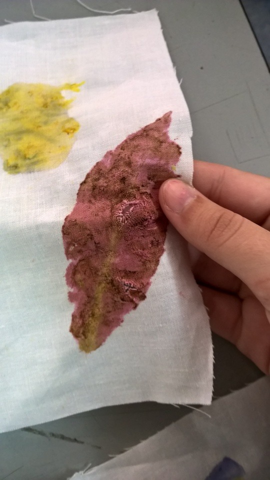
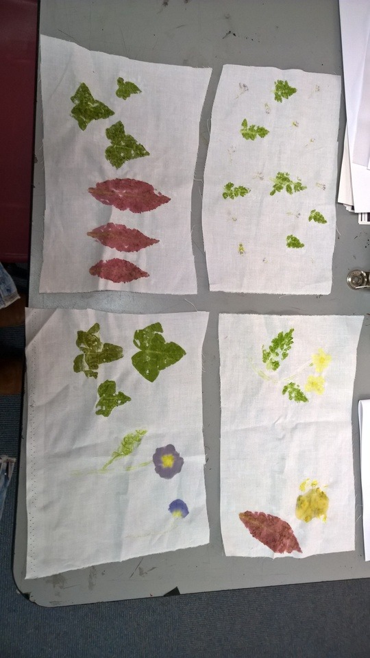
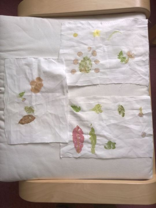
These are the flower pounding technique what I tried. I collected flowers and leaves from all around the college. I tried to find leaves and flowers what had bright colours and they have moisture in them so they can produce loads of the dye what they have.
I dissected the leaves and the flowers into smaller pieces co I can lay them out on the fabric better, then I lay them out onto the fabric then I lay the tracing paper over the plants then gently hammer them with the hammer. All the colours from the flowers and leaves came out very easily and the colour of it was bold and strong.
Some parts of the flowers and leaves had to much moisture in them and did not came out as clear as other ones. some of them were to light in colour and it did not show up or it turned brown. Also if I hit the leaf to hard the fabric ripped as well. After time the colours from the leaves and flowers faded and did not look as good as they used to.
1 note
·
View note
Photo
These are the prints what I did using the flowers. I choose out the ones I thought I could adapt. First I added fine liner to the prints so the detail shows up. Then I photocopied each piece then added watercolour to the prints. Then I added more fine liner. I decided to add watercolour to it because I wanted to add detail to the prints and bring out the small details on the flowers and leaves. After I added the watercolour I added more fine liner to it.
I think adding watercolour to the prints was a good idea because it added more colour to the pints and it made it look more realistic. But I did not like that I added more fine liner after I added the watercolour, because some of the parts what I draw over with fine liner are blended into each other and the small details what made some of the prints delicate looking are gone. Also some of the prints did not work out the way I wanted it. Because after I photocopied them the photocopied versions ink are water proof so it was very difficult to add watercolour to it.
0 notes
Video
Half sleeve fern composition by Rit Kit Tattoos 🌿
2 notes
·
View notes
Video
youtube
Artist uses real leaves & flowers to create botanical tattoos
I decided to use this artist becuase she uses real plants to create prints on the peoples skin what after she uses as an outline to create the tattoo. It is similar to my project because I used real flowers to create prints and I am going to turn the prints into wallpaper. I like her work because it something what people don’t really use so it makes it unique technique. Also because she uses plants to create her prints is very intresting.
0 notes
Video
X-Ray Photographs From the 1930s Expose the Delicate Details of Roses This technique is when they make x ray photographs of flowers. I like this because the photograps looks very gostly like. Also you can still can tell that it is a flower and it shows the outlines of the flowers. I can use this in my project because it looks like the cyanotype print and it can relate to this technique.
2 notes
·
View notes
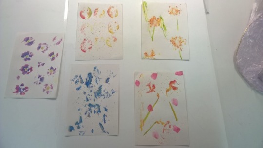
Photo
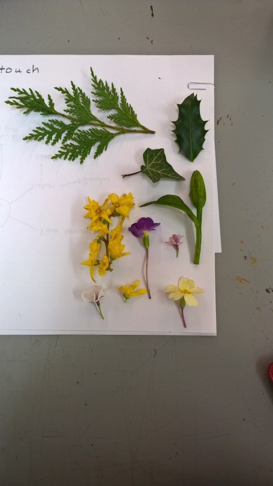
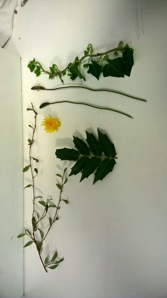
This is the first experimentation what I did using flowers. I collected plants and flowers what I found on my way. I tried to collect a variation of plants so I can create several prints. I also tried to find pants with different texture and thickness to find which one of them would work the best to do prints with.
The first prints I did was the ones I did with blue and purple ink. I wanted to use colours what I can find in nature. It was not the best prints because some leaves has a layer on them what make them to have a firm texture and that makes them waterproof. So when I tried to put them into the ink it did not stay on the leaf but just like water it came of, and that made it difficult to create prints with the leaves. With the flowers It worked out better because then were thinner and they absorb the ink so It was easer to use them several times. But because there were so delicate it ripped very easily. Also It was hard to guess how much ink I should use for the prints. Sometimes it was to much and just created a big mess on the paper and sometimes it was to little ink and it did not leave a print at all. So the first prints what I did was good for experimenting with ink and plants.
For the second prints I did know what type of plant should I use and how much should I use. At choosing plants I choose plants that don’t have a waterproof layer on and that I use the right amount of ink. These prints looked better than the first ones I did because the plants I used did not have the waterproof layer on so it was much easier to use them with the ink. Also I tried to make prints with the flowers and leaves in an order so it looked like I used the hole flower not just parts of it. Also I tried to mix the different coloured ink together so there is a variation between the colours.
0 notes
Video
youtube
DIY :: Revive Your Whites with Hibiscus Tea
Using hibiscus tea to dye fabric. I like this because it using something natural to colour the fabric. This technique is so old but in the modern people use it as well so it is recreating old traditional techniques in new ways. I can use this in my project because it uses natural dyes and I hope that I can use the dye of the flowers and leaves to create my work and samples for my work.
1 note
·
View note
Video
youtube
This Designer Uses Flower Waste To Create Truly Magical Clothing | HuffP...
This artist use natural dye from old flowers and petals for her designs then she turns the fabric into kimonos. I like her work because she reuses the flowers from places from where they just through it away like restaurants but she reuses these and create something new out of it what people can use. It would relate to my project by using flowers what is dried out to create prints using them.
0 notes