
portfoliostudio-chantellecalitz
Portfolio Studio
Chantelle Calitz
13 posts
Don't wanna be here? Send us removal request.
Last Seen Blogs

jerynsworld
Jeryn's World

dvestupeniru
dvestupeniru

teddys-nightmares-blog
Teddy's Nightmares
versteck
Irrevogável realidade
mark-lewis1
Untitled
Text
Blog Post #11: Website Proof 4
chantellecalitz.ca
About Me:

Since last week, I’ve elaborated in my bio on the About Me page and I added a button so that viewers could download my resume. I don’t love the placement of that button, but I couldn’t figure out a way to move it next to the other button that links to my email.
Portal (Case Study):


I’ve added visuals to my case study. This includes:
a blurb I wrote about designing the Table of Contents every year and why it’s one of my favourite spreads to design
layout progressions that show how I solved a problem
different spreads with their genre treatments
Lazy Oak Identity:


I’ve also added content to the Lazy Oak page.
I had 7 pages of thumbs that weren’t very appealing to look at so I scanned them, image traced the ones I wanted to include and I arranged them all onto one art board. This way a potential employer can get a sense of my ideation progress without needing to look at ugly thumbs.
0 notes
Text
Blog Post #10: Website Proof 3: Part 1
chantellecalitz.ca


Since last week, I added captions below the project previews. Before, the viewer would have to hover over the images to see the caption. This is much clearer. It also allows the viewer to see which project is the case study at a glance.

I’ve added an additional page with illustration projects. I chose the keep the Barkley project in the Work page because both pages will then have an even number of projects. I might switch it with the Get Ready project because while both have illustrative work, the Get Ready project also includes layout design.


Generation Squeeze Infographics page
0 notes
Text
Blog Post #10: Website Proof 3: Part 2
chantellecalitz.ca
(There’s an image limit on these blogs, so I had to make a part two.)


Get Ready page
I added a carousel showing my favourite illustrations for this project. I need to fiddle with it a bit more. I also need to optimize my images because my site is taking forever to load.
0 notes
Text
Blog Post #9: Website Proof 2
chantellecalitz.ca

Introduction
Since last week, I updated my introduction. I initially didn’t want to have a white background, but I found that a colour made my website feel less professional. To keep a playful tone, I kept my logo gradient pattern but I reduced the number of times it repeats and I moved it up so that it wasn’t underneath the text.
I added a photo to put a face to my work, and I changed the text to first person.
I also added an About me page. Last week I had a Contact page in it’s place but I think I’ll just link to my email on the current pages.

The navigation bar changes from white to green as the user scrolls down. It stays on the screen, so the links are always accessible.
Projects
I changed the previews of my projects, removed the backgrounds so they’ll look cleaner on the white background. I decided to swap the Get Ready project with an identity design project I’ve been working on this semester, Lazy Oak Luxury Picnics.

I’ve added captions here and there and broken up the text with more images of roughs and ideation, but the project pages still need more refinement. (Hello weekend plans!)


I’ve added pull quotes as well.

As you can see, the images are usually put on a green background. In the project pages, I do vary the colour blocks to add more interest.

About Me
I’ve started working on a blurb that explains who I am, why I chose this career, and what clients can expect of me in the About Me page. I will be adding to that.
Priority To Do List:
highlight my case study on the homepage
add call to action
downloadable resume
add visuals to case study
refine case study
elaborate on Lazy Oak
0 notes
Text
Blog Post #8 Proof 1
chantellecalitz.ca


Home page: I chose to put links to my projects on the home page to reduce the amount of clicks it takes to start reading about my work.
The design choices:
Background:
I chose to stray from the clean, white backgrounds that many portfolio sites have, to add a bit of colour and to make my photo’s background appear more white. I might change this to a champagne colour to put more focus on my logo gradient and the colours in my work itself.
Flow:
I start with a short introduction, because it’s useful information to have before viewers go into my work. I’d imagine a potential employer would look through my work first before the About Me page because it’s the first thing they’ll see.
Projects:
This summer, I’d like to get a few freelance jobs in my town to redesign logos for local businesses. Someone in my town told me that a few businesses were unhappy with their current logo, so I will be designing my portfolio site with the goal of reeling in those specific clients. This is why I put The Fermented Moose first as it is my only logo design that I’ve done for a real client in my town.
Next, I will be switching out Get Ready with the semester long project I’ve been working in Design for Business. I designed the logo and collateral for a fictional luxury picnic company.
Portal will follow as the case study. In the case study, I write about three magazines even though the 2021 issue is not available yet, but it will be in May. I will then update the images to include that issue.
Lastly, the Barkley Cider Series will focus more on the illustrations and less on the package design aspect of that project. I would like to be able to get illustrating jobs in the future. I think an interesting addition to this project would be gifs showing some of the drawing process.

Hover: When a mouse is hovered over the image, a caption appears introducing that project. I will have to add a label without the hover option for the mobile site.
My Logo:
My logo is my initials shaped like a bug. I think the design represents my personality, because I am fun and friendly, but I also prefer a fairly no-nonsense work environment.

I created a bug gradient using my brands secondary colours that I want to incorporate into each page on the website. The background colour of the home page is one of the steps in the gradient for the bugs. See how the gradient blends into the background in the introductions? If I use a different colour from that gradient for the background on each page, they’ll blend in different places, which will seem more purposeful than it just occurring once. I am still deciding if I want to do that or just have the champagne colour throughout like previously mentioned.


I still need to add more detail in my individual project descriptions like roughs, iterations, sketches, hierarchy, pull quotes.
0 notes
Text
Blog Post #7: Case Study Refined [in progress]
Portal magazine
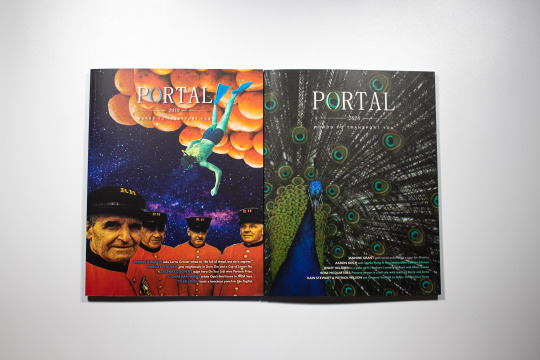
I was the graphic designer for Portal, the literary magazine for Vancouver Island University for three years. Portal is nationally distributed to newsstands across Canada through Magazines Canada and is also sold locally in the university’s bookstore. I work with the Portal team, the Creative Writing and Journalism third and fourth-year students. All VIU students are encouraged to submit their fiction, non-fiction, poetry, scripts, photography, paintings or illustrations. The student magazine department then decide which pieces will make it into the issue, and I design the magazines’ layout, fliers for their fundraising events, ads for ad swaps with other literary magazines, programs and tickets.
I started designing Portal in my second year at VIU, studying graphic design. Being the only designer meant that I was given responsibilities that a lot of junior designers wouldn’t have been able to have yet. It also required that I design 90 pages in two weeks time. This position gave me the opportunity to become more confident using Adobe software and I got more experience designing layouts. It is a unique experience working on this magazine every year. The 2021 issue was Portal’s 30th anniversary issue. To celebrate this milestone, Portal added 3 more articles which made this issue the largest Portal magazine to date.
Portal is also one of just a few literary magazines in the area that print in colour, and we took full advantage of that by showing vibrant colours throughout the magazine through the artwork and color coded genres. For example, fiction is orange, scripts are green, non fiction is blue, and poetry is purple. In the past, interviews have also been placed in the non-fiction category, but since the 2021 issue had three additional interviews, I created a category specifically for these articles called Features which was red. These colours would be present in the drop cap, pull quotes, page number and title.
Being able to design three Portal issues allowed me to improve on my previous designs every year. Before I designed a new issue I would try to find new ways to create interesting shapes or interactions between the text and imagery that suited the tone of the written piece.
Portfolio Reading Series
The Portfolio reading series is a series of events held throughout the year where Portal invites authors to speak and read from their books. I was tasked with designing a logo for this series and a poster series that’ll be used to advertise each event.
Logo Design
I used elements from the Portal logo for recognizability. It was named Portfolio to associate it with Portal as well as the Portent Prize, also part of Portal. Portal uses their parenthesis icon throughout their collateral. The parenthesis changes colour based on the images it’s paired with. The publisher wanted to include a microphone since this is a series where authors and students do readings.
Poster Series Throughout the Years
3 different designs for each year
2019. The readings were held in The White Room in Nanaimo. The poster alludes to the interior of The White Room by using a recognizable light fixture in the posters as a background. The design stayed consistent through the year, and I switched out the book cover and author images throughout the series.
2020. The location changed; it was now being held at The White Rabbit cafe. Again, I made the poster design resemble the interior of the cafe: white walls, art hanging, sandwich board outside advertising their specials. I placed author’s image and the book cover in the frames and the event’s information on the sandwich board. This was an improvement from the previous year’s design, because I overlapped the sandwich board with the frames to create one focal point (instead of three different elements) and kept lots of whitespace in this poster to create balance.
2021. The series moved online due to covid. Now that these readings were posted on Youtube, the publisher wanted to include movie themes like the clapboard and the film strip. Like the frames from the previous year, I used the film strip to contain the author’s image and the book cover. I used colours from both images to create the gradient.
Portal Fundraising Events Posters
I see every thing I design as an opportunity to improve. Looking through the posters that I’ve designed over the last three years, I see improvement in the way the posters communicate. The posters now have one focal point with an established hierarchy.
2 notes
·
View notes
Text
Blog Post #6 Case Study Rough
Portal magazine

2. The Challenge
use fiction, non fiction, poetry, scripts, photography, paintings and illustration submissions into layouts for a literary magazine at VIU
design cover and interior
promotional material such as posters, ad swaps, social media posts, tickets and programs
3. The Approach
vibrant colours used throughout
balance between keeping with the look of previous years and knowing when to make adjustments
consistency in branding on all platforms
4. What I did
color coded genres (eg. fiction is blue)
these colours would be present in the drop cap, pull quotes, page number and title
find ways to create interesting shapes or interactions between the text and imagery that suited the tone of the written piece


Portfolio Reading Series
Logo Design

Used the same fonts as the Portal logo. In both logos the parenthesis change color to be cohesive with the imagery or colours it’s placed with.
The publisher wanted to include a microphone since this is a series where authors and students do readings.
It was named Portfolio to associate it with Portal as well as the Portent Prize, also part of Portal.
Poster Series Throughout the Years
3 different designs for each year

2019. Series was held in The White Room in Nanaimo. The poster resembles the interior. Consistent design throughout the year (recognizable). Switched out the book cover and author images throughout the series.

2020. Location changed. It was now being held at The White Rabbit. Poster made to look like interior: white walls, art hanging, sandwich board outside advertising their specials. Book cover and author switched out with each event in the series.

2021. The series moved online due to Covid. Now that it was being held online the publisher wanted to include movie themes like the clapboard and the film strip.
Portal Fundraising Events Posters


0 notes
Text
Blog Post #5B Refined Rationales
1. Project title
Tod Creek Craft Cider: The Barkley Series

2. The Challenge
I redesigned an existing bottle of cider from Tod Creek Craft Cider in a package design class. $1 of each bottle sold is donated to an effort to clean the Barkley reef just off the coast of Vancouver Island. The original design was lacking interesting visuals that would compel a potential consumer to pick it up and examine the bottle. The cider was being sold in a liquor store so it needed to be visually appealing given the fact that most products sold in a liquor store have a very illustrative or interesting design.
Tod Creek Craft Cider’s brand positioning is: “Premium cider with a west coast bite. Tod Creek Craft Cider is a small batch cider made of BC apples, crafted right here on Vancouver Island.” The goal was to create new labels with an elevated design and to expand the cider into a series.
3. The Approach
I wanted to lean into the idea of the cider being made locally on Vancouver Island. To make the one cider into a series, I updated the design of the existing flavour, apple and blackberry, and I chose fruit pairings native to the island to create two more flavours: apricot and cherry and fig and pear.
Instead of drawing the reef itself, I focussed on an octopus holding the fruit that’s in the cider. In the thumbs, I was playing around with ocean themes and ways to combine them with the fruit pairings. Initially, I found that there was a disconnect happening because I, essentially, have two competing illustrative elements: the ocean and the fruit. I solved the problem by making the two elements interact with one another. The octopus will unify the series, and create diversification by posing in a different position for each flavour, holding different fruits.
4. What I did
I drew the octopi in Procreate and made their tentacles long enough so that they wrap around the bottle to encourage consumers to pick it up and turn it to read the description on the back that describes the reef clean up and fundraising process.
I kept the barcode from the original design because the shape of it is a great element on the back of the label, and I assigned a specific colour to each flavour while maintaining a cohesive colour palette throughout the series.
The final design was able to capture the playfulness that I wanted it to have, along with interesting illustrations that helped to communicate the tone that this cider needed to convey.
___________________________________
1. Project title
The Fermented Moose
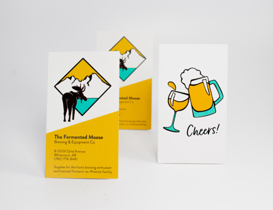
2. The Challenge
I designed a brand identity for a UBrew that opened in 2020 in my hometown, Whitecourt, Alberta. The client needed a logo along with its variations, a business card, a punch card, and a social distancing marker. She wanted to base the logo off of a painting she had made that shows a moose walking away into the mountains with the northern lights above. The tone she wanted to create was a fun and educational experience and she wanted the brand to feel contemporary. Going through the process of learning to brew beer, wine or cider should be enjoyable. The client wanted to incorporate turquoise into the design and wanted the logo to be illustrated but not too cartoonish.
3. The Approach
With this design, I was able to illustrate a few moose and a fun graphic for the back of the business card. The client asked for turquoise to be present in the logo and I paired it with a bright yellow to add the feeling she wanted of joy and excitement. I adapted her painting into a logo by simplifying the image. I chose to focus on the mountains and the moose only.
4. What I did
I illustrated the moose and the mountains in Procreate. I chose to separate the two elements with a tilted square framing the landscape and the moose walking towards it to create movement and depth in the logo. I used a sans serif and the brand colours, yellow and turquoise, to make the identity feel modern. I designed two business cards. One had a graphic one the back of a beer and wine glass clinking and the other had six tiny moose heads that acted like a punch card.
___________________________________
1. Project title
Portal magazine

2. The Challenge
I am currently the graphic designer for Portal, the literary magazine for Vancouver Island University. I designed the 2019 and 2020 issues and the 2021 issue, Portal’s 30th anniversary issue.
I work with the Portal team, the Creative Writing and Journalism third and fourth-year students. All VIU students are encouraged to submit their fiction, non-fiction, poetry, scripts, photography, paintings or illustrations. The student magazine department then decide which pieces will make it into the issue, and I design the magazines’ layout, posters for their fundraising events, ads for ad swaps with other literary magazines, programs and tickets.
3. The Approach
Since Portal works with graphic design students, the turnover is very high in that position as students graduate. Throughout the last three years at Portal, I've been working on ways to make their brand identity more cohesive. I've designed two logos for their yearly Portent competition and a reading series, Portfolio, that incorporate elements from their umbrella brand, Portal. I've also focused on keeping each new issue consistent with the last, using similar colours, typefaces and photo treatments. I've done the same with promotional material so that Portal can cement their identity in the readers' minds.
4. What I did
Using InDesign to design the cover and interior of Portal, I worked on ways to display the art in different ways. To make each layout interesting, I used feather gradients, colour overlays, images placed in object shapes with a mixture of full bleed, half bleed and no bleed compositions. This would also help to establish the tone of each piece.
I also used colour to differentiate the genres. For example, non fiction is orange. This means that each non fiction peace has orange drop caps, text breaks, pull quotes, title, and page markers.
1 note
·
View note
Text
Blog Post #5A Rough Rationales
1. Project title
Tod Creek Craft Cider: The Barkley Series
2. The Challenge
expand existing cider bottle into a series
bland initial design
elevate design
promote Barkley Reef clean up ($1 of every bottle sold is donated to the reef clean up effort)
incorporate two more flavours using fruit pairings native to Vancouver Island
3. The Approach
apple+blackberry, apricot+cherry, fig+pear
Barkley reef off the coast of VI, ocean themes
added visuals since the cider is sold in a liquor store; most products in a liquor store are usually very eye catching
found there to be a disconnect between the fruit illustrations and the ocean illustrations
chose a cartoony illustration style. Eyes=more expressive that way
used Procreate to illustrate the octopi and fruit
4. What I did
octopus holding the fruit unified the two concepts
series is interesting, cohesive yet there's variety in colours used and illustration
each flavour has a specific colour assigned to it
gestalt principle of continuation, tentacles reach around the bottle leading viewer to the information on the back
1. Project title
The Fermented Moose
2. The Challenge
creating a brand identity for a local UBrew
basing logo off of a painting of a moose made by the client
business card, logo, store sign, social distance marker
client wanted to include turquoise in the brand colours
incorporate mountains
3. The Approach
trustworthy, fun experience, exciting
illustrative approach but not cartoonish
4. What I did
used Procreate to illustrate the moose and additional graphics
paired turquoise with yellow to add excitement
chose a sans serif typeface to make the brand feel contemporary
1. Project title
Portal magazine
2. The Challenge
use fiction, non fiction, poetry, scripts, photography, paintings and illustration submissions into layouts for a literary magazine at VIU
design cover and interior
promotional material such as posters, ad swaps, social media posts, tickets and programs
3. The Approach
vibrant colours used throughout
balance between keeping with the look of previous years and knowing when to make adjustments
consistency in branding on all platforms
4. What I did
color coded genres (eg. fiction is blue)
these colours would be present in the drop cap, pull quotes, page number and title
find ways to create interesting shapes or interactions between the text and imagery that suited the tone of the written piece
1 note
·
View note
Text
Blog Post #4 Moodboard

The projects I plan on presenting in my portfolio are all very colourful, illustrative and fun. I chose them, because I want to attract those kinds of projects in the future. I am adapting my previous logo, the two Cs that form a little bug, to fit with this new theme. My brand colours used to be pink and purple, but I prefer using bolder, happier colours wherever I can, especially yellow, and I felt that the previous colours did not match my personality at all.
I want to photograph my four projects in a real world setting: someone reading a magazine, pouring a glass of cider, holding a business card etc. I think this will give the photography a common theme.
1 note
·
View note
Text
Blog Post #3 Portfolio Plan
A) Post screenshots of your sketched wireframes
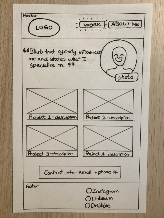
Home page
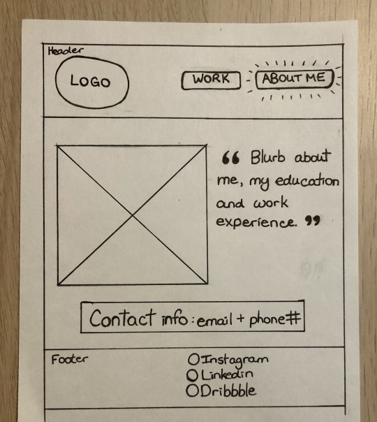
About Me page
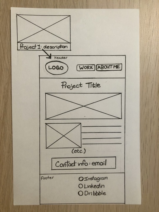
Project explination pages
B) List the links you’ll use in your portfolio
Having looked at a variety of portfolios, I think having Work and About Me as my only two links in the navigation would be sufficient. It seems that a separate page with contact info or a form is just an extra, unnecessary click.
On the Work page, the home page, I will have a small photo along with a blurb that quickly introduces me, sets the tone for the rest of the portfolio and mentions what I specialize in. Below that, I plan to have four thumbnails, the four projects I will be showcasing, with the name of the project and keywords about the type of design. These thumbnails are clickable and will lead to a new page that will show an in depth explanation of the problem, solution, process work and the final design for each project, etc.
Below that I will have my email available in a Contact Me blurb that will be on every page just above the footer. In my wireframes I showed that I will also have my phone number with my email, but I decided against it since it's not necessary.
The footer will feature links to my Instagram, Linkedin and Dribble account.
My About Me page will elaborate on my background, work experience and education.
C) Which 4 projects will you showcase on your site?
Portal Magazine
I am currently the graphic designer for Portal, the literary magazine for Vancouver Island University. I designed the 2019 and 2020 issues and will be designing the 2021 issue, Portal’s 30th anniversary issue, shortly.
I work with the Portal team, the Creative Writing and Journalism third and fourth-year students. All VIU students are encouraged to submit their fiction, non-fiction, poetry, scripts, photography, paintings or illustrations. The student magazine department then decide which pieces will make it into the issue, and I design the magazines’ layout, fliers for their fundraising events, ads for ad swaps with other literary magazines, programs and tickets.
The Fermented Moose
I designed a logo and brand collateral for a UBrew that just opened in my hometown, Whitecourt, Alberta. The client wanted to base the logo off of a painting she had made that shows a moose walking away into the mountains with the northern lights above. With this design, I was able to illustrate a few moose and a fun graphic for the back of the business card as well as a social distancing marker.
Get Ready
Get Ready is a brand that aims to educate men and women about how to build a stylish business casual capsule closet while being more conscious about their impact in the world. A booklet goes into detail about how people can transform their current closet into a capsule closet, how to create a colour palette for their clothes that will match their skin tone, tips to look put together and a handy shopping guide inside that will help people focus on only buying items that can be worn with a variety of clothes that they already own.
The booklet is used with an app that, once people have transformed their closets, will mix and match outfits for each day of the week. Being environmentally conscious and looking stylish has never been easier.
The Barkley Cider Series
I redesigned an existing bottle of cider from Tod Creek Craft Cider in a package design class. To make the one cider into a series, I updated the design of the existing flavour, apple and blackberry, and I chose fruit pairings native to the island to create two more flavours: apricot and cherry and fig and pear.
I illustrated octopi holding the fruit that’s in the cider in different positions for each flavour.
D) Review your proposed showcase projects and determine where you need to fill holes in your showcase
I want to photograph these projects again, this time making them more cohesive and interesting. My current photos are boring, photographed in front of a white background. I want pictures that are friendlier, some of them can even have people interacting with the items for scale or to place them in a real world context.
I also need to create Linkedin and Dribbble accounts.
I will need to examine the rationales I currently have as well and make sure they're thorough enough.
E) What platform will you use?
I will be designing my website on Squarespace.
F) What will your domain name be?
I think chantellecalitz.ca would be a good domain name for me. It's not terribly exciting, but it's easy to google. My style is very fun, but I also tend to be fairly serious.
1 note
·
View note
Text
Blog Post #2 Inner Self

Things that can make me stand out as a designer.
I have a few skills, interests and talents that I’ve developed throughout my life that benefit me as a designer:
I am originally from South Africa. My family immigrated in 2007. Afrikaans is my mother tongue, and I am also fluent in English. Having immigrated at 8 years old, I have an appreciation for other cultures and an empathy for others who have experienced the same thing. I think being an immigrant makes me more sensitive. I am slower to project assumptions onto people, and I understand first hand the need to consider the experiences of every person when thinking about the people using a product/design and how they differ from the next.
I love creating art. I’ve experimented with many different mediums: acrylic, oils, pottery, etc, and I find that I really enjoy digital art. It’s a really useful skill to have for graphic design as well. I have used my illustrations in many projects over the last four years. I have recently started illustrating using Procreate and I can talk about my love for that app for hours. I would want to have the experience of illustrating a children’s book one day.
I’m also interested in photography, though I am not an expert. I enjoy nature photography most, landscapes and wildlife, but I have also done photo shoots for families. This is a useful skill in its own, but I think it also makes me practice my compositional skills too.
Where am I going?
From my experience designing Portal Magazine, I know that editorial design is my passion. I see myself living in BC as an art director of an arts and culture magazine, where I can leverage all three of my skills/interests. To do this I will need to:
Graduate from VIU with a Bachelors in Graphic Design
Go to school for a MDes in Interdisciplinary Design
Move to BC (I currently live in Alberta)
Start small by working for an independent Arts and Culture magazine and work up the ladder
I found that working for a smaller magazine like Portal gave me more responsibility than I would’ve had if I worked at a larger firm. I’d like to end up working on a larger magazine, but I know I’ll learn a lot more if I start off small.
0 notes
Text
Blog Post #1 Inspiration
For this assignment, I wanted to look at a portfolio of a designer that I was familiar with. I follow a lot of designers on various social media platforms, and I chose to look at a portfolio of a graphic designer that I follow on Tik Tok. Marley Soden is a hand lettering artist, and I find her work to be very creative visually and conceptually. I chose her portfolio because it’s well done, but there are some points where I think she can improve.

This is a great start. She is very clear about her specialization in hand lettering and the services she provides: digital lettering and illustration, murals and event signage and tactile and food lettering. This would be ideal for an employer to understand where she would fit in their business and the projects she would be able to tackle.
I also think the theme of her website is very cohesive, the mint green colour with the fun icons works well; however, I think she could have chosen a different typeface for her navigation. The condensed typeface at that size could be hard to read for some.

Scrolling further on her homepage there are a few items from her portfolio. Many of them are animated. It’s very professionally shot, but the biggest let down of her portfolio is that there is no written explanation of her work. That would be an issue for a potential employer. They’ll have no idea what the brief was, who her clients were, what challenges she experienced or what her goals were for these projects.

This is her portfolio page. Again, very beautifully shot. The animations are really cool, but you can’t click on these to get more information. Having watched some of her videos on how she creates these pieces, there is a lot of experimentation involved in each piece and she should write a paragraph or two at least on her process for each.

Lastly, her Hire Me page. The form design is clear, but she’s asking too many questions from the discovery phase right off the bat. I think it would be more effective if she were to ask for a name and last name, email, phone number, and just ask for a brief description of the project. Also, I gathered from the videos we watched this week that a form with drop down menus or options like these are only helpful if she’s getting a lot of clients.
Looking at the 6 P’s:
Photography: The photography is really well done. It’s not all cohesive, but her lettering style is evident in each which may be enough.
Persuasion: The writing that she does have is very professional and convincing. She sounds knowledgeable and confident on her home page. Although, she does speak in the first person on her home page and in the third on her About Me page, which I think is a bit awkward. From the tone of her work, I think she should speak in first person.
Presentation: I’d say she’s presented her work well. The site’s navigation is clear. It doesn’t feel like a cookie cutter portfolio, but I don’t think the form is very effective.
Professionalism: This is a very professional site. There is a clear hierarchy and a good use of white space. Her tone in the About Me blurb could be edited slightly:
“Marley Soden is a lettering artist who unapologetically creates custom typographic designs. She’s semi-obsessive, an overthinker, and a self-proclaimed design nerd who enjoys exploring aesthetics and meaning through her lettering. Common themes in her work include food, introspection, and feminism.
She operates out of Greensboro, North Carolina with her two puppers, Ema and Bear, by her side. When she’s not in design-mode you might find her testing out new recipes, hanging out with her dogs, or writing run-on sentences.”
I think it’s fine that she includes her interests, but the way she describes herself feels like it’s lacking a little confidence. In her other description on her homepage she comes off more self assured.
Personality and Passion: Her personality and passion for her work is very clear in her portfolio.
My Portfolio:
Having looked at Behance portfolios and comparing it to Marley’s, her personality comes through a lot more than the ones I saw on Behance. I would want to choose a platform that will let me customize it a bit more to show my personality throughout the design.
This portfolio was also a cautionary tale looking at the lost potential of her not adding any process work or explanations.
0 notes