
For Practice 2: Creative Project Development class. Recording any thoughts and exploration about assignments.
Don't wanna be here? Send us removal request.
Statistics
We looked inside some of the posts by practice2creativeproject and here's what we found interesting.
Average Info
Notes Per Post
1
Likes Per Post
1
Reblog Per Post
0
Reply Per Post
0
Time Between Posts
4 days
Number of Posts By Type
Text
15
Last Seen Tumblr Blogs


Fun Fact
Total funding amounts to $125.3M.
Text
《Win or Lose》 Reflection
youtube
Win or Lose was a show that had been sitting on my watchlist for a long time, but I just never got around to starting it.
However, since my final project also touches on themes like self-awareness and emotions, I realized that the story of Win or Lose was actually related to these topics too — so I decided to give it a try.
I didn’t expect that after watching all 8 episodes, I would really fall in love with how this animated series handles and expresses characters' emotions!
Because of that, I want to write down some of my thoughts and analysis about it.

A little background
Win or Lose is Pixar’s first original animated series, directed by Carrie Hobson and Michael Yates.
What’s really interesting about this show is that it’s a multi-perspective story, meaning that across the 8 episodes, each one focuses on a different character.
As the audience, we slowly piece together the full story by understanding what’s going on inside each character’s mind.
At first glance, the plot seems simple: it’s just about a group of elementary school kids preparing for a softball game.
But the true heart of the show is how it uses a single objective timeline, and then spends each episode diving deep into one character’s emotional world — revealing the pressure, hopes, and struggles they’re carrying inside.
For example, the first episode focuses on the coach’s daughter, who feels pressure from wanting her father’s approval and struggling with self-doubt.
The second episode is about the coach himself — on the outside, he seems strong and fair on the field, but in his personal life, he’s secretly longing for love while also closing himself off emotionally.
What impressed me the most about Win or Lose is how each episode feels like a standalone short film, yet they all connect perfectly together.
As the directors mentioned in interviews, the show is really about "seeing the world from different points of view" — whether it's a teacher, a mom, or a teammate.
It reminds us that everyone is living their own story, and that even when we’re all going through the same event, we each experience it differently.

How 《Win or Lose》 Handles Emotions and Inner Worlds
One of my favorite things about Win or Lose is how each episode creates a unique visual language based on the characters��� emotional state.
It really feels like the show invites you to step directly into the characters’ inner worlds.
I really wanted to include some of the show’s concept art here to illustrate what I mean. Still, unfortunately, since the series was only recently released, there aren't many official resources available yet.
So instead... I’m sharing some sketches I made myself based on the show, haha!
I think the way the show visualizes the characters’ emotions is incredibly powerful and easy to connect with!
So I decided to organize some of the emotional visual expressions from the episodes:
Episode 1: A young girl feels stressed and anxious because she can’t meet her father’s expectations. The show visualizes this as a big, slimy creature made of sweat that weighs heavily on her.
Episode 2: A referee who is strict and fair on the field struggles with complaints from angry parents. His emotional defense is shown as a blue suit of armor, but this armor also represents his fear of trying new things and his tendency to hide behind rules.
Episode 3: A girl who’s way too mature for her age tries to take on financial burdens to help her mom. In her mind, she transforms into a strong businesswoman, symbolizing how she’s forcing herself to grow up too fast.
At the same time, each episode uses a different color palette to match the character’s emotional state — you can instantly feel what they’re going through just by looking at the colors!
Overall, what makes Win or Lose so amazing is how the art and visuals become a natural extension of each character’s story.
The show beautifully expresses the idea that:
Everyone is living their own version of the day. If you’re willing to let go of your own perspective for a moment, you’ll realize others are doing their best too.
Reference
Instagram. (n.d.). Michael Yates (@yyates05). [online] Available at: https://www.instagram.com/yyates05/ [Accessed 25 Apr. 2025].
Wikipedia. (n.d.). Win or Lose (TV series). [online] Available at: https://en.wikipedia.org/wiki/Win_or_Lose_(TV_series) [Accessed 25 Apr. 2025].
IndieWire. (2023). ‘Win or Lose’: How Pixar’s First TV Series Brought Baseball and Big Emotions Together. [online] Available at: https://www.indiewire.com/features/animation/win-or-lose-pixar-tv-series-creators-interview-1235097427/ [Accessed 25 Apr. 2025].
Skwigly. (2024). Win or Lose – Q&A with Carrie Hobson and Michael Yates. [online] Available at: https://www.skwigly.co.uk/win-or-lose-qa/ [Accessed 25 Apr. 2025].
Facebook. (n.d.). Pixar – Win or Lose behind-the-scenes post. [online] Available at: https://m.facebook.com/story.php?story_fbid=1030653842422547&id=100064338235141 [Accessed 25 Apr. 2025].
0 notes
Text
《Robot Dreams》 Reflection
youtube
Robot Dreams is a movie that left a deep impression on me, the kind of film that makes you immediately want to share it with your family or friends after watching it.
What amazed me the most was how it bravely told its entire story without any dialogue, relying only on animation and music to convey so much raw emotion, capturing all those small regrets and life lessons that are often hard to put into words.
I think that's an incredibly difficult thing to pull off, and it’s exactly why I wanted to write a blog post to record my feelings and thoughts about this movie.
A little background and story introduction
Robot Dreams is a 2023 animated film directed by Pablo Berger, adapted from Sara Varon's 2007 graphic novel of the same name.
The story mainly revolves around a dog who lives alone in 1980s New York. One night, while eating dinner alone and watching TV, the dog sees an ad on a late-night shopping channel and decides to order a robot companion.
The dog and the robot quickly become inseparable. But during one trip to the beach, an accident causes them to get separated.
Most of the movie is about how the two of them try to find their way back to each other or learn to live with the time and space that separates them.
Thoughts on the Story and Film Direction
At first, I thought this movie would just be a fun, lighthearted animated film — no dialogue, just beautiful music and the catchy retro song "September" playing throughout.
But not long after the movie starts, the story takes a sudden turn: the dog and the robot are forced to separate, and the rest of the film follows how they spend a whole year apart from each other. The ending, too, leaves a lot to think about.
What really impressed me was how this movie managed to express deep emotions like separation and letting go, full of small regrets and bittersweet feelings, without using a single line of dialogue.
I used to think that movies without dialogue might feel slow or boring, but the director’s sharp, clear storytelling actually turned the lack of dialogue into a strength. Without words, every little movement and expression from the characters felt full of meaning, and it made me focus even more on the small details in each scene.
The connection between the characters was built purely through their gestures and emotions, making it even more powerful than if they had used words.
In interviews, Pablo Berger said that for him, making a movie without dialogue is like "writing with images" — the purest form of cinema.
And for me, every frame of Robot Dreams felt so relatable, like it was inviting me to project my own feelings into the story. I think that’s what makes this movie truly special.
Character Design


The character designs in this movie were created by Daniel Fernandez Casas!
Even though the characters look simple at first glance, I really love how Daniel Fernandez Casas used small expressions to perfectly show the contrast between the two main characters.
The dog’s expressions are very subtle — sometimes shy, sometimes almost blank or a little nervous — which really shows his introverted and anxious personality.
In contrast, the robot always has a big, obvious smile and bright, lively eyes, showing his playful and curious nature.
But what’s even more interesting is that, because we get so used to seeing the robot’s constant "built-in" smile, the moments when the robot doesn’t smile feel extra powerful.
It makes you wonder what the robot is really feeling deep inside.
One Scene I Really Loved
One scene I especially loved felt a bit like breaking the fourth wall.
It showed us that what we were seeing was actually the robot’s dream while waiting for the dog to come back.
At the same time, through that dream, we could get a glimpse into the robot’s inner thoughts and emotions at that moment.
Final Thoughts
This movie really showed me — and taught me — how to tell a feeling or emotion that's hard to put into words.
A movie that "speaks through visuals" turned out to be way more powerful and emotionally moving than I expected.
I think one big reason why this film is so successful is that the original author and director put a lot of care into the little things: the small, everyday actions, the ordinary places, and the tiny details we usually don’t even notice.
By slowly building up all those small, real moments inside a movie without a single line of dialogue, they made us realize that this story isn’t just about a dog and a robot, but also about their bittersweet and heartwarming friendship.
It’s also about the small regrets and quiet emotions we all experience in our own lives — the ones we often overlook without realizing it.
Reference
Berger, P. (2024) ‘Robot Dreams: Pablo Berger Interview’, Oscars Newsletter. Available at: https://newsletter.oscars.org/news/post/robot-dreams-pablo-berger-interview (Accessed: 29 April 2025).
Grobar, M. (2024) ‘Pablo Berger On Crafting The Wordless, Nostalgic Animation Robot Dreams’, Deadline, 3 February. Available at: https://deadline.com/2024/02/pablo-berger-robot-dreams-interview-1235833143/ (Accessed: 29 April 2025).
Casas, D.F. (n.d.) Robot Dreams Artwork, ArtStation. Available at: https://www.artstation.com/artwork/Ke8dn4 (Accessed: 29 April 2025).
Hebro Character Design (n.d.) Robot Dreams Project, Hebro Character Design Studio. Available at: https://www.hebrocharacterdesign.com/work/robotdreams (Accessed: 29 April 2025).
Sims, D. (2023) ‘Pablo Berger on How Robot Dreams Speaks Without Words’, Roger Ebert.com, 9 December. Available at: https://www.rogerebert.com/interviews/pablo-berger-robot-dreams-interview (Accessed: 29 April 2025).
0 notes
Text
《BRUSH UP LIFE》 Reflection
youtube
"Brush Up Life" is a Japanese drama that aired in 2023. Some parts of the story really connect with the main theme I want to explore in my final project, and it actually became one of the reasons why I wanted to make this project. So I wanted to take a moment to write down my thoughts on this show.
A quick intro to the story:
Brush Up Life starts with a big “what if” — What if life were like a game and we could start over again and again? What would our lives look like then?
The story follows a woman named Mari. One day, she suddenly dies in an accident. When she reaches the afterlife, she's told that in her next life, she’ll be reincarnated as a pangolin! Shocked and confused, she finds out that the kind of creature you become depends on how much good karma you built up in your previous life.
Mari doesn’t want to become a pangolin, so she makes a bold choice: to start her life all over again, from being a baby, but this time with all her past memories and knowledge. Her goal is to live a better life and earn enough karma to be reborn as a human again.

Reflections on the Story
When I watched Brush Up Life, I saw the main character, Mari, live the same life over and over again, each time carrying all the knowledge and memories from her past lives.
With that experience, she was able to make different choices each time, choices she never even imagined in her first life.
From working as a local government employee, she eventually became a scientist, a pilot, a pharmacist, and even a screenwriter, exploring completely different versions of her life.
But despite all the new paths she could take, Mari realized that what mattered most to her in the end was the people she loved and the moments that made her genuinely happy.
Brush Up Life made me rethink the meaning of "life choices."
I don’t know if other people feel the same, but personally, I often find myself wondering:
"Would my life be better if I could start over?" "If I had chosen path B instead of A, would I be happier now?"
These questions seem impossible to answer, yet they linger at the back of my mind. But after watching Brush Up Life, I finally started to look at those questions from a new perspective.
At first, what fascinated me was the "restart" setting: Mari could live her life again and again, this time with all her past knowledge and experience.
It seemed like she had unlimited possibilities, the power to choose completely new paths and achieve things she never dreamed of before.
But what surprised me the most wasn't what she achieved; it was the simple fact that, after all those reboots, what truly mattered was returning to the people and places that made her happy.
Brush Up Life helped me realize something important about the value of choices. Living in today's world, surrounded by endless information and pressure, it's so easy to feel like life is just one giant exam, constantly worrying, "Am I making the right choice?" "Did I pick the right path?"
But watching Mari’s journey made me see it differently:
There’s no such thing as the "perfect" choice in life.
We can’t predict the future, and sometimes even what seems like the "better" decision doesn’t guarantee a better outcome.
The real question isn’t "Did I choose right?" It’s:
Are you willing to believe in yourself at this moment? Are you willing to put in the effort to make this choice the best it can be?
In every restart, Mari was able to move faster, achieve more, and live a "better" life, but in the end, she chose to return to her small hometown and her beloved friends.
Not because it was impressive or extraordinary, but because it made her truly happy. It reminded me that in chasing a better life," sometimes we forget that simply wanting to be happy or to live in peace is already a beautiful and valid reason.
Even now, I still don’t have clear answers about "life choices," because real life doesn’t give us unlimited retries like in the drama. But Brush Up Life taught me something important:
Instead of obsessing over choosing the perfect path, why not focus on making the path you’re on truly worth walking?
If we can let go of the pressure to be "perfect, we can move forward with a little more freedom, a little more kindness toward ourselves, and trust that every choice we make has the potential to become something meaningful.
Reference
Wikipedia. (n.d.). 重啟人生. [online] Available at: https://zh.wikipedia.org/wiki/重啟人生 [Accessed 29 Apr. 2025].
ELLE Taiwan. (2023). 《重啟人生》語錄:從人生無限重來中學會的人生哲學. [online] Available at: https://www.elle.com/tw/entertainment/drama/g43405717/brush-up-life-quotes/ [Accessed 29 Apr. 2025].
0 notes
Text
《Inscryption》 Reflection
youtube
Inscryption is one of those games that constantly left me amazed while playing — I kept saying “Wait, what?!” over and over again.
Whether it was the storytelling or the art direction, everything felt packed with the developer’s clever design and unique vision. Especially when the “real” game begins, you almost start to lose track of what’s part of the game and what’s real life.
Initially, I just wanted to try Inscryption to see if I could draw inspiration for my Final Project, but to my surprise, the game gave me much more than that.
It shocked me with brilliant and unexpected design choices.
A quick note: Since Inscryption is a longer game and I’m not very experienced with strategy card games, I haven’t finished the full playthrough yet.
This blog post will mainly focus on my visual and artistic impressions of the first act of the game and won’t delve into detail about the story twists or later gameplay mechanics.
A bit of background
Inscryption was created by Daniel Mullins, whose previous works — Pony Island and The Hex — already showed his strong interest in breaking the fourth wall, subverting player expectations, and playing with game history and systems as part of the narrative.
Inscryption could be seen as the ultimate combination of all those elements.
Interestingly, the original concept for Inscryption came from a game jam where the theme was “you must make a sacrifice.” That core idea later evolved into the intense, layered experience we know today.
The Deep Immersion of Act One’s Art Design

What amazed me most about Inscryption’s visual design was how much effort the creator put into building a truly immersive experience.
The game uses a first-person perspective, which immediately pulls the player into the feeling of actually sitting at the card table.
On top of that, the intentionally old, low-resolution visual style gives the entire scene a strange, unsettling atmosphere.
Across the table, all you can see is pure darkness, with only a pair of glowing eyes staring back at you, and that simple choice pushes the sense of mystery and creepiness to the maximum. Personally, I really love how the game uses just three simple visual elements:
First-person view
Low-resolution graphics
The mysterious glowing eyes surrounded by unnatural, absolute darkness
Together, these elements perfectly create a weird and eerie atmosphere, setting up a game world that leaves much to the player’s imagination.


When talking about immersion, it’s impossible not to mention how Inscryption handles its UI design!
In Act One, you can clearly see how much effort Daniel Mullins put into creating a 100% immersive experience because there’s no traditional UI at all! Instead, every piece of information the player needs is physically represented as real objects on the table.
For example, as you can see in the image:
The player’s health and the boss’s health are shown through a physical scale (balance).
The small bell next to the scale is what players use to end their turn.
The player’s remaining lives are represented by the flames on the candles!
If you look closely, you’ll notice even more thoughtful details. The design of the scale itself is made up of animal motifs you encounter throughout the game, like wolves, birds, and reptiles.
And my personal favorite:
The pointer on the scale is actually made of animal fangs, perfectly tying into the idea that damage points in the game are represented by golden teeth. Even the base of the candle holder is shaped like a heart, symbolizing that it literally represents the player's life!
Using real-world objects as the UI massively boosted my sense of immersion while playing. It made me feel like everything I needed was part of the world itself, not just floating icons on a screen.
At the same time, this object-based UI also helped strengthen the game's overall eerie atmosphere.


The Card Design in Inscryption
The card design in Inscryption is also really interesting!
In most card games, one of the more boring parts can be reading long ability descriptions printed on the cards.
But in Inscryption, the small, narrow text space on the cards made it impossible to fit in large chunks of text comfortably. So in the end, Daniel Mullins chose to rely heavily on symbols to help players quickly understand each card’s function.
There’s also an in-game rulebook that players can check at any time — just by right-clicking on a card.
Whenever a new symbol appears, the game provides slight hints or explanations, making it easier for players to gradually memorize the meaning of each icon without feeling overwhelmed. When designing the cards, Daniel Mullins also drew on his experience playing many other card games.
He noticed that when cards have too many numbers and arrows, it can actually confuse players rather than help them. That’s why, in Inscryption, aside from health points and attack points, you’ll rarely see any other numbers on the cards.
Even the very important "sacrifice cost" isn’t shown as a number — it's represented by a blood drop symbol instead. Arrows are used very minimally, too.
Instead, the cards use intuitive icons like a skull, wings, or infinity symbol — simple shapes that players can easily recognize and connect to an ability without needing lots of text. Personally, when I first started playing, I did find it a little hard to remember all the symbols.
But because all the UI elements are integrated into the game's physical world, checking the rulebook never felt tedious. And once I got used to the system, I actually fell in love with the clean, text-free design of the cards!
Especially when a single card started stacking up lots of different symbols — it felt so much more satisfying than just reading a big block of text. Honestly, seeing a card full of symbols felt like a real achievement, haha!


Environmental Design in Inscryption
The environmental design in Inscryption is also incredibly fascinating!! Throughout the game, Daniel Mullins continues to weave the idea of immersion into every part of the environment design.
Whenever something happens on the card table — whether it's an event or a card upgrade — it’s never just a simple text box. Instead, a small physical scene actually plays out right on the table, like a miniature theater show unfolding in front of you!
One of my personal favorite scenes is the campfire event. At the campfire, players can risk feeding their card to the surrounding little puppets to boost the card's health or attack stats.
At first, I thought the little puppets sitting around the campfire were just decorations. Still, it turns out that if you sacrifice a poisonous card to them during one of these events, the next time you encounter the campfire, the puppets will be gone, and you’ll be able to safely boost your card’s stats without any risk!
This kind of small, hidden detail really shows how, in Inscryption, every element on the table is there for a reason — it’s never just background decoration.
Inscryption’s boss fight setups are also super creative!
Since all battles happen at the card table, Daniel Mullins cleverly uses the only two bright glowing eyes in the darkness to transform the opponent into different characters.
Basically, the glowing-eyed figure puts on different masks to play the roles of various bosses! It feels almost like a one-person theater performance, with just a few props and lighting changes completely altering the atmosphere.
I really love how intuitive and creative this environmental storytelling is!
And during boss fights, the bosses also physically interact with the table. For example, one boss uses a pickaxe to smash your cards and turn them into useless gold nuggets!
This kind of visualized game mechanic, where actions are shown directly through the environment instead of just explained with text, is something you see again and again throughout Inscryption, and it massively boosts both immersion and player engagement.


Finally, what originally drew me most to Inscryption was its use of breaking the fourth wall. I've always loved games that play with the fourth wall, but in Inscryption, I saw a whole new way of doing it!
The first thing I absolutely loved was how the cards themselves interact directly with the player.
Very early on, you receive a white dog card, and that dog actually talks to you, making sarcastic comments or giving you hints when you draw it during a match!
This kind of unexpected, playful interaction made the experience so much more fun and immersive, and it gave the cards a stronger emotional connection with the player.
The second thing I loved even more was what happens when you die in the game. Instead of a typical "game over" screen, the game features a mysterious figure taking a photo of you with an old camera. Then, your character is transformed into a card that you can use in your next run!
I thought this idea of "turning the player into a card" was absolutely brilliant!
Conclusion
In conclusion, I think Inscryption’s visual design and card system aren't just about being "stylish" or "beautiful."
What makes them truly powerful is this:
It turns mechanics into emotions, materials into meaning, and every game element into a piece of the story.
From Inscryption, I didn’t just learn how to design card stats; I learned how to use cards to help players truly connect with the world they’re inside.
Reference
Wikipedia. (n.d.). Inscryption. [online] Available at: https://en.wikipedia.org/wiki/Inscryption [Accessed 29 Apr. 2025].
Game Developer. (2022). Inscryption’s journey from game jam joint to cult classic. [online] Available at: https://www.gamedeveloper.com/marketing/-i-inscryption-s-i-journey-from-game-jam-joint-to-cult-classic [Accessed 29 Apr. 2025].
DevolverDigital. (2021). Inscryption - Launch Trailer. [online video] YouTube. Available at: https://www.youtube.com/watch?v=Oz_gvTG1iwk [Accessed 29 Apr. 2025].
ArtStation. (n.d.). Finished Artwork of Inscryption. [online] Available at: https://www.artstation.com/artwork/8edk1n [Accessed 29 Apr. 2025].
Polycount. (2021). Finished Artwork of Inscryption. [online] Available at: https://polycount.com/discussion/225932/finished-artwork-of-inscryption [Accessed 29 Apr. 2025].
Game Rant. (2021). Inscryption Interview: Daniel Mullins Discusses 3D, Retro Horror Games, and More. [online] Available at: https://gamerant.com/inscryption-interview-developer-daniel-mullins-3d-retro-horror-games/ [Accessed 29 Apr. 2025].
Daniel Mullins Games. (2021). Inscryption - Full Developer Commentary. [online video] YouTube. Available at: https://www.youtube.com/watch?v=dFQaM6Hu4xs&t=4796s [Accessed 29 Apr. 2025].
0 notes
Text
《The Cosmic Wheel Sisterhood》Reflection
youtube
The Cosmic Wheel Sisterhood is a game I really love, and it also played a big role in inspiring my final project. It’s a pixel-style, choice-driven narrative game. Even though the overall playtime isn’t very long, the entire experience felt super engaging, and it gave me a lot to think about, as well as tons of creative inspiration that I want to write down and reflect on!

A bit of background
The Cosmic Wheel Sisterhood was created by the Spanish indie team Deconstructeam.
This team is known for taking small, everyday moments and exploring them from unique philosophical angles, creating narrative experiences that feel deep and thought-provoking. This game explores themes of fate, friendship, and revolution.
Deconstructeam chose to approach these heavy topics through the lens of tarot card reading, giving players a way to reflect on human relationships, personal destiny, and even politics, but in a way that feels natural and immersive.
What I really admire is how they took something as abstract as political and personal identity and smoothly tied it into the tarot system, allowing players to question their values and shape their own ending through the choices they make in the story.
The game's uniquely designed characters and tarot card system
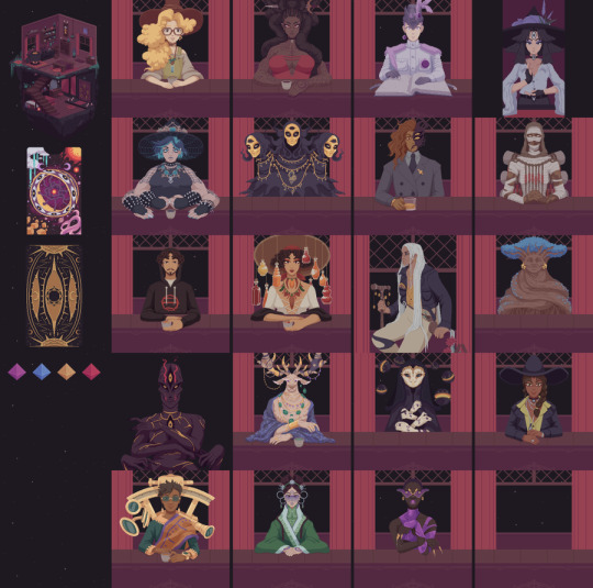
The Cosmic Wheel Sisterhood creates an immersive witch-filled world brought to life by two talented artists: Marta “Furude”, who handled the pixel art and animation, and Ivan Papiol, who worked on concept art.
Personally, what I love most about this game is its character design!
As the title suggests, this is a game full of witches. Before playing, I had a typical image in my mind — I expected to see lots of pretty, seductive witches. But once I started playing, I quickly realized the game wasn’t following that stereotype at all.
Instead, it presents a cast of witches with truly unique and memorable appearances. Each witch has a distinct “core power” or talent, and their visual design perfectly reflects that inner essence.
What’s even more interesting is that in this game’s world, witches aren’t just human — any being, whether it’s human, non-human, a plant, or even a gemstone, can undergo “Ascension” and become a witch.
So when you look at the characters, you’ll see that each one stands out with strong visual traits that go far beyond traditional gender or beauty standards.
I really love this kind of character design, where personality and concept take precedence over appearance. Every visual detail feels like a little hidden clue, making every conversation with a new character feel fresh and exciting, never dull.

Another art detail that I absolutely loved in The Cosmic Wheel Sisterhood is how each witch has their own unique way of flying!
It’s such a cute and charming touch!
In the image above, you can see that every character has a totally different flying style.
For example, the dark red witch is a warrior, so she flies on a broom that looks like a giant sword. The blonde witch next to her is an herbalist, so she floats on a bundle of grass.
And the blue witch is actually a spider who’s skilled at weaving — her “broom” is a magic carpet! I just love these small design details that strongly reinforce each character’s personality and backstory, even without using any dialogue.
Final thoughts
To me, the character design in The Cosmic Wheel Sisterhood really showed how powerful visual storytelling can be.
Even if the game doesn’t explicitly tell you each character’s full background, you can sense who they are just by looking at their clothing, flying style, or design elements. It made me realize that every small visual choice — even the way a character travels — can be more than just decoration.
It can actually act as a storytelling tool that deepens the player’s understanding and connection to the world.
This is something I really want to try in my own final project: using small, thoughtful design details to create moments of surprise and delight for the player, and to hint at the bigger stories hidden behind the visuals.


Another part of The Cosmic Wheel Sisterhood that I really enjoyed was the main interface design, which takes place inside a cozy two-story house.
Each area of the house has a specific function, and when the player controls the main character — for example, going to the bottom-right area on the first floor to create a new tarot card — the interface doesn’t fully switch to a new screen.
Instead, a card creation panel slides out from the right, while the left side still shows a bit of the main room, where you can see the protagonist sitting in front of the altar.
Personally, I really like this kind of UI design.
I think it feels much smoother and more immersive than a full screen transition — it keeps the player grounded in the space.
I also really love the game’s bold color palette!
The overall visual tone leans toward deep purples and reds, creating a mysterious, magical atmosphere.
But the tarot cards themselves are designed with much more vivid, saturated colors.
This contrast makes it super clear that the cards are the true heart of the game, both visually and mechanically.
The game’s tarot creation system is also one of my favorite features.
Players build cards using three simple components:
Background
Main figure (a character or central object)
Symbolic element (decorative or meaningful accessories)
Even though it’s just three parts, this system allows you to mix and match to create countless unique tarot cards.
I really love how the game breaks down each element — for example, when designing a character, you can choose things like their body, limbs, and head separately.
This gives players a lot more freedom to express themselves, rather than just placing a pre-made image on a card.
Choice-based gameplay

One of the most impressive mechanics in The Cosmic Wheel Sisterhood is how the tarot cards you create yourself actually affect the choices available in the story, which in turn influences how the narrative unfolds.
I’ve always loved choice-based games, but it's rare to see a game where you're not just making choices — you're actually creating the choices yourself.
That’s what makes the narrative interaction in this game feel so fresh and personal to me.
Through the cards you design, you’re able to pick interpretations that align with your own values and beliefs — and those interpretations can literally shift the world around you in the game.
While playing, I kept wondering:
Is tarot about revealing fate, or is it actually a tool to write and shape your own destiny?
That question really stuck with me, and it made the whole experience feel even more meaningful.
Conclusion
In short, The Cosmic Wheel Sisterhood isn’t a long game, but it delivers a rich atmosphere and a story that really sticks with you.
The alternate universe of witches it creates is full of interesting ideas, and it sparked a lot of inspiration for me — both in terms of worldbuilding and how interactive storytelling can be handled in creative ways.
Reference
Wikipedia (n.d.) The Cosmic Wheel Sisterhood. Available at: https://en.wikipedia.org/wiki/The_Cosmic_Wheel_Sisterhood (Accessed: 29 April 2025).
Rose, V. (2023) How The Cosmic Wheel Sisterhood uses player-crafted tarot cards to better connect them to the story. Available at: https://www.gamedeveloper.com/design/how-the-cosmic-wheel-sisterhood-uses-player-crafted-tarot-cards-to-better-connect-them-to-the-story (Accessed: 29 April 2025).
Papiol, I. (n.d.) Ivan Papiol Portfolio. Available at: https://www.artstation.com/ivanpapiol (Accessed: 29 April 2025).
Deconstructeam (n.d.) The Cosmic Wheel Sisterhood – Official Site. Available at: https://www.cosmicwheelsisterhood.com/ (Accessed: 29 April 2025).
Deconstructeam [@Deconstructeam] (2023) ‘Some words about the witches in The Cosmic Wheel Sisterhood’, X [formerly Twitter], 11 October. Available at: https://x.com/Deconstructeam/status/1711704828194304184 (Accessed: 29 April 2025).
Hopley, S. (2023) The Cosmic Wheel Sisterhood review. Available at: https://www.rockpapershotgun.com/cosmic-wheel-sisterhood-review (Accessed: 29 April 2025).
Deconstructeam (n.d.) Official Studio Website. Available at: https://www.deconstructeam.com/ (Accessed: 29 April 2025).
DevolverDigital (2023) The Cosmic Wheel Sisterhood - Launch Trailer [YouTube video]. Available at: https://www.youtube.com/watch?v=CY7XxPUnHIg (Accessed: 29 April 2025).
0 notes
Text
《Storyteller》 Reflection
youtube
Storyteller is a light-hearted and humorous puzzle game, and it actually gave me some inspiration for my final project!
So I wanted to write down a few of my thoughts about this game.
A bit of background
Storyteller was created by Daniel Benmergui, a game developer from Argentina. He has always been fascinated by interactive storytelling, which was one of the main reasons he started making this game. After over ten years of experimentation and refinement, the game was finally released in its full version in 2023.


A charming and straightforward visual style
Storyteller’s art was created by the late artist Jeremias Babini.
In the beginning, the game had a pixel art style, but because of that, it needed a lot of text to explain what was happening in each panel.
Daniel Benmergui felt this didn’t quite work — it was too complicated and heavy. So he invited Jeremias Babini to help redefine the game’s visual style with a more fun, childlike picture-book look.
Personally, I really like Storyteller's art style!
What I especially love is how the entire game, from the save menu, system UI, to the levels, is designed like a storybook. I thought that idea was so clever! It felt like the moment you opened a save file, you were already stepping into the story.
It really added to the sense of immersion during gameplay. I also really appreciated how, aside from the level titles and object names, players don’t need to read much text while playing.
The characters have exaggerated, expressive faces that help you instantly understand what’s going on in each panel, even without words! The game’s visual elements are all very minimal, and I love this clean, focused approach where only the most essential information is shown.
What’s even more impressive is how, despite the simple and cute look, every object and character is designed to clearly communicate its meaning through shape and expression.
It’s a perfect example of a game that truly "speaks through visuals."
Puzzle-like game mechanic

What really made me fall in love with Storyteller, and what inspired me the most, was its core puzzle mechanic, which works like building a story using visual pieces.
The core idea of Storyteller is that the player becomes a kind of story director. In each level, you’re given a title and a limited set of elements, and you have to piece together your own version of the story that matches the prompt.
What’s really fun is that in later levels, you start to realize that there’s more than one solution. As long as the story matches the title, you can even come up with something totally weird or hilarious, and it still works!
I really love how the game uses a comic strip-style layout, and it breaks the puzzle pieces into just two simple categories: “backgrounds” and “characters.”
But with just these two elements, the game manages to create countless puzzles and combinations. The drag-and-drop mechanic feels smooth and intuitive; you can quickly move characters, backgrounds, and even rearrange entire panels.
For me, the most interesting part is when you drop two characters you think have nothing to do with each other into the same panel, and suddenly they interact surprisingly and cleverly.
That moment of unexpected discovery is where this game really shines! It’s a perfect example of interactive storytelling done right.
Conclusion
To sum up, Storyteller is truly a game that makes you laugh and struggle at the same time. Sometimes you’ll crack up at the ridiculous stories you end up creating, and other times you’ll feel stuck trying to figure out a story that fits the title.
But this game really made me rethink how storytelling in games can work. How can we use the simplest elements to give players the freedom to create limitless stories?
That’s the biggest inspiration Storyteller gave me.
Reference
Wikipedia (n.d.) Storyteller (video game). Available at: https://en.wikipedia.org/wiki/Storyteller_(video_game) (Accessed: 29 April 2025).
Kennedy, T. (2023) Storyteller: Daniel Benmergui on the puzzle game's long road to release. Available at: https://gamerant.com/storyteller-interview-development-history/ (Accessed: 29 April 2025).
Annapurna Interactive (2023) Storyteller | Launch Trailer [YouTube video]. Available at: https://www.youtube.com/watch?v=8JnoE2rvzCg (Accessed: 29 April 2025).
0 notes
Text
《Gorogoa》 Reflection
youtube
Gorogoa was definitely one of the biggest inspirations behind my final project.
This game has such a unique atmosphere, both in its art and its gameplay. What impressed me the most is the beautiful hand-drawn pencil style and how the game delivers its entire experience without a single line of dialogue or any UI-based tutorial.
Playing it felt like interacting with a living, immersive picture book. You could simply enjoy solving puzzles, or take your time exploring the visual clues to slowly piece together the hidden story behind it all.
A Bit of Background
Gorogoa was created entirely by Jason Roberts, and when I found this out, I was genuinely amazed. It’s hard to believe that such a detailed and polished game was made by just one person!
Jason Roberts was originally a software engineer, and he spent over five years working on Gorogoa all by himself — learning and building it from the ground up.
Unique Visual Style
As for the art, Jason Roberts mentioned that he drew inspiration from many classic painters and artworks. His illustration style gives the game a delicate, almost surreal feel, one that makes every frame feel like a standalone piece of art.

One of Jason Roberts’ main inspirations was David Roberts, a 19th-century painter.
Jason especially admired how David Roberts was able to depict ancient ruins with precise detail, while still giving the overall image a soft, dreamlike quality.


Next is a picture book called The Mysteries of Harris Burdick by Chris Van Allsburg. The unique thing about this book is that each page features a single image and a short line of text, yet it gives readers endless room for imagination. Jason Roberts said that this book helped him realize that even just one image can, through the right kind of expression, lead the viewer to imagine a world far beyond the picture's edges.

Next is comic artist Chris Ware, whose work is known for its high-density and diagrammatic storytelling style, all within a single image. His approach inspired Jason Roberts to think about how to convey different timelines and narrative layers within a single frame, and how to guide the viewer to interpret the story being told through the image itself.

Many other old-school games and artists influenced Jason Roberts.
During the development process, he personally preferred detailed visual design, and he wanted to create scenes that players would be willing to spend time exploring and reading. That’s why he chose a sketch-like art style, using delicate pencil strokes to bring the visuals to life.
What I admire most — and want to learn from — in Gorogoa’s art style is how Jason Roberts controls visual information on screen.
Every frame in Gorogoa is beautifully illustrated with fine details, But Jason cleverly uses different levels of color saturation to guide the player’s focus and gameplay direction.
This way, the rich visuals never become distracting while solving puzzles. At the same time, if you slow down and take your time, you’ll notice tons of tiny, carefully designed details in each image.
I think that balance is what makes the art in Gorogoa truly brilliant. Of course, the stunning symbols and surreal environments throughout the game also left a strong impression on me.
And because of the game's unique mechanics, Jason Roberts shared that no image could be created in isolation — Each one had to be tested and reworked to see how it could visually connect and interact with others.
All I can say is that the visual design of Gorogoa is full of things worth studying and learning from!
Simple but Stunning Gameplay Mechanics

Gorogoa has just one core gameplay mechanic — the idea of deconstructing and reconstructing images.
Players interact with four frames on the screen by zooming in and out, separating or overlapping layers, and dragging image panels like puzzle pieces to connect elements across scenes.
Jason Roberts chose to use four simple, clean squares for the main layout because he believed that a limited space could actually create a more powerful contrast. By narrowing down what could happen inside each frame, players would feel a stronger sense of surprise when unexpected things did occur.
His goal was to give players the feeling of watching a magic trick, where the solutions often defy logic, and players experience the illusion of something impossible happening within a very controlled space.
I personally loved this core mechanic while playing Gorogoa! The controls are extremely simple — there's basically no need for a tutorial — but the experience is deeply engaging. As I played, I was constantly curious about where each image would take me next.
It started as a puzzle game, but over time, it began to feel more like I was watching a magic performance. Each image connects so cleverly with others, and there’s no traditional sense of time or logic — Yet within the four limited frames, you’re somehow traveling through moments, spaces, and meanings.
Even though the game only has one main mechanic, it truly pushes that mechanic to its fullest potential. I really feel like Jason Roberts achieved what he set out to do — He made me feel like there’s a whole imaginative world beyond the borders of each frame.
Conclusion
In short, Gorogoa's visual design and gameplay experience are both incredibly unique. I felt like I was constantly going through a cycle of observe → understand → be amazed → dive deeper — over and over again, haha!
And because the game has no dialogue at all, there’s so much room for imagination. This game really made me think more deeply about the limits and possibilities of visual storytelling in games and it helped me understand what it truly means to "tell a story through images."
Reference
Roberts, J. (2017) Gorogoa – A Short Film by Jason Roberts [YouTube video]. Available at: https://www.youtube.com/watch?v=gRbFZm8ZvcM (Accessed: 29 April 2025).
Wikipedia (n.d.) Gorogoa. Available at: https://en.wikipedia.org/wiki/Gorogoa (Accessed: 29 April 2025).
Tutt'Art (2016) David Roberts – Orientalist Painter. Available at: https://www.tuttartpitturasculturapoesiamusica.com/2016/03/David-Roberts.html (Accessed: 29 April 2025).
Unknown (n.d.) The Mysteries of Harris Burdick – PDF version. Available at: https://mrsgraveswebsite.weebly.com/uploads/1/2/6/8/12686140/the_mysteries_of_harris_burdick.pdf (Accessed: 29 April 2025).
The New York Times (2012) Image from “The Mysteries of Harris Burdick” Review. Available at: https://static01.nyt.com/images/2012/10/21/books/review/1021-wolk01/1021-wolk01-superJumbo-v2.jpg (Accessed: 29 April 2025).
Steam Community (n.d.) Gorogoa Screenshot. Available at: https://images.steamusercontent.com/ugc/992366716345202682/9F063161D82434889136C1338E898C2A0BC6440C/ (Accessed: 29 April 2025).
Unknown (n.d.) Image of Book Cover (possibly Harris Burdick). Available at: https://encrypted-tbn0.gstatic.com/shopping?q=tbn:ANd9GcRktv_IFHc9OocsPlvTmSp7E_UQ49aSIOF5MyMpBb-xDelzVgvj9XZJLng4KLNHocf7v-nXSxSY1J6dzdEp2MQhg-lOn8_bc16-A06YQE4 (Accessed: 29 April 2025).
0 notes
Text
Void-Live Brief-5

When I started drawing the scene concept art, I realized that my understanding of perspective wasn’t very strong. So for this part, I decided to directly use 3D tools for support.
Even though the final perspective still had some problems, using 3D really helped me a lot with drawing the buildings! After that, I mostly used this method to help create my scene and build concept sketches.
During the process, because I'm not very good at coloring and lighting, I really appreciated the advice my teacher gave me here!
The suggestion was to pick a building photo with colors I liked and try applying the same color scheme directly to my own building designs. Also, by locking in a clear light direction and adding shadows based on it, I could quickly make the buildings look much more three-dimensional!

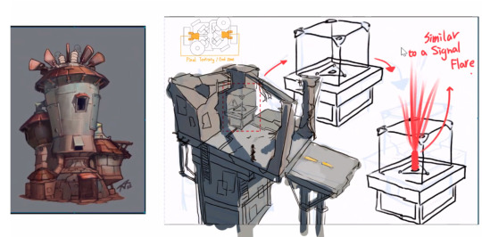
This area is the player's starting zone!
My idea and inspiration mainly came from how most shooter games give players a brief moment at the beginning to showcase their character skins. So I wanted to design a tall tower where players could choose their weapons and showcase their gear all in one place.
The lower part of the tower would be where players pick their weapons, healing items, and other equipment. The upper part would have a full-body scanning device. When a player steps inside, their full-body projection appears on a circular platform at the top of the tower.


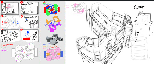
Here are the exterior designs for the different buildings across the map!

Here is the object design!
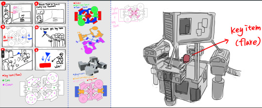
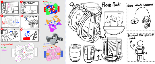
I wanted to create a special backpack for carrying the key item. Since the core gameplay of my game involves two teams fighting to steal the key item in the center of the map, I thought players would need a tool to store and carry the key item.
So, I looked at the design of a flare gun and combined it with a backpack to come up with this idea for the special key item backpack!
0 notes
Text
Void-Live Brief-4

After finalizing the basic concept in writing, I started sketching out some ideas for the map design. At first, I just drew a few shapes and layouts that I personally liked. But no matter what, I made sure to always stick to the most important rules: the three-lane structure and symmetrical design.


Next, I picked one map layout that I felt had a good overall look. I started applying the key points I had studied from other FPS map designs, thinking carefully about the purpose of each area, where to place cover, and what the main attack routes for players would be.

Since one of the key features of this map is the difference in terrain height, I decided to complete a more detailed version of the map sketch first. After that, I imported it into Blender to create a simple base model for future development.


At first, I built a flat version of the map in Blender based on my 2D layout. Then, I started selecting different areas and extruding them to create the 3D structure.
Unexpectedly, I had to adjust it many times! Once I placed everything into 3D, I realized that some areas were too cramped, which could block player movement during attacks. I also noticed some height issues that weren’t obvious in the 2D sketch. Because of these problems, I went through several versions before finally finalizing the 3D map model.

Here is the final version, which includes a simple game flowchart and a detailed map breakdown. To make the later stage of scene concept design easier, I first roughly divided the map into indoor, outdoor, and semi-indoor/outdoor areas.
Then, I drew the different elevation levels and the placement of covers. Finally, I labeled each area clearly to show the different sections of the map!
0 notes
Text
Void-Live Brief-3
Project Idea Notes
Initial Inspiration
My first inspiration mainly came from Splatoon. I wanted to create a first-person shooter (FPS) concept that feels more like a party-style, competitive game.
Game Genre
First-person tactical shooter
Game Mechanics — Reference Games
Ready or Not
Rainbow Six Siege
Valorant
Ultimate Chicken Horse
Make Way
Splatoon
League of Legends (LoL)
Core Gameplay Mechanics
Victory Condition: There will be a victory item (such as a crown, flag, or key) placed in the center of the map. Players need to grab this item and carry it into the enemy’s territory to win. (While fighting, teams can steal the victory item from each other.)
Setup Phase: Before the match starts, both teams can place obstacles, traps, and small enemies on the enemy's side of the map. After both sides finish setting up, players can use drones within a limited time to scout their own side of the field, spot the enemy's setups, and plan their attack strategies.
Visual Style Keywords
Street vibes
Ruined/futuristic technology
Homemade weapons
Gangs
Underground battles
Level Design (Map Design)
Main approach: Symmetrical three-lane design
Key focus points:
Firefight hotspots (doorways, staircases, middle lane, etc.)
Choke points
Cover placement and terrain design
Weapons, Armor, and Recon Tools Design
All gear will feel homemade, using scrap and salvaged materials.
Players will mainly have:
One primary weapon
One secondary weapon
Key defensive gear
One reconnaissance tool
Obstacles, Traps, and Small Enemy Design
Obstacles, traps, and small enemies will include a mix of living creatures and non-living mechanical objects.
0 notes
Text
Void-Live Brief-2


After actually playing Ready or Not, I realized that one of the most important parts of this assignment is the map and level design. So I thought it would be a good idea to study how modern first-person shooter games design their maps. I decided to look into three games: Splatoon, VALORANT, and CS (Counter-Strike).

FPS Map Design Study
After carefully observing and analyzing the maps from these three games, and discussing my findings with ChatGPT, I put together a simple summary of key points to keep in mind when designing FPS maps.
1. Map Route Design
Most competitive FPS games use a "three-lane structure," basically dividing the map into three main paths:
Middle lane: The area where players are most likely to encounter each other. It’s usually open but very risky.
Side lanes: More hidden and indirect, perfect for players who want to sneak around and surprise the enemy.
Defense lane: A safer route that lets players quickly retreat and defend when their territory gets invaded.
Each lane has its own features, allowing players to use different strategies.
2. Map Balance
A good map must be completely neutral, meaning it shouldn't give either team an advantage.
Both sides should reach key areas at about the same time.
It's important to balance the number of cover objects along each path.
Players using both close-range and long-range weapons should have areas where they can perform well.
3. Cover and Terrain Types
In shooting games, there are different types of cover:
High cover: Completely blocks the player’s sight. Used for hiding and ambushes.
Low cover: Partially blocks sight. Players can crouch, shoot, or snipe from it.
Dynamic cover: Can be destroyed or moved by players during gameplay.
When placing cover:
Make sure cover is distributed symmetrically across the map for balance.
Keep the distance between covers within 5 to 10 meters to allow safe movement without being too exposed.
4. Predicting Key Areas
By looking closely at maps, you can spot that level designers often plan:
Hotspots for firefights (like doorways, staircases, and middle lanes).
Safe zones for players to recover or reposition.
Some maps even intentionally design narrow paths to force players into close-quarters battles, making the gameplay feel more intense.
Conclusion
In conclusion, I think good FPS map design needs to focus on balance, variety, and interactivity. I hope to apply these ideas and research into my own map design for this assignment!
Reference
YouTube (n.d.) Ready or Not - Gameplay Footage. Available at: https://www.youtube.com/watch?v=ktMai7cw794 (Accessed: 29 April 2025).
Variety (2024) Riot Games Launches 'Best of Valorant' Album With Champions Finale Music Lineup. Variety. Available at: https://variety.com/2024/gaming/news/riot-games-best-of-valorant-album-champions-finale-music-lineup-1236108969/ (Accessed: 29 April 2025).
Google Drive (n.d.) FPS Map References Folder. Available at: https://drive.google.com/drive/folders/1TJQSn6FdiXZyr3daQco7QuhrC1lSEhVo (Accessed: 29 April 2025).
Bilibili Wiki (n.d.) Splatoon 3 - Goldeye Bream Art Museum. Available at: https://wiki.biligame.com/spld3/金眼鲷美术馆 (Accessed: 29 April 2025).
IGN (n.d.) Valorant - Bind Map Callouts. IGN. Available at: https://www.ign.com/wikis/valorant/Bind_Callouts (Accessed: 29 April 2025).
巴哈姆特論壇 (n.d.) Counter-Strike 地圖討論. 巴哈姆特. Available at: https://forum.gamer.com.tw/G2.php?bsn=1054&sn=131 (Accessed: 29 April 2025).
0 notes
Text
Void-Live Brief-1
youtube
Introduction
After finishing the interdisciplinary group project, the second assignment was to create a concept for a first-person shooter game. Since the teacher mentioned that we should base it on Ready or Not, a first-person tactical shooter, I decided that before I started brainstorming ideas, I needed to play it myself.
Before this, I had almost no experience with tactical FPS games, so I felt that trying it firsthand was really important before jumping into concept work.
That's why I want to quickly document my gameplay experience here, along with some concept art references I found from Ready or Not.
A Little Background about Ready or Not
Ready or Not is developed by a studio called Void Interactive.
In interviews, they shared that their main motivation for creating the game was:
"We wanted to make a game about the mental pressure and tactical decision-making of modern law enforcement — not just another shooting simulator."
Because of this idea, Ready or Not is very different from most FPS games on the market today.
Instead of focusing on fast and satisfying shooting action, the game is built around slow-paced observation and strategy. There’s no "easy shooting fun" feeling here — players really experience what it’s like to be part of a SWAT operation, needing to think carefully and plan ahead.
This focus on realism and tactical decision-making is what makes Ready or Not stand out the most!
My Gameplay Experience

When I first played Ready or Not, it was also my very first time trying a realistic, tactical first-person shooter. I was really impressed by how detailed and realistic everything felt — from the guns and bombs to the design of the environments.
During gameplay, there were a lot of things I really liked, and also a few things I wasn’t quite used to yet. So I decided to organize my thoughts and record them here.

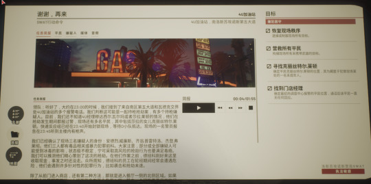
During the tutorial level, one thing I really liked was how the game taught players how to open doors through the UI.
Since Ready or Not doesn’t have Chinese voice acting, and trying to read the NPC tutorial subtitles while performing actions was actually quite challenging for me, I struggled a bit during the basic shooting tutorials.
That’s why, when it came to the "how to open doors" section, the experience stood out so much for me! As you can see in the screenshot, there’s a metal door with simple red markings showing exactly where and how you can interact with it.
Thanks to this, I was able to pick up the door-opening mechanics very quickly, without even needing to rely on the tutorial subtitles!
Personally, I think integrating tutorial UI directly into the game environment like this is a really player-friendly approach and can greatly enhance the game experience. I also plan to incorporate this idea into my future concepts, or even into my own final project.

Another thing I found a bit confusing and wasn’t quite used to was the squad system in the main missions.
In Ready or Not, you play as the leader of a tactical squad, and your team is divided into two groups: Blue Team and Red Team. At first, I found it really hard to tell which two members were on the Blue Team and which two were on the Red Team. It was only later that I realized you could tell by looking at the color of the glow sticks on their backs.
I feel that this is probably one of the small downsides of super-realistic games, because they focus so much on detailed realism that it can slightly impact the gameplay experience.
That said, I wouldn’t exactly call it a flaw — it feels more like a double-edged sword. Since I’m a complete beginner, it felt confusing to me. Still, I think Ready or Not is actually designed more for players who already have some experience or knowledge of tactical FPS games.
For players familiar with the genre, this kind of subtle detail is a great design choice. This also made me start thinking about the concept game I want to design — specifically, what kind of players I want to target and create the game for.

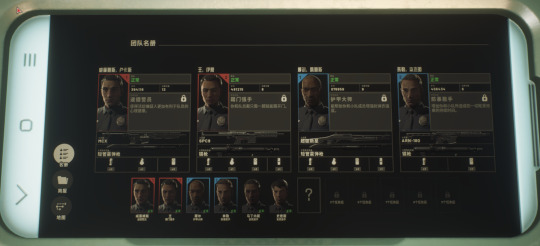
Another thing I personally really liked, but also found a bit hard to get used to, was the map and information design!
I think the way Ready or Not handles information is really amazing. Since the game focuses heavily on realism, players carry a small tablet that they can use at any time to check mission details. Instead of showing team information in a separate UI window, everything is placed inside the tablet, which I feel greatly improves the sense of immersion.
Also, when it comes to getting mission info, Ready or Not doesn’t just hand everything to you directly. All the details you need are wrapped inside things like online news articles, citizen reports, or social media posts — stuff you would actually see in real life — instead of giving players a full, clear mission briefing right away.
Players have to carefully read through all these pieces of information or listen to recordings in order to plan their strategy before starting the mission. I think this approach really boosted my feeling of immersion while playing!

Finally, regarding the game concept side of things — this is a piece of level design artwork created by the artist Daniel Quinn for Ready or Not.
I really love how clearly the multi-layered structure of the level is presented in this design! It makes understanding the layout so much easier at a glance. I definitely hope to study this approach and apply it to my own future concept designs.
Referencing
Wikipedia (n.d.) Ready or Not (video game). Available at: https://en.wikipedia.org/wiki/Ready_or_Not_(video_game) (Accessed: 29 April 2025).
Quinn, D. (n.d.) SWAT Level Design for Ready or Not. ArtStation. Available at: https://www.artstation.com/artwork/ArlO2e (Accessed: 29 April 2025).
Quinn, D. (n.d.) Ready or Not: Nightclub Level Design. ArtStation. Available at: https://www.artstation.com/artwork/elPorY (Accessed: 29 April 2025).
Void Interactive (n.d.) Official Website. Available at: https://voidinteractive.net/ (Accessed: 29 April 2025).
80 Level (2022) Ready or Not Devs on the Game’s Mechanics, NPC AI, Early Access Experience. Available at: https://80.lv/articles/ready-or-not-devs-on-the-game-s-mechanics-npc-ai-early-access-experience/ (Accessed: 29 April 2025).
0 notes
Text
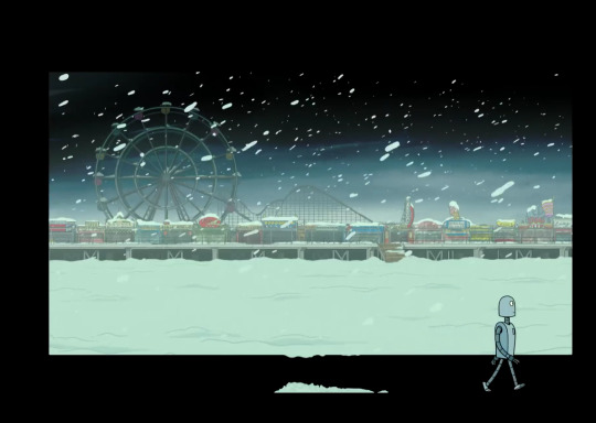
Interdisciplinary Project Record - animation - 3
During the production process, I still felt a bit nervous and worried that I might not be helpful to the team. So I took the initiative to offer to try making some 2D animal animations.
After discussing with my teammates, I was assigned to create the animations for the dragon’s eye, a bat, and a little travel fairy.
To be honest, I didn’t have a very clear idea of how 2D animation production actually worked. At most, I just knew the basic idea that 2D animation is usually drawn frame by frame.
So at first, after looking at different videos and reference images, I started by sketching a rough version of a simple dragon blinking animation.
(Quick side note: during this process, I learned that a dragon’s eye movement is actually very similar to that of reptiles or crocodiles! I thought that was a really fun little piece of trivia, haha.)
After I finished that version, I felt like something still looked a bit off, but I couldn’t quite figure out what it was.
Later, after doing some research and watching a few videos, I learned that there are actually 12 basic principles of 2D animation. I also found out that the timing — the spacing between each frame — can really affect how smooth and lively the animation feels overall.
youtube
So, I made a rough attempt to adjust the dragon eye animation I had sketched earlier. Basically, I just made the "eye open" part stay on screen a bit longer.
At the time, I thought it was fine because it was just a rough sketch — I figured I could leave the detailed adjustments for when I did the final coloring.
In traditional static drawing, this idea usually works. But back then, I didn’t realize how much trouble this mindset would actually cause me later on.

Before moving on to coloring and clean line work, I made a more detailed rough version of the animation.
This time, I didn’t just extend the open-eye frame — I also adjusted the timing between the opening and closing frames to make the dragon’s blinking motion look more lively and natural.
I was pretty happy with how it looked, so I started coloring and doing the clean line work. But that’s when the real struggle began.

While I was halfway through coloring and doing the line work, I realized that during my earlier rough sketch phase, I had only focused on the blinking motion — opening and closing the eye — without thinking about how the surrounding skin of the dragon would also move along with it.
For the animation to feel more natural and alive, the skin around the eye should shift slightly too, rather than just staying like a static background.
At first, I happily tried adjusting the size of the dragon’s skin midway through the frames. But then I realized that in 2D animation, randomly tweaking even a single frame can have a huge impact on the overall smoothness of the animation.
This is exactly what I meant earlier — I shouldn’t have assumed I could leave detailed adjustments until after coloring and line work. In reality, for 2D animation, it’s best to lock down all the movement and dynamics during the rough sketch stage.
Once you start doing clean line work and coloring, making changes to the motion becomes really troublesome and time-consuming.
At the time, I had to slowly fix and adjust the scaling of the dragon’s skin frame by frame while doing the line work and coloring, to make the motion look more natural.
It was a tough lesson, but honestly, a really valuable one. It made me realize how important it is to finalize the movement properly during the rough sketch phase when working on animation.

After finishing the dragon eye animation and learning so much from that experience, I moved on to creating the animation of bats flying out of a cave.
This was also my first time animating multiple objects at once.
The first challenge I ran into was understanding the structure of bats and how to properly animate their flying motion.
After doing a lot of research, I found a website that was super helpful — it gave me a much clearer idea of how bats move when they fly and helped me understand their overall body structure better.
Once I had a rough understanding of a bat’s motion and shape, my second challenge came up.
I wanted to show the bats flying from the distance toward the audience.
Getting the flapping motion right when the bats were still far away took a lot of trial and error.
In the end, I discovered a really simple trick: by flipping the bat's frames horizontally back and forth, I could easily create the feeling of the wings flapping when the bat was still small and far away, haha.
Of course, this trick only worked while the bats were far off in the distance.
Once the bats got closer, the real challenge was making sure I animated the wing flapping properly, frame by frame.
I had to clearly define the order of the wing movements to create the feeling that the bats were flying toward the viewer — otherwise, it would just look like they were floating forward instead.
In the end, when I finished the full animation, I was actually really happy with how it turned out, haha.
But during the coloring and line work process, I gained a whole new level of respect for all 2D animation artists.
Coloring in 2D animation is so detailed and requires so much logic and precision — even a small mistake in color or lighting on just one frame can have a huge impact when the animation plays!

Finally, I started working on the animation of the little fairy appearing.
During this process, I really came to appreciate how useful motion guide lines are in animation.
At first, I wanted to show two little light balls coming together and merging into the fairy. But trying to draw the movement of two light balls by hand was actually really difficult — it was super easy to mess up their positions and hard to maintain the animation's 12 principles at the same time.
Using motion guide lines made a huge difference. They helped me quickly sketch the movement paths and made it much easier to spot and fix anything that looked off. (And honestly, watching the light balls follow the guide lines was strangely satisfying, haha.)
After the fairy appears, the part I spent the most time adjusting was the moment when the fairy blinks and its body squashes down slightly.
During the rough sketch phase, that movement felt really stiff and awkward, and I wasn’t sure how to fix it at first.
Later, by adjusting how much the fairy's body deformed and tweaking the timing between frames, I was able to more or less get the playful feeling I was aiming for — it made me laugh when I finally saw it working!
But once again, during the clean-up and coloring phase, I found myself feeling even more respect for all animation artists. You not only have to clearly understand the relationship between each frame, but also have to be super familiar with how light, shadow, and object forms work together.
It’s honestly such a challenging craft!

Conclusion
Although the production time for this project wasn’t very long, I feel like I managed to try out a lot of creative approaches and types of work that I had never attempted before.
I also unexpectedly realized that I really enjoy seeing my own drawings come to life through animation!
At the same time, I discovered how fun photobashing can be as well!
1 note
·
View note
Text
Interdisciplinary Project Record - Moodboard - 2
Reflection on My First Experience with Photobashing and AI
After facing setbacks with my first photobash attempt, I realized my biggest problem was that I didn’t take the time to calmly figure out what kind of image I actually wanted to create. Instead, I rushed into combining photos without a clear plan.
Another mistake I made was not paying attention to the original lighting and perspective of the photos I was using. Because I didn’t properly adjust these elements during the process, when I combined different images together, they ended up looking very mismatched and unrealistic.
So, for my second attempt, I decided to slow down and rebuild everything from the ground up with a calmer mindset.
Even though the final result still wasn’t perfect, it was definitely a lot more successful than the first one.

Working Under Tight Deadlines
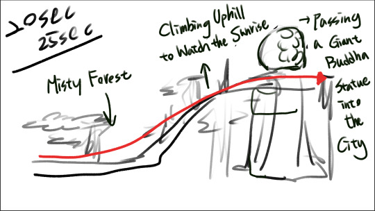
Looking back now, there are still so many areas where I could have done much better. But because the deadline was so tight, I had to move on quickly and start working on the second and third concept images.
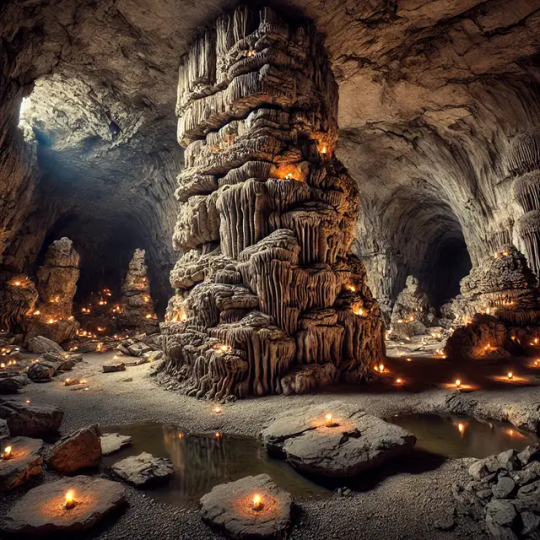
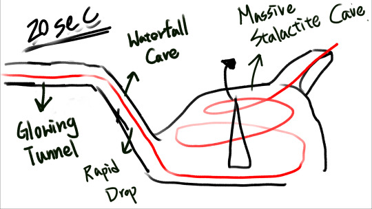
What made the second and third images different was that our group's theme was to create a roller coaster ride inside a cave. However, it was really hard to find cave photo references online that matched the angle and feeling I had in mind.
So I thought, "Maybe I can try generating some images with AI that are closer to what I’m imagining, and then photobash them together?"
With that idea in mind, when I started making the second cave roller coaster concept, I first used ChatGPT to generate a few reference images.


(All three images above were generated using ChatGPT.)
Using AI to Support the Process
After getting those images, I started trying out different ways to combine them. However, because the time was really tight, the results didn’t turn out as good as the first image. Now that I look back, there are definitely still areas that could be improved.
That being said, during the process, I really felt that using AI-generated images for photobashing was actually a pretty good emergency solution when you're short on time.
To be honest, it's really hard to use AI images directly because they often have a lot of mistakes. Personally, instead of spending time learning how to perfectly prompt AI for better images, I would rather spend that time painting and improving my own work.
But even so, AI images did save me a lot of time that I would have otherwise spent searching online for the right reference photos.


Final Rush and Reflections
For the third concept image, I also used AI to generate the pictures I needed first, and then photobashed them together to create the feeling I wanted.
By the time I finished drawing the storyboard and creating these three visual concepts using photobashing and AI, it was already morning — time to go to class, haha.


(All three images above were generated using ChatGPT.)


However, once I started typing prompts and saw the results, I quickly realized that AI still has a long way to go before it can truly replace concept artists. AI doesn't have an aesthetic sense — it's just a tool. To get an AI-generated image that actually matches what you have in mind isn't something you can achieve with just a few simple prompts. You still have to spend a lot of time experimenting, adjusting, and tweaking your inputs to get a somewhat decent result.
When I realized that, I thought, "I might as well spend that time painting — it would make me much happier!"
That's why I’m really glad I gave photobashing a try. Photobashing feels quite different from traditional drawing, and I found it super interesting! It felt almost like making a scrapbook — cutting and pasting different elements from various photos together until I could create an image that matched the vision in my head.
But of course, this technique also really tests your experience and sense of aesthetics. Since you're combining multiple photos at once — each with different perspectives, lighting, and textures — blending them together into a clear, beautiful final image is definitely a major challenge!
I’m excited to keep practicing and hopefully incorporate photobashing into my regular art workflow in the future!
0 notes
Text
Interdisciplinary Project Record - Moodboard - 1
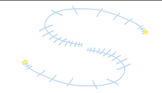
Interdisciplinary Project – Reflection
Since we just finished the Interdisciplinary Project, I wanted to take a moment to reflect on what I did during this assignment, what I learned, and what areas I found myself lacking in.
What made this project different was that it was a group assignment where we had to work with classmates from different specializations. In our team, we had one student from 2D animation, two from game art, one from digital illustration, and me from concept art. The goal of this project was to create an immersive dome film. Honestly, throughout the process, I was constantly worried that I wouldn’t be able to contribute anything meaningful. But in the end, I actually learned a lot and had time to reflect on many things about myself.

Mood Board and Early Challenges
First, I want to talk about making the mood board. At the beginning of the project, we had to discuss and agree on what kind of immersive film we wanted to create, and then present that idea to the teachers during class.
One of the first challenges I faced was communication. As the concept artist in the team, it was naturally my role to make the storyboard and visual concepts for the film. But because my English still isn’t very strong, I found it hard to keep up during our group discussions.
Thankfully, most of our communication was done online, so I had help from live subtitles. I also used an app called Otter to record the meetings and turn the audio into transcripts. After going through the transcripts myself, I would send them to ChatGPT to help organize the ideas. That way, I could clearly understand what the team had discussed and use that shared direction to draw the storyboard that the team needed.


Time Pressure and Trying Photobash
The second big challenge I faced was the tight deadline. We only had three weeks for this project, so the whole production schedule was really rushed.
After our group discussions in the afternoon, I had to organize all the ideas we talked about and then immediately create the mood board before the next class. This mood board included both the storyboard and the visual concepts for the film.
Honestly, I was really panicking at that time because I had never been in a situation where I needed to produce so much in such a short amount of time. After I quickly finished a rough storyboard, I started thinking, "Maybe this is a good chance for me to try using photobashing?"
So, I started working on my very first photobash. Unfortunately, the result at the beginning wasn’t great.
I think there were two main reasons for that. First, I was feeling really anxious and rushed at the time, so I couldn’t fully focus on learning how to use photobashing to create the image I had in my head. Second, I wasn’t familiar with photobashing techniques yet, so it was a huge challenge for me to find the right photos, combine them properly, and then blend in my own painting on top.
Trying to make the final image look good, clear, and believable at the same time was a lot harder than I expected.

0 notes