
Statistics
We looked inside some of the posts by purvianpat-asmediastudies and here's what we found interesting.
Average Info
Notes Per Post
0
Likes Per Post
0
Reblog Per Post
0
Reply Per Post
0
Time Between Posts
9 hours
Number of Posts By Type
Text
17
Last Seen Tumblr Blogs


Fun Fact
Tumblr was the first site to host the blog for President Barack Obama in 2011.
Text
CCR QUESTION 4
How did you integrate technologies -software, hardware and online-in this project?
Answer:
To answer this question I did a "What's In My Bag?" style video. Except here, all the items are actually the essential technologies I used to create my magazine.
youtube
0 notes
Text
CCR QUESTION 3
How did your production skills develop throughout this project?
Answer:
I shared my journey and progress through a storytime. Each "section" is kind of like a chapter but also has a heading and subheading like typical magazine articles would.
youtube
0 notes
Text
CCR QUESTION 2
How does your product engage with audiences, and how would it be distributed as a real media text?
Answer:
I answered this question in the form of an instagram reel. This is a short yet engaging way of communicating with the audience.
youtube
0 notes
Text
CCR QUESTION 1
How does your product use or challenge conventions, and how does it represent social groups or issues?
Answer:
I answered this question through an interview-style podcast episode.
youtube
0 notes
Text
Week 38- Final Project Submission
Here's my final magazine:


Thankyou for sticking with me through my journey of designing this magazine! I had so much fun making it and learnt so much from it!
0 notes
Text
Week 37- A full record of my work
While working on this project I learnt a lot of new things and put in a lot of effort into it. Here's everything I did:
I learned about various media conventions and their applications
I started analysing and consuming more print media
I learnt how to work on Canva and a little bit of Picsart
I learnt how to write a feature article
I learnt how to manage a social media page
I learnt and practiced photography
I learnt about creating visual harmony in design
I ended up with 3 magazines (2 mock magazines, 1 final magazine)


This project has taught me alot. It has enhanced my creative thinking skills and made me more confident with designing things. I'm very happy with my final outcomes too! Thankyou for reading through my process of creating!
0 notes
Text
Week 36- Final Project Post-Production
Distribution
PHYSICAL COPIES
I took a proper print of magazine to see how it would look physically. This is how it would look in store, on a shelf among other magazines.
DIGITAL COPIES
To get an idea of how the magazine would look on a website I created a draft of it on issuu.com . This is how it would look:
Both the physical and digital versions came out really well! This concludes my post-production stage as well. With this, my magazine is now complete. Thankyou for sticking with me through the journey of designing DHVNI!
0 notes
Text
Week 35- Final Project Post-Production
Corrections
After completing my first draft of the magazine, I showed it to my teacher who made some corrections. Turns out, I missed out on some minute elements. I implemented all of his corrections and refined my draft.
Here are a few of the corrections I was asked to make to my article page-
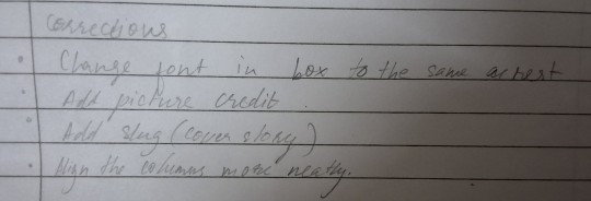
Another issue that kept popping up was the quality. When I converted my draft magazine into a pdf it was kind of blurry and pixelated. I fixed this problem by changing the dpi (dots per inch) to 300dpi on an online dpi convertor. This made my pdf nice and crisp and solved the problem.
Audience Feedback
I showed my magazine to some people who fit the exact target audience I defined during the planning stage. I got their thoughts and advice on the magazine.
About 85% people said they found the cover page attractive, making them want to flip through it.
About 75% said they would buy the magazine if they saw it online or in store.
90% of the people found the feature article engaging and relatable.
60% liked my contents page design. Some questioned why it wasn't in the conventional grid structure. However, majority thought the use of typography was brave.
80% said the visual identity was strong and represented indie music culture well.
This comes to an average of 78% positive feedback which beats the 75% I had anticipated.
I also received soome bits of advice which I also tried to implement in my design. Here they are-
Making the text on the contents page a bit darker so that it contrasts even more and pops out.
The font size on the article page could be a bit larger if possible.
A QR code or link to the featured artists discograph would increase interactivity.
I tried to use this advice to the best of my ability. Hypothetically, if Eleanor Raj was an actual artist I would add a link to her Spotify as well.
In conclusion, I got an overall positive feedback frommy target audience. This means my design choices translated well to others.
Making the slight corrections I needed to transformed my draft magazine into a final magazine.
0 notes
Text
Week 34- Final Project
Creating a Social Media and Spotify page
Now that I had my first draft of the magazine ready, I decided to create an Instagram and a Spotify account for DHVNI. This would allow my magazine to be more connected to its audience. This would help advertise and spread hype around DHVNI. It would help build a community around DHVNI.
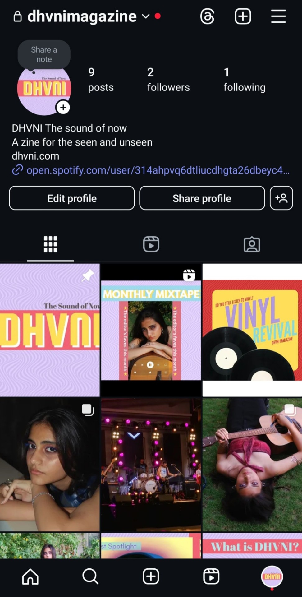
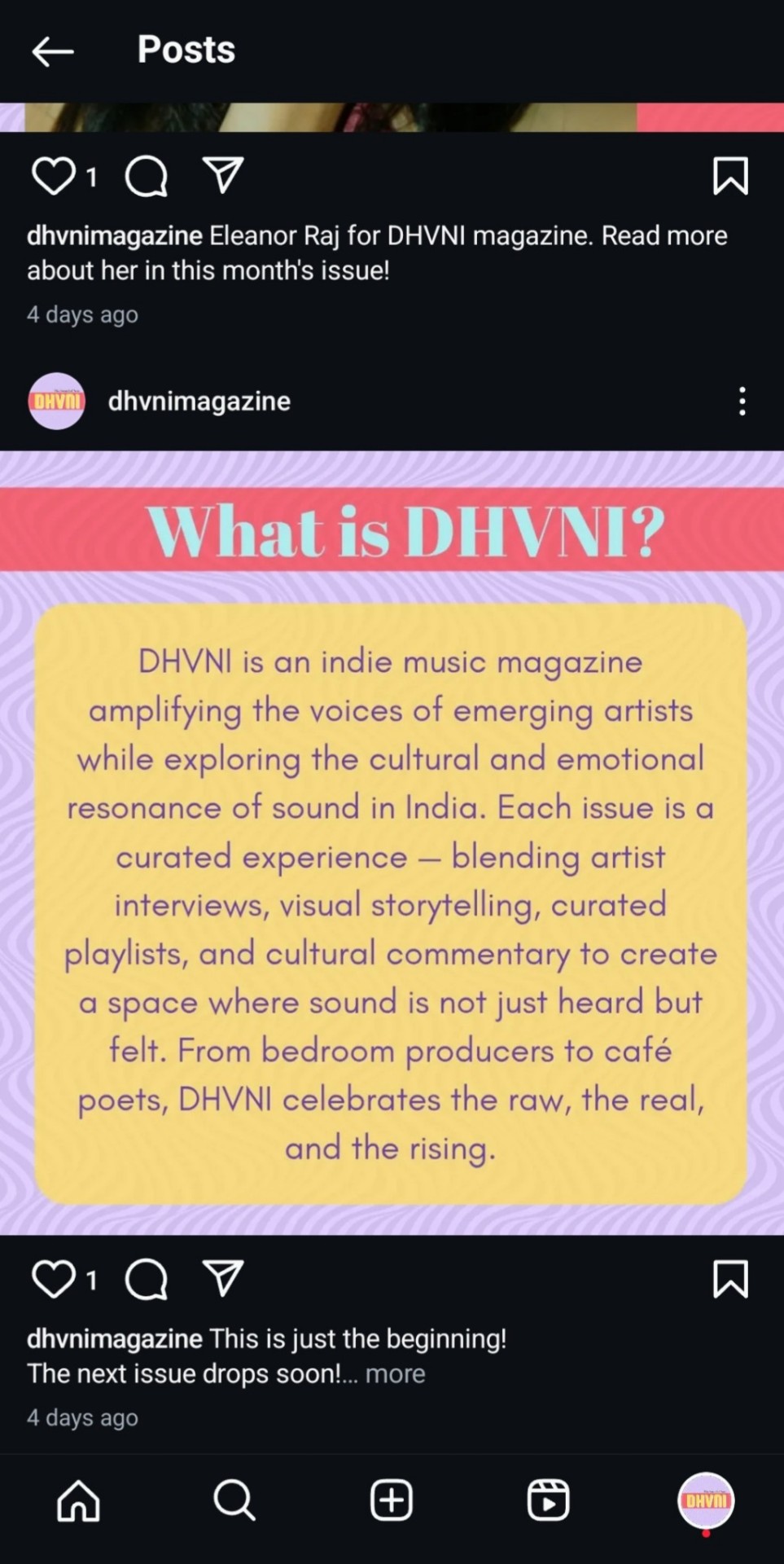
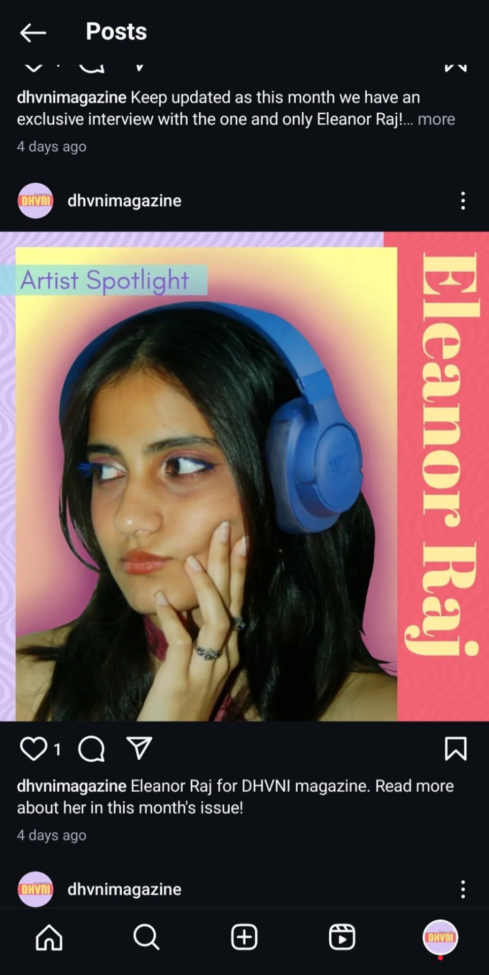
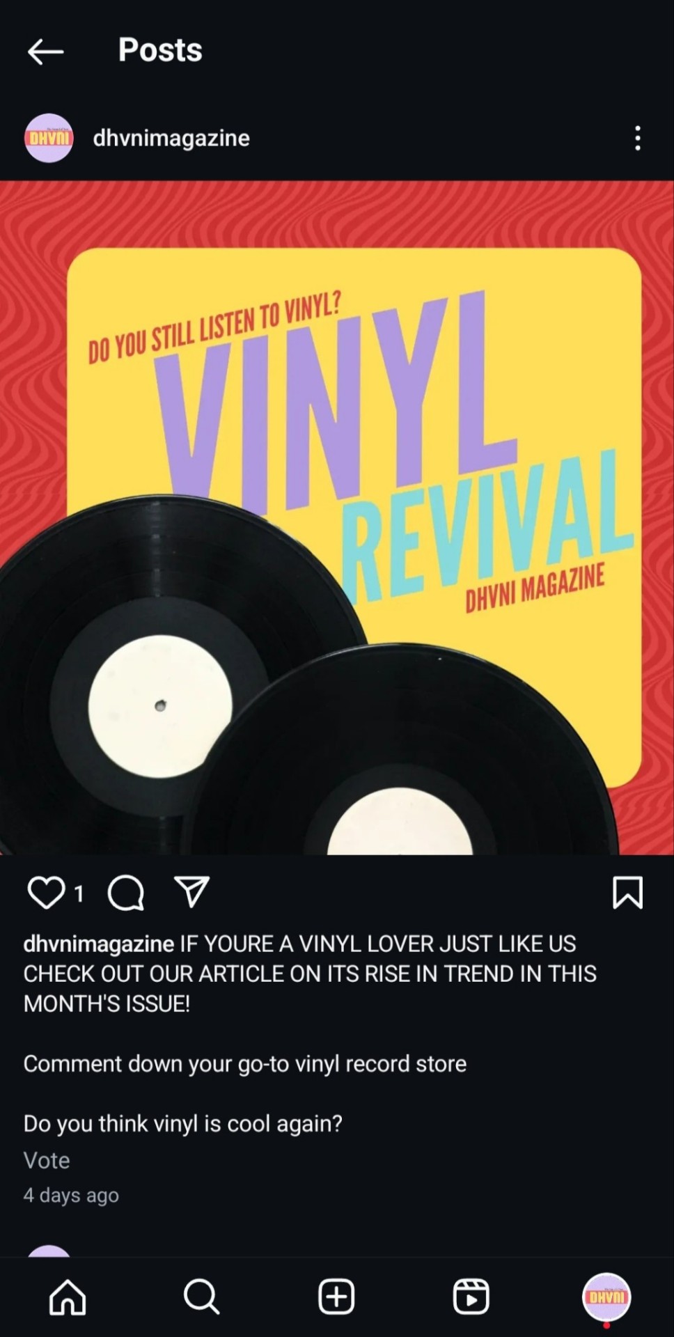
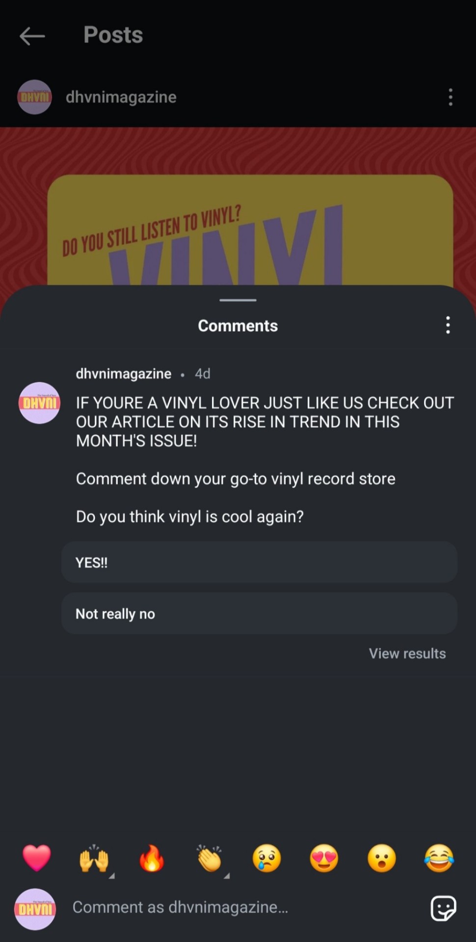
I made posts that introduce the magazine and featured artists, tease the contents of each issue, and interact with the audience through polls and comments. I created multiple posts that introduce Eleanor Raj. Here's a scroll through the page-
I also created a Spotify account for DHVNI, where you can find all the monthly curated playlists. I did this so that it connects the audiences to the brand, making it clear that the magazine is all about music.
Here's how the account looks-
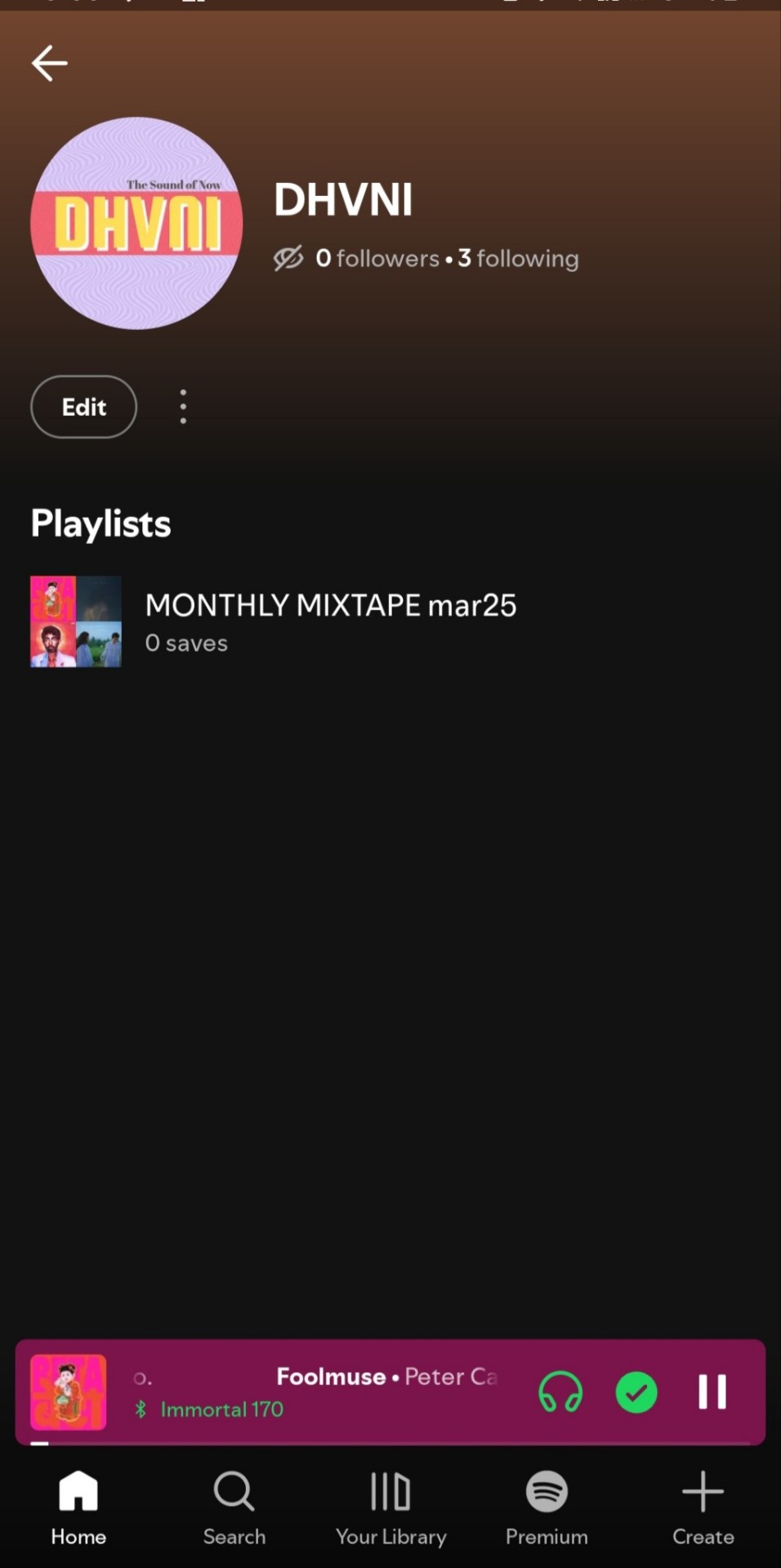
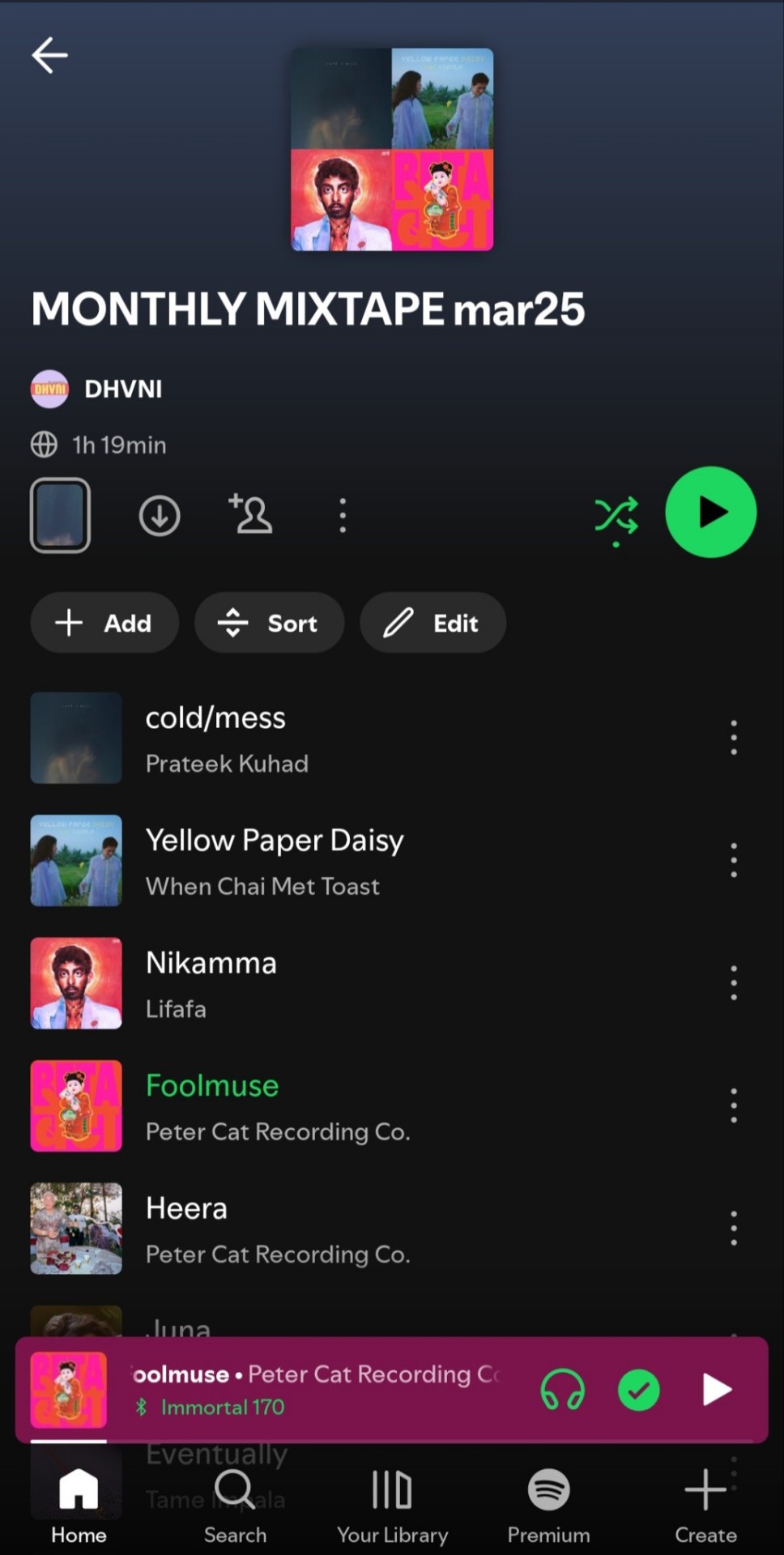
A new monthly mixtape playlist would be curated with every issue, creating a whole experience for the readers.
This is how I would appeal to my younger audience. Thankyou for reading!
0 notes
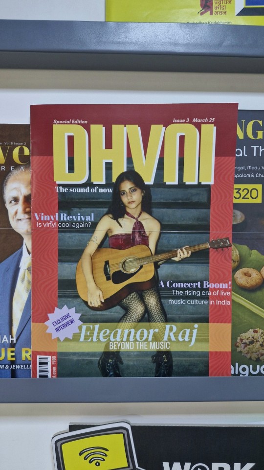
Text
Week 33- Final Project
Analysis of Cover Page
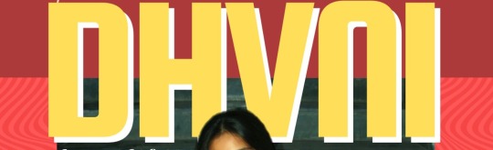
Font: squada one
For the masthead I used a bold san-serif font on Canva. It draws the attention of the reader's eye to the top, aiding visual hierarchy. It also hints at the magazine's confident identity.
Font: Glacial Indifference
I used another san-serif font but this time I made it bold and italics. It tied in well together with the masthead.
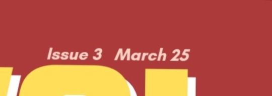
Font: Abril Fatface
For the tagline I used a modern serif font. It blanced out the fonts used earlier, creating an interesting visual harmony. It stands out yet doesnt take away from the masthead.
Fonts: Abril Fatface and TT Interphases
For the cover linesI used 2 fonts. The article heading has the same bold serif font as the tagline. This is paired with a thinner san-serif font for the subheading creating a balance.
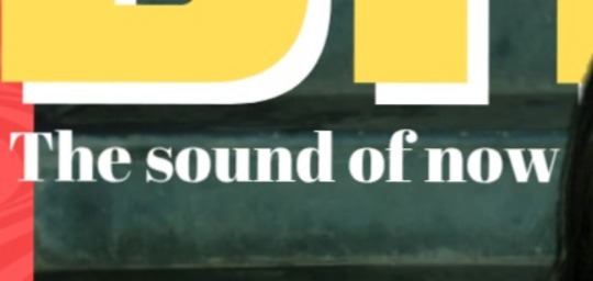
Fonts: DM Serif Display, TT Backwards and Bebas Neue (In the sell line sticker)
For the main cover line I used fonts similar to the other coverlines, but slightly different. This highlighted the feature article cover line in a subtle way without being too distracting. The translucent banner underneath serves the same purpose.
I used different colours throughout to make the spread more playful.
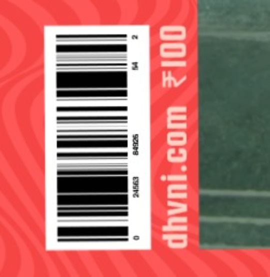
A barcode with a website URL and the price are placed all together at the bottom corner of the page. They make my design look more realistic.
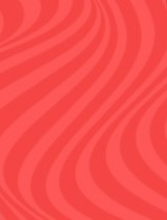
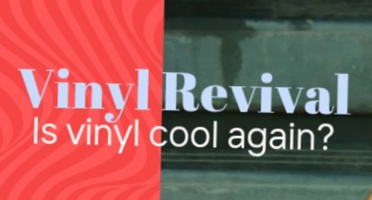
This subtle wave pattern is present all over the background of my design. It represents sound waves and makes the page look more groovy and music-connected.
These were all the important elements of my cover page.
0 notes
Text
Week 32- Final Project Production
Double-spread main article page
This week I designed my double-spread article page. Doing this was the easiest out of the three. By now I had enough experience to know exactly what I wanted.
Version 1

From the get-go I had this layout in mind. I liked the visual hierarchy. However, the spread seemed too structured, too "safe". I need a graphic to break the boxiness of the design.
Version 2

To break up the monotony, I used a treble clef graphic. I also rounded the edges on the text boxes. The treble clef design made the article seem more connected to the theme of music in a subtle way. But the more I was looking at the spread, the more I realised the use of colours was a bit excessive and tacky. They werent going well with eachother at all.
Version 3 (Final version)

I changed all the text back to black and left pops of colours in the subheadings and pull-out quotes. I added another musical note for more dynamics. I also changed the font in the "Creating Jinx" text box.

I was extremely happy with my final product. It has a clean, minimal look. Yet, the colours and elements make it visually interesting and playful too. I feel like it represented Eleanor Raj's identity very well. Though slightly different from the other two pages of the magazine, it added a balance to their fun chaotic designs.
With this, the first draft of my final magazine was complete! I am really proud of the way it turned out.
0 notes
Text
Week 31- Final Project Production
Contents Page Design
For my cover page, I wanted to keep up with the groovy aesthetic of my cover page. I also wanted to make the typography more fun, instead of going for a more grid-like list structure. I also decided not to use coloumns and sections in my spread.
I came up with a few versions of this too. However they were all based around the same design.
Version 1


This was my first design. I did not like it at all. The colours were too light and everything looked extremely washed out and flat. As much as I didn't like the colour scheme, this design ended up being a base for all my following versions.
Version 2

I changed the colours to a palatte that was more lively, and bright. However now, the main image was no longer standing out as much.
Version 3 (Final version)

By changing the colour of the 'contents' banner to a bright baby blue, it was no longer taking away from the main image. Yet, it was still vibrant and lively. I was really satisfied with my final version.

One thing I really liked about the design was the typography. The bold numbers in different fonts, paired with the clean headings create a visual contrast that adds interest.

It also has the same wavy background as the cover, tying it all in together. The intentionally off-grid layout has a playful yet editorial edge to it.
Designing this page didn't take me as long as the cover page. It took me about 2 days to design it.
Seeing my magazine come together one step at a time is extremely exciting!
0 notes
Text
Week 30- Final Project Production
Cover Page Design
This week I finally started designing my cover page. I came up with two different versions. Here's the first design I ended up with-

Even though this was my original plan, I wasn't very satisfied with the design. It just didn't feel right, something about it was a bit off. So, I started designing another cover with a fresh mind.
This time I used a completely different picture for my cover.

This one felt more authentic and raw, matching the identity I wanted to portray. I had multiple versions of this design, improving each time.
Version 1

This is what I started of with. Frankly, I did not like the colours at all. Thus, I decided not to add the other elements, instead, I fixed the problem first.
Version 2

With this version I made some major changes. I chose colours that complemented and contrasted with my main image well. Red and green contrast really well together.
Version 3

I changed up the colours a bit more, still keeping it red though. I also added more emphasis to the main cover line for my feature article with the translucent yellow banner.
Version 4

Version 3 still seemed empty, so I decided to add a subtle wave graphic that added more dynamics to my design. It also connected my design to music as they kind of resemble sound waves. I added a full-stop to my magazine name because I thought it would make it seem more powerful. But I realised it misaligns the text and ruins the visual balance of the design. So I ended up with my final design.

I was really happy with this design. It was fun, colourful and groovy. Yet, it was raw, authentic and confident. It captured the aesthetics I had in mind almost perfectly!
Designing this cover was quite time consuming. It took me nearly a week. This cover will define the aesthetics of my other pages.
Here's a comparison between the first and final versions

Thanks for following my journey as I designed the cover page. Until next time!
0 notes
Text
Week 29- Final Project Production
Editing
This week I spent a good amount of time editing my images based on my design requirements. This task was time-consuming and not easy. However, the final results were extremely polished and satisfying. They will make my magazine look a lot more professional.
Here are some examples-


I wanted to use this image in my cover page. Since the headphones were too dark, I edited in a pair from another picture in the same angle. I used a digital painting app called HiPaint for this. I also edited the background, adding a pink spray aura and yellow background.


I colourgraded this picture to make the greens pop out more and make it less dull and dark. I also increased the brightness and warmth. I also tried making the background black and white, leaving the model in colour. I'm not sure whether I like it or not though. I did all this on an app called Picsart.

I then cut the model out of the picture and added the head of the guitar (it was missing in the original) in a similar method as the one used for the headphones earlier. This can be used for the overlapping part of one of my possible covers.
I adjusted the colours and brightness of all the other pictures I was planning to use too. I used a photo editing app called Picsart to do this.


Since I didnt have Adobe Photoshop, I had to use multiple apps to edit these images to my liking. I was very happy with the results. The images were way more inhanced and looked more professional too. I had a lot of fun editing! Thankyou, stay tuned for next week!
0 notes
Text
Week 28- Final Project Production
Photography (Part 2)
These were from my second location– My building's garden. It portrayed the dreamy, indie, and authentic vibe I was going for perfectly.


This concluded our photoshoot. After this I will edit my pictures. My model understood exactly what I was going for, making this alot easier. This photoshoot was loads of fun!
0 notes
Text
Week 28- Final Project Production
Photography (Part 1)
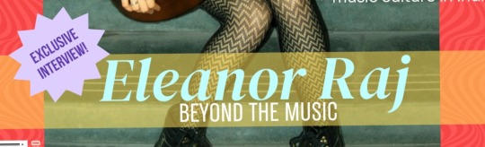
This week I finally conducted my photoshoot with my model. I shot everything on a Nikon D80, with no other equipment. I styled my model in a cool, grungy outfit. A red top, a black skirt, stockings, chunky black boots. This matches the alternative, indie musician aesthetic i was going for. Her makeup was subtle yet colourful, with blue eyeliner and mascara. I believe these small details really add to her character. I also used props like a guitar and a pair of blue headphones.
All these elements came together well to present Eleanor Raj in exactly the way I wanted to. Here are the unedited pictures from the photoshoot.


Our first half of the shoot was conducted in multiple locations. It started with mainly my bedroom and then my building's staircase. Then we went to other spots around my society. The locations gave off the urban, alternative, and raw aesthetic I wanted to portray.
In the next post I will post the other half of images from my second location. Thankyou for reading!
0 notes
Text
Week 27- Final Project Pre-Production
Drafting
For my article I knew I wanted it to be in an interview-style. Eleanor Raj would mention her struggles with visibility in the industry, being an independent female artist, and her journey in general.
With photography ideas in mind, I created my flatplans and drafts for my page layouts. Here they are:
Cover page


Content page

Main article double spread

These drafts are really rough, however they will be a huge help while designing DHVNI.
0 notes