
Don't wanna be here? Send us removal request.
Statistics
We looked inside some of the posts by pw-wp and here's what we found interesting.
Average Info
Notes Per Post
5
Likes Per Post
3
Reblog Per Post
2
Reply Per Post
0
Time Between Posts
3 months
Number of Posts By Type
Text
9
Last Seen Tumblr Blogs


Fun Fact
Kazakhstan’s Minister of Communications and Informatics has blocked the Tumblr site because it contained 60 sites of terrorism, extremism, and pornography in 2015.
Text
Super Women- The Winding Road of Portrayals of Female Heroes in the Comics
One would not be far off in assuming that we are living through a cultural sea change of the portrayal of superheroines in American Culture. After some 70 years, Wonder Woman is finally appearing in her own movie, long-time male comic avatars are being replaced with female characters, and the industry of comics itself is finally, in fits and starts, looking in the mirror and starting to reconsider the way women in the art form are represented. It’s been a long journey from the wild west days of Fantomah and Miss Fury, one that today’s blog entry seeks to briefly examine.
The Pioneers: Wonder Woman and the First Superheroines

IMAGE: Early Wonder Woman and Fantomah Representations.
Women had a tough row to hoe from the very beginning in comics. The first known superheroine characters to be published, including Fletcher Hank’s Fantomah, were certainly unique, but they were like needles in a haystack. Jon Morris (2015) writes that Fantomah might very likely be the first female superhero (p. 50). She has recently been rediscovered and brought back to some form of prominence, mostly due to the bizarre nature of her powers and her creator’s notoriety. The first major heroine, and the only one to stand the prolonged test of time, Wonder Woman, wasn’t even featured on the cover of her first appearance. Daniel Wallace recounts how she first appeared off the cover and inside All Star Comics in 1941 (p. 40, 2014). All things considered, it was a miracle she was published at all.
Conceived by William Moulton Marston for DC comics in 1941, many leaders in the field were less than thrilled with the introduction of a female hero, even as a back-up feature. Lepore (2014) notes that when the character joined the Justice Society of America following feedback from the readers, writer Gardner Fox made her a secretary and wrote her out of the action whenever possible (pp.210-211). The bizarre nature of some of the early Wonder Woman stories (anybody like bondage? Lots of bondage here) didn’t help matters. Still, they didn’t hurt much either, as Wonder Woman served as a beacon for all comic heroines to follow and was one of the few comic heroes, along with Batman and Superman, to survive the implosion of superhero comics in the early 1950s.
Wonder Woman would also have one unique trait shared by only a handful of DC characters (including Black Canary and Saturn Girl) and a larger number of Marvel Comic Heroines (The Wasp, Marvel Girl, Black Widow) for the next several decades: she wasn’t a gender-swapped clone of a male hero.
Turning Women into Girls and Swapping Genders- Silver Age Heroines
For most scholars and writers like Chris Sims, the “Silver Age” of superhero comics is generally considered the time period between the late 1950s, with the re-introduction and reformatting of the DC comics character the Flash (2016), and early 1970s that saw the renaissance of superheroes and the emergence of Marvel Comics as the first real competition DC had ever seen. This time period saw the addition of a plethora of male and female characters in the comics, but unlike Wonder Woman and others from the earlier Golden Age of comics, most of the heroines introduced here had some frustrating handicaps. The most popular heroines were either female clones of popular male heroes, like Supergirl, Mary Marvel and TWO Batgirls or were, well, labeled as “girls” instead of “women”.
The “girl” issue is a bizarre aspect of this story. Many of the new female heroes introduced in the 60s and 70s were either girl friends, fiances, or rookie partners to male heroes. Hence names like “the Invisible Girl” (later changed to “woman”), “Marvel Girl”, and the aforementioned Batgirl and Supergirl. Characters like The Wasp and Big Barda were beaus to characters like Antman and Mister Miracle, respectively. While there was nothing intentionally “lesser” about these portrayals, it was no surprise that Desta (2017) notes that feminists like Gloria Steinem held up the original superheroine Wonder Woman as the prime example of characters to follow.
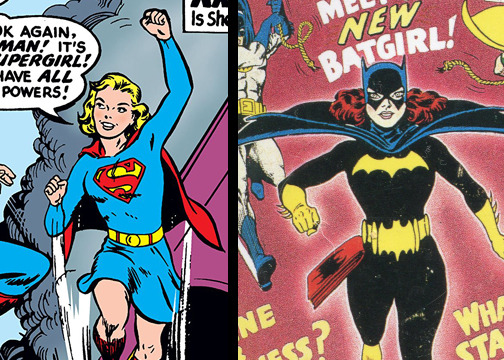
IMAGE: The 1960s DC Comics “Clones” Super Girl and Bat Girl.
The clone concept of heroines is an ongoing trend to this day, pursued for both noble (lifting up female perspectives in popular books) and less than noble (laziness and copyright purposes) purposes. The two most famous examples were done to cash in on trends. Supergirl, first appearing in 1959 was part of a trend of making “Super” spin offs that lasted for almost two decades. Kistler (2015) relays that Superman’s cousin joined the pages graced by other “super” characters like Krypto the Super Dog. The second Batgirl (Barbara Gordon- the one you’ve heard of) was introduced in the comics after Yvonne Craig originated the role on the Batman tv show during the 60s. Daniels (1999) notes that the tv show executives actually asked DC comics to put the character into publication (p. 115). These two characters have transcended the clone stigma in the following years, but it still boggles the mind that they occupy the top three spots in terms of popularity when it comes to DC’s heroines. In terms of design, these characters were fundamentally gender-swapped versions of the male characters they were fashioned off of, with small aesthetics changes like hair color, skirts instead of pants, or slight palette variations in their colors.

IMAGE: The 1970s Marvel “Clones” Spider-Woman and She-Hulk.
Copyright issues led to the production of several clone heroines at Marvel Comics in the late 1970s. Howe (2012) relates that Marvel realized they had to control certain copyrights, so POW!, here’s a Spider Woman comic (p.193). Universal might create a female Hulk for the 70’s t.v. show that they’d own? POW! Here’s a She-Hulk comic (p. 220). While these would eventually turn into individualized characters, it would take a few decades, and about three to four iterations of Spider-Woman. Still, as you can see below one should give Marvel some credit: each iteration of Spider-Woman had a unique costume, with the second one even serving as inspiration (at least, in storyline) for the second most famous Spiderman costume.
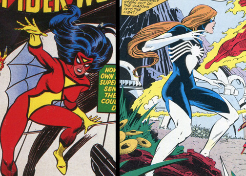
IMAGE: The first and second characters to use the name “Spider-Woman”.
The Rough Years: Weird Anatomies, Revealing Costumes and Women in Fridges
If one had only recently gotten involved in looking at superhero comics and the way they portray women, they could be forgiven for accepting the stereotype promoted by the Simpsons of comic book fans being overweight, sarcastic shut-ins who are incapable of talking to women. The representations, especially the most popular ones, could be troubling. Some major examples include the depictions of women in the work of Frank Miller and the general artistic aesthetic of the late 1980s and early 1990s.
Frank Miller is widely regarded as one of the Godfathers of modern comics, through his revolutionary work on characters like Daredevil and Batman. Over time, some of his work has proven controversial. His portrayal of women has especially drawn controversy. In some of Miller’s stories, characters like Catwoman are turned into dominatrixes and others, like Elektra, are created to much acclaim only to be murdered as plot devices to motivate the male heroes. Daniels (1991) notes, but does not really comment on, the fact that Elektra is “killed by another criminal and died in her blind lover’s arms” (p. 190). To be fair, Miller did bring the character back to such acclaim that she has sometimes trounced Daredevil in terms of popularity. These characters are also drawn in a very sexualized manner by Miller, especially in his later work. An example of this would be the character of Carrie Kelly, a female Robin first introduced in “The Dark Knight Returns” (Miller, 1986). Portrayed as something of a tomboy in the original story, Miller draws the character accordingly. Fast forward to the early 2000’s, when Miller revisited the story in the sequel “The Dark Knight Strikes Again” (Miller, 2001). Carrie has moved from the Robin persona to one based on Catwoman, complete with skin-tight latex. The depiction is more controversial, and the case for balance or excuses for Miller is undercut by the inclusion in the story of protest leading faux superheroine strippers and a naked news anchor. Cultural change might justify the changes, but the depictions remain somewhat controversial.
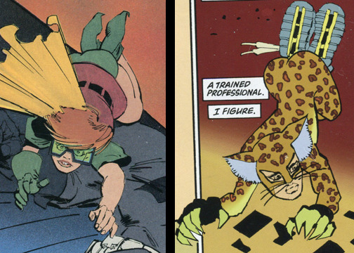
IMAGE: Miller’s drawings of Carrie Kelly in the 1980s and again in the early 2000s.
It would be extremely unfair to present the example of Miller’s work as an outlier. Indeed, looking back at the comics of the time, his representations were modest. The late 80s and early 90s brought in bodybuilder bodies for male characters and hourglass, supermodel frames for women. To go through and list all of the examples would take forever and a day, so we will use the magic of images to show a brief sampler, and then focus on one particularly flamboyant and infamous example of sexualization.
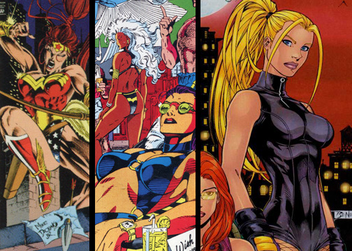
IMAGE: Examples of female representation from 1980/90s superhero comics.
Illustrators like Jim Lee, Rob Leifeld, Todd McFarlane and others lead the way in stylizing characters to the extreme during this time period. A visual look at the drastic changes wrought by these trends can be seen in the Fantastic Four’s Invisible Woman (no longer a Girl). As Sanderson (2000) points out, the Invisible Woman’s designed was updated by artists over the years (p. 39). The decades passed and as we hit the 90’s, her costume goes from essentially a jumpsuit, to a body sock, to a bathing suit, complete with a cutout 4 over the bosom. This apparently was so drastic a change that it only lasted a handful of issues before converting to a more conservative dress once again. This is an extreme example, but such occurrences were everywhere.
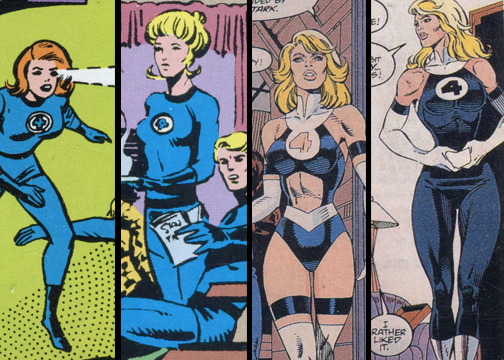
IMAGE: Invisible Woman Costume updates over the years.
This state of affairs continued during the booms and implosion of the comics industry in the 1990s. The visual elements continue to this day, though they are not nearly as dominant as they once were. There are, of course, many, many comics getting published at any one time, and many different representations and styles going into them, but the trend was not subtle and set the stage for what would happen in the new millennium.
In 1999, comics writer Gail Simone set up a website called “Women in Refrigerators”, which kept a running tally murdered, raped, or otherwise afflicted superheroines in comics. The term references a Green Lantern story where the titular hero’s girlfriend is killed and shoved into his refrigerator. The point of the moniker was to point out the degradation that several female heroes in comics were exposed to. The fact that they were often used simply as props for the male heroes or “depowered, raped, or cut up and stuck in the refrigerator” (Simone, 1999) was pointed out vigorously, which related to how female superheroes were being represented at this time. This was a fairly revolutionary statement and website to create, and seeded the ground for debate as the 2000’s rolled in.
CHANGING TIMES and FEMALE FANS: Modern Developments
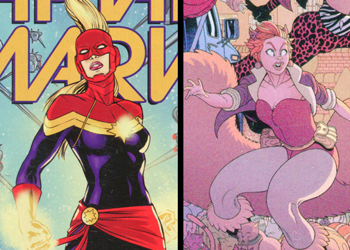
IMAGE: Modern female heroes Captain Marvel and Squirrel Girl
As we move into the present day, publishers began to wake up to the need to update how they represent women in the medium. Thanks to things like Women in Refrigerators and Gamergate, DC, Marvel, and others started presenting female heroes differently.
Examples of addressing the problems in the past interpretation of women include efforts by Marvel to replace male leads with female leads and intentionally take off monikers like “woman”, “she-”, or “girl”. As Khal (2016) notes, Wolverine, Iron Man, Thor, and most famously (and for the second time, oddly enough) Captain Marvel monikers were all passed on to women. No “girl” monikers were affixed to the new titles. Captain Marvel was actually an example of a clone character seizing the mantle of the original character, and has completely eclipsed the original space policeman who originated the name. She has proven so successful in recent years that Eisenberg (2017) reports she will be the star of the first female-lead titled Marvel Movie.
Marvel has also been actively promoting new and/or obscure characters that harken back to the rebel spirit of characters like Wonder Woman and Fantomah when they first came out. Marvel Characters like Squirrel Girl are quirky and have a distinctly millennial tilt. They are drawn in a modern style that doesn’t rely on gross exaggerations or conservative staples of the years before. These new characters and the updated usage of others have coincided with somewhat mixed reactions (Hibberd, 2017) but a much more diverse audience.
DC has been busy updating characters as well. Revolutionary takes on characters like Batgirl, who has been popular enough to spark work on a new solo film by Joss Whedon (Foutch, 2017), have similarly brought in new readers and more positive representations of female heroes. Granted, the exploding popularity of characters like the often abused and forgiving Harley Quinn, as seen by the plethora of merchandise based on her appearance in the film Suicide Squad (Amazon, 2017) can sometimes be seen as a step backward. Regardless, there has been noticeable improvement within the last 10 years.
Over time, it’s been a matter of two steps forward and one major step back for superheroines in comics, both in how they are written and how they are portrayed on the page. While it’s taken a few too many decades, it is a positive sign that so many new characters and exciting developments have been happening so recently. Hopefully this trend continues into the future.
Sources used for this article include:
Amazon. (2017). Harley quinn search results [Data set]. Retrieved from https://www.amazon.com/s/ref=nb_sb_ss_c_1_8?url=search-alias%3Daps&field-keywords=harley+quinn&sprefix=Harley+Q%2Caps%2C163&crid=1NIBPWFGP5DWD
Daniels, L. (1991). Marvel: Five fabulous decades of the world’s greatest comics. New York, NY: Harry N. Abrams, Inc.
Daniels, L. (1999). Batman: The complete history. San Francisco, CA: Chronicle Books LLC.
Desta, Y. (2017 October 10). How Gloria Steinem saved wonder woman. Vanity Fair. Retrieved from https://www.vanityfair.com/hollywood/2017/10/gloria-steinem-wonder-woman
Eisenberg, E. (2017). Captain marvel’s movie: What we know so far. Cinema Blend. Retrieved from https://www.cinemablend.com/new/Captain-Marvel-Movie-What-We-Know-So-Far-70431.html
Foutch, H. (2017 March 30). Report: Joss whedon’s “batgirl” movie will draw from the new 52. Collider. Retrieved from http://collider.com/batgirl-movie-joss-whedon-new-52/#images
Hibberd, J. (2017 April 3). Marvel outrage after diversity, female characters blamed for sales. Entertainment Weekly. Retrieved from http://ew.com/tv/2017/04/03/marvel-female-diverse-characters-hurting/
Howe, S. (2012). Marvel comics: The untold story. New York, NY: HarperCollins Publishers.
Khal. (2016 July 7). With the new iron man, marvel continues to move forward and diversify its superheroes. Complex.com. Retrieved from http://www.complex.com/pop-culture/2016/07/marvel-comics-switching-characters/
Kistler, A.S. (2015 October 23). Supergirl: A brief history of the last daughter of krypton. Tor.com. Retrieved from https://www.tor.com/2015/10/23/supergirl-a-brief-history-of-the-last-daughter-of-krypton/
Lepore, J. (2014). The secret history of wonder woman. New York, NY: Alfred A. Knopf.
Miller, F. (2001-2002). Batman: The dark knight strikes again 1-3. New York, NY: DC Comics
Miller, F. (1986). Batman: The dark knight returns 1-4. New York, NY: DC Comics
Morris, J. (2015). The league of regrettable superheroes. Philadelphia, PA: Quirk Books.
Sanderson, P. (2000). Marvel universe. (2nd. ed.) New York, NY: Harry N. Abrams, Inc.
Simone, G. (1999) Women in refrigerators. Retrieved from http://lby3.com/wir/
Sims C. (2016 October 7). Ask chris #310: Starting the silver age. Comics Alliance. Retrieved from http://comicsalliance.com/ask-chris-310-starting-the-silver-age/
Wallace D. (2014). 1940s. In Gilbert, L. (Eds.), Dc comics: A visual history (2nd. ed.) (pp.28-61). New York, NY: DK Publishing.
3 notes
·
View notes
Text
FAN ART: Weird subculture or Natural offshoot of Graphic Design?
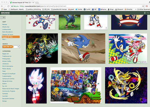
IMAGE: Examples of fan art from the Deviant Art website.
My work often takes me to the hallowed halls of convention centers and community centers for annual gatherings of image makers of all stripes and their fans. These conventions, or “Cons”, be comic, horror, or video game themed, but one thing seems to be universal about them: Fan Art.

IMAGE: The fan-art-made-good example of Fiona the human and Cake the Cat from the Adventure Time cartoon series.
Fan Art is, essentially, art created by a fan-base centered around a specific property, actor, story, etc. It fulfills several purposes, from practicing art-making, community building, and, in some controversial cases (like most Cons one could attend), for profit. PBS’s Off Book program has explored how fan art is something that transcends media, stretching from graphic design to illustration and beyond (Brown, 2012). In some cases it can even influence the original product, as in the case of Adventure Time’s gender-swapped characters Fiona the Human and Cake the Cat (gender-swapped fan art creations of series leads Finn the Human and Jake the Dog). These characters proved so popular that series producer Fred Seibert greenlit an episode starring the duo (Brown, 2012). This is a grand example of fan art, but with the ocean of other offerings in the realm via online homes like Threadless, DeviantArt, and Mondo (at varying levels of quality and legality) and the recent experience of walking through mountains of fan art at a Wizard World Convention, I thought it might be a fine idea to look at the genesis of this subset of art.
Commissioned Beginnings
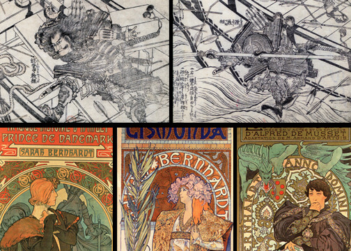
IMAGE: Top Row: Mythical figures drawn by Hokusai, Bottom Row: A selection of Mucha’s posters of Sarah Bernhardt.
Like much art, the term fan art is subjective. For example, if we consider religions to be organizations and gatherings of fans, why, we have fan art going back to ancient times of religious figures. Maybe the Venus of Willendorf had her own comic book. These images extend up to today, outside of Islam, anyway, and I don’t have years to write a single blog post, so we will narrow our scope a bit. Perhaps the best look at the origins of fan art can be traced back to the same beginnings, we ascribe to modern graphic design. I’m speaking, of course, about posters and Japanese ink prints.
Meggs notes that some of the early Japanese ukiyo-e woodblock prints that made their way over to Europe depicted Kabuki actors (p. 196, 2012). While the context is lost to many viewers today, these images functioned the same way as movie posters of actors function today. This is essentially the legit version of fan art- advertising art that is usually commissioned by the rights holder. It was not limited to just actors: like the posters of Superman or Wonder Woman on your kid’s wall, artists like Hokusai produced prints representing heroic warriors like Yoshitsune (Bouquillard and Marquet, pp.151-152, 2007) It did not take Europe long to pick up on this trend, either.
Artists like Mucha and Toulouse-Lautrec immediately spring to mind. Ulmer writes about how Mucha practically produced a sub-genre of Sara Berndhart posters in the late 19th century, when the actress contracted him exclusively to produce the now immortal prints (p.8, 2007). It would not long before professional image makers like Mucha found themselves joined by amateurs as well, and not just in the schoolbooks of aspiring artists.
SKYGACK and the Beginnings of Cosplay

IMAGE: Original comic image and homemade costume of Skygack the visitor from Mars.
Innovations in printing lead to an image explosion around the turn of the twentieth century. Along with adverts, newspapers helped launch the comic strip, a medium that has since branched into the multi-billion dollar businesses of animation, comic books and films. It’s fitting then, since thousands dress up as Batman and Spiderman every year, that one of the earliest documented examples of fan art would concern cosplay (the dressing up as) a comic strip character.
According to Ron Miller, Mr. Skygack was the creation of cartoonist A. D. Condo and was essentially a fish-out-of-water gag wrapped up as a visitor from Mars (2013). The character proved so popular that Plunkett notes fans started to make costumes of the Martian for city events and parties (2016). Apparently it was such a big trend that the newspapers picked up on it, so we have visual evidence of it, over a hundred years later. While the creepy looking fellow is something of a footnote now, Skygack deserves at least a plaque in the inevitable fan art hall of fame as a pioneer in the field. While this fellow was all laughs and harmless fun, there is also seedier side to fan art, so much so that the label may not even be properly applied.
TIJUANA BIBLES and Selling under the Table!
Image: Safe for work covers of Tijuana Bibles.
Now comes probably the most controversial subsection of fan art: erotic fan art. No, there won’t be any NSFW images presented here, but it is fascinating to examine this subsection, considering it is most associated with Rule 34 of the Internet today.Rule 34, of course, is, as Dewey writes, “If it exists, or can be imagined, there is Internet porn of it” (2016). Like the pioneering days of film, video and art itself (exhibit A: The Venus of Willendorf, of comic book fame), fan art’s less discussed and notorius subset has a history dating back decades. Tijuana Bibles, sometimes referred to as bluesies or eight pagers were illicit, cheaply printed little tracts depicting your great grandpa’s favorite cartoon characters in sexually explicit situations.
These illegal little books were sold under the counter and included scandalous adventures being pursued by Popeye, Blondie, and even Mickey Mouse. While the quality for most is lacking, some actually include some fine draftmanship, enough so that places like Duke University have collections of the little deviants(David M. Rubenstein Rare Book & Manuscript Library, 2017). They served as an income source for many artists in the same way that illicit images produced on the internet are sometimes produced for profit. Indeed, they could even be used as stepping stones to “legitimate” careers. Faraci writes about how the initial Bazooka Joe (of gum comic fame) artist, Wesley Morse, got the nod from producing Tijuana Bibles (2012). The legacy of these little things extends out to today, and beyond just visual art. After all, we are all suffering through Fifty Shades of Grey movies thanks to written erotic fan fiction writing based on the Twilight series. One wishes the artists of the original Tijuana Bibles could have gotten a piece of that pie!
Beyond this somewhat seedy side of the fan art universe, not much of note has lasted the years between the early 20th century up to around the 1980s, outside the fantastic riffs of MAD magazine and the extreme world of Underground Comix in general, there is a style of fan art that is worth noting.
Before they were Pros: Fan art by Superstars when they were Young

IMAGE: The evolving skill of painter Alex Ross, as seen through his love of comic books.
Everyone has to get started somewhere. As Brown notes, oftentimes fan art is used as a way to practice the craft while having a guidepost and not needing the time to make new ideas (2012). This certainly makes sense. Even the author of this blogpost got his start from drawing horrendous Mickey Mouse doodles. The recent influx of artist books in the marketplace also provide the proverbial proof to the pudding.
Alex Ross is known far and wide for his painted depictions of superheroes. A collection of his work for DC comics shows that the man has been steeped in his subject matter for years (Kidd, 2005). His early drawings are certainly crude (he was, after all, five years old) but his efforts certainly pay off over time as his work gets better and better. He moves from doing fan art to inspired original characters, building his skill level over time before getting to college and mastering painting (pp. 21-28). Like many other comics artists, Ross does not appear out of a stump- he starts by emulating things he enjoys and grows into his own style and artwork. He is not alone in this- one particularly famous quartet of terrapins owe a lot to fan art and fandom in general
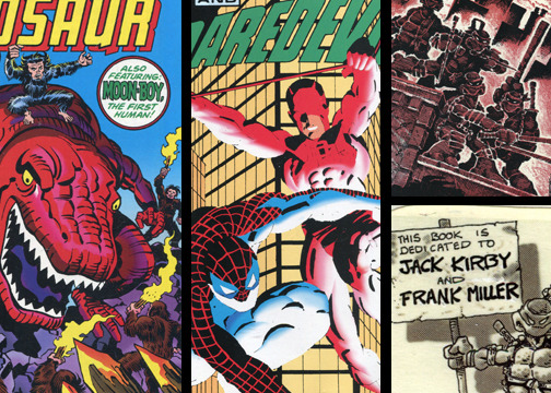
IMAGE: From left to Right: The work of Jack Kirby, Frank Miller and Eastman and Laird.
Kevin Eastman and Peter Laird have been very open about the inspiration that creators Frank Miller, Jack Kirby, and the character of Daredevil from Marvel Comics provided them in creating the Teenage Mutant Ninja Turtles. Farago writes about how both were inspired by artist/writers Jack Kirby and Frank Miller (p. 20, 2014). These inspirations, swirling about in the indie-publishing scene of the 1980s, were given manifest presentation in the first issue of the Ninja Turtles, which blatantly presents the heroes sharing an origin story with Daredevil (Farago, p. 20, 2014)- at the time being brought to new prominence by Miller. The fact that the comic book is dedicated to Kirby and Miller helps seal the deal.
The themes and art style of the early TMNT books has a healthy blend of Kirby dynamism and Miller inking techniques from that time. While not strictly an exercise in fan art, Eastman and Laird’s admitted admiration for the two other creators helped shaped one of the most dynamic franchises of the last thirty years. Like with Ross, the fruit of this labor shows the benefits of early, devoted fan hood combined with art making.
The Good, the Bad, and the Interesting Controversy
So we’ve seen a ton of interesting sides to this whole fan art thing. The good side has been expounded upon, along with the seedy seed, but what about the bad side? Well, the last bit of this blogpost will take a look at that and some of the controversy involved. Specifically, the copyright infringing, convention engulfing controversial side of the issue.
The culture news site Bleeding Cool has done fairly extensive reporting on the issue of rampant fan art at comic conventions. They have noted the uptick of giant collections of fan art that keep showing up at these fan gatherings, and how much these collections irk some practicing artists, who may rely on licensed image reproduction of everyone’s favorite superheroes to supplement their income in a tough business. One artist, Aldrin Aw,, was so frustrated at a particular vendor selling “fan art” (which here mostly related to copying original art and adding digital effects) that he hounded him out of the convention (Johnston, May 2016). He also went out of his way publicly shame the “fan” artist on social media. The growing conversation around the fan art and bootlegging at conventions has also lead to greater efforts at explaining the legal repercussions of selling another person’s intellectual property throughout the community. Seth C. Polansky, a lawyer specializing in art and IP issues points out that much of what we consider “fan art” is, in a strict sense, illegal (Johnston, June 2016). That’s certainly a downer for a growing artistic subculture.
Thus, we find ourselves at a crossroads. A long-running subset of image making and artistic development that’s struggling to find a balance between a passionate hobby and legitimate money-making venture that crosses many redlines in the legal sense. Perhaps the best balance is seen in the work of studios like Mondo and Gallery Nucleus. Both offer a variety of fan art paintings and other works, but they are licensed. Unlike sites like Deviantart, much of this work is invited and functions in the same way as the commissions of Kabuki art cited above. Things have gone full circle, in effect.
Regardless of the many issues involved, fan art is something here to stay, and it has a pedigree. It will be quite interesting to see just how far it spreads in the future.
Sources for this writing include:
Bouquillard, J., & Marquet, C. (2007). Divinities, warriors, and legendary figures. In C. Henard (Ed.), Hokusai: first manga master (pp.145-157). New York: Abrams.
Brown, K. (2012, May 3). Fan Art [Video file]. Retrieved from http://www.pbs.org/video/off-book-fan-art-creativity/
David M. Rubenstein Rare Book & Manuscript Library. (2012).Guide to the tijuana bibles collection, 1930-1998 [Data file]. Retrieved from https://library.duke.edu/rubenstein/findingaids/tijuanabibles/#historicalnote
Dewey, C. (2016, April 6). Is rule 34 actually true?: An investigation into the internet’s most risque law. The Washington Post. Retrieved from https://www.washingtonpost.com/news/the-intersect/wp/2016/04/06/is-rule-34-actually-true-an-investigation-into-the-internets-most-risque-law/?utm_term=.eed623bc895e
Faraci, D. (2012, July 25). Tijuana bibles from wesley morse, creator of bazooka joe (NSFW). Birth.Movies.Death.. Retrieved from http://birthmoviesdeath.com/2012/07/25/tijuana-bibles-from-wesley-morse-creator-of-bazooka-joe-nsfw
Farago, A. (2014). Teenage mutant ninja turtles: The ultimate visual history (1st ed.). San Rafael, CA: Insight Editions.
Johnston, R. (2016, June 10). Artists alley, art theft and copyright law- a lawyer speaks to bleeding cool. Bleeding Cool. Retrieved from https://www.bleedingcool.com/2016/06/10/artists-alley-art-theft-and-copyright-law-a-lawyer-speaks-to-bleeding-cool/
Johnston, R. (2016, May 8). Buzz sends tim lundmark packing at wizard world minneapolis comic con. Bleeding Cool. Retrieved from https://www.bleedingcool.com/2016/05/08/buzz-sends-tim-lungren-packing-at-wizard-world-minneapolis-comic-con/
Kidd, C. (2005). Mythology: the dc comics art of alex ross. New York: Pantheon Books.
Meggs, P. B., & Purvis, A. W. (2012). Art Nouveau. In Meggs’ history of graphic design (pp.196-231)(5th ed.). Hoboken, NJ: John Wiley & Sons Inc.
Miller, R., (September 19, 2013). Was mr. Skygack the first alien character in comics?. Io9. Retrieved from https://io9.gizmodo.com/was-mr-skygack-the-first-alien-character-in-comics-453576089
Plunkett, L.,(May 16, 2016). Cosplay is over 100 years old. Kotaku. Retrieved from https://cosplay.kotaku.com/cosplay-is-over-100-years-old-1777013405
Ulmer, R. (2007). Alfons Mucha. Los Angeles, CA: Taschen
1 note
·
View note
Text
Today’s Kids are Wussies: Ok, Not Really, the Illustrations they See are Just very Tame Compared to Yesteryear
Tauss’s work is actually very reminiscent of Grammel’s later work, and offers a great look at a horror spin on the classic paper-back book covers from the 60s and 70s. It’s also so confusing and eerie that it holds up almost four decades later.It’s that time of year again. Of all the traditional American holidays, Halloween is probably the most diverse visually. Factoring in genres like horror and suspense, and mediums like film and costume, Halloween inspires thousands of images every year. Unfortunately, most images and illustrations based on Halloween motifs produced today tend to riff on cutified versions of the famous Universal Monsters Stable. It’s a hodge-podge of Monster High and generic Frankensteins every October, but it hasn’t always been like this. Horror illustrations, like most things from our youth, used to be much more...intense.

IMAGE: A collection of illustrations from Stephen Gammel’s work on the Scary Stories books.
The pre-eminent example of softening horror illustrations into something less inoffensive (and, unsurprisingly, less popular) is the re-illustrating of the collection of horror stories for kids by Alvin Schwartz called “Scary Stories to Tell in the Dark”. Scott Meslow recalls how the original books, published in the 1980’s, had illustrations by Stephen Gammell, but for the 30th anniversary of the books, the publishers turned to another artist to do new illustrations (2016). Meslow notes that a glance at the Amazon reviews for the book show how disastrous the choice was. People were not happy with the less-offensive illustrations, which lacked Gammel’s hard-edged style. Having spent a great deal of time researching past illustrations this year, I was surprised to see that Grammel’s spooky look was somewhat en vogue for a long time before the late 90s. I thought it would be fun to take a look at these selections from the Society of Illustrators Annuals to explore how some horror illustrations were considerably intense back in the day. Here we go!

IMAGE: Illustration by Tom Daly from the seventh Society of Illustrators Annual.
It’s next to impossible to tell what this illustration by Tom Daly, done for Columbia Records is about. One thing’s for sure, though, that screaming face in the sunflower near the center is bleeding from the mouth and has seen something awful, and can’t go on any longer. As for aesthetics, the image is certainly eerie.

IMAGE: Illustration by Tom Ballenger from the eleventh Society of Illustrators Annual.
Tom Ballenger’s interesting version of happy YooHoo consumer here is reminiscent of some of the other frightening “kids” mascots from the late 1960’s and early 1970’s. Hundreds of think pieces have been done on the frightening original designs of characters like Ronald McDonald, and the YooHoo fan here is no exception.

IMAGE: Illustration by Herbert Tauss from the fourteenth Society of Illustrators Annual.
Tauss’s work is actually very reminiscent of Grammel’s later work, and offers a great look at a horror spin on the classic paper-back book covers from the 60s and 70s. It’s also so confusing and eerie that it holds up almost four decades later.

IMAGE: Illustration by Don Ivan Puchatz from the sixteenth Society of Illustrators Annual.
Don Ivan Puchatz takes the cake for a Dada-esque spin on horror with his illustration for The New American Library. Once again, it’s hard to tell what is going on here (something emblematic of 1970s illustration in general), but combined elements, which would be humorous in a line-based or shape based style, are truly eerie when rendered out like this.

IMAGE: Illustration by Alan Magee from the twenty-third Society of Illustrators Annual.
Outside of his client Pocket Books, I can’t tell you much about Alan Magee’s illustration here, except that it’s just plain creepy. It’s like the most terrifying family reunion ever.

IMAGE: Illustration by Tomi Ungerer from the fourth Society of Illustrators Annual.
For this last example, I’m going all the way back the 4th Annual. I don’t believe this was meant to be a frightening illustration, but looking at it over fifty years later, it is certainly disturbing. I mean, what exactly is Santa Claus’s plan here? Nothing good, that’s for sure.
Sources used for citation and research in this blogpost include:
Brooks, W. (Editor). (1975). Illustrators 16: The sixteenth annual of american illustration (1st ed.). New York, NY: Hastings House Publishers
McVicker, C. (Editor). (1973). illustrators 14 (1st ed.) New York, NY: Hastings House Publishers
Meslow, Scott (2016, October 8). Scary stories to tell in the dark: Traumatizing childhoods for 35 years. Gentleman’s Quarterly. Retrieved from https://www.gq.com/story/scary-stories-to-tell-in-the-dark
Mott, H. (Editor). (1970). Illustrators 11: The eleventh annual of american illustration (1st ed.). New York, NY: Hastings House.
Munce, H. (Editor). (1982). Illustrators 23: The twenty third annual of american illustration (1st ed.). New York, NY: Society of Illustrators Inc.
Peak, R. (Editor). (1965). Illustrators '65 (1st ed.) New York, NY: Hastings House Publishers
0 notes
Text
From Monsters to Icons: Gorillas in Design
Gorillas. We’ve all seen them, we all love them. They appear multiple times a year in films, they fill toy store shelves, comic book pages, editorial cartoons, video games, and of course are often star attractions at zoos. For an endangered species, one could argue that they are almost omnipresent in our cultural lives. How did this start? What twists and turns has this relationship taken? Let’s take a look at some of these apes and see.
It would seem absurd to the modern person, but the gorilla occupied the same cultural space as Big Foot for years. As John Landis notes, in a surprisingly detailed writing on gorillas in the movies, the first stuffed gorilla didn’t arrive in Europe until the 1840s (p. 187, 2011). They arrived on the scene with the cultural impact equivalent to aliens suddenly landing in a modern American city. Books were written, artwork made, and posters printed.

IMAGE ONE: Clockwise from Top: Gorilla enlevant une Femme (Gorilla carrying off a woman) by Fremier, Elend und Untergang folgen der Anarchie by Engelhard, and Destroy this Mad Brute/Enlist by Hopps
Unlike today, the majority of early representations focused on sensationalist representations of the gorillas. These were wild animals hell-bent on smashing and destroying. Some big examples of this are “Gorilla enlevant une Femme (Gorilla carrying off a woman)”, an 1887 bronze sculpture by Emmanuel Fremier, which Landis notes won the Medal of Honor at the Paris Salon (p.187, 2011) and the infamous poster by Harry Ryle Hopps from 1917, “Destroy this Mad Brute/Enlist” produced to encourage fighting in World War 1. Negovan notes that this portrayal of a hated enemy or idea as a gorilla was also present on the other side of this momentous conflict in the work of Julius Ussy Engelhard (p. 29, 2017). Engelhard presents the gorilla as a representation of anarchy in “Elend und Untergang folgen der Anarchie” produced in 1918. While it’s next to impossible to find positive images of Gorillas at this time, the dynamic would get more complex as time went on, especially with the most famous gorilla in popular culture history.

IMAGE TWO: KING KONG taking on a T-Rex
King Kong opened in theatres in 1933, and the title ape has been the most popular named gorilla character ever since. The story of a thirty foot tall gorilla plucked from and island and taken to his doom in Manhattan is a solid part of American mythology. Morton has written extensively on the impact Kong has had, from multiple sequels and remakes, model kits, toys, shirts, books and more (2005). King Kong is also the first major gorilla representation in popular media to be more than a simple brute. Kong is ferocious, but plays the loving beast to the beauty of heroines like Fay Wray, Jessica Lange and Naomi Watts. Having appeared in various films for several decades, Kong is now set for a round 2 with the second most famous giant monster on earth, Godzilla, in 2020.

IMAGE THREE: Clockwise from Left: Congorilla, Solovar and Gorilla Grodd
The success of King Kong jump started a massive influx of gorilla goodness and goofiness in pop culture for the rest of the 20th century. Nameless gorillas (well, men in suits) invaded movie and tv screens from the ‘40’s to the ‘70s. Even RankinBass, the makers of the classic Rudolph holiday specials, got into the act in 1967 with a King Kong ripoff called “It” in their “Mad Monster Party” movie (1967). Regardless, the real action in ape appearances was in comic books. DC comics and Marvel comics both got into the act, with characters that have lasted for decades. Irvine notes that DC had heroes like Congorilla and Solavar, the king of an actual Gorilla City (comics are a weird medium) and villains like Titano, the Ultra-Humanite and the infamous Gorilla Grodd (p. 71, 2014). Grodd, a popular Flash nemesis who, Irvine notes, debuted in 1959 during the Silver Age of comics (p.94, 2014) and never left, has appeared appeared in toys, live-action tv and even the Superfriends cartoon show! He can also control minds.
Marvel didn’t have quite as deep a roster of gorilla characters, but they did have the distinction of copyrighting the name “Gorilla-Man” and have reused the character sparingly over the years (Dougall, p. 152, 2014).

IMAGE FOUR: Donkey Kong fleeing Mario! SOURCE
While Planet of the Apes would come out in the late 1960s, jumpstarting a general fascination with great apes for the 1970’s, the next big cultural landmark reserved just for gorillas would occur in the early 1980’s when illustrator Shigeru Miyamoto would create Donkey Kong- the progenitor of the billion dollar Mario franchise. Ryan (2012) notes that Miyamoto was originally pegged to make a Popeye game, but when licensing rights fell apart, adapted the game to be based around a carpenter's quest to save his girlfriend from his own escaped gorilla (pp.23-27). Donkey Kong, the game and the gorilla, became iconic, spawning a cartoon, sequels, toys, a relaunched game series that dominated the 1990s, and even a lawsuit from Universal arguing he was a King Kong ripoff. Nintendo won the court case (Ryan, pp. 40-44) and Donkey Kong runs across screens to this day. While starting as a villain, the character has fully taken on the hero mantle nowadays.
Gorillas have come a long way from being the legendary mountain men of the 1840’s. Thanks to an ongoing evolution in the culture, they are more likely to be seen as noble creatures nowadays, a far cry from the mindless brutes of yore. They have also established a firm niche in western culture, so one can only imagine what the next pop culture gorilla fad will entail.
Some of the sources used for this blogpost include:
Bass, J. (Producer & Director). (1967). Mad Monster Party [Motion picture]. United States: RankinBass.
Dougall, A. (Editor). (2014). Marvel encyclopedia: The definitive guide to the marvel universe (4th ed.). New York, NY: DK Publishing.
Irvine, A. (2014). 1950s. In L. Gilbert (Senior Ed.), Dc comics a visual history: Updated edition (62-95). New York, NY: DK Publishing.
Lapetino, T. (2016). Art of Atari (1st ed.). Mt. Laurel, NJ: Dynamite Entertainment
Landis, J. (2011). Monsters in the movies: 100 Years of cinematic nightmares (1st ed.). New York, NY: Dorling Kindersley Limited.
Morton, R. (2005). King Kong: The history of a movie icon: From Fay Wray to Peter Jackson (1st ed.). New York, NY: Applause Theatre & Cinema Books
Negovan, T. (2017). Beautiful macabre: Rare & peculiar posters 1862-1973 (1st ed.). Los Angeles, CA: Century Guild Museum of Art.
Ryan, J. (2012). Super Mario: How Nintendo conquered america (1st ed.). New York, NY: the Penguin Group
0 notes
Text
Sculpture and Illustration: Accepted Norm or Quirky Outlier?
When examining the current state of illustration it would be fair to assume that you would stand out if you utilized sculpture as a way to produce your images. With some notable standouts, like Red Nose Studio and Dave McKean, most illustrators simply don’t use the sculptural method in their work. But has this always been the norm? How exactly has illustration been affected by sculpture over time? Stepping back a bit, and digging a little deeper, one finds a robust selection of sculptural illustrations and illustrators in the industry. Indeed, sculpture’s current scarcity might be the exception to the rule.


IMAGE 1: Maquette produced by Thomas Hart Benton, from the Peabody Essex Museum, followed by a 3D printed replica. source
Going back a hundred years, the work of muralist and American painter Thomas Hart Benton provides a look at how sculpture has been used as a tool for completing painted work. Alec Buren points out that Benton, whose narrative work straddles the line between illustration and fine art, would produce painted maquettes for most of his paintings as a way of producing references (2015). Indeed, he would essentially produce his images twice! While you would be hard-pressed to find the maquettes now (they were not built to last) some fascinating work is being undertaken to preserve and publicize them using 3-D printing! Buren again points out that the Peabody Essex Museum is using scans and 3-D printing to recreate the fragile forms and take them on a US tour (2015)!

IMAGE 2: Florence Thomas and some of her work. source
Moving a few decades ahead, one finds a plethora of dimensional illustration in slides produced by artists for that famous forebear of VR, the view-master! Rossen writes that using stereoscopic images, the view-master company relied on artists like Florence Thomas to produce miniature sculpted scenes that could then be photographed and printed on film for the red viewing tool (2017). These image started getting traction in the 1940s and exploded in popularity through the 1980s, inspiring a whole generation of artists, including the writer of this blogpost.

IMAGE 3: Selections of Judith Jampel’s work
As time goes on, perhaps the most unique selection of illustration in the dimensional sense starts cropping up in the late 1970s. In particular, the work of Judith Jampel stands out. Bossert illuminates us on who Jampel was; a multiple award winner who started off in design, her work with nylon, polyester and caricature has a unique “eerie” vibe to it that screams out across the years to today (1977, p.10). The work produces a double take- almost an uncanny valley sensation that seems way out of context for the 1970s or 80s. While data on Jampel after the 1980s is scarce, and she has no web presence to speak of outside digging into back issues of news and popular media, her work leaves an indelible mark. One hopes that a rediscovery is in the offering.While this form of “soft sculpture” illustration, reminiscent of the work of Claes Oldenburg, was adapted by a few other illustrators, including Ellen Rixford, it has gradually transformed into a more toyetic aesthetic, leaving the more realistic work of folks like Jampel behind.

IMAGE 4: Chris Sickels artwork. source
Circling back to the beginning of this post, but also to the present day, it’s important to consider the work of illustrator Chris Sickels, better known as Red Nose Studio. Sickel’s work manages to synthesize the best elements of all the previously cited work and create a truly unique illustration style that separates him from the rest of the illustration community. In an interview with Julie Danielson, Sickels explains that much of his work involves reclaiming materials and sculpting elements from scratch (2013). He sets up scenes and lighting rigs that emulate the work of Benton and the view-master illustrators, while presenting quirky characters and skewed realities reminiscent of the work of Judith Jampel. Add in whimsical qualities and a strong sense of identity and you are left with a unique vision of another world represented in handmade characters, sets, and props.
Looking at it all in summary, it would appear that sculpture-based illustration has reached a chokepoint. There are a few practitioners, and some, like Red Nose Studio, are very successful. Still, history shows that while it may seem like a unique, smaller style subset to be working in, the field is bound to open up again as new work becomes available and styles go in and out of fashion. Viewmasters were huge business in their prime, and a look at the annuals shows a steady, if small selection of dimensional illustrators cycling in and out of the field. With new developments like Virtual Reality and the growing digital home of the illustration field, sculpture-based illustration is primed for a big comeback.
Some of the sources used for this blogpost include:
Buren, Alec (2015, July 14). Museum uses 3D printing to take fragile maquette by thomas hart benton on tour through the states. 3ders. Retrieved from http://www.3ders.org/articles/20150714-museum-uses-3d-printing-to-take-fragile-maquette-by-thomas-hart-benton-on-tour.html
Cardinal, Lance (2014, April 6). The amazing miniature worlds of…...view-master!. Lance Cardinal. Retrieved from http://lancecardinal.blogspot.com/2014/04/vintage-view-master-scans.html
Danielson, Julie (2013, July 15). Seven questions over breakfast with chris sickels (a.k.a. red nose studio). Seven impossible things before breakfast. Retrieved from http://blaine.org/sevenimpossiblethings/?p=2602
Rossen, Jake (2017, June 21). Chakka-chhh: The hidden history of view-master. MentalFloss. Retrieved from http://mentalfloss.com/article/84549/chakka-chhh-hidden-history-view-master
Society of Illustrators. (1977). The eighteenth annual of american illustration (1s ed.). New York, NY: Hastings House, Publishers, Inc.
0 notes
Text
PAY NO ATTENTION TO THE MAN (or woman) BEHIND THE CURTAIN: REMEMBERING THE UNSUNG CREATORS IN POPULAR CULTURE
There is a continuing inside joke in the illustration community that really isn’t that funny, but comes up so often that we, for the most part, have come to accept it as part of our daily working lives. At least once a month (or, if you’re lucky, once a week) you will get contacted by a potential client who wants work done for free. Fortunately, most people understand when you reply that, as a small business owner, you can’t afford to work for free on a project. It’s a harmless, if somewhat frustrating, exchange that we accept as part of the business of educating clients about our work and its value. Once in a blue moon, though, you get a person contacting you for work that can’t comprehend why you can’t afford to illustrate their children’s book. Often times, they’ll say “I’ve already done the hard work, writing it and all.” This approach is frustrating, but understandable. What many folks don’t realize is that we, as image makers, have been taught to value our work and safeguard it against exploitation and usage outside what we agree to. This mindset is derived, for me at least, from knowledge about what has happened to fellow creators who did not receive proper credit. For today’s post, I thought it would be interesting to examine some of these image makers.
Do you know who the first person to animate Mickey Mouse was? Well, it wasn’t Walt Disney. Perhaps more interestingly, the chief person in charge of designing the Creature from the Black Lagoon was a woman who ended up getting blacklisted from the SFX department at Universal. Let’s take a brief look at these two individuals who were instrumental in creating some of the most important characters of the last 100 years in american culture.

Ub Iwerks was an animator who worked closely with a young Walt Disney in the 1920’s. The two were instrumental to Walt’s early successes, with Walt being the idea man and Ub being his chief animator and designer. After losing the rights to his first major creation, Oswald the Lucky Rabbit, Walt had a meeting with his staff to brainstorm a new character for the studio to promote in lieu of their erstwhile bunny. After some thought, the name Mickey Mouse was decided upon, and Ub set about making sketches. Most folks agree that the Mickey we would all come to know and love came from the hand of Ub Iwerks, even if it originated in the mind of Walt Disney. Indeed, Ub animated the first several Mickey cartoons almost completely alone in a backroom at the studio to maintain secrecy before the character was introduced. Ub would go on to draw the first Mickey Mouse comic strips before that post was taken over by the immensely talented Floyd Gottfredson.

While Iwerks never apparently cared much for not being recognized as co-creator of the mouse, he did eventually leave the studio after a falling out with Walt. According to legend, the straw that broke the camel’s back came when a fan at a party asked Walt to draw a sketch of Mickey, to which Disney turned to Iwerks and suggested he draw the mouse, and that Walt would sign it afterward. Iwerks would eventually return to the studio and express no hard feelings, but it is somewhat depressing that his name is not nearly as recognizable as Walt’s when it comes to public knowledge these days.

A similar, but much more obscure, example of something like this can be seen in the genesis of the Creature from the Black Lagoon from Universal Pictures. While there has been considerable writing and discussion about Ub Iwerks (even a Disney produced documentary!) lately, very little work is available exploring the contributions of Millicent Patrick, despite the fact that she was one of the chief creative forces behind the design of the famous “Gill-Man”. Indeed, so little is known about about Ms. Patrick that there are conflicting references about her in various sources. One thing that is certain, however (at least, according to Michael Mallory’s Universal Monsters: A Legacy of Horror), was that she designed the final look of the famous monster. A talented illustrator who apparently once worked at Disney Animation Studios, Patrick is seen in many publicity photos for the film. She was even sent out on tour for the film as “the Beauty who Created the Beast”.

This tour upset the head of her department so much that she was blacklisted, and she did very little movie design work afterward. Even though the creation of the Creature was definitely a team effort, it is odd to the modern eye that one member of the creative team being spotlighted would cause this much vitriol. It is a shame, because even today there are very few women involved in the SFX field. This is slowly changing, as superstars like Rebecca Sugar are remaking the world of character design and animation.
Artists like Ub Iwerks and Millicent Patrick helped create icons of popular culture and, apparently, never held lasting bad feelings for their lack of credit. It’s important to remember what others had to put up with to give present day creators the right to make a claim on the work they produce.
Sources that helped me with today’s post include:
Universal Studios Monster: A Legacy of Horror by Michael Mallory
T. Andrae’s article “Of mouse & man: floyd Gottfredson and the Mickey Mouse continuities, collected in Walt Disney’s Mickey Mouse by Floyd Gottfredson “Race to Death Valley”
Vincent Di Fate’s article “The Fantastic Mystery of Milicent Patrick” on tor.com (link: http://www.tor.com/2011/10/27/the-fantastic-mystery-of-milicent-patrick/)
0 notes
Text
FROM FANTASTIC to JUST THE FACTS, MA’AM: WHAT HAPPENED TO ACTION FIGURE PACKAGING?
Graphic Design and illustration are kind of like funky chameleons. They show up on just about everything available for sale, even on things you don’t really think about in relation to great design. Case in point, along with my modest collection of design and art books, I have an ever growing horde of action figures and collectibles, including the boxes they come in.

It’s ok: I can justify it because I’m an illustrator.
Over time, I’ve come to notice something peculiar about these packages compared to the packages I hoarded as a child. Basically, the packaging has gotten very boring. Very, very, very boring.
For example, take a look at this package for a “Marvel Universe” figure below left. Notice the big comic picture of the figure inside. You have bright colors and dynamic shapes and everything a kid at the toy shop could want. Fast forward a couple years and we see that Hasbro has updated the packaging and the brand to “Marvel Infinity”. The result is great…if you like the color black and monotony. What happened to the colorful dynamism? The heroic art of the enclosed figure? The gratuitous use of sans-serif? A brief look at some other packages may shed some light on this.

While it is possible to dig all the way back to 1950’s and 1960’s for examples of action figure packaging, for this post I’m going to focus on packaging from the 1980’s to today. Why? In a name: Teenage Mutant Ninja Turtles.

Looking back at the halcyon days of 1985-1992, the Teenage Mutant Ninja Turtles ruled the toy aisle. Every few months brought a new set of figures, and the figures all had dynamite packaging. Each toy came packed on a card replete with illustrations of said toy’s character in action, all based on the original Mirage comics and the animated series. The Ninja Turtle, or similarly mutated also-ran, would be shown partaking in all the fun action features the designers hoped the toy’s owner would re-enact. Instead of a blank back, the figure rested on a small work of art. These vibrant designs made each toy more unique.

Like this figure? you can actually buy it at the image’s source here, via ebay!
On the back of each figure pack was a photo-packed checklist of other figures and the true stand-by accessory of 80’s toys: the ID card.

These embellishments effectively made the entire package as collectible as the figure (at least the card, at any rate), and many a shoe box was filled with them upon removing the plastic figure from within. The variety of the art and the unique design of the characters set the line apart from the army of He-Men and G-I Joes available elsewhere in the toy aisle.
HOWEVER, fast forward a few years later to the present day, and we see that turtles have much more subdued digs. This brings us back to the earlier comparison between the Marvel “universe” and “infinity” figures. It would seem that, as time has gone by, the packages have gotten stream lined.


Gone are the individual illustrations on the front, and, while the card remains on the back, it is oblong (to say the least). The backing is also significantly smaller. While most of these changes seemingly represent a desire to lessen the budget of each package, it is still depressing that there are no individual edits to the front of the package. The individuality of the original packages is replaced with a uniformity that lessens the charade of the mass market plan to sell cheap plastic to unsuspecting kids willing to pay top dollar.
While variety is the spice of life when it comes to toys, it is unfortunate that more of today’s toys are not packaged as creatively as they used to be.
0 notes
Text
Your Visit in Miniature: A Look at Collectible Figurines through the Author’s own Collection
The generation of millennials have been subjected to a level of consumerism and advertising that previous generations would find hard to fathom. We have never known a world without ready-made experiences and places within reach or logos and mascots begging for our attention. Indeed, our childhoods were full of designed objects made to represent the places we could visit in the form of miniature figurines. Unlike today, where plastic is more expensive, most theme parks and theme restaurants used to have cheap plastic trinkets available for our parents to purchase. Thus, there are still tangible reminders of trips to theme parks and Chuck E. Cheese clogging the junk drawers of current twenty and thirty-somethings. For this post, I thought it would be fun to do a brief review of this phenomenon via a look at some items from my own personal collection as well as take a quick look at where the idea of such items originated.

Hallowed Origins
Tokens and keepsakes have been around as long as humans have been making art. One only needs to take a look in the collection of any natural history museum to see the tokens available to the upper classes throughout time made of gold r precious minerals. For regular travelers equivalent to today’s vacationer, a better example is seen in the tokens and charms available to pilgrims in Europe on their way to holy sites. the British Museum points out that these tokens were a keepsake for the pilgrims and a cheap reminder of their visit for later on (British Museum, 2015). In a way, the saints that were so often related to these holy sites were the equivalent of mascots for today’s vacation destinations. This puts a new spin on buying a Mickey Mouse figurine at DisneyLand, as one realizes it is the modern equivalent to getting a stern visage of St. John to take home with you.
REGIONAL AND CULTURAL CONNECTIONS

This phenomenon is not relegated just to European and North American cultures. A trip to any Asian district in a big city provides one with ample chances to purchase miniature Buddhas, dragons and other charms. In my own travels I’ve collected quite a few of the buddhas in particular. These modern trinkets are mass-produced from molds, but are replicated to mimic the look of ivory and precious stone. They retain a strong cultural aesthetic that immediately identifies to the possessor the culture they come from.

On a recent trip to New Mexico and Colorado i ran across the colorful little animals below.
While, like the Buddhas, these little guys are also mass-produced, the material and method of production has seemingly been developed to mimic the handmade aesthetic of the Native American tribes in the area. The hand painted aesthetic and selection of vibrant colors does lend itself to identifying with the local artistic heritage. The vibrant patterns and natural abstractions of the figures have mad them favorites amongst my collection- another tangible reminder of an artistically fulfilling trip.
Plastic Mementos of Museums and Parks
While cultural figurines are a common site throughout various neighborhoods and regions, the most unique collectibles are found at places like museums and theme parks. This brings me to the section of my collection culled from various entertainment and edutainment sources.

This brilliantly red tyrannosaur figure is made of injection molded plastic and hails from the basement of the field Museum in Chicago. A visual throwback, the figurine is based upon the turn of the twentieth century paintings and illustrations of Charles R. Knight and depicts the T-Rex lumbering about with its tail dragging along the ground. This may, in fact be part of the reason the fantastic plastic mold machine is stored along with other dinosaur producers in the basement of the museum and away from general public view. Well, that and the fact that miniatures are purchased via a coin slot mechanism that has apparently topped out at $2.00, compared to the $8.00 an equivalent size figure would cost in the gift shop. Regardless, the luminescent, hollow plastic dinosaur is a grand memento of the Field’s history of presenting dinosaurs and the collection of Knight’s art that still resides on the walls of the exhibits.
Few places on earth have devoted as much plastic to figurines fro consumption as Disney Land and Disney World. The House of Mouse has produced hundreds of plastic toys over the decades, but most are simply derivative of their successful animated characters. The two figures below deviate from this formula in interesting ways.

Figment (the space-ready pink dragon above) is the star attraction of the “Journey into Imagination” ride at Disney’s Epcot Center in Orlando. As such, he is a figurine designed specifically to evoke a particular ride, not a movie or other cartoon. Indeed, I used to have the whole set of these figures, which depicted Figment at different parts of the ride. Now, why is this important? Well it says something about how good Disney is at branding, down to a specific ride. Indeed, I can still remember the segment of the ride where Figment appears as an astronaut, some twenty years after the fact. Like a fish to a worm, Disney hooked millennials like me with colorful plastic trinkets that reminded us why we absolutely had to return to the park to see Figment. In recent years, Disney has phased out the practice of selling individual figures in the park to selling sets or commemorative one-offs that are boxed up and sold as “collectibles”. This brings me to the next figurine.

If Figment is designed for little hands and attention spans, the figurine of Donald Duck above is designed purely for adult nostalgia. Incredibly, in what was seemingly an effort to attract grown-up fans of the parks, Disney produced figurines of the actual walk-around costumed performers in the park. Sold on a blister pack (basically the plastic shell most toys come in) with a built-in stand for either Disney World or Land fans, this figurine is for DISPLAY PURPOSES ONLY and is roughly twice the height of the Figment figurine. It comes fairly close the purest form of a dimensional memento. Like getting your photo taken with Donald? Well, here he is in plastic, just the way you saw him at the park. No abstraction or simplification is applied, and the figure resembled a full body cast shrunk down to size for a Disney fan’s desk. It would be difficult to imagine where to go from here in terms of design for these figures based on location, but in my travels I have run across one mascot figurine that shoots straight past cultural resemblance and plaything aesthetic in to the realm of the abstracted absurd.

(Photo of Titanic Belfast from the Titanic Belfast Website)
This delightful little bit of sculpted cubism is know as Titan, and is a keychain figurine that I picked up at the Titanic Museum in Belfast Ireland. While information on Titan is practically impossible to find online, I assume that character is a failed mascot for the museum. Why? because he is, essentially, a quarter of the museum’s main building that has been given eyes, arms and legs. Yes, Titan is, in a way, the purest example of a memento figurine: an anthropomorphic version of the site itself. Design wise, the character is something of a disaster, reminiscent of the Whatizit from the 1996 Atlantic Olympics. It has no mouth (despite its microphone accessory) and seemingly no way to properly emote. This helps explain why there is no mention of the character on the Museum’s website. While the aim is logical (a fun figurine for children to remember their trip), the execution is a disaster. Without context, one cannot possibly discern that this figurine has anything at all to do with the Titanic. Still, it is a unique little oddity and that is why I happily paid three pounds to take him home with me.
Variety is the Spice of Life (and Junk Drawers)
While there is something to be said about the sheer consumerism on display in most of these modern examples, it is important to remember the tradition these modern tokens come from. While it can be somewhat caustic to see gift shops and souvenirs full of trinkets and molded chunks of plastic and wood that are meant to mimic cultural touchstones of a place on sale for less than five dollars a piece, these little shelf sitters and junk drawer fillers retain a charm and significance that ties them back to the tokens of old. While the pilgrims held their tiny reminder close as holy symbols, we are free to collect and enjoy miniature mementos of our trips across a wide range of aesthetics. From regional and cultural knickknacks, to museum and theme park mascots, the tiny totems are a design product that will be with us far in to the future.
Referenced sites in this essay:
The British Museum:
the British Museum (2015). Pilgrim badge depicting St. George and the dragon. The British Museum. Retrieved from
http://www.britishmuseum.org/explore/highlights/highlight_objects/pe/p/pilgrim_badge_depicting_st_geo.aspx
The Titanic Belfast Museum website:
Titanic Belfast (2015). Homepage. Titanic Belfast. Retrieved from http://www.titanicbelfast.com/
0 notes
Text
Adventures in Non-Fiction: Making History Interesting for Kids, Then and Now
Welcome to my first venture into the wonderful world of blogging about illustration and graphic design. Periodically, I will be pontificating about obscure pieces of illustration and graphic design either from or inspired by my own collection. Today I’m going to be writing about two of my favorite things combined: comics and history.
Getting children (or anyone, really) interested in history has always been a struggle. In general, historical textbooks are big on data and slim on entertainment. Publishers have utilized illustrated texts in an attempt to get more child eyeballs on the material and ready to learn about history. One of the more interesting attempts at this was done by Pendulum Press in the late 1970s in its “Basic History of America Illustrated” series, which utilized comics as a medium to explain history. To better examine Pendulum’s approach, I’m going to compare and contrast it with the more modern take on illustrated American history produced by DK Publishing in conjunction with the Smithsonian Institution via their Children’s Encyclopedia of American History. Since this blog deals with design, that will be the focus of comparing and contrasting the two works.

THE TIME PERIOD
For these comparisons, it only seems fair to compare two sections that cover the same period of history. Conveniently, both are split apart into the same sections for this review. The Pendulum Press effort is broken into several booklets, while DK’s is broken into chapters, but both have distinct sections set aside for the CIVIL WAR, or, more specifically, the years 1850 to 1876.
COMPARISONS
To begin with, both companies are blunt about their audience. Pendulum Press has the ever-popular “letter to teachers” page in the front of each volume, and DK… well, DK has “Children” in its title. Both take the smart step of breaking up their volumes or chapters into color coded sections. This is done via book covers for Pendulum Press and tabs for DK.

Both cover major events (in this case, the civil war and its related events) and utilize most of their prime retail space on pictures.
The similarities stop there, so let’s take a look at the major differences between the old-school Pendulum Press book and the info-savvy DK approach.
CONTRASTS
Comic books are based around a graphic narrative look. Utilizing black and white line work produced by noted comic artist Nestor Redondo, the Pendulum Press book presents information in the form of an ongoing narrative using points of view of various historical personages and made up characters discussing the historical events they are witnessing. While this leads to some humorous trips to a place I like to call “Exposition City”, this tactic does provide a framework for the artwork to shine through. We get to see the exciting battles of the war and the struggles of figures like Lincoln in the dynamic line work produced by Redondo. All of the artwork is original, and owes much to the superhero and suspense comics of the time. The only odd part of the presentation is the sometimes jilted inclusion of typed text in lieu of the more traditional hand lettering seen in most comics. Still, if you are seeking a unique presentation with a unified art style look no further.

By contrast, DK takes a different approach.

DK, as a company, has become synonymous with the scholarly scrapbook approach to providing information. Indeed, they have made quite the business out of producing comic and character encyclopedias for EVERYONE, including Disney, Marvel, DC, Star Wars, Doctor Who, LEGO, and even World Wrestling Entertainment. The Children’s Encyclopedia is no different, and features tons of images on either a white or washed out background with callouts, headers, sidebars, and an emphasis on spread design. It also features no original artwork. Instead, it relies on historical images. In essence, it resembles a collection of other books or periodicals smashed together and fashioned in to a somewhat sterile presentation for fact-hungry children.
Pendulum has the benefit of being sized for tiny hands (at roughly 5.25 by 8 inches, it fits snuggly into any backpack) while DK gives us a big book worthy of any coffee table or school library.

Contrasting the same facts presented between the two books shows that, as far as dynamism and excitement goes, Pendulum comes out on top despite its lack of color. Examining the attack on Fort Sumter, the Pendulum Press book gives the viewer an exciting rundown of the event using visuals packed with the same punch seen in superhero comics. DK gives the viewer a paragraph and what appears to be a washed out lithograph. Both work for the audience, but the Pendulum Press book works better as an attention grabber.

The DK book’s greatest strength is also its greatest weakness. It’s an encyclopedia, and, as such, its design is not focused on narratives or capturing a viewer’s attention. By its very nature it already has the viewer’s attention. Even though it includes a plethora of images, factoids and design ornaments, it doesn’t have a personality. The Pendulum Press book has personality. The characters are reacting to events, and the varied compositions of the drawings attract the viewer’s attention. Abraham Lincoln functions as a moving character the viewer can follow. In the DK book, he’s a yearbook photo.

While it is somewhat unfair to compare books from separate decades on a design basis, it’s a testament to the work of the artists in the Pendulum Press series that what is essentially a boxset of booklets published in black and white competes with, and in many ways trumps, the gold standard of info books for children currently being published. At any rate, it’s a shame that such assets are not readily available or popular today.
The books compared in this post are: Farr, Naunerle. 1859-1876 The Civil War. West Haven, CT: Pendulum Press, Inc., 1976. Print. King, David C. Children’s Encyclopedia of American History. DK Publishing, 2003. Print
1 note
·
View note