
Don't wanna be here? Send us removal request.
Statistics
We looked inside some of the posts by racheldibiase and here's what we found interesting.
Average Info
Notes Per Post
2
Likes Per Post
2
Reblog Per Post
0
Reply Per Post
0
Time Between Posts
1 month
Number of Posts By Type
Text
11
Last Seen Tumblr Blogs


Fun Fact
Premium Tumblr themes are available from anywhere between $9 to $49.
Text
Project 2
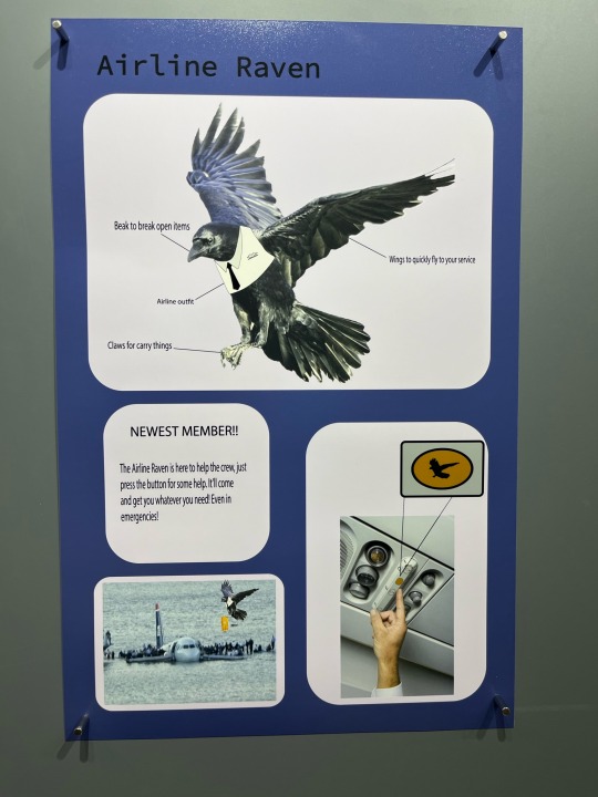
This project was to redesign nature. My initial thoughts when it came to this was making a funny twist, like how both planes and birds fly yet have nothing to do with the other. The creation of the airline raven was created by those thoughts. The idea was to make the raven a crewmember of the airline. With the press of a button, it would fly to you and get you whatever you needed without disturbing others since it doesn’t talk nor make much noise. It was also convenient for emergencies since it would drop lifeguard vests, etc to people in trouble if anything were to happen with the plane. A reason why a bird was chosen is because if ever the airplane became stranded, birds are known to fly to the closest area of land which will help the people stranded since the bird would have a tracker. At the top of the page, the bird is described : the wings, claws, beak, and its vest which add a humane factor to the bird. Ravens usually symbolize death which is why by making it a helper, humanizing it, I wanted to change its symbolism from death to saviour.
This poster is made to represent an airline pamphlet with given instructions hence the shapes. There is some colour: the background being dark purple with the shapes being a lighter purple which make it aesthetically pleasing and balancing to the poster. The vest was an added touch to the bird which I used by drawing on my iPad fully giving the bird a crew look. The bird button is zoomed in to better see and understand that it is what one must press to call. It is the same color of the previous button however I added the bird feature to it to add some detail to it and making it all black. The bird was taken from the internet however I changed it up a bit by adding some highlights of blue and playing with the saturation and hue to create a lighter bluish version of a raven which in reality is pitch black.
The idea of this project was to make it realistic but not, it is realistic since it uses both a bird and an airplane which are commonly seen in the air however it plays with the idea of fiction since it is very unlikely for a raven to be used as a pet and for it to be in an airplane. There is a nice amount of white space since it balances everything out without making the poster look stuffy. There is emphasis on the raven since it is the biggest image on the poster and really focusing on the idea of the bird rather than the button and what it can do. I’d say there might be a little form of hierarchy since the images go from big to small in a descending order. Ex: bird, button, airplane, words.
0 notes

Text

Project 1
This project was one that gave me a rough start due to trying to figure out how to begin and what i needed to help make a nice change due to the fact that I had a late start. To begin, I imaged traced my pictures and with my teachers help (Chris/ You who will be reading this) was able to layer and make 3 shapes for my pictures which play a role in the poster. The Color was chosen with the help of some classmates, because it caught the eye and because it was a somewhat calming aesthetic Color. The 3D “Downtown” was added for its cool effect and because I believed it helped so I wouldn’t have too much negative space.
This poster is based on a picture taken Downtown, Montreal on Saint-Catherine’s street. The image communicates a variety of both French and English to detail the fact that downtown is a place that highly involves both languages. There is a lot of repetition when it comes to the number 3; for example the 3 pictures, the 3 letters in “mtl”, the 3 in the bottom picture representing the restaurant, and the 3 threes. The theme of threes helps the poster balance out in the matter of proportions. The balance could also be considered a hierarchy if you look at the placement of the main pictures. The star at the top represents how Downtown is the star attraction of Montreal. Everyone knows about Downtown and everyone goes Downtown for either shopping or going to restaurants.
0 notes

Text


Inspired designer
Although this isn’t a digital creation. I find the account “Vintagepatterns2sew” on Etsy really pretty and inspiring to look at.
0 notes


Text

Semiotic Analysis Assignment
This sculpture called “Cilo’s Dream” was created by Coderch & Malavia in 2020 using bronze and blue patina. The sculpture is portraying a person who has long hair and has their knees to their chest. The person’s hair is in the air giving the viewer the perception that they are in water. I also assume that they are sitting on coral or some sort of rock that the viewer can see from the feet going up to next to the face. I would like to say that the sculpture has a modern style since it is very realistic. It reminds me of a sculpture you see in gardens or in water fountains at the park. The colour used in the sculpture attracts the human eye and it gives a pop of colour to the grey background. There is also texture used in the sculpture to define the hair and the skin, I get the impression of movement due to the position the sculpture is in which leads the gaze to the hair all the way down to the body.
The sculpture is literal because there isn’t a comparison to something else, however one could assume that it is also analogical since it is simply a sculpture however the additional things like the rock and flowing hair can give the impression that it is not a regular sculpture of a person but the sculpture was sculpted to give the impression of being underwater.
There are not many signs to identify since this is simply a sculpture however the position of the sculpture could also indicate being cold since they are holding themselves as if they were, or if they were sad.
The sculpture doesn’t seem to have much of a meaning due to it being a sculpture and also in a position that doesn’t tell much however objectively speaking the sculpture has the ire knees to their chest with hair in the air. There is also rocks under, behind and also in the sculptures hair. This could be a very simple sculpture. Subjectively, I would say that the sculpture given the emotions of a normal person is quite cold due to its position and is most likely underwater due to the rock/coral. The hair also symbolizes the idea of the sculpture being underwater.
Cilo’s Dream. 2020, www.this colossal.com/2021/01/coderch-malavia-bronze-sculptures/.
(The MLA format was handwritten since copy and paste wasn’t working)
1 note
·
View note
Text

Exhibition Analysis Assignment
This picture was taken in 2016 Galle, Sri Lanka which is a small island. I was unable to find the photographer for this work nonetheless the work is directed toward the sea with what seems to be sticks poking out with some people sitting on them. It seems that the photograph portrays a seat for fishers to get deeper into the water for a bigger catch. It’s uncertain to say if the picture has a certain style since it seems like a regular picture of the ocean. In the description, it mentions how this is a fishing style known only to this place and that this was a technique that emerged after World War 2 when the rocks that fisherman used to cast from were bombed. After reading the description, my understanding is more detailed it explained why this technique came to be and that this is a fishing style known only in Weligama Bay which explains how it could be odd for people living elsewhere to see since this is a rare style.
The photo doesn’t seem to have a specific message however it represents the cultural way of fishing since this tradition is said to have dated back 350 years. Since this is a tradition known only to this island, it would probably be said that it has an ethnic importance to those who live there since this was a style that came to be used and known only to the villagers and that since it was so secluded, the entire world wouldn’t really feel any importance with this technique. Objectively, this photo shows 2 men fishing, sitting on sticks in the deeper side of the ocean which could be incredibly long. However, subjectively speaking, one could say that these men are deserted on the island after the war and that they are sitting on sticks for a last chance to catch some food which could be an excruciating event. The photo has a hard time conveying a message however the pop of colour from the ocean gives a new appreciation for the view. The framing and focus is perfect in the sense of showing the viewer the situation of the men fishing, how the sticks are they’re last resort since they have no rocks to stand on. The movement of the waves helps to direct the eyes to the center of the picture and then out into the rest of the sea which can also we used for appreciating the view.
The picture does a good job at showing the view of the ocean and of showing the tradition of fishing which could be used in other places however because of the different aspects, it can be hard to tell if this is a terrible situation and that the men need help or if this is just a way of showing tradition and making it more acknowledge. The target audience would probably be towards anyone who isn’t from Sri Lanka since this is not something regularly seen and the photographer would have maybe wanted to expand the idea of this fishing style to the world. Personally, this photo gave me the impression of a tradition that could be cool to learn about however I also had self doubt that these men could be in a horrible situation and would need help which is why the description was helpful the read about.
0 notes
Text

Advertisement Analysis Assignment
This print was created by the brand TABASCO which was founded by a man named Edmund Mcllhenny in 1868 on Avery Island, Louisiana. As the picture depicts, the main subject is the bottle of Tabasco being held by pliers. The pliers point out emphasis because it is really red near the bottle to indicate how hot the Tabasco is to the point of melting the pliers. There is also the form of colour which is mostly used in the print. Red was used to represent how hot and spicy the bottle is. This method exaggerates the product since a sauce can’t physically melt the pliers.
The prints quote “Don’t touch. little bottle. Big flame” describes how intense this heat it, which can make anyone a curious George to find out. The print also really pushes on how this sauce is perfect for Mexican food, this can be a daring challenge since Mexican food is very spicy. The creators add at the bottom how it can be added to other things like guacamole, salsa, tacos and burritos, red beans and rice which is food eaten by a lot of cultures. They add that its Gluten free and has zero calories which make those who want to watch what they eat be considered as well.
The target audience is mostly those who enjoy spicy food, and by saying that it goes perfect with Mexican food; those who enjoy even Mexican food would love to try it. This can also peak the interest of those who like to taste test or do challenges and try a really hot sauce. Personally I found that this image does a great job of depicting how spicy the sauce is. I would try it just to see if it was good but hopefully it wouldn’t be too hot. I find that this image can be read as a negotiated reading since the image and words show/say that the sauce is hot but it could still be questioned and lead to a different understanding. However, its also a Dominant-hegemonic reading since the message comes off in a pretty unquestioning manner since it isn’t that difficult to understand that red equals hot and the melting of pliers means really hot. To be frank, the company did a very good and simple job at showing its product and how it is the perfect hot sauce.
0 notes
Text

Formal Analysis Assignment
This art piece called “The Last Sleep of Arthur in Avalon” was painted by a man named Edward Burne-Jones. This was the creation of a huge piece that measured 279cm x 650cm and was started in 1881 and then was finally finished by 1898. This was originally a commissioned piece that later became a public artwork. The subject matter was based on King Arthur’s tale which became a very known story in schools and for any medieval lover. As you can see in the painting, that this was dedicated to his death. The piece has a very distinctive style that most people use to display medieval art, for example the blurred faces, the golden buildings, the greenish landscape and finally the robes/dresses they wore that is usually seen in the olden time movies and known legends.
To show the elements of art and design, the artist used the element of art known as texture in the painting, when looking at the building you can see that it seems to have carvings, which is often seen in the European continent with tales of their riches. Like when they decorate the homes of their gods and goddesses, the Roman buildings like the colosseum, etc. There is also the texture in the paint which even online, you are able to see. It has a look of bumps and roughness to it. There also happens to have the use of colour which is used for the robes of the many people surrounding King Arthur. The colour could be used as an example of emotion since each colour has a different meaning and the death of King Arthur affected his subjects and loved ones very differently. I’ve noticed that the certain colors used are ones of calmness like green, purity - white, love - pink which could have been a representation of King Arthurs character. In addition, there is some variety since the painting is pulling the viewers eye all around the area to the different people but there is emphasis on the building that is leading to the king on his deathbed which the artist wanted to direct us too.
I’ve always had a fondness for the story of King Arthur and his tale so this painting had already captured my eye however the use of colour and texture really made me admire it. The texture of the “medieval look” and painting texture made me fall in love harder with the style. The different colouring gave me a sense of comfort and different emotions that draw a person to this art piece. Which is why the artist probably used so many bright comforting colours in such a sad moment. The creator was probably trying to show his love towards the Arthurian legend by making a variety of things to look at and the emphasis to the king. I believe that observing the painting a bit better gave me a new perspective on the understanding of why certain things were put in the piece. By having Arthur in the middle, it showed how others wanted to see and witness his passing to not forget or get a last word in. It also showed how loved he was as a king or as a person however we will never know.
0 notes
Text

Homework #1
This is a picture of my fireplace that I took when Quebec was missing electricity for a good couple of days. Although it’s a strange thing to find inspiration from, I chose this image because of how mesmerizing a fire can be. It’s a thing that can hurt you yet is so beautiful. It can destroy but it kept us warm when it was freezing outside. I’ve always had fondness over watching a fire burn, something about it made me at peace. It’s like watching a dance that continues to spread, leading to why I find it inspiring.
1 note
·
View note