
Statistics
We looked inside some of the posts by ratastrophic and here's what we found interesting.
Average Info
Notes Per Post
2M
Likes Per Post
1M
Reblog Per Post
954K
Reply Per Post
2K
Time Between Posts
1 month
Number of Posts By Type
Photo
14
Note
1
Text
2
Last Seen Tumblr Blogs


Fun Fact
Tumblr’s website traffic is steadily declining.
Photo

Next time you feel like engaging in unhealthy coping mechanisms, remember that Mental Health Marge is out there, and she will find you
81K notes
·
View notes


Photo

👻🎃 RoadRat Monster Week - Day 2 (Hayseed) 🎃👻
I might add more details in the future! Just need to catch up with the week haha.
839 notes
·
View notes


Note
So that's how to reference with digital art. Cool. Thanks for sharing it.
It is! I always make sure to try and break the pose into shapes and work from there. I also like to use arrows to show the flow of the pose!!! I then open it next to my picture and draw the shapes scaled up in size as I draw on a 4000px x 4000px canvas usually. You can also use posemaniacs.com for referencing, if you scroll down the right side and click “model” it has hands, a torso, and a head for practicing with.
Here’s 2 examples!!!
Making someone bigger than ref’d person:


Making someone smaller than ref’d person:


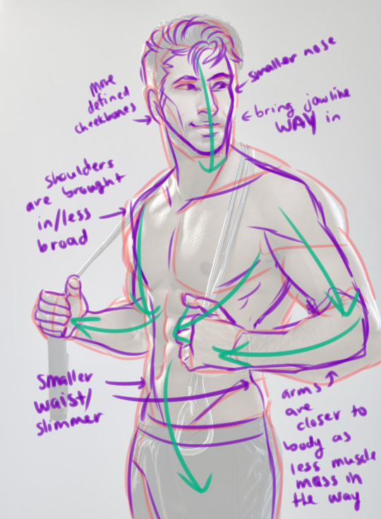
HOPE THIS HELPS EVEN MORE SO!
15K notes
·
View notes
Text
some resources for people who want to start animating
free animation programs
the 12 principles of animation
51 animation exercises (from beginner to expert)
glen keane animates a scene
my advice: have fun and play–play is learning | always be watching real life to see how things move | also be watching cool animations to learn from them | don’t wait until you’re ‘good at art’–animating will help you improve | it’s hard but so worth it when things turn out well, good luck!
65K notes
·
View notes
Photo


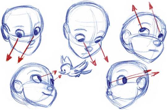
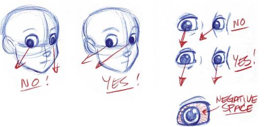

Eye Direction and Proximity, by Tom Bancroft
10K notes
·
View notes

Text
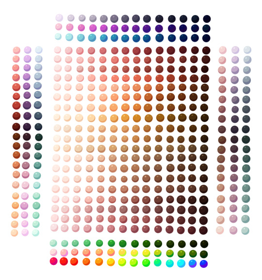
shading colour tips
hey yall its me the Art Mom™ to help you shade pretty
rule 1: DO NOT SHADE WITH BLACK. EVER. IT NEVER LOOKS GOOD.
red- shade with a slightly darker shade of purple
orange- slightly darker and more saturated shade of red
yellow- i think like..a peach could work but make it a really light peach
green- shade with darker and less saturated shade of blue or teal
blue- shade with purple
purple- a shade thats darker than the purple you’re using and maybe a little pink (MAYBE blue)
pink- darker shade of red
white- a really light lavender or blue..or i guess any really light colour??
black- okay listen dont use pure black to colour anything unless you want to leave it with flat colours because you cant really shade black lol
grey- a slightly darker shade of purple or blue (less saturated)
brown- slightly darker and less saturated shade of purple or red
aaaaand thats all i got lol. let me know if there is anything i should add to this list!!
469K notes
·
View notes


Photo


Igor Wolski - http://igorwolski.com - https://www.youtube.com/user/iquorek1 - http://igorwolski.tumblr.com - https://www.inprnt.com/gallery/igorwolski - https://www.instagram.com/wolski.igor - https://www.facebook.com/wolski.igor - https://www.behance.net/igorwolski - https://twitter.com/wolski_igor
3K notes
·
View notes

Photo

https://www.instagram.com/p/Bf2zVQXFoMv/?utm_source=ig_share_sheet&igshid=1uah8rfn4akxn
19K notes
·
View notes
Photo


I hope I have the time and energy to finish this later
10K notes
·
View notes
Photo

“This was her planet, after all…“
This is the Dusk version! You can find the Dawn version on my twitter!
3K notes
·
View notes