Don't wanna be here? Send us removal request.
Statistics
We looked inside some of the posts by raygoodwinbaphotographyjournal and here's what we found interesting.
Average Info
Notes Per Post
0
Likes Per Post
0
Reblog Per Post
0
Reply Per Post
0
Time Between Posts
7 days
Number of Posts By Type
Text
8
Video
4
Photo
5
Last Seen Tumblr Blogs


Fun Fact
Tumblr was named as a finalist in Lead411’s New York City Hot 125 in Aug 2010.
Text
Alienated Spaces - Kentmere 100
In a previous post, I mentioned that I shot a roll of Kentmere 100 after I had shot a roll of Ilford HP5+. I have never used Kentmere 100, although I was thoroughly impressed with the 400 speed variant. Knowing that the 400 speed film worked rather well for the Economy Exhibition documentation, I was eager to see how the 100 speed film worked.
I used the same setup of the Nikkormat FTn and the Nikkor 50mm F1.8 AI. I was able to open up the lens a bit more as it was two stops slower than HP5+’s box speed. I was mostly set to 1/500th-1000th and stopping down from F2.8-5.6 depending on the lighting. The film was developed at 1:50 in Rodinal as I always do. They were developed at home and scanned at home using my Canoscan 9000f MKii
The roll was partly related to Alienated Spaces, but some were just misc shots. I mainly wanted to see how the film handled and whether it was worth trying again.

Cricket Club. 1/500 and F2.8. The dynamic range of the film is really well controlled. I was exposing for the shadows as always as I know the highlights can be recovered with a negative film. I am also very impressed with the Nikkor’s optical performance here. Incredible sharpness and subtle bokeh.

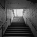
Church of Brutalism. 1/1000 and F5.6. The tones of the film work really well with the bland concrete. The exposing for the shadows again controlled the highlights and retained detail across the frame.

Doorway. 1/1000 and F5.6. Again, the tones of the film are fantastic. The grain is well controlled and the tones aren’t overbearing. I could of opened the aperture to F4 or 1/500th so save those shadows on the left - but it isn’t exactly a deal breaker.
My experience with Kentmere 100 is overall extremely positive. I like the nuanced tones, fine grain and it’s competitive price. It will never replace HP5+ for me, but I shall use it again. The Nikkor 50mm F1.8 also came up trumps again, with its corner to corner sharpness and bokeh.
Below is a select few from that roll related to Alienated Spaces.


0 notes
Text
Summer, Creative Block and Projects

(BHP Fuel Fest - June 2018)
I always find the summer to be a particularly annoying time of year: the days are extremely long, the days are very hot and the light is usually harsh and unforgiving. These are some of the reasons why I find summer a hard time of year to create anything - I’m not a massive fan of being melted and having the risk of being attacked by a melanoma.
During these long days, it would be ideal to have something to occupy the mind as well as fuelling the creativity of a photographer/student. This is where summer projects come in very handy. It manages to keep one creative and in motion during the long sweaty days. I waited and waited for something to be briefed to us; perhaps it was going to be as we finished, perhaps just after - I waited but it never came. I was partially expecting this to happen.
Not having such a project to keep me in check lead me to get into a photographic rut. As of writing this, I haven’t taken a photograph since June 17th 2018 - that’s four weeks...a month without doing what I love doing. Speaking of doing what I love doing, the last thing that I had photographed was BHP Fuel Fest in Exeter. I was in my element: I was surrounded by cars and people that I enjoy and photographing things which I want to photograph for a living. It was a real epiphany moment when I realised that I had missed doing something of which I had a real passion for: automotive photojournalism. The results of that can be found here - BHP Fuel Fest

(Small Worlds & City Limits - April 2018)
So, there’s no official summer project which leads to me organising what ever it is I am doing. At the moment, I really feel as if I am in a creative rut. Not being in a creative institution and being surrounded by creative individuals was certainly something that fuelled the past year of photography. I certainly wouldn’t of been able to do what I had done without these. This lead me to go over the work I had created over the last year and see if I can make it into a project or two. It still astounds me that my work warranted the grade it did - I couldn’t see how the vast majority of my work was worth a 1:1: obviously it did, otherwise it wouldn’t of been graded so. Two projects really stood out in terms of the content: PHOT102′s Small Worlds & City Limits and PHOT104′s Parked Cars. These are the two projects of which I had really enjoyed, but they were the shortest projects we had in terms of workload. Both projects are subjects of which I am interested in documenting and something I wish on expanding upon. I plan on working on these projects over the summer and plan to create worked upon these.

(Parked Cars - April 2018)
The work for PHOT102 shall be renamed to ‘Alienated Spaces’. This documents the urbanised spaces of the city/urban environment with the hidden subtext of the alienation/estrangement that lives and breeds with modern capitalist utopia. This project will be mainly analogue based, utilising 35mm B&W film and colour film. The main inspiration for this project is Guy Debord’s Society of the Spectacle - it was also inspired by my stills video for BAIS300. PHOT104′s Parked Cars will continue as it was originally with the same subject and context of the images. I will be renaming the project to something a bit different, as I feel ‘Parked Car’s is a little on the nose, almost perfunctory - perhaps change it to something somewhat ambiguous or grammatically interesting.. But this shall be improved upon and changed in time regarding composition and location. Both projects should be worked on during this summer, where shall they be expanded and strengthened.
(edit 15/7/2018) - Parked Cars has been renamed to “Where’d You Park?”
0 notes
Text
BAIS300 - ...And - Evaluation
BAIS300 has been the interdisciplinary studies portion of my photography degree. BAIS300 was aimed at using more than one discipline when it comes to photography and image making. In this evaluation, I shall go through the process of starting with Art School 2030 and following on to ...And. In this evaluation I shall also explain what went well, what didn’t go so well and what could of been improved.
This project started in January with Art School 2030. The entire collection of first year students were jumbled up into certain groups and were tasked to design an Art School for the near future. We would primarily be with people we haven’t seen before and had no connection to. This gave the opportunity to show how well people work in groups of somewhat strangers. I had quite caustic views on this project as a whole. While I do feel it’s important to work in groups, I personally find it difficult to work in a group with people who I have no connection to. I also found the entire ethos of the project rather conspiratorial; PCA is going under changes and students are tasked to design an Art School of the ‘future’? While it was mostly aimed at a teamwork exercise, it seems odd that this subject was chosen. The entire write-up can be read below.
Art School 2030
After this had passed, the brief then led onto ...And. This project was based around the use of photography and another practice; whether that be moving image, sculpture or graphic design. I initially didn’t quite know what to do for this project. It started with creating GIFs through Photoshop. While I found it interesting that this can be made with PS, I was unsure that I would implement it with what I was going to do. I then set my sights on creating a moving image piece inspired by Grant Gee’s documentary Meeting People is Easy. The establishing city shots of the documentary following Radiohead around their OK Computer tour is something that is ever inspiring as well as the album itself. I asked myself, “how can I do this?”. I started with making some test ‘vignettes’ with my Canon 100D to get the kind of aesthetic and framing that I wanted. To recreate the camcorder aesthetic, I decided to use my Mother’s Canon MV850i MiniDV camcorder. It needed some TLC, but when this was done it was working fine. I also had to have some sort of soundtrack; noise/folley that would complement the visuals. It was at this point when a friend of mine recommended Le Jetee. This motion picture made entirely of stills was a key piece of inspiration. It gave my the epiphany that the audio is as important as the image itself. It also made me realise that still photographs sewn together could create a narrative. This piece of the puzzle answered the sound track issue and also allowed me to implement photography into my project as well as moving image. I recorded sound from radio broadcasts through a synthesizer, field recordings and a recording of a piece of ‘music’. Some recordings were remastered by my friend, Thom Chapman.
The actually shooting process went incredibly smoothly. The camcorder was easy to use and I didn’t have any technical issues apart from not having any audio import with the video. This was no problem as I wasn’t using the audio from the camcorder. The biggest issue I faced was my editing software totally crapping out when I was ready compile all three sections of the video. This meant I couldn’t compile these sections and was unable to master the audio. Microsoft has implemented an extremely rudimentary video editor with the photos app. Unfortunately, MS has also discontinued Windows Movie Maker. It was still very simple, but it still has some creative control. I was able to compile all sections together, but unable to mix the audio properly. It was up to my friend Thom to help me out again. I am very thankful that he was able to help me in my hour of need. Apart from this software related FUBAR, the whole process was rather smooth. The endgame of the project is an exhibition spanning across the whole college. My work was displayed on an iMac placed on a plinth in T2.23. To plan the exhibition, we were also tasked to measure our room and create a model to gauge the scale of what we were doing. The model building was very easy, if not somewhat boring. I realise that planning can help troubleshooting along the line, but I felt that building a model of our room that we know pretty well wasn’t all too necessary; although it does put us in good stead for future exhibitions. The actual exhibition was also a mixed bag. While there was some good work exhibited within our class, I felt that the execution of the aesthetic quality was lacking as well as the lack of an overarching narrative. Having such a ‘creative’ freedom over what can be done leads to others creating vastly different work...so much so that it doesn’t quite match. This really showed when I walked around the college looking at the other exhibitions. The other disciplines across the college had an incredible narrative that followed the work and had a certain atmosphere. I feel that our portion of the exhibition felt rushed and lacklustre. I also feel that the overall theme of the project could be altered slightly. It has been mentioned in the past that the interdisciplinary unit was set to a certain discipline; a chance to learn new skills instead of choosing something one knows something about. I would argue that one would learn more if the discipline they were involved in was vastly different, ultimately expanding their creative horizons.
A coda. While the beginning of the project was a stretched out few days of isolating work, the latter portion was very enjoyable. Art School 2030 left me feeling rather isolated and estranged when it came to group work. It didn’t make me feel at ease when working with a group of people, it just made me feel more awkward and in-the-way. ...And is where I started to enjoy what I was doing as I have total creative freedom to create whatever I wanted. Virtually, I had no real restrictions to what I could do. It gave me the chance to explore processes what I haven’t ventured to or explore the ones that I have experienced and improve upon. The work I have created is something I am for the most part, proud of. In someways, I feel that the product I have created is the moving picture manifestation of my PHOT103 work, as the ethos is similarly based around the theme is social isolation, estrangement and alienation. I would like to continue both the moving image side of this project and the field recordings mixed with photography. I feel that these aspects are something that I can improve on and implement in future projects. The exhibition felt rushed and rather lacklustre compared to the other exhibitions across the college. This could be changed with prior planning and an actual narrative for the work. Overall, I feel that the work I produced was up to my standards, but the setting for the exhibition could of been executed better.
0 notes
Text
BAIS300 - ...And - Exhibition

The time came to set up the exhibition. We had prior experience to exhibition setting up and this would come in handy for this particular exhibition. One portion of the setup was undertaken on the 18/5/2018. Me, Jamie and Aaron collected some boards from The Warehouse to place in T2.24. This was particularly difficult as the trolley we used wasn’t in the best shape and trying to push 300kg or so of boards up a hill wasn’t all too fun; it was tiring work but nobody else bothered to help.
21/5/2018. The time came to setting up the whole space for the exhibition. The boards were ready to be placed and the work was ready to be shown. I had previously taken a plinth from The Warehouse prior to the exhibition, as well as contacting I.T so that I could book and use an iMac. Mine portion of the setup was incredibly easy. I just had to place the iMac on the plinth, load my video and secure the computer to the plinth using a lock; I was pretty much the first one to finish. The finished product is shown below. The boards in the far end of T2.24 was to be arranged in a concertina fashion using the same clips we used from Economy. This turned out to be a somewhat nightmare, as the kept on rounding off and then making the boards fall over. Although, this was rectified after some double checking of the clips.

But, we weren’t the only ones showing work for this exhibition; the entire first year students would arrange and setup an exhibition for this project, but with different briefs depending on their respective courses. As soon as I stepped afoot in other exhibitions, I realised how bad our one really was. Everyone’s had a reoccurring theme and a certain mise en scene that our’s lacked.


‘The Asylum’ by Costume Design was a good example of that. The entire exhibition was dark and harshly lit. Background noise filled the space with unsettling water drops and screams. There had been so much thought and effort put into this exhibition, which ultimately think about where our’s went so wrong.


Another example was the exhibition by Interior Design. Each section had photoshopped plans and then the actual setup for the interior. Again, you could see the planning that went ahead for this project. With our’s, I feel that it was too independent and lacked an overall theme. While it’s good having free reign over what one wants to do, the varying themes of the work seemed to clash for me. I don’t think any of my work gelled with anyone else’s.
In conclusion; I feel that our exhibition lacked where most succeeded. Our planning and overall aesthetic quality was lacking when compared to the other’s across the college. While I feel that there was some good work in our exhibition, I don’t think that a lot of it mixed well together; I wouldn’t say that my vignette highlighting my feelings of alienation and estrangement gels with a timelapse of make-up application. I think that if we were to tackle this again, I think it would be a good idea to either stick to groups or have an overarching narrative/theme; that way there can be some consistency within the work.
0 notes
Video
youtube
BAIS300 - ...And - City Vignette
It has been completed. It has been a rollercoaster of exploratory practice and learning curves. I set out to create ‘vignettes’ of the city; somewhat conveying my feeling of alienation and estrangement in the urban environment.
It all started out with the inspiration of Grant Gee’s Meeting People is Easy; a documentary of Radiohead’s gruelling OK Computer tour, spanning from early/mid 1997 to mid 1998. The music of Radiohead’s third studio album and the cinematography of Grant Gee’s documentary inspired me to have a look at the city and what it makes me feel. The use of visuals and audio cues were something I found intriguing, and felt as if it was something I should pursue.
To recreate the lo-fi aesthetic of Grant Gee’s documentary, I decided to use a MiniDV camcorder. Luckily I had one in the house, the opposite of lucky was that the batteries were rubbish and the camera needed some TLC. This was all overcome and was explained in a more eloquent manner in a previous post.
I felt as if it needed something else, rather than a compilation of city scenes and noises. A friend of mine recommended me to watch Le Jetee; a motion picture made entirely of still photographs. This was a turning point for my work. I had realised that not only did the usual 24fps not matter too much, but the actual soundtrack/foley plays such a large part when it comes to motion pictures. The entire soundscape puts you in the space, totally negating the use of the 24fps that we have accustomed to with video. It occurred to me that I could use photography in my work as well as moving image, it felt like a match made in heaven. The thing I thought was missing was found, I just needed to think of a way to express these thoughts.
I chose to take another leaf from someone else’s book and to use field recordings to create the scene. I walked around Plymouth finding these ‘alienated spaces’; certain places that conjure the feeling of indifference. After each photograph, I would use my dictaphone to record the sound of the space, leaving a still image, with a motion of sound behind it.
After these sections had been completed, I still felt as if there was something missing. I thought that there should be some sort if intermission between both moving image and stills section. I chose to use a longer piece of footage of the traffic with the drumloop/synth progression I had composed earlier. The went in the middle of both scenes creating some sort of short musical intermission just to break up and create a difference in the vignette series.
I had some help with the audio mixing. I had explained in an earlier post that my usual video editing software totally crapped out on me, leaving me with very little to edit with. The stills section with the foley was much quieter than the rest of the video. Thanks to my friend Thom, he was able to help me out with the audio mixing and was able to bring up the dB of the stills section. He also ‘remastered’ the drumloop/synth progression. Thank you Thom.
The video will be displayed on an iMac in T2.23, hopefully on a plinth...but failing that a table should suffice. The audio shall play thought some Phillips headphones that I shall provide.
0 notes
Photo

BAIS300 - ...And - Stills Vignette Contact Sheet
Using my Pentax Spotmatic F, Super Takumar 55mm F2, Ensinor 28mm F2.8 and a roll of Ilford’s HP5+. I included every photograph from this roll, all 24 frames. I wanted to maximise my quality/quantity and also stick with the 24 frames per second of video; although the ‘video’ is one frame per five seconds. All images were scanned with my Lidl film scanner...with surprisingly good results. I wanted to cover similar locations that I had filmed in previously. This was to show some consistency in my results and because some of these spaces were interesting in the audio that flows around them.
The film was developed at home with Rodinal at 1+50 dilution with minimal agitations to reduce grain. Development took 11 minutes, agitating for the first thirty seconds then one inversion every minute. I have found this to be a reliable process when it comes to Rodinal development. Rodinal is best used for slower films and sometimes isn’t too kind with fast speed films, so minimising the agitations which can effect how the images looks is something that needs fine tuning when to home development.
I wanted to focus on the city as whole, I guess this is similar to what I have done with previous projects. I wanted to focus on the man-made/the unnatural. The unnatural spaces are something that me feel indifferent to what we are doing to our space. This, bundled with my ever alienated and isolated feelings of social settings create a mass of estrangement. Which at the end is what this is all about; a self reflection of my alienation. This is a key theme to a lot of my work as it’s something that is prominent in myself, so I feel that my work expresses this.
These frames have already been created into a ‘video’, which has been explained and shown in a previous post. I now have to somehow marry both my MiniDV and photographic vignettes together.
0 notes
Video
vimeo
BAIS300 - ...And - Stills Vignette
While one section of my alienation fuelled vignette was filmed on a MiniDV camcorder, another would be comprised of still photographs with audio taken in each photographic location
Using my Pentax Spotmatic F, Super Takumar 55mm F2, Ensinor 28mm F2.8 and a roll of Ilford’s HP5+. I included every photograph from this roll, all 24 frames. I wanted to maximise my quality/quantity and also stick with the 24 frames per second of video; although the ‘video’ is one frame per five seconds. All images were scanned with my Lidl film scanner...with surprisingly good results. (Contact sheet on a separate post thanks to Tumblr’s amazing image compression)
I set out to Plymouth to similar locations to what I had filmed to photograph and record. I had noticed that each location I visited had a certain audio space. There was always something in the background which made the scene. Initially, I was only really looking at Grant Gee’s Meeting People is Easy in terms of research, but I think that watching Le Jetee was a real turning point for me and this project. If I hadn’t of seen that motion picture, I feel that this project would of been narrow-minded and lacking any sort of interdisciplinary action. Without Le Jetee, I couldn’t of implemented photography in the way I wanted to.
I mentioned that I think audio is as important as the visual in terms of motion pictures. I expressed that Le Jetee works on the premise that the audio puts you in the scene, and that you aren’t reliant in moving images to tell you whats going on as the audio does that for you automatically. The still images become alive in your mind as you imagine the scene moving with the audio. This is what I wanted to recreate with this section of my vignette.

This was how it was originally planned to be made. All images would be imported into Hitfilm Express 2017, each image and audio clip would run for five seconds each. At first, I noticed that the images were taking a really long time to get placed correctly. I thought that this would be down to the large size of the scans, no big deal I thought. After an hour or so of getting it ready, it was ready to export....FIVE HOURS REMAINING. A five hour render for two minutes of photographs and audio, that’s not right. My PC isn’t a total powerhouse, but it shouldn’t take five hours to render that. I was at a loss, I had to compile both of these clips together for the final product, and that would take even longer than five hours to render that. So, I did what I could and managed to create and export the video using one of Microsoft’s hidden video editing features in Photos. While Windows Movie Maker doesn’t exist anymore, Microsoft does have a basic video editor in Photos. I was able to import all 24 images, set them to five seconds each and then compile all five second audio files into Audacity to match the stills. The matching audio was then exported from Audacity and then imported with the stills, when matched up it was exported as a 1080p video and it certainly didn’t take five bloody hours; in fact it took around 30 seconds at the same audio quality (48000HZ) and at double the resolution of the video (1080p is double 540 in terms of resolution).
The audio was again recorded with my Olympus DS40. All clips were recorded at the highest sample rate possible. The only issue I had was the wind, while I do have a low cut filter applied to the audio and shielded the dictaphone from the wind, it isn’t all too impervious to wind noise without a dead cat windmuff.
All that remains now is to marry both sections of this project together. I am still unsure how I am going to do this, perhaps using something to co-join both segments, like a separate video clip or an audio cue similar to Grant Gee’s chime/bong sound when another clip is show.
*Please note, that I forgot to take any screenshots of the Microsoft editing or the Audacity editing*.
0 notes
Video
vimeo
BAIS300 - ...And - Vignette Section #1
The first section of my moving image piece has been edited/created. Using clips recorded from my Canon MV850i and recorded radio chatter/instrumental use. As usual, I used Hitfilm Express 2017 to edit my video. It was exported at 540p and the audio sample rate at 48000Hz.
This section was mainly inspired by Grant Gee’s Meeting People is Easy rockumentary. I wanted to edit the sections of video in such a way that it conveyed a certain level of alienation and estrangement. The droning feedback of the Korg Monotron is used to signify the ‘fridge hum’; something that I feel represents the background noise of a city. I also wanted to create a certain confusion with the radio chatter. I had the radio going through my Korg Monotron Delay, effectively acting as an effects unit. I was able to control the delay rate and feedback, resulting in some delayed and distorted chatter.
One thing I wanted to focus on was the lack of people in my work. I have also used this in my photographic work, but I wanted to have as little human contact in my work as possible to have a certain social isolation-orientated influence. I often feel socially isolated and alienated, so this exclusion of people directly in my video and photography directly responds to this.
As mentioned, this is the first section of my video for this project. I intend to include photographs coupled with sound as another section of this video. I would also like to include the drumloop/synth track I recorded, but I am unsure how it’ll fit in with the sections I have created and are under-construction. A roll of HP5+ is currently being shot for this project in similar settings to the video, but I will also be recording audio in each area where the photograph is taken. Each from will last at least 5 seconds, and I plan to use all of the images from the roll to maximise it’s use. 5 seconds of a 24 exposure roll would result in an 120 second (two minute) clip, which is what I am aiming for. Perhaps the drumloop/synth track can act as a coda for the vignette.
What has to be done? I have to finish that roll of HP5+, record audio after each image in the photographs space, import the images w/ audio with the vignette project as well as organise the displaying of the work. I plan on using a monitor/Mac to display the vignette while it’s placed on a plinth. The audio of the vignette will also be coming out of the headphones to reduce the amount of noise in the exhibition space.
0 notes
Text
BAIS300 - ...And - Video Production & Audio Recording
My BAIS300 project is based around moving image, as well as audio recordings and still photography. The moving image aspect is something where I wanted to challenge myself. It would of been the easier option use a DSLR for videoing, but where is the fun with using the easy option? Early on in this project, I expressed my views on using a MiniDV format camcorder. Thankfully, I have access to my Mother’s Canon MV850i, a MiniDV camcorder from the mid to late 1990′s that has been in the family since then. It has been sitting around not doing anything since around 2008, so the batteries were total junk. I managed to get my hands on some spares, but they aren’t much better. I also bought three 60 minute tapes for the minuscule price of £5.79. Finally, I can start recording...so I thought. I decided to sacrifice one of the tapes for testing the camera’s functions and alas, there was a huge issue: nothing on the tape. Thankfully, some TLC with the recording head soon sorted this issue.
Around 7 minutes of video has been recorded, and it has already been compiled into what could be the first portion of the vignette. There will be around two to three portions to the vignette; a moving image with background noise, moving image with recorded music and a stills section with background foley.
But how does one transfer MiniDV tapes into a digital format? It’s actually quite easy, all you need is the camera, a firewire cable and a computer that’s capable of firewire connectivity and tape importing. Again, my Mother comes to the rescue with here 2011 Macbook Pro which has Firewire 800 and iMovie installed.
Camcorder Importing

To import the video, you set the camcorder to VCR, and iMovie automatically recognises the camera, you then choose the portion you want to import and you select ‘import’. Obviously, it imports in real time, so if the clip is 7 minutes, it’ll take 7 minutes. Once it had been imported, I exported the video into an MP4 so it’s ready to be edited and compiled on my PC. I did run into an odd issue, non of the audio transferred from the tape; this isn’t a great deal as I’m not using the camera’s audio. The video will be edited and audio will be compiled with Hitfilm Express 4.
Audio Recording
Along with the visuals, there will be audio to go along with them. As I expressed in an earlier post, I feel that audio is as important as the visual. I used my Olympus DS40 to record my audio, this goes for recording from the radio, music and foley.

To record the radio section, I ran my Korg Monotron Delay through my Alba portable radio. This means that the audio from the radio would pass through the Korg, allowing me to alter the signals from the radio. As this is the Delay model of Monotron, I can change the delay rate and feedback, creating some rather unique audio options. The DS40 is placed next to the Monotron to record the audio. The DS40 is set to STHQ which is the highest possible quality for this unit. The audio is then imported into my PC. The DS40 records into a WMA format, which Audacity isn’t too fond of, so I always convert my audio into a WAV format before editing.


Again, a similar setup was used to record a drum loop with a synth progression. I used WebSynths to play the keys, and my phones Roland 909 emulator ran through a portable speaker. This offered an interesting home-brew approach to home recording music. It felt as if I was creating an underground synth mixtape. The same settings for recording were used on the DS40.
This offers some insight into how I record audio at home for the project. I plan on using more field recordings with this project. As usual, the recording settings won’t change in terms of the DS40′s capabilities. Things such as travel announcements and general city foley will be recorded and used for this project. Some more video can be recorded, audio will be recorded and some stills will be taken within the week to go along with my vignette. I plan on using Ilford HP5+ pushed to 1600 asa, as well as increasing the contrast to give it the Le Jetee aesthetic. I will also need to organise how I am going to show this video. I wanted to have it displayed on an old CRT, but in the day and age it’s getting increasingly difficult to find a decent one that fits my needs. I may have to setting with a monitor and a Mac Mini for now.
0 notes
Text
PHOT103 - Evaluation
PHOT103 started with ‘Abstracted Self’ and then ‘Exploded Image’. PHOT103 was a project mainly based around the alternative process in the photographical world, and to show that photography doesn’t just have to be undertaken with a DSLR. Through this evaluation, I shall express my thoughts on this project as well as what went well, what didn’t go so well and how I would improve on these things.
It all started off with ‘Abstracted Self’. This portion of the project was based around self portraits and abstracting the image. For the most part, I hated this project entirely. My caustic view on self portraits hasn’t changed:
As someone who doesn’t take self portraits or even use social media all that much, I found this part of the brief narcissistic and extremely futile. I find the act of self portraits time wasting and useless, almost like someone is begging for attention for ones self. I wanted to abstract and obscure myself from the photographs as much as possible. I didn’t want the images to be about me; I wanted them to be about the techniques and the aesthetic quality of the image rather than the subject.
PHOT103 Abtracted Self Images
I honestly don’t see the point of taking self portraits, unless you are totally in love with yourself or want other people to notice you. I don’t feel a need to document myself with photography, in a way all of my images are self portraits from my eye’s view. Positioning the camera facing to me is something I’m not into; I’ll leave that one for the narcissists.
Despite my controversial views on self portraits, I do like the technical aspects to the photographs. I felt that mixing the influence of Uta Barth and Vivian Maier was quite interesting. Perhaps I can fuse double exposures with off focus scenes once more in the future. Apart from the technical aspect of this portion of the project, I hated it. I don’t plan on taking any self portraits in the near future as I have no need; what am I going to do? Show people how I look? It’s a waste of time.
This is where PHOT103′s mood changed. It went from something I detest with an abhorrent hatred to something I am really fond of: collage/montage. In the early stages of starting PHOT103, I already had the idea in my head that I could continue with my work from a previous project titled ‘Your Home May Be At Risk’; a set of collage/montage images themed of my feelings of the modern societal system. Themes of alienation, social isolation and estrangement were themes that ran along both of these projects. I wanted to continue with this work, but I knew that I had to improve on what I had already created. I wanted to have more of my own photography in the images as well as some content that I had scanned using found books and magazines. With this, I had partly done what I wanted.
I kept to a similar aesthetic, I have always been inspired by Stanley Donwood’s artwork for the ever inspirational Radiohead. I have always felt that Donwood’s work as accompanied Radiohead’s audio experience so well, I feel that his artwork almost sets the scene of the album before even listening to it. I was also inspired by artists such as WK Interact and Mark Lazenby as they had created artwork that was standing out in a world of similar and boring montage art. Of course, I had to research Richard Hamilton as well as I have always found Hamilton’s work to be visually impressive and relevant.
The images I created for this project are a vast improvement to my work from last year. I have managed to expand my visual aesthetic with researched artists as well as keeping the ethos and theme of the project. I also read more into the alienation of a capitalistic society. Although Karl Marx’s theory of alienation is more aimed towards the proletarian, I felt that there is an aspect that can be brought into the lives of people who aren’t a part of the proletarian; the alienation and estrangement is found with people who feel as if they don’t fit in with the other wage slaved mentalities and serial consumerists. On a personal level, this alienation, social isolation and estrangement has been felt due to my differences to my contemporaries. While I am a similar age to said contemporaries, I don’t tend to undertake the same activities such as social media use, partying or vernacular. The feeling of not fitting in anywhere makes one feel these on a constant basis. This, is the driving force behind PHOT103. Perhaps this can also be used against ‘Abstracted Self’, my disgust for self portraits stems from my alienated view of my cohort.
A coda. PHOT103 was a roller coaster of a project. It started with a project of which I hated with an unhealthy disgust. It was something I initially detested in practice, but I came to enjoy the image making process in the technical aspect. I’ll use the techniques again, but I won’t undertake the self portraits again. ‘Exploded Image’ is where I finally started to enjoy image making again. Across a lot of projects, I felt as if I was producing work instead of creating; just making work to pass the year. Exploded Image is where I started to enjoy making images, not just for my course but for me. All to often I found myself feeling burnt out with creating images, nothing felt good anymore in terms of photography and I feel as if this has shown in my work in certain projects. Sometimes, it just takes doing something different or taking another approach to revivify ones creative process. Exploded Image’s ‘Your Home May Be At Risk...Again’ will continue as a personal project. It could return in terms of college work, but for now it will be a personal endeavour.
0 notes
Photo


PHOT103 - Exploded Image - Final Image Selection - Your Home May Be At Risk...Again
PHOT103 has been an interesting photographic journey, as it started with something that I didn’t enjoy (self portraits) and ended with something I really enjoy...collage. This will be divulged with the evaluation, for now it the selected images for Exploded Image.
Originally, it was supposed to be a follow on from my ‘Your Home May Be At Risk’ project from my access course in Exeter, from around this time last year. I expressed that I wanted to make images that I couldn’t due to time restraints etc. While I don’t feel as if I have totally made that promise, I do feel as if I have made some good images from this project. For a start, I used more of my own photography in my work and used scanned objects more. These are things that I wanted to improve upon in this project. While I feel as if I hadn’t quite done as much as I wanted, I think that it’s an improvement.
The criteria for the final images was pretty simple: Aesthetically pleasing, focused subject matter and refined style. These show the most improvement over my previous work over these points. This is down to further research into different artists and practice in the photographic and collage sense. Each image has a similar theme of transport and technology, but they are all executed in a different way even though to process was similar. The process to this kind of image making has been explained in an earlier post. Perhaps the most difference is seen in ‘Plans’ as it doesn’t totally use the process I have been sticking to. There was no erasing used in this image, it was mainly focused on the layering of the image and how the colours are changed and represented. ‘Safety’ and ‘Roads’ were made using my typical process of painting-erasing and image erasing to create a distorted and scratched aesthetic. I felt as if there needed to be some diversity when it came to my selected images. I didn’t want to have three identical images using the same process; I would rather have three images with similar ethos’ compared to three images that look identical.
Why aren’t these printed? I felt that it would be fitting for these images to be submitted on a digital format compared to a physical print. Because the drylab was broken (again) it made me think: Do I my images fit the print format?’ My images are about the alienation, estrangement and social isolation in a modern societal system, something that I quietly deal with. Why not have the images submitted in the digital world where they are directly in contact with what they are attacking? I felt that this was more apt in terms of the idea of submitting images. Why do we have to print things all of the time? Why can’t there be different forms of submitting work? It’s 2018 and we have to rely on printed formats of image making? While the images will be posted here, I shall provide a link to some full resolution images (These has to be scaled down as Tumblr didn’t like the large file sizes).
Full Resolution Images.
0 notes
Text
BAIS300 - And... - Ethos, PHOT103 Relation and Update
While recording and looking at my research, I noticed that there is a link between the ethos’ of ‘And...’ in addition to ‘Exploded Image’. Exploded Image is about:
my feelings of our modern societal system. Critically thinking about: capitalism, materialism, consumerist tendencies of our modern world, the feeling of alienation, isolation and estrangement that it creates.
I feel that ‘And...’ is a more visual and audio-centric representation of that I feel of the modern western society; a dystopian landscape of concrete, noise and alienation. This also comes from the research, Both Exploded image and ‘And...’ share Radiohead based research from the OK Computer era, from the album’s and Grant Gee’s documentary standpoint.
While Exploded Image shows a more artistic view on my feelings of my view of the modern society from a possible third person perspective, I think ‘And...’ is a first person view of how I feel in a modern society; showing my eyes view on what I see and here when in a city. This can also be linked to earlier projects such as PHOT101 with the long exposures and Urban Collage.
An Update. I have finally started recording with my Canon MV850i. I had to order some batteries (which are still rubbish) and some tape. Once that had been done, I set off to recorded...but nothing was saving to the tapes. I had foreseen this and wondered if the recording head needed cleaning: it did. After cleaning it at home and without the help of a cleaning tape, I was ready to go. I have since recorded some city scenes according to my research and whatever stood out for me. But I feel that I have chosen the wrong time of year to undertake such a project as it’s often too sunny to record. As I want it to convey my feelings of alienation of estrangement, I feel that the sunny weather is the opposite to what I want. I would ideally want to shoot at night, under artificial light indoors or when it’s rainy/foggy.
But, recorded has commenced. All I have to do is import the video from the camcorder to my Mother’s Macbook Pro (it’s the only machine I have to hand that can import MiniDV tapes at this moment in time). I can do it with my PC, but I would have to order a Firewire card and find some software to do it on my own machine. For now, the Macbook should suffice. I have also undertaken some field recordings in the city, on the train and from the radio to be used in the video, along with some music that I have put together. This will be explained better in a later post. For now, I have to import what I have, work on the audio part and think about the stills images portion of the video.
0 notes
Video
vimeo
BAIS300 - ...And - Research
La Jetée
La Jetée is a french science fiction motion picture created (for the majority) of still photographs. The story is based around a post nuclear landscape and the experimentation of time travel. A man is a prisoner and is chosen to be experimented upon by scientists, who are hopeful to send their subjects to different time periods. Initially the scientists have difficulty with their early experiments, as the subjects can’t mentally be prepared for the shock of the time travel. When they come across ‘the man’, it transpires that he can withstand the shock; this is due to an pre-war childhood memory of a woman he has seen on an airport jetty and an incident when a man dies. After several attempts, he manages to reach to the pre-war period. Over time, he and the woman develop a romantic relationship. It is then that the scientists want to send the man into the future, it is here where the man reaches beings of a higher technological advancement and offer him the power to regenerate his own war torn society. Upon his return to the scientists, he realises that he will be executed and discarded by the scientists. He contacts the future beings who offer to help and escape their time for ever. Instead, he chooses to visit his childhood memory again and hopefully meet the women of which he developed a romantic relationship with. He is at the jetty, it occurs to him that his childhood self would also be there at the same time but he is more concerned about finding the woman. After finding her, he rushes over to see her, but he sees one of the agents from the jail who is about to kill him. In his dying breath, he realises that the man who he saw die at the jetty was himself.
I was recommended to view this by a friend of mine, who thought that it would of related to my dystopian city vignette(s). Before watching it, I was unsure how a motion picture could be viewed when it’s mostly made from still shots (apart from one scene for a few seconds which is a standard 24fps video). I would assume that it’s totally jarring and difficult to view, or that it wouldn’t make sense at all. The lack of motion would seem impossible to view, even if normal video is just still images at a fast rate. This is the total opposite. I found it really easy to watch and interesting to digest. My mind would see the photographs, and with the ambient noise, imagery and narration I would create the scene in my head as a moving image. As a piece of photography mixed with cinematography, it’s fantastic. It also made me think that maybe I could incorporate some sort of similar setup when it comes to making my video(s). How would I be able to mix moving images from a MiniDV camcorder with some photography? Would I be able to pull it off as well as La Jetée?
The sounds are also a whole area of interest. As the framerate of the ‘video’ is much lower compared to the standard 24fps, there is a great emphasis on the audio. The score of the string arrangements are often mysterious and sometimes melancholic. While the orchestral score is great in it’s own right, I find the real attraction of the audio is within the ambient noise: the whispering, the heartbeats, the airport chatter. All of these aspects are used to create and set the scene. The whispers in the experiments are spine chilling; it caught me off guard in my first watch through and made me feel a sense of unease, coupled with the erratic heartbeats it grows into a cacophony of agitation and anxiety. The whispered German language oversees portions of the experiments, even enunciating it. This shows that not only does the visuals play a key part in setting the scene, but there also has to be the right audio to accompany the visuals; if the motion picture relies on stills as it’s primary source of visuals, it would need the audio to play a bigger part in the scene so that the fullest extent of the information is shown. But, I feel that it can also be used to subtly hint the viewer about what is happening; cue the whispering.
This is where my main inspiration lies; the audio. I feel that the audio plays a big roll in what I am intending to show in my vignette(s). While I am showing you the visuals of a city, I am also making you listen to what I think a city sounds like within the changes of the audio. The synths play apart similarly to a church organ; an instrument which sets the scene of a vast chasm of space. The electronic feedback and the radio chatter acts as the fridge buzz of the city, the ambient noise of the traffic and the people blending together to create a mass sound of pollution; almost conveying the unnatural and materialistic nature of the city itself. With the sounds I plan on creating and the ones I have already create, I see them as the way I imagine my images for ‘PHOT103 Exploded Image’ sound. These projects are actually linked in ways regarding the ethos of both projects; this I feel is a more visual and audio-centric version of that project.
What do I take back from watching La Jetée? I see it as a surprising amount. I like the incorporation of still images to create a motion picture, it’s such a radical and bold move to even attempt. Mainly, it’s the audio space; using audio to set the scene rather than relying on the visuals to do it all for you. While you can set up good compositions of moving image and show what you want to show, I feel that sometimes the audio is often overlooked when it comes to moving image. Meeting People is Easy is a good example of this. While it’s my main piece of research, it was also the catalyst for me to undertake this project in the first place. Grant Gee has used the audio from Radiohead’s soundchecks, live shows, ambient noise etc to establish the shots and scenes of the documentary; and I feel that Chris Marker has done the same for La Jetée. Marker has used certain pieces of audio the establish the shot to the viewer along with the visuals. This, is something I will have to work towards and hopefully get right.
0 notes
Text
PHOT102 - Small Worlds & City Limits - Evaluation
My project was based around the small worlds that live inside Plymouth’s predominant brutalist architecture. These spaces offer a world of communes that’s encased in concrete slabs. I set out to document these spaces with my photographic knowledge and practices. This evaluation will cover what I did, how I did it, what went well and what didn’t go so well.
The project (as previously mentioned) was based around the brutalist architecture of Plymouth and the small worlds of people that reside within them. The small worlds was always there in the images despite some criticism; the buildings house these small worlds of people; in short, the buildings are the small worlds of the city. I scoured Plymouth for brutalist locations, which isn’t very hard as the post war planning of Sir Patrick Abercrombie was predominantly brutalist and post modernist in design. The rebuilt nature of Plymouth was to show a great new city, a new welfare state which was set to be the crown jewel of the south west; a modern city powered by new optimism. You could even to go as far as saying that Plymouth is a small world in of it’s self, the limits of the city reaching out to the ocean and the surrounding countryside.
I first set out to look at some locations and use that as a test shoot using my Canon 5D just to scope out what I was actually doing. The correct architecture and buildings weren’t difficult to source. The initial test shoot went well, but I soon realised that I had been composing the images in a similar fashion compared to all of the other architectural photographs I had done in the past. Totally disgruntled at my limited technique, I set out to change what I had been doing, seemingly on autopilot. I looked at some highly inspirational photographers (Daniel Hewitt, Rory Gardiner and Simon Phipps) who seemingly inspired me to change what I had been doing over the years. I wanted to focus more on the forms of the buildings, rather than the building itself. The geometric patterns and often symmetrical nature is what these photographers were pointing towards, I took it upon myself to do the same. This totally changed the way I looked through the viewfinder of my camera(s). Instead of just having the building in the frame, I would look at the structure and the shapes, seeing what looks appealing and whether it worked the camera’s particular format. Speaking of cameras, I seemed to of used quite a selection of my own equipment. It was mainly shot on 135 film, but I had also used two rolls of 120, only one being successful. This also brings me onto the Agfa Box 50. I was planning on using it in this project as the camera dates back to when Plymouth was being rebuilt. Unfortunately, this was overtaken by the purchase of the Zeiss Ikon Nettar 518/16 which comes from the same era. While it would of been nice to use the Agfa, I feel that the mushy meniscus lens would of juxtaposed the sharp nature of my images; the Zeiss isn’t totally sharp across the whole frame, but it’s a lot better than the Agfa. I also tried a range of films, going from a fine grained Fomapan to a disappointing Ilford professional emulsion. While there was some disappointment with film stocks and one huge mess-up on my behalf regarding my temper.
I feel that I gained some valuable images within my repertoire. I had researched some photographers that I have known for a while and changed the way I compose my photographs when it comes to architecture. It made me realise that I had to some extent plateaued my compositional knowledge, even making me think that this could of extended past my architectural actions. But I think that realising that one has a need to change is one step further to becoming a better photographer; one is always learning and never stops. The images created certainly shows a certain degree of improvement, from my standpoint, I can see that there is a difference between the first and the last shoots. I would say that if this project was longer I would of created more images and of better quality. All it took was looking at what some of my inspiring photographers did and implementing it within my own work; not stealing their ideas, but taking bits and pieces of the composition and aesthetic qualities.
The things that didn’t go well was a surprisingly long list for me. I don’t think I am one for misfortune in the usual sense; the normal photographic procedure is usually a smooth process with minimal hiccups. It was obviously my time to experience some setbacks. The major problem was ultimately me. First, I had totally forgot proper 120 darkroom loading etiquette, thus a horrible 30 minutes of a mental rage meter rose until breaking point: the film went in the bin and I had to retake the images. I retook the images (begrudgingly) on Ilford Delta 400. I had heard great things from this film. I set out to retake the images I had previously ruined. It transpires that Rodinal isn’t fantastic with higher speed films (despite no issues with HP5+) and the result of the Delta was a porridge level of grainy mess. This lessened with a decent scanner, but I still wasn’t impressed. Perhaps the grainy mess of Delta 400 could be reduced if I stand develop it for an hour or so with minimal inversions. The other issue was a younger me shooting half a roll of film, rewinding it and then totally forgetting I had shot half of it. This meant that when I had shot the offending roll and developed it, looking at it in my bathroom sink and seeing a long black stripe made me think that I had fudged up. The issue that wasn’t my fault (finally) was my Minolta 9000 totally dying after the last roll and last shoot. I mentioned that it has skipped a frame and that there was some light seal gunk on the shutter. After cleaning this off, the advance lever decided to not advance anymore; obviously the skipping frames was the death rattle of the Minolta. After many years and many more rolls of film, it had given up the ghost; seemingly passing the photographic baton to another contestant to claim my most used camera.
Overall, I think that even though 102 was a short project, it was extremely enjoyable. I had taken photographs that I am proud to call mine and I had improved my photographic process for the better. I had also learned that even though 120 film looks fantastic, it’s a pain in the posterior to load in the dark. It’s also key to choose your films wisely; don’t experiment with different film stocks when it comes to creating work of a certain expectation. I wish I had of used Delta 400 beforehand so I didn’t waste a lot of images on a film I am not 100% fond of. Just stick to a reliable film stock and be done with it. It think it was also an interesting approach to view Plymouth in; It made me stop and think about the city I inhabit on a regular basis, seemingly making me think about Plymouth’s long documented past and it’s unknown future. It also made me think about how these buildings have the facility to house and become small worlds.
0 notes
Photo


PHOT102 - Small Worlds & City Limits - Final Images
0 notes
Photo

PHOT103 - Exploded Image - Plans (Early)
‘Plans’ is a montage/collage image made from my own photography and found images. The theme of this image touches upon a cities need for transport, as well as technology, commuting and housing. These are all things I have touched upon with previous works, just implemented and aesthetically shown in different settings.
This time, I was inspired by WK Interact’s use of schematic imagery within his work. I wanted to incorporate both the colour palette I have been using (whites and bleached blues) with Interact’s use of diagrams. It was a challenge to position the diagrams correctly, just so it doesn’t look too overpopulated.

A second variant of this early images exists as this. It is the same basic file as the early version, just altered using GIMP’s ‘Value Invert’. Oddly enough, I actually prefer this version of the image. It totally changes the feel of the image, it completely negates the white space around the top of the image as well as giving a certain nuance which to me seems a little sinister.
The main photograph is from my location shoot in Plymouth back in February when I was looking for road related imagery. This particular photograph was taken overlooking Gdynia Way. The original image is shown below.

I think that this is an area I have neglected when it comes to this project. One of the main points of this project was to continue on with a previous one and improve, and I currently feel as if I have stagnated my abilities to progress with my craft. Perhaps it’s time to create more of this work with the very little time I have left of this project.
0 notes
Photo


PHOT102 - Small Worlds & City Limits - Final Selection
The time has come to select the final images for this project. To be honest, I don’t think it was as hard as I thought. I wanted to pick one from each contact sheet (not including the test shoot or barbican images). This would leave me with three A3 prints as originally planned. I shall explain my decision for these final images in chronological order.
The first major shoot was shot with my Zeiss Nettar 518/16 with a roll of Fomapan 100. This was actually the hardest roll to choose from as I felt that the majority of the roll was worthy of being printed in my opinion. This could be down to the fact it was a new camera (to me), a kind of new film and a new format to shoot in; so I felt that it was a breath of fresh air when it came to creating images. Like I said, I could of picked anything from this roll as I was impressed with the films qualities as well as the Zeiss’ optical performance, even with it’s dated nuances. I chose the shot of the Civic Centre because of it’s imposing posture on the image; it towers over anybody below it and looks down in disarray in it’s solemn state. The building was once a hive of activity for the council, a small world of workers and people working together. But now, it lies in disrepair waiting for a future unknown. *I should note, that even it was taken with a 6x6 camera, I have cropped the image to fit the 3:2 aspect ratio of the other 135 format images. Although I don’t condone cropping ones images, I had no choice.*
The second shoot was using my Canon EOS 100 Elan with my 50mm F1.8 STM. This was a replacement shoot for the prior roll of Delta 100 that went wrong due to my temper raging at the abysmal 120 film loading. This is the main part that puts me off of using medium format B&W. I love the quality that 120 gives, but I hate loading it for processing. For this, I used a 135 format Ilford Delta 400. While I wasn’t all that impressed with the film (this may be down to the Rodinal favouring lower speed films), I do like the images that came out of it. If these were taken on a fine grained film, I would of liked them even more. This was at a stage when I was still figuring out how I was composing my images, but defiantly improved over the earlier iterations. I chose the first frame of the Mary Newman building purely on the aesthetic qualities of the photograph. I really enjoyed the harsh brutalist lines, and it was exactly what I was looking for. The geometric shapes and symmetrical design is often thought of dystopian in my view. I also like the fact that you could move that building to the USSR and it wouldn’t look out of place. Again, the building is a small world of students. It’s primarily halls of residence; a place where students live and breathe in their own little world. I also feel that the university campus is a small world in it’s self.
The last shoot was perhaps the most annoying (apart from ruining a roll due to a rage). The first 16 images were pre-exposed by a younger me, unknowingly sabotaging my own film. But, this was OK as the final part of the roll for me was fantastic. This is where I had really nailed down my compositions and what I wanted from the images. This was taken in the Courtenay Street car park. This was looking toward the back of WHSmith. As soon as I saw the image in the view finder of my Minolta 9000 with the 50mm focal length: it was perfect. Everything was in it’s right place, I stopped down to F11 to get more in the frame, adjusted the shutter speed accordingly and pressed the shutter button. I think Ilford Pan 100 really worked in the images favour. The fine grain complements the harsh and contrasting lighting. I also think that the 50mm F1.7 was the right choice, because it’s damn sharp and it’s the only Minolta AF lens I own. I can only imagine how the first 16 images would of turned out if I hadn’t exposed the roll before hand. I had the same feeling with earlier images where the jigsaw pieces fell into place; but obviously they weren’t meant to be.
0 notes