
Don't wanna be here? Send us removal request.
Statistics
We looked inside some of the posts by rfc-gd and here's what we found interesting.
Average Info
Notes Per Post
3
Likes Per Post
3
Reblog Per Post
0
Reply Per Post
0
Time Between Posts
7 days
Number of Posts By Type
Text
13
Last Seen Tumblr Blogs


Fun Fact
Users from the US are the majority of Tumblr visitors.
Text


Final Thoughts
Wow this came fast, the end of the semester and the project. the above photos picture my final prototypes (left) and my digital mockups (right)
I'm really happy with how they turned out, I initially had a lot of trouble figuring out the layout as the builders bar wrapper folds in some odd places, but once I wrapped my head around it (no pun intended) everything kind of fell into place.
Overall I think it's a really good piece of work and I'm super happy I chose this product.
0 notes
Text
A little double blog post as I did forget last week.
On the right are my prototypes from last week and on the left my new digital copies. I got a lot of really helpful feedback during the guest crit and have re-worked my design to reflect that. I've created 4 different versions of the same layout and intend on seeing which one looks the best physically before deciding on my final iteration. I've had a lot of fun with this project, it's been quite challenging at times as I've never attempted to design a wrapper before, but all in all has been a very rewarding experience.
0 notes
Text


Project 2: Planning
To begin my planning phase I started by creating some scale diagrams and my visual brief. I drew one hardcopy layout, one layout with measurements and one exact diagram as well as creating three rough layouts for my new design. I want my new design to be more streamlined and clean, whilst also having more easily accessible recycling information so I plan on shrinking and rearranging some of the elements on the side of the package to give more space for a clear, uncluttered design on the front. I've been having a little trouble visualizing the creases but all in all, am happy with the progress being made on this project so far.
0 notes
Text


Project 2
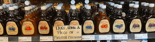
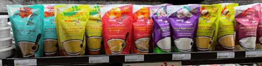
During the field trip I saw a lot of different examples of product branding, all of which were quite effective. But for the purpose of this I’m going to be specifically discussing the soupetc!, bagged soup photographed above. From the tone/markings of the packaging, immediately this comes across as an organic brand, it’s very bright and fun, with focus on the ingredients in it as opposed to the final product. This leads me to believe that the brand is more nutrition oriented. It draws the consumer in by presenting an organic, locally sourced theme, which they do a very good job of showing as the brand clearly displays labels saying it was grown and produced in East Vancouver. The flavors are all differentiated by color and images, with the color being the main indicator as to which flavor is which. It seems that the company has tried to tie the colors of the packaging to the colors of the soup, or at least the color of one of the main ingredients, which makes it easier for the consumer to quickly grab the flavor of their choice.
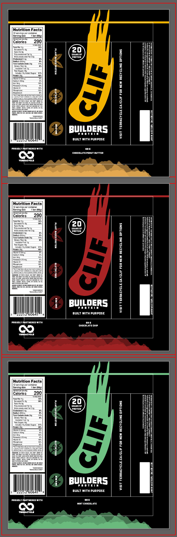
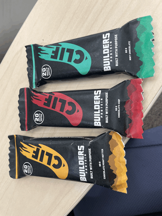
For my product, I chose Clif Builders Bars. Builders Bars are advertised as being a quick and easy source of protein for athletes or even just those with. a busy schedule. But along with being convenient, Clif Builders Bars come with a variety of issues, the biggest being the difficulty of recycling the wrapper. Due to what it's made of the wrapper can only be recycled using a special program, Clif is partnered with a program like this yet doesn't display any info on the wrappers. The second thing I'd like to change is the colour coordination, even though each wrapper is a different colour depending on the flavour, some wrappers are such similar colours that it's difficult to tell them apart.
I would also like to take a look at the actual box that the Clif bars come in, regularly you can get a 12 pack of one flavour so for anyone looking to buy more than one of each flavour it's kind of an issue.
0 notes
Text

Final Thoughts
I had a lot of fun doing this project and I'm so happy with the final outcome. As Said in my last post, I had a lot of little technical issues towards the end but was luckily able to solve them just in time! I'm super pleased with the skills that I've learned during this that I'll be able to carry over to my next packaging design attempt.
0 notes
Text


Second to last stage!
Here we are, nearing the end. I honestly loved this project so much, from designing my own box, to drawing the graphics, even down to the frustrating print technicalities. On the left you will see a lovely photo of my work space after developing prototypes, and on the right is every prototype I've made so far leading up to the final product on top of the original box on the far right. I encountered a LOT of issues when trying to develop a hard copy of my final product, the first print shop I went to couldn't do a die cut or creasing for me and then misaligned the double sided print. Which wasn't exactly ideal, but the second was spot on and helped me nail a final product in no time!
0 notes
Text


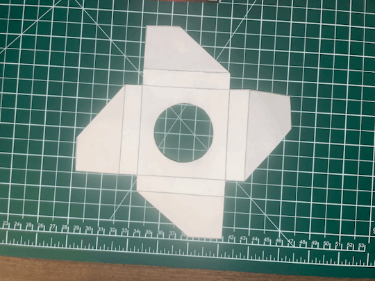

Application Phase, PT 2
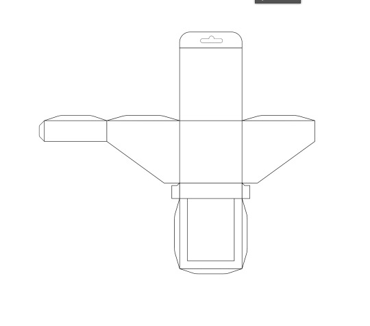
Continuing on from last week, I've really refined my graphics and tightened in my box design. I added about 1/2 an inch more depth to the box in order to cover the product better, which did cause some issues with the slope I had to resolve whilst developing my prototypes (you can probably tell by the one on the far right covered in tape) I also finalized the design for my product stand, I chose a fan shaped design in order to save space and paper, and set it up to fold around the base of the dome and secure it in the box.
0 notes
Text


Application Phase
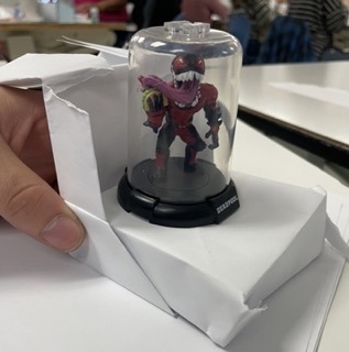
Building off of my initial paper concept from the last phase, I have decided to go with a triangular shaped box in order to limit the use of materials on the front face of the packaging. At first Was only pushing around the idea of keeping the tabs around the display frame, but after a little feedback from my group have decided to keep them to provide more coverage for the product itself. I'm pretty confident in the composition of my box itself and have now directed my attention towards the graphics for said box which you can see above. On the far right is the original image found on the packaging which I have re-drawn in a raster medium in order to use more freely, and on the left an illustration I actually did myself using a photo from the despoil movie as reference.
1 note
·
View note
Text


Project 1 Rationale
The 5 R's: Refuse, Reduce, Reuse, Recycle, Rot
During class we experimented with rough paper product models under the basis of the 5 R's you see above. It really opened my mind to the different possibilities of packaging and just how much I can reduce waste and excess, beyond the boundaries of what I had priorly imagined.
Planning Phase
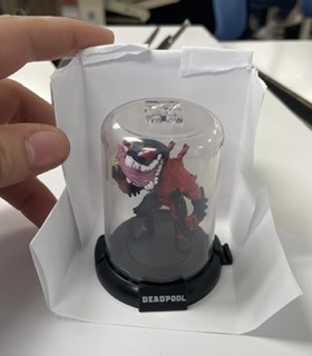
Challenge: The main objective for this project was to find a product that is excessively over packaged and redesign it to be more practical and environmentally friendly with less materials. For my product I chose a Deadpool themed “Domez” collectible miniature, (see photo in post below) which comes in a small cardboard box with a large plastic viewing window.
The initial problems that I have identified are as follows: reducing the amount of plastic in and around the box, retaining viewability of the actual product, leaving appropriate room for the product branding and euro hangar, and making sure the collectible itself is protected. As it is a Deadpool themed collectible I need to find a way to make it feel very action themed and extravagant whilst also being very minimalistic which I feel could prove a challenge.
Approach: My first step in this project has been sketching up roughs and developing a few prototypes. My plan is to hopefully change the box to more of a triangular shape, and leave a cutout on one side in order to display the product. The main goal in my redesign is to eliminate as much plastic as possible, whilst still keeping the product safe and viewable. I’m trying to work out a way to keep the dome secure in the box, as currently the manufacturer has done it with a plastic cutout and a lot of tape. Right now the easiest solution for this seems to be making a cardboard mini stand for the base of the product in order to anchor it into the box.
Outcome: Hopefully my redesign should turn out quite well, I’m anticipating a little trouble with the dimensions of an angular box, but once I can plot a sure fire way to make everything secure and protected I think it should be a really solid piece of packaging!
2 notes
·
View notes
Text

Project #1 Eco-Friendly Packaging: Discovery Phase
For this project I was torn between a few different overpackaged products but this Deadpool themed "Domez" Collectible really drew me in. As you can see there's a large plastic shield in the front of the box and another inside which is completely unnecessary. I'd ideally like to eliminate all plastic in the packaging and reduce the overall amount of cardboard used in the box itself.
0 notes
Text

Final Summary:
I had a lot of fun with this project, above you'll find my final files and hard copy box. I had a couple of hiccups like colour tone and size but they were easily fixable after the first print! It was really interesting to see how the proportions can be changed so minutely but still be extremely noticeable to the correct observer.
0 notes
Text

Activity 1, Part 2
As a continuation of my last post, this is the hard copy of my Andalou box. after creating all of my prototypes and traced maps, I was finally able to re-create my box using illustrator. I faced a decent few challenges whilst trying to re-create this box, the biggest two being matching the color correctly and finding or making appropriate vector assets. By using a low transparency scan of my box as a template I was able to work out my spacing quite well, with only a handful of noticeable errors.
0 notes
Text

Activity 1, Part 1 Progress.
For this activity, I was tasked with deconstructing and creating a scale drawing of an Andalou Creamy Cleanser box. I broke my box down and began tracing, finding particular trouble in keeping the box steady while I lined up the corners. once finished creating my templates, I traced the box once more to create my rough prototype.
0 notes