
Don't wanna be here? Send us removal request.
Statistics
We looked inside some of the posts by ripixhd and here's what we found interesting.
Average Info
Notes Per Post
9K
Likes Per Post
5K
Reblog Per Post
4K
Reply Per Post
16
Time Between Posts
9 days
Number of Posts By Type
Photo
17
Last Seen Tumblr Blogs


Fun Fact
Total funding amounts to $125.3M.

Photo


This is an artist named Matthew Plummer-Fernandez. Born in London, UK, he is approximately 38 years old. He’s a British-Columbian artist who produces altered data-files and distorted 3D printed objects as abstract artworks of geometric art. Matthew’s art form is very unique, using 3D printed objects. He scans certain objects, from kitchenware to Mickey Mouse figures and uses software to glitch certain objects and lastly 3D printing them out in coloured resin. This produces this very clean aesthetically pleasing sculptures, giving off a futuristic feel, kind of like if the “wabi-sabi” aesthetic did a 180 degree turn with more futuristic things. What brought Matthew to create this type of art was his artistic practice embracing the serendipity of digital glitch both as a playful and challenging reinterpretation of imperfection as added aesthetic value, and as a means of reflecting political views on free software applications and copyright protected artifacts.
1 note
·
View note
Photo

This is an image I made in adacity with a bmp file. To create this I added an echo and bass to the file making a glitched broken image. The “shadow” like streaks ahead and behind of me are an example of the broken image. Then there’re also the discolouration of the pixels throughout the whole photo, making it very vibrant and “contrasty.”
0 notes
Photo

Here is an example of glitches in games. This one is from Assasins Creed, one of the most iconic “glitch” images ever. This is clearly broken because of the fact the pixels on his face are changed to being transparent, showing the eyes, mouth, and hair in a very disturbing way. Even the collar is broken, with the pixels of the clothing seeping through his white scarf like clothes.
0 notes
Photo
This has been seen many times and even so, I’d still like to bring it up.
This picture is “broken” in a way. From the red pixels spewing out everything to the actual moving and shifting pixels in the centre all very much give a “glitch” vibe or aesthetic. This also helps convey a vaporwave or psychedelic feeling to it as well.

2K notes
·
View notes
Photo
This is a glitched gif of Joaquin Phoenix that’s been “glitched.” What makes this broken about the art is the data moshing. From the frames shifting apart and the pixels changing colours, overall corrupts gif which makes it broken. However this also helps with the overall gif, conveying a sense of being insane, unstable, and overall just scary which Joker conveys.
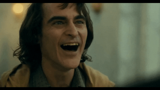
5K notes
·
View notes
Photo

I glitched this image using the website “pixelock.” On the website, I added my image file and press a button that would glitch the image, similar to Photomosh which I used earlier.
From the image, the glitching effects was clearly very vibrant and beautiful. It completely discoloured and “broke” the pixels. Creating a very saturated and vibrant image. There’s also slight shifting of the pixels near the top breaking the roof into different segments. The overall glitching of the image makes the photo give off kind of a retro like but also vaporwave like feel due to the futuristic like feel of the colours but also the retro TV static like pixels.
1 note
·
View note
Photo

I took this image of a raccoon at leadership camp 2019. To glitch the image, I went on Glitchatron to create this image. What’s broken about this image is the slight discoloration of the hundreds and hundreds of pixels and especially the pixels shifting. You can even see some of the pixels really start breaking near the bottom of the stairs.
0 notes
Photo

This is a “broken” image of Baby Yoda which I used in the website “Photomosh.” On the website, there’s a “mosh” button which automatically distorts your images you place.
I chose this specific “glitched” image because it still clearly shows what the image is without distorting it too much. It still shows the outline and shape and even the details of yoda, replacing it with a somewhat glitchy or even retro like feel, almost like it’s broken kind of like old tv static with a twist.
The way the websites software was able to keep the greens and the browns as details to show what the image is while being able to differentiate the background too is great!
0 notes
Photo

This is an image of kinetic typography. Kinetic typography is “moving text.”
It’s a animation technique mixing motion and text express ideas to convey a particular message or emotion
0 notes
Photo

Words that come to mind:
1. Monster/Monster hunter
2. Silver
3. Witcher
4. “Evil is Evil. Lesser, greater, middling… Makes no difference. The degree is arbitrary. The definition’s blurred. If I’m to choose between one evil and another… I’d rather not choose at all.”
5. "People like to invent monstrosities. Then they seem less monstrous themselves
6. Calm
7. Perspective
8. Coin
9. Neutrality
10. Butcher of Blavikan
0 notes
Photo
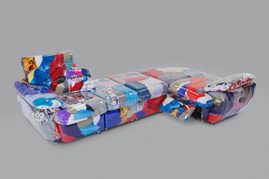
This couch made by Harry Nuriev is a piece of art in collaboration with Balenciaga. This sculpture called the “Balenciaga Couch,” is in shape of a couch filled with unsellable or damaged Balenciaga garments. When I look at this sculpture, it screams “Luxury.” The colorful interior of the couch with the shiny transparent vinyl outer layer, almost like an abstract painting. This screams fashion trends to me... these days, many designer brands are creating more “crazy,” “abstract,” and “in your face” garments along with the classic branding of Balenciaga which just yells expensive and luxury. Luxury, expensive, vibrant, colourful and creative are some phrases that come to mind when looking at this sculpture.
1 note
·
View note
Photo

This timeless design uses its own original and unique font. Created by John Stith Pemberton. I believe the font is inspired by other fonts such as Spencerian Script and Loki Cola. Whenever you see this font, the first thing that comes to mind is Coca Cola. It’s become such a popular type and nearly the whole world recognizes this type. The bold red letters, the somewhat close compact spacing to fit the whole name and simplistic smooth texture, this type is truly one of a kind. This type also gives a sense of “quality,” and “elegance,” due to the cursive like font with modern characteristics that make it readable. The font also really pops out and doesn’t even have lines because of it’s incredible contrast with the colours. The red and white make the type really “POP,” and helps create this unforgettable name and type.
0 notes
Photo

This horrible text is what I went by online when I was about 9yrs old. This was made on Paint, I believe using Georgia Font. Taking a photo of the ocean from google and typing “RIPIX” over the image in blue. A little blurry from the resolution, however, the blue type, matching with the blue tints of the ocean create a certain vibe. This type of skyblue was my favorite colour at the time, which made me want to incorporate this colour into my first ever gamer “Icon.” Even with the lots of blue, The text still pops in contrast with the ocean’s dark tints, hues and shadows and the sun in the middle of the image helped bring attention to the name/text, “Ripix.”
1 note
·
View note
Photo
I believe the font used in this image on the boxes are either Arial or Helvetica Neue. This type of “type” style is becoming huge these days. The simplistic type with it’s simplistic shape form and spacing helps make the text easy to read when in contrast with a plain coloured background. The background and type don’t really have much textures, since it’s pretty much just a pure filled in colour, however this helps give off a nice “pleasing” look. Almost like it’s screaming “High Quality.” This type of style is popularized heavily these days, especially with huge brands using this type of style, such as “Off-White,” “Balanciaga,” and sometimes even on Nike campaigns.

VYBES
809 notes
·
View notes
Photo

This font is Burford Rustic, giving off a retro-grungy like effect. Made digitally on photoshop, this font along with its colours, contrast and much more all together help the type pop. The type also helps give almost like a “wild west” type of theme or feeling. The red-grungy background mixed with the different textured lines and dots in contrast with the text in the middle. The size of the font and space all together help the type pop without being too insignificant or too obnoxious or “in your face,” but instead uses the contrast of the background to make it “pop.”
0 notes
Photo
The Eiffel Tower is also a form of art. I love the architectural designs put into it and force and time put into making the tower known around the world. Then there’s also the beautiful photo which really lightens up the mood and helps me even admire the Eiffel Tower even more. It just brings nothing but awe and positive vibes and is overall a great photo.
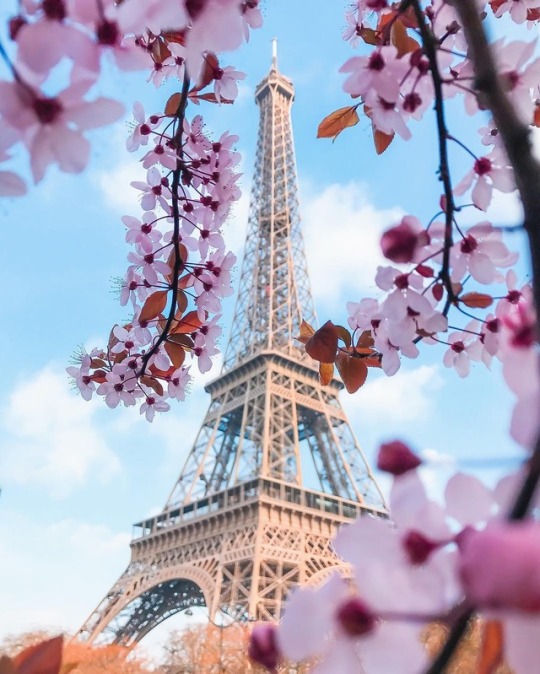
“Paris, France“ by | Saúl Aguilar
1K notes
·
View notes