
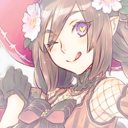
Graphic Designer, illustration student at BCU and general weirdo.
Don't wanna be here? Send us removal request.
Statistics
We looked inside some of the posts by rlloydandersonbcu and here's what we found interesting.
Average Info
Notes Per Post
1
Likes Per Post
0
Reblog Per Post
1
Reply Per Post
0
Time Between Posts
14 days
Number of Posts By Type
Text
11
Video
3
Photo
3
Last Seen Tumblr Blogs


Fun Fact
1,644 Tumblr posts in 1 second.
Text
Mythic Visions: Module Evaluation
Year 2 begins, fewer students and a few new faces. Different tutors and a brand new module. The first couple of weeks were dedicated to a separate editorial piece that was daunting due to the subject matter but I managed to finish something that I’m personally happy with. After that there were 3 different tasks to choose from (Illustration through exhibition, Image Text Brief or Mythic Visions), At the time I was finding it extremely difficult to concentrate. I just fell into Mythic Visions without really giving it much thought which was fine because I enjoy a challenge.
The goal for Mythic Visions was to choose one of the Grimm Fairytales (Iron John or Seven Ravens) and produce a piece of work that will identify with it’s target audience. I selected Iron John as I was more interested in that tale and it sparked way more visuals in my imagination. Now admittedly, if I had a couple of extra weeks I know even more work would’ve been produced as I have been ill for a majority of this module. But, I can’t make any excuses as the deadline is approaching so this is what I came up with...
I wanted to create a single image that can be used for a front cover, a poster or promotional purposes. Something that captures the audience’s attention and tells a story without giving away too much detail. My main inspiration is an artist named Graham Humphreys. This is the kind of work that I eventually want to do as a career. I started with very rough character designs, (I’m not very pleased with them but observers seem to like them) using different kinds of media. Just messing around with different techniques gave me an idea for the cover image. A majority of the tale takes place in the forest so I played with the idea of creating a face from a tree. Reminiscent of Treebeard from The Lord of the Rings. I really liked this idea so my main focus shifted to getting this design done and ready to print for the hand-in. I found an interesting image on the internet of an old man with a long beard. I used this man as a template for my Iron Hans design.
Originally this was going to be a fully hand painted piece using Gouache. I started as I always do by creating a base wash on watercolour paper. gradually textures were added from dark to light. I wasn’t very happy with the way it was looking so I made the hasty decision to use inks on tracing paper just to give it a detail boost. I’m not used to this method so it took a long time and a lot of doubt until I was satisfied with the result. The goal was to scan the individual pages and composite the layers digitally using Photoshop. With that in mind I decided to create all of the pieces of the overall image on separate pages. This gave me more freedom to experiment without worrying about messing up the final image. If I had the chance to do it again I definitely would do the whole thing on one page and would try to rely less on inks.
I created separate layers for Iron Hans, The forrest, the title and the silhouette of the prince on a horse and scanned them all in. Using different layers effects in photoshop to bring it all together cohesively. I added a stained paper texture as an overlay to give it a classic feel.
A week before the deadline we had to pitch our ideas. I was nervous because it looked like other students had a ton of work to present, a ton of GREAT work. I didn’t have much to show but I had enough to talk my way through the pitch. I think it went well and was great practice for the future.
Overall I am very pleased with the way that it turned out and I have a feeling it will look great printed. I’m disappointed that I only have one fully finished piece to display. I would love to return to this project and create more content for it. The target audience for this are early teens who are interested in Harry Potter and The Lord of the Rings. I’d like to imagine they would be captivated by the look of the poster and would be interested in knowing more information about the tale.
I wasn’t able to being out my A-game for this one. I’m counting this as a blip on my creative journey. I know I am more than capable of doing better and putting more focus on sketches and research. I’m hoping that I can really shine and get a confidence boost in the next module. I appreciate the patience and understanding from my tutor and I promise to work harder than I’ve ever worked next time round.
The following images are a step by step of how I started and finished my project. From paint, to ink to completion.
The Initial sketch done, A base wash added and the start of some minor details using burnt umber.

Mid Tone Greens added.

Minor details added to the second wash.

Tracing paper with ink details.

Long, boring process. I’m not used to this method but I like it.

All of the elements composited together using Photoshop. This is the final result.

I’m also including the final editorial image. Mine is based on WIRED magazine article about Mental Illness, The article itself really got to me because it’s something I am currently dealing with in my person life. I am thrilled with the way this turned out. Again, this is not typically my style but I had a lot of fun working this way and I hope to use the same process again.

This is the original version that I wasn’t pleased with but the idea is quite striking. I can imagine these designs on a t-shirt.

0 notes
Video
tumblr
This is a short demo that I made when I first practised Flash. Looking back now, I kinda like it
0 notes

Text
Texas Chainsaw Massacre
My first ever fully finished Illustration.

0 notes
Text
DRIVE:
Rubbish photo taken with a mobile phone. I will upload a scanned version soon.

0 notes


Text
Punk Zine Logo
A little on the graphic side but I have to do what I’m asked to do.

0 notes
Text
Neighbours From Heck:
Here a few snippets from my previous module at uni. I haven’t upload of the images because quite frankly, they were too obscene.


0 notes
Text
Cartoon Crossover


I did these in my spare time. I wanted to do a crossover of my favourite cartoons and horror movies. As displayed are The Scooby-Doo/Cannibal Holocaust and Beavis & Butt-head/Texas Chainsaw Massacre mashup
1 note
·
View note
Text
Random Showcase:
Without much information to share. Here are a few pieces of my work in the last few years.
This is a tiny preview of a Huge Project I worked out. Watch this space because this is an exciting one.

0 notes
Text
Module 4: Evaluation
After a long hiatus from the previous module, we were given a short deadline, high pressure project. The title for this is Eavesdropping. The aim is to create a physical book as well as digitising it as a PDF document. First thing I need to get out of the way is that I was discouraged from doing anything horror-related even though this is where I shine, I had to think past my comfort zone. At first I was not comfortable with this but through time I have compiled a few cool ideas that I want to elaborate on in the future. My initial idea was to produce a number of literal artwork based on interesting and amusing things that I hear during train journeys to work. To my detriment this idea had to be scrapped since people barely talk anymore in public. I’m sure the text messages would’ve made for amazing art but unfortunately I’m not that brave to stick my beak in their business.
The only thing even remotely amusing (to me at least) that I heard was a woman who kept referring to Al Pacino as Al Chaponi. as this was during the first week of the project I drew a few concept designs but unfortunately have gone missing. I hope this tacky photoshop rendition gives a good idea of where I was going.With this idea trashed, I struggled for a long time to come up with another idea. It also doesn’t help that I’ve got other commitments to focus on such as a job and commissioned art for a book that I’m hugely excited about. It took a couple of weeks for me to realise that my main inspiration for this module is right above me.
My neighbours are loud as hell, each day I would hear unusual sounds, each more louder than the other. I wish I was joking but one day it literally sounded like a zoo animal was jumping around with house brick laced boots, bouncing babies on the ground like flyaway footballs.This has since stopped as I had a massive row with them a couple of weeks ago but that didn’t stop me from rolling with this. I wanted to produce a number of scenarios based on noisy neighbours. The original intention was to depict Jesus and Satan as roomies but I didn’t feel very strongly about it and wanted to do a variety of different characters.
As I am a big fan of Scarfe’s satirical work I tried to emulate his loose but chaotic style. I sketched a couple caricatures of George Bush and Tony Blair as roommates meanwhile Osama Bin Laden is right under their noses the whole time. This isn’t too far from the truth when you think about it. My intention was not to depict any bias with any other characters, except for these 2 muppets.
Through research on how I want to present my book. I discovered Edward Gorey…..This really caught my eye and I am a big fan of his work. The Doubtful Guest in particular. If anyone is struggling with how to present their book then take a look at this and thank me later.
I wish I could say is was smooth sailing at this point but to be honest I have been very self critical of the way my sketches look. For some reason the ideas in my head refuse to match with the translation to paper. Since time is running out, I have no choice to keep going despite how annoyed I get.
The main objective of my book is to depict very well known rivalries through history, literature, film, sport and music as noisy neighbours. This includes Bush and Blair vs Bin Laden (as mentioned earlier), Jesus vs Satan, Biggie vs Tupac and Andre the Giant vs Hulk Hogan. a lot of time has been spent nailing down a particular style, to save time and relieve pressure they strictly black and white designs. To relieve more pressure I’m not going to stress myself out trying to get exact likenesses right. I like this idea so much, I will definitely give it another go or better yet create mini animations.
The worst part of this process was the printing. Making sure everything is presented properly and the pages are in the correct order to print. This is the part that I don't work well under pressure. I've struggled with this even in my professional life. To be on the safe side I have decided to take my booklet as a pdf document to Kall Kwick and even then I ran into trouble. My first pass was an utter fail. I printed 3 copies out and the order of the pages were wrong and the colours were incorrect. This is something I really need to improve on in the future. The digital version is not a problem thank God
Despite all the things I have pointed out that I didn't like. The stuff I really like are the pieces of art and colour ways that I didn't focus hard on. I'm starting to realise that after all this time if I keep a relaxed and cool attitude my work is way more natural and there's a specific style where I shine.
As a closure for this year, I am ultimately proud of everything I have done so far. I look forward to working more with animation in the future. I also can’t wait to do more horror related work. Upon reflection, This module in particular has also made me realise that I need to work on my timekeeping…. I left things a little too late but the upside is that I will have a final product to hand in.
Bring on Year 2. A fresh start and a more mature approach is on the cards, I also want to team up with my fellow students. I know where I've gone right and where I've gone wrong. I plan on going wrong a lot less
0 notes
Photo

Complete set of Postcards. Printed by the lovely folks at the Curzon building. I will go there for all my future prints.
0 notes
Text
Evaluation:
Frustration, one word that comes to mind when I think about the past few weeks. The instructions given were baffling, one moment we were told one thing then something completely opposite through email. It was only a day ago that I was given notice to write an evaluation when it was never even specified as far as I know (I have asked around and was greeted with equally puzzled faces). Luckily I have enough content to write about because despite the negative thoughts I have about this module, this is the hardest I have worked and the most proud I have felt since I started at BCU.
The trip to the Birmingham museum was really enlightening, not only did I get to see a lot of great work on display, I have made more of an effort to communicate with the other students. I actually felt quite jealous of the amount of talent at BCU. Jealous enough to make me feel hungrier to succeed, The Box project was something I dreaded doing. I felt like I was back at primary school yet I was lost through most of it. It made me question my ability and I felt like giving up every day. I managed to create some great typography using different material that was way out of my comfort zone. I was so happy with the way my designs turned out that I am looking into work more with graphic type facing. The box itself was a shoddy mess that I dislike immensely so I’m glad to see it gone. I’m keeping the design work for inspiration.
I really enjoyed working with David Shillinglaw. The workshop he carried was fantastic. I got to work with 3d materials and colours that I’m not used to but have used since. It was also a blast taking photographs in the studio with Conor, I don’t have the heart to throw it away so I’m leaving it to the tutors to do the honours after receiving our marks.
Working with Anna Bushan was another interesting experience. I have never done abstract art before and I really enjoyed it. Again, working with different colours that I’m not used to was a fun experience and I have used my final abstract art as my user image for pretty much everything my name is attached to.
The one workshop I thought would be completely pointless was the use of sticks and ink. I was very flippant during this practice and didn’t really put my heart into it. I did like parts of my finished result, I've carried one of the typography styles into an outside project.
I really enjoyed getting my gouache paints out again for the portrait task. I love the colour wash process and the step by step layered effect. The work I produced was something I’m really proud of and show it to everyone I know all the time. The next time will be less horror orientated and more of a personal effort.
Another thing I found incredibly useful was the book binding workshop. In 20 minutes I took away a lifetime of skill. So much so that my final zines use 2 of the 4 methods explained.
The final piece of work I had to produce was the zine. The mass produced version for sale wasn’t really hard to make. I channeled my memory of several documentaries about the Video Nasty punk scene during the 80s when numerous handmade, photocopied video trading zines were distributed. They were cheap, scuzzy but ultimately innovative. I tried to emulate that style with my own flavour added to it. I used all of the ink work that I’ve done since the start of this module and whittled it down to the images that made the most sense. I really liked the typography designs from the box task and I knew it would come in handy again. Lucky for me this zine was the perfect outlet for them. The A4, pocket sized 8 page zine was the style that I felt would be the most effective and it definitely was after many trial and error. It was also a cost effective way to produce many zines for sale. The use of different coloured paper also added to the handmade quality.
The other zine I created was a one off deal for me only. I’m not sure if this will be marked at the end. I couldn’t resist, this was a passion project for me and I had a lot of confidence that it would turn out really well. I took all of my most recent horror art and compiled a book with a brief description of how I achieved each piece of work. I created a layout using indesign and stitched it together after printing. I had it in my head that I wanted to create a slip cover reminisent of the Led Zeppelin III vinyl packaging but I wanted to make sure the book was complete before shifting focus to that. I created mask template using indesign and printed it off on stronger card. It turned out amazingly and really makes the book pop. This is a piece of work that I’m incredibly proud of and will use it for my physical portfolio.
Now that everything is done and this is literally the last thing I need to do I can look back with my head held high. I approached this with a ton of confidence and I work tremendously hard. Obviously there are thing I wish I could work on more but ultimately I feel like I have created sufficient content to show to future employers. Again, I’m not going to point the blame on anyone but I do think a few aspects of this module wasn’t thought out very well but intentional or not, I am proud of what I have achieved and I’m excited to know what the next project will be, what ever it is I will increase the level of confidence that I have gained from this project.
0 notes
Video
tumblr
Main Zine Demo
0 notes
Photo

Final submission for my Module. My main Zine, featuring work for my portfolio, a zine for sale and postcards featuring some of my work from the last 4 weeks.
0 notes