Don't wanna be here? Send us removal request.
Photo

Final Design (Curzon Street station-artwork)
1 note
·
View note
Text
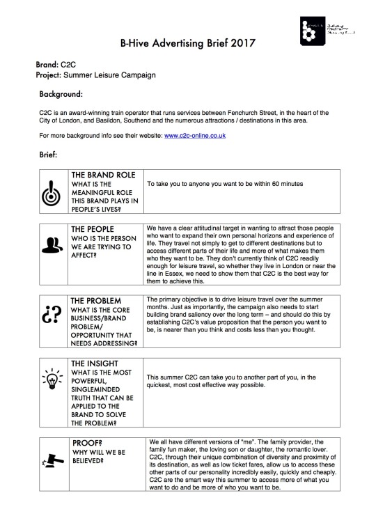
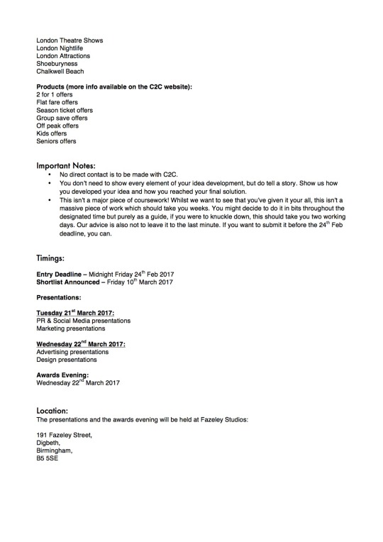
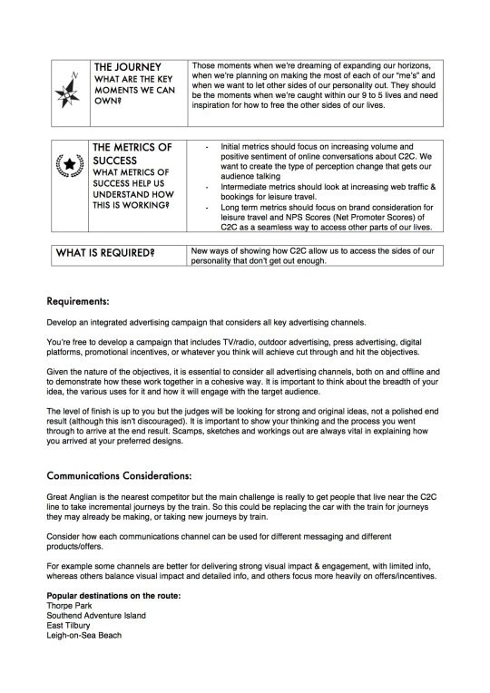
B-hive Design Brief 2017
For Tuesday 7th February, We have been asked to start researching and coming up with initial ideas for the B-Hive completion (deadline-24th February). As we haven't got long until the deadline I am going to look at the two briefs in detail over the weekend and start to come up with some initial concepts.
0 notes
Photo


Brand Design Guide
Today me and kimberley met at uni to put together the the brand design guide for Greedy Goose Co. we will include this in our final submissions.
0 notes
Photo


Final Billboards
These are the final billboards I have slightly changed where i placed the shape elements to match the posters.
0 notes
Photo


Social Media (Instagram, Twitter, Facebook)
Here kimberley has created several mockups of how Greedy Goose Co. could appear on the social media platforms of Instagram, Twitter, and Facebook. Linking to our poster advertising using hashtags such as ‘#OhThat’sGreedy’ could be trended and popularised with our target audience to develop the public presence of our brand worldwide.
0 notes
Photo

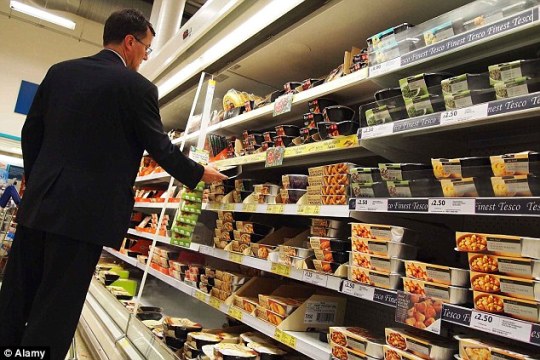

As our beer is going to be sold in supermarkets we thought the best place for it to be positioned would be the takeaway/ready meal section. Therefore when a customer buys a takeaway they can conveniently pick the beer that compliments it.
Here is a mock up of where we would like it positioned on the shelves and the type of food it would go next too. Here I have used a Tesco’s takeaway dinners to give an idea.
We could also think about incorporating our beer into a “meal deal” where you could get a main a side and beer for a discounted price. for example a ‘curry, rice and a Rice & spice beer for £5 pp’
0 notes
Photo


Bottle Cap
After our presentation our tutors liked the idea of our ‘Just Eat’ completion/advertising concept but felt it was moving away from the brief, which states its to be sold in supermarkets. Therefore we are going to use the same form of Advertisements/completions but predominantly linked to our ‘Greedy Goose Co’ brand rather than ‘Just Eat’.
Here is a mock up of the bottle cap. On the inside of each bottle cap there is going to be a unique code, customers will need to login to the Greedy Goose co website to see if their a winner by entering the unique code. The prices would range from food and drink vouchers too one off holidays. As a new brand I think this would definitely encourage our target audience to try for the first time.
0 notes
Photo

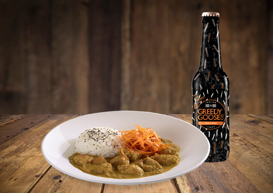
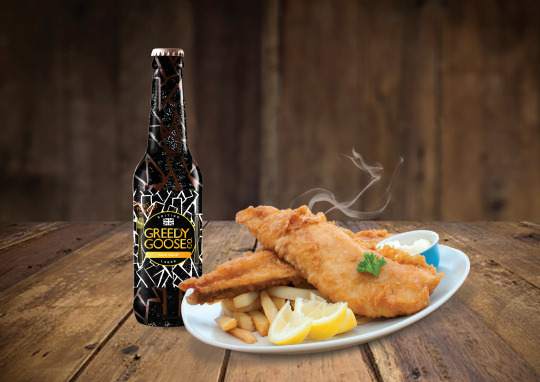
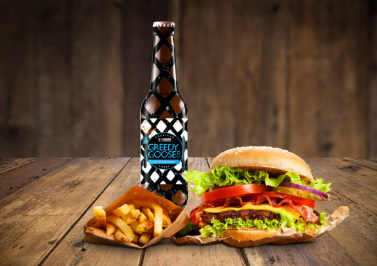
Food and Drink Mockup
Using photoshop I did 4 sets mockups displaying our beers and the food they are designed to be consumed with.
0 notes
Photo

Final Map
This is our final group Illustrated Map, that we will be presenting and exhibiting along with our other outcomes for the main brief submission deadline.
I think kim did a brilliant job putting it all together! I love the colour palette she's used which i think compliments my brighter hue illustrations wonderfully I also love the typography which gives the impression of brush strokes which links perfectly with the creative/ art map.
0 notes
Photo


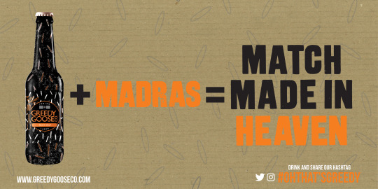
Finished Billboards
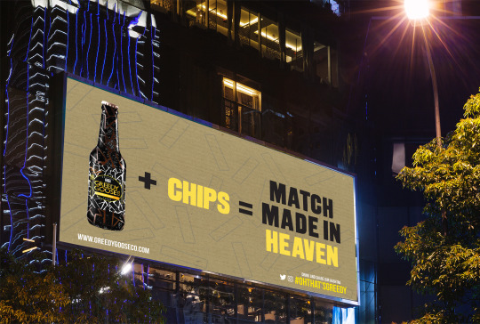
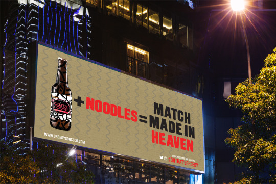
For the final billboards I decided to incorporate a pattern onto the cardboard background. Each pattern links to the particular takeaway its for and is also in keeping with the linocut prints on the bottles. i thought this faint detail just added an extra bit of depth and character to the billboards. Plus the patterns have naturally became apart of our brand identity.
0 notes
Photo


New Billboards
As I said in my previous post I wasn't happy with how similar the posters and billboards were, therefore I went ahead and designed these instead.
As our beers are brewed to compliment certain foods I found using the “beer+food=match made in heaven“ was the best way of visualising this in a creative and fun way. I think they are simple and straight to the point which is perfect for a billboard. “match made in heaven” is also another slogan we could use in a comedic way on adverts etc.
For each of the billboards I took into account kimberleys previous posters and used the same colours, typography, type size and background, as we want everything to compliment and fit nicely together, which i think they do.
0 notes
Text


Billboards
These are some billboard I designed using the letter pressed slogans myself and kimberley made in the print room. As kimberley had already made the posters I took into account the colours and elements she used therefore they have ended up looking very similar.
I am going to remake them with a completely new theme, yet I still want them to be in keeping with the rest of our brands identity.
0 notes
Photo

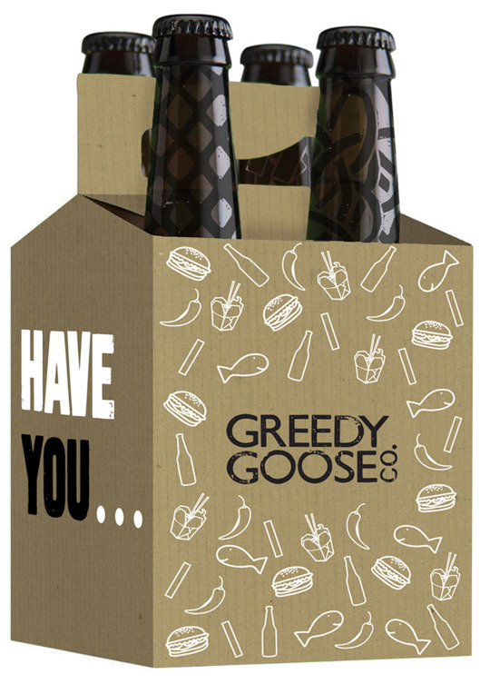

Final Packaging
This is the final packaging I decided on I will later create mock up versions of where it will be placed in a supermarket.
We were planning on having the beers in fridges in the the takeaway/ready meal isle so customers can convinenly pick the beer that complimemst there takeaway of choice.
like i explained in my previous post people would be able to customise there own 4 pack as family and groups of friends will often order more than just one kind of takeaway. Therefore I have chosen this shape of packaging to make the bottles easy to be taken in and out of the box.
0 notes
