
I made this account to show my photography projects!! - constantly updating!!
Don't wanna be here? Send us removal request.
Statistics
We looked inside some of the posts by roses-portfolio and here's what we found interesting.
Average Info
Notes Per Post
3
Likes Per Post
3
Reblog Per Post
0
Reply Per Post
0
Time Between Posts
19 hours
Number of Posts By Type
Text
4
Last Seen Tumblr Blogs


Fun Fact
Tumblr has 4 main sources of revenue.
Text


Here are some behind the scenes of the Drowning project. I decided not to include the three underwater photos as when me and my friend took them the camera wasn’t at the right settings. When editing these I have had to turn the brightness all the way up so they can be seen! The final picture is a brief look into our set up, wearing all black clothing in shallow water and using the natural lighting and bath bombs to our advantage. A very fun project overall!
0 notes
Text

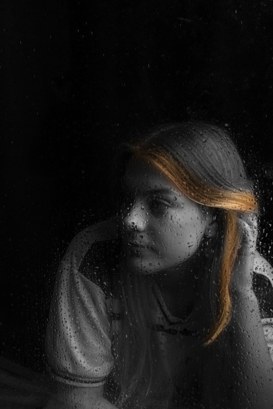


Inside Rain: The project 'Inside Rain' was inspired by the artist Naoya Hatakeyama and his photographs of city scapes behind a rainy piece of glass. For my work I decided to do an inside shoot with a model instead of an outside shoot with buildings as the type of night lights/city scene that I needed wasn’t available to me. For this shoot I got the model and created a rainy window in the studio. I did this by using a piece of glass that was held up by a wooden frame and I sprayed water in it to make it seem as if it had been raining. For this shoot I got the same friend and created a rainy window in the studio. I did this by using a piece of glass that was held up by a wooden frame and I sprayed water in it to make it seem as if it had been raining. This technique was very successful and helped me achieve the look I was going for. I decided to use a black background as again, it helped her be centre point of the photograph. For this shoot I used the soft box for the lighting as it created soft yellow tone lighting which I liked and also thought fitted the shoot well. In the editing process I created some simple edits and some experimental ones. For the simple edits I either just corrected the levels or corrected the levels and made the photograph black and white. These were both successful. I think the black and white edits were the most successful simple edits as I thought they created the right overall mood for the shoot. For the experimental edits, I tried different colour combinations and different styles of editing. The photo on the right-hand side (the third row down) is an example of my experimental edits, for this edit I was trying to show the black and white taking over the colour of her body, it could also be represented as the sadness taking over her body. I thought this looked quite interesting and different to the original photos. Overall, these were the best outcomes of the shoot!!
1 note
·
View note
Text


Drowning: This shoot is inspired by the artist Alban Grosdidier and his shoot "The Drowning Project". His project was created to 'replicate the feeling of submersion that someone can feel when living in a big city'. To create this shoot, a friend and I got together and filled a bathtub with water. We also wore all black clothing so the focus point wasn’t pulled away from the face. We then positioned ourselves above and under the water to create the submerged/trapped felling Grosidider had created in his photos. We then wanted to take his work a bit further, so we decided to add colour to the water by using a red bath-bomb. This not only created colour for our shoot, but the bath-bomb also created texture on top of the water, which made our photos look quite interesting. In the editing process I decided to do some simple edits, fixing the levels and turning the images black and white. With the red photos I decided to enhance the colour and then erase the extra colour from her face and arms so they were back to normal, this made the colour stand out more overall. I also decided to do some experimental editing with these photographs, this caused some interesting results and made the photographs different from the original submerged theme. By doing these experimental edits it meant I was able to take these pictures further. After researching, photographing and editing, these are my favourite images.
0 notes
Text


The Ink Project: This photo shoot was inspired by an artist called Chris Duesing. He took portraits and combined them with photographs and videos of ink. This project is three photo shoots that I developed and edited over a few weeks to create the final pieces. For the first shoot I took portraits/videos with coloured lights to act as a base for my main ink photographs. When doing this shoot, I took coloured stills of my model and then I took a video and I got her to spin slowly whilst sitting down whilst also changing the colour of the lights. I then took the photographs of the ink separately, the first ink shoot I photographed the ink with a black background and yellow toned light (the soft box studio light), this was successful, but I couldn’t see the ink as well as I had hoped. The second time I did this shoot was a lot more successful, instead of using the soft box studio light, I used two bright white lights, this lit up the tank a lot better which made the ink a lot easier to see. The top two edits were the photographs from the first shoot. When editing these photographs I corrected the levels on both images, I then layered the ink photographs over the portrait and used different blend modes to create an overlapping effect. This made the images look quite different as by using different blend modes the ink highlights different features of her face making each photograph different. Although this shoot was technically successful, I didn’t like the way you could see the reflection of the light on the water, I also think it didn’t blend as well as it could of. When creating my second ink shoot, I took these elements into consideration, I started by changing the lighting to two bright white lights on either side of the tank, this meant the tank was well lit. The only problem with this is that you could see all the marks on the tank, but I fixed this later in editing. I then continued the shoot the same way as before. When editing the second shoot I decided to overlap two coloured portraits (opposite colours), I then took the new ink photographs and layered them on top and again used different blend modes, this created a very different effect with the ink this time which was exactly what I wanted. When editing the levels of the second ink shoot, I had to make sure to get the background as black as possible to hide the white marks from the tanks, this was done successfully. Here are some of my best outcomes from the project!!
2 notes
·
View notes