
Don't wanna be here? Send us removal request.
Statistics
We looked inside some of the posts by samcichowski and here's what we found interesting.
Average Info
Notes Per Post
47
Likes Per Post
23
Reblog Per Post
20
Reply Per Post
4
Time Between Posts
7 days
Number of Posts By Type
Text
15
Last Seen Tumblr Blogs


Fun Fact
Tumblr has a 66 index score for customer satisfaction in the US.
Text
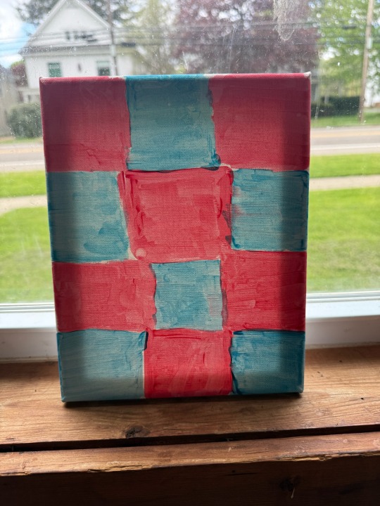
For my art final project, I took inspiration from 2 of our lessons from this year. The first was from Formal Elements 2025. I looked through this lesson and saw the color wheel and chose some of the primary colors. I selected red and blue because I love the way they go together. I think it’s important to have colors that bring each other out in art and I feel like these colors do just that. The second lesson I inspired from was Minimalism. I wanted to create something that was very simple, and I feel like I did that. The small design still has a lot to offer but, it very simple. Minimalism was my favorite unit this year because of how simple the art was. I think it looks very clean.
2 notes
·
View notes
Text
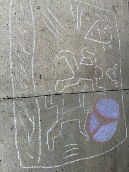
For our chalk art project on the St. Bonaventure trail, we drew inspiration from Keith Haring's vibrant and expressive style, focusing on themes of love, peace, and harmony. Haring's work often featured bold lines, bright colors, and recurring motifs such as hearts and dancing figures, conveying messages of unity and joy.
2 notes
·
View notes
Text
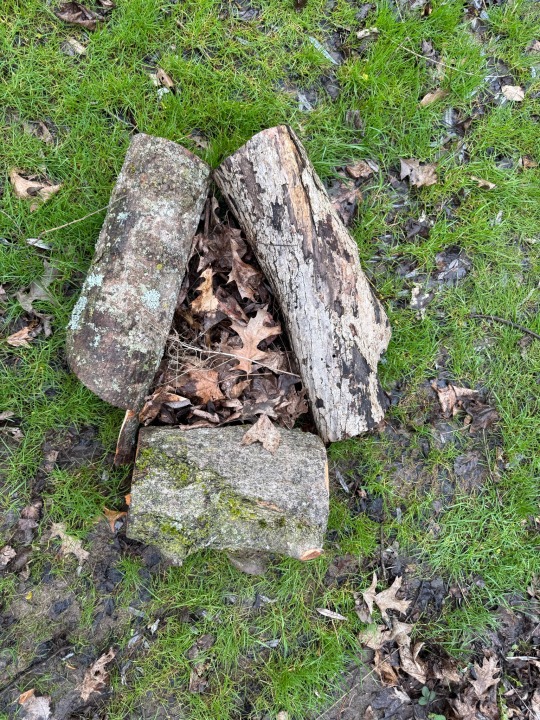
The triangle is one of the oldest and most powerful symbols in human history, appearing in cultures, religions, and architecture across the world. In ancient civilizations, such as in Egypt, the triangle was central to pyramid design—structures that symbolized spiritual ascent and the connection between earth and the divine. The triangle's three sides often represent balance and harmony, with meanings like mind-body-spirit, past-present-future, or birth-life-death. Its strong geometric form also made it a symbol of stability and power.
In religion and philosophy, the triangle holds deep significance. In Christianity, the triangle is used to symbolize the Holy Trinity: the Father, the Son, and the Holy Spirit. In alchemy and the occult, upward- and downward-pointing triangles often symbolize masculine and feminine energies, fire and water, or spiritual and physical realms. Artists and architects have used the triangle for its visual strength and aesthetic appeal. Whether used practically or symbolically, the triangle continues to carry meaning that connects logic, emotion, and belief through a simple, yet profound, shape.
2 notes
·
View notes
Text
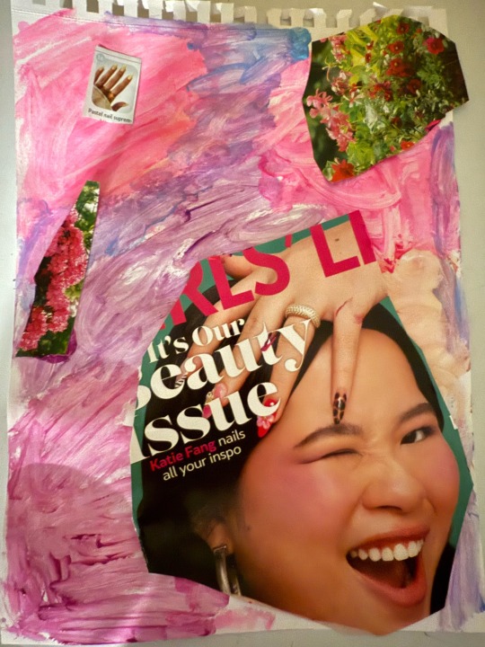
This is my project for this weeks assignment. I selected a magazine that showcased different nail styles that different women would wear. I saw how so many different styles could work with different colors. So for my background, I tried to create it with the most common colors I found within the magazines.
4 notes
·
View notes
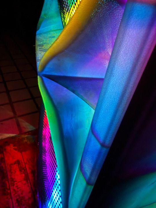
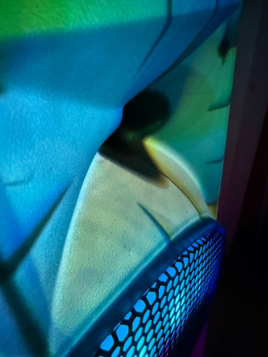
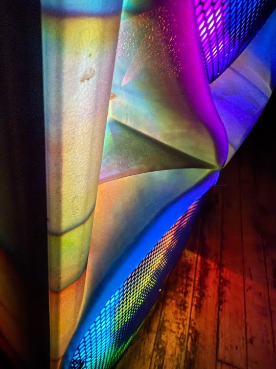
Text
For my piece, I used the lights off my speaker to create a cool looking image. I took close up shots and angled the camera in the right spot to create the image I liked. I had to move the speaker in the right spot in order to create the angle I liked. Also, I needed the wait to night time to get the image I was looking. Overall, Im very happy how these images turned out.
4 notes
·
View notes
Text
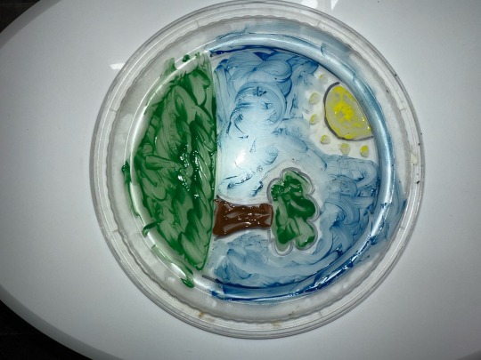
For this project, I painted directly on the top of a to-go food box. I used green, blue, brown, and yellow to create a landscape. The green represents the earth, blue for the sky, brown for the ground, and yellow for the sun. I chose the to-go box as the surface to add a unique, recycled element to the piece.
3 notes
·
View notes
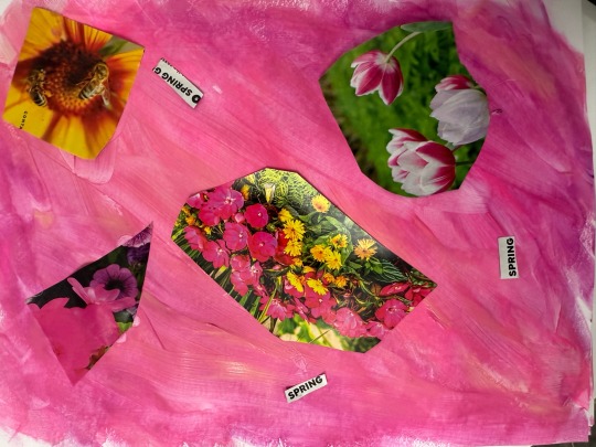
Text
In this piece I used different pieces from the magazine Container Gardening. They show many different plants and, I found that the word spring was featured a bunch, so I used it in the piece. I created a bright pink/purple background because it reminds me of spring and also because it goes good with the flowers.
2 notes
·
View notes
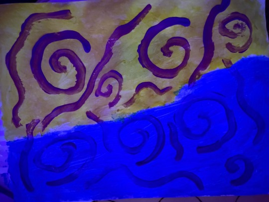
Text
This is my abstract piece for the midterm. I thought the digital version was much easier to do than the hand painted piece. I felt like I was in much more control and If I made a mistake, I could easily correct it. That was what I appreciated the most about the Digital piece. I used paint to create a background for the canvas. I used yellow and blue colors because I think they go very good together. Then I finish with some purple to create some designs on the piece that I thought looked very neat. I like the challenge of creating a piece with paint since I never use paint anymore. Overall I really enjoyed this project.

3 notes
·
View notes
Text
Assignment 3
For this weeks assignment, I was inspired by both Bryce and Gabe. I liked how Bryce used Blue and Green colors for the background. I thought this went well with Gabe’s work. He used some nature like pictures on his piece and I thought they went hand in hand. My work is combination of different parts of both. I went with Gabe’s overall structure from his album cover, but still used some parts from Bryces work.


4 notes
·
View notes
Text
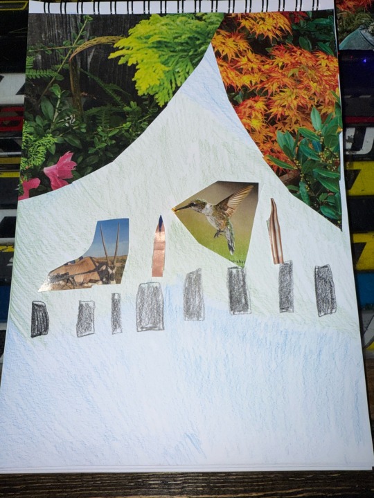
I like the selection of colors for the background. Blue and green go really well together. I also like how you hot creative in making your outfit. Really cool!

This is my second piece of work from this semester. I chose the background colors of Blue and green for a more Analogous color combination. These are two of my favorite colors in think slight blue highlights look good with green. In terms of the outfit, I didn't really know where to start. The hat and the shirt came from a flower's magazine where I just outlined a shirt and a hat that I cut out. I think the Lavander and the white in the clothes look really nice. The arms and legs are bullets pulled from a hunting magazine, there is no real meaning behind them, it's just the only thing I had in mind
5 notes
·
View notes
Text
I like how you got creative to make the outfit using a doritos logo very cool!
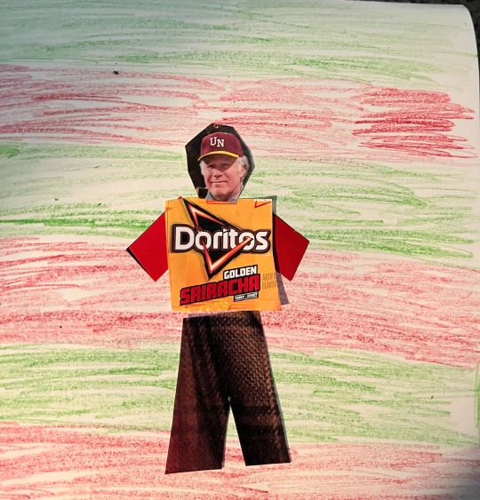
For assignment #2 I used red and green for my complimentary colors. For my outfit I created a normal everyday outfit. I used a dorito bag and the v from the Voice to create the t-shirt. The pants were made from a jacket someone was wearing in a magazine and the head was from a picture of Will Ferrell courtside at a Lakers game.
3 notes
·
View notes
Text

For my outfit I used the colors purple and yellow for the background. I always liked how the two colors went well together. I tried to be creative when making my outfit. I used flowers as the pants and a wolf for the head piece.
3 notes
·
View notes
Text
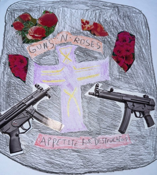
This is my first assignment for class. The album I selected was Appetite for Destruction by Guns and Roses. I selected this album because I have listened to it all my life and I listen to it before hockey games. As you can see I added my own touch to the album. Obviously because the band is called Guns and Roses so I added guns and roses. My favorite song from the album is Welcome to the Jungle, it really gets me fired up. I hope you all enjoy my work
3 notes
·
View notes
Text
Hello, my name is Sam Cichowski and I am a senior finance major at SBU. I play on the hockey team and love to snowboard and golf in my free time. I also enjoy watching sports and spending time with my friends and family.
4 notes
·
View notes