
Statistics
We looked inside some of the posts by sandragrar-blog and here's what we found interesting.
Average Info
Notes Per Post
0
Likes Per Post
0
Reblog Per Post
0
Reply Per Post
0
Time Between Posts
16 minutes
Number of Posts By Type
Text
17
Last Seen Tumblr Blogs


Fun Fact
Tumblr has a low social media market share in South America.
Text
PROJECT FINAL EVALUATION
It was my first self-managed project with my own brief which I think made the whole project much more complicated than I thought. I decided to focus on the concept art and illustration in this project as I always tried to add it into my design in my previous projects on this course. I also wanted to try creating my own game therefore I decided to use this area to set as my topic. As a game design and gaming itself is a new area for me as an artist I had to research quite a lot about it. Starting with the marker research to get an overall idea of what is going on and what is trending right now. I also undertook an online course about the history of the games, which I though was a great idea as it gave me a short overview of the most important facts which I had to know about the development of the games and what influenced it. As my idea of what kind of theme I want to choose I research quite a few artist and illustrators who were a part of a team who designed a game, however they were not young artist which work mostly digitally right now but artist who actually took part in creation of the most popular and iconic games. During my development process I also realised that I didn’t pay enough attention to the artistic element of this project therefore I had to go back to my research and find an art movement which could inspire my outcomes. I found Art Nouveau the most appealing - it actually made me think about changing my mind from creating a next-generation horror game which has very realistic graphics to a fantasy platform game which would be more illustrative. This idea led me to research into artist who create child book illustrations. The art of Shaun Tan had a huge impact on what I was creating and the style of it. It actually inspired me to do a lot of experimental illustration and mixed-media art. I tried brush marker, acrylics I even tried sculpture. Even though I know that developing ideas in this way is good it took me a lot of time because I changed my mind a couple of time during developing only one aspect of my project. As an artist I want to do a lot of things at once and I have a lot of ideas what to do, however it is not always a good thing as it made me wonder around the ideas for too long. I spent most of my time on the research and developing my character designs because I wasn’t sure what I wanted to do or where I wanted to push my ideas. I couldn’t set myself a goal which I could accomplish which made my time planning very unstable. I think that next time I would definitely set myself deadlines within the project to meet them and make sure that I left enough time for other aspects of the project.I think that as a person I like to work in stressful environment as it makes me to work much harder, however it also leads me to wanting to do more than I am able to and it always ends with frustration. It also made me change my mind a couple of times during the final weeks of the projects which gave me more and more work to the end of the projects not leaving enough time for annotations and reflecting on the project. Even though I have a couple of outcomes which I’m quite proud of like the poster design animation and the logo, I tend to focus on the bad aspects of the projects - I think it allows me to push myself to develop these areas more and improve myself. I think the biggest let down of this project was the character design final outcomes - as I mentioned before I spent most of my time on it trying my best to develop it to a good standard. however at the end I wasn’t sure how I need to present these and because of time limitation I rushed things and left it in much worse state than I imagined. I think that if I would draw these on a bigger scale it would allow me to show all the details which I worked so hard on and if I wouldn’t have enough space on the board to put them on as they are I could scale them down in Photoshop and print it. I also think that next time I should focus on creating less but to a better standard.
Overall I think it was the most instructive and informative project on this course in terms of self-management and actually experience a work of self-employed freelancer. This will be definitely a good lesson to take into the university course.
0 notes
Text
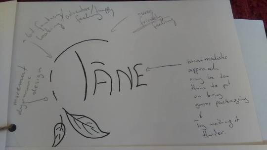
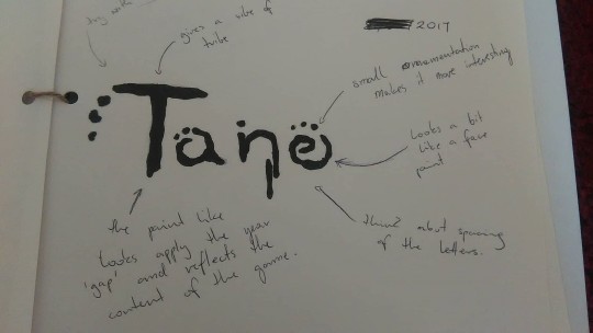
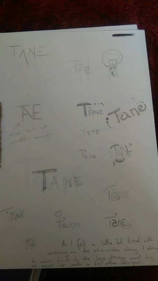
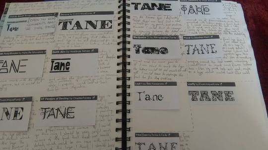
LOGO FINAL
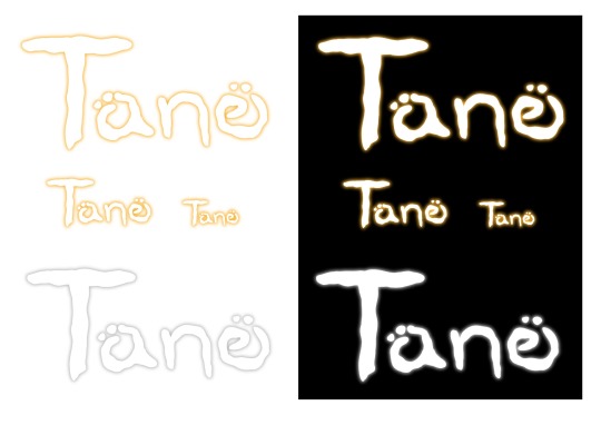
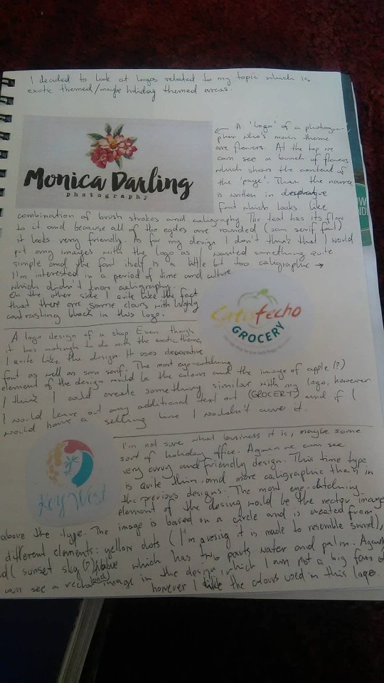
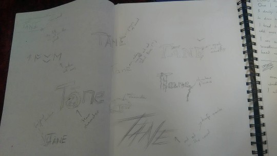
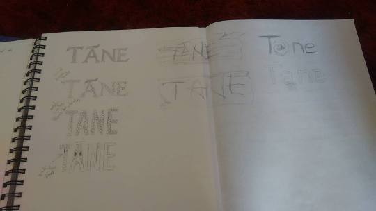
My final logo is an outcome of a few different inspirations and ideas. During my research into the logos and font I couldn’t really find anything which would match the idea which I had in my mind therefore I decided to create my own type. The shape of the characters was inspired by my own symbol which I created for this game to represent a skill, which was inspired by a tattoo of four winds – a Maori tattoo. It may sound quite funny when I say I became my own inspiration, however it gave me opportunity to match my logo design with the content of the game. I must say I’ve never been good at creating logos – that is also a part of my reason why I decided to do it (I wanted to challenge myself, but most importantly I wanted to improve myself in the areas which I was lacking and which I had negative experience or approach to). At the beginning, I was fixed on the idea of a logo which must be modern and minimalistic, I unconsciously restricted myself by basing on the knowledge from my first year of the course. Therefore, I got stuck at some point of my developing process as I tough the ideas which I was working on were simply not working for me. Therefore, I decided to look for more inspiration in books which would have brand identities and logos, I believe it was my turning point in the whole logo design part of the projects. I picked a few logos which I thought were the best inspiration for me and used them as a reference or a mood board. It opened my mind to thinking in wider range and showed me that you can be much more creative while working with the logos. I think I was lacking that kind of inspiration in my first year and it became a reason of my negative feelings. Getting back to my point, once I found the book, new ideas started to popping into my mind where one of them was my final logo design. I think the most interesting element of the logo is the unusual shape of letters. it reminds me of a text written by using your finger - I think it could let a player know that the game is related to native very organic story. I also think that it convey a feeling of freedom and the the flow of the lines which are so different from most logo designs these days, which have straight, sharp, very geometrical typography, makes it more playful and relaxing. As my time was very limited I didn’t really have time to explore a lot of different ideas, textures or designs or feedback which I could get which I quite regret, however I still think the logo came out quite good. I was wondering if there will be an issue with the colours as the logo is mainly white with small glow to it, however once I created a final logo sheet where I checked if the logo was working in smaller sizes and in black and white it worked just fine. I was quite happy with the shape of my logo which I created as a scamp therefore I used it as a template in Illustrator and drew over it with brush tool - I though it will be the best option for me as the type has many rounded lines which would make it quite hard to recreate using a pen tool, which could add some sharp edges which I didn’t want. During creation of this logo I was thinking on moving it into Photoshop as I didn’t know at the beginning that you are able to use blur effect in Illustrator. However, after a small research and a few watched tutorials on youtube I managed to create the whole logo in Illustration which made me extremely happy. Overall I’m very happy with the final outcome of my logo, as I couldn’t get much feedback I’m not sure what I could improve in this logo, from my point of view I could pay a little more attention to the shape of the letters as I can see some elements which aren’t quite the way I want them to be, however overall I’m proud of this logo. Even though it is quite minimalistic I still think it would get attention of some people.
0 notes
Text
MAP DESIGN
INITIAL IDEAS/ MAP
After a small research into creating the maps for games I tried to follow some of the steps and create a few small maps which I could possibly use with my game. I also used it as a small warm up before getting into the actual map creating.
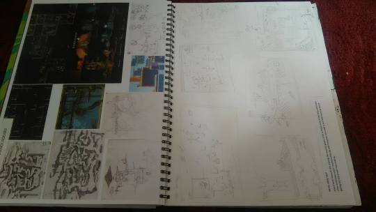
INITIAL IDEAS/ BIG MAP
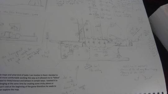
Once I get hold of how it is to create maps and what kind of tasks I can involve in them I decided to do one bigger maps – I felt a little bit more comfortable working this way as it allowed me to “follow” the story and how the play would need to think/interact and behave in certain ways. I wanted it to make it easy to understand but challenging at the same time by creating some tricky places or creating elements which the player can’t visit at the beginning of the game therefore he needs to come back to this place later to further explore the map.
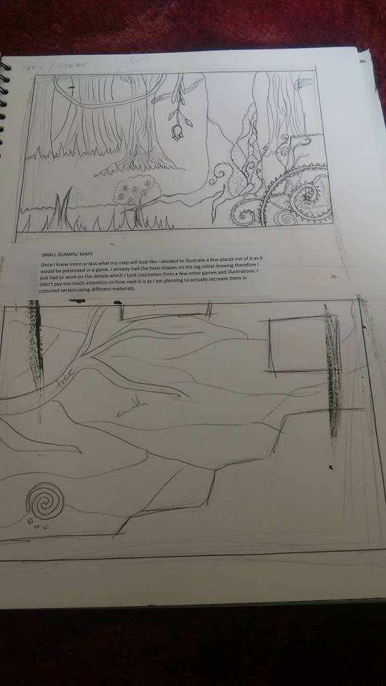
SMALL SCAMPS/ MAPS
Once I knew more or less what my map will look like I decided to illustrate a few places out of it as it would be presented in a game. I already had the basic shapes on the big initial drawing therefore I just had to work on the details which I took inspiration from a few other games and illustrations. I didn’t pay too much attention on how neat it is as I am planning to actually recreate them in coloured version using different materials.
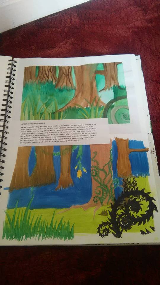
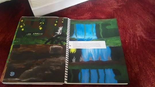
MATERIAL EXPLORATION MAPS
Before I started creating the scamp for my small map illustrations I had a watercolour paintings in my mind, however once I sat to it and started to work with them I felt very uncomfortable and it was hard to actually keep the shapes how I wanted therefore I dropped this idea. My second attempt was with brush markers as I thought they look similar to the watercolours but I have bigger control over where the ink is, however I still thought that it is not exactly what I wanted, I lack the fact that I could overlay some part or cover with different colour without planning it beforehand. In my conclusion, I decided to use acrylics as it simply seemed as the most comfortable way and a way which actually not only would make the work easier but also add a texture to the illustration.
SMALL MAPS FINAL
As I mentioned before I decided to use acrylic paint to illustrate my final small maps which I could use on the back of my CD packaging. The job was quite easy as I had to simply recreate the previous scamps adding some small details and working on the colour variation to make it a little bit realistic but not too much. I must say that I am quite impress with some of the elements from this illustration – I’ve never been a huge fan of acrylic however now I can see another side to them and how useful they can be, especially with mixed media designs. I also love the fact that I could create some texture on the illustration which gave it a little bit different dimension.
0 notes
Text
ENVIRONMENTAL DRAWINGS
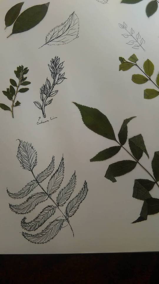
LEAVES / ENVIRONEMT STUDY
While taking photos of some plants I decided to collect a few leaves to then create a few study drawings – I wanted to have real leaves which I could see all of the details myself and have a go at recreating them and then deciding of which I could use in my illustrations and environmental designs.
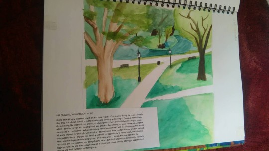
LIFE DRAWING/ ENVIRONMENT STUDY
Going back with my experience with art and usual request of my teacher during the course I thought that they put a lot of attention to life drawings and studying while doing it. This gave me an idea to do something like that with this project, as a lucky person I have a beautiful park nearby my house which I decided to visit and simply paint it as a process of developing my ideas and experiencing the nature and art themselves. As I cannot bring a whole bunch of staff with me to the park which would allow me to paint for example with acrylics, I decided to use more comfortable and available method using watercolours. I enjoyed this painting and took my opportunity to have a break, where I didn’t have to rush things and could simply focus on drawing what I can see. Not only it gave me the relaxation and the experience of being close to nature but also it allowed me to look at the nature in bigger perspective and even though I saw all of the details I could simplify it to bigger shapes which I think would work better in platform game.
0 notes
Text
FINAL POSTERS
Second of my posters, as I mentioned before I had to cut down the number of poster because of time limitation, therefore I decided to use the main character as it was the most obvious choice which I could do. However, this time I decided to create a poster which would be focused a little bit more on the character rather the whole game concept. I wanted it to look a little bit different than most poster which I sae therefore I went for a dynamic body posture, like jumping down, to represent my character which I located on the side of the poster to offset the point of focus a little bit and make it less predictable. I made it a little bit less detailed then my previous illustration as I wanted to work on it a little bit digitally as I did in my development process where I inserted my traditional drawing of Tane and mixed it with digital photomontage. I used the same process, techniques and materials as in my first poster: using my scamp as a reference I redrew the design on the bigger page (my initial idea was to print it in A2 size as most of the posters are printed) than rubbed off it to soften the pencil that it wouldn’t show from underneath the markers and coloured the poster. Again, I made a few mistakes, but hopefully I will be able to fix them digitally.
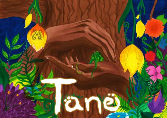
Once I was done with my research and all study drawings I could finally start working on my final posters. For my first poster, I decided to use the illustration of hands holding Tane inside of them. I drew them one on top of the other to show that these hands aren’t from one person – I wanted it to look that both of his parents, Rangi and Papa, are holding him tight in his hands as loving parents holding and protecting his child. I also had in mind the scamps of my maps which I created earlier and which I wanted to include in my posters. In this one it’s the tree which is next to the place where Tane fell which I illustrate in my animation. However, it felt quite empty therefore I wanted it to look friendlier and fantasy like so I research a few flowers and used my previous drawings as a reference to create this floral touch at the sides of the poster. As the illustrations is very detailed and quite big it took me three days to complete the whole poster which was more than I expected, however I understand that the good quality “products” needs time to be made. When I was researching already existing poster for the games most of of them, if not all of them were created digitally, or were simply taken from the actual game. As I cannot do it, and I wanted to create something different yet something matches the general standards I decided to use brush markers as they look quite similar in texture and the way they look on the paper as digital paintings. As I couldn’t really find any good reference pictures I decided to make them by myself; that’s why I took a picture of my own hands and printed out the photo, which I then traced onto tracing paper and then into my sketchbook. Even though the illustration isn’t perfect and I did a few mistakes which shouldn’t happen, like the green line in the middle of the illustration which I make by mistake by putting another poster on top of this one and colouring while the brush makers bleed trough this kind of paper. I feel proud to see it, and how much my skills improved since the beginning of this course, even though I didn’t work strictly only on my illustrative skills I still can see the improvement and the way I work is also a bit different, the way I approach the work and techniques which I use.
0 notes
Text
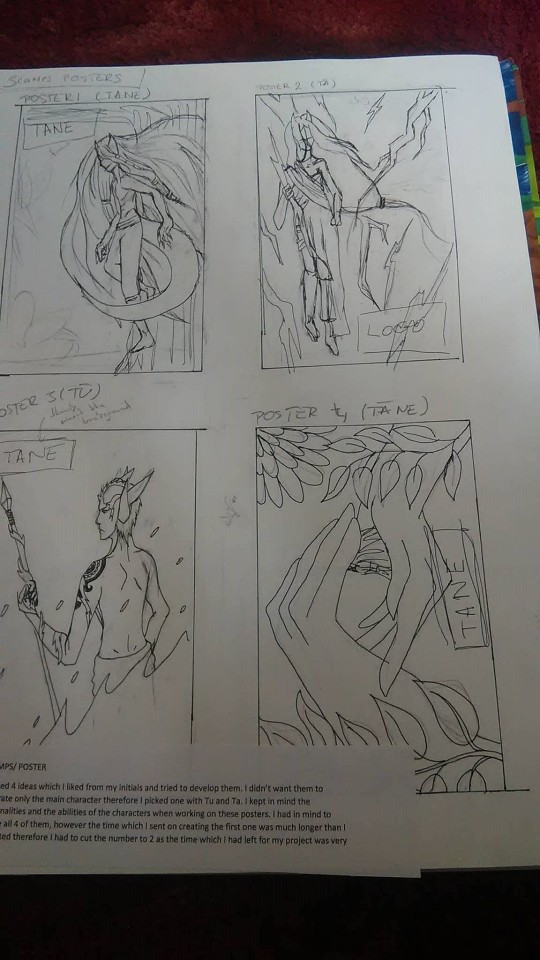
POSTER SCAMPS
I picked 4 ideas which I liked from my initials and tried to develop them. I didn’t want them to illustrate only the main character therefore I picked one with Tu and Ta. I kept in mind the personalities and the abilities of the characters when working on these posters. I had in mind to create all 4 of them, however the time which I sent on creating the first one was much longer than I expected therefore I had to cut the number to 2 as the time which I had left for my project was very short.
0 notes
Text
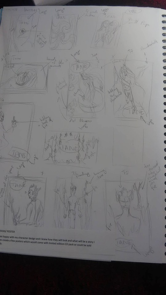
POSTER INITIALS
Once I was happy with my character design and I knew how they will look and what will be a story I decided to create a few posters which would come with limited edition CD pack or could be sold separately.
0 notes
Text
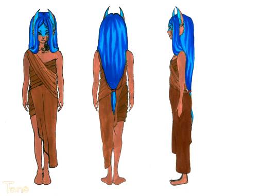
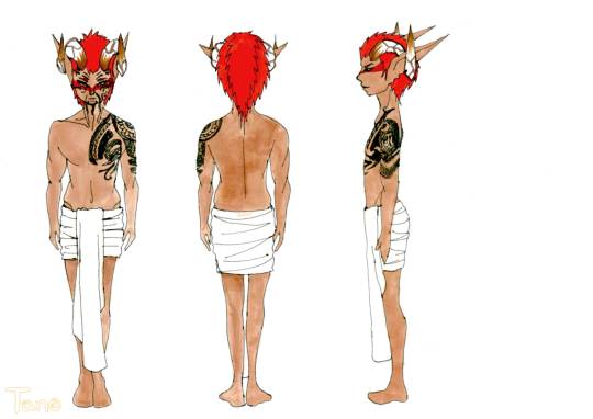
FINAL CHARACTER DESIGN SHEETS

I didn’t really want to called it a final sheet as it is not the final version of the character which I would like to show, I would be more keen to call my basic designs which I have in my A3 sketchbook my final outcomes, however while considering my exhibition space I needed something smaller therefore I decided to use professional way of representing a character design which is front, side and the back. I didn’t have much time left which made me rush things and made a lot of mistakes which hurt me quite a lot, however I felt like this will be the best way to show my character design as in the final form. I’m quite unhappy with the way I’m presenting my characters- I spent long hours trying to develop them and make them look nice but in the end, it came into something totally different than I imagined. I worked on very fine details which I could not include on these sheets as they are too small. I think that it would be a better idea to actually draw them on a bigger paper where I could add all of the details and then scan it in and scale it. However, the stress played a big role in this part as I wanted to finish everything on time, which sum to my poor management skills. I am not satisfied with this outcome; however I feel like I have no other choice but to put it up anyway. It will be a good lesson for my next projects.
0 notes
Text
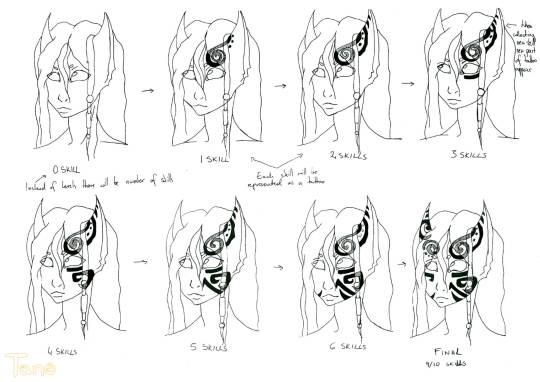
MAORI TATTOOS/ LEVELING
I decided to use the fact that in Maori culture the tattoos are the symbol of power and social status to represent the leveling in the game. The more skills the player collected the more tattoos character has on its face.
0 notes
Text
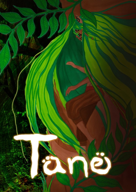
TANE ILLUSTRATION
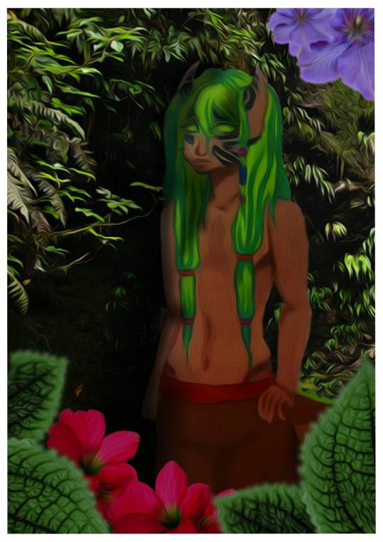
A mixed-media illustration of my main character Tane. This time I decided to put my traditional illustration inspired by Shaun Tan and edit it in digital environment by adding a background and some flowers on the bottom. I quite like the illustration however I think I shouldn’t add the acrylic effect on the character illustration as it distorted the shapes. The most favorite part of this illustration is the background which I created by adding some picture of forest and than adding acrylic effect on it.
0 notes
Text
ILLUSTRATIONS INFLUENCED BY ARTISTS
Tane Illustration
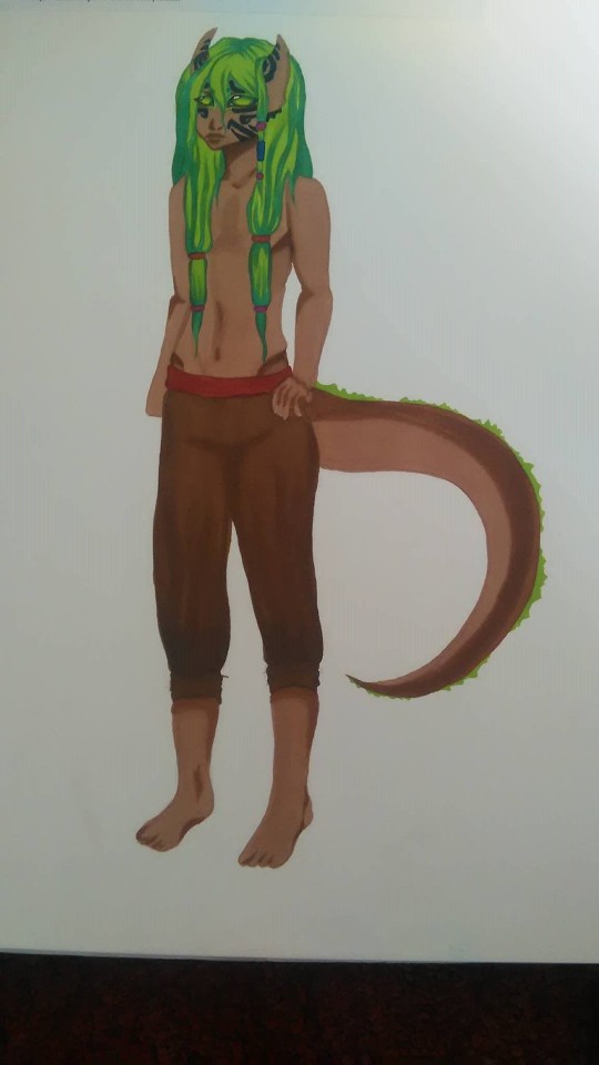
An illustration of my main character inspired by Shaun Tan art.
TAWHIRI ILLUSTRATION
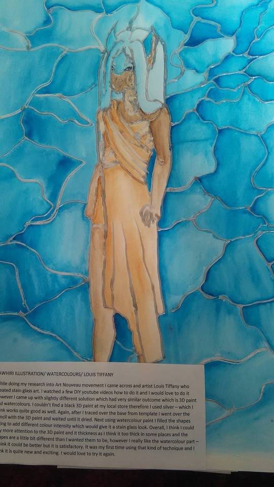
Inspired by Louis Tiffany and the stain glass art.
While doing my research into Art Nouveau movement I came across and artist Louis Tiffany who created stain glass art. I watched a few DIY youtube videos how to do it and I would love to do it however I came up with slightly different solution which had very similar outcome which is 3D paint and watercolours. I couldn’t find a black 3D paint at my local store therefore I used silver – which I think works quite good as well. Again, after I traced over the base from template I went over the pencil with the 3D paint and waited until it dried. Next using watercolour paint I filled the shapes trying to add different colour intensity which would give it a stain glass look. Overall, I think I could pay more attention to the 3D paint and it thickness as I think it too thick in some places and the shapes are a little bit different than I wanted them to be, however I really like the watercolour part – I think it could be better but it is satisfactory. It was my first time using that kind of technique and I think it is quite new and exciting. I would love to try it again.
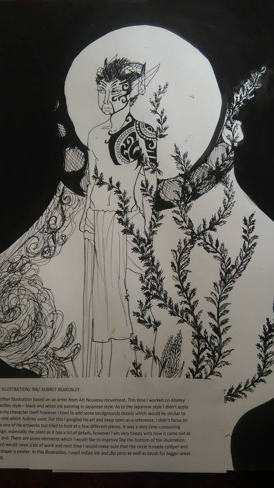
Inspired by Aubrey Beardsley and Art Nouveau art movement.
Another illustration based on an artist from Art Nouveau movement. This time I worked on Aburey Beardley style – black and white ink painting in Japanese style. As to the Japanese style I didn’t apply it to my character itself however I tried to add some backgrounds details which would be similar to the one which Aubrey used. For this I googled his art and keep open as a reference, I didn’t focus on only one of his artworks but tried to look at a few different pieces. It was a very time-consuming design, especially the plant as it has a lot of details, however I am very happy with how it came out at the end. There are some elements which I would like to improve like the bottom of the illustration which would need a lot of work and next time I would make sure that the circle is made calliper and the shape is neater. In this illustration, I used Indian ink and dip pens as well as brush for bigger areas to fill.
0 notes
Text
SHAUN TAN
Comment:
While researching about Shaun Tan, I looked at numerous pages and videos talking about or with him. I also looked at this artworks and the way he works which left me with impression that we work quite similarly. In one of his interviews he said he doesn't know the meaning behind his illustration at the beginning but he work his way around it to look for the story in it during the development of the work. He described it as giving the illustration a soul – I must say that I respect his way of working, I believe that the illustrations created this way are very “real”.
I cannot use this approach in 100% as I had already a outline of the story for my game, however I could still work around with it to add small changes to the main character or skill set which it would have.
I also really like the his process, I feel most comfortable when I draw small things ( he mention that working on a smaller scale he feels more comfortable as it's size allows him to think that its not as important and he doesn't need to worry about the way it looks or the outcome). I feel like I could use some of his ideas like cutting out some images and using it as a collage I this artworks while developing them – I think it could work as a reference image in next stages.
As for this actual style of drawing – as I am very much into fantasy settings which would be aimed at younger age audience I think that his work is just a perfect reference to my own style – his work is minimalistic/simple which will work perfect with the game and gives a very friendly feeling. On the other hand, he uses quite often robots or gives his characters a mechanic look which won't quite work with my theme but other than that I feel that I would use his style to develop my designs.
I also may combine his art style with the Art Nouveau artist Louis Tiffany, who created glass work (stain glass etc.) I think it would work just perfectly as something fantasy looking and yet have something unique to it. I may not be able to create glass stain however I could use watercolours and 3D paint to give a impression of it on normal paper. I will definitely try to work with it.
0 notes