
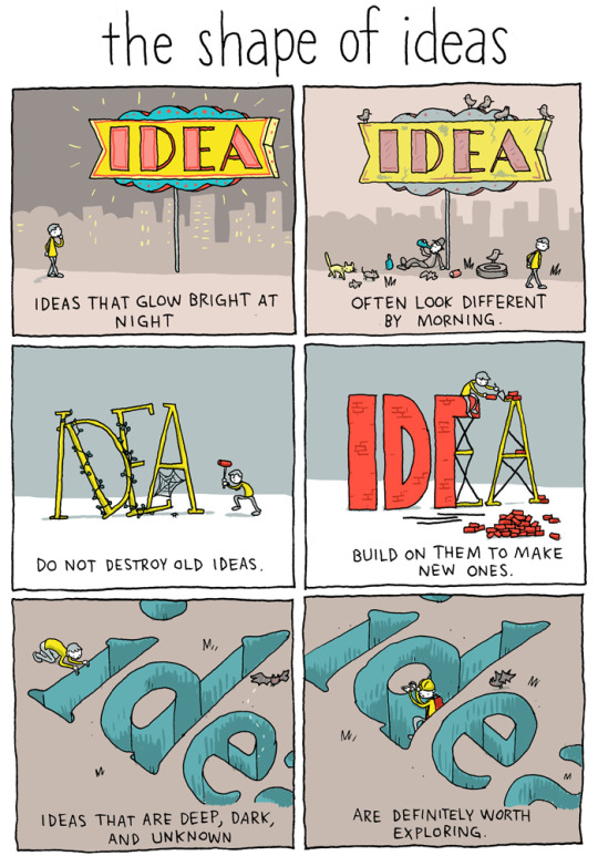
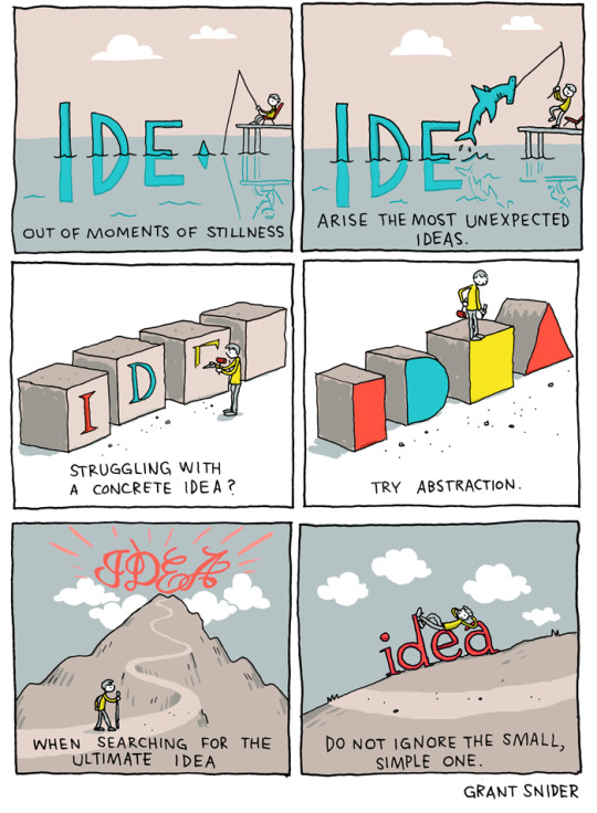
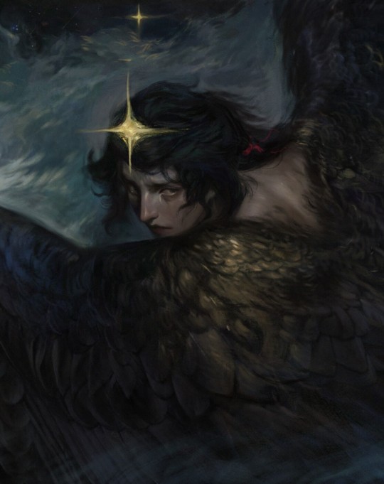
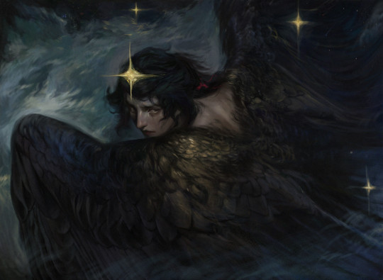
Mostly reblogs here, but I do have a blog section here with personal posts written by yours truly, about topics that become relevant for my life and my own introspections. English is my second language.
Don't wanna be here? Send us removal request.
Statistics
We looked inside some of the posts by sandytree1 and here's what we found interesting.
Average Info
Notes Per Post
543K
Likes Per Post
314K
Reblog Per Post
229K
Reply Per Post
253
Time Between Posts
28 days
Number of Posts By Type
Text
12
Photo
4
Note
1
Last Seen Tumblr Blogs


Fun Fact
12.7% of mobile users access Tumblr.
Text


If it's any consolation, there exists a world, somewhere out there, far away, where you could have been happy.
It just... wasn't this one.
11K notes
·
View notes
Text

people are sharing this on insta again so here’s the version with the font i made 🥰💖
available as a postcard in my shop!
4K notes
·
View notes
Text
21 top examples of JavaScript
JavaScript creates platforms that can engage a user and ensure that they remember your site and continue to revisit. It can be used to create games, APIs, scrolling abilities and much more.
The internet is full of web design inspiration, including great examples of JavaScript being used to bring a website to life and provide great user experiences. Here we pick some of our favourite examples of JavaScript in action for your inspiration.
01. Histography
Histography is an amazing way to explore 14 billion years of stuff
If you’ve ever watched Cosmos, you may remember Carl Sagan talking about the Cosmic Calendar. If the age of the universe was condensed into one year, recorded human history would fit within the very last seconds of 31 December.
14 billion years of events is a huge dataset, and displaying it in a browser is no easy task. But designer and developer Matan Stauber rose to the challenge – although even he wasn’t sure it would be possible: “I think the main obstacle would have to be proportions,” he explains. “How do you create a timeline when 99.9 per cent of the history we know will have to be condensed into less than one pixel of the screen?”
The son of a historian, Stauber created Histography as a student at Bezalel Academy of Arts and Design, under the guidance of Ronel Mor. “If we think about ways people visualise history, timelines are probably the most common one, and yet they haven’t changed a lot since the days of the printed paper,” he says. “I saw that as an exciting design opportunity, especially today with the access to big data sources.”
The site scans and indexes events from Wikipedia, grabs the article, and pulls in a Google image and YouTube video. The data is easily discoverable and a joy to consume. If you’ve ever lost hours exploring Wikipedia articles, set aside plenty of time for this one.
02. Filippo Bello
Adoratorio opted to use CSS3 and Javascript instead of WebGL to give a sense of depth
This online portfolio showcasing the talent of Italian 3D artist Filippo Bello was conceived, designed and developed internally at Adoratorio by Enea Rossi and Alessandro Rigobello. The team were given total freedom in how to design it.
The play with depth throughout the website is very effective – the images move slowly towards the viewer, creating the impression of diving into each project. This is achieved using what is called a segment effect: the background image is replicated in different boxes that move towards the viewer. The team challenged themselves by avoiding the most obvious technologies. “WebGL is not suitable for every kind of user,” says Rossi, art director and co-founder. “So the main challenge of this site was to understand how to deepen the screen using CSS3 and JavaScript code-strings only.”
The page transitions and the little zoom effects on the images are a nice added touch to the final result, which was – as Rossi describes it – “absolutely beyond our expectations”.
03. The St. Louis Browns
The St. Louis Browns site is styled like a vintage book
For this website about the history of the St. Louis Browns baseball team, digital agency HLK has crafted a very beautiful experience. The site reads like a well-crafted vintage book, complete with chapters and textured typography. Users can scroll through each chapter for a time-based, story-like experience.
Inspiration for the site has been pulled from 1920s manuscripts and advertisements, with many of the images directly from the years they are describing. This brings a uniquely dated feel to a modern, digital space. This is complemented by a grey-and-brown toned colour scheme, accented by a single shade of orange.
Some of my favourite parts of this site are the little details, such as the menu button (circular with a hamburger menu inside) that converts to a baseball on hover. I also love the timeline on the left-hand side, which follows the screen and updates on scroll.
The site is built using Node.js and the Express framework to allow for smooth updating and flow between content.
04. Leg Work Studio
Leg Work Studio’s site uses interactive animations to bring the experience to life
Leg Work does a lot of great work on the web, from graphic design to interaction and media. So it comes as no surprise to find that its own personal site is no exception. The studio’s personality shines through via fun, mixed-media illustrations. It combines vintage photo effects (such as the dot grid pattern) with digitally painted white accents and scans of physical handwriting to create unique art to represent the agency.
However, it is not just the illustrations that make this website notable – the interactive animations really bring it to life. Some of the illustrations themselves are actually videos instead of static visuals, created with After Effects, and website components like the sidebar animate smoothly.
The website is designed with mobile in mind, and mobile interactions are mirrored in the desktop experience, where the user can swipe with the track pad to get through the sections. The website is built using Modernizr to ensure compatibility, and jQuery for interactions.
05. Code Conf
Code Conf’s Nashville-themed site
The site for CodeConf really goes above and beyond the standard conference website. The conference was held in Nashville, Tennessee, and everything about this design pays homage to this location.
The website itself is nicely responsive and has a warm, cohesive colour palette. The whimsical illustrations give the site character and create a playful country-rock aesthetic that continues throughout the page (and even into the event itself).
No details are spared, as even the menu’s decorative horizontal rules (only seen on smaller screen sizes) flow with the country-rock aesthetic. The site implements Google Maps for location features, and is built with jQuery and AngularJS.
Everything is illustrated: all of the venues, the ‘set list’ of speakers, the call to action for buying tickets, and breaks between sections. There is also a fun cast of characters that can be found dotted around the site: vector cacti, unicorns, dragons, octocats, and cowboys and girls playing music and posing playfully around the page.
06. IBM Design
IBM Design’s site is inspired by the physical world as opposed to the digital one
In the past few years, IBM has invested in growing a design programme and steering the company towards a human-centric approach to creating software. It recently came out with the IBM Design Language, which contains an update for its animation vocabulary. It provides design guidance and resources for web developers, all open-sourced on GitHub.
What I love about this animation update (even more than the fact that it’s open sourced) is how the studio looks at IBM’s heritage and the physical world for inspiration, instead of other digital properties. Hayley Hughes, IBM design language lead, says that the team pulled inspiration from machines; in particular their solid planes, physical mass and rigid surfaces.
“From the powerful strike of a printing arm to the smooth slide of a typewriter carriage, each movement was fit for purpose and designed with intent,” she explains. “Our software demands the same attention to detail to make products feel lively and realistic.”
Why is animation so critical to IBM’s Design Language? “Just as a person’s body language helps you read the conversation, animation relays critical information that helps users understand how to navigate and use our products,” Hughes says.
07. Masi Tupungato
Image-led site for Italian wine-making project Masi Tupungato
This wonderful website from international digital creative agency AQuest for Masi Tupungato, a winemaking project based in Italy, almost lets the imagery speak for itself.
Unusually, a loading screen is used for each of the pages as the crisp fullscreen images load up. Usually this would be a big no-no – users want the content as soon as possible. However, here it actually improves the user’s experience by ensuring images are fully loaded before any content is unveiled. The design creates a sense of empathy, leaving users feeling like they’ve been to the winery and picked the grapes themselves.
The site can be on the heavy side on some pages (ranging from 1.2MB up to 5MB in weight), which could be improved by introducing some lazy loading techniques. However, despite its weight, the site is well-built, with the start render in under one second and return visits loading within the second mark too. The framework is based on unsemantic.com, which is a successor to the 960 Grid System.
When viewing the site on desktop and larger viewports, users are able to see and interact with each of the wines separately. They can take advantage of the larger screen size to display all of the wine characteristics and details side- by-side. In contrast, on the mobile site the details and description slide in and can be slid away again smoothly.
08. tota11y
tota11y makes accessibility simpler
Making accessible websites is critically important. However, the techniques and testing involved often seem like they require deep specialisation that can make web developers and designers feel like they’re adrift.
Enter tota11y: a simple tool that can be included as a JavaScript file in a page or, even more simply, used as a bookmarklet on any site. It flags items in the page that run afoul of accessibility guidelines – low visual contrast or missing textual alternatives for images, say.
Wayward elements are flagged visually, making it easy to snap a screen grab and show team members or clients exactly what the issues are, while the expanded explanations coach users on methods to quickly fix the glitches.
Khan Academy‘s website for tota11y is not overtly glamorous, but then, important work isn’t always glitzy. The down-to-business simplicity of the text – both in appearance and in content – belies the complexity of the problem the tool itself aims to alleviate.
09. Know Lupus
The Know Lupus site explores the condition in a fun, informative way
The Lupus Foundation of America (LFA) is a national organisation working to solve the mystery of lupus. Viget partnered with the LFA on a pro bono public awareness project to help the general public understand the disease.
“LFA wanted to create a fun yet informative game that would help educate the public in an engaging way, to help overcome that issue,” explains Laura Sweltz, UX designer and project lead. “Our design process focused on accomplishing that goal, while also creating something that people with lupus would actually feel excited about sharing.”
Viget’s solution was a casino-inspired card game built using React, in which each card highlights a fact about lupus. Custom illustrations by designer Blair Culbreth keep the game lighthearted while addressing the serious subject matter. Casino-inspired sound effects weave through the game.
The animations are smooth and snappy, adding another layer of delight to the game. The mobile experience is just as interactive as desktop, and responsive transitions have been fully considered. The end result is a playful experience that makes learning feel effortless.
10. The Boat
The Boat, an online graphic novel
Longform storytelling has been steadily gaining popularity on news and media sites, but broadcasting network SBS‘s The Boat, an online graphic novel based on a story by Nam Le, feels unique in both its style and execution. Sumi ink illustrations, expertly executed animations and a chilling soundscape capture the story of a young Vietnamese refugee’s journey.
To bring the story to life, illustrator Matty Huynh spent six months with Nam Le’s original prose, sketching thumbnails and iteratively creating the characters.
“I think the balance you see comes from this extended period of development,” explains producer Kylie Boltin. “That deep inward-looking period enabled the core team members to know the story inside out. We knew the story beats and we knew which moments needed to be highlighted. The guiding principle was to complement the core storytelling, rather than overpower it or add an element just for the sake of it.”
The graphic panels feel like diary sketches – urgent, imperfect and deeply emotional. This site proves just how powerful and engaging online storytelling can be in the right hands.
11. Run4Tiger
Can you run as much as a tiger? Find out with this site and your running app
Moscow-based Hungry Boys designed this show-stopping campaign site for the World Wildlife Fund Russia to raise public awareness for its Save The Tiger campaign. Why race your friends when you can race a GPS-tracked Amur tiger?
The site lets you sync your running app of choice (it currently supports nine different apps!) and pits you and other runners against the big cat, which averages 20km a day. If the tiger beats you, you donate $5 to WWF.
It’s a great concept, and there’s a great design to go with it. The sharp black and yellow colour palette – uncharacteristically bold for a charity app – conveys the urgency of the Save The Tiger initiative.
Run4Tiger’s creator Ksenia Apresyan says the team definitely had movement in mind when designing: “We wanted to make the website as dynamic as it could be. That’s why we decided to use the most fresh technologies and show our main message, made of dynamic particles, on the main page.”
Next page: 10 more top examples of JavaScript to inspire you…
12. Design Matters
The Design Matters site has a continually colour-shifting gradient background
Design Matters is a radio show launched by Debbie Millman in 2005. Over the years, Millman has interviewed over 200 designers, artists and creatives around the world. These are now housed on a beautifully redesigned site.
The first thing you notice is the morphing gradient background, which is subtle yet unique and mesmerising. The next thing you notice when you jump into an interview page is the enormous play icon overlaying the content.
“From the beginning I knew I wanted to have a giant play button on the screen, and after playing around with the design I settled on a completely transparent button,” says Armin Vit of UnderConsideration, the studio behind the site. “Since the interviews are all about transparency between Debbie and her guests, I enjoyed the visual extension of that.”
Vit used JS layout library Masonry to create a Pinterest-like grid of interview ‘pods’, each of which contains a well thought-out type hierarchy and image. As the audio is housed on SoundCloud, Vit had to figure out how to make the play button trigger a SoundCloud file via its unique ID.
What does Millman think of the site? “Armin took all the myriad must-haves for this site and created one design for me to look at,” she smiles. “I loved it the second I saw it.”
13. Wrap Genius
Food data
NYC-based designer and developer Sam Slover and team set out on a mission to document what he ate for 10 weeks, and created an interesting visual look into his diet.
“We wanted to tell the story of one person trying to figure out how to make his personal food data more meaningful,” says Slover. “So we took the audience on a journey: what does it mean to track your own food data and what insights can come of it?”
The result of his data-gathering is a one-page site that houses a beautiful collection of infographics. “It turns out there was quite a bit of data to design around,” he smiles. “We needed to make hard decisions about which areas to pursue when doing visualisations.”
Along with outlining what food was purchased, the team chose to focus on representing where the food came from, the ingredients, and an awards system where the best and worst foods were rated.
The team used Illustrator to develop the visuals, and Chart.js and D3.js to render some of the charts. While the site’s layout is simple, don’t be fooled – some serious number crunching went on behind the scenes, with the aid of a Node.js and MongoDB stack.
14. The Local Palette
Fuzzco took inspiration from the print version of this publication
The local Palate is the South’s premiere food culture magazine. In redesigning the site, the team at Fuzzco took its cues from the print magazine. “We started with a grid structure similar to the one similar found throughout the magazine,” says Fuzzco founder and creative director Helen rice. “For the typography we took a bold, modern approach and allowed space for large, engrossing photographs to reflect the engaging feeling found in print.” The navigation also mimics the look of the spine of the magazine.
The site’s stunning food photography and striking typography are arranged in a refreshingly simple layout that is a pleasure to view on any device. The recipe grids and full article pages are especially beautiful.
To build the site, the team used the – as they put it – “usual suspects” of jQuery, Sass and Typekit to serve the type. WordPress was selected to give editors flexibility in how the content is presented.
“We set up a system for editors to change the colour of some of the homepage elements to represent the current feature article,” continues rice. “This creates the same effect as a new magazine cover.”
15. Mike Kus
The portfolio of designer Mike Kus presents his stunning work in a refreshingly clean and understated manner
Here designer Mike Kus presents his stunning work in a refreshingly clean and understated manner, in which large images live alongside simple user interface elements. Bold dashes of colour come through from the portfolio items themselves, rather than from unnecessary decorative elements.
“I think of my work as the brand, hence there was no need to add a lot of style to the actual site [or its] UI,” says Kus.
The website is fully responsive and equally easy to navigate on larger and smaller screens. What makes the site such a pleasure to explore, however, is the image selection: each portfolio item uses strong, carefully selected imagery that make you want to see more of the project.
Kus notes that “one of the main issues was making sure the site had the same visual impact across all viewport sizes” – and in our opinion, it certainly does.
16. Multeor
Multeor is written in plain JavaScript using HTML5 Canvas
Multeor is a multiplayer web game developed by Arjen de Vries and Filidor Wiese and designed by Arthur van ‘t Hoog. The idea of the game is to control a meteor crashing into earth. You score points by ensuring you leave the biggest trail of destruction. Up to eight players can connect to a single game simultaneously.
Multeor is written in plain JavaScript using HTML5 Canvas and backed with a Node.js server to manage the communications between the desktop and mobile devices using WebSockets.
Rather than using one of the many game libraries, Wiese built entirely from stratch. “We decided not to use a prefab game engine,” he says, “which means rendering the graphics, detecting collisions, keeping track of entities and coding a particle system for the explosions. Not depending on a specific game engine was great fun: it gave us a lot of creative freedom and we definitely learned a lot because of it.”
17. Here Is Today
Here Is Today required a small amount of JavaScript to put the animation in place
Here is Today was created by designer Luke Twyman. He explains the motive behind the site: “Being fascinated by the scale of time, I wanted to create something that would clearly give people a sense of that vastness, and a feeling of where we sit in relation to all that’s gone before. To do this, two important features on the technical side would be some kind of zooming/scaling mechanic, and also a super clean layout.”
Twyman kept all widths relative to make the site’s message convey equally well on a smaller screen: “From the start I decided to do away with pixel measurements and pt sizes for type, and instead set my own measurement unit based on a fraction of the screen width. I set one unit to be 1/22 of the screen width and positioned and scaled everything using that unit, so the spacious layout would be maintained on different displays.”
It took just a small amount of JavaScript to put the animation in place: “The zoom mechanic is based on a simple tween animation formula, which I’ve used numerous times now, although I’d never used it in JS before. In fact this is only the second thing I’ve built using JS, but I’ve found the transition from other languages I’ve used or tried to be fairly easy, and there’s plenty of great documentation at hand online.”
18. The Trip
The Trip is an interactive film with audio, powered entirely through JavaScript and HTML5
The Trip is an interactive film with audio, powered entirely through HTML5 and JavaScript (with Flash nowhere to be seen). The complexity of the project proved challenging, as developer Otto Nascarella explains. He says, “Most of the difficulties we had during the development process were due to the lack of cross browser/devices consistency of HTML5 new technologies, so it was decided we’d ‘recommend’ Chrome for a better experience on desktops,” he says.
“The JavaScript code uses jQuery for almost everything – even though I flirted with the possibilities of using Zepto – I wrote two plugins for jQuery, [used] TextBlur to animate blur on fonts using text-shadow, that did not get used the end, and also TextDrop, the one that is responsible for the typographic animations.”
19. MapsTD
MapsTD harnesses the power of Google Maps for an immersive gaming experience
MapsTD is a tower defence game, but with a difference. You tell it where your home is, and through the power of Google Maps, it will produce a game in which you’re defending your hometown, with the baddies relentlessly charging past the streets and houses of your neighbourhood.
Creator Duncan Barclay explains how it works. “It’s obviously built using the Google Maps API, with MooTools being used for the other aspects of the UI and as a general-purpose JavaScript library. It uses several bits of functionality provided by Google Maps. As well as the map itself, the biggest part is the route finder API, which is used to work out the paths the enemies follow. Once you’ve picked a start location, it does a lookup to get the latitude and longitude. It then looks for four routes by adding or subtracting a fixed number from that latitude and longitude (to get a point due north, due east, and so on), and uses Google to find a path between the two.”
Creeps
As the game progresses, more enemies (or ‘creeps’ as he has called them) appear on screen. Barclay found himself battling to keep performance high and timings correct: “One of the biggest challenges – one that still isn’t quite right – was the timing. Firstly, if the page isn’t active, most browsers reduce how often they check if timeouts have reached the end, resulting in creeps moving in bursts rather than moving steadily. I ended up fixing that by pausing the game when the tab loses focus. The detection code was taken from David Walsh’s blog and is in the game credits.
“The other problem was that as you progressed, there were too many things happening, which resulted in the game slowing down a lot. The workaround ended up being to use harder creeps rather than more of them, and making the game incrementally more difficult each level after level 50.”
20. Command and Conquer
Command & Conquer is back, and it’s online, thanks to Aditya Ravi Shankar
This is an amazing example of how powerful today’s tools are. Aditya Ravi Shankar has used them to create an online version of classic real-time strategy game Command and Conquer.
Recreating the original 1995 game was a long and painstaking process, says Shankar. “Every little thing took time – things like selecting single units or multiple units; being able to select by drawing the box from left to right or from right to left; making sure the panning was smooth; figuring out a decent fog of war implementation; allowing for building construction, dependencies (the Power Plant is needed for the Refinery, which is needed for the Factory) and building placement (buildings cannot be constructed on top of other buildings); and depth sorting when drawing so units could move behind buildings and trees.”
It’s only when the development tasks are itemised in this way that you realise just how much work went into the project, including some very complicated logic – making it even more impressive that the entire thing could be achieved using only HTML5 and JavaScript.
21. Peanut Gallery
Peanut Gallery is a project from the Google Creative Lab
Peanut Gallery is a project from the Google Creative Lab. Valdean Klump, a producer at the Lab, explains the concept. “The Peanut Gallery is a Chrome experiment that lets users add intertitles to silent film clips by talking to their browser,” he says.
“The technology behind it is Google’s Web Speech API, a JavaScript API that lets developers integrate speech recognition into their web apps.” The project does a good job of demonstrating the Web Speech API, which displays live text updates as it tries to understand a human’s speech.
“One of our favourite features of the API is that text updates in real time while you speak,” Klump continues. “For example, if you say ‘European Union’ slowly, you can watch as the API begins by printing ‘your’ or ‘year’ and then corrects it to ‘European Union’. “Another neat feature (for English speakers only at this point), is punctuation. Say ‘question mark’, ‘exclamation point’, ‘comma’, or ‘period’ and the API will insert the correct punctuation for you,” adds Klump.
These examples of JavaScript were originally published in net magazine.
Related articles:
12 inspiring ecommerce website designs
22 ways to boost your productivity
How to design responsive and device-agnostic forms
This post comes from the RSS feed of CreativeBlog, you can find more here!
The post 21 top examples of JavaScript appeared first on Brenda Gilliam.
from Brenda Gilliam http://www.brendagilliam.com/21-top-examples-of-javascript/
1 note
·
View note
Text
I cried, and the birds came down and made my song their own.
Theodore Roethke, from "Words for the Wind", The Collected Poems of Theodore Roethke [ID'd]
435 notes
·
View notes
Text
Soul types in Fear & Hunger

In the Fear & Hunger series, human souls can be of diverse types. They are decided at the time of one's birth, and are indicators of how one's personality and life will be like, oftentimes being the source of a person's skills. Soul types are the Fear & Hunger equivalent to real-life zodiac signs, though birth signs are still mentioned and confirmed to exist. Soul types are not the same as unique souls, which are for the most part unlockable accessory items that give certain stat bonuses and special status effects to the wearer. The Ancient One soul, held by the girl, is unique as well and will not be listed in this article for that particular reason.
"The new gods only pass on their knowledge to those who share the same birth sign and soul with them."

Sources
Reddit: Souls, Summarized: How Souls work within Fear and Hunger, Leftie 2023
What soul type are you?
Encyclopedia: wiki.gg
29 notes
·
View notes
Photo
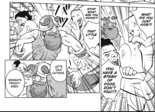


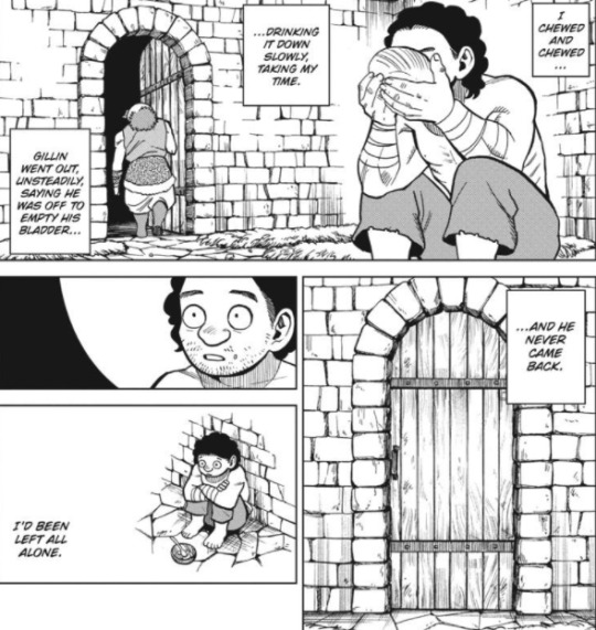
And there’s another reason Senshi is so nurturing and stays so steadfastly by the side of the “young ones” and keeps them fed- he knows what it’s like to lose everyone. To maybe be abandoned. And he doesn’t want it to happen to another group. What’s more, Senshi notices how incredibly fishy the whole situation looks and…
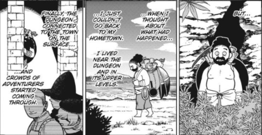

He’s haunted by the guilt that he may have (unintentionally) engaged in cannibalism. That’s why he’s stayed in this cave. Which is pretty fuckin’ heavy! Especially with the addition of “this is what I think of every time I eat” from our biggest foodie. You realize this may have been part of his quest to learn to cook so many monsters. He can’t bring himself to directly confirm it wasn’t griffin, but he holds out hope he might run across something else that tastes like it, so he can finally get relief.
It’s no wonder Senshi couldn’t talk about this before. It’s a lot to carry! But this is how you do a good backstory- it lines up with Senshi’s personality and explains a lot of his motivations and behavior, while adding some extra depth. It’s not just there to be edgy, it adds to the overall narrative and character dynamics.
76 notes
·
View notes
Text
People should use this text embellishment more
𓆝 𓆟 𓆞 𓆝 𓆟
71K notes
·
View notes
Text
Good Traits Gone Bad
Exploring good traits gone bad in a novel can add depth and complexity to your characters. Here are a few examples of good traits that can take a negative turn:
1. Empathy turning into manipulation: A character with a strong sense of empathy may use it to manipulate others' emotions and gain an advantage.
2. Confidence becoming arrogance: Excessive confidence can lead to arrogance, where a character belittles others and dismisses their opinions.
3. Ambition turning into obsession: A character's ambition can transform into an unhealthy obsession, causing them to prioritize success at any cost, including sacrificing relationships and moral values.
4. Loyalty becoming blind devotion: Initially loyal, a character may become blindly devoted to a cause or person, disregarding their own well-being and critical thinking.
5. Courage turning into recklessness: A character's courage can morph into reckless behavior, endangering themselves and others due to an overestimation of their abilities.
6. Determination becoming stubbornness: Excessive determination can lead to stubbornness, where a character refuses to consider alternative perspectives or change their course of action, even when it's detrimental.
7. Optimism becoming naivety: Unwavering optimism can transform into naivety, causing a character to overlook dangers or be easily deceived.
8. Protectiveness turning into possessiveness: A character's protective nature can evolve into possessiveness, where they become overly controlling and jealous in relationships.
9. Altruism becoming self-neglect: A character's selflessness may lead to neglecting their own needs and well-being, to the point of self-sacrifice and burnout.
10. Honesty becoming brutal bluntness: A character's commitment to honesty can turn into brutal bluntness, hurting others with harsh and tactless remarks.
These examples demonstrate how even admirable traits can have negative consequences when taken to extremes or used improperly. By exploring the complexities of these traits, you can create compelling and multi-dimensional characters in your novel.
Happy writing!
58K notes
·
View notes
Text
not "i ship these characters" or "i want them to bond platonically" but a secret 3rd thing (I want them to be forced to interact by the Narrative bc they would HATE that)
10K notes
·
View notes
Text
Love is madness, and lust is poison. - George R.R. Martin
1 note
·
View note
Text
A reader lives a thousand lives before he dies. The man who never reads lives only once. — George R.R. Martin
0 notes
Text
Cersei Lannister: I shall wear this as a badge of honor. Robert Baratheon: Wear it in silence, or I'll honor you again.
0 notes
Photo


GAME OF THRONES 2.07, A Man Without Honor
454 notes
·
View notes
Note
Could draw Cersei in green ?
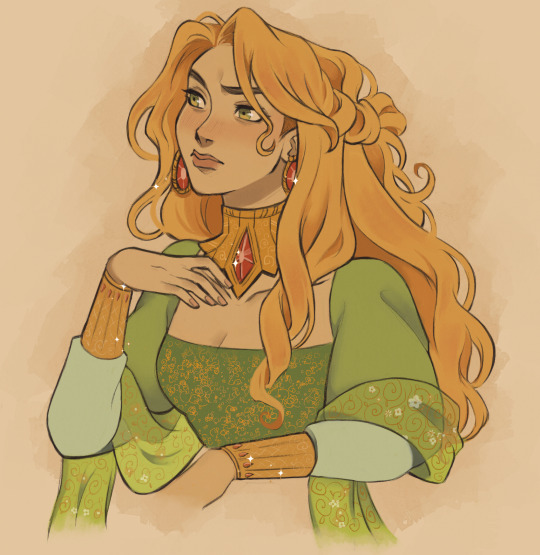
Cersei in green!!!
759 notes
·
View notes