
Don't wanna be here? Send us removal request.
Statistics
We looked inside some of the posts by saoirseann and here's what we found interesting.
Average Info
Notes Per Post
0
Likes Per Post
0
Reblog Per Post
0
Reply Per Post
0
Time Between Posts
48 minutes
Number of Posts By Type
Text
8
Photo
9
Last Seen Tumblr Blogs


Fun Fact
Tumblr has been providing a Korean-language service since 2013.
Text
Semester 2 Final Links - Jan - April 2020
Prototypes
Low Fidelity Prototype - https://xd.adobe.com/view/c35875ad-8f9c-4621-455a-ce381f2015cf-b569/
Semester 1 Prototype - https://xd.adobe.com/view/91c78b93-ebd1-4e59-70d2-d576431d532c-e7f6/
Final Prototype Semester 2 - https://xd.adobe.com/view/2a4ebf12-9071-4101-6fa3-5784d164e99c-5c7f/?fullscreen
App Walk Through Video - https://bookmarkapp.co.uk/img/video/bookmark_walkthrough.mp4
Websites
Dashboard - https://bookmarkapp.co.uk/dashboard.html
Promotional Website - https://bookmarkapp.co.uk/
Sketchbook
Digital Sketchbook - https://bookmarkapp.co.uk/pdfs/sketchbook.pdf
Onboarding Research & Inspo
General Onboarding Research -https://saoirseann.tumblr.com/tagged/apponboarding
Favourite onboarding apps - #https://saoirseann.tumblr.com/tagged/favonboarding
Onboarding research- https://saoirseann.tumblr.com/tagged/onboarding
Personalised Onboarding Research & Inspo for Bookmark- https://saoirseann.tumblr.com/tagged/peronboarding
General UX/UI Design Research
Mental Models in Design - https://saoirseann.tumblr.com/tagged/mentalmodels
Week 4 catchup - https://saoirseann.tumblr.com/tagged/todo
UI Styles - https://saoirseann.tumblr.com/tagged/uistyle
Steve Krug book list summary and key points - https://saoirseann.tumblr.com/tagged/dontmakemethink
The Design of Everyday Things- https://saoirseann.tumblr.com/tagged/readlist2
Principle of Consistency and Standards in User Interface Design - https://saoirseann.tumblr.com/tagged/uistyle
UX Planet 7 best tips for button design - https://saoirseann.tumblr.com/tagged/buttondesign
Colour Scheme & Card Design Research
New colour scheme - https://saoirseann.tumblr.com/tagged/newcolourscheme
Fathom Crit and feedback with UX Designer - https://saoirseann.tumblr.com/tagged/fathomcrit
Colour Assibility Checker for my final Alpha prototype - https://saoirseann.tumblr.com/tagged/colouraccessibility
Card UI Design - Questions I need to ask first -https://saoirseann.tumblr.com/tagged/carddesign
Successful card design in 3 steps: UX, UI, and Framework - https://saoirseann.tumblr.com/tagged/cardresearch
Tips on Designing Better Cards - https://saoirseann.tumblr.com/tagged/designbettercards
Bookmark User Personas- https://saoirseann.tumblr.com/tagged/userpersonas
User Task flows - https://saoirseann.tumblr.com/tagged/taskflows
Launch Strategy
Social Media platform research - https://saoirseann.tumblr.com/tagged/lsresearch
Initial research - LinkedIn learning course - https://saoirseann.tumblr.com/tagged/launchstrategy
Research on successgul launch strategy - https://saoirseann.tumblr.com/tagged/SCLS
BookMark Social Media - https://saoirseann.tumblr.com/tagged/socialmedia
Promotional Website
Single page websites inspiration - https://saoirseann.tumblr.com/tagged/webinspo
Creating an effective Promotional Website - https://saoirseann.tumblr.com/tagged/websitetips
Website Low Fidelity Wireframes - https://saoirseann.tumblr.com/tagged/promositesketches
Bookmark website outline - https://saoirseann.tumblr.com/tagged/promotionalwebsite
Bookmark is live - https://saoirseann.tumblr.com/tagged/promotionalwebsite
Business Strategy
Bookmark Business Strategy, mission statement etc - https://saoirseann.tumblr.com/tagged/businessstrategy
What makes a website effective - launch strategy LinkedIn learning course - https://saoirseann.tumblr.com/tagged/effectivewebsite
Usability Testing
Initial research into Usability Testing and its definition - https://saoirseann.tumblr.com/tagged/initialUR
Usability Research - https://saoirseann.tumblr.com/tagged/usabilityresearch
Usability Characteristics - https://saoirseann.tumblr.com/tagged/usabilityelements
6 Steps to Usability Testing - https://saoirseann.tumblr.com/tagged/UTsteps
User Testing 1 with UX Designer and Student - https://saoirseann.tumblr.com/tagged/usertesting1
User Testing 2 with User Interface designer - https://saoirseann.tumblr.com/tagged/usertesting2
User Testing 3 with a Product Designer - https://saoirseann.tumblr.com/tagged/usertesting3
User Testing 4 with a UI Designer - https://saoirseann.tumblr.com/tagged/usertesting4
User Testing 5 with a UX Designer - https://saoirseann.tumblr.com/tagged/usertesting5
NI Design slack Usability testing - https://saoirseann.tumblr.com/tagged/usabilitytesting
Usability testing benefits/ quote - https://saoirseann.tumblr.com/tagged/UTbenefits
Typeform Design Feedback Survey - https://saoirseann.tumblr.com/tagged/designfeedback
SUS Research and benefits - https://saoirseann.tumblr.com/tagged/sus
SUS Typeform and results - https://saoirseann.tumblr.com/tagged/susresults
What's changed Semester 1 - Semester 2 Development
Onboarding development for Bookmark - https://saoirseann.tumblr.com/tagged/onboardingdev
Illustration Inspo - https://saoirseann.tumblr.com/tagged/illustrationinspo
Genre screen development - https://saoirseann.tumblr.com/tagged/genrescreen
Genre last minute redesign changes - https://saoirseann.tumblr.com/tagged/genrefinalredesign
Home Screen redesign - https://saoirseann.tumblr.com/tagged/homeredesign
Personalised Book recommendations onboarding - https://saoirseann.tumblr.com/tagged/personalisedOB
Book Screen redesign & issues - https://saoirseann.tumblr.com/tagged/booksredesign
Filter Screen Redesign - https://saoirseann.tumblr.com/tagged/filterredesign
Improving my understanding of mobile UI - specifically modal overlays https://saoirseann.tumblr.com/tagged/modaloverlys
Profile Redesign - https://saoirseann.tumblr.com/tagged/profileredesign
Friends Redesign - https://saoirseann.tumblr.com/tagged/friendsredesign
Settings - https://saoirseann.tumblr.com/tagged/settingsredesign
Friends Profile Redesign - https://saoirseann.tumblr.com/tagged/friendredesign
Overall thoughts on the redesign VS Semester 1 - https://saoirseann.tumblr.com/tagged/oldvsnew
Semester 2 original goals - https://saoirseann.tumblr.com/tagged/semester2goals
The Future of Bookmark
Last Research Post/ Conclusion -https://saoirseann.tumblr.com/tagged/futureofbookmark
0 notes
Text
Bookmark User Task Flows
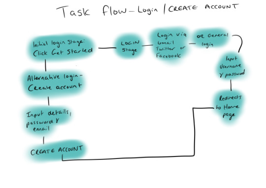

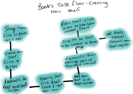
I created a few task flows to show the different stages of how a user would use the final Bookmark prototype. I created these on my iPad using Procreate.
I planned to do proper user flows of all my final designed screens within Adobe XD. But, due to only having a Windows laptop, the only plugin I could find to carry this out was the Overflow Plugin which annoyingly is only available for Mac OS. This is something I could have worked in the studio using the external monitors there, but these rough sketches will hopefully work for now
0 notes
Text
The Future of Bookmark

If I had more time for Bookmark to complete the project entirely, I would have worked on designing the rest of the Achievement Award illustrations. As I only got to show one in the final prototype due to time constraints with the deadline brought forward three weeks.
I would also add further gamification elements to the app, so say on World Book Day I could have a unique challenge available for app users there they all have to set a minimum reading goal of 30 minutes to complete that day. They’d receive an extra award for doing so.
Another idea I was planning to carry out was giving a summary each month of how much they have read etc. Could be via email or a push notification. I get this every Monday from my watch telling me you did not meet your move goal every day and what it works out to be an achievable goal. You could consider this around helping motivate users but not setting goals they cannot meet.
0 notes
Photo

Semester 2 Goals - The Outcome
My overall focus for this final semester from my prior feedback from Chris was enhancing my understanding of mobile User Interfaces through small master-apprentice exercises. I also carried out a significant amount of research into other content-heavy apps.
I set myself goals and targets for this semester using Notion and was able to get the majority of everything completed despite the date change with the final deadline. So I'd say my app is a final product (but I would have liked to improve the Goals screen to visualise better the users reading statistics.)
The most time-consuming part of this project was getting all of the information on books, authors, reviews, and looking at their average ratings.
0 notes
Photo


Bookmark Relaunched
Here you can visibly see the difference in the five key screens of bookmark from my initial prototype in semester 1 to my final product. I'm pleased with the outcome despite the considerable change in circumstances due to COVID-19. Not how I pictured my last year of university ending, But I tried to maintain level headed and put in a lot of work into my final app.
The key difference is my improvement in UI design, and the massive different the new colour scheme makes as the entire app is brighter and more exciting to look at in comparison to before. The usability and user experience of Bookmark has also significantly improved. I think this is down to me being more open to feedback from not only my lecturers but from experienced designers throughout Belfast. The usability testing was something new to me along with designing the app, so it's been a great learning experience and rewarding to see the positive feedback on the final app.
Overall although I'm happy with how my major project turned out, there were a few screens I wanted to work on redeveloping which included both the Goals & Achievement screens. I knew there was a better way of displaying the visuals for the number of pages read/ hours spent reading statistics on the goals page, but I didn't get the time to work on this. This is also the same with the Achievements screen as I planned on creating playful illustrations for the rest of the 7 award badges. When I realised the deadline was changed I didn't want to rush these designs which would alter the rest of the UI, so I had to decide to only display 1 award. Hopefully, this doesn't affect the overall experience of using Bookmark.
0 notes
Text
SUS Question & The Results

Here’s a link to the System Usability Scale Typeform survey I created to send to the five users that completed the remote usability testing - https://saoirsemullan.typeform.com/to/HP5D7o
The Results
I asked the five users who completed the usability testing for Bookmark to complete this SUS Typeform survey for me. This research is beneficial as the SUS questionnaire is valid and can effectively differentiate between usable and unusable systems. It allowed me to achieve a measured figure for the usability of Bookmark.
I scored 79.4 overall after figuring out how to analyse the survey results by using the set algorithm. The SUS survey has helped me measure the impact the design changes and refinements I've made have had on the overall app and functionality. My score is above the target set for good usability, which is 68, so I'm happy with how well this has performed.
0 notes
Text
Typeform Design Feedback Survey
Here’s a link to the Typeform survey I created to give to a few of the users carrying out my remote usability testing for the final prototype of Bookmark - https://saoirsemullan.typeform.com/to/j5OP9S
Some of the Results
User 1 - UX Designer Early 20s


User 2 - Product Designer Early 30s


0 notes
Text
Usability Testing 5 - Feedback & Refinements

What They Liked
Love the onboarding illustrations!
LOVE LOVE LOVE the achievement badges!
The profile page is working really well, achievement illustrations are really nice! and everything is nicely separated out
What they said needed improving
When switching between home and books, the bottom nav changes size
The “enter your goal” modal is a bit confusing as it has the number of pages and then two dates. Maybe it would be clearer just to enter in one goal for all dates?
On Home, clicking on a book doesn’t seem to do anything, I would loved to have seen an example of a page once you have clicked on a book
I like the use of the books as multi selects, but the usability nerd inside my is saying it might confuse users and make it hard to scan the options - even though I like how it looks! so take this one with a pinch of salt
What I learned & Changed
After all my usability testing, this last user provided the most useful, in terms of highlights an error I didn't even notice before. The screens I designed for Home were all a smaller width than the rest of my, not sure how this happened as I created my app for Huawei P20 Pro screen size at 2340 pixels height & 1080 width. Somehow the home screens had gone to 1020 which seemed to cause the navbar being resized any time you clicked out of the Home onto another screen.
I was able to fix this, as although minor thankfully, it would have caused a lot of problems with the user's experience when trying to navigate between screens.
I also added more detailed book reviews from the Home screen so there's now two users can click on and view in detail.
After I received feedback from all five of my users I sent them out my SUS questionnaire to summarise my results and to also figure out where my app sits on the usability scale.
0 notes
Text
Usability Testing 4 - Feedback & Refinements

User Group - Mid 20s - UI Designer
My main objective stays the same with all users - Get an overview of how easy the app is to use, the layout of the onboarding and startup screens. Also, to figure out if any features didn’t work as anticipated.
What They Liked
Really like the onboarding cards and how they look like you're flipping through a book!!
LOVE the little fade animation when you selected the books you've read before.
The bookshelves are really good and have some nice shading on.
Illustrations are nice (love the 'Welcome to Bookmark' guy with his coffee)
Like your 'Books Read This Year' feature. Really nice to see your progress. It's a big motivator.
Your little book illustrations are and have a lot of depth on the 'Books' screen.
That 'Journey Begins' screen is actually so cute. LOVE IT. Also as I'm writing this I've just seen that he's lifting books as well. AMAZING. I'd love to see some more of the achievements illustrated.
Achievement titles are really cool and are playful.
What they said needed improving
I don't know if this is just on my end, but the last onboarding card doesn't show for me (the fourth one). If there isn't one there, I would remove the fourth dot as it looks like there is extra content I'm missing out on.
I was expecting the back button on the Login/Create Account screen to take me back to the onboarding cards.
I would maybe put the clickable link on the 'What genres do you love reading?' screen at the top, just so the person using the prototype doesn't have to scroll for it.
I would maybe remove the '(Choose at least five)' bit of text, as someone that doesn't read often that might be coming to your app to try and build their reading habit, they might not have read five. They might have only read one.
The back button on the home screen logs the user out. I would maybe remove the back button from there and put the logout button into the settings (You don't want the user to log out of your lovely app so easily)
What I learned & Changed
This feedback was beneficial, and the fact that there were so many positives helped put into perspective how much time I spent redesigning Bookmark this semester. A lot of people loved the award illustrations, and two said they would like to see more, this was one of my original goals at the start of the semester, but unfortunately with the deadline getting accelerated I didn't complete it.
0 notes
Text
Usability Testing 3 - Feedback & Refinements

User Group - Early 30s - Product Designer
After finishing my testing with the first two users, I refined my app further to send it off for the third usability testing.
My main objective stays the same with all users - Get an overview of how easy the app is to use, the layout of the onboarding and startup screens. Also, to figure out if any features didn't work as anticipated.
The feedback was mostly positive, with a few minor changes.
What They Liked
The whole premise of the app - "it's like a cleaner Goodreads."
I like the gamification element with the achievements
What they said needed improving
Onboarding - option to sign in via Facebook to make the Create account section quicker and speed up the process
To remove the confirm password field on Create account section as it's uncommon now with most apps since you can allow users to reset their passwords via email.
To inject more personality into the Genre selection screens
What I learned & Changed
The feedback was valuable to get an outside perspective on my app. I already was aware the genres screen was lacking design, but due to time constraints, I wasn't able to solve this. I did, however, try to take this advice on board and recreated the Genres Select Screens using book icons to illustrate each genre. This was what I was going to submit as the final design, but last minute I went with my gut and just used simple buttons that were clean and minimal and easier for users to scan the information/
I'm pleased with the comment that it's like a cleaner Goodreads! Because obviously, this was my goal when initially thinking about developing this project idea. I wanted to solve the issues with Goodreads and great a better user experience for everyone.
0 notes
Photo
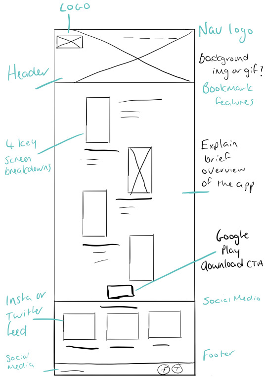
Initial website sketches for Bookmark
I tried out a few sketches of my promotional website for Bookmark, and this is the layout that inspired the final design. I want users to have a great experience on the site and to be able to navigate between each section easily. They can do this through the navbar which will stick to the top as the users scroll down the page.
I want to try and design an illustrative banner for the top of my site to help promote Bookmarks brand and also to have a mockup of the main home screen or welcome screen beside it. This will the first thing users see when they visit the site so I want it to look great so that they'll stay on it to download the app later.
Another critical area of the planning for the site will be deciding where to play the Google Play Store download button as I need it to be a clear CTA for users. I may also add this to the navbar to ensure they won't miss it on the page.
Social Media and graphics play an essential role in promoting Bookmark, so I want to implement this into my site, either through a Twitter or Instagram live feed. This will also help encourage users that Bookmark is a reading community that they can join/ or follow today.
0 notes
Photo

Planning my Promotional Website for Bookmark
Before creating my promotional website from scratch, I initially sketched a few rough ideas of how I'd lay everything out.
I wanted the most prominent area to be my app and the key features. So I tried to think of the best way to do this by looking at successful app promotional websites such as Deliveroo, Too Good To Go & the MeetUp website.
I thought I could create a gif to illustrate the critical screens in Bookmark or to display the initial onboarding so users can get a peek at how it works with its set features.
I wanted to reuse my illustrations from Bookmark to display a brief overview of the app's benefits and why users should download it. To also promote users to follow us on social media, I want to incorporate a direct twitter feed or Instagram feed, so all my posts are displayed automatically for users to see immediately.
0 notes
Photo

Friends Profile Redesign
As I redesigned the users' profile screen, I implemented the same design for the friends profile to keep the UI consistent. I also removed the messaging feature from Bookmark. After the redesign, I realised it was an additional feature that was cluttering the user face and also wasn't as necessary as I thought initially.
After carrying out usability testing and asking the question - Do you think a message option on the profile screen to talk to friends would be useful or would it take away from the app?
The results confirmed I was right in removing it as all five users stated that it wouldn't be beneficial and would only clutter the app. So I focused on only having a share feature where users can share it directly to their most recently used apps.
The option for users to also seamlessly switch between their profile and their friends makes for a positive user experience.
0 notes
Photo

Find People to Follow Redesign
The friends section has entirely changed from my initial design. I wanted to remove so many options for users to add friends to follow. Through my initial research for my launch strategy, I realised Twitter is the most effective use of communicating with friends and building a network in comparison to Facebook.
So, I decided to remove the 'Add by Facebook' option, and I also removed the email option. My research into effective UX design also reiterated the fact that giving users too many choices can overwhelm them, so now they only have two.
Now users can find friends to follow through their phone contacts and through linking their Twitter accounts to their Bookmark account. This new UI makes it simpler for users to find friends to follow and removes any complications or issues they may have had with the initial design.
This new UI has also enabled me to add in more content on up to twelve friends profile photos, bios and large CTAs where users can immediately click to follow them in an instance.
0 notes
Photo
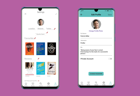
Settings Redesign
The settings page was one that needed a significant redesign, as the initial design was terrible and didn't reflect what an actual settings page looked like.
To improve my final prototype significantly, I needed to ensure all screens within the app are up to a high standard of UI. To do this efficiently, I researched how to best layout the settings and what information is information.
I did plan to add more elements to the settings page but wasn't able to get this completed on time. This would have included a dark mode, ability to increase the text size for some of my older users and also a help section redirecting them to our website for Bookmark.
0 notes
Photo

Profile Screen Redesign
I redesigned the profile screen for Bookmark is this is one of the critical features of the app, it's a place where users can go to see their recent activity, awards and their latest reviews.
In my initial design, the book covers were too large and took up a significant amount of space on the screen. While researching and studying other content-heavy apps, I decided it was best to decrease these in size. I also changed the layout of information on the profile.
I added the coloured top nav in the redesign. This helps incorporate the Bookmark colour scheme throughout the app. It also makes a massive difference in making the app easier to navigate with the back button button is more prominent. Both the profile and friends screens have the same three icons on the top right. So, users can easily share their profile, edit their profile and also connect with more friends via their contacts and externally through connecting their Twitter accounts.
To make the information on the profile even easier to read and to provide better separation between each section, I added blue 2px horizontal lines. These lines help further define each area without messing up the clean interface.
0 notes
Photo

Filter Screens Redesign - Semester 1 VS Final Prototype
In the first semester of switching degree courses, I struggled quite a bit with essential UI elements and functionality, ley example of this is my old filter system. The prior filter design have users barely any options to sort through their book content. After researching other apps to see the most popular filter systems, I was able to consider this in my redesign.
I looked at Deliveroo, Spotify, Eat etc. to come to this conclusion. The use of radio buttons is universal through all filter systems on apps. It's helped make the information quicker to scan for users so they can quickly decide on how they'll filter their results
To try and make my filters the most effective, I wanted to ensure I only incorporated useful and relevant choices for my users to choose from in the app. I looked at the options Letterboxd gave users as it's a very content-heavy app that organises information very well. I took what I learnt from them and put it into practice for Bookmark.
0 notes