
Welcome to my humble abode. Dedicated to Design Survey 124.
Don't wanna be here? Send us removal request.
Statistics
We looked inside some of the posts by sbteubert and here's what we found interesting.
Average Info
Notes Per Post
1
Likes Per Post
1
Reblog Per Post
0
Reply Per Post
0
Time Between Posts
6 days
Number of Posts By Type
Text
15
Last Seen Tumblr Blogs


Fun Fact
Hackers stole 65M passwords from Tumblr in 2013.
Text
Week 15 - Final Thoughts
After fifteen weeks of talking about design, I definitely recognize that design has a significantly larger impact on my daily life than I ever knew before. Design exists in essentially every object I see, and now I can acknowledge its importance. Design is a rapidly expanding field-so much so that its definition changes very frequently. With the evolution of technology, we are bound to see many changes in the field of design in the near future that we couldn’t even possibly imagine at this very moment.
Virtual reality (VR) and augmented reality (AR) is one project I believe will have a prominent future. It has already developed a great amount, but it still has a long way to go. Virtual reality exists in the form of headsets used for gaming, entertainment, training, and more. It replaces the viewer’s environment with a completely different world. Many advanced forms of VR already exist today, but it has yet to become an everyday essential item. Augmented reality has also developed quite a bit. Instead of replacing one’s vision completely, AR adds on to the viewer’s environment. Google Glass is one example of a headset that uses AR. It exists as a tiny screen that covers only part of the eye, but provides information that wouldn’t be there without it. The US military is also testing out AR technology on military dogs. VR and AR are impressive forms of design that have great potential.
Today, more than ever, we as a society are seeing action being taken in social justices to provide a safe and welcoming world to everyone. Design has a huge impact on that action, and we can see that through the work of citizen designers, who keep their audiences in mind when creating products. Creating more ethical products is essential to keep the Earth healthy and strong. The past of design has brought an irreversible state of pollution on this world, but action can be taken to improve the viability of the planet.
One final project I see as the potential future is the improvement of robots. Robots already exist today in many forms, but we have yet to see ones that we have predicted for a long time. For example, we are seeing the beginning of intelligent robots that act like humans. These types of robots exist in Japan, which has a very advanced robotics system. Very soon, we could see the expansion of that technology to across the globe, and could eventually become a household essential.
The future of design is unpredictable. However, with that uncertainty comes the potential for many different possibilities that could become a reality with the technology that exists today. At this point, not only is it a matter of how these projects can be done, but when.
0 notes
Text
Week 14 - Your Choice
Minimalism is a very popular concept with design nowadays, especially with logo design. I’ve recently learned that despite a logo’s simplicity, it could still have taken weeks to even months to design. However, another thing I have noticed is the amount of criticism that many companies and brands are facing by redesigning their logos to be more minimalistic. For example, Google has recently changed their logos for their different Drive applications, with each icon displaying the same multicolored ribbon design. I first found out about the change through an Instagram post, and when I scrolled through the comment section, a majority of the comments were negatively responding to the change. Firefox also redesigned their logo, with the fox and the globe having noticeably less details. Again, people were not happy with the change, claiming they liked the look of the detailed fox better. From a design student’s perspective, I’m torn between whether or not these changes are good. Like I mentioned before, designers will take months to come up with a design, no matter how simple it is, but it seems that every company is trying to simplify their logos. I believe switching to a more minimalistic design is okay in some cases, but in other cases, it’s better to embrace tradition. As far as what cases those are, it’s hard to tell.
0 notes
Text
Week 13 - New Media
As technology continues to rapidly develop, design is becoming more and more digitalized, resulting in different aesthetics being adopted. One of those aesthetics is the “digital aesthetic”, which is characterized as having a “futuristic and textureless world of artifice,” with “forms and surfaces [that] are smooth and unbroken” (Eskilson 387). It first found its way into design in the early 1990’s when digital technology started its rapid evolution. Video games are one example of design that uses digital aesthetics. The unique virtual worlds created for video games have a distinct style that matches that of a digital aesthetic. I also see this aesthetic being used with modern 3D animations. When ASMR (Autonomous Sensory Meridian Response) first became a trend, the internet flooded with visually pleasing 3D animated short videos that had clean and smooth textures and pastel colors. Unfortunately, many conflicts erupted as a result of the newly-evolving digital age, with some believing that the digital future would bring about chaos, and others believing it would change the future for the better. With the digital aesthetic, new beauty standards were brought into existence, making the aesthetic possess both positive and negative characteristics.
Works Cited: Eskilson, Stephen J. Graphic Design: A New History. 3rd ed., Yale University Press, 2019.
0 notes
Text
Week 12 - New Media
In our previous lectures, we’ve learned a lot about physical design, including architecture, industrial designs, and more. However, with rapidly emerging technology, design is becoming less physical and more digital. Interactive design acts as a bridge to connect physical and digital design. As we learned in our last lecture, new media, which is used to define the interplay between technology, images, and sound, changes its definition daily. Designers today face new challenges to further engage viewers with their content. Many websites are adopting interactive features to improve the viewer’s experience. Instead of putting all of the information down in paragraphs of words, features such as parallax scrolling, dynamic panels, animated and flashy graphics, vibrant colors, etc. are being introduced to provide a more engaging experience. The world of technology is still very 2-Dimensional, but efforts are being made to shift to 3-Dimensional. For example, virtual reality (VR) is a relatively new and rapidly expanding technology that replaces the viewer’s current world with a virtual one. Virtual reality is used in many different ways. Augmented reality (AR), similar but not the same as VR, is also rapidly expanding and adds virtual elements to reality. We see AR a lot in newer applications such as Pokemon Go. Interactive design has a huge impact on our digitalized world and continues to become a bigger part of it as technology and humanity evolves.
0 notes
Text
Week 11 - Graphic Design
According to the reading, a citizen designer is “a professional who attempts to address societal issues either through or in addition to his or her commercial work” (Eskilson 431). In other words, a citizen designer creates designs with the audience in mind instead of strictly a corporate point of view. For example, the text references a website, freesoil.org/fruit, that was created in order to “elevate the ecological knowledge of consumers and encourage a way of life that is friendly to the environment” (Eskilson 393). The creators, F.R.U.I.T., instead of simply trying to sell a product for the sake of profit, connected their audience through means of interactive features to encourage action and raise awareness.
Citizen designers are very relevant today because of the intense political climate that exists, especially in the US. Now, more than ever, artists are focusing on issues in their communities and using their art to address them and inspire action and change. They do this for the sake of the cause, not for profit. Companies such as F.R.U.I.T. that use interactive website features have their audiences in mind as interactive and hands-on learning is a very effective tool. Citizen designers think of their audiences before profits, making them very selfless. They hold a lot of power when it comes to gaining people’s attention, making their contributions to society all the more important and impactful.
Works Cited: Eskilson, Stephen J. Graphic Design: A New History. 3rd ed., Yale University Press, 2019.
0 notes
Text
Week 10 - Graphic Design
I found it very interesting to read about the development of typography throughout the years. I remember working with many different typefaces during my senior year of high school working with the yearbook and newspaper, but I never thought about how these typefaces came to be.
One particular topic I enjoyed reading about was the invention of the sans serif typeface in the nineteenth century (Eskilson 45). It was first released in 1816 by William Caslon IV. Sans serif leaned more towards uniform stokes and a solid geometric structure with a vertical emphasis. It worked very well with advertising since the letters were able to be read clearly when enlarged.
Another interesting topic I came across was on blackletter. Blackletter is a traditional German script that was utilized a lot in the 1890’s (Eskilson 95). Blackletter was a very ornamental version of roman typeface, using narrowly proportioned letters, stylized ligatures, and small spaces between words and text. By the looks of it, blackletter appears to be more difficult to read, but upon further inspection, it isn’t much more difficult than roman typeface.
I think it’s important to read and learn about the history of typefaces that we still widely use today. Reading these sections provided me with a different perspective on different typefaces I encounter on a daily basis.
Works Cited: Eskilson, Stephen J. Graphic Design: A New History. 3rd ed., Yale University Press, 2019.
0 notes
Text
Week 9 - Industrial Design
Brooks Stevens serves as a highly prominent character in the industrial design industry of Milwaukee. Stevens spent most of his life in Milwaukee. When he left to attend college at Cornell and earn his degree in architecture, his professors knew by the way he worked that architecture was not the field for him. Upon returning to Milwaukee, Stevens began to indulge himself in the field of industrial design when he redesigned some of the product labels of the firm he worked for, Jewett and Sherman, and won a contest to redesign the company logo for his father’s employer. From then on, his career in industrial design kickstarted. At that point, there were only a few known industrial designers, and they lived in New York. Stevens decided not to travel to New York because he said Milwaukee was “where the business was.” Not only was Stevens the first industrial designer in Milwaukee, but he was one of the first industrial designers in the country. Stevens and his firm created designs for a plethora of everyday objects: toys, packages, appliances, bicycles, transportation, clothing, and more. He also coined the term “planned obsolescence,” which is an important and influential term related to Graphic Design. Stevens’ decision to stay in Milwaukee allowed industrial design to expand and grow across the country.
Source: https://mam.org/collection/archives/brooks/
0 notes
Text
Week 8 - Industrial Design Observations
As we move along in this course, I’ve been paying more attention to the design qualities of normal everyday objects I possess. It is interesting to see the solutions designers are able to come up with when creating products. Below I have recorded a few of my observations:

This sketch of a desktop mirror I own is a very convenient design. The mirror has two sides to it, so the screws on either side allow the circular mirror to rotate both ways. The stand the mirror is connected to has a built-in bowl that serves as a storage bin for small objects, such as jewelry.

The design of this calculator is quite efficient. The buttons are big with an easy-to-read font and a big display screen. It is battery and solar powered. On the back, there is a little stand that folds in and out to allow for the calculator to sit at an angle and can be flattened when not in use.

My swivel office chair has many components to it that allow it to be a successful design.

I own a 3-in-1 writing tool that is very successful in its design. One end has a highlighter and the other end is a pen. On the cap of the highlighter is a clip that also holds sticky tabs that can be refilled.

This tiny speaker can be expanded and contracted to utilize space. The plug-in cord length can be adjusted, and when put away, sits in a pocket of the design that makes it flat.
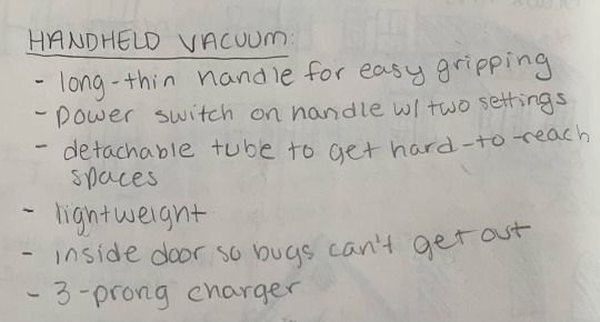
I own a small, hand-held vacuum cleaner that has a very useful design. I use it to suck up bugs and crumbs so the added door feature is nice so bugs can’t escape.

This ceramic candy dish is used as a Halloween decoration and a place to store candy for the season. The interior space is very efficient to put candy and other small objects, and the ceramic material provides stability.

This Prismacolor marker blender uses both ends with different-sized tips that allows for less wasted space and materials. The thick end is slanted to allow for different thicknesses in lines when drawing or coloring.

My camera bag is a very useful design. It’s small enough to be easy to transport and big enough to fit my camera and two lenses. Different detachable flaps allow me to customize the interior for organization, and several pockets sit on the outside to maximize storage space.

Last, but not least, my 32 oz. water bottle is made of aluminum steel to keep drinks hot or cold, has a handle grip on the cap to hold or clip onto something, and has an attached cap that spins on and off and even has a magnet for quick stow.
0 notes
Text
Week 7 - Architecture Part 2
Universal Design is the creation of a design that accommodates for a variety of different people without any adaptation. There are 7 principles that make up Universal Design. Below are two examples:
1. Equitable Use - “The design is useful and marketable to people with diverse abilities.”
An example of equitable use would the designing a ramp that is placed near or integrated in a staircase. This design accommodates people who have mobility issues and cannot use regular stairs. The ramp will provide a smooth, elevated lift to the next floor without the risk of injury.
2. Low Physical Effort - “The design can be used efficiently and comfortably and with a minimum of fatigue.”
An example of a design with low physical effort would be the automatic soap dispensers, faucets, and paper towel dispensers in public restrooms. These designs have sensors that detect hand movement and will turn on when a hand is placed near the sensor. This design allows users to access these facilities without having to touch any surfaces.
Principles of Design source: https://projects.ncsu.edu/ncsu/design/cud/pubs_p/docs/poster.pdf
0 notes
Text
Week 6 - Architecture Part 1

The Wisconsin Gas Building represents the Art Deco style of architecture. Art Deco, which took place from 1925 to 1937, features cubic forms, complex use of rectangles and trapezoids, and zigzag designs.

This is a quick sketch of a cottage from the Ten Chimneys Estate in Milwaukee. These buildings resemble the era of Beaux Arts, taking place from 1825 to 1925. Beaux Arts featured late and eclectic forms of Neo-Classicism and is usually represented by opera houses.

The Godfrey and Kahn building in Downtown Milwaukee features the International Style of architecture, which can be seen in office buildings all around the world.

The Gothic style featured in the St. Joan of Arc Chapel at Marquette University took place from 1100 to 1450 AD. It features pointed arches, ribbed vaulting, and flying buttresses, as mentioned above.

The Turner Hall Ballroom represents the Romanesque era (800 to 1200 AD) with its rounded arches, different vaults, and massive doors inset with arches in massive walls.

The Milwaukee Art Museum is an iconic example of the unique architecture present in Milwaukee. The building features the styles of Futurism and Minimalism from the Modernist era, which started in 1900.

The Mackie Building is one of my personal favorites. I got to stay in the Mackie Flats during a weekend trip to Milwaukee with my family. This historical building features styles from the Renaissance era (1400 to 1600 AD), which includes symmetrical arrangements of windows and doors, extensive use of classical columns, triangular pediments, square lintels, and the use of arches, domes, and sculptures.

This building found on the East Side of Milwaukee reminds me of the Brutalist style of the Modernist era. It features rough, concrete forms.

The Beláy Apartments resembles a Minimalist style. The Minimalist style emphasizes “less is more”, using little to no ornamentation in the designs.

This last building is not a building found in Milwaukee, but instead Chicago. The Chicago Theater is one of my favorite buildings and reminds me of the Baroque style of architecture. Taking place from 1600 to 1830 AD, Baroque features irregular shapes, extravagant ornamentation, complicated shapes, large, curved forms, and high domes.
0 notes
Text
Week 5 - History of Design

J. Howard Miller, We Can Do It!, 1942. Poster. Photolithograph. (Eskilson 230)

Alexandria Ocasio-Cortez, 2018 (https://blog.adobespark.com/2018/09/18/the-campaign-poster-8-iconic-examples-from-yesterday-and-today/)
The first image above (J. Howard Miller, We Can Do It!) is from the Second World War in the era of American Modern. During that time, America started seeing the use of iconic figures, such as Uncle Sam and Rosie the Riveter to represent the war and to convince men to enlist and women to work in factories and shipyards. The poster below it represents US Representative Alexandria Ocasio-Cortez when she ran for Congress in 2018. Her campaign posters remind me of the We Can Do It! poster because of both the use of an iconic figure as the main focal point and the bold text.

Georgii and Vladimir Stenberg, The Man with the Movie Camera. 1929. Poster. Color Lithograph. (Eskilson 195).

Brianna Collins (https://www.instagram.com/journalbean/?hl=en)
The image above (The Man with the Movie Camera) is a poster created by the Stenberg brothers, who were very famous designers during the Russian Constructivism era. At this point in history, photomontage was becoming more present in art and society. The second picture above (Brianna Collins) is an example of an art journal, which is a current trend. Both works of art use photomontage, collage, and manipulation of text.

(Eskilson 248)

The first image is a picture of Kem Weber’s Zephyr Clock, which was created in 1933 and displayed in the Museum of Modern Art’s “Machine Art” exhibition. It represented the style of Art Deco that occurred at the time. The photo below is a picture I took of an alarm clock I own. The Art Deco movement emphasized sleek geometric or stylized forms. The second photo reminds me of the Zephyr Clock by it’s strict geometric shape and simple style. It is also interesting to compare the two and observe how clocks have changed in design over time.
0 notes
Text
Week 4 - Found Object
While walking around my yard a few times, I came across several different kinds of bird houses. Since we have a fairly big yard surrounded by our neighbor’s crops and forest, we tend to get a quite a few visitors from nature. The bird house I chose to study in particular is hung up in a tall tree and is shaped like a house.

The design is quite simple: A house-shaped enclosure with a hollowed-out interior for the bird’s nest to sit. A small hole serves as the entryway and exit to the house. A small rod just below the circular entrance acts as a perch for the mother bird to sit while she feeds her young. The design is quite pleasing because it is more than just a wooden box hanging in the tree (although ours could use a new paint job) and it solves the problem of birds needing a place to build their nests. Other bird houses I’ve come across were also house-shaped, but in different variations. One in particular was actually in the shape of a cage. This was designed possibly for more exposure to the outdoors. It is not as pleasing as the bird house because it reminds me of an animal cage.
0 notes
Text
Week 3 - History of Design
After exploring the concept of design, I realized that most of the everyday objects I come across and use have some sort of design quality attached to them. Below are a few of the observations I made after exploring my house:
Wax Melter

Stapler


Nail Polish Bottle

Wireless Earbuds (Apple AirPods)

Glasses Case


Chapstick

Gum Container


Back Scratcher

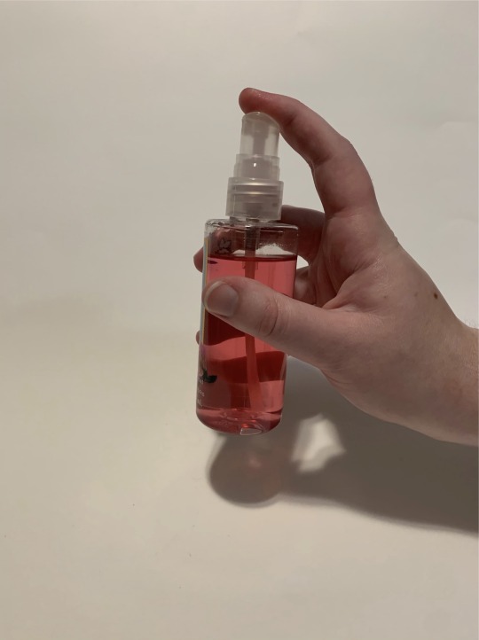
Perfume Spray Bottle

iPad Case with Keyboard

0 notes
Text
Week 2 - Design Thinking
After reading “Design Thinking” in the Harvard Business Review, I would personally define design as the process of finding a solution to a problem that matches the needs of the client in an appealing form. I think the most significant takeaway from the article is when they mention the importance of aesthetics in design. Specifically, the article states “Great design satisfies both our needs and our desires” (Brown 92). Even though aesthetics aren’t necessary, they are a large factor in the satisfaction of clientele.
One product I use that incorporates design thinking is from the brand PopSocket. PopSocket is a brand of grips, wallets, and mounts that adhere to the backs of digital devices to provide support. I purchased the PopSocket wallet that attaches to the back of my phone and can hold four cards at a time. Built-in is the brand’s signature PopGrip that pops out to use as a grip for holding and a stand, then flattens back in when not in use. The wallet part can even detach from the phone and be reapplied. I think this product is very successful when it comes to design thinking because it solves many problems that consumers face when using devices. The PopGrip allows me to use my phone without worrying about dropping it or sliding out of my hand. I can also stand my phone up on its side to watch videos. The wallet provides a simple place to store my driver’s license, school ID, and credit card right against my phone so I don’t have to bring a separate wallet or purse with me when I go places. PopSocket’s products come in many different styles and they even have the option to customize PopGrips, so they are very appealing in addition to their ability to solve a problem.

Image and product source: https://www.popsockets.com/p/popwallet--black/801937.html?lang=en_US
0 notes
Text
Week 1 - About Me
Hello! My name is Sophie and I’m from Janesville, Wisconsin where I’m currently living for the semester. I hope to be back in Milwaukee next semester, though! I’m double-majoring in photography and graphic design, so I am taking this course as a requirement for my degree. I have always found design to be very interesting, but I don’t have a lot of experience with it. I came into UWM with only photography as my degree and added DVC onto my studies just last year. I was, however, part of my high school’s yearbook editing team where I took photographs and helped design the layouts of various pages, but that’s as far as my experience with design goes (so far).
There are definitely a lot of things that inspire my art. Sometimes my inspiration comes to me randomly, and other times it’s from the music I listen to, other artists I follow on social media, and even from my own experiences and emotions. I am greatly inspired by the works of Barbara Kruger, who uses elements from both photography and graphic design in her art. She is one of the reasons why I decided to pursue graphic design in addition to photography.
I think design plays a major role in deciding what products to buy/use. Recently, I purchased a planner to use for the school year, and I definitely paid attention to the design of each option. I settled for one that was minimal in content because it provides more line space to write down my assignments, and also leaves room to add a little personality of my own.
1 note
·
View note