
First Year Bachelor of Communication Design Student at Te Pūkenga
Don't wanna be here? Send us removal request.
Statistics
We looked inside some of the posts by shaemeful and here's what we found interesting.
Average Info
Notes Per Post
9
Likes Per Post
9
Reblog Per Post
0
Reply Per Post
0
Time Between Posts
7 hours
Number of Posts By Type
Text
17
Last Seen Tumblr Blogs


Fun Fact
Tumblr Inc. is using 66 technologies for its website.
Text
End of Semester Reflection
This semester saw us explore three essential Adobe programs: Illustrator, Photoshop, and InDesign. From this list I was very familiar with Photoshop, had had some experience with InDesign, but had admittedly always avoided using Illustrator because I didn't understand how to use it properly. While I still have much to learn, I can happily report I am now significantly more confident using all three of these programs and no longer fear the dreaded Illustrator.
The biggest problems I encountered with this course involved Illustrator - but that's because I was treating it like Photoshop. The missing piece and the biggest lesson I learnt was that Illustrator layers stack whereas Photoshop layers interact (or at least how my brain interprets it). Once I had this locked in I was able to absolutely smash out my book backgrounds on Illustrator with ease. This program was without a doubt my biggest learning curve, but honestly it was the most satisfying to get right.
Learning the Pathfinder tool was probably the trickiest part and the way I managed to finally wrap my head around it was to sit down and just play around with it. While the buttons do say what they're going to do, until you're familiar its hard to compute what they actually mean. If I could do the semester over again I would have taken more time at the beginning to figure this function out as it was a real fundamental I missed and struggled with as a result.
Because I was sick or away for a large portion of Term One I found myself behind very quickly. When it came to catching up I went through all the material provided to us on Moodle and Teams and did all the steps/documented everything myself, but to make sure I was on the right track I was often checking Timothy Still's (timothystillop1.tumblr.com) for a reference point. I definitely don't think he as even aware I was using him for inspiration, but he had a really solid Tumblr to use as an example so if I ever meet him (or have I? I'm not even sure WHO Tim is) I will have to thank him for getting me through the Tumblr side of this course!
Our final project saw us make a nursery rhyme book for a small child, I chose to personalise mine for my three year old niece, Riley. This was without a doubt my favourite assignment of the semester across all my papers and I think that shows in my final spreads.
I wanted to challenge myself by minimising how much I used Photoshop to create my pages as this was the program I always gravitate towards. While I obviously had to cut my Riley images out and edit them on Photoshop, almost all other media featured on the pages was created in Illustrator. I did take my Illustrator backgrounds into Photoshop to add my Riley images so I could make final adjustments, but all in all I'd say 80% was Illustrator.
With this project I got a little bit excited and did stray away from the brief by adding an additional four pages, but I don't feel like the quality of my work dropped with the extra workload. My goal was to create something I could get printed and bound to give her as a gift, and I am so insanely proud with the work I produced I can't wait to give it to her.
One thing I will be revising before getting it printed is changing some of my supporting images into proper vector drawings. For the sake of time I did rip the pirate ship, the drum kit, and the microphone from the internet - but making them vector drawings that I create will allow for more cohesion across the book.
This course taught me a lot and has really inspired me to continue creating digitally. The skills and tools I have learnt across all three platforms will be things that I take away with me no matter what specific field I end up in - because even if I'm not using them professionally, they will be things I use in my own personal projects.
Thank you for sharing your knowledge with us, Toby!
5 notes
·
View notes


Text
Adobe Shortcuts Masterpost
General
Undo - Command/Control + Z
Redo - Shift + Command/Control + Z
Cut - Command/Control + C
Paste - Command/Control + V
Paste in Place - Shift + Command/Control + V
Pan - Space
Pen - P
Toggle Fill/Stroke - Shift + X
Illustrator
Selection Tool - V
Direct Selection Tool - A
Pen Tool - P
Moving Anchor Points - Space while holding Left Mouse
Adding Anchor Points - +
Removing Anchor Points - -
Toggle Smart/Guide Lines - Command/Control + U
Wire Mode - Command/Control + Y
Select All - Command/Control + A
Join Lines - Command/Control + J
Reflect - O
Duplicate - Option/Alt + Drag
Photoshop
Brush - B
Eraser - E
Sizing Current Tool - [ and ]
Opacity - 1 to 0
Move Tool - V
Marquee Selection - M
Lasso - L
Quick Selection - W
Deselect - Command/Control + D
Eye Dropper - I
Gradient/Paint Bucket - G
Clone Stamp - S
Select All - Command/Control + A
Locking Selected - Command/Control + 2
Unlocking Everything - Option/Alt + Command/Control + 2
InDesign
Export - Command/Control + E
Selection - V
Direct Selection - A
Text - T
Scale Frame and Image - Shift + Command/Control
Preview - W
Group Items - Command/Control + G
0 notes
Text
Nursery Book pt. 6
In a few of my Riley images, part of her hands/feet were cut off (it's like my sister had no idea I was going to use this pictures in photo for a school assignment, how inconsiderate). Because I didn't want the small child to be missing fingers or her toes I used the Clone tool and the Brush tool to draw these missing digits back on.


While not necessarily super duper convincing, I am super happy with my end result. Considering they are small details on a small child - you're honestly not even going to really notice them. But in saying that, if I hadn't made these changes it would have been obvious the image was incomplete.
0 notes
Text
Nursery Book pt. 5
We're almost at the end of this course, but before I post my final spreads I want to share part of my creative process. I started with laying my text into InDesign and putting in the images I already had. Seeing visually what I already had helped me figure out what I still needed and helped me to construct my spreads.
I printed these out and drew on top how I imagined the rest of the page looking. I ended up doing two test prints of each spread before getting to my final design and taking it fully into the digital space.


1 note
·
View note
Text
Nursery Book pt. 4
Making great progress, but haven't been actively documenting as it has been the same process over and over again. I've done a test print of my spreads and super happy with where my current layout is sitting at the moment and font size. I'm now onto creating my backgrounds and other supporting material for my images of Riley, here is my first vector background created on Illustrator:

This is going to be the background for both Ry and Xav and Little Ry-Peep! Now time to load it into Photoshop to add my images!
0 notes
Text
Nursery Book pt. 3
My book is now well underway, I still have a lot to do in the next couple of days but here are a couple more updates for document sake:


Created a vector heart that my page numbers are going to go into and added a shadow heart behind to give it a candy heart vibe. Should I have used pathfinder and made the heart one single shape? Probably. But duplicating and adjusting slightly took all of three seconds so you win some, you lose some.
Also went ahead and made my End Papers. As with everything, they are subject to change. But for the time being here they are:

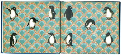
I want to go in and possibly add my Riley layer masks throughout the flowers similar to the penguin example we were shown in class:
But will be super dependent on time and isn't one of my main priorities with this project.
I have also set my margins for the time being, again - subject to change. I know I want a slightly larger gap at the bottom of my page so I have adequate room for my page number hearts to sit.

I have also been looking into what font I want to lock in for my paragraph styles and at the moment I am sitting with Futura as my research tells me this is one of the better fonts to use when designing for children as the typeface is clear enough for new readers to easily distinguish. When designing for children, especially young children, you want to make sure the font you're using is large enough and you want to increase your leading to help make it easier on them.

0 notes
Text
Week Eleven
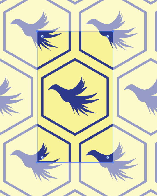
For our final session we learnt about End Papers and how to make repeated patterns in Illustrator.
End Papers are patterned page spreads on the first two pages and the back two pages of a book. They should match, ie. be the same design, and should be consistent and cohesive with the overall aesthetic and colour scheme of the book.
To create an End Paper tileable design we're going to go into Illustrator and start by drawing a box (with no outline) and then drawing something inside that we want to have repeated.

To make this easier we can select the box and go Command/Control + 2 to lock it so we can move our anchor points with ease without accidentally grabbing the box. Option/Alt + Command/Control + 2 will unlock anything you have selected.
We also went and drew a curvy shape that we will eventually fill to test our pattern. We spent some time in class finessing this shape until our handles were neat, tidy, and how we wanted them:
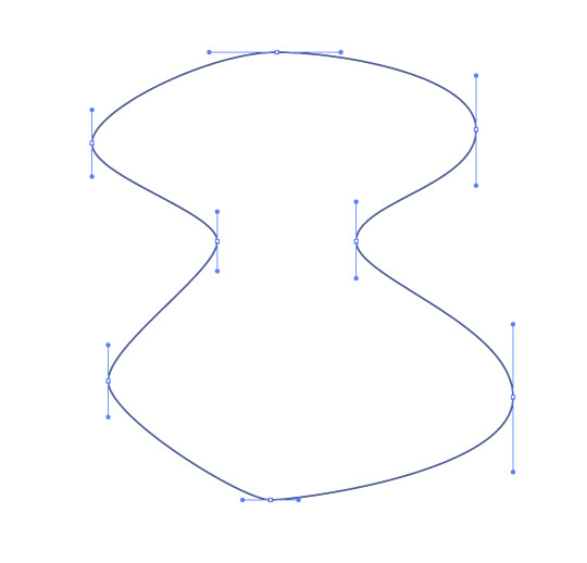

Once we were happy with our drawing, we unlocked the box and dragged the whole tile into our Swatches palette and then filled our shape with that swatch.
By double clicking our swatch we open up our pattern settings where we can make pick our tile type, change the colours, the offset, and make general changes/updates to our drawing.
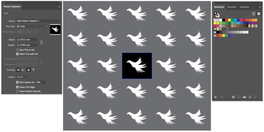
We were encouraged to have a play around with the different settings so we could get a feel of what was possible with this tool.
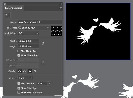


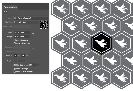
We were then shown how you can follow the same steps but with a hexagonal tile system:

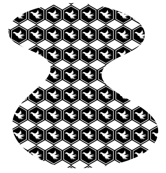

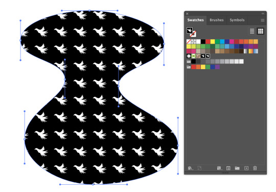
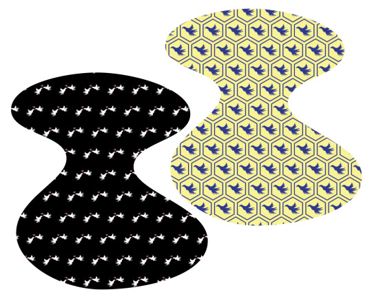
Here are two of my curvy shapes all filled in:
With how it is all set up currently, if you were to move the shape the pattern wouldn't move with it - instead the shape would glide over the pattern. If we wanted to lock the pattern within the shape and essentially "fill" it with the content we want to go Object -> Expand.

If we go into Wire Mode (Command/Control + Y) we can see our shape is now "full" of the pattern, whereas the one on the left is empty since we haven't expanded both. This also makes the individual tiles editable if you wanted to make changes to one without editing the rest.

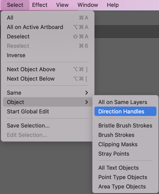
The last cool thing we learnt today is if we make some text and go Type -> Create Outlines we can then edit individual paths and handles of the font.


And if we want to bring up all of our handles at once we need to select the shapes we want to see handles for and go Select -> Object -> Direction Handles.
We're in the home stretch of this paper now, with one more week to finish our book designs I am trucking along creating content for my book. In the final part of this session we had self-directed time where I got most of the way through a pink teapot vector that I plan on using as one of my images.
While I completely forgot to document the process, I used the same techniques I have previously written about and here is the completed teapot:

I really enjoyed this weeks session as I found real inspiration in the pattern making process and I am looking forward to using this in future whenever I can.
1 note
·
View note
Text
Nursery Book pt. 2
Before really diving into the design I needed to consider my audience and the recipient of the book which is my darling niece. So unbeknownst to her mother, I started fishing for what she's currently into which according to my sister includes: Shaun the Sheep, ballerina dresses, race cars, the colour pink, and her cats Buddy and Macy.
I got my sister to send me through some photos of her because while I plan on including multiple vector drawings I also plan on superimposing her into multiple images to really personalise the book further and for the book to act as like a time capsule of her at this age.
At the time of writing this I currently have these images of her complete (or nearly complete):

Starting as a vector drawing in Illustrator, I then popped it into Photoshop to add Riley. I still need to go back in and adjust the curves of her a little bit, and also blend the pie edge a little more to make that transition smoother.
I have also taken these two images:
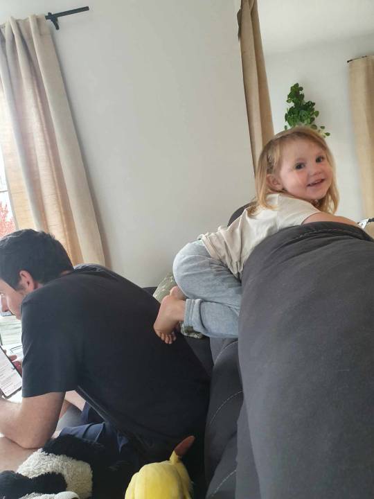

To create this one:

I used different selection tools to make layer masks and to apply colour filters; I also used the Clone tool so I could create a knee for Riley because in my original image this is cut off by the couch.
I got so absorbed into making this image that I once again completely forgot to take any screenshots along the way - but every technique I used is one I have previously written about for my own reference.
1 note
·
View note
Text
Final Assignment - Nursery Rhyme Book
For our final Fundies assignment for the semester we've been given the task to design and create a book for a young child. Immediately I knew I wanted to create a personalised nursery rhyme book for my 3 year old niece, Riley!
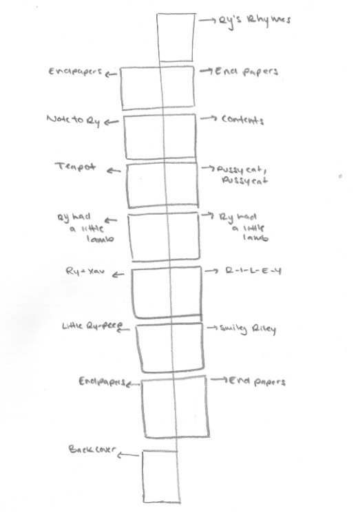
The book contents should be arranged as:
Page 1: Cover (in my case "Ry's Rhymes") Page 2-3: End Papers Page 4: Contents Page 5-9: Content Page 10-11: End Papers Page 12: Back Cover
However, I am cheeky and also have a lot of content I want to include as I plan on getting this printed and bound at the end to give to her as a gift so am aiming for an extra four pages. If you're reading this... it means I was successful!
Although not confirmed just yet, here is where I'm sitting at the moment regarding layout:
And content:
Ry's a Little Teapot
Ry's a little teapot, short and stout Here is her handle, here is her spout. When she gets all steamed up, hear her shout Tip her over and pour her out!
Pussycat, Pussycat
Buddy and Macy, where have you been? We've been to London, to visit the King!
Buddy and Macy, what did you there? We frightened a mouse under his chair!
Riley had a Little Lamb
Riley had a little lamb, its fleece as pink as blush And everywhere that Riley went, the lamb was sure to rush.
It followed her to school one day, which was against the rules It made the children laugh and play, to see a lamb at school
Ry and Xav
Ry and Xav, they found a cave and went to look for treasure.
Xav fell down, but didn't frown 'cause Ry was there save him.
R - I - L - E - Y
There was a farmer who had a dog, and Riley was her name oh! R - I - L - E - Y R - I - L - E - Y R - I - L - E - Y And Riley was her name oh!
Little Ry-Peep
Little Ry-Peep, has lost her sheep and doesn't know where to find them. Leave them alone, and they'll come home dragging their tails behind them. Smiley Riley
Smiley Riley pudding and pie, kissed the boys and made them cry. When the girls came out to play, Smiley Riley ran away.
0 notes
Text
Week Ten
This week in Fundies we covered more of the basics of InDesign including Parent Pages, page numbers, and page columns. We also discussed the anatomy of a book as we were introduced to our final assignment for the semester - creating a nursery rhyme book.
Typically with InDesign booklets we want to aim to be creating page numbers in multiples of 4 as one piece of paper will equal four pages.
Loading into InDesign we want to make sure our display is on Advanced so we have easy access to all the tools we're going to need to create our document.

First thing we did in today's lesson was create an 8 page document so we could explore how Parent Pages work. Anything applied to the Parent Page will be applied throughout the document unless "None" is applied. You can drag None onto any page to stop it from inheriting information from the Parent Page.
Parent Pages are super useful tools when you want to create consistency throughout your documents without having to go through and edit every single page individually. Things like headers, page numbers, columns, and even smart guides that are applied to a Parent Page will appear throughout the document.
To add page numbers to our document, we're going to add a text box on both Parent Pages where we want them to appear, select just the number, and then go Type -> Insert Special Character -> Markers -> Current Page Number.

On the Parent Page this will appear as an A and B, but on our actual document it will be numbered in chronological order. InDesign is also programmed to readjust this accordingly if we were to rearrange the order of our pages.
To adjust your documents margins or to add column guidelines we're going into the Layout menu.

Typically you would adjust the margins of both Parent Pages but to do this you need both Parent Pages selected.

In the same way we were adjusting wraps last week, you can change all edges at the same time or you can click the chain link and change certain edges differently. It is more common to see more space at the bottom than to see more space at the top!
Adding column guidelines allows us to see the grid and design to it. This grid will also help us when positioning text and images as our frames will want to 'snap' to the guidelines. We can break the grid but we want to make sure that we're doing it intentionally and purposefully.
Other things we learnt today that I found very useful include:
You can adjust the size of text across multiple text boxes at the same time by selecting the relevant boxes, clicking into the Text tool, and then using the arrows at the top of the page.
You can have text flow between text boxes by clicking the red X and dragging it to a new text box. When you change and adjust the text size of box size it will move between.

We were then introduced to our final assignment which I will discuss in a separate post!
This class answered my biggest question of InDesign and that was how to have text flow between boxes. I knew there had to be a way that was better than manually editing the paragraphs and copying+pasting but before today I had no clue. I am also super excited about the project but I will save that babble for my next entry!
0 notes
Text
Week Nine
This week in Fundies we took a look at our third Adobe program - InDesign. Whereas Photoshop and Illustrator are used to create images, InDesign is where they are all assembled together. It is a useful tool for Graphic Designers who are looking to put together printed items with text as it has sophisticated tools for both managing text and for creating interactions between text and images.
Starting off by opening up a new document, we made a text box that filled the entire page and filled it with placeholder text by going Type -> Fill with Placeholder Text. We then wanted to open up our Paragraph Style palette by going Type -> Paragraph Styles.

A paragraph in InDesign is the text between two 'carriage returns', which is achieved by pressing enter. The style of a text can be saved as a paragraph style and then applied to any paragraph throughout the document. This is an essential tool when creating larger documents, because any changes you make to a paragraph style will be automatically applied to any paragraph that was using that style.
To create a paragraph style I prefer to style a block of text first, and then press the 'create new style' button at the bottom of the paragraph style palette. You can click the 'create new style' button first and then craft your style within the menu, but I just find this way easier and more straight forward. You also want to make sure you're naming your styles as you go to avoid confusion.

The plus you're seeing next to the square brackets tells us that a change has been made from the style it was originally set at, but that this change hasn't been saved.
We were also shown character styles which function essentially the same, but as the name suggests are for changing characters, words, or collections of words within a paragraph. For example, if you want to italicize a single word or sentence within a paragraph - a paragraph style would change the whole block of text. Character styles just change the characters you apply them to.
The first paragraph style we created was the style we would then go on to use for the body of our text. We dragged this down to the little plus at the bottom to make a copy, then went into the menu to make changes to what would become our heading style.

You'll want to make sure the preview box in the bottom left is ticked if you want to be able to see your changes in live time.
We then went into the Indents and Spacing tab to make further adjustments so there would be a larger gap between our headings and our body text, helping to create our visual hierarchy.

We then went through the same steps but applied them to our character styles.

We also discussed hyphenation, and more importantly - how to turn it off. Going back into the paragraph style menu, we will find the hyphenation tab on the left. We can either turn it off altogether, or adjust the settings and parameters in which it's allowed.
While hyphens can be a solution to make text fit, they can also be an absolute eyesore so we were advised to use them sparingly and carefully. Turning this off may mean text gets cut off and frames will need to be resized to accommodate.

When inserting a text box in InDesign, it will default to one column unless you have gone into Layout -> Margins and Columns and programmed the page to do something different. So if you want to add more columns to your text box, the button is along the top toolbar.

We then learnt how to set up bullet points using a poem we were provided. To start you want to insert your text with a carriage return after each point, then create a new paragraph style.


To correctly set our bullet points, we want to start with a setting like below and tweak from there. The important thing to note is we want to set our Left Indent first, and then set the First Line Indent at minus the same.

The next thing we covered in today's lesson was placing photos onto our document, and the difference between linking and embedding.
If we are embedding our image and we want to alter that image later on - that image will have to be replaced vs. if we were to link that image, edit that image, and then resave, InDesign will give us the option to just 'relink'.
We played around with our image on Photoshop (and then restored it) to demonstrate how InDesign will show an exclamation point when a link needs our attention. We access our Links palette through Windows -> Links. Clicking either the refresh or the chain down the bottom will allow us to relink our image.

Scaling photos in InDesign is slightly different than what we've experience thus far, as every object has a frame around it. If we pull on the gizmos in the corner on their own without any keyboard short cuts - we're going to have the frame expand and the image stay the same.

Holding Shift + Command/Control will allow you to resize the image and the frame at the same time
Holding down Option/Alt will allow you to free-crop the image
Holding Shift will maintain proportions
While images usually get their own spot on a layout, InDesign has features built in to allow for easy text wraps. To access these we need to go Windows -> Properties (or Text Wraps), select our image, and then select the text wrap option we want to go with. We can then also change the settings so our image and text interact in the way we envision.

We were then shown how to insert a shaped image into our text using a different text wrap.
To start we copied our image and drew a circle over top of it using the Ellipse tool. Then we used Control + X to cut our image, then right-clicked our shape and use 'Paste Into' to create our shaped image.


We now had our image in a circle and ready to be dragged onto our text. Then we just had to choose the 'wrap around object shape' text wrap and adjust the offset until we were satisfied.

This was an information jam-packed session that covered a lot of the fundamentals of this program and was a great way to be introduced to InDesign. I have used InDesign before, but not since I was in Year 12/13 (so we're talking circa '15-'16) so for all intents and purposes this was all new information to me. I really enjoyed today's session and felt like I walked away having absorbed a lot of information.
0 notes
Text
Week Eight
Today's session was our opportunity to showcase our Illustrator skills across two separate drawings - one silhouette and one that includes both colour and shading.
To start off I found a cute tooth drawing on Noun Project that I thought would be a great warm up and a chance for me to really practice keeping my handles straight as the fingers are made up of several curves very close together.
After tracing my chosen image I scanned it and loaded it up into Illustrator as reference so I could trace over top of it:

I decided to start with the hands as I thought this would be the hardest part to finesse and get right. Initially I just went through and placed my points roughly where I wanted them, making sure to keep my bottom handles straight, and then I went back in and tweaked. Each 'knuckle' join was made using broken points.

As I was playing around I decided I really liked the look of having loops in between each finger as it tied in with the loop at the top of the tooth's body, so I strayed from my original drawing to include this. Using the stroke palette I changed the corner join to round to take away the sharpness that the loops created.

Once I was happy with where my hand was at, I duplicated it and mirrored it so I could use it for the other side.
Using layers to keep my work tidy, I went ahead and drew the rest of my image - again keeping handles straight where possible.
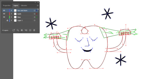
To create the stars I drew one and then duplicated it twice more and readjusted them to where I wanted them.

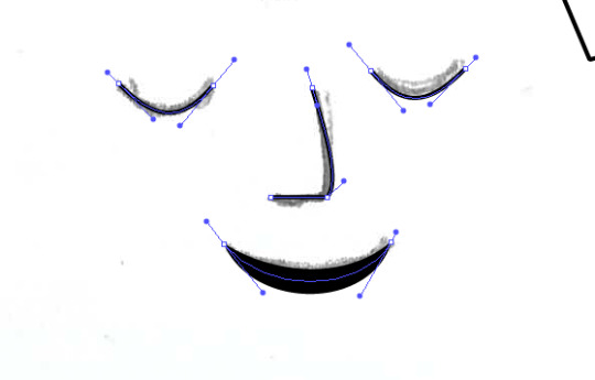
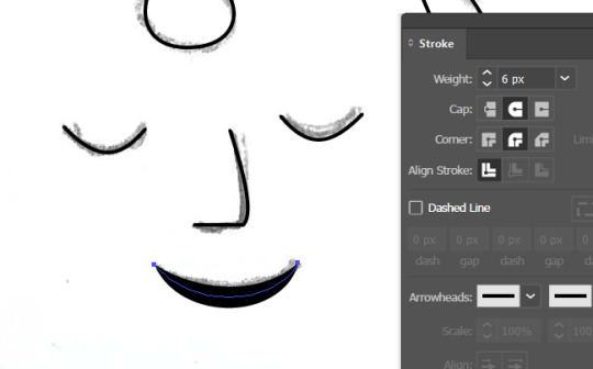
For the face I drew one eye and then duplicated and mirrored to match the other side. The nose is made from a hybrid point so I could have a flat bottom while still having a nice curve for the bridge. And for the mouth I went into the stroke palette to both increase the stroke weight and change the stroke profile so it would be thicker in the middle.
I then just added a white fill to the tooth elements and changed the floss fill and outline to grey to finish the first image off and voila:
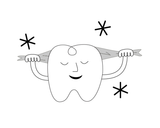
Although I am slowly getting more comfortable with Illustrator, it is definitely the Adobe program I struggle the most with. While my drawing may not be perfect, I am super happy with how it turned out and it served as a great warm up for my next image.
I admittedly really struggled to get started on my second image because I just kept getting myself confused, and it wasn't until I was taking a break did I have a brain wave. The reason I was struggling, was because I was trying to use Illustrator how I would use Photoshop when they are completely different and need to be used differently.
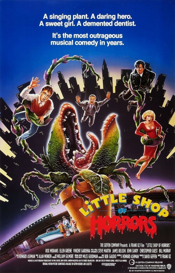
After much frustration I did what I should have done in the beginning and revisited our penguin from week three to try and refresh the ole' noggin, I also picked a less complicated image. Initially I set off wanting to create my own version of Audrey II from Little Shop of Horrors to challenge myself - but it was just a little beyond my current skill set.

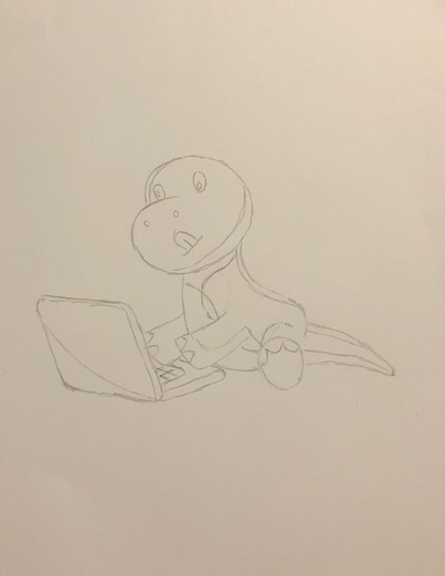
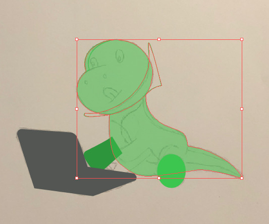
Instead I chose to do a dinosaur sitting on a laptop, mainly so I can tell my boss it's him.
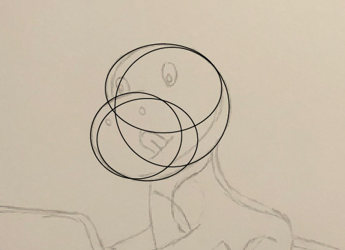
I wanted to start with creating my dinosaurs head and body, so used a series of circles to make up the shape of the head and then used the Pathfinder 'Merge' to make them all one shape.
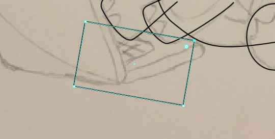
I then traced the outline of his body, and merged this shape with his head to create one shape.

I traced both his arms and his foot out in separate layers, and then moved to the laptop which I created using rectangles, the Direct Selection tool and the Curvature tool. I followed the same process as I did for the body and created the lid and the base as two shapes and then used pathfinder to merge.


Once I had my base shapes established it was time to add some colour. I went through and added my base colour and then dropped the opacity down so I could see my reference underneath. I traced where I wanted my shadows and highlights, you only need to be tidy on the inner edge because the rest will get cut away. I then duplicated my base layer, selected both the copy and the shape I just traced and using Pathfinder 'Intersect' to leave behind my desired shape.

I then repeated this process until I had all my shadows and highlights placed where I wanted them.
Instead of having to copy the body layer a million times, we can select multiple shapes, right click and "create compound path" (which essentially joins the items together), and then select this "new shape" and the body layer and use Pathfinder to cut out.
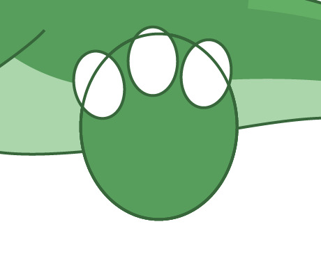


I used this process to cut out the toes of my dinosaur. I created multiple ovals with a white fill and green outline, placed them where I wanted them, make a compound path with them, and then cut them out with Pathfinder.
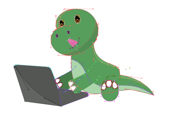
At this stage old Greg was looking like this:

He was lacking some facial details, so using a combination of the Pen tool and the Ellipse tool I went in and added/coloured my details.

At this point I was starting to feel a lot more confident as it all started to come together. I was already pretty happy with it but knew the eyes needed a little more attention to make him interesting and feel complete.

I added some red gradient eyes, some extra circles as highlight, and also went in with the Pen tool by the foot/tail to add a couple of extra lines. At this point I was very happy to call him complete and I'm very proud I continued to persevere because it finally feels like I've made that missing connection with this program.
Now that I've made that missing link I feel confident moving forward as a designer using Illustrator and I am excited to one day revisit my Audrey II drawing and give it another go once I have developed my skills a little further.
And just for funsies, here is what Dino Greg looks like when all his handles are exposed:
1 note
·
View note
Text
Week Six Homework
The take home task for this weeks lesson was to continue building on the image we had already created. We were asked to add another two elements to continue showcasing all the different skills we've been practicing over the last couple of weeks.
Here was my starting image:

I was really digging the green so I knew I wanted to keep the jungle theme going and thought adding a bird of some description would be very fitting and would be a fun way to add an element that could interact with the man I already had clipped.
Starting with Object Selection to get the bulk of the bird highlighted I made a layer mask and went in and refined the bird further until I was happy with my selection.


I brought the man and the S behind him up the image and also made him slightly smaller so I had more room both at the top and bottom of the image. I positioned the bird in his hair and then altered my bird layer mask so that its tail feathers and back foot were behind him to give the illusion that the bird was trying to grab him.

My next step was to adjust the Brightness/Contrast of my bird layer. First I did a layer where I applied it to the entire bird which is what you see on the left. And then I applied another adjustment layer on top of that one and cranked the brightness right up, but then went into that layer mask and took away everything except that top edge of the birds back wing to catch the light coming from the top left of the image.


Jumping down to the bottom of the image I decided a snake hanging off the bottom would look quite cool and found this image, which lucky for me was super easy to select using the Pen tool.
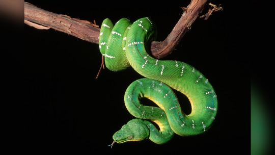

Honestly it was like it was meant to be, the snake sat perfectly on the bottom and only needed a slight curve adjustment before I was happy with it.

As a final touch I lowered the brightness on the lower leg of the man:

And I was left with an image that I was super proud of:

0 notes
Text
Week Six
This week in Fundies we learnt all about compositing which is the process of combining visual elements from separate sources into one image. Often to create the illusion that all those elements are parts of the same scene.
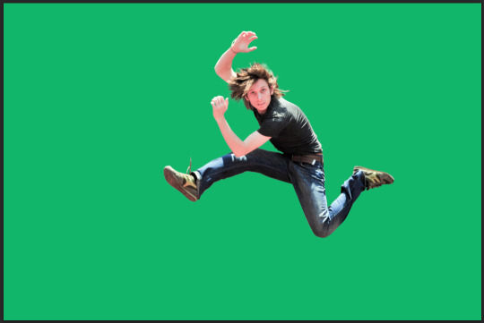
We started with a man jumping and were asked to create a clipping mask using the different selection tools we've been recently exploring. I started with the Object Selection tool which did select a large bulk of the man, but as you can see in the images below; it did leave me with a lot to tidy up:


I made a layer mask with what did get selected and duplicated my starting image. In between these two layers I added a green layer and knocked the opacity right back. This is going to make it significantly easier to see what I'm doing moving forward as I carefully edit my layer mask.
As I go through and make selections of different parts, Control + Delete and Option/Alt + Delete will fill the selection with either 'black' or 'white' depending which colour is in the foreground (X toggles this back and forth).
After what felt like an eternity I had my clipping mask complete. To achieve this I used a mixture of the Pen, Elliptical Marquee, Lasso, and Brush tools.
Creating this clipping mask showed me the importance of branching out from my tried and true Pen tool and highlighted how effective all these tools are when used in conjunction.
We then saved this file out, loaded it up into Illustrator, locked our original layer, drew a snake like shape over top, then hid our original layer, and saved this file out. It is important that when you're doing things like this that you aim to keep everything in the same folder. Because you're linking things between the different Adobe programs, if you wanted to take it home or move it between computers you need to take all files related to it with you.
Going back into Photoshop now, we want to place this file so we're going to go File -> Place Linked and then choose Crop to Media Box.
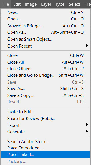
This will place the snake exactly where we drew it in Illustrator. Because we are linking the files, any changes we save in the Illustrator file will automatically update in the Photoshop file.
Here is the shape I created loaded back onto my Photoshop file:
To have the pink weave in and out of the green I layered the pink between duplicates of the green and then erased sections of the top green layer where I wanted the pink to show. Holding Option/Alt while using the Eraser tool in Illustrator will allow you to erase a rectangle at a time.
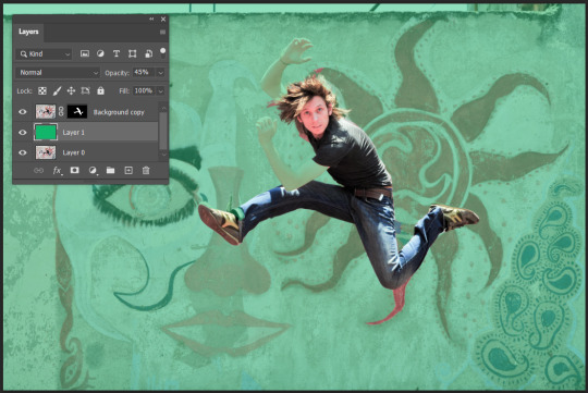
To complete the image we then superimposed it onto a background of our choosing. I ended up selecting a jungle background because the weaving arrow made me think of vines, so I actually went back into Illustrator and changed the colour of the arrow to a darker green.
For final touches in Photoshop, I added a Curves layer to my clipping mask as well as a Hue/Saturation layer to the entire image:

Until I was left with my final image:
This was my first time ever linking Illustrator and Photoshop files and wow, what a world of possibilities it has opened up. While we covered layer masks in last weeks lesson, I feel like this was the exercise where it all really clicked for me. I am definitely going to have a lot of fun using these tools and skills in future.
0 notes
Text
Week Five Homework
This week we were asked to find two images, one as a background and one as an 'interest', and then combine these two to create our own image using the various different skills and tools we've covered thus far.
At the time of doing this homework task I have already started my InDesign Nursery Book and so have stumbled across one of the funniest and most cursed images I have ever seen, and I knew exactly what I had to do...
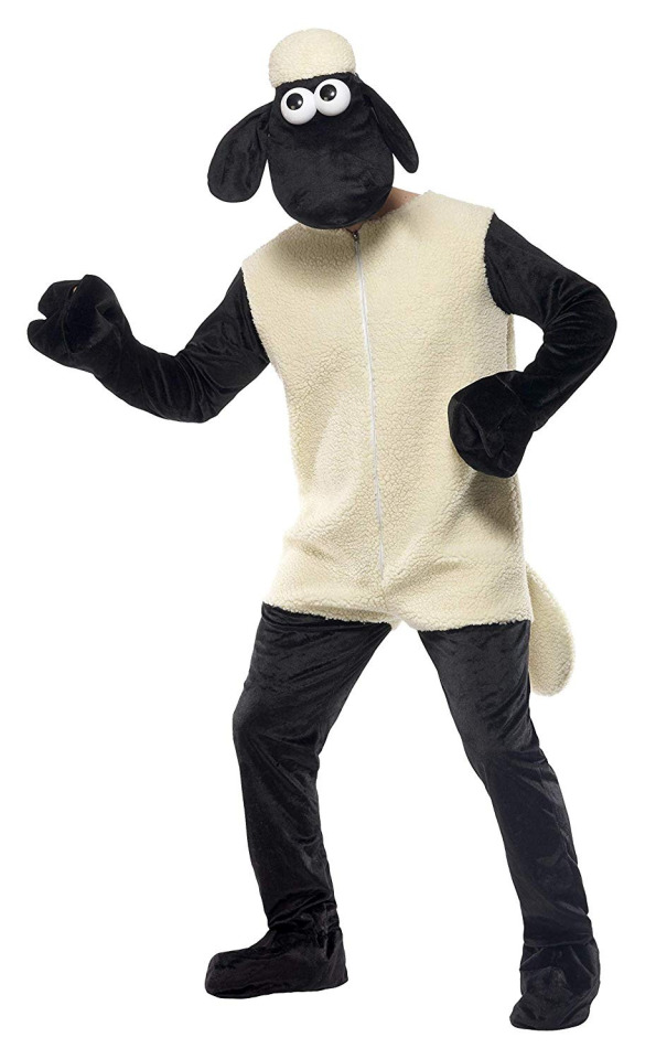
To begin I used the Quick Selection tool to select my image, and because of the plain white background it honestly did a pretty good job but to make sure I was fully happy before moving on I went into Quick Mask Mode and then just tidied up the sections I felt need a little more attention.


I then turned this into a layer mask and dropped it into my background image:

My image had a white outline around it that I wanted to remove so I double clicked my layer mask to open up Properties and adjusted the Shift Edge slider to -100% to remove it.

My next step was to make the inserted humanoid-sheep feel like it belonged in the photo so made a couple of different adjustments until I was happy with my results.


This left me with a humanoid-sheep that colour matched significantly better but it still looked like it was just placed on top of the grass... because it was. So the next thing I did was use the Lasso tool to select a portion of grass that I could then duplicate in a new layer and bring on top of the sheep:

I moved the patch of grass to cover the humanoid-sheep feet (trotters?) and then with the Eraser tool went in and faded out parts to make it look more realistic. I still wanted to see part of the foot so it looked like it was moving out of the patch of grass so strategically revealed parts of the foot as I went. I also use the Blur tool to try and match what the other grass at this level was doing.
Pro Tip: Using a bigger brush size in a soft brush type with a low level of hardness will give you more control when trying to feather or soften edges (at least in my experience).

Once I was fairly happy with where the grass patch was at, I went in and did a slight curve adjustment of the whole image to try and make it feel a little more cohesive:

Once I got here I decided I didn't like how the patches of grass looked being so close together and still looking so similar, so I jumped onto the Clone Stamp (S) tool, dropped the opacity and picked a big soft brush and just ran it over a few spots to blend it into the lighter grass a little more.

After a little more erasing and blurring, I had my final image:

If I was being pedantic I would have gone in and perhaps shrunk the sheep at the back a little so I could create better perspective, but lets just pretend the humanoid-sheep is actually a child vs. the sheep at the back being a mammoth.
All in all I think this image is hilarious and I really enjoyed making it!
0 notes
Text
Week Five
This week in Fundies we looked at the different ways we can isolate parts of an image and also looked at masks, paths, and layers.
Having been an avid Photoshop using since day dot, these are all tools I have played around with before - but prior to this weeks lesson I had never really explored masks. Masks are an incredibly useful tool as they are a non-destructive way to hide parts of an image without erasing them, meaning we can modify a targeted area without altering the entire layer.
We started this week off by exploring layers, layer groups, layer opacity, and other features of the layer palette. This is something I was already super comfortable navigating which made this part of class super fun because I was able to just mess around making some experimental abstract art:

We then moved onto our first exercise of the class which was taking an image of the Earnslaw and manipulating the image so there were two ships in the water. Here was our starting image:

Our first step was to duplicate our starting layer for two reasons:
We want to make sure we have a backup incase anything goes wrong and we need to start again and;
In this instance we want to preserve our initial image so we can superimpose our second Earnslaw onto the first.
Then using our Square Marquee tool (M) we selected the boat and then clicked "Add Layer Mask" at the bottom of the layer palette.

Once we have created our mask we are able to "enter" the mask by holding down Option/Alt and clicking the layer to toggle between.

Once we've created our mask we can further refine it using the Brush and Eraser tools. Once we're happy with our selection we just needed to reposition and resize our second boat and voila:

Pro Tip: Using the Blur tool or a softer edge brush will give you a softer selection. Using a hard brush will make the lines cleaner!
Next we were presented a bowl of fruit and asked to select the orange that is sitting behind the lemon:
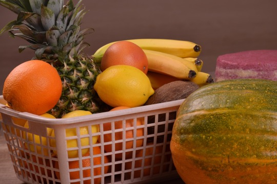
Using the Elliptical Marquee tool we were able to select the orange very quickly (holding down space to reposition), but we were then left with part of the lemon selected too which wasn't what we were going for. Holding down Option/Alt we are able to take away from our selection without dropping it - in the same way holding down Shift allows us to add to our selection.


Like in our first example we then made a layer mask, but this time we played around with the Hue/Saturation palette.
We then went through and experimented with other types of selection tools including Quick Selection (W) and the Lasso (L) tools. Within the Lasso tool we have the standard, polygonal, and magnetic. The Lasso tool is definitely the selection tool I have used the least but really enjoyed how easy the Magnetic Lasso was to use as it was generally pretty good at recognising what I was trying to select and snapping to those lines for me. By the end I was left with:

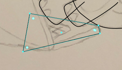
We then moved onto my personal favourite selection tool and the one I use the most frequently in my own work - the Pen (P) tool. Functioning similarly to Illustrator, the Pen tool works by creating bezier curves to select your image which you can then tweak using the Direct Selection (A) tool before locking in the selection. Just like in Illustrator you can hold Space to readjust where you're placing the anchor points while you're working.
While I've been using it for years and winging it, now that I have a solid foundation of knowledge how HOW it works it I am able to work much faster and cleaner.
Using this plant picture for practice we set off to select the inner five leaves using as few points as possible.

When we're ready to confirm our selection, we'll right click and select "Make Selection". If we then wanted to go in and further tweak our selection, my personal favourite method it to enter Quick Mask Mode (Q) and use the Brush tool in black/white to further refine where needed.

Our final task for the afternoon was to take this image of a Hummingbird and superimpose it onto a different background:
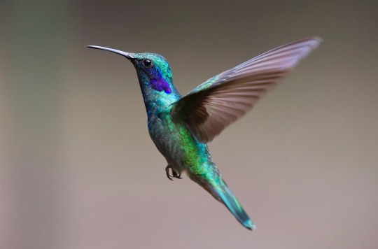
Using the Object Selection (W - with Quick Selection tools) tool we were able to select the Hummingbird with ease, but due to the motion blur on the wings we will need to go in and further refine to get our desired look.

While I forgot to document these next steps, we created a layer mask and using the pen tool went over and traced the different curves we could see in the wing.
Then using the Blur tool we went over the edge, focusing more on the upper edge as this is where the most movement was, until we were happy with our overall selection.
Then we flipped the bird and dropped it into our second image and made final adjustments like resizing and rotation until it looked like it was in the actual image.

I also went in and slightly readjusted the curves of the background image to brighten it up slightly, and also carefully went along the belly edge of the bird with a darker shadow colour to smooth it out even further.
0 notes