
Statistics
We looked inside some of the posts by shanexhuang and here's what we found interesting.
Average Info
Notes Per Post
0
Likes Per Post
0
Reblog Per Post
0
Reply Per Post
0
Time Between Posts
3 days
Number of Posts By Type
Text
17
Last Seen Tumblr Blogs


Fun Fact
US Tumblr user growth rate is estimated to slow down to 4.1%.


Text
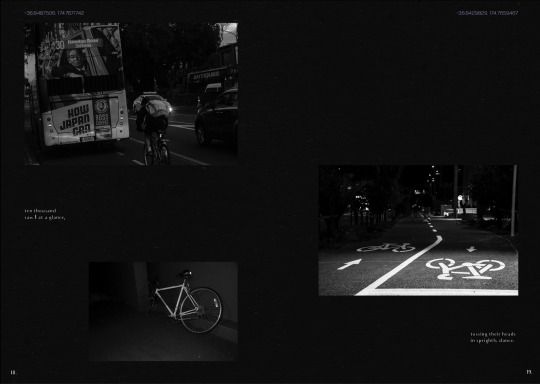
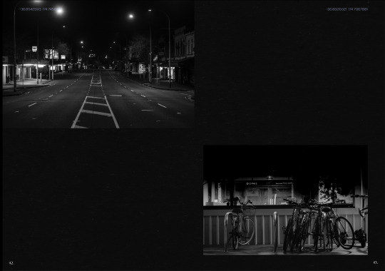
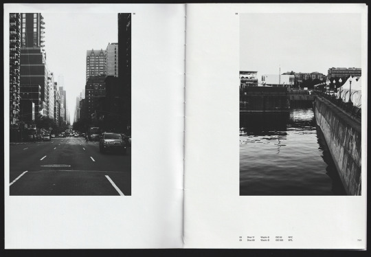
Final Publication Mockup


Soft Cover
A4 Double page spread photo series book
130gsm Grainy black paper
0 notes
Text
InDesign insight- Grids


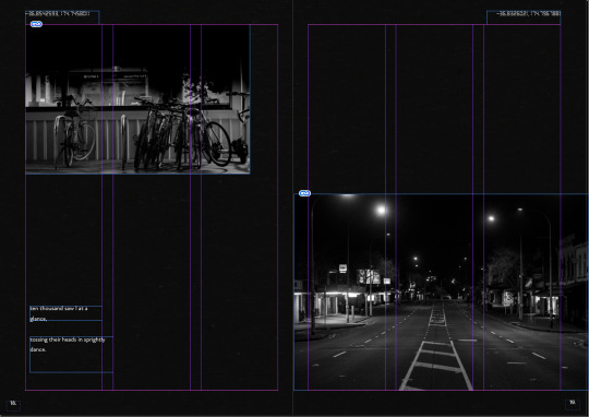


Breaking the grid, by not following the grid it creates a asymmetry look on the overall page. But I still manually balanced the layout looking at the visual weighting of the images shape and text.
0 notes
Text
Font Consideration
DS-DIGITAL

Creates the appearance of film camera’s date stamp.
Latitude is important in this project because psychogeography is related. The location is one of the key context for my project. Different place make you feel and behave differently.
0 notes
Text
Minor Development
Testing the DS Digital font and angle and placement of the latitude number.
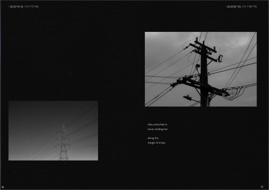

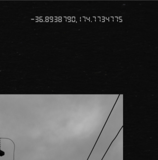

I changed the font of latitude numbering to DS DIGITAL, creating a film camera look and feel.
Also played with the angle of the latitude number. I tried with horizontal and vertical.
Placing number on vertical was a bit weird to look at, also it was hard to read, legibility isn’t too good.
0 notes
Text
Minor Development


Development after feedback from Meighan.
Edited to lessen the contrast on the seagull images because it had some type of dark shadow underneath the seagull, also the colour on the background didn’t match the shade of the other images. This could be because we are working on digital screen. It could differ in physical print.
I also lessen contrast and highlight of the images on some of the pages as it was overkill and is a bit too much. I also made the type point size little bigger because it was too small to read.
Added colophon and updated forewords
0 notes
Text
Layout Development


Developments after getting feedback from George.
He suggested to make a contemporary approach for the layout and typeface. Try to layout sense of imbalance, keeping it little bit busy. Don’t neutralise image and the text. Crucial to ‘Contrast’. Not to create balanced layout and make it asymmetry. Change the typeface to a clean modern sans serif font. Make some image larger so it’s not neutralised.
Add colophon informations like Author, publisher, location, Time, Camera, etc..
0 notes
Text
Font Consideration
Quasimoda- This is a basic sans serif font that has an elegant clean texture. Designed by German designer Mr. Botio Nikoltchev


Mariné- This is a geometric sans but with the softness of humanistic strokes. It’s mild contrast and multiple different styles allow Mariné to work well as both a text and display font.


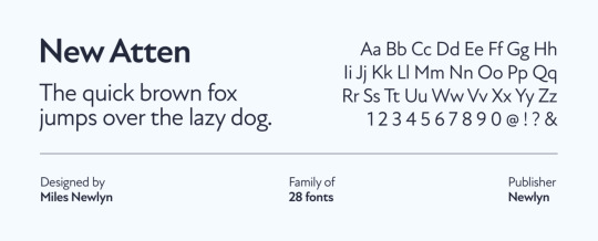
New Atten- A sans serif “inspired by the voice of Sir David Attenborough”, designed by Miles Newlyn, initially together with Adam Katyi and later with Riccardo Olocco, Leo Philp, and Malou Verlomme.

0 notes
Text
Font Consideration
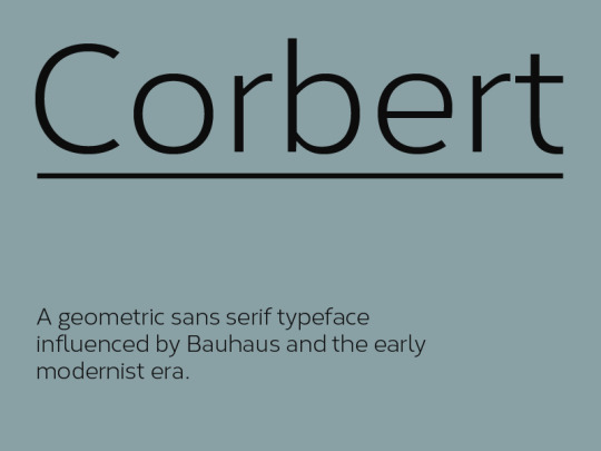
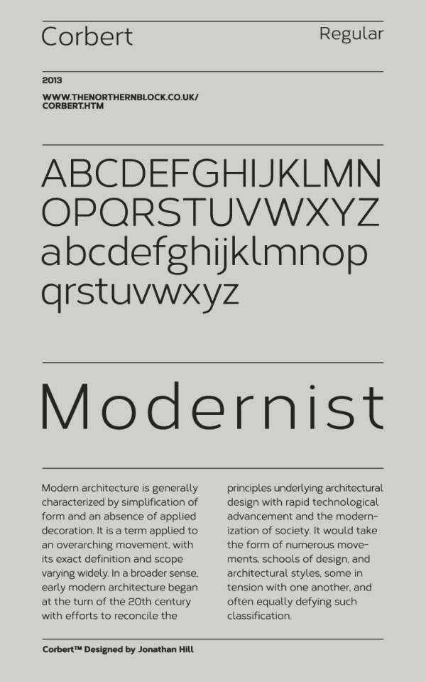
A geometric sans serif typeface influenced by Bauhaus and the early modernist era. Precise circles are optically adjusted to create a clear, natural typeface with great legibility.
0 notes
Text
Testing/Developing layout


Symmetrical and balanced layout. Played with the text, placing the text in different levels.
Text is balanced and neutralised with the images as the layout and placement is in similar ways.
I used serif font called Audrey, giving a traditional vibes to the publication.
Placed the latitude numbering on top of the page. They are in san serif font called Cobert. I used a subtle purplish blue colour to convey the sense of loneliness.
Maybe needs more spacing for each images on the layout. Needs more negative spaces for the viewers to breath.
The Audrey font might needs change as the size and width of capital letters are different to lower case letter.
I will maybe need to look for a clean, contemporary and modern font.
Need develop better cover page.
Add colophon in the publication.
Update the foreword, possibly change colour and font.
0 notes


Text
Finalised Photos for my project
Chosen images for my publication project
Finalised and edited ready to be used on my publication.
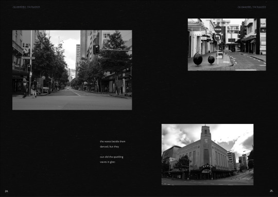
They are high contrasted image with deep tonal depth. Activating the sense of strangeness and abnormality. Taking the audience to another world / realm. The images portray and emphasises on the feeling of solitary, mystery, and emptiness. Content of the image are contrasting too, juxtaposing within the image.


0 notes
Text
Layout inspiration from Pinterest
Series of layouts I liked that I found on Pinterest https://www.pinterest.nz/shenye_h/pins/


0 notes
Text
Layout inspiration from Pinterest
Series of layouts I liked that I found on Pinterest
https://www.pinterest.nz/shenye_h/pins/


0 notes
Text
Layout / Publication inspiration
Lena Sitnikova- MEMORY (a collection of film photos)
https://www.behance.net/gallery/101975423/MEMORY-%28a-collection-of-film-photos%29?tracking_source=search_projects_recommended%7Cflaneur%20photo%20book


Things I liked
-grainy noisy images
-minimal text amount
-imbalanced layout
-contrasting layout
0 notes
Text
Layout / Publication inspiration
Valerie Bourdon- Two Cities — Film Photography Photo Book
https://www.behance.net/gallery/82888099/Two-Cities-Film-Photography-Photo-Book?tracking_source=search_projects_recommended%7Cflaneur%20photo%20book


Things I liked
-asymmetric and symmetric layout
-high tonal contrast images
-minimal text amount
-small text point size
-white negative spaces
0 notes