
Shared Language is a collaborative dictionary started as part of the MA Communication Design at Central Saint Martins and is a continuing exploration of our common language.
Don't wanna be here? Send us removal request.
Statistics
We looked inside some of the posts by sharedlanguage and here's what we found interesting.
Average Info
Notes Per Post
18
Likes Per Post
17
Reblog Per Post
1
Reply Per Post
0
Time Between Posts
23 hours
Number of Posts By Type
Text
17
Last Seen Tumblr Blogs


Fun Fact
Tumblr was attacked by a cross-site scripting worm deployed by the Internet troll group GNAA on Dec 3, 2012.
Text
CSM Photography Department
Jet, Feb 4th 2011
B24 main studio
B22 small studio
B14 b&w darkroom
B22 digital editing suite
Mamiya RZ 6x7
Bridge - easily edit batches of raw files
cyanotype
liquid light - emulsion you can paint on any surface
photogram
photomontage
pinhole camera
Wolfgang Tilsmann - photographer, abstract images using lights to expose color paper in darkroom
Martin Parr - British photographer, harsh commentary
Elaine Constantine - commercial photographer, captures natural moments
William Eggleston - American photographer, dye transfer
Sally Mann - American photographer, took nudes of her children, controversial
Maplethorp
Diane Arbus
Cindy Sherman - film stills, self-portraits
Gillian Wearing
Jean Paul Goude
1 note
·
View note
Text
Aerial Photography
Feb 9th 2011
The White Horse
landscape symbol only seen from above
he went to take aerial photographs
archaeologists were excavating at the time (found their research reports interesting, the information and the aesthetic)
found a book about archaeology and similar building sites
discovered a history of archaeologists working closely with aerial photographers
began photographing excavation sites from aerial view
Segsbury Camp
he and Simon Calary lived with archeologists as artists in residence
put a hasselblad on a pole and photographed excavation site from above; tried to do it systematically
very detailed images, imperfect grid was interesting
joined images together, 2m by 4m of a 20m by 40m trench
commissioned a set of drawers, each photograph took up half a drawer
displayed in the National History Museum
happened to be how aerial reconnaissance photos were sotred
also shown in a barn near the site, open to locals
did a series of small b&w aerial photos of the area
Other work
went on to work with amateur pilots and do more medium format aerial photography
lowlight really shows the contours of landscapes
Marylin Bridges- American aerial photographer
he researched by looking at old archaeology books, google maps, and weather
other project about the effect of wind farms on the English landscape
going to produce a website, no prints
tracking all emissions and carbon footprint of the project
anti-wind farm campaign in UK
some people embracing it - co-op in Oxforshire, mutual: locals own a small piece of it so they have a vested interest
low hum, value of houses drop, eye sore
photographs of landscapes with and without them
also photographed individual windmills
0 notes
Text
Research: Practice
James Swinson, Feb 16th 2011
went from science to painting to moving image
praxis: the process by which a theory, lesson, or skill is enacted or practiced, embodied and/or realized. (wikipedia)
importance of cinema = we think cinematically
idea of research led him to documentary projects
Acting Tapes - acting in cinema
have to ask a question, have an argument
The Installation of a Time Machine
First Time Tragedy Second Time Farce
he would rather show work in an unconventional space in order to interact with people outside of the art world
thinks they are less inhibited about talking about the work
project proposal is like a film script
practice-based phd
0 notes
Text
Graphic Design Practice – Digital Installation
Graphic Design Practice – Digital Installation
Christopher Pearson
Date: 2 Feb 2011
Christopher Pearson is a designer, artist and free-lancer. He graduated from Camber well College of Arts. When he was in MA Communication Design from Royal College of Art, his final project was quite success. He work with technology, combines digital media and tangible craft. Making amazing 3D wallpaper and animation wall art.
I was very interested in Christopher Pearson’s Oak Seasons. They are six glass screens laser etched with patterns describing the growing cycle of the English Oak tree. Among the foliage are surprising items such as a light bulb between leaves, swing hanging from a branch and a road map. It is illuminated with LED lighting. Amazing works.
His Animated Crest appears at first to be a British Airways crest carved out of stone; Pearson has made it into a 3-D animation with the lion and pegasus moving around. It tricks people’s eyes and giving a surprise to the audience.
I like his passion on the work. He would like to try new things and experiment his ideas. He knows what he want and want should he know before start doing the work. He think when we learned a skill, we should try to find and using the possibilities it offers.
After listen this lecture I feel that I should work harder. His final project of his MA course is so strong. I am also in a MA course; I also want to have a strong project when I graduate. I think I can learn some methods of planning project and working attitude from him.
0 notes
Text
Digital Installation
By Christopher Pearson 2 Feb 2011
Christopher graduated from Camberwell in 2000 then completed his MA at RCA in 2005. His very first commercial work is for Alexander McQueen printed patterns. The picture of feathers beautifully makes the work. Then he moved into the work for MTV, the brief is they want wallpaper that capture what happen at MTV station. He use photo collage technique and then drawn over it to create the classic wallpaper feeling. He also mentioned that the reason he went to do an MA is to seek for new ways in creating self-initiated projects. His 2 years at RCA provide him the space to explore.
After graduated, he was commissioned to do quite a few project related to wall decorations. The projection technology allows him to play with animated patterns such as animated glass-windows and installation for British Airways in which he create a classic brick patterns that could move. Many of the project works as 3D illusions.
In the professional advise part, he mentioned about Proposal and how you have to pitch the work against other people in real life. It was a horrible experience to him I believe as he literary said the word “horrible” quite a few time. In a way I understand his experience as I was many time get rejected from the project that I would like to do, after I have splashed out all the ideas/energy of course.
In conclusion, his work is impressive; I could see a very hard work behind all his project. I could see how important it is to build your own identity, Christopher did make his work seen when he was at school and his following commissions are obviously a developing step from there. It made me realized what I should do with my 2 years MA life here. An experiments.
9 notes
·
View notes
Text
Modern British Posters
By Paul Rennie 2 Feb 2011
Paul studied about the development of posters, by doing so he is observing the development of our society as well. He talked about some interesting facts related to the creation of posters
Billboard is part of the architectural development. The idea was create during city modern age where there are many construction happening and somebody think it is a good idea to cover the site along with promoting something.
Standards are agreements between everybody. It synchronized things. Before 1840 people have separate life, they do their own thing and not connected. Global time is also one on the very first standard created by the demand of consistency in different places, for the usage of railways.
Henry Ford is the one who utilized the concept of “Standardization”, he sees the value of highly set standard and assembly line for cars was made. He created the industrialized age, after this era, everything has changed. The world is now focus on supplying at the cheapest labour cost.
Posters were defined by the size of printing press; the environment around it is also limited under the same constraint, for example, bus stands size.
Graphic design has played and still has significant role in the society. Even though it is everywhere, it is so transparent.
At the end of the lecture, Paul also contributed to our research report process by sharing his idea of what it is. It is the understanding of the world, how we can find evidence that make the case and be able to persuade the audience into what we are doing. To join the conversation.
0 notes
Text
Photography
By Jet 4 Feb 2011
Jet is the technology experts form our Photography Studio at CSM. Unlike the normal technician, she is well rounded in this area. At the lecture, Jet introduced us to the facilities related to photograph, such as, lights, digital-film camera, dark room etc. I have been to the induction with her once, and it was quite interesting to see the whole process of lighting and manual photo developing. As well as the technical side, what’s more interesting about the talk is how Jet introduced us to the world of great photographer. By showing us samples of their works along with some stories about the maker.
One of the photographers Cindy Sherman take portrait of herself as other women in different roles given by society. She dressed up and represent variety of persona elegant, sexy, provocative, or reserved. Sherman has raised challenging and important questions about the role and representation of women in society, the media and the nature of the creation of art.
Another work that attracted me is the work of Jean-Paul Goude; a French graphic designer, illustrator, photographer and advertising film director. It was also mentioned by Patrick that he is a legend in what he do. Some of the photograph by him shown was stunning, and it has a special quality to it that I couldn’t quite explain; blunt, bold, at the edge and deep.
I haven’t been aware of most of them since artistic photography was typically not my main concern, so this talk is an eye-opening for me.
0 notes
Text
Photography
04.02.11 Jet
Photography was the subject of Jet’s lecture this Friday morning. She talked about the photo studios and equipment available in Saint Martins for us to use such as the darkroom, the digital editing suite and cameras that we can borrow for project use. But most interesting than talk about the available structure, were the examples of photographic projects created in the College. That definitely will bring the students to the studios and labs: the possibilities are infinite and the results, spectacular. I definitely want to try some techniques even though I prefer to think about the page layout. After some “indoors” examples of photographic projects, Jet started to present some of her preferred photographers and their work such as Terri Amos, Cindy Sherman and Pennie Smith. One of my favorites: British photographer Elaine Constantine: one of the most featured contributors of The Face Magazine. Her pictures portrait young British culture and have enormous energy and movement. Another one I couldn’t avoid mentioning: Jean-Paul Goude, French photographer, illustrator, graphic designer and an advertising film director as well. One of those multi talented geniuses that is complete. His videos for Grace Jones in the 80’s are exceptional. To finish this post I would like to mention the name that was most used during the lecture: Photographer’s Gallery. A London must if we are interested in the subject, where one can find lots of inspiration and fantastic work.
1 note
·
View note
Text
Design Practice
02.02.11 Christopher Pearson
Christopher Pearson was the designer who spoke this Wednesday about his professional practice and his work. You can check what he is up to in www.christopherpearson.com. Design, craft and technology were the themes of several of his projects. Here is an example of an installation for the British Airway First Club and Concord lounges Heathrow terminal 5. He created animated wallpaper and panels designing natural patterns.


Images in http://www.christopherpearson.com/ There were other projects using light and projection that I found interesting as well, because they involved interaction. Like the work Henry VIII's Shadow, a video that can be checked at the designer’s website. I was inspired by Pearson’s attitude towards design and life: he is above all a curious person. Listening to the stories behind his projects you can say he likes to discover, experiment and try new things. Mainly when it comes to technologies: he likes to try effects or play with the possibilities that it offers. It is becoming a pattern in these Wednesday lecture’s: we are getting in contact with designers who put a lot of energy in their work, invest in self initiate projects not only hoping for commercial return, and in the end, they create beautiful and interesting pieces or services that brings them personal and professional realization. I think I got the message.
0 notes
Text
Animation
This Wednesday we had a lecture with Kimmo Moykky, the animation laboratory technician and Isak Akerlund, a Central Saint Martins animation student. They talked about trends in animation, the software available in Saint Martins for us to use and showed some samples of their work. But the most interesting part of the lecture in my opinion was Isak Akerlund’s account of his experience as a toy designer while working for BRIO, a Swedish wooden toy company in 1908. It was almost ironic that we had the opportunity to know more about Brio’s project to launch the push puppet Mickey and Minnie, a licensed product, after we had a lecture about standards. Firstly, Isak showed some images of Mickey Mouse Club House, the actual character cartoon. The current 3D-ish version of Mickey appearance is very different from his previous versions. Here is a poster of the first Mickey’s film Steamboat Willie, of 1928, so you can check the long trajectory: from a black and white outlined mouse to the current glossy aspect.

Mickey in Steamboat Willie

For kids today: Mickey Mouse Club House Secondly, Isak told about working with licensed products, the difficulties of adapting a 3D character to a wood toy and the solutions found. Here is the final toy. It is impressive how the final toy is similar with the Disney’s cartoon. Standards, standards, standards…
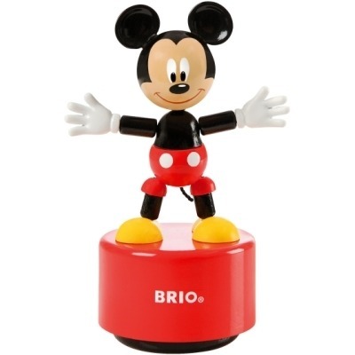
Push puppet Mickey
6 notes
·
View notes
Text
British Modern Posters
02.02.11 Paul Rennie
British Modern Posters is the title of Paul Rennie’s book and was the theme of the lecture he gave us last Wednesday as well. He showed images of the posters in his book, talked about the history of this media and established a connection between the emerging of posters in Paris (1816) and the industrial society. It was very interesting to see how posters could portrait the modern society values. Paul mentioned some facts that helped build modernist values, the most important of them, in my opinion, was the creation of the assembly line and a system of mass production by Henry Ford, founder of Ford Motors Company. Mass production means standards, global consumerism and the same design for everyone. Many companies think design the same way today. Mainly the big chains that have franchise systems. Is it the best way to think design in the post-modern society in which individuality and small voices can be heard? Or does it depend on each case?
The lecture made me think of an article by Katherine McCoy, first published in How Magazine in 1995, where she talks about design and specialized audiences:
“Designers must become the audience’s advocate. We cannot count on univalent and monotone mass communications methods to answer the needs of many graphic design problems. While we must not neglect the first and second components of the sender-message-receiver equation, we must respond to the full potential of audience differentiation and diversity to shape and enrich the sender’s expression and the message’s coding.” ( McCoy, 2006:205 in Bennet, 2006) McCoy, K. (2006). ‘Graphic Design in a Mulicultural World’. In: Bennett, A. (ed) Design Studies: theory and research in design studies. New York: Princeton Architectural Press. 200 – 205
0 notes
Text
Animation Software
Kimmo Moykky & Isak Akerlund 2 Feb 2011
The lecturers gave us some idea about using animations software. There are two kinds of animations, two-dimensional animation and three-dimensional animation.
Two-dimensional animation: - Hand drawn animation, which need to be drawn in the individual frame. The software we can use is ‘Sketchbook’. - Flash CS4, Photoshop, After Effect, which are used for web design or animation.
Three-dimensional animation: - Maya is very common programme for making special effects in film. However, it is quite difficult to use and it takes long time to finish. The lecturer showed us the slides of making a 3D ball by using Maya. You just need to choose when you want the ball to bounce, and then the computer will work on the animation in between. But still it needs to be manipulated by us to make it be more human touched. We could also use Maya to make the facial expression like control eyebrows, eyes positioning, cheek, etc. There are many free ready-made 3D characters in free website that we can download it and use it to practice. The website that the lecturer recommend is ‘Blender’. - 3D Max is another three-dimensional animation programme, which is developed by the same company as Maya. So the programmes look similar to each other. 3D Max is used more for making animation for game. In the future it is possible that Maya and 3D Max would be blended together.
The trend of 3D animations in film these days is that the animation becomes more invisible and perfect to make people believe what is happening like it really happens. The blue screen, green screen, and pink screen, are used to put the background off but it takes high budget. So the compositing technology like the ‘NUKE’ software and the ‘After Effect’ has available.
The advertisement at the moment is trying to go back to basic and use the hand drawn animation, while the scientists are now using animation for explaining the complicated functions in their works.
1 note
·
View note
Text
Technology lecture & Toy Design. (kimo & isak)
Kimo gave us a neat and swift talk about the various 2d and 3d animation software’s, relevant tutorial sites and some intricacies of the soft ware (hard one to learn, easy ones to learn etc)
Animation brought about the the language which can be redefined by time and space in a very different way from the time and space related in a painting. Greek/ roman concepts of space were defined in the space in the painting. However, which animation, space takes on time, and is redefined, causing a shift in our conscious states.
He however mentioned, how maya (the software) was moving towards a ‘perfect imperfection’. Computer generated images needed to be more believable, and hence the push towards imperfection and non fantastic imagery/ human tendency of error. From fantastic to realistic
He also said, with a software like maya, ‘you can make your own customized special buttons for special effects’ which can be the next stage of programming and IP.
ISAK, the toy making genius
I was pretty astounded by isaks toy work. From brio to walt Disney Isak, besides his attention to detail in 3D computer modeling (which was brilliant), his implementing various toy histories to continuously redefine the toy was quite remarkable. He spoke about the wooden train toy tracks, its historical reference, the 2D to 3D shift in mickey mouse, lego being a constructive imaginative space providing tool for children, the rules of production shifting from possibilites of manufacture to ‘health and safety’ guidelines, the implications of the various sized screens in animation (from the big screen to the mobile phone), hand crafted toys in relation to craftsmanship and the production of toys in relation to global economic political implications of the present means of production. Cutting a tree to build a wooden toy in ones own locality seems more sustainable than importing toys (fuel, transport, non bio plastics).
I was wondering what the personality / psychological state, the difference between children who grew up with toys to who did not would vary. It has an interesting sense not only n terms of the construction of consumption, property and ownership but as a space for cultural narrative.
His final game presentation, was brilliant in the way he implemented imagive space, cultural reference to the past to digital interface introductions, to the movement across 3 dimensional space.
0 notes
Text
British poster - Paul Rennie
Modern British posters :
‘Its not about design history’ , its about value shifting from authentic pieces of art to art in the age of mechanical reproduction.
Old painting had a higher value than old posters in the time when reproduction was seen as non art, and was attributed to advertising and production. paul rennie say this ‘weird market’ was an interesting time, as steam engine collections (poster, book, toys) and old paintings were regarded as valueable. Where as posters were regarded as production technics.
He portrays the time (end of the 1920’s) as the beginning of the industrial age, and poster art was the beginning of defining and telling society ‘availability of surplus goods’. Sheet Music was the beginning of lithography, and was the beginning of compositions of music being able to disseminate and reach others beyond the composer himself. The notes of sheet music (of the piano / orchestra) defined not only the possibility of music receiving a defined language, which could be replaed, but also defined a certain structural language to conscious thought pertaining to that time.
Posters redefined the physical spaces of the town or city, bringing stories, visual, excitement as well as defining archieture itself eg. Bus stations which had poster sized spaces, to place them.) the economic politics of advertising and architecture are many, and had a huge inpact in the way cities were going to be defined.
Standardization: the agreement of what exactly constitutes industrial production. For example, Transportation (railways) brought about the standardization of time. Adam smith brought the idea of ‘division of labour’, a mechanical separation that removed a craftsman from his craft, and introduced mechanical specialisations. Henry ford, brought in the T ford, the first privatized luxury car and introduced ‘’fordism’. This standardizing system brought freuds psychoanalytic studies the need to standardize behaviour and saw the beginnings of the ‘assylum’ / behaviour homes’ as the administration of behaviour.
Design was a blind spot, as it was behind all culture defining changes.
0 notes
Text
Modern British Posters
Modern British Posters Paul Rennie Date: 2 Feb 2011 Dr. Paul Rennie is the collector, curator, lecturer and writer from whose book, Modern British Posters: Art, Design & Communication. In the lecture, he has put the British posters created in mid 20th Century on the slideshow, like War Posters created by Paul Nash & Abram Games; London Transport Posters created by Tom Eckersley. He began collecting British posters in the 1980s and it was mainly about railways, cinema, politics or some public information.
Besides discussing the graphics showed in the poster, he also discussed the shift of previous printing method which was labor demanding, time-consuming and massive, and to become standardized 4-colors printing. There are three pivotal periods in the development of British Poster Design. 1. The dazzle effect of color juxtaposition in the beginning of First World War. 2. Visual Propaganda and illustrated war during the outbreak of Second World War. 3. Punk Movement in the late 70s. In the industrial and cultural context, the technology changes us, and we response to the technology. In the age of computerization, the position of posters had changed as the format of communicating message is drastically shifting to more web-based, however, posters are still powerful as it opens up a complex interaction which graphic design are playing an important role inside.
He also showed us the ‘grid type diagram’ of how his ideas get into the position, like which photographs are associating with the most valuable part in the society. It’s a mind mapping method, thus he also suggest some ways to elaborates and organize materials in our research project by rearranging the book covers. Those book covers reveals the flow of our mind, it’s a good visualization to determine the relevancy of our lists of books.
0 notes
Text
Animation Software
Animation Software Kimmo Moykky & Isak Åkerlund Date: 2 Feb 2011
I’ve done some little animated gif with flash before but I nearly know nothing about Maya and Aftereffect. I always think that people who can work well with these software are genius. Kimmo showed some students’ work that are using watercolor in creating an animation. It’s fun to combine the organic and computerize feeling with flash. The trend of animation is tend to be invisible realistic in making characters or special background effect, it makes people to believe what is happen in the film, however, I would prefer some ‘imperfect’ animation as it’s more touching to see hand drawing 2D motion graphics from each frames.
Isak Åkerlund is an industrial designer in Brio, a toy company in Sweden, and he starts his 3D animation as a demonstration of his product to retailers in Commercial Design environment. He encourages us to maximize the use of mobile, like adding some products or film in the show reel to show people. From his presentation, I can feel that he is really passionate in making toys and I’m very appreciating his minimal thought of making license toys. From the original setting of Disney Character, the works are ‘below the line’, therefore many constrains to make physical objects from digital world. He examined the shape and size of Mickey Mouse first, and he is very obsessive to keep the tangible touch of the character like keeping the nose of Mickey Mouse as wooden materials (3D) rather than paint (2D). And it’s funny that he told us the mistakes of Mickey Mouse’s ears between 2D and 3D that I’ve never noticed! I’ve also been very impressed about the posters of Lego, there’s a real photo shooting Lego in the middle, and the shadow is showing the imagination of what children is thinking. Honestly, toy design plays an important role of our creativity development, especially some simple designed wooden blocks, which leaves a room for children to think and create their own stories.
0 notes
Text
Graphic Design Practice – Digital Installation
Graphic Design Practice – Digital Installation Christopher Pearson Date: 2 Feb 2011
Christopher Pearson’s works are multidisciplinary; he is a digital designer/artist exploring pattern and physical surfaces through a ‘craft-like’ approach to digital technology. He was graduated from Camberwell College of Arts and he explored a lot during his study in MA Communication Design from Royal College of Art. His work is amazing and impressive; the incredibly aesthetic approach from pattern on textile towards projection on glass formed his unique style. One of his famous works is ‘Etch Form’; it is a bespoke range of glass and Perspex products in a series of three-dimensional repeating patterns based on the oak. It is illuminated with LED lighting. I like the gradual releasing visuals that he projected on the glass, especially the sequence of organic forms revealing different levels of sensation.
The way that he adjust the accuracy of projection on objects spent him a lot of time but I like what he first make a prototype in the studio, and experiment how the lights, images deal with the division of the animation. In the animated pattern, I was moved when I saw the dandelion shining in the grass with a little etching texture and it’s light yellow reflecting from the layers of glass. It’s subtle yet beautifully capturing the nature. Chris also discussed, ‘When you are not doing exactly what you want, do something you enjoy a bit or something make a lot of money.’ I’m not sure if it’s right but he is a good demonstrator of how his work can be poetic in a commercial field in design.
http://www.etch.christopherpearson.com/
0 notes