
This is an Data Interpretation course from from Coursera feat. Wesylen University
Don't wanna be here? Send us removal request.
Statistics
We looked inside some of the posts by shinjiniandherresearchproje-blog and here's what we found interesting.
Average Info
Notes Per Post
0
Likes Per Post
0
Reblog Per Post
0
Reply Per Post
0
Time Between Posts
3 days
Number of Posts By Type
Text
15
Last Seen Tumblr Blogs


Fun Fact
Mobile US users spent an average of 115.8 minutes on Tumblr app monthly.
Text
Week 4: K-Means
from pandas import DataFrame, Series import pandas as pd import numpy as np import matplotlib.pyplot as plt from sklearn.cross_validation import train_test_split from sklearn import preprocessing from sklearn.cluster import KMeans
# Data Management nsc = pd.read_csv(“nesarc_pds.csv”, low_memory=False) nsc[‘S2AQ20’] = nsc['S2AQ20’].replace(99,np.nan) nsc['S2BQ2D’] = nsc['S2BQ2D’].replace(99,np.nan) nsc['S2BQ2E’] = nsc['S2BQ2E’].replace(99,np.nan) nsc['S2BQ2FR’] = nsc['S2BQ2FR’].replace(999,np.nan) nsc['S4AQ7’] = nsc['S4AQ7’].replace(99,np.nan) nsc['S4AQ9DR’] = nsc['S4AQ9DR’].replace([9997,9998,9999],np.nan) nsc['ETOTLCA2’] = pd.to_numeric(nsc['ETOTLCA2’], errors='coerce’) var = [“S2AQ20”,“S2BQ2D”,“S2BQ2E”,“S2BQ2FR”,“S4AQ7”,“S4AQ9DR”,“ETOTLCA2”] var1 = [“S2AQ20”,“S2BQ2D”,“S2BQ2E”,“S2BQ2FR”,“S4AQ7”,“S4AQ9DR”,“ETOTLCA2”,“AGE”]
for i in var1: nsc[i] = pd.to_numeric(nsc[i], errors='coerce’)
c1 = nsc[var1] c1 = c1.dropna() c = nsc[var] c = c.dropna() cpy = c.copy()
# Scaling for j in var: cpy[j]=preprocessing.scale(cpy[j].astype('float64’))
“”“ Clustering Variables S2AQ20 DURATION (YEARS) OF PERIOD OF HEAVIEST DRINKING
S2BQ2D AGE AT ONSET OF ALCOHOL DEPENDENCE
S2BQ2E NUMBER OF EPISODES OF ALCOHOL DEPENDENCE
S2BQ2FR DURATION (MONTHS) OF LONGEST/ONLY EPISODE OF ALCOHOL DEPENDENCE
S4AQ7 NUMBER OF EPISODES (DEPRESSION)
S4AQ9DR DURATION (WEEKS) OF ONLY/LONGEST EPISODE (DEPRESSION)
ETOTLCA2 AVERAGE DAILY VOLUME OF ETHANOL CONSUMED IN PAST YEAR, FROM ALL TYPES OF ALCOHOLIC BEVERAGES COMBINED ”“” # train and test split train, test = train_test_split(cpy, test_size=.3, random_state=123)
# k-means clustering from scipy.spatial.distance import cdist clusters = range(1,20) meandist = []
for k in clusters: model = KMeans(n_clusters=k) model.fit(train) cls = model.predict(train) meandist.append(sum(np.min(cdist(train, model.cluster_centers_, 'euclidean’), axis=1)) / train.shape[0])
“”“ Plot average distance from observations from the cluster centroid to use the Elbow Method to identify number of clusters to choose ”“”
plt.plot(clusters, meandist) plt.xlabel('Number of clusters’) plt.ylabel('Average distance’) plt.title('Selecting k with the Elbow Method’)
# Interpret 6 cluster solution model6=KMeans(n_clusters=6) model6.fit(train) clusassign=model6.predict(train)
# plot clusters from sklearn.decomposition import PCA pca_2 = PCA(2) plot_columns = pca_2.fit_transform(train) plt.scatter(x=plot_columns[:,0], y=plot_columns[:,1], c=model6.labels_,) plt.xlabel('Canonical variable 1’) plt.ylabel('Canonical variable 2’) plt.title('Scatterplot of Canonical Variables for 6 Clusters’) plt.show()
“”“ BEGIN multiple steps to merge cluster assignment with clustering variables to examine cluster variable means by cluster ”“” # create a unique identifier variable from the index for the # cluster training data to merge with the cluster assignment variable train.reset_index(level=0, inplace=True) # create a list that has the new index variable cluslist=list(train['index’]) # create a list of cluster assignments labels=list(model6.labels_) # combine index variable list with cluster assignment list into a dictionary newlist=dict(zip(cluslist, labels)) newlist # convert newlist dictionary to a dataframe newclus=DataFrame.from_dict(newlist, orient='index’) newclus # rename the cluster assignment column newclus.columns = ['cluster’]
# now do the same for the cluster assignment variable # create a unique identifier variable from the index for the # cluster assignment dataframe # to merge with cluster training data newclus.reset_index(level=0, inplace=True) # merge the cluster assignment dataframe with the cluster training variable dataframe # by the index variable merged_train=pd.merge(train, newclus, on='index’) merged_train.head(n=100) # cluster frequencies merged_train.cluster.value_counts()
“”“ END multiple steps to merge cluster assignment with clustering variables to examine cluster variable means by cluster ”“”
# FINALLY calculate clustering variable means by cluster clustergrp = merged_train.groupby('cluster’).mean() print (“Clustering variable means by cluster”) print(clustergrp)
# validate clusters in training data by examining cluster differences in AGE using ANOVA # first have to merge AGE with clustering variables and cluster assignment data data=c1['AGE’] # split GPA data into train and test sets n_train, n_test = train_test_split(data, test_size=.3, random_state=123) n_train1=pd.DataFrame(n_train) n_train1.reset_index(level=0, inplace=True) merged_train_all=pd.merge(n_train1, merged_train, on='index’) sub1 = merged_train_all[['AGE’, 'cluster’]].dropna()
import statsmodels.formula.api as smf import statsmodels.stats.multicomp as multi
gpamod = smf.ols(formula='AGE ~ C(cluster)’, data=sub1).fit() print (gpamod.summary())
print ('means for by cluster’) m1= sub1.groupby('cluster’).mean() print (m1)
print ('standard deviations for by cluster’) m2= sub1.groupby('cluster’).std() print (m2)
mc1 = multi.MultiComparison(sub1['AGE’], sub1['cluster’]) res1 = mc1.tukeyhsd() print(res1.summary())


Clustering variable means by cluster index S2AQ20 S2BQ2D S2BQ2E S2BQ2FR S4AQ7 \ cluster 0 20519.575910 -0.123316 -0.396928 -0.214280 -0.164058 -0.276760 1 21446.183575 0.005736 1.371894 -0.224220 -0.249446 -0.265347 2 18984.911765 1.091913 0.572542 1.876836 5.140055 0.717593 3 19319.125000 1.332112 0.452860 0.550371 0.748134 1.875452 4 18855.412698 0.035524 0.091741 -0.222021 -0.175676 3.286241 5 18604.514286 0.020961 0.060241 4.531810 -0.114797 0.664498
S4AQ9DR ETOTLCA2 cluster 0 -0.154849 -0.075416 1 -0.147045 0.229559 2 -0.126325 0.013964 3 6.630989 -0.088925 4 -0.085770 -0.027003 5 -0.134659 0.014416
OLS Regression Results ============================================================================== Dep. Variable: AGE R-squared: 0.156 Model: OLS Adj. R-squared: 0.152 Method: Least Squares F-statistic: 42.61 Date: Tue, 22 May 2018 Prob (F-statistic): 2.29e-40 Time: 17:55:46 Log-Likelihood: -4492.7 No. Observations: 1160 AIC: 8997. Df Residuals: 1154 BIC: 9028. Df Model: 5 Covariance Type: nonrobust =================================================================================== coef std err t P>|t| [0.025 0.975] ———————————————————————————– Intercept 34.6186 0.413 83.774 0.000 33.808 35.429 C(cluster)[T.1] 12.8066 0.910 14.072 0.000 11.021 14.592 C(cluster)[T.2] 7.2932 2.043 3.570 0.000 3.285 11.302 C(cluster)[T.3] 8.0481 2.417 3.330 0.001 3.306 12.790 C(cluster)[T.4] 6.0322 1.527 3.951 0.000 3.037 9.028 C(cluster)[T.5] 4.8671 2.015 2.416 0.016 0.914 8.820 ============================================================================== Omnibus: 87.652 Durbin-Watson: 1.892 Prob(Omnibus): 0.000 Jarque-Bera (JB): 106.462 Skew: 0.706 Prob(JB): 7.62e-24 Kurtosis: 3.460 Cond. No. 7.24 ==============================================================================
Warnings: [1] Standard Errors assume that the covariance matrix of the errors is correctly specified. means for by cluster AGE cluster 0 34.618570 1 47.425121 2 41.911765 3 42.666667 4 40.650794 5 39.485714 standard deviations for by cluster AGE cluster 0 11.702770 1 10.248511 2 14.577624 3 13.143577 4 13.203322 5 11.647700 Multiple Comparison of Means - Tukey HSD,FWER=0.05 ============================================== group1 group2 meandiff lower upper reject ———————————————- 0 1 12.8066 10.2087 15.4044 True 0 2 7.2932 1.4616 13.1248 True 0 3 8.0481 1.149 14.9472 True 0 4 6.0322 1.674 10.3904 True 0 5 4.8671 -0.884 10.6183 False 1 2 -5.5134 -11.6756 0.6489 False 1 3 -4.7585 -11.9392 2.4223 False 1 4 -6.7743 -11.566 -1.9827 True 1 5 -7.9394 -14.0256 -1.8532 True 2 3 0.7549 -8.1233 9.6331 False 2 4 -1.261 -8.3475 5.8255 False 2 5 -2.4261 -10.4448 5.5927 False 3 4 -2.0159 -10.0039 5.9722 False 3 5 -3.181 -12.0065 5.6446 False 4 5 -1.1651 -8.1855 5.8554 False ———————————————-
Summary:
Clustering was done using the following variables:
S2AQ20 DURATION (YEARS) OF PERIOD OF HEAVIEST DRINKING
S2BQ2D AGE AT ONSET OF ALCOHOL DEPENDENCE
S2BQ2E NUMBER OF EPISODES OF ALCOHOL DEPENDENCE
S2BQ2FR DURATION (MONTHS) OF LONGEST/ONLY EPISODE OF ALCOHOL DEPENDENCE
S4AQ7 NUMBER OF EPISODES (DEPRESSION)
S4AQ9DR DURATION (WEEKS) OF ONLY/LONGEST EPISODE (DEPRESSION)
ETOTLCA2 AVERAGE DAILY VOLUME OF ETHANOL CONSUMED IN PAST YEAR, FROM ALL TYPES OF ALCOHOLIC BEVERAGES COMBINED
Elbow curve suggests segmenting data into 6 clusters.
Two-dimensional representation of the 6 clusters gives two closely packed clusters and 4 loose clusters
Performing ANOVA to examine cluster differences in age reveals a significant relationship between cluster number and age as the p-value is 2.29e-40 (<.05)
HSD post-hoc test gives significant mean differences of age between clusters
0-1, 0-2,0-3,0-4,1-4,1-5
0 notes
Text
Week 2: Random Forest
import pandas as pd import numpy as np import statsmodels.api as sm from sklearn.cross_validation import train_test_split from sklearn.tree import DecisionTreeClassifier from pandas import DataFrame, Series import matplotlib.pylab as plt from sklearn.metrics import classification_report import sklearn.metrics
# Feature importance from sklearn import datasets from sklearn.ensemble import ExtraTreesClassifier
# Loading data nsc = pd.read_csv(“nesarc_pds.csv”,low_memory=False) nsc.dtypes
# converting all working variables to numeric for i in [‘AGE’,'SEX’,'MARITAL’,'S2BQ1A17’,'ALCABDEP12DX’,'TAB12MDX’]: nsc[i] = pd.to_numeric(nsc[i],errors='coerce’)
nsc['S2BQ1A17’] = nsc['S2BQ1A17’].replace(9,np.nan) clean = nsc.dropna() exp = clean[['AGE’,'SEX’,'MARITAL’,'S2BQ1A17’,'ALCABDEP12DX’,'TAB12MDX’]] dep = clean.MAJORDEP12 exp_train,exp_test,dep_train,dep_test = train_test_split(exp, dep, test_size=.3) print(exp_train.shape) print(exp_test.shape) print(dep_train.shape) print(dep_test.shape)
# Building model from sklearn.ensemble import RandomForestClassifier classifier = RandomForestClassifier(n_estimators=20) classifier = classifier.fit(exp_train,dep_train) predictions = classifier.predict(exp_test)
print(“\nConfusion matrix: \n”,sklearn.metrics.confusion_matrix(dep_test,predictions)) print(“\nAccruracy = ”,sklearn.metrics.accuracy_score(dep_test,predictions)*100,“%”)
# Extra trees model extrees = ExtraTreesClassifier() extrees.fit(exp_train,dep_train) # relative importance of each variable print(“Relative importance of variable: \n”,extrees.feature_importances_,“ in order \n”,exp.columns)
# Testing accuracy on varying number of trees trees = range(20) acc = np.zeros(20) for idx in range(20): classifier = RandomForestClassifier(n_estimators=idx+1) classifier = classifier.fit(exp_train,dep_train) preds = classifier.predict(exp_test) acc[idx] = sklearn.metrics.accuracy_score(dep_test,preds)
plt.cla() plt.plot(trees,acc)
Output:(342, 6)
(147, 6)
(342,)
(147,)
Confusion matrix:
[[94 13]
[31 9]]
Accruracy = 70.06802721088435 %
Relative importance of variable:
[0.42760142 0.05358502 0.23470483 0.0770946 0.15433372 0.05268041] in order
Index(['AGE’, 'SEX’, 'MARITAL’, 'S2BQ1A17’, 'ALCABDEP12DX’, 'TAB12MDX’], dtype='object’)
Out[241]: [<matplotlib.lines.Line2D at 0x7f1d257ae240>]

Summary:
Accuracy of our fitted random forest model with 20 trees is around 70%, which is over 5% better than what we got with decision tree. Thus we can conclude that random forest model is capable of surpassing a decision tree model in correctly predicting classes.
Descending order of importance of explanatory variables on dependent variable(major depression in last 12 months) :
AGE>MARITAL STATUS>ALCOHOL DEPENDENCE LAST 12 MONTHS>EVER CONTINUE TO DRINK EVEN THOUGH CAUSING HEALTH PROBLEM>SEX>NICOTINE DEPENDENCE LAST 12 MONTHS
It was observed that increasing number of trees in the forest initially increases accuracy but further increments cause volatility in accuracy scores and there is no guarantee of increase in accuracy
0 notes
Text
Week 1:Machine Learning - Decision Trees
This is the first task of the Machine Learning Course.
Here are my variables:
Income , which is an Explanatory Variable Alcohol, also an Explanatory Variable Life, which is a Response Variable
Decision Tree
This is how the decision tree looks like :

Interpretation:
The result tree starts with the split on income variable, my second explanatory variable.
This binary variable has values of zero (0) representing income level less than or equals the mean and value one (1) representing income greater than the mean.
In the first split we can see that 26 countries have the life expectancy and income levels greater than the mean and the other 76 countries have the life expectancy less than the mean.
The second split , splits in the other the nodes according to consumption alcohol levels and so on.
we can see that the majority of countries with the life expectancy greater than the mean has the alcohol consumption between 2.5 and 3.5 liters per year
Code:
import pandas as pd import numpy as np from collections import OrderedDict import matplotlib.pyplot as plt from sklearn.cross_validation import train_test_split from sklearn.tree import DecisionTreeClassifier from sklearn.metrics import classification_report import sklearn.metrics
from sklearn import tree from io import StringIO from IPython.display import Image import pydotplus import itertools
# Variables Descriptions INCOME = "2010 Gross Domestic Product per capita in constant 2000 US$" ALCOHOL = "2008 alcohol consumption (litres, age 15+)" LIFE = "2011 life expectancy at birth (years)"
# bug fix for display formats to avoid run time errors pd.set_option('display.float_format', lambda x:'%f'%x)
# Load from CSV data = pd.read_csv('gapminder.csv', skip_blank_lines=True, usecols=['country','incomeperperson', 'alcconsumption','lifeexpectancy'])
data.columns = ['country','income','alcohol','life']
# converting to numeric values and parsing (numeric invalids=NaN) # convert variables to numeric format using convert_objects function data['alcohol']=pd.to_numeric(data['alcohol'],errors='coerce') data['income']=pd.to_numeric(data['income'],errors='coerce') data['life']=pd.to_numeric(data['life'],errors='coerce')
# Remove rows with nan values data = data.dropna(axis=0, how='any')
# Copy dataframe for preserve original data1 = data.copy()
# Mean, Min and Max of life expectancy# Mean, meal = data1.life.mean() minl = data1.life.min() maxl = data1.life.max()
# Create categorical response variable life (Two levels based on mean) data1['life'] = pd.cut(data.life,[np.floor(minl),meal,np.ceil(maxl)], labels=['<=69','>69']) data1['life'] = data1['life'].astype('category')
# Mean, Min and Max of alcohol meaa = data1.alcohol.mean() mina = data1.alcohol.min() maxa = data1.alcohol.max()
# Categoriacal explanatory variable (Two levels based on mean) data1['alcohol'] = pd.cut(data.alcohol,[np.floor(mina),meaa,np.ceil(maxa)], labels=[0,1])
cat1 = pd.cut(data.alcohol,5).cat.categories data1["alcohol"] = pd.cut(data.alcohol,5,labels=['0','1','2','3','4']) data1["alcohol"] = data1["alcohol"].astype('category')
# Mean, Min and Max of income meai = data1.income.mean() mini = data1.income.min() maxi = data1.income.max()
# Categoriacal explanatory variable (Two levels based on mean) data1['income'] = pd.cut(data.income,[np.floor(mini),meai,np.ceil(maxi)], labels=[0,1]) data1["income"] = data1["income"].astype('category')
# convert variables to numeric format using convert_objects function data1['alcohol']=pd.to_numeric(data1['alcohol'],errors='coerce') data1['income']=pd.to_numeric(data1['income'],errors='coerce')
data1 = data1.dropna(axis=0, how='any')
predictors = data1[['alcohol', 'income']] targets = data1.life pred_train, pred_test, tar_train, tar_test = train_test_split(predictors, targets, test_size=.4)
#Build model on training data clf = DecisionTreeClassifier() clf = clf.fit(pred_train,tar_train)
predictions=clf.predict(pred_test)
accuracy = sklearn.metrics.accuracy_score(tar_test, predictions) print ('Accuracy Score: ', accuracy,'\n')
#Displaying the decision tree from sklearn import tree #from StringIO import StringIO from io import StringIO #from StringIO import StringIO from IPython.display import Image out = StringIO() tree.export_graphviz(clf, out_file=out) import pydotplus graph=pydotplus.graph_from_dot_data(out.getvalue()) Image(graph.create_png())
0 notes
Text
Week 4 : logistic regression
I am trying to a logistic regression where ,
Internet usage is my response variable
Electricity Usage is my explanatory variable
and, Urbanization level is also another Explanatory variable
The code is here as follows:
import pandas as pd import numpy as np from collections import OrderedDict import seaborn as sn import matplotlib.pyplot as plt import scipy.stats import statsmodels.formula.api as smf import statsmodels.stats.multicomp as multi import statsmodels.api as sm#call in data set
# Load from CSV data = pd.read_csv('gapminder.csv', skip_blank_lines=True, usecols=['country','incomeperperson', 'urbanrate','relectricperperson', 'internetuserate'])
# Rename columns for clarity
data.columns = ['country','income','internet','electric','urban_rate'] # convert variables to numeric format using convert_objects function data['urban_rate']=pd.to_numeric(data['urban_rate'],errors='coerce') data['income']=pd.to_numeric(data['income'],errors='coerce') data['internet']=pd.to_numeric(data['internet'],errors='coerce')
# Remove rows with nan values
data['electric']=pd.to_numeric(data['electric'],errors='coerce')
# Copy data frame for preserve original
data = data.dropna(axis=0, how='any')
data1 = data.copy()
# Mean, Min and Max of INTERNET USAGE
mean_i= data1.internet.mean() min_i = data1.internet.min() max_i= data1.internet.max()
# Categorical response variable life (Two levels based on mean)
data1['internet'] = pd.cut(data1.internet,[np.floor(min_i),mean_i,np.ceil(max_i)], labels=[0,1]) data1['internet'] = data1['internet'].astype('category')
# Mean, Min and Max of electricity usage
mean_e = data1.electric.mean() min_e = data1.electric.min() max_e = data1.electric.max()
# Categorical explanatory variable electricity usage (Two levels based on mean)
data1['electric'] = pd.cut(data1.electric,[np.floor(min_e),mean_e,np.ceil(max_e)], labels=[0,1]) data1['electric'] = data1['electric'].astype('category')data1 = data1.dropna(axis=0, how='any')# convert variables to numeric
data1['internet']=pd.to_numeric(data1['internet'],errors='coerce')
data1['electric']=pd.to_numeric(data1['electric'],errors='coerce')lreg1 = smf.logit(formula = 'internet ~ electric',data=data1).fit() print (lreg1.summary())print("Odds Ratios") print (np.exp(lreg1.params))params = lreg1.params conf = lreg1.conf_int() conf['OR'] = params conf.columns = ['Lower CI', 'Upper CI', 'OR']print (np.exp(conf))

# Mean, Min and Max of urban rate# Mean,
mean_u = data1.urban_rate.mean() min_u = data1.urban_rate.min() max_u = data1.urban_rate.max()lreg2 = smf.logit(formula = 'internet ~ electric + urban_rate',data=data1).fit() print (lreg2.summary()) params = lreg2.params conf = lreg2.conf_int() conf['OR'] = params conf.columns = ['Lower CI', 'Upper CI', 'OR']print (np.exp(conf))

INFERENCE
Electricity usage is a statistically significant parameter in the estimation of Internet usage .It is 151735087877 times more likely that a person with Internet usage than a person who doesn’t use Internet that much.
After adding urban_rate we see the likeliness increases- Hence this is a proper confounding variable
0 notes
Text
Week 3: Multiple Regression Modeling
Summary of OLS Results:
I am trying to check the Relationship between Internet Usage rate as an Response variable explained by Income rate,Urbanization Rate and Electric Usage Rate.

Examine the p values and parameter estimates for each predictor variable. IE the explanatory variable, Internet usage, and the potential confounder, electric usage rate . As we can see both P values are less than 0.05. And both of the parameter estimates are positive. Indicating that urbanization rate and electricity consumption rate have a direct correlation with the level of internet usage of a country. For both, we can reject the null hypothesis.
Looking at the Confident intervals though we see that for the urban variable ranges from 0.401 to 0.753 meaning that we’re 95% certain that the true population parameter for the association between urbanization rate levels and Internet usage rate fall somewhere between 0.401 and 0.753 , and for the electric usage rate is between 0.005 and 0.010
Support for primary hypotheses
My primary hypothesis is “The level of Internet usage consumption of a country might be directly related to urbanization rate.”. After adding the variable Electric usage rate is possible to note that results show the association between my primary explanatory and response variable.
In other words, Urban rate is positively associated with the internet usage after controlling for electricity usage levels. And, electricity usage rate level is positively associated with the internet usage rate after controlling for the urbanization levels.
Regression Diagnostic.
Then I added another explanatory variable called Income levels:

So the Internet usage rate when electricity usage rate and urban rate are at their means is 21.21% (highlighted in blue). There is also a show that the coefficients remains significant .

The qqplot for my regression model shows that the residuals generally follow a straight line, but deviate at the lower and higher quartiles. This indicates that the residuals did not follow a perfectly normal distribution.
Plotting Diagnostic.
The plot of the standardized residuals shows us that 95% of the values of the residuals to fall between two standard deviations of the mean (the central highlighted area). So basically, they’re either between -1 or 1, and all but a few countries have residuals that are more than 2 standard deviations above or below the mean of 0 (the expanded central area). The residuals fall between two standard deviations of the mean.
Residual values that are more than two standard deviations from the mean in either direction (areas highlighted in yellow) are a warning sign that we may have some outliers.
Extreme outliers can not be observed since there is no deviation equal or greater than 3.

Additional Plotting Diagnostic:

The plot in the upper right-hand corner shows the residuals for each observation at different values of income level. Is easy to note that there are absolute values of the residuals significant larger and smaller at lower values of income level, but as income level increases the residuals values get smaller with only one large. this indicates that the as income increase the internet usage rate also increases.
Leverage Plot.

The leverage of an observation can be thought of in terms of how much the predicted scores for the other observations would differ if the observations in question were not included in the analysis. The leverage always takes on values between zero and one. A point with zero leverage has no effect on the regression model. And outliers are observations with residuals greater than 2 or less than -2.” In this leverage graph we can see that we have a few outliers, represented by the residuals greater than 2 and less than -2. but this plot also tells us that these outliers have small or close to zero leverage values, meaning that although they are outlying observations, they do not have an undue influence on the estimation of the regression model. On the other hand, we see that there are a only one case with higher than average leverage in terms of having an influence on the estimation of the predicted value of life expectancy. This observation has a high leverage but is not an outliers. We don’t have any observations that are both high leverage and outliers.
Code of OLS:
import numpy as numpyp import pandas as pd import statsmodels.api import statsmodels.formula.api as smf import seaborn as sn import statsmodels.stats.multicomp as multi import statsmodels.api as sm import matplotlib.pyplot as plt
# bug fix for display formats to avoid run time errors pd.set_option('display.float_format', lambda x:'%.2f'%x)
#call in data set # Load from CSV data = pd.read_csv('gapminder.csv', skip_blank_lines=True, usecols=['country','urbanrate', 'relectricperperson','internetuserate', 'incomeperperson'])
# Rename columns for clarity data.columns = ['country','income','internet','electric','urban_rate']
# convert variables to numeric format using convert_objects function data['urban_rate'] = pd.to_numeric(data['urban_rate'], errors='coerce') data['electric'] = pd.to_numeric(data['electric'], errors='coerce') data['internet'] = pd.to_numeric(data['internet'], errors='coerce') data['income'] = pd.to_numeric(data['income'], errors='coerce')
# Remove rows with nan values data = data.dropna(axis=0, how='any')
# Copy dataframe for preserv original data1 = data.copy()
reg1 = smf.ols('internet ~ urban_rate', data=data1).fit() print (reg1.summary())
data1['electric_center'] = data1.electric-data1.electric.mean() print (data1.electric.mean(), '==>', data1.electric_center.mean())
reg2 = smf.ols('internet ~ urban_rate + electric_center', data=data1).fit() print (reg2.summary())
data1['income_center'] = data1.income-data1.income.mean() print (data1.income.mean(), '==>', data1.income_center.mean())
reg3 = smf.ols('internet ~ urban_rate + income_center + electric_center', data=data1).fit() print (reg3.summary())
fig1 = sm.qqplot(reg3.resid, line='r')
stdres=pd.DataFrame(reg3.resid_pearson) fig2 = plt.plot(stdres, 'o', ls='None') l = plt.axhline(y=0, color='r') plt.ylabel('Standardized Residual') plt.xlabel('Observation Number')
sn.lmplot(x="urban_rate", y="internet", data=data1, order=1, ci=None, scatter_kws={"s": 30});
fig3 = plt.figure(figsize=(12,8)) fig3 = sm.graphics.plot_regress_exog(reg3, "income_center", fig=fig3)
fig3
fig4 = sm.graphics.influence_plot(reg3, size=2) fig4
0 notes
Text
WEEK 2: BASIC REGRESSION
First let me explain the variables:
1. Explanatory Variable: Alcohol Consumption
2. Response Variable: Life -Expectancy
Basic Regression Plot :
The scatter-plot looks like this :

and the results look like this:

The results of the linear regression model shows low F-statistic (18.90) and a small p-value (2.34e-05), considerably less than our alpha level of 0.05. This indicated that life expectancy was significantly and positively associated with alcohol consumption.
The coefficient for income is 0.6 and the intercept is 65.03. So now we know that our equation for the best fit line of this graph is:
life = 65.0361 + 0.6 * alcconsumption
The OLS regression results shows the R-Squared = 0.098 (The proportion of the variance in the response variable that can be explained by the Explanatory variable), indicating that this model accounts for about 9.8% of the variability we see in response variable, life.
Here is the code :
import numpy as numpyp import pandas as pandas import statsmodels.api import statsmodels.formula.api as smf import seaborn
# bug fix for display formats to avoid run time errors pandas.set_option('display.float_format', lambda x:'%.2f'%x)
#call in data set data = pandas.read_csv('gapminder.csv')
# convert variables to numeric format using convert_objects function data['alcconsumption'] = pandas.to_numeric(data['alcconsumption'], errors='coerce') data['lifeexpectancy'] = pandas.to_numeric(data['lifeexpectancy'], errors='coerce')
############################################################################################ # BASIC LINEAR REGRESSION ############################################################################################ scat1 = seaborn.regplot(x="alcconsumption", y="lifeexpectancy", scatter=True, data=data) plt.xlabel('Alcohol Consumption Rate') plt.ylabel('Life Expectancy') plt.title ('Scatterplot for the Association Between Alcohol Consumption Rate and LIfe Expectancy Rate') print(scat1)
print ("OLS regression model for the association between Alcohol rate and LIfe expectancy rate") reg1 = smf.ols('lifeexpectancy ~ alcconsumption', data=data).fit() print (reg1.summary())
Centering the explanatory variable:
Code :
from collections import OrderedDict # Measures for center and graph measures = OrderedDict() measures['Mean'] = data.alcconsumption.mean()
# New var for center the mean data['alcohol_center'] = data.alcconsumption-measures['Mean']
measures['Center'] = data.alcohol_center.mean() measures['cMin'] = data.alcohol_center.min() measures['cMax'] = data.alcohol_center.max() measures['Min life'] = data.lifeexpectancy.min() measures['Max life'] = data.lifeexpectancy.max()
scat2 = seaborn.regplot(x="alcohol_center", y="lifeexpectancy", scatter=True, data=data) plt.xlabel('Alcohol Consumption Rate') plt.ylabel('Life Expectancy') plt.title ('Scatterplot for the Association Between Alcohol Consumption Rate and LIfe Expectancy Rate') print(scat2)
print ("OLS regression model") reg1 = smf.ols('lifeexpectancy ~ alcohol_center', data=data).fit() print (reg1.summary())
Output:

0 notes
Text
Week1 | Writing-about-your-data
Variables
Here are the list of variables used
Variable Name Description
(1)Income - 2010 Gross Domestic Product per capita in constant 2000 US$”
(2) Life- 2011 life expectancy at birth (years)
(3) Alcohol- 2008 alcohol consumption per adult (liters, age 15+)
Income per Person
GDP is published in a country’s National Accounts. These statistics comply to protocols laid down in the 1993 version of the Systems of National Accounts, SNA93. The GDP calculation methodology can be seen here
Sample and procedure
The primary World Bank collection of development indicators, compiled from officially-recognized international sources.
It presents the most current and accurate global development data available, and includes national, regional and global estimates.
Life Expectancy
The data was provided mainly, by [Human Mortality Database] (http://www.mortality.org/)
The Human Mortality Database was created to provide detailed mortality and population data to researchers, students, journalists, policy analysts, and others interested in the history of human longevity.
The project began as an outgrowth of earlier projects in the Department of Demography at the University of California, Berkeley, USA, and at the Max Planck Institute for Demographic Research in Germany. It is the work of two teams of researchers in the USA and Germany with the help of financial backers and scientific collaborators from around the world .
The French Institute for Demographic Studies (INED) has also supported the further development of the database in recent years.
Sample and procedure
The Human Mortality Database (HMD) contains uniform death rates and life tables (e.g., life expectancy) for various populations. It also includes the original raw data (i.e., births, deaths, census counts or official population estimates) from which they were derived. For a detailed description about methods and data about data, see here and here
Alcohol consumption per adult (age 15+)
In this work, the data are from 2008 and refer to alcohol consumption per adult (age 15+), liters Recorded and estimated average alcohol consumption, adult (15+) per capita consumption in liters pure alcohol, this database were provided by [World Health Organization] (http://www.who.int/en/) through the Global status report on alcohol and health.
It represents a continuing effort by the World Health Organization (WHO) to support Member States in collecting information in order to assist them in their efforts to reduce the harmful use of alcohol, and its health and social consequences.
Sample and procedure
The Global status report on alcohol and health have 286 page, the description about data sources and the methodology can be seen in approximately ten pages (Appendix IV. pg. 279 Data sources and methods) [on this pdf] (http://www.who.int/substance_abuse/publications/global_alcohol_report/msbgsruprofiles.pdf)
Conclusion
My code book was prepared from Gap Minder, the data that I chose are provided from various sources, some of them provided by governments of countries.
0 notes
Text
Data Analysis Tools - Week4 | Exploring Statistical Interactions
The fourth assignment deals with testing a potential moderator. When testing a potential moderator, we are asking the question whether there is an association between two constructs for different subgroups within the sample.
RESEARCH QUESTION:
Is there an association between Alcohol Consumption and Life Expectancy ? And does the GDP(Income per person) act as an potential moderator?
Explanatory Variable : Alcohol Consumption(Quantitative)
Response Variable : Life- Expectancy(Quantitative)
SCATTER - PLOT FOR ALCOHOL VS LIFE EXPECTANCY


P-Value >0.05 -----> No significant association between Alcohol and Life Expectancy.
EFFECT OF A MODERATOR VARIABLE
Moderator Variable : Income per person

We will change the Moderator Variable into three Categories which references to countries with LOW, MEDIUM & HIGH GDP.
The code is as follows:
def incomegroup(row): if row['income'] <= 744.239: return 1 elif row['income'] <= 9425.326: return 2 elif row['income'] > 9425.326: return 3
data2['incomegroup']= data2.apply(lambda row : incomegroup(row),axis=1)
chk1 = data2['incomegroup'].value_counts(sort=False, dropna=False)
print(chk1)
data_clean= data2 sub1=data_clean[(data_clean['incomegroup']== 1)] sub2=data_clean[(data_clean['incomegroup']== 2)] sub3=data_clean[(data_clean['incomegroup']== 3)]
Now we will check the scatter plot and the correlation coefficient for each group:
LOW GDP:


MEDIUM GDP:


HIGH GDP :


INFERENCE:
No association between Alcohol and Life - Expectancy for countries with low and medium GDP
Association exists between Alcohol and life expectancy for countries with High GDP
Code:
print ('association between alcohol and life expectancy for LOW income countries') print("Correlation Coeff,"," P-Value") print (scipy.stats.pearsonr(sub1['alcohol'], sub1['life'])) print (' ') sn.set(style="darkgrid", color_codes=True) scat2 = sn.regplot(x="alcohol", y="life", fit_reg=True, data=sub1,color="brown") plt.xlabel('Alcohol Consumption') plt.ylabel('Life-Expectancy') plt.title('Low Income Countries') plt.show()
print ('association between alcohol and life expectancy for MEDIUM income countries') print("Correlation Coeff,"," P-Value") print (scipy.stats.pearsonr(sub2['alcohol'], sub2['life'])) sn.set(style="darkgrid", color_codes=True) scat2 = sn.regplot(x="alcohol", y="life", fit_reg=True, data=sub2,color="brown") plt.xlabel('Alcohol Consumption') plt.ylabel('Life-Expectancy') plt.title('MEDIUM Income Countries') plt.show() print (' ')
print ('association between alcohol and life expectancy for HIGH income countries') print("Correlation Coeff,"," P-Value") print (scipy.stats.pearsonr(sub3['alcohol'], sub3['life'])) sn.set(style="darkgrid", color_codes=True) scat2 = sn.regplot(x="alcohol", y="life", fit_reg=True, data=sub3,color="brown") plt.xlabel('Alcohol Consumption') plt.ylabel('Life-Expectancy') plt.title('HIGH Income Countries') plt.show()
0 notes
Text
Week 3:Correlation Coefficient
The third assignment deals with correlation coefficient.
A correlation coefficient assesses the degree of linear relationship between two variables.
It ranges from +1 to -1.
A correlation of +1 means that there is a perfect, positive, linear relationship between the two variables.
A correlation of -1 means there is a perfect, negative linear relationship between the two variables.
Variables:
Life Expectancy -Explanatory Variable
Alcohol Consumption -Response Variable
Calculating the co-relation coefficient :


The correlation is approximately 0.31 with a very small p-value, this indicate that the relationship is statistically significant.
CODE:


0 notes
Text
Week 2: Chi-Squared Test
The second assignment deals with the Chi-Square Test of Independence.
A Chi-Square Test of Independence compares frequencies of one categorical variable for different values of a second categorical variable.
The null hypothesis is that the relative proportions of one variable are independent of the second variable; in other words, the proportions of one variable are the same for different values of the second variable.
The alternate hypothesis is that the relative proportions of one variable are associated with the second variable.
Note that if your research question only includes quantitative variables, you can categorize those just to get some practice with the tool.
Data Dictionaries
Data Dictionary for alcohol variable
My numerical variable is the breast-cancer and the categorical is a five levels variable, this is, the alcohol consumption (in liters) divided into 5 ranges:

And we checked the distribution of the Breast -Cancer Data along with the mean :
Mean: 37.2
Std : 22.89

Data Dictionary for breast cancer variable:

Hypothesis
Test the hypothesis about alcohol consumption and breast cancer.
Specifically, is the quantity of alcohol consumption and breast cancer is independent or dependent?
For this analysis-
I’m going to use a categorical explanatory variable with five levels, with the following categorical values: Alcohol consumption (per year, in liters) from 0 to 5, from 5 to 10, from 10 to 15, from 15 to 20 and from 20 to 25
My response variable is categorical with 2 levels. That is, breast cancer greater than or less than the mean (calculated) of all countries in gap-minder data set.
Null hypothesis:
there is association between breast cancer and alcohol consumption.
Alternate hypothesis:
there is no association between breast cancer and alcohol consumption.
Contingency table:

It seems to show that the most country with the breast cancer greater than the mean are those that alcohol consumption is in the range between 10 and 15 liters.
Graph of percentages:

Post Hoc Bonferroni Adjustment
On Bonferroni Adjustment p value had adjusted dividing p 0.05 by the number of comparisions that we plan to make-

INFERENCE:
Association between breast cancer and alcohol consumption exists for countries with alcohol consumption between 0L-5L and 5L-10L
Association between breast cancer and alcohol consumption exists for countries with alcohol consumption between 0L- 5L and10L-15L
Association between breast cancer and alcohol consumption exists for countries with alcohol consumption between 0L- 5L and15L-20L
Association between breast cancer and alcohol consumption exists for countries with alcohol consumption between 5L-10L and 10L-15L
Code:


0 notes
Text
Data Analysis Tools - Week1 | ANOVA
PRIMARY HYPOTHESIS:
The level of alcohol consumption of a country might be directly related to expectancy life.
Null Hypothesis: There is no association between Alcohol and Life -expectancy
Alternate Hypothesis: There exists an association between Alcohol and Life -expectancy
My Response Variable is the life expectancy.
And Explanatory Variable is the Alcohol Consumption which is a five level Categorical Variable shown as follows:

Below is the F-STATISTIC Summary :

As the F-Statistics = 6.112 and p-value is less than 0.05.
But, since there are more than 2 categories - we have to do a pod-hoc test.
Means:

Standard deviations:

Post Hoc Test:
Applying the Tukey’s Honestly Significant Difference Test.

SO,
F test is insufficient in this case because of the 10 comparisons, only 2 have rejected the hypothesis.
Here is the code:


Thank you!!
0 notes
Text
Week 4: Data Visualization
We are going to begin with visualizing our variables with graphs. Though three or more variable could be selected, in the name of clarity and simplicity and for to focus on the hypothesis of the project , I opted for only 2: Life Expectancy and alcohol consumption.
Univariate histograms for quantitative variables
Univariate histogram for alcohol consumption:

Points to be noted :
The Distribution is :
Unimodal
Right-Skewed
Here is a statistical summary of the alcohol consumption data:

Univariate Histograms of Life Expectancy

Here is the statistical summary of the Life-Expectancy Data:

Scatter plot for the association between Alcohol Consumption and Life Expectancy:

Univariate bar graphs for categorical variables
Univariate bar graph for categorical variable life:

Univariate bar graph for categorical variable life:

Bivariate bar graph:

Conclusion
From considering the Scatter plot it seems there is no correlation between life-expectancy and alcohol-consumption.
But considering the bivariate bar graph we can say that moderate alcohol consumption can contribute to life expectancy increases.
Thank You
CODE:


0 notes
Text
Week 3: Re-Organizing of the Data
Data management is the issue of this third week, data management involves making decisions about data, that will help answer the research questions. This assignment is important because it offers us the opportunity to practice making sound data management decisions and think about how these decisions will impact your research.
After watching the videos of this week , I found out that I have to make some changes- ie. Arranging the data in a more organized manner.
Rename Variables
For convenience and clarity of coding I renamed variables.
Code:

Statistical Summary
Then here we have information about the data I have been working on:The Table shows the statistical summary of the variables I have been working on:

Dropping off NULL Values

Creating Categorical Variables
PART A
Now first I have to check the range(MIN and MAX) of each of the variables and subsequently take a decision as how to bucket them into different levels :
Here is the CODE:

And here is the output :
Lets have a look at the min max of each of the variables :

PART B
Now we create Bins for each level where level 1 stands for the lower values and level 5 stands for the higher ones-

FREQUENCY DISTRIBUTION
Next we check the frequency distribution for each of the levels and see how the data is distributed :
Here is the CODE:

And here is the output:
DISTRIBUTION IN TERMS OF PERCENTAGE
Next I want to see the relative frequency and subsequently make a table which shows the percentage distribution:
Here is the CODE:

And here is the output :

Thank You
0 notes
Text
Week 2: Diving straight into Python
As part of week2 of the Data Visualization Course, we have been given a choice – learn SAS or Python.
I chose Python because as a newbie recruiter I am asked to learn Python which is in accordance with the job requirements.
Assignment 2:
On this assignment, the program must load the dataset into memory and calculate the frequency distributions for chosen variables.
Bellow there is my code:
First, We have a look at few of the rows of the data I am interested in exploring:

The output looks like this:

STEP1: Next, we check for the missing values in the dataset:

And this is what we found :

As my variables do not represent categories, maybe the frequency distributions do not seem to make sense, anyhow they are showed.
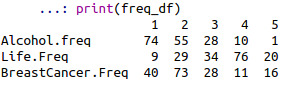
STEP 2: Check the frequency distribution for each of the three variables
At first we check the count and percentage for the variable “ALCOHOL CONSUMPTION”
Here is the code + the output :

Then, we check the count and percentage for the variable “Breast Cancer”

Then, we check the count and percentage for the variable “Life Expectancy ”

Note : the tables include the first 5 rows since showing the entire table would be long.
Thank you
0 notes
Text
Week1:Research Proposal
Hi all,
I'm Shinjini Chattopadhyay from India and I enrolled in Data Management and Visualization course by Wesleyan University, via coursera.
My project encourages me to develop a research question after carefully going through the codebooks and choosing something that interests us
Also, The assignments needs to be uploaded as a blog entry- I chose Tumblr in accordance to my convenience.
ASSIGNMENT 1 :
On this first assignment,we are asked to choose one from the five codebooks provided and two topics we want to research on.
Happy Reading :)
STEP 1: Choose A Dataset I chose the Gapminder codebook because of its simplicity and its focus on the world health indicators.
STEP 2: Identify a specific topic of interest.
RESEARCH TOPIC
Is there any association between the life expectancy and alcohol consumption?
Step 3: Identify a second topic that you would like to explore in terms of its association with your original topic.
Looking at the Gapminder codebook, I saw the possibility to explore the possible relationship between alcohol consumption and life expectancy, and, also, after reading various research articles i wanted to check the possible correlation between alcohol consumption and the development of breast cancer in women.
Step 4: Prepare a codebook of your own.

Step 5: Based on your literature review, develop a hypothesis about what you believe the association might be between these topics. Be sure to integrate the specific variables you selected into the hypothesis.
Hypothesis
PRIMARY HYPOTHESIS: There is a negative correlation between life expectancy and the quantity of alcohol consumption.
SECONDARY HYPOTHESIS : An increase in alcohol consumption increases the chances of developing breast cancer.
Background & Literature review
There are numerous studies showing that an increase in the alcohol intake can lower one’s life expectancy.
Lead author, Dr Angela Wood, of the University of Cambridge, said: "The key message of this research for public health is that, if you already drink alcohol, drinking less may help you live longer and lower your risk of several cardiovascular conditions."
The study analyzed 599,912 current drinkers in 19 countries, none of whom had a known history of cardiovascular disease, and found an increase in all causes of death when more than 100g of alcohol was consumed every week.

Also, study shows drinking alcoholic beverages -- beer, wine, and liquor -- increases a woman's risk of hormone-receptor-positive breast cancer. Alcohol can increase levels of estrogen and other hormones associated with hormone-receptor-positive breast cancer. Alcohol also may increase breast cancer risk by damaging DNA in cells. Compared to women who don't drink at all, women who have three alcoholic drinks per week have a 15% higher risk of breast cancer. Experts estimate that the risk of breast cancer goes up another 10% for each additional drink women regularly have each day.

References :
[1] Shkolnikov, V.; McKee, M.; Leon, D. Changes in life expectancy in Russia in the mid-1990s. The Lancet, v. 357, n. 9260, p. 917-921, 2001.
[2] Trevisan, M. et al. Drinking Pattern and Mortality:. Annals of Epidemiology, v. 11, n. 5, p. 312-319, 2001.
[3] JNCI: Journal of the National Cancer Institute, Volume 78, Issue 4, 1 April 1987, Pages 657–661, https://doi.org/10.1093/jnci/78.4.657
0 notes