
Statistics
We looked inside some of the posts by skipieohhhhh and here's what we found interesting.
Average Info
Notes Per Post
7K
Likes Per Post
3K
Reblog Per Post
4K
Reply Per Post
0
Time Between Posts
5 days
Number of Posts By Type
Text
17
Last Seen Tumblr Blogs


Fun Fact
130K people were victims of a chain letter scam that affected Tumblr in May 2011.
Text
Andy Goldsworthy
Goldsworthy made work with snowballs, ice and natural materials, the melting process on watercolour paper echoing the processes in the natural world.
The drawings in this exhibition are made with snowballs, ice and natural materials from different locations: Borrowdale graphite, Borrowdale slate, Derwent water, Drumlanrig clay, Pit clay, and earth from the source of the Scaur River, Penport. The process of the snowballs melting on watercolour paper and forming the drawings echoes processes in the natural world: erosion, sedimentation, ice and flow. The visual structure and colour qualities thus produced are extraordinary.
The Ice and Snow Drawings have two main sources. The first Arctic Snowballs of 1989 resulted from an experience Goldsworthy had while out hunting with his Inuit guide Luti and his son. Coming across a breathing hole in the ice pack, Luti circled around at a distance, moving towards the hole, while his son stood ready with his gun in anticipation of the rising seal.
Dark blood dripped and trailed in the snow as the sledge moved off, carrying carcass and hunters. The seal was caught by the hunter’s instinct and knowledge of its survival habits.
The second source for the Snowball Drawings was an experience made by Goldsworthy following an exhibition at Glasgow’s Tramway. His large snowballs, which gradually melted during the course of the show, left an afterimage caused by the ‘impurities’ in the snowball.
On another occasion in the Arctic, Goldsworthy and his guides came across a polar bear’s tracks in the snow. Running parallel to this were the tracks of a mechanised skidou. Luti’s comment was simply: “dead bear.”
This experience of immersion in the natural world continues with the snowball drawings, but other questions arise. In the drawing with graphite from Borrowdale – one of the main sources for this material – there is a dual process: on the one hand natural, on the other with the artist’s participation. Who, or what, is making the drawing?
The oeuvre of artist Andy Goldsworthy utilises ‘found’ natural objects like leaves, rocks, ice and sticks to create captivating, often ephemeral interventions into the natural landscape that remind us of the power of natural beauty and the continuously changing seasons. Architectural writer Eva Menuhin discusses some of the traits in his work, which has recently become more monolithic yet is still concerned with movement, natural materiality and time, as seen in his work in progress ‘Hanging Stones’.
0 notes

Text
Andreas Eriksson
Hovering between abstraction and figuration, Andreas Eriksson’s meditative works can be interpreted as patchwork topographies or details of organic forms such as trees, earth and rock formations.
Eriksson’s artistic practice encompasses a wide range of media including painting, photography, sculpture, tapestry and installation. Rendered in earthy and botanical hues, his works are understated yet possess a poetic quality which has a lasting effect on the viewer. The emotional intensity of Eriksson’s work is the result of a sustained exploration of his response to the natural world.

Weissensee No. 12, 2018-2019
Linen
94 1/2 × 55 1/2 in | 240 × 141 cm
‘Weissensee No. 12’ is part of a recent series of large-scale handwoven tapestries by Andreas Eriksson. Rendered in subtle hues of undyed yarn, this body of work offers a unique window onto the artist's rural surroundings in Medelplana, Sweden. Eriksson sources the tapestries' linen from multiple sites in Sweden, linking each piece to a specific geographical location. Hovering between abstraction and figuration, this meditative work can be interpreted as a patchwork topography or a detail of an organic form. Tassels and loose threads hang freely from the surface, conjuring up associations with cascading waterfalls, patches of lichen and trees rustling in the wind. Variations in tone and structure between different types of yarn create striking modulations of light and depth, lending the work a painterly quality.
This new body of textiles expands the artist's formal language and demonstrates how he translates his paintings into tapestries
"It is impossible to trace any topography, scenery or perspective in Eriksson’s [works]. They have a strong hallucinatory power in that their lack of north- or southward orientation produces a disjunction, making it hard to understand where the sky and the ground lie."
– Filipa Ramos
vimeo

Andreas ErikssonWeissensee No. 19, 2019
Linen
222 x 140cm (87 3/8 x 55 1/8in)
0 notes


Text
Emma Larsson
https://www.instagram.com/zebrakadebra/?hl=en

Emma Larsson (a.k.a. @zebrakadebra) is a Stockholm-based artist and illustrator. Her work strikes the balance between colorful dreamscape and inarticulable melancholy. Emma has evolved her practice to include expressive and organic watercolors, alongside paintings created with oil and acrylic. She describes her work as an ongoing exploration without rules and conventions, continually generating new forms, patterns and themes. Emma has collaborated with brands and agencies including Rachel Comey, Show Studio, and Winsor & Newton.
Swedish artist Emma Larsson known for her poetic, playful, and contemplative illustrations.

Eccentric Abstraction II - Framed, 2024
Watercolor and Mixed Media on Paper
Larsson’s work is characterized by a synergy between her, the materials, and an unknown presence she calls “force.


Even though she went to art school for a few years, between drawing, painting, and sculpting, she considers herself self-taught, an outsider, experimenting with all kinds of materials. She is a creative explorer. Her work is in constant flow. It can be described as poetic, playful, contemplative, intuitive and intriguing.
The creation comes from a flow of energy, memories of nature, and freedom Emma’s paintings are purely instinctive, they source from pleasure and freedom
The result is somewhat uncanny; abstract images which feel familiar and yet strangely unknowable, perhaps like beasts from the outer reaches of space, magnified microscopic fungi, or a not-quite-discernible dream motif. They are deeply appealing in a way that is hard to articulate. You work with watercolours, acrylics, inks and oils. What is it about mixing up these mediums that creates the effects you like? For me, the paper I use is as important as the paints; its structure, thickness and ability to absorb liquids all matter a lot to me. Every piece has several layers, as I add different paint after each drying session until it feels finished. Each painting takes a couple of days to complete but I always work on a set of multiple paintings simultaneously.
"I would describe my works as intuitive expressions. I rarely have a set idea when I start the process, so the outcome is always a result of experimenting."
On your Instagram, you say that you believe that there is “No beauty without strangeness”. Can you tell us a bit more about this? Beauty is important, but it is subjective. For something to be beautiful, it doesn’t have to be pretty. Personally, I’m not drawn to the “obvious beauty” we’re told to admire in the pages of fancy magazines. There has to be some flaw for me to feel interested; it’s the imperfection or the awkwardness that attracts me.
Her use of watercolor is quite the sight to behold as she expertly fuses colors together that seamlessly bleed into a delectable kind of complexion. The tints of color come together and meld into an organic melange that ebbs to the flow of the water utilized.
the use of symmetry
Larsson’s paintings incorporate this design element in most of her works but one can see there is a deliberate imperfection when mirroring the two sides of the painting.
Drawing inspiration from nature, one can notice some familiar forms such as flowers and birds.
2 notes
·
View notes
Text
Color field Painting
The term colour field painting is applied to the work of abstract painters working in the 1950s and 1960s characterised by large areas of a more or less flat single colour.
From around 1960 a more purely abstract form of colour field painting emerged in the work of Helen Frankenthaler, Morris Louis, Kenneth Noland, Alma Thomas, Sam Gilliam and others. It differed from abstract expressionism in that these artists eliminated both the emotional, mythic or religious content of the earlier movement, and the highly personal and painterly or gesturalapplication associated with it. In 1964 an exhibition of thirty-one artists associated with this development was organised by the critic Clement Greenberg at the Los Angeles County Museum of Art. He titled it Post-Painterly Abstraction, a term often also used to describe the work of the 1960 generation and their successors.
0 notes
Text
Buckling of paper
Watercolour paper warping occurs when the fibres in the paper absorb moisture unevenly, causing it to expand and contract in different places. The flat surface becomes warped and it dries stuck in this position
Let’s imagine that when you paint on your paper, you’re adding water to the top of it. Those fibres will expand, yet the underneath of the paper will be dry. This causes the top of the paper to lift up as it grows, while the bottom pulls under, creating an arch.
And if you create puddles of really wet patches when you paint, the surface will be wetter and drier in different areas, creating uneven warping.
As the paper dries, the fibres will decrease in size again, but the paper may remain a little warped.
Bonus: How to stretch your watercolour paper
Prep your paper by thoroughly wetting both sides in a layer of clean water. Lay out on a flat surface like a wooden board and pull and stretch the paper tight. Tape down the edges with strong painters tape, or staple it down. Allow to dry completely before painting on it.
Some artists swear by stretching their papers, but I find it difficult and fiddly to lift them off the board. You’d probably have to just cut the edges off next to the tape because it won’t peel, and this is too faffy for my impatient brain. But if stretching works for you, go for it and enjoy warp-free painting!
0 notes
Text
Kathy Prendergast
Intimate in tone and subject matter, Kathy Prendergast’s practice combines drawing, sculpture and installation. What might appear minimal or elusive at first glance can encompass a complex web of emotional, personal and political resonances. Proximate to the body and connecting subjective reflections on the world, her work explores a potent cluster of issues including power, identity, landscape, memory, geography, and family. A connection between the body and landscape, often manifested through mapping, can be traced back to the beginning of her practice. Often using redaction or removal as a device, creating negative space through black ink, coloured paint or white paper, the artist erases or overwrites geographic expressions of power. Prendergast points out the subjectivity of maps, their inherent colonialism, and the ultimate fragility of borders and territories over time. Though delicate, fragile and usually on a human scale, her works also point towards the infinite – suggesting the vastness of space or the constellations of the sky. Prendergast’s work is methodical – the product of slow, repetitive processes requiring patience, precision and devotion. Faithful to mark-making, drawing and hand-crafting as well as the revelatory potential of sparking unfamiliar connections with everyday objects, her work is enigmatic, eerily beautiful and emotionally resonant.


Throughout her career Kathy Prendergast has received international critical acclaim for her work with cartography
Kathy Prendergast’s Black Map series, from which these works are selected, are produced using printed motorist maps almost entirely obscured with ink. Tiny white spots that represent towns, villages, and cities pinpoint places of habitation and, up close, the place names, road numbers, and contour lines peer through the surface. From afar the ink appears opaque and the effect is that of a night sky dappled with strange and unfamiliar constellations.
youtube
Everyone loves a map, everyone loves a globe


0 notes
Text
The Lavit Gallery
exhibition report
Annual Members exhibition
27 February- 22 March
this exhibition is of artwork by the Lavit Gallery artist members.
It includes work with; print, painting, sculpture, photography, ceramics and textiles.
it has a wide range of artists from amateur to professionals
out of the 134 artists only 69 are exhibiting.
there is not distinct theme in this exhibition
Curator: unknown
location: Wandesford Quay, Clarke's Bridge, Cork
Installation and display: the installation was very traditional, large open space with white walls and everything was hung our put on a plint. the Lavit Gallery is a commercial galllery aswell so I imagine that the works where hung in a way to not only displayed but also sold.
some artists in the show are: pauline Angew, Jo Ashby, Patty Atkinson, Patricia Beran, Toni Boris.


0 notes
Text
Wangechi Mutu
“I create as a way of reinvigorating myself by replacing and reworking images and ideas that never fully represented me and the women and the people I was born from and who made me,” Wangechi Mutu has said.1 Born in Nairobi, Kenya, in 1972, the artist relocated to the US in the mid-1990s to study fine art. Her experience of migration and her diasporic identity have infused the artist’s creations with an expansive philosophy of belonging: “If a plant has just one root that doesn’t necessarily mean it’s going to stand straight and strong. The idea of having many roots, of having your feet really grounded in different places, is extremely empowering for me.”
Mutu is committed to reshaping the narratives of womanhood; by doing so, she challenges Western culture’s racist and misogynistic tenets
In her collages, sculptures, videos, and performances the figure of the woman is depicted with the complexity and profundity of a timeless archetype
As the artist explained the origin of her collage-making practice,
“I took these idealized stereotyped images of women and Eden-like ‘tropical’ images of Africa to create other images, tension-charged, potent, because they were full of my own emotional upset at the original ones…I was taking apart the images of a world that refused to acknowledge me.”

In Yo Mama (2006), the heroine—modeled after Funmilayo Anikulapo-Kuti, the Nigerian feminist and mother of the legendary Afrobeat musician Fela Kuti—embodies the role of Eve, the biblical first woman. She stands atop a beheaded snake, piercing its severed head with the stiletto heel of her boot. The serpent’s coiling body unravels placidly through the pink outer space, holding the two panels of the collage together as its tail wraps around a distant planet. Mutu’s cosmic composition utilizes the potent symbol of the snake in all its richness: the cunning creature associated with Eve’s damnation morphs into a mythical, celestial being whose dead body bridges two planets, while its wounded phallic form evokes oppressive masculinity. In Mutu’s retelling of this foundational tale, Eve defeats the snake and emerges victorious, taking control of her own story.
In Mutu’s practice, mixing materials through collage, bricolage, and montage is not a mere formal choice but a guiding principle of resilience and regeneration.


youtube


0 notes
Text
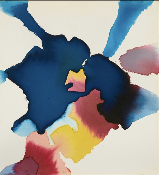
Alice baber
“When I first conceive of a painting, I must feel it, I hear it, I taste it, and I want to eat it. I start from the driving force of color (color hunger); then comes to a second color to provide light, luminous light. It will be the glow to reinforce the first color. I then discover the need of one, two, three, or more colors which will indicate and make movement, establish the psychodynamic balance in midair, allow freedom to take place, add weight at the top and bottom of painting, and create mythical whirlpools between larger forms.”
Alice Baber, Color, 1972
Alice Baber (1928-1982) was an American abstract expressionist painter, best known for the organic, biomorphic forms she painted using a staining technique which allowed her to explore pure color and elicit a sense of radiant light.
Baber’s stylistic development during the period between 1958 and the mid-1970s is characterized by a series of experiments with color and technique. Having turned to abstraction in 1958, she began exploring a monochromatic approach to painting, primarily using shades of red. By 1960 Baber came to add yellows, greens, and lavender to her work. She gradually incorporated a growing variety of colors into her canvases, a process that reached its hiatus by the mid 1970s when she finally introduced black to her work, achieving a new range of effects and subtleties.
Her evolving approach to painting is also characterized by her choice of materials. In the first half of the 1950s she worked primarily in oil, but soon began to dilute her paint in order to emphasize the different shades of color, eventually expanding her practice to include also acrylic on canvas and watercolors on paper as alternatives to oil. Watercolors in particular lent themselves more easily to her growing interest in transparency and luminosity, as well as her interests in joining light and color in a kinetic fusion. Baber also worked with acrylic. Working in both mediums in parallel led to discoveries that altered the course of Baber’s painting, a method of ‘sinking’ (or ‘staining’) and ‘lifting’ to create abstract, organic forms – a visual style that has since become her signature. Color would remain central to the artist’s practice throughout her career, a theme on which she wrote at length in several publications, and which became the subject of exhibitions the artist curated, including Color Forum, a large-scale group exhibition held at the University of Texas, Austin, 1972.


Post-war feminist artist and lithographer Alice Baber produced brilliantly colored abstract expressionist oil and watercolor paintings by staining her canvases with rounded biomorphic forms. Using a technique of pouringdiluted oil paint onto a canvas in layers, she sometimes experimented with variations of a single hue and at other times created a purposeful interplay of different tones, as in The Song of the Wind (1977). Baber referred to her attempts to relay feelings through color as a “color hunger,” and exploration of “the infinite range of possibilities.” A member of the cooperative March Gallery in downtown New York, where she held her first solo exhibition in 1958, Baber was married to noted Abstract Expressionist painter Paul Jenkins. Baber’s work can be found in the collections of the Met, the Whitney, the Guggenheim, and the National Museum of Women in the Arts.
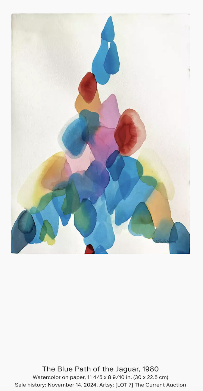
Wheel of Jaguar, 1982
Watercolor on Paper 12 × 11 in | 30.5 × 27.9 cm

The Light Inside the Mountain, 1978
Oil on canvas 33 × 55 in | 83.8 × 139.7 cm

Just Arrived, 1962
Oil on canvas 57 × 44 in | 144.8 × 111.8 cm

UNTITLED
watercolor on paper, 22 x 30 IN unframed, 33.5 x 41.5 IN unframed
0 notes

Text

Alice Baber (American, 1928-1982), The Light Inside the Mountain, 1978. Oil on canvas, 32 7/8 x 55 in.
58 notes
·
View notes
Text
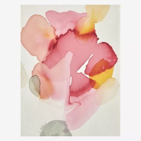
Paul Jenkins
The paintings of Paul Jenkins have come to represent the spirit, vitality, and invention of post World War II American abstraction. Employing an unorthodox approach to paint application, Jenkins is as much identified with the process of controlled paint-pouring and canvas manipulation as with the gem-like veils of transparent and translucent color which have characterized his work since the late 1950s. Born and raised in Kansas City, Missouri in 1923, Jenkins later moved to Youngstown, Ohio. Drawn to New York, he became a student of Yasuo Kuniyoshi at the Art Students League and ultimately became associated with the Abstract Expressionists, inspired in part by the "cataclysmic challenge of Pollock and the total metaphysical consumption of Mark Tobey." An ongoing interest in Eastern religions and philosophy, the study of the I Ching, along with the writings of Carl Gustav Jung prompted Jenkins' turn toward inward reflection and mysticism which have dominated his aesthetic as well as his life.
Paul Jenkins (b. 1923, Kansas City, Missouri, d. 2012, New York, New York) was an American painter who is celebrated for his dynamic abstractions in oil, acrylic, and enamel. His paintings are characterised by their masterfully controlled, multilayered washes of pigment that meet on canvas in oceanic pools and eddies. While the artist’s work was initially received in the terms of American Abstract Expressionism, his sustained, rigorous inquiries into the physiological and spiritual aspects of colour, what the artist termed its “phenomena,” opened it to new avenues of expression that would outlast numerous movements throughout his six-decade career.
Coming to artistic maturity in New York at Abstract Expressionism’s height, Jenkins befriended many of the movement’s leading figures before decamping to Paris, which would serve as his second base of operations for the rest of his life. In Paris the painter established the conditions for his now-celebrated process, in which pigments are coaxed along the surface of a canvas that has been primed and buffed to a silken plane. By manipulating the angle of the surface on which paints traveled and by guiding their movements with an ivory knife, Jenkins produced a body of work that is striking for the singularity of its maker’s conviction while evidencing his spiritual restlessness and continual seeking.

Phenomena Umbra
1982
Watercolour on paper
31 �� x 43 ¼ in. (79.4 x 109.9 cm)
Framed: 33 x 45 ½ in. (83.8 x 115.6 cm)

Phenomena Noh Veil
1969
Acrylic on canvas
39 ⅛ x 39 ⅛ in. (99.1 x 99.1 cm)


Paul Jenkins (1923-2012) is a major artist in post-war abstraction whose work is recognized for its luminous flows of color combining opacity and transparency to both emanate and reflect light. An early pioneer of poured paint, Jenkins worked on paper and primed canvas. His paintings have achieved prominence for the fluidity of their forms as well as their gem-like veils of color which have characterized his work since the 1950s. Full of verve with a profoundly spiritual aspect, his paintings have a natural feeling to them, with rarely any trace of the artist’s hand. “A painting” he said, “should be a world not a thing.”
Jenkins made his vibrant compositions by pouring paint directly onto the canvas, then tilting it so the paint dripped, bled, and pooled into fluid, diaphanous washes that resembled ceramic glazes.
His palettes and methodologies can evoke the experiments of fellow abstract titan Helen Frankenthaler.

Phenomena Emanation of Host,,
1989
Watercolour on paper
43 3/10 × 31 in | 110 × 78.7 cm

Phenomena Set the Compass,
1994
Watercolour on paper
43 3/10 × 31 1/10 in | 110 × 79 cm
“It is a presumption on my part but after all, that is one of the expanding possibilities of Abstract painting: that which makes something felt which is not explicitly seen.”
0 notes
Text
Yahoo Hortal
https://yagohortal.com/
Most artists actually think in terms of light and dark, and not so much color. But, Yago, you’re a colorist too" Peter Halley
Yago Hortal (Barcelona, 1983), studied Fine Arts at the University of Barcelona and the University of Seville. In 2007, one year after graduating, he wins the 49th Prize for Young Painters. The following year, at only 25 years of age, he began to exhibit not only in Spain but also in the rest of Europe and the United States. His paintings maintain a tight relationship between the work of art and action painting itself. The canvas forms part of a performance in which the artist consciously creates spontaneous color forms in an infinite gamma, expressing passion and vibrancy. The painting seems to come out of the canvas, causing a desire to touch it and creating textural sensations.
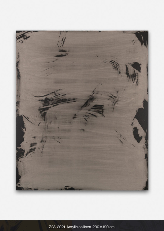


Yago Hortal paints in vivid, sometimes fluorescent acrylics, smearing, marbling, and splattering the material in thick, abstract brushstrokes onto large-scale white canvases that pop with color. Hortal works on several paintings simultaneously, responding to the colors both impulsively and with premeditation, and often letting the paint drip down the canvas.
“I look for a balance between chaos and order,” he has said, “something like a combination between a chess game and a boxing match.”

Z85, 2024
Acrylic on linen23
3/5 × 19 7/10 in | 60 × 50 cm
Giant, sweeping waves and splashes of thick paint flood our souls in vibrant colour. Inspired by Abstract Expressionism, the art of Yago Hortal has a direct connection with the viewer, creating sensations that balance between chaos and order. The contemporary artist paints with spontaneous yet also planned action. Brushstrokes that smear, marble, and splatter, recreate the face and personality of colour in our contemporary age.
Yago Hortal was born and raised in the city of Barcelona. He uses industrial colors and materials that reference an urban experience. Within his studio, he listens to different music genres that mould his emotional state before painting. As energy flows onto the canvas, it is captured and preserved as a physical signature.
“What matters to me is that the rhythm of each brushstroke can be reflected in a single gesture…each brushstroke acting as a reflection of the moment it was made. That’s why all my paintings are also a kind of personal diary.” - Yago Hortal
characterized by its intense and vibrant chromaticism.
“ I am known for very gestural artwork, very liquid, with a very marked gesture, very clear, as well as a very thick density and exuberant color.”
0 notes