
Don't wanna be here? Send us removal request.
Statistics
We looked inside some of the posts by skylixuezi-blog and here's what we found interesting.
Average Info
Notes Per Post
0
Likes Per Post
0
Reblog Per Post
0
Reply Per Post
0
Time Between Posts
1 month
Number of Posts By Type
Text
5
Last Seen Tumblr Blogs


Fun Fact
Mobile US users spent an average of 115.8 minutes on Tumblr app monthly.
Text
206
Preventing Chinese culture from erosion of K-pop culture
The Korean pop culture is sweeping East Asia. When the popularity of the Korean pop culture is increasing, more and more people pay attention to it, the products of the k-pop culture such as Korean dramas, music, fashion and tourism are boosted. As the Korean television drama aired China, the fans of them are crazy to chase the things that showed in it. China, as one of countries where the Korean culture is popular, whose culture is confronted with the problem of the erosion by the Korean culture. Mostly, people in China blindly follow their idols or other things the exported from Korea, which is weakening the power of Chinese culture. In 2001, a term “Korean wave” or it can be called “Hallyu” in Chinese is first coined by Chinese social media. Then the culture from Korea is concerned by the mass media in China, k-pop culture is The emergence of the new term leads to a new popular culture in China. The Chinese traditional culture is not the regarded as a main stream any more and the Korean culture is gradually replacing its position. In 2016, the Chinese government promulgated “Korean’s Ban”, which limit and control the development of Korean entertainment media, tourism and business in China. Due to the fever of Korean culture, the phenomenon influences the development and expending of Chinese culture. Because of globalization and exchanging culture, culture integration is a normal phenomenon. Chinese government uses policy to interfere the culture problems between two counties cannot solve this kind of problem permanently. Although the policy can work on Korea, no one can guarantee cultures from other country besides Korea won’t develop in China. In this paper, I argue that instead of trying to limit Korean influences in China, local government can emphasis the significance of Chinese culture as a form of countermeasure.
Korean drama fever
Korean wave has spread a lot of Asian countries and it gains the most popularity and success in China. In 2005, the Korean TV drama “Daejanggeum" aired in China and make Chinese audiences obsessed with it. Even the General Secretary of the Communist Party of China is into the drama and prefer to watching it when he is free. After that, more dramas from Korea are introduce to Chinese audiences and brigs the fever. From the research, it says that China and Korea have long historical relationship and similar culture background. Korean culture is influenced by the civilization of Huaxia and because it has the same school of thought as China. The values and philosophy are similar between Korea and China, and in this way, the similar expression of feeling and thoughts in Korean dramas can be accepted easily by Chinese audiences. While, the similar value doesn't represent the same life style between these two countries. Most Chinese people are trying to simulate the character in Korean dramas, such as lifestyle, hairstyle and dressing, etc. Gradually, more and more people give up their original habit to blindly follow a world that only created for dramas. Korean Tv drama not only brings people more ways of entertainment but also lead them to another culture.
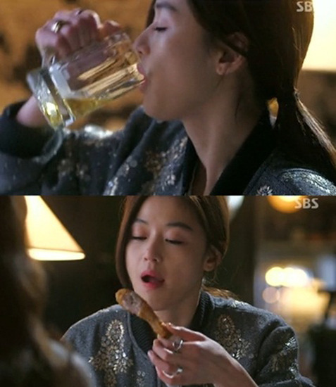
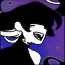
Figure1. Main actress in My Love From the Star eating fried chicken and beer
In 2013, a Korean TV drama called My Love From the Star aired and has aroused great repercussions in China. The main actress in the drama loves eating fried chicken and beer and she prefers the combo at the time of first snow. The combo of fried chicken and beer is a potential advertisement in drama, Chinese people who are in the Korean wave are supposed to some special combination the they never tried before. Although everyone knows that the combo is not healthy at all, people are likely to try and it is obvious that the effect from Korean drama is undoubted.
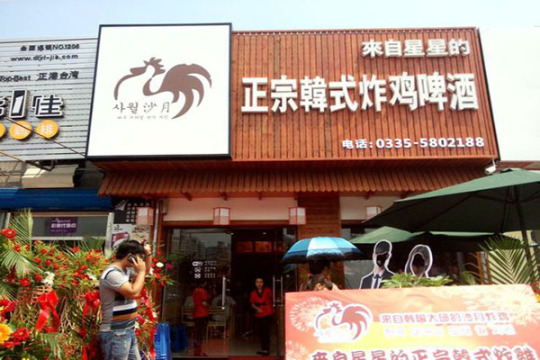
Figure2. Restaurant of fried chicken and beer in China After the Korean Drama My Love From the Star, lots of restaurant started business to serve fried chicken and beer. Food is one the examples of many other booming business. The are some bracelet or gift shown in dramas may be popular after broadcasting the TV dramas. You can search the same style and the name of the drama in an online store called Taobao and customers will have several access to buy what they want that wearing on the actors. The Korea’s Ban limit the chance for Chinese audiences access to the Tv dramas, and some business such as catering industry, fashion industry and cosmetics industry. Despite all this, some fanatic cannot stop their pace chasing the Korean wave. The limitation can not control them at all. People still have more ways to gain the resources of Korean TV dramas and share to fellows. Policy cannot limit the spreading craze of Korean pop culture. The erosion of Korean culture can just be faded by regulation but it is hard to disappear. China and Korea that belong to the East Asian Confucian circle of culture, share the similar values and thoughts. The reason why a culture can be eroded by another is that China is lack of their own traditional culture.
Re-making TV shows in China On the TV shows, the directors and producer can implement their thoughts and values. The TV shows will entertain the audience of their own country first. Besides, most TV shows can express the culture behind it. In Korea, there is a hot show called ‘Show Me the Money’ which is a competition between Koran rappers. Rap is related to hiphop culture that distant from traditional culture. Korean want to let more Korean audiences know more about the culture and the combination of Korean and rap is a form of culture integration. Even though Chinese local government has announced the policy Korean’s ban and limit the media development from Korea, the remaking of the same TV shows is as normal as before. A new TV shows called The Rap of China aired in 2017 which has the similar setting and rule for the competition. When the people in China is encouraged to protect their own traditional culture and prevent the erosion from others especially Korea, local people still try to duplicate some similar products from other culture. Despite of the remaking shows, the original ideas and thoughts are from other culture. Changing the part and the language of a show cannot create a totally new one that can expose another culture. Another TV show called “Where are we going, dad?” is broadcasted in China and gained popularity from Chinese audiences. China has Confucianism which educate people etiquette, thoughts and philosophy and it has a long history of this culture.
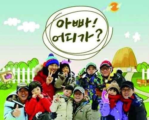
Figure3&4. Where are we going, dad? Korean version(Top) Chinese version
“Where are we going, dad?” is a proper show that can show the new generations what kind of culture they are in and educate them by the interesting way on TV. For Chinese TV programs, directors seldom create some with fun, some are too standard and give a boring sense to audience to see more about the show. Some culture can be discover by people and be imperceptible for people. Remaking is a good way to learn some ideas and create things new but it not a way for producers to duplicate ideas. The lack of creating own TV shows in China result in the less use and development of Chinese culture. Traditional culture need to be innovated and it should be integrated with modern culture and applied to new media and showed to audiences. The reason why Korean pop culture can develop and succeed around the world is the fusion of Korean and modern pop culture together. Lots of countries are influenced by k-pop culture but most of them still preserve their own culture as the main stream. On the posters of two version of ‘Where are we going, dad?’, it is hard to see obvious distinction except for Korean and Chinese characters. Chinese version should create some part with Chinese characteristics such as paper cuttings or some famous landscape or architecture. Mass media is a fast and effective way to express the thoughts and values, showing and enhancing the Chinese traditional culture can influence mass audiences more than other approach.
Idol group influenced by K-pop music Korea has three greatest entertainment company: SM, YG and JYP. The three companies are supposed to making stars. When the Korean wave is not as well-know as now, people in China just know some singers and groups from Korea. Then, more Chinese go to Korea to study and are willing to enter these companies as a trainee. Trainees are people who are not debuted and still training to be recognized. Some Chinese stars started their career in a Koreans group and be known by fans and audiences. Kris Wu is one of them. Kris joined a group call EXO and gain lots of fans. Then he left EXO by some personal reason. These Chinese stars gain enough popularities and fans in a Korean group, and then they will leave the group and backed to China themselves. This is a better way for them to become popular rather than work hard in China by themselves. There is no doubt that Korean wave affected Chinese entertainment industry a lot. People are addicted to the Korean pop culture and some stars take advantage from the wave to get a better development. For this reason, more and more Chinese stars are influenced by the Korean pop culture. The way they dressing and the style of dancing tend to be like a Korean star. The whole entertainment circle is also have tendency to be Korean. Further more, some Chinese company tried to make the group in a similar Korean style. At the very beginning, China don't have the group with more than 10 people, the proper and regular group in China have 3 people in it. The Korean wave boosts the debuting of group with more than 10 people. Korean entertainment company prefer to create a group above 10 people. Then, in order to adapted the market of the mass audiences, more and more companies try to make a bigger group. A group called SNH48 is well-known now in China. The duplication not only occurred in TV shows but also in performing styles. Actually, a popular group of three boys called TF-boys is well-known in China than the SNH48. TF-boys is debuted in 2013 and they set off a craze when their first song was announced. They are formed as a fresh, youthful and healthy figure to the audiences, which haven’t emerged in the Chinese entertainment circle before. This is one of the successful example for China to create product or stars by their own creativity. Because of the Confucianism, people in China tend to in to the figure that are fit to their age. Some figures from Korean culture like the musician called Trouble Maker doesn't make sense for people who prefer a positive attitude towards life. Taking examples from others cannot erase the original cultural background and creating something new can emphasis Chinese own traditional culture.
Entertainment industry drives other industries The spread of Korean wave brings more commercial opportunity to Korean. According to the research(Ju Young, G., 2012), the quantity of the plastic surgeons has a remarkable increase over past 10 years and a part of proportion are occupied by the stars in Korea. The plastic surgery is more and more popular these years. These changing of the idea in China because of the influences by the Korean entertainment media. For the Chinese traditional idea, the body and everything you have are gifted by parents and people are not supposed to destroy or change it except for getting the admission from parents. The plastic surgery is not accepted by most of the Chinese at first and only a small portion of people are willing to try the surgery. Along with the increasing knowledge about plastic surgery from Korean idols and the high success rate from the hospital, more and more are trying to do it. Because when people are watching a TV show or dramas from Korea, they won’t consider the face are as beautiful as they born, which gives them a feeling that they can become them if they try the surgery. The traditional idea in China are broken by the effect of Korean media. As long as the thought has formed, it is hard to change and the idea will be delivered to the next generation. It is not negative aspect, and it represent some innovation of Chinese thought and tend to be more open. For this point, the policy that announced by the government will not be efficient to today’s situation. Besides, the tourism is another booming industry that pushed by the Korean wave, more people are willing to visit the place that shown on TV and dramas, they want to experience the same places as the shows. Before the policy announced, Chinese visitors make up about 47% tourists in Korea, however, after the Korean’s Ban was announced, the rate is falling by 27%. Although the policy limit the amount of tourists from China to Korea, the desire to Korea cannot be stopped. The regulation of the tourism is just control the amount of tour group but if people want to travel there by themselves, it is easy and out of the policy. Purchasing agency is another job promoted by the Korean wave. Instead of using the cosmetics produced by China, people prefer to choose the products that some Korean idols represent.
Instead of limiting the Korean wave swept in China, Chinese government to should realize the significance of how to emphasizing Chinese culture. The first step is not to contradict the success of the Korean wave in China. The popular things cannot be the classical and permanent but it has the particular reason to succeed. The primary reason that Korean pop culture can influenced China and even Asia and America is the system. The social media is the fastest and most efficient way to deliver informations through long distance. The Korean government decides to spread their culture to make the country overcome the economies crisis at the beginning. Then they tried to use media as a way to show their modern culture and something new to mass audiences. The whole system of the entertainment industry is becoming more and more impeccable thorough their development. From the shows to producers and then to the TV station, they control and grasp every part of the system. Besides, as the paper illustrated above, the entertainment industry motivate other industries as well. The idols who are welcomed in the TV shows will represent for some brand of food, cosmetics or fashion, which will motivate the development of the related business. The purpose of Korean wave is to be popular. It represents the pop culture. The entertainment companies train successive generations of a new type to give a felling of freshness. Even though there are lots of negative news exposed, the popularity of Korean pop culture cannot be hit down. That is the most powerful thing that the Korean wave can develop in recent years and keep acclaimed. The third reason that the Korean pop culture is successful is that all products from this culture give a positive attitude towards dream. Everyone is yearn for the good things and the Korean pop culture has the deeper meaning behind it. One thing that cannot be denied is the positive attitude Korean wave gives people. For China, we have the long history of our culture and these culture should make Chinese proud of it. The Korean pop culture is a integration between two cultures but it benefit Korean culture all over the world. Chinese culture is popular around the world and more foreigners from different country try to learn Chinese. There are 512 Confucius Institutes in the world in about 140 countries. To develop and emphasis Chinese culture, the culture integration is necessary and unavoidable. The negative part of the Korean wave is some people blindly follow the wave. This phenomenon will decrease any kind of culture related to it. Chinese entertainment industry tend to have this problem. For example, if the shows or dramas have been aired in Korea and gain lots of popularity, China will prefer to buy their copyright and remake or reproduce a similar one. The elimination of remaking is necessary. On the other hand, the remaking should be meaningful for audiences but not only change the language and the guests of the show. Creative about Chinese own culture and spread them can be the better countermeasure for preventing the erosion from the other cultures.
References
Figure1.Retrieved November 16, 2017, from https://goo.gl/images/aaoXu9
Figure2.Retrieved November 16, 2017, from http://image.baidu.com/search/index?tn=baiduimage&ct=201326592&lm=-1&cl=2&t=12&word=炸鸡啤酒%20店铺&ie=utf-8&fr=news
Figure3&4. November 16, 2017, from https://www.google.ca/search?client=safari&channel=mac_bm&dcr=0&biw=1278&bih=650&tbm=isch&sa=1&ei=A-4NWovOKIqejwPD24L4DA&q=爸爸我们去哪儿韩国版海报&oq=爸爸我们去哪儿韩国版海报&gs_l=psy-ab.3...37830.38824.0.39286.4.4.0.0.0.0.49.185.4.4.0....0...1.4.64.psy-ab..0.0.0....0.Z_AVs-e169Y#imgrc=YFLbMLzGZuRgQM:
Ju Young, G., Goo-Hyun, M., Byung-Joon, J., So-Young, L., Jai-Kyong, P., Sa-Ik, B., & ... Myoung-Soo, S. (2012). Analysis of Scientific Papers Included in the Sciences Citation Index Expanded Written by South Korean Plastic Surgeons: 2001-2010. Archives Of Plastic Surgery, 39(1), 46-50.
South Korea tourism hit by China ban. (2017, July 11). Retrieved November 16, 2017, from http://www.bbc.com/news/business-40565119
Huang, X. (n.d.). 'Korean Wave' - The Popular Culture, Comes as Both Cultural and Economic Imperialism in the East Asia. Retrieved November 16, 2017, from http://www.ccsenet.org/journal/index.php/ass/article/view/3449/3123
(n.d.). Retrieved November 16, 2017, from http://journeyeast.tripod.com/korean_wave_in_china.html
Kim, P. (n.d.). Why Is China Obsessed With Korean Pop Culture? Retrieved November 16, 2017, from http://blog.tutorming.com/expats/why-south-koreas-pop-culture-succeeds-in-china
“Chinese Cremation, The Intriguing History of a Tradition”, 2002. Retrieved from http://www.memorialize.com/Chinese-Cremation-information.php Kanathala, A. (Author), “Life Moves - Story of life in stop motion animation!”, 2013. Retrieved from https://www.youtube.com/watch?v=Z7MR53vrw1w Colville, S. (Author), “A Stop Motion Interpretation of Durban Culture”, 2011. Retrieved from https://www.youtube.com/watch?v=6zZAg7CbnWk Pinterest Gallery Link: https://www.pinterest.ca/lixuezi15/206-proposal/
0 notes
Text
Journal 4
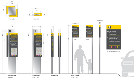
People will always be confused when they come to a new place, and the transportation signs and some way-finding signs will help them to get their destination. Designers need to know what the people in the field really need to make decision points. Which point they have questions? What questions they will have? How can they get right informations? The three questions need to be solved in the designing process. Besides, the sequence viewers encounter the information is the key to be considered when planning signage. Designers should think about the signages between stations to make them seamless. Wherever people are, in the street level or the platform area, the signage should be consistent and clear. Using template to organize informations is necessary to convey message and collect some data. Different signage need to be applied in different places. Signage need to be complex and colourful when in the use of place-making while for hospital it just need to emphasize simple functionality. When signages are used in vacation destination, it should be like exhibit to make people being intrigued. Sometimes, the combination of wayfindng and exhibit will explain and make the place. But the most important thing of the information is to provide a opportunity to viewers for interaction and make the excited about the vocation destination and want more. Designers should always have a customer satisfaction surveys and organize the sequence of their informations more alike as a narrative, ultimately, build up the interest of people and make them attentive to the signs. Icons and color are significant when design the signages. For icons, they have the ability of self-explanatory and it can reinforce some message that people already understand. As a powerful design tool, color can attract people’s attention. However, it has limitation because of people’s recalling system. Designers prefer to using color to convey different things which make people confused about it. So it is a good way to only use color when it needed. Some airport or transportation station will use couple of basic color and consistent which each other, to make people more clear.
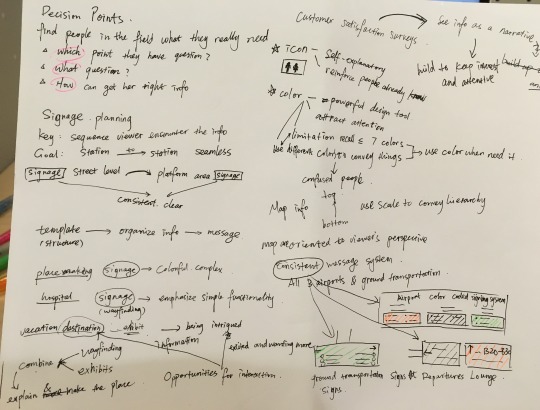
visual examples below
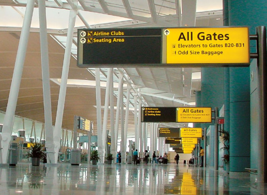
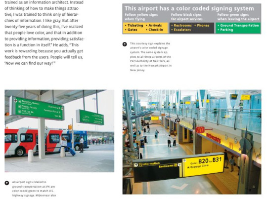
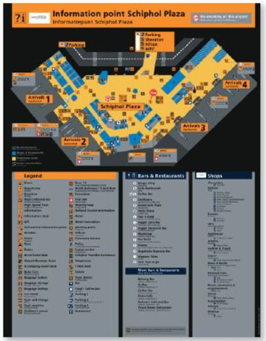
At the airport and some ground transportation, they use basic colors with the words as signs to direct people. Simple color will not confuse viewers and not make them ignore the important informations. The consistent color between airports and ground transportations make people more clear about and they will not mislead by the various color for different informations.
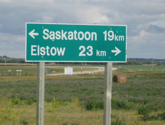
Maps used to direct people should orient in viewer’s perspective. Destination on the left side should also display in the left side of the map.
Good Examples
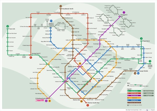
The map of subway in Singapore is a good example. Even though it uses lot of color, the purpose of the map is not like signs to direct people. It just need to clearly show different lines and the station on it. Color is necessary here to clarify the difference and it will help.
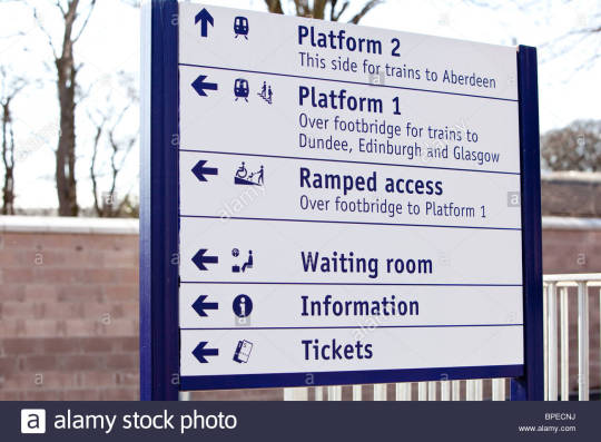
Here is a sign in railway station. It combines the icons with words to make it clear visually and it also reinforce the understanding of the viewers.
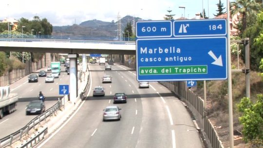
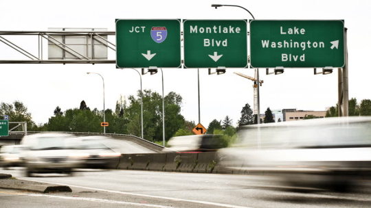
Combination of icon, color and word in highway to direct people.
Consistent color and structure at bus station.
Bad Examples
No differences between the signs to different direction, people will not too attentive react to it with only an arrow different between them. Mostly, it will make people confused a little bit or passed the branch without attention.
Code snippets
We can use the code to load image like some icons in the information design, to make it clear and visualize the words in a more simple way. Moreover, use div to design the signs in similar way and make them consistent in the same color and structure. We can also adjust the color to emphasize the important or different part to be attentive.
HTML
<div class="prop"> <img src="https://s3.amazonaws.com/codecademy-content/courses/web-101/unit-5/htmlcss1-img_diamond.png" width="60px"> <h2>Experienced</h2> <p>Our quarter century of experience in travel planning combines local knowledge with international taste. You'll be amazed at what we can provide!</p> </div>
<div class="prop"> <img src="https://s3.amazonaws.com/codecademy-content/courses/web-101/unit-5/htmlcss1-img_diamond.png" width="60px"> <h2>Luxury</h2> <p>We understand that you expect the world of your vacation - Jetsetter can provide once in a lifetime experiences at top of the line quality.</p> </div> </div>
CSS
.value-props { margin: 40px auto; width: 60%; }
.prop { border: 1px solid #FFF; padding: 40px 0px; margin: 5px 0px; }
.prop h2 { font-family: 'Quicksand', sans-serif; font-size: 24px; }
.partner, .prop { text-align: center; }
0 notes
Text
Journal 3
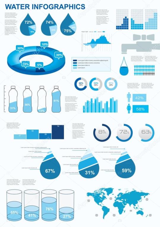
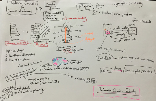
Graphics in information design acts an important role. In the reading, the author refer the content about technical concepts of general audiences. The main idea is the turn the complex content into some understandable, attractive and informative graphics to help readers better understand. This is also the importance of the graphics used in information design. For information design, the editors or designers need to pay attention to the ‘business hierarchy’ and ‘keep client closer’. They need to learn which level the client are in and make them excited with you during the process. They compare the information design to furnace in industry. People should collect various references materials like the furnace melt the various metal. Then, they need to do the research seem as the production process. A good information design must have some sketches. Whatever the sketches are, they should show more informations but not only some general concepts. Enough details in information design is needed such as some callouts, but too much will make it complex and hard to understand to get the main informations. information design should be visually, so it can convey some information that written materials cannot. Colors are significant to show the information visually. Icons are easy and convenient way to represent something and easy to make sense. Although different colors are necessary in information design, subdued color palette is more easy to absorb. Editors need to consider which one is better said between pictures and words. Picture can make readers more interested while words may explain something better, so they need to work together concisely. Overall, a good information design is to make readers clear and visually understand what they convey. Good examples The information design below uses proper color to make the information clear. Use drop to show the proportion of water and different other icons to visualize the information that they want to convey. Besides, they are combined with words to explain. Readers can visually get the point and main idea of the whole design. I think the first one is a really good example to show information about water. Various icons(drop, water bottles, glass cups, people), graphics(bar chart, pie chart,etc) and clear statistics help show information with words.
Bad examples
Too much words, colors and lines in the below information design. Actually, I cannot get the information of the whole design at once when I look at them. Most of their information are described by words and data. Visually, they looks boring and cannot interest readers. Colors used here make the information more confused even in the second design.
Here are some code snippets for images and tables that are two main important elements for graphics in information design.
index.html
<table> <thead> <tr> <th>Company Name</th> <th>Number of Items to Ship</th> <th>Next Action</th> </tr> </thead> <tbody> <tr> <td>Adam's Greenworks</td> <td>14</td> <td>Package Items</td> </tr> <tr> <td>Davie's Burgers</td> <td>2</td> <td>Send Invoice</td> </tr> <tr> <td>Baker's Bike Shop</td> <td>3</td> <td>Send Invoice</td> </tr> <tr> <td>Miss Sally's Southern</td> <td>4</td> <td>Ship</td> </tr> <tr> <td>Summit Resort Rentals</td> <td>4</td> <td>Ship</td> </tr> <tr> <td>Strike Fitness</td> <td>1</td> <td>Enter Order</td> </tr> </tbody> <tfoot> <td>Total</td> <td>28</td> </tfoot> </table>
style.css
#cover { background: url("https://s3.amazonaws.com/codecademy-content/courses/web-101/unit-8/htmlcss1-img_bicycles.jpeg") no-repeat center bottom; background-size: cover; background-attachment: fixed; height: 900px; position: relative; top: -55px; width: 100%; }
0 notes
Text
Idea Journal 2
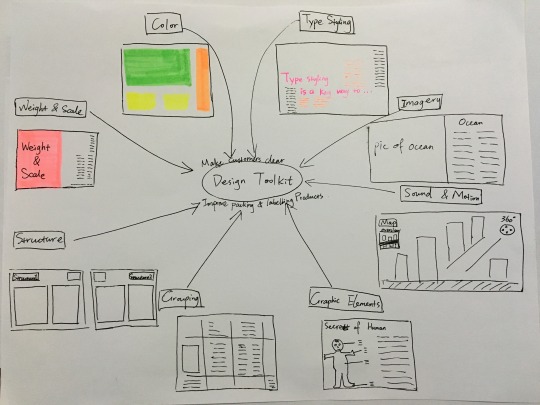
The 8 basic toolkit that we need in design are color, type styling, weight and scale, structure, grouping, graphic elements, imagery and sound and motion. These 8 basic elements are used to differentiate various parts of a design. Color is an important and most obvious element to clarify the hierarchy for deferent content. Readers can be attracted by the most highlight color and the to the color with smaller size or weight. Besides, different type styling can be used for different content to express different information in different field. The same typeface but different size and weight can create an effective and visually dynamic way for readers’ reading. When some parts of a design take up more weight or scale, it means it is the thing the designer most want to express in the design. With the combination with color and type styling, it can clarify complex hierarchy clearly. One more other element can create a rich visual language like weight and scale is structure. Some design prefer using the same structure, same structure can convey different meaning. Sometimes, they are a series of design or the designer will give some special meaning to them. The posters use the same structure want the visitors focus more on the information they interest but not pay more attention to understand different design and the important on it. Using lines, bars, boxes is a good way for designer to structure their content and visually separate their information for readers. The whole information will be more readable and organized with grouping. Graphic elements as an important part in information design, it can show the readers some visual information rather than only text. Mostly, it can draw readers more attention and create a visual interest. As the graphic elements, the imagery is another kind of visual information to attract readers. It is a powerful way to draw people's attention and then they are willing to read more details in the following articles. The last thing is sound and motion. Combining these elements with others can create a powerful effect or a sense of narrative. The packing and labeling will also uses the 8 elements above to make product out of clutter and help customer clarify the information.
I’m going to show some visual examples below.
Using a contrast color to draw attention.
Labels used on products to help customers clarify the information even without packing.
Here is the code from my exercise2.
.header { background-image: url("3.jpg") ; opacity: 0.8; background-position: center center; background-size: cover; height: 500px; width: 100%; }
/* Add the ID selector to this CSS rule */
#header-text { margin: 0 auto; position: relative; text-align: center; top: 25%; width: 60%; }
h1 { color:#FF3300; font-family: 'Open Sans', sans-serif; font-size: 70px; font-weight: 800; line-height: 60px; padding-top: 205px; margin: 0; }
h2 { color: #FFF; font-family: 'Open Sans', sans-serif; text-align: center; font-size: 28px; font-weight: 100;
}
h3 { color: #A46800; font-family: 'Open Sans', sans-serif; font-size: 36px; font-weight: 400; line-height: 30px; margin: 10px 0px; text-align: center; }
I use div to set up different part text of my web and then set them in different color and different font size and font weight. It uses type styling color to help readers find the important part and follow it. It will be easier for them to find title subtitle header and headings.
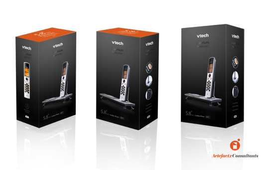
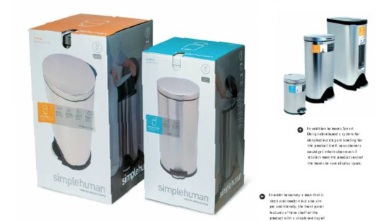
Use the same design structure for different type product. Customers just need to focus on the different part. And people will know they are the same series.

There too many informations in the product design. Too many colors and text on it. It is hard to clarify the main information and they are in clutter. All elements in the design are not organized.
The design uses contrast with the black background. Blue and black contrast with each other and helps the highlight the main information in blue. Besides, the context and the logo are connected by an icon like shooting star. The context on the left are align left. The entire design is simple and clear to get the information.
0 notes
Text
Idea Journal 1
In the readings, I’ve learnt that information design is a term to be concerned by more and more people as well as it is also applied in everywhere in our daily life.From the paper to digital device, wherever you are information design will appear in different field to affect the experience of people. Even information design is ubiquitous, it also have a serious problem of overload. As the typical solution of human, point of view in becoming rare. Most people tend to use the devices like computer, phones to access to the internet, more interfaces are needed to design to attract consumers. The interaction between computer and human are more ubiquitous now. Information design is becoming more important in today’s shopping and other activities. So the information should be more attractive and clear for people to help consumers can sort what they want exactly and the organization present what they want much better. Information design has many advantages:it can help consumer gain the key point and make them trust the organization, which can help the organization save money and time; it can also direct a clear destination and simplify the complex information to provide a better user experience. If a restaurant website want be a good one, it should satisfy the good points above so that consumers can gain sufficient informations and attracted by these. Besides, there are also many requirements a blog need to have, like they need to know what the consumers’ goal and to set some icons to help them understand their information.
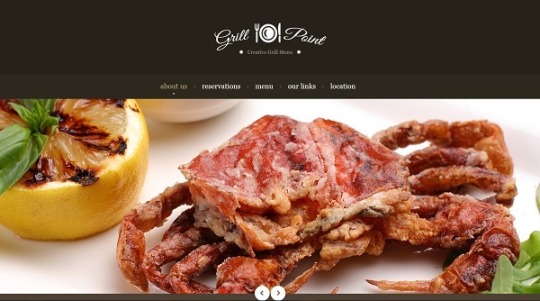
Here is a frontage of a restaurant web, people can clearly see the crab on the most attractive place and it can show people a way that is a web about food. People always see one thing in different way, and the logo with the icon will provide the information about the restaurant, the menu and some other information on the page give a direction to people where they want to know more about. In this page, it categorizes the information rant than providing lots of information without organization. The bottom of the page has the icon to direct people see the photos and it is the tool to give people an instruction.For the color contrast between black and white to show the information clear and give a feeling of neat and clean. It uses the principle of proximity, contrast and sign.
<div class="navigation"> <img src="https://s3.amazonaws.com/codecademy-content/courses/web-101/unit-6/htmlcss1-img_burger-logo.svg" width="180px;"> <ul> <li>Menu</li> <li>Nutrition</li> <li>Order</li> <li>Locations</li> </ul> </div>
<div class="content-box"> <div class="content-header"> <h1>BBQ Bacon Burger</h1> </div> <div class="content-body"> <p>Our BBQ Bacon Burger features our special house ground blend of wagyu and sirloin, spiced perfectly, and finished off with just a drop of white truffle oil. A butter grilled brioche bun layered with roasted red onion, perfectly crispy pork belly, and our hickory smoked BBQ sauce.</p> <br /> <a href="#" class="btn">Order Now</a> <br>
Here is the code that related to the content box and header on the font page. It provide the option such as Menu, Nutrition, Order, Location to direct people to what information they want and make the information chunking.
0 notes