Don't wanna be here? Send us removal request.
Statistics
We looked inside some of the posts by slayonetta7 and here's what we found interesting.
Average Info
Notes Per Post
59
Likes Per Post
55
Reblog Per Post
3
Reply Per Post
1
Time Between Posts
3 days
Number of Posts By Type
Text
17
Last Seen Tumblr Blogs


Fun Fact
There were a total of 171.5 billion posts on Tumblr in 2019.
Text

I have been following this brand called Orttu for a while because they create some really fashionable clothes for men. I've noticed a pattern in their presentation pictures that they've been following for most of their products.
They usually stick to rather plain white backgrounds with very few props and objects, thus making their clothes and the models stand out. In this specific picture the wooden chair in the background compliments the models skin color.
Through this minimalistic design, the clothing item, in this case the Paris Top is the center of attention due to its vibrant blue color.
3 notes
·
View notes
Text

While scrolling through my recommended Twitter feed I found this artwork of the Sailor Moon characters by Sidney Deng.
I really like how the artist managed to create each "slice" while sticking to one color per character. The colors are kept rather light and pastel, so they don't contrast each other too much. In a way, the colors compliment each other and bring out the richness in each part of the artwork.
The rule of thirds was employed here, with the characters faces being in the middle third, while the upper and lower thirds create a frame through some ornament-style figures. It frames the artwork and nicely rounds it of.
3 notes
·
View notes
Text

This is my dog Luka, of course I couldn't withhold from using at least one picture of him that my mother kept sending me over the last few months for my Visual Diary!
Wherever he goes, this little guy is serving contrast due to being completely black. However, the focus of this picture is the composition and the story it tells.
Due to how minimalistic the background is with very plain and lightly saturated colors, Luka stands out immediately. The main focus though is the piece of a toilet roll he has in his mouth, as the bright brown-greyish papier maché stands out a lot. The picture is simple, but it tells a story of fun and joy, how he is biting down on the toilet roll but stops to look up in surprise when I show up in front of him with my phone in his little face.
It is a very simplistic picture with few colors, but it's bright and warm and simply sparks joy within you.
2 notes
·
View notes
Text

These official artworks are from the video game "Final Fantasy 7 Rebirth". I could stare at these for hours and not get bored, because the execution of color, lighting, contrast and position is so well made here.
Both artworks are the exact same with the only difference being the focus on the two male protagonists in the top version and the two female protagonists in the bottom one. The image has been separated into three parts, one for each of the characters on the artwork. Both the female and male protagonists face away from the center of the image, where the main antagonist Sephiroth is positioned. It makes it seem as if they are staring into the distance while also showing that they are being separated from each other.
Sephiroth is positioned in the center against a bright red and yellow sky. The lighting from the rising or setting sun is illuminating his figure and we are almost blinded by the sun just barely passing him by. The mountains and rocks on both sides of him seem like they've opened up just for him, they almost frame him in the middle.
The sky on the left is dark and gloomy, it seems to show that these characters will have a dark fate awaiting them. In contrast to that is the bright blue sky on the right, with these two characters appearing more hopeful.
This simple artwork gives us a clear idea of what the game's story will be like.
2 notes
·
View notes
Text

I came across this beautiful hallway when I was exploring the city center the other week. I don't remember where it was exactly, but I was fascinated by the beautiful almost mural-like artwork on the ceiling.
The corridor shows and obvious green color theme, with some shades of yellow, blue and brown incorporated. The lamps on the wall and the chandeliers on the ceiling have been precisely chosen to compliment the artwork.
Through the green-yellowish hue, the corridor feels warm and welcoming, as if you are walking through and artpiece.
3 notes
·
View notes
Text

I follow this german brand called "Sauberkunst" on Instagram which specializes in selling their own solid soap, shampoo and conditioner bars. When I saw this post I couldn't help but remember the principles of food styling, which I had just given a presentation on.
A major principle is to stick to the same color family. We see that the soap is made up of brown chocolate components whereas the green and yellow colors stem from a pear. We can just make out a piece of the pear in the bottom right corner, while visible it doesn't take the focus away from the soap bar. We also see some cocoa powder in the upper third of the image, representing the chocolate component.
Lots of additional items are used to bring out the richness of the soap. It almost makes it look delicious and as if it would smell amazing. The background is in a lighter color and differently textured in order to make the solid soap bar stand out, which is positioned in the exact centre of the image.
2 notes
·
View notes
Text


I went by the art gallery of the St. Stephens Green shopping center this week and these paintings stuck out to me.
I'm a big fan of blue and turquoise colors, it reminds me of the ocean or the deep blue sea. The artist has a very distinct style of painting by making use of a sort of wave form and by blending the colors together, making them overlap to create these shapes.
The painting in the middle with the black background is probably my favorite one. Apparently it was done by pouring acrylic point onto the canvas in order to create these wavy blended shapes. The white circles on each side create a nice contrast with the black background and guide you towards the intertwined shapes in the middle of tha canvas.
Each painting has its own focus point, the blue and green painting in the bottom left corner of my photograph immediately draws you into the left side of the canvas where the swirl form comes together.
Despite all of them being their own individual piece, all the paintings seen on my photograph fit together really well, as if they were from the same "series" or had the same Leitmotiv.
3 notes
·
View notes
Text

I saw the front of this house while I was waiting for a friend in front of a restaurant in the city center. For some reason I looked up at the night sky and noticed this rather ominous scenery while my gaze turned back down.
There is a stark contrast between the two windows on the top and on the bottom due to the lower apartment being lit up. It immediately captures your gaze as you see the scribbles on the wall through the windows. It makes you wonder, who is living there and what are all these scriptures on the wall?
But there's another contrast between the left column of windows and the right one. The upper window on the left shows a bright emergency exit sign, which made me wonder whether this is an apartment or an office building. An emergency exit sign would be out of place in a regular apartment after all. The lower window on the left is illuminated by two lights right next to it which almost point towards the window with the emergency sign.
I personally couldn't help but stare at this scene all throughout while waiting for my friend to arrive, it makes me long for answers.
4 notes
·
View notes
Text
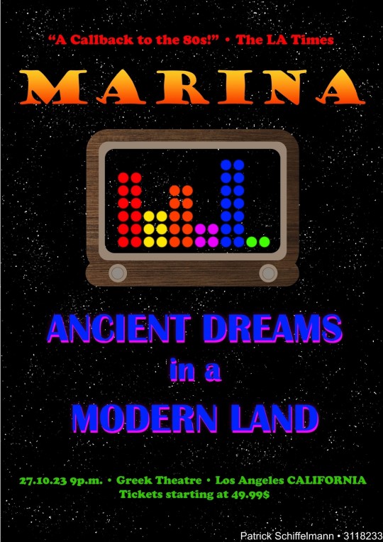
This post is dedicated to my Typography Music Poster assignment for the Visual Communication module.
I chose Marina as the musical act, as she is one of my all time favorite pop artists. Every record of hers has its own theme and story and for some reason she has managed to create music that always fit to my personal situation when her albums released.
Ancient Dreams in a Modern Land is her latest studio album and is comprised of two main concepts: The Ancient and The Modern. I tried to match her design language for this era while still making this poster my own thing. The idea of the abstract old radio in the middle is supposed to reflect The Ancient. Some of the songs on this record have an 80s pop-vibe to them which is what both this radio and the quote from the LA times stand for.
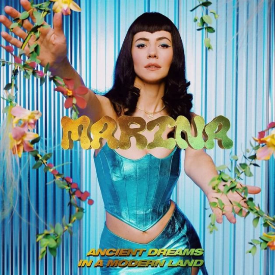
But this is also expressed in the colors I used which are bright and eye-catching. The colors were taken from Marina's music video to the titular album track in which she is standing in several rings of bright neon color as can be seen in one of the attached pictures. The color hierarchy is the same within the radio waves and from the top to the bottom of the poster starting with red and ending with green. The sine waves within the radio are supposed to represent The Modern, a modern style of showing the amplitudes of songs in the music apps on our phone or editing software for example.
The background is kept very simple, a dark nights sky with stars alluding to the sky you'd see in the Greek Theatre in Los Angeles, where the concert takes place, as the venue is open-air. It also works as a foundation for the colors as it makes them stand out even more.
The fonts I chose are playful and fun and reflect Marina's current style which can be seen on the cover artwork.

2 notes
·
View notes
Text

I came across this Color Wheel artwork on Twitter the other day. The artist called @tidi_art (Twitter handle) decided to draw the characters of the show Sailor Moon in a sort of color wheel style.
One is immediately drawn to the prominent central figure "Sailor Cosmos" shining bright in white and silver colors. Even though each of the characters has a very strong and distinct color scheme, the artist managed to blend them together very well.
There's a lot going on in each separate "slice" of the wheel, with a plethora of details added next to each of the characters. Despite these many details it doesn't look overloaded, as each of them blends in well with the corresponding background color, making them not that noticeable at first.
The main background of this artwork has a a beautiful frame and a slight color gradient as well, which helps making the color wheel stand out in the middle. The title "Cosmocolor Wheel" at the top is written in a rather small typeface and doesn't take away from the main focus of the piece, the chosen typeface actually helps in making it blend into the frame, as if it were a part of it.
The wheel isn't finished yet unfortunately, but I'm very excited to see what it looks like in its completed form.
4 notes
·
View notes
Text

I went through the Instagram acccount of one of my favorite Tomb Raider artists again today and had to stop at this piece. The artist adayka likes to draw Lara Croft in a similar artstyle as the one from the Tomb Raider comics released roughly 20 years ago. She's experimented with different materials to draw on and chose cardboard quite a few times now.
Her carboard art is one of my favorites as the simplicity and roughness of the canvas fits perfectly to the style of the classic Tomb Raider games. The artist likes to draw some sort of map on a different material which is then glued to the cardboard. The map is kept in a similar color scheme to the cardboard material and serves as a frame to the image of Lara she draws on top. She likes to go over the edges of the map such as with Lara's ponytail or the smoke of the gun.
While Lara is the immediate focus of the artwork due to the green top, she doesn't stand out as the color scheme used for her feels very much integrated into warm desert-like background color of the map and the cardboard.
If you look at Lara and follow her gaze you'll be guided to the drawings on the map which seem to depict Lara's location during her current adventure. Adayka manages to work with the positioning of the different parts of her art here to tell a short story very in line with what Tomb Raider stands for.
4 notes
·
View notes
Text

As I was coming back to the dorms late at night, I came across this artwork displayed on one of the buildings. I remember seeing it before at the Griffith College Creative Show in June, it's part of a photography collection called Sacred Geometry by Peter Bjoerk.
His photography exhibition was my favorite one, as his art was using very few colors, with most pieces being in black, white and shades of grey. This one specifically caught my eye, as it's close to impossible to not feel drawn to the dark pyramid in the center of the photograph. There's something very ominous and foreboding about this image, but the scene also seems calm and serene.
It seems as though the pyramid is being embraced by nature from all sides, with some of the white flowers growing at its foot shining bright against its darkness.
Overall, I can only recommend checking him out on Instagram (@pbjoerk) to find more of his work. Sacred Geometry captures a certain atmosphere and feeling that I haven't seen in any other photography collection so far.
4 notes
·
View notes
Text

I came upon this work by the Chinese artist Dagou while browsing through "It's Nice That" again. The artist specializes in the implicit portrayal of intimate relationships, mostly between two men as seen in the art displayed on the website.
This piece named "A whisper" stood out to me the most. Despite the shillouhettes of the two men being covered by a vine, "hidden" almost, the color contrast makes them stand out immediately. My eyes were drawn to them, despite not being in the foreground.
The red and orange colors used in the background for both the sky and the mountain peaks make it seem like the two are sitting on a bench in the warm evening sun. They are on their own, anonymous and hidden within the trees, as is implied by the branch covering them half.
It's a very simple artstyle with a limited amount of colors, but the precise use of contrasting elements and layering them on top of each other creates such a profound scene.
Source:
8 notes
·
View notes
Text

Every Halloween I carve my own pumpkin with a new design each year. This year I unfortunately didn't have the time as I wasn't spending Halloween at home, but when I went to my friend's house I saw that they had carved a "cat on the moon" design.
When I saw this scenery I was immediately inspired. I'm really happy with how this photograph turned out, as I wanted to show the contrast between the night sky and the lit up pumpkin in order to make the design stand out. The warm orange tones of the pumpkin work well together with the wooden table against the darkness in the background.
4 notes
·
View notes
Text

I found this painting by the artist Duri Baek on the website "It's Nice That". The article showed several of his creations, but this one stood out to me.
At first glance it seems almost lifelike, as if it were a photograph. The artist managed to capture the essence of a forest by merely using a limited color palette of yellow and green shades. The choice of color makes this forest appear warm and inviting, as though you were walking up to it on a warm summer day in the afternoon.
In this particular piece Baek works with a lot of shadows to make the trees appear real and lifelike, as if they had actual shape and weight to them. Through the arching branches of the tree in the front left, you are immediately drawn to the forest entrance on the right.
5 notes
·
View notes
Text

I went to the Pink Restaurant in the Dublin city center a few days ago and what can I say, the name obviously speaks for itself.
This photograph shows the bathroom of the restaurant bathed in different shades of pink. The mirrors have been placed opposite of the bathroom doors which creates a contrast between both sides of the hallway. While the shades of pink are all very similar the only thing that stands out are the white mirror frames and the words above them, they are the eye-catchers. Even though this little hallway is overloaded with different things such as the rose patterns on the doors, the flower wallpaper and the hexagonal floor tiles, it all works well together in the context of this restaurants theme.
3 notes
·
View notes
Text

This photograph shows the train station in Blackrock as the sun sets.
I was visiting some friends this week which live in Blackrock village and on my way back I was blinded by the sun as I stepped onto the train station platform.
The moment I captured was by pure coincidence, the way the platform and the train tracks lead your eyes towards the sun in the distance, shining bright over the connecting bridge. The sun radiates warmth as the colors in the picture above show. The dark stairs at the top of the photograph are slightly illuminated through the lens flare that also guides your sight to the center.
It's a beautiful composition, that was purely accidental.
3 notes
·
View notes