
I am a half Russian half Georgian student at the University of Westminster doing BA Photographic Arts. I believe that photographs are the experience captured and the box is an absolute arm of consciousness that helps me to observe the world with clarity.
Don't wanna be here? Send us removal request.
Statistics
We looked inside some of the posts by sofiatopchishvili-blog and here's what we found interesting.
Average Info
Notes Per Post
264
Likes Per Post
170
Reblog Per Post
92
Reply Per Post
2
Time Between Posts
3 days
Number of Posts By Type
Text
3
Photo
14
Last Seen Tumblr Blogs


Fun Fact
70% of Tumblr users say the Dashboard is their favorite place to spend time online.
Text
BA (Hons) Photographic Arts
BA (Hons) Photographic Arts
Major Project 1
Research Report
Name
Sofia Topchishvili
Major Project Title
Don’t Call Me Vodka– this title development randomly in the bar while talking to one of my British friends. Having a political talk, stereotypes started to flow into our conversation (which by I was not angry about - I got used to it) and we started to talk about Russian people, bears and vodka. That was when I realised the time has come for the Western world to understand Russian people and separate us from politics.
Research Methods
I began this project by looking at one of my favourite photographers – Boris Mikhailov, especially his work – The Retrospective and Case History. After moving to England everything changed and while creating art I always look for ways to give back to my community therefore when I have initialised Don’t Call Me Vodka Project I knew it would be something on-going. While, I was researching Boris Mikhailov, I fell in love with his almost effortless ways of photographing homeless and after finding out that most of it was staged it disappointed me in a way because thinking of it being almost creative photojournalistic project – I really deeply believed he encountered with homeless by chance not drunk with them and asked to act for the camera. However only later on I understood why was that the case. While I was conducting interviews, myself I have realised Russian people are really afraid of the camera – for them/us it is not only is a tool it is a weapon. Other aspect of Boris Mikhailov’s work that became my ultimate influence in my work is his handwritten notes written in Russian, it gives in that Soviet retrospective look. Boris Mikhailov, did not like to explain, he created and that is something that I still look forward to evolving in my art work. As most of the time is almost I have this little voice that tells me how and in what way viewers should see my work – but it never works this way. Other photographers that influenced my work are; ‘The Sochi Project’, - by Rob Hornstra and Arnold van Bruggen, Book ‘Blanco’ , Alex Webb, Diana Markosian, Shirin Neshat, Daro Sulakauri.
Pilot Project
Through the pilot project, I re-evaluated multiple dilemmas that helped to finalise my plan for the Final Major Project Execution. One of them was which format to use – I was stuck between medium format and 35mm format. By recalling in memory my first experience photographing and conducting interviews for Don’t Call Me Vodka I have realised that 35mm would be a better fit because of the practical matter – the camera has to light, small, fast and with a flash almost invincible but affective. The reason for that is – the places that I would be visiting for my major project would be quite dangerous – and I would have to take pictures quickly and the most effective way. As my major project would be conducted in Russia it was a bit of a challenge to figure out what exactly to do concerning while I would in London, and what would be the best way to execute Pilot Project. After much consideration, I figured out that I should focus on recreating Russian environment. For my first test shoot I have photographed my model friend and I have taken her around council buildings around Stockwell the outcome was not entirely positive as the camera let me down because of the focal point problem. As for my second test shoot, I have photographed my musician friend – but this time I had tried re-creating Russian environment and photographed in the abandoned warehouse. My other two shoots were conducted in Russia during my Christmas time.
Pilot Project allowed me to develop very important aim for this project. Even though I could not particularly photograph subjects and locations that would be in my final project I had practised photographing portraiture in the certain angles, development certain street style photograph. In the way that I would want my final prints to look like. Even though this project is photojournalistic I was looking for the ways for it to be creative and pilot project helped me to research and develop that style.
Audience and Context
When I have started Don’t Call Me Vodka I knew that it would be exhibited in London and it played very important role in my aims and context. Through this on-going project I want to depict real life of people that live in Russian Federation. Growing up in Russia I never paid much attention towards life that we as Russian’s live, until I moved to Western World. As this project will be exhibited in London and knowing this from day one I wanted to show true survival that people go through on daily basis in Russia by conducting interviews with them about their life in Saratov, about political and social dilemmas that affect their daily life. The aim for my viewers to have their own “punctum” experience while they engage with prints and installation – to have that nostalgic recollections with objects that on their own do not mean much but for each viewer represent something more.
Production and Presentation
For my major project I have chosen to photograph with 35mm camera and opened up a lot of options. Concerning practical matter 35mm is the format that allowed me photograph easily and as well as that is has very creative effect that depends on the film you choose – I would stick with Kodak 400, I do believe it is the most, vibrant film which has the most amazing colours especially for shooting in Russia that could be quite grey at times. Concerning the actual camera, I have shifted from Olympus XA 2 to Olympus M-1 because it is simply better in focal point and quality of the image. As well as that I do feel that semi-automated 35mm has clear resemblance to Russian people and their experience with photography. As I remember, myself when I would be young my mother would photograph with 35mm one off camera and VHR Camera. This camera resemblance with Russian people, because it is cheap – (really depends which one you buy) it is compact and back in 90s not many families had digital cameras.
As for the presentation for my pilot project I would be having 2 folders mainly – 1 with prints that I have done previously for my Don’t Call Me Vodka, influence prints from Boris Mikhailov and for the second folder I would include some prints I have done from my pilot project and some digital prints from the reference.
The prints for the pilot project did not come out as I accepted as one of the aspect is I could not develop good quality content that would resemble to my final major project as I was based in London.
Visual References / Bibliography
As I have previously mentioned my main influence for this project is Boris Mikhailov and his great ability to photograph soviet retrospective in the most controversial and yet admirable way. As well as his use of handwritten notes. Other photographers that influenced my work are; ‘The Sochi Project’, - by Rob Hornstra and Arnold van Bruggen, Book ‘Blanco’ , Alex Webb, Diana Markosian, Shirin Neshat, Daro Sulakauri.
0 notes
Text
BA (Hons) Photographic Arts
BA (Hons) Photographic Arts
MAJOR PROJECT PROPOSAL
Name
Sofia Topchishvili
Project Title (or working title)
Don’t Call Me Vodka
Subject / Concept
The subject for this project is to explore retrospective nostalgia from my Russian childhood. Taking photojournalistic approach, the concept for this project is to recollect memory from my hometown by photographing and conducting interviews with Russian people that share similar experience living in Saratov but who come from different backgrounds, age and class. This project is a continuation for the DON’T CALL ME VODKA, a journey that started for me back in 2017. Continuing this project, I would want to focus more on post-Soviet social groups in Russia such as working class, convicts, and elderly. The other subject change would be shifting from political angles to more social and personal approach.
Aims
This time there are two main aims for this project, personal – aiming to photograph and recollect memory from the time that I used to live in Russia and to record and conduct interviews with Russian people from different backgrounds around Saratov. Through this on-going project I want to highlight the notion how people live in my city and the change that happened since 90s. Aiming to depict that the majority of Russian people really struggle to survive because of the political oppression that comes from the never-ending external sanctions and never changing presidency. The aim is to explore and revisit sites around Saratov that I have shot before as well as extending and perfecting quality of film prints. Thus, the most important aim is to do justice to my people through my art.
Context / Audience
Through this on-going project I want to depict real life of people that live in Russian Federation. Growing up in Russia I never paid much attention towards life that we as Russian’s live, until I moved to Western World. As this project will be exhibited in London and knowing this from day one I wanted to show true survival that people go through on daily basis in Russia by conducting interviews with them about their life in Saratov, about political and social dilemmas that affect their daily life. The aim for my viewers to have their own “punctum” experience while they engage with prints and installation – to have that nostalgic recollections with objects that on their own do not mean much but for each viewer represent something more.
Proposed form, medium, presentation
Initially thinking that I could change the medium for this project – I wanted to shift from 35mm to medium format, however after long decision making I had to go back to 35mm. The main reasons are – this project is photojournalistic which means the camera has to be fast and semi-automated, it has to be small and quite light for it to be fit into my pocket. The 35mm camera that I would be using is semi-automated Olympus M [mju:]-1. Concerning the prints and the vision I have for my project that later would be exhibited – I want to create different sized c-type prints. Producing minimum 4 large c-type prints and multiple different sized small prints with handwritten notes and quotes all framed up and depicted tougher in the exhibition. Additionally, if I would have enough time I would try to do short video’s that later I would edit out almost as a VHR style. The possibility of the video to be exhibited as an installation in the exhibition – and played in the old square TV on top of the vodka bottles installation.
0 notes


Text
Time plan – Execution of the Major Project
Time plan – Execution of the Major Project
January
1st-10th– Final Submission Preparation for the Deadline on 10th
10th– 30th– Finalise Dissertation for the Deadline on 30th
February
2nd– 12th– Visit Russia to photograph Major Project
15th-30th– Start selection for the prints
March
1st– 15th– Final Selecting process,
2nd– 30th– Darkroom & initialising
April – Darkroom & finalising exhibition ideas
May – printing & executing, buying objects for exhibition
June – Exhibition
1 note
·
View note
Photo


Shoot 4, Digital Camera
As the main reason for this last test shoot was to photograph locations that I would return to in February - when I would be photographing my Major Project. The outcome is very positive - and I have realised not only the market - is another nostalgic memory for me - it would be something new and perhpas and bit shocking for the audience and that aspect of “wow” is alwasy one of the main reasons I do art.
12 notes
·
View notes
Photo


Shoot 3 - Location; Russia
Some of the other, digital photographs. First one is of my grandad, and the last picture is very interesting I took that picture a while ago and found it in my archives - how interesting and it is to include that at least as a reference for my project - and an inspiration for the instillation - both being contreversial adn ironic for the name of my project - “ DONT CALL ME VODKA”
10 notes
·
View notes
Photo


Shoot 4 - Location; Russia
During our Christmas shopping we want to our local market. While we were shopping we visited the meat section and I almost forgot how different and unique our Russian market’s are - the meat and fish on the counter’s are very fresh but my some european friend’s would say it would not be very sanitery.
Therefore, after Christmas and New Year next time we went to the market I haev wanted to take my camera with me - this time I took only my digital camera - to photograph the place just for the reference.
0 notes
Photo


Reference for future exhibition for my Major Project
Brainstorm of the ideas for the layout that could be used for the future Major Project Exhibtion in the end of the module.
0 notes
Photo


Exhibitions Ideas & Previous Exhibition Sneak Peak
Here is the look of my DONT CALL ME VODKA Exhibition that happened for 2nd year module - Wall, Page & Screen Module.
I know it is quite a while before we start brainstorming and actually initialising exhibition however it just popped into my mind an idea from my previous exhibition and pictures I have taken while I was in Russia this Christmas.
As you can see in my previous exhibtion I have created tight space between flags and prints - I want to re-create that clutter of nostalgia feeling with soviet retrospective objects and different sized frames and c-type prints.
1 note
·
View note
Photo


Shoot 3 - Location; Russia
some more footage that I took around my hometown - Saratov for my pilot project.
219 notes
·
View notes
Photo


Shoot 3 - Location; Russia
These two pictures might not seem to represent much for the Western person but for Russian people and for me being that one - it has so much meaning.
When I look at the these images the term - punctum - everybody sees completely different highlights and focus only on couple of things - in these pile of cluster and rubish - and for each person it would flashback many nostalgic childhood moments.
For example for me in the first image - chicken’s represent my grandfather’s house, village the recolaction of memories when I had to feed chickens. As to may Russians - lifestock and agroculture is very essesntial part of our culture.
In the second picture - the corner with icons - the recolation of memory in my grandmother’s house - her corner of different icons, each having different meaningd. Childhood memory of me going to sleep - and my granmother teaching me long prayer to say before bed - I remembered it to this day.
In my Major Project I want to photograph places and things that not only represent something to me but the viewers would haev their own punctum moment in each image.
3 notes
·
View notes
Photo


Shoot 3 - Location: Russia, Saratov
After our final presentation I flew back to Russia for Christmas & New Year’s. During my stay in Russia I do not have time to photograph or to say execute my Major Project and I will be coming back in the start of the February to do so, however I went around the city to the places that I would potentially photograph for my project. One of the most nostalgic places for me is my grandmas house and the playground around it. We went around the park and the buildings around her area and to her neighbours flats for a tea as we did when I was young. Growing up in Saratov I remember my grandmas house would be almost as a safe house for me - ironically the area where she lives is really not safe and it is almost in the end of the city - but that watm feeling in your heart that what matters.
In my major project I want to haev almost 2 sides/parts to it - visiting and documenting places that I would visit when I used to live in Saratov and Russia and go places where I have never been.
0 notes
Photo


Saratov Russian: Сара́тов, is a city and the administrative center of Saratov Oblast, Russia, and a major port on the Volga River located upstream (north) of Volgograd. Population: 837,900
Uvek, a city of the Golden Horde, stood near the site of the modern city of Saratov from the mid-13th century until its destruction by Tamerlane in 1395. While the exact date of the foundation of modern Saratov is unknown, all plausible theories date it to ca. 1590, during the reign (1584–1598) of Tsar Fyodor Ivanovich, who constructed several settlements along the Volga River in order to secure the southeastern boundary of his state. Town status was granted to it in 1708.
By the 1800s, Saratov had grown to become an important shipping port on the Volga. The Ryazan-Ural Railroad reached Saratov in 1870. In 1896 (26 years later), the line crossed the Volga and continued its eastward expansion. A unique train-ferry, owned by the Ryazan-Ural railroad, provided the connection across the river between the two parts of the railroad for 39 years, before the construction of a railway bridge in 1935.
During January 1915, with World War I dominating the Russian national agenda, Saratov became the destination for deportation convoys of ethnic Germans, Jews, Hungarians, Austrians and Slavs whose presence closer to the western front was perceived as a potential security risk to the state.
During World War II, Saratov was a station on the North-South Volzhskaya Rokada, a specially designated military railroad supplying troops, ammunition and supplies to Stalingrad in 1942-1943 the city was bombed by German aircraft the main target was the Kirov oil refinery bombarded heavily seriously damaging the installation and destroying 80% of its plant and temporarily interrupting its work. The Luftwaffe was able to destroy all the fuel stock at bases in Saratov and eliminate the oil plant in the city..
Until the end of the Soviet Union in 1991, the Soviet authorities designated Saratov a "closed city"—strictly off-limits to all foreigners due to its military importance as the site of a vital facility manufacturing military aircraft.
0 notes
Photo


Harry Callahan: Color
‘’I sort of believe that a picture is like a prayer; you’re offering a prayer to get something, and in a sense, it’s like a gift of God because you have practically no control-at least I don’t. But I wouldn’t make a pronouncement out of it. I just don’t know what makes a picture really – the thing that makes it is something unique, as far as I can understand. Just like one guy can write a sentence and it’s beautiful and another guy can write it and it’s dead. What that difference is I don’t know. That’s as far as I am religious; I don’t believe in any religion’’
Born in Detroit, Michigan Harry Morey Callahan became one of the most influential American photographers in twenties century, not only has he become famous for his colour photography but his black and white negative was widely recognised. Callahan began teaching himself photography in 1938. Callahan left almost no written records—no diaries, letters, scrapbooks or teaching notes. His technical photographic method was to go out almost every morning, walk through the city he lived in and take numerous pictures. He then spent almost every afternoon making proof prints of that day's best negatives. Yet, for all his photographic activity, Callahan, at his own estimation, produced no more than half a dozen final images a year. He also worked with multiple exposures. Callahan's work was a deeply personal response to his own life.
His photography is mainly concentrated on colour, he arrests very saturated highly contrasted compositions. Callahan finds particular objects with an intriguing texture which he matches and compares with contrasting colours from the colour pallet. He creates dreamlike imagery with the use of double exposure, he overlays fashion adverts on top of the concrete buildings, which conceives a sense of the reflection surface. He incorporates daylight and shadows constantly and he uses it as the frame to highlight particular patterns. He explored themes of feminism which was highly popular in seventeenth. Concentrating on vibrant clothes in the foreground he leaves background in a shadow, almost creating an allegorical dark paradise appearance. His images seem almost accidental. He included diverse details such as shop signs with the distinct sixties font, navy blue and light pink coloured signs. Vintage pallet highlighted the American identity, his images evoke patriotism towards his nation, without his actual acknowledgement of promoting certain symbolism.
In my opinion, he is one of the artists that take photography as the way of living, he captured urban landscapes almost every day, it became his daily routine. Callahan fully explored the world that surrounds him with great success, in some way he reminded me of William Eggleston, both American Photographers famous for there colour imagery. Their work, however, seem to be almost too perfect, too saturated, too idealised almost as the poster.
1 note
·
View note
Photo


The Islamic Republic of Iran, Seifollah Samadian and Shirin Neshat
When I was digging up books in the library I have found this amazing book about Iranian Photography - interestingly the book was both in English and Chinese and I think it gave it even odder and exciting look. The book itself was not in a great state - but all of the photography was in black and white and it featured some of the most beautiful works I have seen in my life - for me two especially two photographers stood out - Seifollah Samadian and Shirin Neshat. Both photographer’s share deep connection to their homeland and share necessesity to bring that nostalgi throughr their work - for exmample Neshat writes on top of her prints - and for me this resembles to - Boris Mikhailov and his prints and handwritten descriptions benath it.
Born in Tehran in 1954, Seifollah Samadian is an Iranian artist, photographer and cinematographer. Highly-regarded internationally as an art director with experience working with directors like Martin Scorsese and Abbas Kiarostami, Samadian came to the forefront of critical attention in a wave of Iranian photography that gained momentum in Iranian the arts scene in the years following the 1988 end of the Iran-Iraq war. Samadian later became Professor of Photojournalism at the University of Tehran and is today Publisher and Editor-in-chief of the Iranian cultural magazine Tassvir (Photography). Samadian’s photography strikes me with its brutality and beauty at the same time. If you look at the last picture with the flag you can see that the way he photographs is eclectic and it always changing one thing that remains especially in these series is the aspect that all photographs are in black and white. Balck and white mode brings out the drama and perhaps it flashes back the history of Iran and it’s religious oppression for Sunnis. I find his photography very inspiring and diverse, he really knows his angles and part of that reason might be because he works as the cinematographer as well.
The second artist- photographer - that stood out for me in this book is Shirin Neshat - for me, she is the ultimate inspiration not only her work is amazing but she is a woman. Therefore, being a feminist this brings me so much joy, that an artist living in a such patriarchal and rich in culture place as Iran - have created astonishing women-empowering content that is now imprinted in history. Shirin Neshat is an Iranian visual artist who lives in New York City, known primarily for her work in film, video and photography. Her artwork centres on the contrasts between Islam and the West, femininity and masculinity, public life and private life, antiquity and modernity, and bridging the spaces between these subjects. Neshat has been recognized countless times for her work, from winning the International Award of the XLVIII Venice Biennale in 1999 to winning the Silver Lion for best director at the 66th Venice Film Festival in 2009 to being named Artist of the Decade by Huffington Post critic G. Roger Denson.
My favourite works are one of Neshat’s earliest works, such as the Unveiling (1993) and Women of Allah (1993–97) series, which explore notions of femininity in relation to Islamic fundamentalism and militancy in her home country. As a way of coping with the discrepancy between the culture that she was experiencing and that of the pre-revolution Iran in which she was raised, she began her first mature body of work, the Women of Allah series, portraits of women entirely overlaid by Persian calligraphy. Her work refers to the social, cultural and religious codes of Muslim societies and the complexity of certain oppositions, such as man and woman. Neshat often emphasizes this theme showing two or more coordinated films concurrently, creating stark visual contrasts through motifs such as light and dark, black and white, male and female. Neshat has also made more traditional narrative short films, such as Zarin. The work of Neshat addresses the social, political and psychological dimensions of women's experience in contemporary Islamic societies. Although Neshat actively resists stereotypical representations of Islam, her artistic objectives are not explicitly polemical. Rather, her work recognizes the complex intellectual and religious forces shaping the identity of Muslim women throughout the world. Using Persian poetry and calligraphy she examined concepts such as martyrdom, the space of exile, the issues of identity and femininity.
14 notes
·
View notes
Photo


Alex Webb
One of the other inspiring photographers for me is - Alex Webb, who has an eye for capturing unexpected moments. With an acute focus on the more wider frames, as opposed to simply documenting one thing, he finds influence in multiple countries, cultures and subcultures. His career spans more than four decades, Webb is best known for his vibrant and complex colour work, especially from Latin America and the Caribbean. The American-based photographer has published 16 books, including The Suffering of Light – a comprehensive exploration of his colour work - the work that I have viewed in the book and the one that inspired me the most as well as his most recently publication - Slant Rhymes, with his wife, the poet and photographer Rebecca Norris Webb. This is the creative couples’s fourth collaborative book, along with Alex Webb and Rebecca Norris Webb on Street Photography and the Poetic Image (Aperture, 2014) Memory City (2014), and Violet Isle: A Duet of Photographs from Cuba (2009).
He had done multiple interviews, and the one I have picked on was about Slant Rhymes being as a kind of visual dialogue, which echoes their 30-year friendship and 20-year creative collaboration: “Sometimes we find our photographic slant rhymes share a similar palette or tone or geometry,” explains Webb. While the photographer tries to avoid making “artistic statements”, his approach remains uncomplicated: “Photos need to talk, so words are not always needed. Slant Rhymes is a photographic conversation between two Rebecca and I, as we work together and apart.”
Collaborating with partner opened a lot of doors to a lot of ideas to Alex Webb, by putting the two projects together Webb and Norris created an interesting and unexpected turnout - of sharing similar tone patterns and geometry. I believe Webb’s photography does not need a lot of explaining his work is splashed with vibrant colours, his photography shows the different idea of angles and frames.
1 note
·
View note
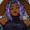
Photo


Shoot 2
Additioanally for my second shoot my friend asked me if I could do some digital portraits - and here are some best outcomes. I do not intend to use digital camera for my major project - however I always fins it usefull to carry one with you at all times - sometimes to see the exposure levels, to understand the lighting better and to get quick shots for reference
1 note
·
View note