
Don't wanna be here? Send us removal request.
Statistics
We looked inside some of the posts by solfirafira and here's what we found interesting.
Average Info
Notes Per Post
158K
Likes Per Post
91K
Reblog Per Post
66K
Reply Per Post
269
Time Between Posts
19 days
Number of Posts By Type
Text
17
Last Seen Tumblr Blogs


Fun Fact
12.7% of mobile users access Tumblr.

Text
【✨Acapella VTuber Magazine May Issue✨】 Selected Pages: Cyclethon 4
Full magazine can be read here!
This one's longer than expected, so strap in!!
Article: Connor & Mousey's Cyclethon 4

Role: Designer Writer: snakeeatingmouse Program: Adobe Illustrator
When I was informed that I'd be in charge of the Cyclethon spread, the first thing I did was to start sketching out ideas into my Rhodia dot pad.
P.S. I swear by Rhodia's products and have been a customer of theirs all throughout my design career lol Sponsor me please Rhodia!! I have the fountain pens and inks to show off how durable your paper is too if you're into that kinda thing!!

I typically like to sketch out a rough idea of where I want to position the main things, like the title/logo, the article text/copy, and any sort of assets I want to include.

I also use the space to sketch out my design fundamentals, such as marking out the spaces I have available to me in the title so I can see where I can fit certain words together in a nice way. I play around with the words and try to form some sort of cohesive title layout with this method. I took inspo from Ironmouse's logo with this one!


I was drawing direct inspiration from a social post from Connor so I noted down design elements that I wished to emulate, and also any other ideas I had. For example, I noticed the cute little monkey iconography in the background and tried my hand at expanding it into all the members that participated in the Cyclethon, however as I found out more and more people were a part of it, I realized the scope creep wasn't going to work in this case so this idea was scrapped. I do think the team look cute in this chibi style tho haha!

After that, it was simply off to the races as I opened Illustrator and started working on the various design elements. For me, the key is to plan out the copy first, and then form the elements around it. There's no point in doing all this work if the article is cut off or isn't the main focus, at the end of the day the copy is the most important element, and everything else serves as a support character.

Slowly, things started coming together. I made the title element by dragging my sketch into Illustrator and forming it out of vector elements. You'll notice the accent colour ended up changing due to the influence of the pink in the title element!

Finally, I sorted through all the images I had available to me from the various posts and pictures posted by Connor, Mousey, and the Cyclethon team, and pulled the ones that best chronicled their journey. I also added a lot more decorative elements since polaroids are a very popular form of fan item within both the vtubing community and the idol space and so I wanted to establish a vibe of scrapbooking with decorative stickers and little comments and arrows and hearts.

All in all, I think the design process was relatively straight forward and I credit a lot of it to the initial sketching page that I did. I don't do all this all in one day, but rather spread out into multiple days and so it can be tough to hold onto a really good idea if you don't have something visual to serve as a foundation. I highly doubt that when it's nearing the deadline and I'm rushing to finish a spread that I'd be able to have the mental capacity to be creative when the stress and pressure to finish is building.
I think it's crucial for a creative to allow those first few days/week to be as free and open as possible to allow for the most creative of ideas to come to you, and not have to worry about the details. This is when thinking about the big picture comes into play, you don't have to sweat the details. Just draw, just sketch, just go crazy and throw everything -- no matter how insane -- onto the page. Afterwards, with a goal in mind, assess the ideas and pull the ones that make sense within the timeline you have, and the skills that are required to pull it off. Sort of like the "write drunk, edit sober" mentality!
—————————————
Hmm ok so this got long lol, I think I'm gonna split this post and talk about the other pages I made in a separate post. Until then...
Go read the magazine!
The Acapella team and I worked really hard each issue, and it would mean a lot to us to know people are reading it.
AFTER ALL, IT'S FREE ! ! !
There are so many talented designers and writers and editors and proofreaders on staff and I adore working with them all. They're all so supportive and lovely to work with, and I'd love for them to be able to enjoy the fruits of their labour via more views and more readers.
Also!!! You may have noticed that I've started crediting the writers. We've begun to start crediting the writers whose hard work should be recognized as well, so keep an eye out for that in my future posts :D
#fira works#acapella media#magazine#editorial design#vtuber#envtuber#vtuber uprising#ironmouse#cdawgva#immune deficiency foundation
1 note
·
View note


Text
【✨Acapella VTuber Magazine April Issue✨】 Selected Pages
Full magazine can be read here!
---------------------------------------
Interview: Hirano Kokoro Ch.
Program: Adobe Illustrator (layout & design), Adobe Photoshop (artwork bg removal) Role: Designer

I was inspired by sports manga panels when I learned that Roro was a Hockey vtuber so that's the theme I went with for this spread. I looked at some Haikyuu! manga panels to see how the mangaka would emphasize heavy action panels and applied a few of those ideas here such as the diagonal speed lines in the bg of the first Roro image.
It would be a disservice if I didn't mention that in an original draft of this, the deco elements (exclamation marks, stars) were not coloured and in fact standard black and white in order to push the "manga panel" theme, but when sharing with the Acapella team, they wanted to see what it would look like with colour which resulted in a much more put-together version that better worked with Roro's visuals that we ultimately went with it. Shoutout to the Acapella Media staff!! Couldn't have done it without y'all <3
---------------------------------------
Article: Oshi Conbini / Lunalia Anniversary
Program: Adobe Illustrator Role: Designer

For this one, it was a bit of a last minute request and I was never supposed to design it this much but I ended up getting a bit carried away haha! With Oshi's article, this was easy as I pulled major inspo from their insta posts. Background, colour palette, it was easy to adapt the page to their branding. I originally had the idea of the quotes looking like insta comments but quickly realized that simple was best so I ended up opting for a simple border and solid red dropshadow.
One thing that was mentioned as feedback -- and that I now know I should have spent a little bit more time finessing -- is the column distinction, because I totally get how some people may first perceive it as sort of a Left, Right, Left, Right sort of orientation instead of a Left Column, Right Column sort of direction. I plan on taking the lessons I learned from this page onto future pages and take more care in making that distinction a little more easier to follow.
With Lunalia, I drew inspiration from the V4Mirai website that has an interesting techy green colour against a dark grey backdrop that made me lean towards a more techy, digital theme. If I had a chance to make one final change, I'd probably try to add some sort of techy background pattern or design as I realize now it feels a bit empty in that aspect. Oh well!
---------------------------------------
All in all, I'm so happy and grateful to have been part of this wonderful project and hope everyone can look forward to more posts from me as I use this place as a way to do a bit of a post-recap of the design process. There are two more articles in particular that I can't wait to post and speak about more (Roro's was one of them, so I'm glad I can talk about it here hehe), but until that gets released, it'll be hush hush from me 🙊
Please look forward to more editions from Acapella Media, as well as these recap posts. Do you guys like these? I hope they're informative to someone out there...
Anyway, that's it from me for now~
Go read the magazine!!
#fira works#graphic design#layout design#acapella media#magazine#editorial design#hirano kokoro#oshi conbini#lunalia#v4mirai#vtuber#design#adobe illustrator#envtuber#vtuber uprising#indie vtuber
4 notes
·
View notes
Text
hi
i remembered i had a tumblr account..!
i am also here because i am in need of a new hyperfixation (alongside the other 31283 ones that I have on a rotating basis)
maybe i pick up drawing again..?
1 note
·
View note

Text
the day I go back to making my usual amount of money from a job and company that I love, I will cease subathons and donothons and do my absolute best to give my community everything I possibly can for free. I don't want to be Mr. Beast, nor do I have any altruistic intent that ends up feeling selfish. Only a grateful heart for how much they mean to me.
I hope one day I can fulfill this promise to them.
3 notes
·
View notes
Text
MAN
I hate going on the internet only to have to be subject to some kid's uneducated opinion.
DON'T QUOTE TO ME THE SACRED WORDS OF HATSUNE MIKU, I WAS THERE WHEN IT WAS WRITTEN.

I have thoughts about DECO*27's latest song called Sad Girl Sex and the whole discourse around Miku as a brand and also her age that keeps being brought up, but I need some time to fully prepare my points before I open that can of worms.
0 notes
Text
after missing a week, I'm back on my every-few-days runs and so today I decided to map out my route on google maps just to see the distance.
apparently my usual route is like already 5km in total so that's awesome for me training for a 5k marathon, but I mostly do majority walking and like a few minutes of running interspersed so I think now I should practice keeping up a light jog the whole route, only taking a break when absolutely necessary.
2 notes
·
View notes

Text
following productivity youtubers are a wild journey because some of them post a video once a day consistently for years and write a book and publish an app, while others will disappear off the planet for months and come back with announcements like "so i've been recently living out of a van" and they didn't mean #vanlife they legitimately meant an actual van
and then they proceed to show the most minimalist tech you've ever seen that looks like it was made with today's technology but with the functionality of what someone in the 80's would require
i'm convinced some of these people are a different human species entirely
1 note
·
View note


Text
"Satire requires a clarity of purpose and target, lest it be mistaken for, and contribute to, that which it intends to criticize."
possibly Terry Pratchett???
an apocryphal proverb found on the internet
also known as Poe's Law
CAN SOMEONE TELL ME WHO THE ACTUAL ORIGINATOR OF THIS QUOTE IS ?!?!?!?!
3 notes
·
View notes
Text
so i just discovered rose pine...
i feel a strong urge to make a stream overlay based on this theme lol
1 note
·
View note

Text
Some of you post like you’re trying to avoid making a video essay
4K notes
·
View notes
Text
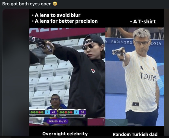
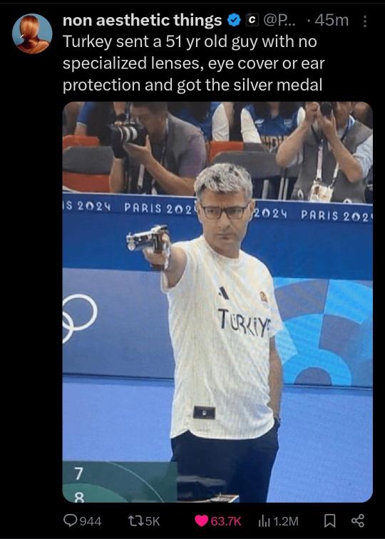
This is frustrating.
I love the comparison, but I hate how they are comparing.
They are acting like she is using optics to give herself an advantage. But the device she is wearing is just for comfort and essentially does the same thing as closing one eye and squinting the other.
The little thing over the left eye is basically like an eye patch.
And the thing over her right eye is a mechanical iris, like in a camera lens, but it is NOT a lens.
Different lighting environments are going to be brighter or darker and you may have to squint more or less to let in the same amount of light into your eye. Squinting allows the shooter to get the sharpest possible vision in order to shoot a bullseye the size of a 12-point Times New Roman period.
But if you have to squint for hours for practice and in competition, this can strain your face muscles and become uncomfortable. So this iris basically squints for you.
It's more like wearing comfortable shoes so your feet do not hurt than a lens magnifying the target and giving an advantage.
Both athletes have access to these items. One felt more comfortable without them. The other didn't feel like getting a muscle cramp from squinting all day.
Either would have shot the same if they had or had not used these devices.
Just a funny difference in gear preference.
I should also add, the Turkish dad is the only one using lenses.
141K notes
·
View notes