Photo

artist : Xtian Miller,
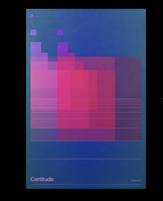
He used pale color for his poster design and it makes people understanding that the poster is vintage.Because , also, the frame is faded. The pink lines give to the design depth perception.Especially, The lines are getting closer each other at the middle of the paper. In my point of you ,the transparent pink squares are combining with the pale-dark-blue backround to make to the design more enjoyful.
Certitude* meaning is alived by the effect of the pale-dark-blue backround to the pink transparent color.Therefore, the pink color is changing due to the backround and there is no certantity for the pink... We can see the changing at the top-right-corner. Certitude* aspect is coming from backround ,but the irony is the text also is pink color.
Why I decided this design? Those all little squares make me feel that it is an old school-arcade-pixel game..
#visualidentity#visualdiary#graphicdesigndaily#typography#typogram#typosters#graphic art#graphic design#typhography#desinginteriores
2 notes
·
View notes


