
Statistics
We looked inside some of the posts by starclarkanimation and here's what we found interesting.
Average Info
Notes Per Post
0
Likes Per Post
0
Reblog Per Post
0
Reply Per Post
0
Time Between Posts
2 days
Number of Posts By Type
Text
13
Video
4
Last Seen Tumblr Blogs


Fun Fact
The Tumblr office adopted Tommy, an 11-year-old Pomeranian.
Text
12 principles of animation
Analysing 10 clips with their principles
Anticipation
Anticipation helps prepare the viewer for the action that is about to happen. This technique is key for making the animation look more realistic. If your animation doesn’t have anticipation it will look very stiff and awkward which is why its important to make sure that this technique is perfected.

Exaggeration
If you choose to add too much realism you could unfortunately ruin the animation, as it would be easier to film the action in real life as it would look quite static. Exaggeration is a great dynamic approach as it can add life to the motion which is being created.

Secondary Action
Secondary actions are fantastic for paring up and emphasising the main movement going on. What makes them work so well is that they help create a sense of dimension ( an added action to accompany what's happening). For examle the hair and the bag flapping.

Solid Drawing
With solid drawing its important to know the very basics of drawing, which is why drawing lessons are extremely helpful. This is because the drawing must stay consistent as the object or character must remain the same mass even if its in motion. This is to make it more realistic with physics law.

Appeal
Appeal as a technique is very important, this is because your animation must attract the viewers eye. A lot of people are drawn to an animation based on the aesthetic alone. Each viewer have different tastes in style but this is why fan bases are often made. They love the appeal of the art, character and story.

0 notes
Text
Digital Journey
Week 4
Image 1: Wall.e

Image 2: Wall.e
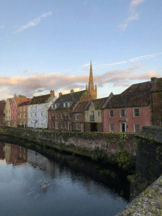
Image 3: Wall.e

Image 4: Wall.e

Image 5: Wall.e

Image 6: Wall.e

Final image

I’m so happy with how my final image turned out. I followed the colour composition from (https://color.adobe.com/create/color-wheel) I used the monochromatic tab to create this colour pallet and I love the earthy tones it has created. Using the clipping mask it had created a really nice grain over the image which really helps with the ‘post apocalyptic ’ style I'm going for. I think this works really well with the theme and emphasises my idea ( being stuck in lockdown for 20 years and coming out to see Norwich covered in lost of moss) I have continued to hide my object like I have done for the last 6. I placed Wall.e in the bush just off to the right to hide him but also keep him closer to the foreground. I did this because I noticed in images 1 and 3 that due to him being so distant he isn’t that easily noticeable. I would really like to do a project like this in the future as it was nice to have total control over what my images can be. If I was to do this again I would like to explore more options to this photo and maybe add more object into them. I would also love to create a more recognisable ‘post apocalyptic’ scene. I could include darker and orange sky's, cracks in the ground, fog, smoke from cars.
0 notes
Text
Digital Journey
Week 3
Completing My 6 photoshopped images.


https://color.adobe.com/create/color-wheel
Out of all the images I took these are my prefer 7 as they are the best angles and they have a nice composition. I quite like that all of the main parts of the photos are slightly off centre this is because it feels like a lot of the space within the image is taken up by large buildings. With what I know now with the image I would like to create a masking layer and paint in moss.
To do this I had to search on YouTube and I found this very helpful video: ArtOfSoulburn,2020, https://www.youtube.com/watch?v=f-0kA1T33Og
This 13 minute video helped so much as I was able to follow it step by step to create a mask and then I filled the image and and painted white which brought out the moss underneath. I then used the leaf brush in photoshop to create the moss like texture and I started to fill in the images in places where I thought moss would hit.
Moss Knowledge:
In most areas, mosses grow chiefly in moist, shaded areas, such as wooded areas and at the edges of streams, but they can grow anywhere in cool, humid, cloudy climates, and some species are adapted to sunny, seasonally dry areas like alpine rocks or stabilized sand dunes. Choice of substrate varies by species as well. ~ https://en.wikipedia.org/wiki/Moss
With that I would use that newly found knowledge and my own from my images of moss. I can create a mossy effect onto my images
IMAGE 1:

IMAGE 2:

IMAGE 3:

IMAGE 4:

IMAGE 5:

IMAGE 6:

These are my 6 digital sketches and with the final image I have put in Wall.e as lost toy. I am going to add him in my final image and fill it with more moss to make it look even more post apocalyptic.
I really love how these photos look. I think the mask worked really well as it shows the true colour of moss and the texture.
I cut out this image from Wall.e. Disney, Pixar, 18 Jul 2008, Directors: Andrew Stanton · Alan Barillaro
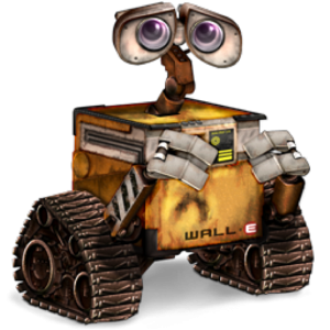
I’m going to place this image and lower the opacity to blend it into my images, my goal is to hide him as best as I can either as a small toy, street art, hidden in the water.
0 notes
Text
Digital Journey
Week 2-3
Learning Photoshop. Planning colour and texture.
Task 1: Plan colour and texture

With this experiment I put my images into Procreate and played around with ways I could get the moss colour and texture across. I started by drawing a basic sketch of the images and the drawing some slight green on top of where I’d like the moss to go. Then I placed a zoomed up picture of moss on top of my image and then I turned the opacity down so you could see the original image come through. Then I tested out how it would look if I placed the moss on top like before but instead cut out the surrounding area other than the building.
I really like how these turned out as experiments, I want to now take a look at texturing and colour composition.

I took pictures of moss around the of Norwich, starting from my accommodation, then heading to lesson then around town and finally back home. From this I place the images into procreate and looked specific colours of the moss and worked with different textures to see what would look best. There's a brush called ‘stable’ it gives small brush strokes and I really like that brush as it creates different tones of green within the pattern so it works very well for adding depth. I used a brush called cloud and that didn't work too well, this was because it was very opaque so it didn't give of my desired effect.
Learning Photoshop
Photoshop is a new program for me. I had used it very briefly in year 1 of college so I looked to YouTube to teach me the basics .
The two videos I used:
Alec Markarian,2016: https://www.youtube.com/watch?v=pFyOznL9UvA&t=1612s
Flow Graphics,2016: https://www.youtube.com/watch?v=KAmSB5MQxOo
these videos helped so much , notes below are ones I took from the video.


0 notes
Text
Digital Journey
week ½ task: Take photos of a journey around Norwich


0 notes
Text
Digital Journey
Week 1/2 task: take pictures of a journey around Norwich


0 notes
Text
Digital Journey
Week ½ task: Take pictures of a journey


0 notes
Text
Digital Journey
Week 1 ~ Digital Journey

In this weeks lesson I had to fill out a sheet based on these given photos, from this I will have to make my own composition sheet with my chosen photos.
Firstly I was given 6 words ( Calm, In Balance, Tension, Conflict, Resolution and Home) then I had to put these words into a basic chronological story. One task consistent of doing 3 lines based on what I think the word means, another task was to incorporate these photos into silhouettes or the value of a picture. Creating the value was really fun as I was taught a new technique to show the value of a picture. I really enjoy the blurriness of the sketches. With this technique, block out all the darks very roughly then add the white highlights to create depth. I think this is a great way to communicate an idea quickly.
Planning an idea
Starting with a mind map

In this mind map I wrote out the first few things that come to mind to see if I could grasp and idea for this project. It started with (Life, Holiday, Time and Transport) I liked these ideas but nothing really grabbed my attention so I thought about what I truly loved about Norwich the most. The thing that drew me to study here was the architecture, On my interview day I felt very inspired even just walking around the city centre. From this thought I knew I wanted to take photos of buildings. With this idea in my head I needed to think about where I wanted to go next.
In the background of me working I had playing an episode of Gravity Falls. From this I got the idea to photoshop houses together to make the mystery shack.

Within this plan I wrote out specific places in Norwich where id like to take pictures ( The Market, Cathedrals, The river near Glasshouse and Elm Hill). I drew a quick sketch of the Mystery Shack so I could work out the types of buildings I would need to photoshop together to make it look most realistic. I could then add object that hint towards the show.

Gravity Falls, 02 Jan 2013, Alex Hirsch, Networks: Disney Channel · Disney XD · The Walt Disney Company
3 days into this project I changed my idea.
At this point in time The UK got the news about a potential second lockdown. This sparked the idea to create Norwich in a post apocalyptic scene. Almost as if we had been placed into lockdown for 20 years and eventually we can immigrate back in to society and Norwich is covered in moss. The object I would like to incorporate Wall.e into my work. I want to make him a lost toy which refer back to him as a lonely robot in a post apocalyptic world.
What I need to think about when doing my project.

My 6 panel sketch
0 notes
Video
youtube
Week 4 ~ Animation/After Effects
Pumpkin mouth Halloween clip
The task:
Create a Halloween loop ( 2 seconds )
for this I chose to create my own assets as I wanted to create a pumpkin mouth biting down in the foreground and to add some depth show different layers in the background. I had a lot of fun doing this as I could be free with the assets I could create. To do this I used the pen tool and drew it and filled it out. Then I added keyframes and moved the teeth to meet each other. Then I moved the mouth up and down as a chain reaction once the teeth had moved to give it more of a realistic but cartoon feel.

Pumpkin teeth, Laithwaite's Wine ,2015
http://blog.laithwaites.co.uk/wicked-wine-food-pairings-halloween/#.X6wxP1pxc2w
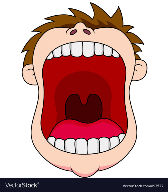
https://www.vectorstock.com/royalty-free-vector/open-mouth-vector-893533
0 notes
Video
youtube
Week 3 ~ Animation/ After Effects
Week 3 has been very fun as we got to experiment more with objects instead of squares and circles. Firstly I got to experiment with ‘paths’, to do this you need to create assets ‘circles’. This is a really useful technique to learn and I think I got it to work quite well although I should have delayed each one so they don’t all play at the same time as it’s very distracting.
What I learnt
follow the path
Various Loops
Car
Skateboard reference: https://youtu.be/VFoA7zapmxA?t=63
Snowboarder reference: https://giphy.com/gifs/3o7TKnugq1I4e3b97i/html5
Helicopter reference: https://giphy.com/gifs/j79FTNpBYYGTKPTtHv/html5 https://youtu.be/dp_x_s-kG7k
Assault course reference: https://youtu.be/ufc030OfmE0?t=10
For this week I had to use a lot of references to make sure my animation are the most accurate using physics. The most difficult was the snowboarder or the helicopter. This is because The snowboarder became very stiff at the end because it hangs in the air for 2 seconds and then doesn’t hit the floor with the correct amount of weight. In my spare time I’m going to go back and correct this. The helicopter wasn't too bad although I wanted to rotate it fully around but as it was 2d the object lost the sense of 3 dimension as you could see the helicopter’s ‘nulls’ separate. To rotate it I flew it off screen and flipped it around then I lowered it slightly until it hit the helipad.
I have set goals each week and the previous weeks goal was to aim to achieve good physics and I think I did an okay job but I still need some improving to do but I will be working on these in my own time and updating my progress. My next goal is to refine what I have learned so far.
0 notes
Video
youtube
Week 1 ~ Animation/After Effects
This is my first week studying Animation. Our first project is to study the 12 Principles of animation using the program After Effects.
What I learnt
Key frames
Speed
Easing in and out
Anticipation and overshoot
Arcs
Bouncy Ball
Impact
My attempt
This past week I have begun to develop my skills within the first stages of animation. I have been studying the principles of animation. First starting with the very basics which are listed above. I have enjoyed exploring this program although it has definitely been a challenge. I thinking having the videos showing us step by step truly helped when learning to animate as I could take it at my own pace to make sure I have thoroughly got the steps down as accurate as I could.
I think my interpretation of over-shoot with rotation worked quite well. I think the way it has increased with speed until it overshoots with a rotation as it comes to an immediate stop, it rotates at a slight angle to lift of the ground as it immediately drops back down in the same position as it had stopped in. This gives the illusion of something causing it to stop and in cases where you would us this to make it look most realistic I believe it could work for using a car or a bike. This will show the built up motion until it must immediately stop.
I think what I could work on would be the way a ball bounces. When viewing it I notices that it mass slightly changes inside of it stay as the full mass off 100-100 the squashing down to 125-75, I do notices when it is going to squash just before the mass changes. Over the coming few weeks left on this project I would like to focus more on improve this ability.
0 notes
Video
youtube
Week 2 ~ Animation/After Effects
In week 2 I feel slightly more confident about using after effects, I have enjoyed developing my previous weeks skills along side learning new outcomes such as the ‘Pendulum’ or completing the ‘Bouncing ball’ with a graph.
What I have learnt
Graph Editor
Pendulum reference: https://youtu.be/fTOuA2Y_IX0
Bouncing ball with the graph reference: https://youtu.be/aY3TrpiUOqE
Follow through & overlap
Rope swing
bouncing ball down the stairs
Tennis ball, balloon , bowling ball reference: https://youtu.be/8eejc0p7nCM ( bowling ball) https://youtu.be/udgkQBsvWS ( balloon)
I think my most successful animation was the balloon drop. I really like how slow it drops and once it hits the side of the step it rotates. I followed the clip linked above (balloon reference) to help me get the most accurate result. I didn't add any squash and stretch to this balloon as it is full of air but I really enjoy how it compares to the ball which had previously fallen. I wasn't too keen on the bowling ball I believe it looks to stiff and I need to work on focusing weight into the ball more. To achieve this I think I should research into more clips about how gravity works with that much mass. What I notice so far is the ball doesn't drop as fast as it should do. It also skims the steps ( I attempted to add a rotation but for some reason it wasn’t working but I believe that would have improved the over all look and make it not so robotic).
I improved on my goal from last week (work on the bounce of a ball) next week I’d like to work on the fluidity of the animations by using the 12 principles correctly.
0 notes


Text
Life Drawing
Drawing with a geometric shape.


0 notes


Text
Life Drawing
Life Drawing using Croquiscafe on Vimeo
Drawing at home


0 notes
Text
Drawing
Tonal Sketch ~ Blending the light and dark shades

0 notes